


Mobile Website Design a UK Guide for SMEs in 2026
52.8% of worldwide web traffic now comes from mobile devices, while desktops account for 45.61%, according to Statista's mobile responsive web design data for Europe. That flips an old assumption on its head. For most UK SMEs, the phone is no longer the smaller version of the main website. It is the main website.
That matters in Dorset as much as it does anywhere else. A visitor looking for a café menu in Weymouth, a tradesperson in Dorchester, or a local shop opening hours in Portland usually wants one thing fast. If the site is awkward on a phone, they won't wrestle with it. They'll leave, try a competitor, or put the decision off entirely.
Good mobile website design isn't about squeezing a desktop layout into a narrower box. It's about deciding what the customer needs first, then removing friction until getting that result feels effortless.
Table of Contents
- Why Mobile Website Design Is Essential in 2026
- Understanding The Core Principles Mobile First vs Responsive
- Key UX Elements for a Winning Mobile Experience
- Technical Foundations for Mobile Speed and SEO
- Mobile Design for WordPress and eCommerce Sites
- How to Test Launch and Optimise Your Mobile Website
- Your Dorset Business Mobile Website Checklist
Why Mobile Website Design Is Essential in 2026
For many Dorset businesses, the first customer interaction now happens on a phone, not a laptop in an office. That changes what good web design looks like.
A site that feels awkward on mobile loses business in quiet, expensive ways. Visitors miss the call button. They abandon a quote form halfway through. They give up trying to find opening hours, service areas, or directions. In practice, that means fewer enquiries, fewer bookings, and less value from the traffic you already paid to attract.
The issue is not whether people can technically open your website on a phone. The key question is whether that experience is good enough to win a customer.
For UK SMEs, especially local service businesses, mobile design also affects how well your marketing works overall. Someone searching for a Dorset accountant, café, builder, salon, or holiday let is often ready to act there and then. Good rankings help you get found, but conversion happens on the page. That is why mobile usability works closely with local SEO for businesses. Search visibility gets you into the shortlist. A clear mobile experience helps you get the call or enquiry.
Mobile is now the main customer journey
Your mobile website works like a shopfront with a single glance to make the right impression. If key information is buried, buttons are fiddly, or the page takes too long to load, people do not pause to admire the design. They move on to the next option.
For most SMEs, a phone user wants four answers fast:
- Who are you
- What do you offer
- Can I trust you
- What should I do next
When those answers are clear, mobile starts pulling its weight as a sales tool rather than acting as a cut-down version of the desktop site.
Practical rule: If someone cannot use your site comfortably with one hand while standing outside your premises or sitting in a car park, it still needs work.
What businesses often misunderstand
Many small business owners still treat mobile design as a resizing exercise. That is usually where results slip. Good mobile design is really about priority.
On a smaller screen, every extra block competes for attention. Navigation has to be tighter. Service pages need to reach the point faster. Trust signals need to appear earlier. Calls to action need to be obvious without feeling pushy. We often explain this to Dorset clients as the difference between fitting your brochure onto a phone and building a page that helps somebody make a decision.
That trade-off matters. Decorative elements, long introductions, and crowded menus may survive on desktop. On mobile, they often get in the way of the action a customer came to take.
Understanding The Core Principles Mobile First vs Responsive
The two phrases business owners hear most are mobile-first and responsive design. They're related, but they're not identical.
Responsive design means a layout adapts to different screen sizes. Mobile-first means the design process starts with the smallest screen and builds upward. One describes how the site behaves. The other describes how it is planned.
A simple analogy helps. Responsive design is like tailoring one suit so it can adjust across several body shapes. Mobile-first is like fitting the most restrictive size first, then adding room where needed. Both can work. The second approach usually forces better discipline.
The strategic difference
When a team starts with desktop, the temptation is to include everything. Wide banners, long menus, sidebars, oversized imagery, and content blocks that only make sense when there's abundant space. Later, someone tries to fold that into a phone layout. That's where mobile starts feeling cramped and compromised.
When a team starts with mobile, every element has to justify its place. The hierarchy becomes clearer because space is limited. You decide what really matters to the customer, then expand the experience for tablets and desktops without losing focus.
That's why businesses researching what responsive web design is should also ask a better question. Was the site merely made to resize, or was its design centered on mobile behaviour?
Mobile-First vs. Responsive Design At a Glance
| Aspect | Mobile-First Design | Responsive Design |
|---|---|---|
| Starting point | Begins with the smallest screen first | Often begins with a desktop layout, then adapts |
| Content decisions | Forces prioritisation early | Can lead to later content trimming |
| User focus | Built around mobile behaviours from day one | Can be excellent, but depends on execution |
| Design process | Expands upward from essentials | Rearranges existing components across sizes |
| Budget impact | Often saves rework by clarifying priorities early | Can be efficient, but may create patching work later |
| Future-proofing | Usually stronger because the foundation is leaner | Good if the system is flexible and maintained |
Which approach suits a UK SME
For most SMEs, the answer isn't ideological. It's practical.
If you're rebuilding from scratch, mobile-first is usually the cleaner route. It helps avoid bloated page structures and forces better decisions about enquiry paths, service pages, and contact journeys. If you already have a functioning site and need improvements without a full rebuild, responsive updates can still make sense.
A responsive site that was planned properly will beat a “mobile-first” site that ignores content, speed, and conversion basics.
The key trade-off is this. Mobile-first demands more discipline early. Responsive retrofits often seem cheaper at the start, but they can become fiddly when desktop assumptions have already shaped the whole site.
For a Dorset business owner speaking to an agency, a useful question is not “Do you do responsive?” Almost everyone says yes. A better question is, “What screen size and mobile user journey do you design around first?” That gets you into the core thinking behind the build.
Key UX Elements for a Winning Mobile Experience
A good mobile interface feels almost invisible. The user doesn't notice the design because nothing gets in the way.
That's the standard to aim for. Not flashy. Not crowded. Not clever for the sake of it. Just clear, quick, and comfortable to use with a thumb on a small screen.
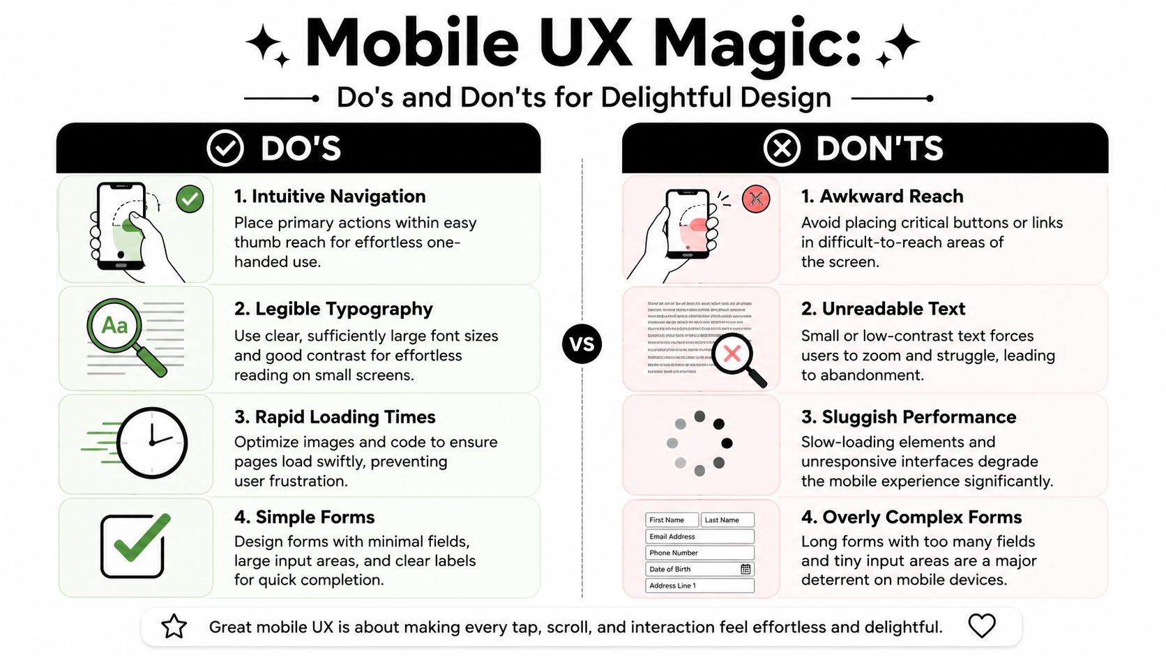
Design for the hand, not just the screen
Many business owners review their site on a laptop and assume the mobile version is fine because everything technically “fits”. That's not enough. Mobile use is physical. People tap with their thumbs, scroll quickly, and make decisions in seconds.
For UK mobile UX, designers should place CTAs within the natural thumb arc and ensure touch targets are at least 48×48 pixels to avoid tap errors that can worsen Interaction to Next Paint beyond the 200ms limit, as outlined in CloudSwitched's UK web design best practices.
That changes some common layout habits:
Primary buttons belong within easy reach
If “Book now”, “Call us”, or “Get a quote” sits in an awkward corner, users miss it or delay acting.Menus should reduce effort
A cluttered navigation system on mobile feels like a cupboard where everything falls out when you open the door.Spacing matters
Links and buttons need breathing room. If users keep tapping the wrong item, the design is working against them.
Content has to earn its place
On mobile, every paragraph, image, and heading competes for limited attention. A desktop page can get away with more scene-setting. A phone page usually can't.
Readable typography, clean contrast, and short content blocks make a bigger difference than decorative flourishes. Strong mobile pages tend to use:
- Clear headings that tell users where they are
- Short paragraphs that scan easily
- One main action per section rather than several competing buttons
- Visual restraint so important details aren't buried
If you sell products, services, or digital downloads, the same logic applies beyond brochure sites. Sellers trying to improve online storefronts often benefit from practical tips for selling creative work online, especially where product presentation, trust, and checkout flow all need to work smoothly on phones.
The best mobile UX usually feels slightly under-designed to the business owner and noticeably easier to the customer.
For a broader look at friction points, this guide on how to improve website user experience is worth reviewing alongside your own site.
Forms should feel easy, not administrative
Forms are where many mobile websites lose people. The page may look fine, but the moment a user sees too many fields, awkward labels, or fiddly dropdowns, motivation drops.
Strong mobile forms usually share a few traits:
They ask for essentials first
If the first contact can begin with basic details, don't force extra questions too early.They use obvious field labels
Placeholder-only labels are often a nuisance on small screens.They avoid tiny tap targets
Radio buttons, checkboxes, and submit buttons need generous sizing.
A mobile form should feel like a quick conversation, not a tax return.
Technical Foundations for Mobile Speed and SEO
Around 60 percent of UK website traffic now comes from mobile devices, but many SME sites are still built and tested as if desktop is the default. For Dorset businesses, that gap shows up in missed calls, weaker enquiries, and lower visibility in search.
Performance carries more commercial weight than many owners expect. A mobile page can look tidy in a design review and still frustrate users if heavy scripts block interaction, hero images load late, or layout shifts push buttons out of place. On a local service site, that often means a potential customer gives up before they ring, book, or request a quote.
Near the start of any mobile speed review, it helps to see the key metrics visually.
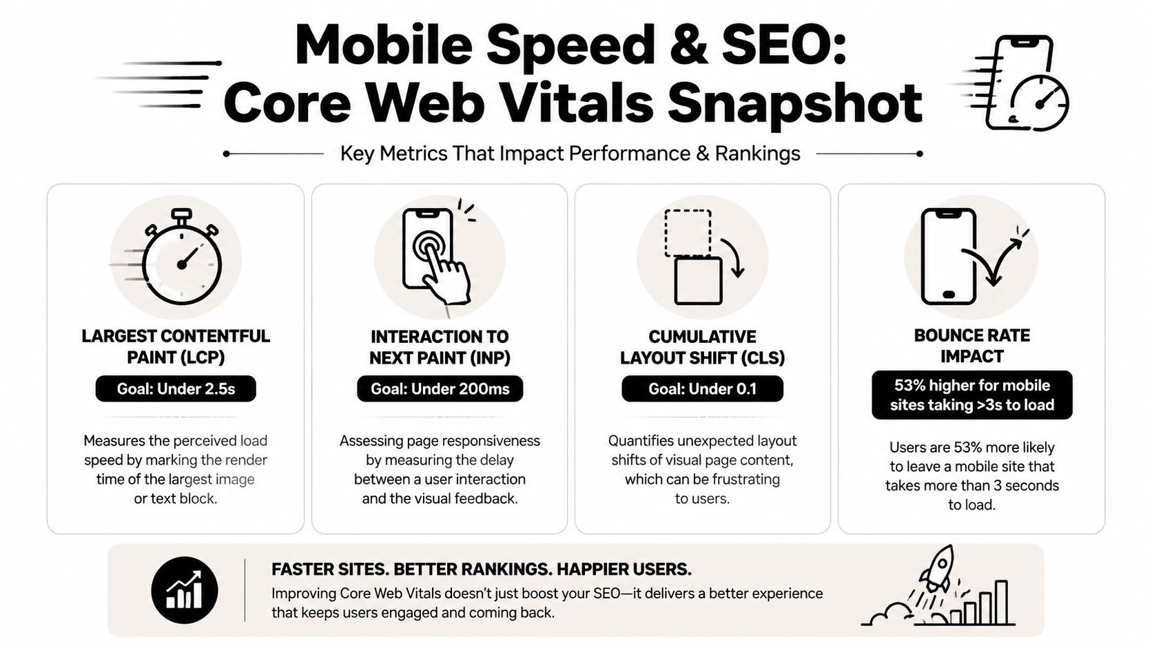
What Core Web Vitals mean in practice
Core Web Vitals are a way of measuring whether a page feels fast, stable, and responsive on a phone. For SMEs, that matters because Google uses mobile performance as part of how it assesses page quality, and customers make their own judgement far faster than any audit tool does.
A useful way to read the three main metrics is this:
| Metric | What it means for a user |
|---|---|
| LCP | How quickly the main content feels visible |
| INP | How quickly the page reacts when tapped |
| CLS | Whether page elements jump around unexpectedly |
If the headline and main image appear quickly, the site feels ready. If a tap on a menu or button responds straight away, the site feels dependable. If the layout stays still while content loads, the site feels easier to use. Those are technical measures, but they map closely to trust.
Here's a video walkthrough if you want a plain-English explanation of how these signals affect site quality.
The technical choices that help
Google indexes the mobile version of a site first, so the mobile build needs the same core content, metadata, and structured data as desktop. If key information is hidden, stripped out, or loaded in a way search engines struggle to process, rankings can suffer even if the desktop version looks complete.
On the build side, small technical decisions have a cumulative effect. We see this often on SME websites around Dorset. The homepage may only be a few sections long, yet it still feels slow because the banner image is oversized, fonts are loaded in several weights, and a plugin has added scripts no one needs. It is a bit like filling a delivery van with decorative fixtures before loading the parcels. The van still moves, but not efficiently.
The work that usually improves mobile speed is less glamorous than a redesign, but it pays off:
- Use properly sized images instead of uploading originals straight from a phone or DSLR
- Set width and height attributes so content does not jump during loading
- Prioritise above-the-fold assets so the first screen appears quickly
- Keep JavaScript under control so taps and scrolling stay responsive
- Limit plugin and page builder overhead on WordPress sites where bloat builds up
- Monitor performance after launch because a fast site can slow down over time as content and tools are added
For a practical business-focused breakdown, our guide on improving website loading speed covers the fixes that usually deliver the biggest gains first.
One trade-off is worth being clear about. Feature-rich builds often promise more movement, more personalisation, and more tracking. On mobile, every extra script competes for the same limited bandwidth and processing power. For many local businesses, a faster quote page with clear calls to action will outperform a more elaborate page that takes longer to become usable.
Questions worth asking your developer
Business owners do not need to write code to spot a weak mobile build. Good questions usually reveal whether performance has been planned properly or left to chance.
- What is loading first on mobile, and why
- How are key images being compressed and prioritised
- Are mobile and desktop content, metadata, and schema aligned
- What third-party scripts are being added, and which ones are essential
- How will performance be checked after launch and after future updates
Slow mobile sites rarely fail because of one dramatic mistake. They slow down through a series of minor compromises that no one revisits. That is why we treat speed and SEO as part of the build standard at DesignStack, not a tidy-up job once the site is live.
Mobile Design for WordPress and eCommerce Sites
WordPress is still one of the best options for SMEs, but it isn't automatically good on mobile. The platform is flexible. That flexibility can produce either a clean, fast site or a lumbering mess held together by plugins and visual workarounds.
The difference usually comes down to build discipline.
WordPress can be excellent or bloated
A common mistake is choosing a theme because the demo looks impressive on desktop. Demos often showcase large sliders, animated sections, multiple font files, and heavy scripts. On mobile, that polish can turn into delay.
For mobile-first development in 2026, performance budgets should be set from day one, with layouts built using CSS Grid and Flexbox for natural scaling, while avoiding fixed pixel heights that break text wrapping on screens as narrow as 360 pixels, according to Accent Design's practical strategy guide.
That advice is especially important in WordPress because page builders can tempt people into fixing layout problems visually rather than structurally. It may look fine on one preview size and fall apart on a real handset.
When choosing themes or planning a WooCommerce build, it helps to review examples of best WordPress themes for eCommerce with mobile behaviour in mind, not just desktop appearance.
Mobile eCommerce needs a cleaner path to purchase
On eCommerce sites, every extra tap matters. A shopper on a desktop may tolerate browsing filters, comparison tables, and long product descriptions. A phone user is less forgiving.
The strongest mobile stores usually simplify a few things:
Product listings stay scannable
Clear imagery, obvious prices, and predictable filtering beat visual clutter.Product pages focus on confidence
Core details should appear before long description tabs or secondary content.Checkout removes hesitation
Autofill, straightforward field labels, and prominent payment options matter more than decorative extras.
If a mobile customer has to pinch, zoom, hunt for delivery details, or fight the cart, the store is asking them to work too hard.
WordPress and WooCommerce can absolutely deliver a strong mobile experience. They just need a build process that values speed, hierarchy, and restraint over gadgetry.
How to Test Launch and Optimise Your Mobile Website
A mobile website shouldn't be treated like a brochure that gets printed once and left alone. It behaves more like a shopfront on a busy street. You notice what people ignore, what they gravitate toward, and where they hesitate.
That's why launch is not the finish line. It's the moment the actual evidence starts arriving.
Test on real devices before launch
Desktop browser previews are useful. They are not enough.
A proper mobile review should include actual phones, ideally different screen sizes and both major mobile operating systems. Menus that look tidy in a browser inspector can feel awkward in the hand. Buttons that seem large enough on a monitor can be frustrating on a real touchscreen.
Before launch, check these basics:
Navigation flow
Open the menu, move between service pages, and return to the homepage without friction.Form completion
Submit an enquiry from a phone. Don't just look at the form. Complete it.Tap behaviour
Test buttons, accordions, image galleries, maps, and click-to-call links.Reading comfort
Review body copy outside, in natural light, not only at a desk.
Treat launch as the start of evidence gathering
Once the site is live, watch what mobile users do. Don't rely only on internal opinions. Business owners often know their own services too well. Customers arrive cold and need clearer signposting.
Useful post-launch checks include:
Review mobile landing pages
Which pages attract traffic first, and do they answer the user's likely question quickly?Look for drop-off points
If users regularly leave on a service page or form page, inspect that step first.Compare key actions by device
Calls, form submissions, quote requests, and product purchases often reveal where mobile friction still exists.Make one change at a time
If you alter button copy, layout, and form length together, you won't know what helped.
A sensible optimisation cycle is simple. Observe behaviour, identify friction, make a focused improvement, then review again. That approach keeps risk low and helps the site improve steadily rather than through disruptive redesigns.
Your Dorset Business Mobile Website Checklist
Local businesses often need the same fundamentals as everyone else, but the priorities are slightly different. A Dorset customer may be trying to call quickly, check opening times, find parking, get directions, or confirm that you're a credible local provider before making contact.
That local intent should shape the mobile experience from top to bottom.
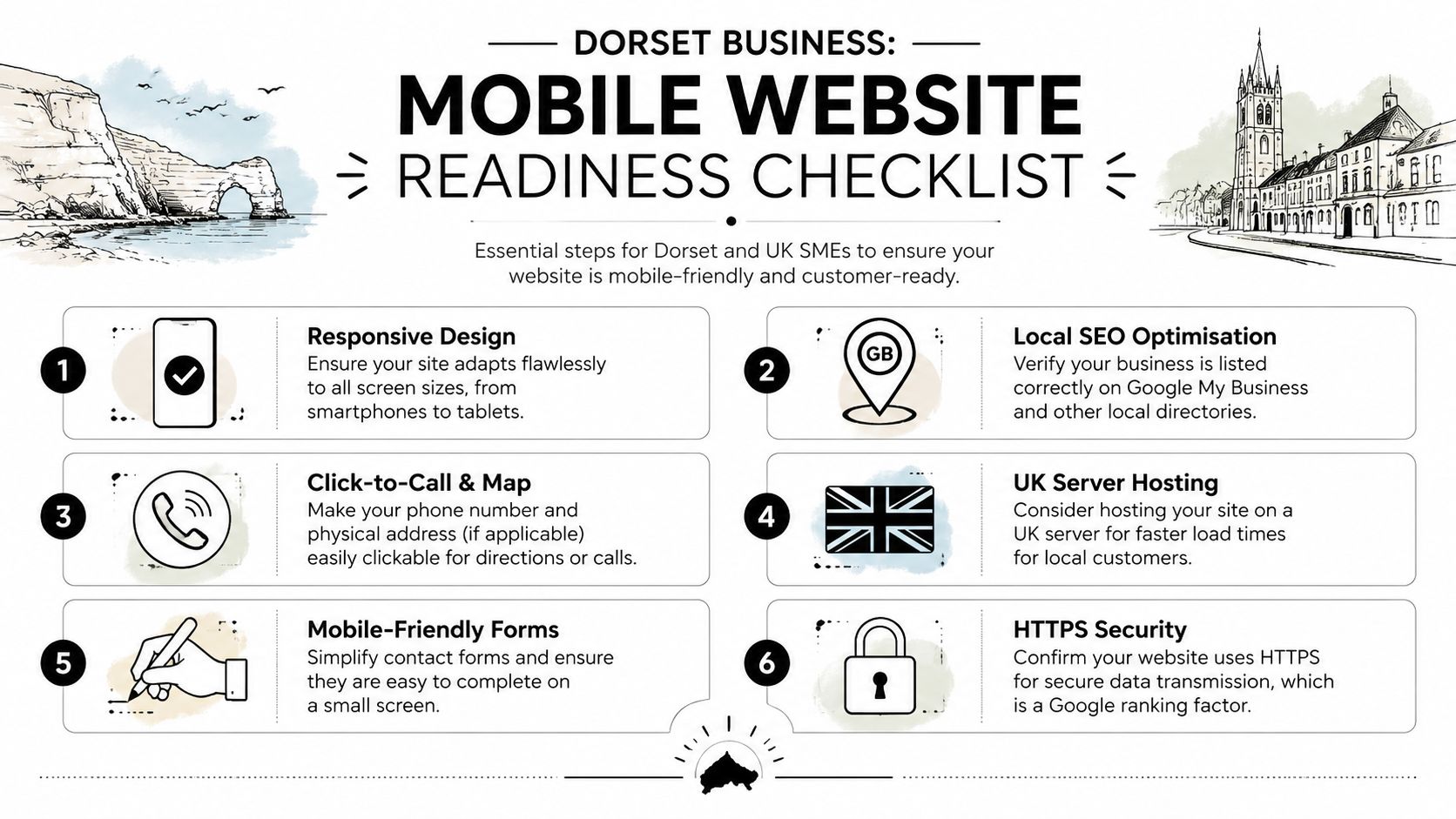
What local SMEs should check first
Use this as a practical audit list for your own site.
Responsive layout across real screens
Don't stop at a desktop resize test. Check actual phones and make sure the layout remains readable and tappable.Clear local trust signals
Show your trading area, service coverage, and genuine business details in places users can find quickly.Clickable contact details
Phone numbers should tap to call. Addresses and map links should work without fuss.Simple contact forms
White Hat SEO notes that UK SME research found removing mandatory phone number fields can reduce abandonment by 37% in their UK responsive web design guide. For many Dorset firms, that's a useful reminder. If someone prefers email first, forcing a phone number can create needless friction.Fast-loading local pages
Service area pages, menus, event listings, and booking pages need to feel light and immediate.Secure browsing
HTTPS is basic trust infrastructure. Users notice security cues, especially when submitting details.
What this looks like in the real world
In local projects, the most effective mobile choices are usually the least theatrical. Community organisations often need membership details, events, and contact routes to be easy to find on a phone. Hospitality businesses need menus, opening times, maps, and booking actions to sit front and centre. Service businesses need reassurance, service clarity, and a low-friction enquiry route.
That's why local examples such as The Lobster Pot or the Weymouth & Portland Chamber of Commerce are useful points of reference. Different audiences, different goals, same underlying rule. Mobile users want the shortest sensible path to action.
A Dorset SME site is usually in better shape when it can pass this quick test:
| Check | What good looks like |
|---|---|
| Homepage clarity | Visitors understand the offer within moments |
| Navigation | The top tasks are easy to reach with one hand |
| Contact path | Call, form, map, or booking actions are obvious |
| Readability | Text is comfortable without zooming |
| Trust | Reviews, credentials, and local relevance are visible |
| Performance | The site feels prompt and stable on mobile data |
Mobile website design for local businesses is often less about adding features and more about removing excuses to leave.
If your site handles those basics well, you're already ahead of a surprising number of competitors.
If your website needs a proper mobile rethink, DesignStack helps Dorset businesses build responsive WordPress and eCommerce sites that are easier to use, easier to manage, and better aligned with how customers browse on their phones. If you want a local team to review your current site or plan a new one from scratch, it's a sensible place to start.



Leave a Reply