CMYK vs RGB for Print: Which Colour Mode to Use
Send commercial print jobs as CMYK converted with the printer's profile, and keep an RGB master for screens. The familiar advice to use CMYK for print is useful, but it misses the important part: your printer's paper, production process and PDF requirements determine which CMYK copy you should supply.
RGB isn't a mistake you need to remove from your entire brand library. It's a useful source format, especially when the same artwork must serve your website, social media, stationery and packaging. The practical approach is to protect that master and prepare a separate, controlled file for each print output.
Table of Contents
- CMYK vs RGB at a Glance
- How Each Colour Model Builds the Colours You See
- Matching the Colour Mode to Your Print Job
- Why Bright Brand Colours Shift in Print
- Choosing PDF Settings Your Printer Will Accept
- How to Prepare a Print-Ready File Step by Step
- What to Do When Your Printer Supplies No Profile
CMYK vs RGB at a Glance
For commercial printing, supply CMYK artwork matched to the printer's requirements, while retaining RGB versions for digital use. When comparing CMYK vs RGB for print, think about the destination rather than choosing a permanent winner.
CMYK and RGB compared for print decisions
| Feature | RGB | CMYK |
|---|---|---|
| Built for | Screens and other light-emitting devices | Printed materials |
| Colour model | Red, green and blue light | Cyan, magenta, yellow and black inks |
| How colour works | Additive: combined light can produce white | Subtractive: inks absorb light from white paper |
| Colour range | Generally wider, including bright blues and neon-like greens | Narrower; some vivid oranges and greens cannot be matched accurately |
| Typical UK uses | Websites, social media, video, screen adverts | Brochures, packaging, stationery, posters, leaflets |
| Needs conversion before print? | Yes, to the printer's CMYK profile, unless their workflow handles conversion | No further mode conversion if the artwork already matches the required output condition |
Read the first rows as a description of the equipment doing the work. A website visitor sees a display; someone holding a leaflet sees ink on a surface. Neither colour model is more professional than the other, and changing the document mode alone doesn't guarantee accurate results.
The colour range row explains the surprise that catches many business owners. A colour can be perfectly valid in your website artwork without being reproducible using ordinary process printing. Choosing it on a laptop doesn't establish what it should look like on a business card.
What this means for your next file
Start by identifying where the artwork will appear. For a screen-only graphic, use RGB; for a printed item, obtain the production specification before preparing the delivery copy.
If you're commissioning a logo, request usable digital and print versions rather than a single image labelled final. These logo design tips can help you think about how the mark needs to work across different applications.
Keep filenames clear enough that a colleague won't accidentally send a web export to the press. Include the intended output and stock in the print filename, and retain the editable source separately.
How Each Colour Model Builds the Colours You See
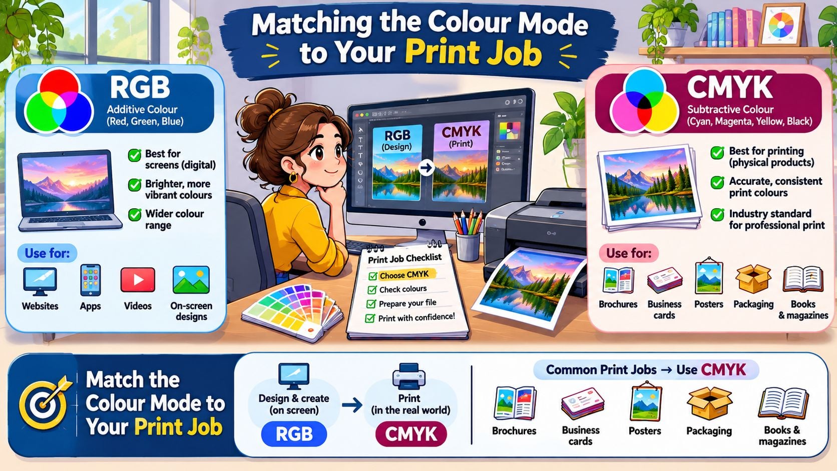
A screen creates colour by emitting light. Its red, green and blue components combine in different amounts, and together they can produce white. This is additive colour, because the display adds light to create what you see.
Printing starts from a different position. On ordinary white paper, cyan, magenta, yellow and black inks absorb parts of the light falling onto the sheet. The remaining reflected light creates the visible colour, which is why CMYK is called subtractive colour.
The National Archives' graphic file formats guidance describes RGB through its red, green and blue components and identifies CMYK as the usual subtractive, pigment-based space for printing. University of Bristol print-service guidance makes the same practical distinction between screen artwork and printed materials.
The paper is part of the colour
The white in a printed layout is usually the paper showing through, not a layer of white ink. A warm, cream-coloured sheet therefore changes the starting point for the whole design.
Black ink, represented by K, helps produce clear text and controlled dark detail. For small lettering, a black-only build also avoids relying on several coloured impressions lining up precisely.
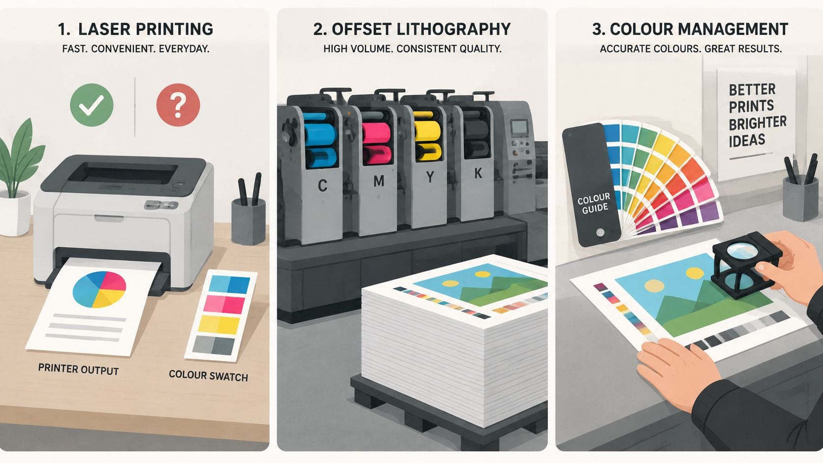
This illustration places colour management alongside the physical printing processes it supports.
Why the same blue can look different
A gamut is the range of colours a particular colour space or output condition can reproduce. RGB generally offers a wider range than process CMYK, although the exact comparison depends on the RGB space, printing process and paper.
Say a professional-services firm uses an electric blue behind its website headline. On the display, that blue looks luminous; when prepared for a leaflet, the nearest printable version may appear flatter or less saturated. The conversion hasn't necessarily failed, but the destination can't reproduce the original appearance.
The screen emits light; the page reflects light through ink. Prepare the file for the device that will reproduce it.
Don't compensate by turning up the saturation without checking the print preview. That can push more detail outside the printable range rather than improve the result.
Colour also carries meaning, so a technically printable substitute still needs to feel appropriate for the brand. Our guide to colour psychology in branding helps connect those visual choices with the impression you want to create.
Matching the Colour Mode to Your Print Job
The instruction to send CMYK becomes useful only when you know how the job will be printed. An office printer, a lithographic press and a digital production press don't necessarily expect the same incoming file.
The UK Government's print colour guidance publishes explicit CMYK specifications for its palette. That's a helpful distinction between screen and print assets, but a brand's colour values still need to be reproduced through the chosen production workflow.
Office printing and internal documents
For an internal presentation or draft leaflet, your office laser or inkjet printer will commonly handle colour conversion through its driver. Follow its recommended input settings rather than assuming a commercial-press CMYK profile will improve the output.
Use these prints to check wording, scale and layout. Unless the office device is managed for the intended production condition, don't treat its colour as approval for a commercial run.
Commercial litho and digital presses
A community organisation ordering a substantial brochure run might use offset lithography, where the artwork should match the press and paper condition. A Dorset café ordering a short flyer run might use a digital press, where the supplier may request converted CMYK or prefer to manage colour within its own workflow.
Large-format signage needs its own specification too. Ask the supplier about the material and production process, rather than reusing a brochure PDF because both products are printed.
The distinction between screen and physical output is straightforward, but the production settings beneath it need to be job-specific.
For a rebrand, organise the assets by application:
- Website and social media: Retain the RGB master and prepare suitable digital exports.
- Coated stationery: Create a production copy for the chosen coated stock.
- Uncoated leaflets: Prepare and approve a separate version for that paper.
- Packaging: Confirm the substrate, inks and finishing requirements before finalising artwork.
Our graphic design services include branding, logos, flyers, print media, business cards and letterheads. For products with additional material and finishing considerations, packaging design brings those decisions into the artwork process.
Identify the output route first, then choose the delivery settings. That prevents a default conversion from becoming an accidental brand standard.
Why Bright Brand Colours Shift in Print
Neon and fluorescent colours are the highest-risk choices when a brand relies on ordinary process printing. Automatic conversion can produce a printable approximation, but it can't give standard inks a fluorescent property they don't have.
The Pantone reference range from Graphics Direct highlights the importance of physical colour references, particularly for metallics, fluorescents and vivid hues that can't be accurately reproduced in CMYK. These require a production or branding decision, not just a different export button.
Colour types by print risk and fix
| Colour type | Print risk | Practical fix |
|---|---|---|
| Neon or fluorescent | High, often looks dull | Specify a suitable spot ink, or test a substitute on the actual stock |
| Saturated orange or green | Medium, often loses brightness | Soft-proof first, then adjust the printable colour deliberately |
| Metallic or foil-look | High, CMYK can't reproduce the reflective finish | Use metallic spot ink, foil, or an agreed non-metallic substitute |
| Deep navy or rich black | Low to medium, sensitive to ink coverage and stock | Specify the CMYK build and check total ink coverage |
| Pastel tints and skin tones | Usually lower risk, but subtle shifts remain noticeable | Confirm delicate colour relationships with a printed proof |
These are practical risk categories, not a guarantee for every image or press. A pale portrait can still be commercially sensitive, while a saturated illustration may be acceptable with an agreed compromise.
Choose the fix that preserves recognition
Say a Weymouth retailer uses a neon green sale sticker online. Printed on an ordinary flyer, the green may lose its electric appearance, leaving the promotion less distinctive.
A spot ink may be appropriate if the printer can supply the required effect. An expanded-gamut process may offer another route for some vivid colours, but it won't automatically reproduce fluorescence or metallic reflection. Where those processes aren't suitable, choose a tested substitute and give print its own specification.
For a practical companion to discussions about named colour references and process equivalents, the Cobra DTF colour matching guide is useful context. Always confirm the final choice through the supplier and production method you're using.
Approve a physical reference
Ask for a swatch or production sample on the intended paper. Agree what variation is acceptable, using a measurement tolerance where the printer supports one and an approved physical reference where appropriate.
Document the approved coated and uncoated versions within your brand identity deliverables, rather than leaving the decision in an email conversation.
Practical rule: Approve the colour you can produce consistently, not just the colour you prefer on a bright display.
A recognisable, repeatable print palette usually serves a business better than an unsupported promise of an exact screen match.
Choosing PDF Settings Your Printer Will Accept
| PDF standard | Transparency | Colour profile | Best for |
|---|---|---|---|
| PDF/X-1a | Flattened, no live transparency | CMYK and spot-colour workflow with a defined OutputIntent | Simple layouts, text-heavy jobs and workflows requiring flattened files |
| PDF/X-4 | Live transparency and supported layers can be retained | ICC-managed colour supported, with a defined OutputIntent | Complex artwork and compatible modern production workflows |
| Printer's own preset | As the printer specifies | As the printer specifies | Any job where the printer supplies a validated preset |
The printer's supplied preset takes priority. PDF/X-1a isn't automatically safer because it removes live transparency, and PDF/X-4 isn't a reason to ignore the printer's production requirements.
Flattening converts transparent interactions into a combination of printable objects. Keeping transparency live lets compatible production software process those interactions later. The appropriate choice depends on the receiving workflow, particularly where shadows, overlapping graphics and fine text interact.
Give the PDF a defined destination
An OutputIntent identifies the intended printing condition. It gives the printer's raster image processor, often called the RIP, a reference for interpreting the file rather than leaving the production team to guess what your CMYK values mean.
The production context discussed by Printweek's colour-management feature includes ISO 12647-2 for process-colour offset printing and FOGRA39, associated with ISO 12647-2:2004, for typical coated-paper offset conditions. Characterisation data records expected colour measurements in CIE XYZ and CIELAB, allowing software and production equipment to work against a measurable reference.
Don't select that profile just because its name looks familiar. The printer must confirm that the reference suits the stock, press process and standard they use.
Consider a saturated blue brochure cover. A defined output condition lets you judge its printable rendition and make an informed adjustment; it doesn't make an otherwise unprintable blue survive unchanged.
The video offers a visual companion to the screen-to-print distinction.
Avoid cycling a finished file through unrelated profiles. Repeated conversions can alter colours and separations unnecessarily, so create fresh production exports from the master rather than adapting an already converted delivery PDF.
How to Prepare a Print-Ready File Step by Step
A reliable print file needs more than the correct mode. The British implementation of ISO 19302:2018 describes colour definition, colour reproduction and colour conformity as measurable stages, covering file preparation, proofing, viewing conditions and evaluation against reference printing conditions.
That framework explains why identical CMYK values aren't a complete specification. Paper, ink behaviour, calibration and viewing light all affect the result.
Build a controlled production copy
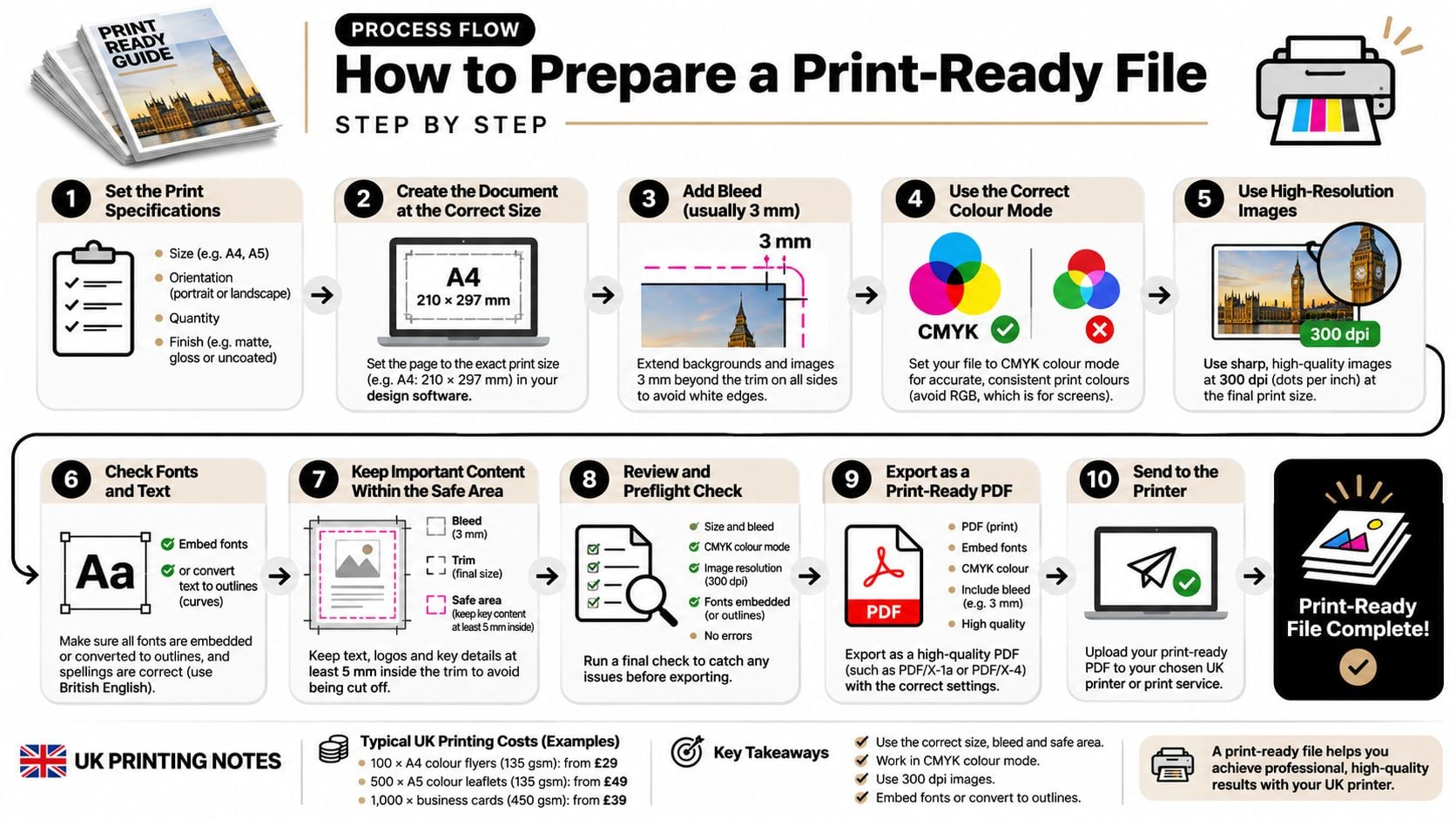
Set up the print layout deliberately. For a print-led document, establish CMYK swatches and the intended output condition before approving the design, while preserving your RGB source assets. The common slip is treating the screen version as print-approved before checking its printable appearance.
Get the production specification early. Request the printer's ICC profile, stock condition, PDF preset and bleed requirement before laying out edge-to-edge artwork. Don't assume the settings from a previous supplier suit this job.
Enable soft-proofing and gamut warnings. In Photoshop, use Proof Setup and Proof Colours with the intended destination profile; use equivalent proofing controls in your layout software. A common mistake is judging the preview on an overly bright, uncalibrated display as though it were a physical proof.
Check effective image resolution. Inspect each image at its final placed size in InDesign's Links panel or your application's preflight tools, using the printer's resolution requirement. Enlarging a small web image doesn't restore missing detail, even if you change its resolution label.
Convert with the destination profile. Use Convert to Profile where appropriate, or the printer's specified PDF colour-conversion settings, and preserve the required output information. Don't confuse assigning a profile, which changes how values are interpreted, with converting colours to a new destination.
Set bleed and marks to the specification. Extend backgrounds beyond the trim and keep important text safely inside it. Don't add crop marks automatically if the printer's preset doesn't request them.
Inspect black and ink coverage. Check small black text, overprint settings and large dark areas with Acrobat's Output Preview or equivalent preflight tools. Avoid using a heavy rich-black build for small type or exceeding the destination's total ink limit.
Approve a physical proof where colour matters. Request a suitable hard proof or production sample, and establish whether it represents the intended stock and finish. Don't mistake a convenient desktop print for a controlled colour reference.
The preparation sequence is easier to manage when each check has a clear place.
Check the proof as a finished product
For art reproductions, Striped Circle's discussion of pigment inks and paper choices offers useful context for evaluating the material alongside the image. The same care belongs in graphic design for marketing, where the finished leaflet or brochure must communicate clearly.
A satisfactory proof has colour within the agreed tolerance, intact text, correctly positioned artwork and safe margins around the trim. Check content and finishing as carefully as colour before authorising production.
What to Do When Your Printer Supplies No Profile
A reply saying only send CMYK leaves an important decision unresolved. Don't rely on your software's default and assume the printer will interpret it as intended.
Ask for the specification in writing, using a short, practical message:
Please confirm the paper stock, whether it's coated or uncoated, the intended output profile or printing condition, and your preferred PDF preset. If you don't specify a profile, please confirm how you'll handle the supplied colour.
Make the assumptions visible
If the printer still can't name a profile, propose a recognised CMYK profile suited to their stated process and stock. Ask them to accept that choice, include the corresponding OutputIntent in the PDF, and identify the profile in your delivery message.
Keep the RGB master untouched. Export a clearly named copy for this supplier, so you can prepare a different version later without trying to recover colours from an existing press file.
Before authorising the full run, establish the following:
- A representative sample: Request a printed copy on the intended stock, with the planned finish where possible.
- Suitable viewing light: Compare it under neutral lighting rather than coloured shop lighting or beside a glaring display.
- An approval record: Save the accepted sample details, profile, stock and any agreed colour adjustments.
- A fallback decision: If a key colour fails, approve a substitute or discuss a suitable spot-colour process instead of repeatedly changing the file by eye.
Protect the next reprint
Record the printer's job reference and approval alongside the production PDF. A saved file alone doesn't document the paper or the conditions under which you accepted the result.
If the supplier can't explain its colour handling or provide a meaningful sample, consider whether it's suitable for colour-critical work. An internal notice and a flagship packaging project don't need the same level of control, but both need clear expectations.
At DesignStack in Weymouth, we can handle the process from branding through to printing for Dorset and UK businesses.
We offer logo design, branding and print artwork preparation, helping you organise screen assets and production files for their intended uses. Visit DesignStack to discuss your next brochure, business card or rebrand, and bring your printer's specification so we can prepare the right delivery files.