Graphic Design for Marketing: A Practical Guide for UK SMEs
You've just paid for a new logo, your nephew has rebuilt the Instagram template in different colours, and the printer is asking why the flyer doesn't match the website. Nothing looks terrible on its own. Together, it looks like three different businesses are fighting over your name. That's the problem most Dorset SMEs bring to a studio, and it's rarely a talent problem. It's a system problem. Good graphic design for marketing fixes the system first, then makes individual assets faster, cheaper, and far more recognisable.
Table of Contents
- What Graphic Design for Marketing Actually Means
- Why Marketing Design Pays for Itself
- Core Use-Cases Every SME Should Cover
- Building a Brand System That Compounds Trust
- Authenticity, AI, and Sustainable Design Choices
- The Design Process and Brief That Get Results
- Pricing, Hiring, and Choosing a Design Partner
- Dorset Case Studies and Your Next Steps
What Graphic Design for Marketing Actually Means
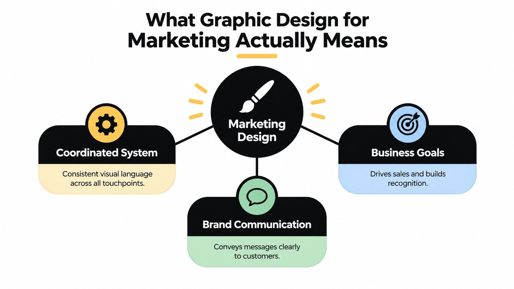
Graphic design for marketing isn't decoration. It's the coordinated use of typography, colour, imagery, layout, and motion to make a specific audience understand, trust, and act. Art can exist for its own sake. Marketing design has a job, a deadline, and a customer who gives you seconds before scrolling past.
That job repeats everywhere a customer meets you. They might see a search advert on Monday, your shopfront on Wednesday, a printed menu at the weekend, and a staff uniform when they walk in. If those touchpoints share no visual logic, you're paying to introduce yourself from scratch every time.
System first, assets second
A managed visual identity means you've decided, once, how your logo geometry, headline type, spacing, photography, and calls to action behave. After that, a social post, proposal cover, or exhibition banner becomes an application of rules, not a fresh invention. That saves time and stops well-meaning staff from improvising your brand in Canva, PowerPoint, or Word.
Ad-hoc design works the opposite way. Each asset starts blank, so fonts drift, colours get approximated, and messages compete. You'll feel it as endless revisions and a nagging sense that nothing quite looks professional, even though you've spent money on every piece.
Lay your last ten customer-facing items side by side. If a stranger couldn't tell they came from one business without reading the logo, you don't have a design shortage. You have a consistency shortage.
Take a Dorset retailer whose packaging, window graphics, and social posts use the same deep green, the same condensed headline font, and the same style of hands-on product photography. A customer who saw an Instagram post recognises the shop from the pavement. That recognition is the product. The individual post is just delivery.
Start by auditing what breaks your current system. Look for old logos still in email signatures, supplier-created adverts, menus retyped in default fonts, and website banners stretched to fit. Fix those leaks before commissioning anything new. You'll often get more value from tightening what exists than from another redesign.
Why Marketing Design Pays for Itself
Graphic design isn't a cottage indulgence for businesses with spare cash. IBISWorld's UK graphic design activities data estimates revenue will reach approximately £4.2 billion in 2026, with about 10,943 businesses operating in the sector, and growth at a compound annual rate of 2.2% between 2021 and 2026. Treat those 2026 figures as projections, but the direction is clear. Businesses keep buying design because they need a constant supply of assets for websites, advertising, social platforms, packaging, and print.
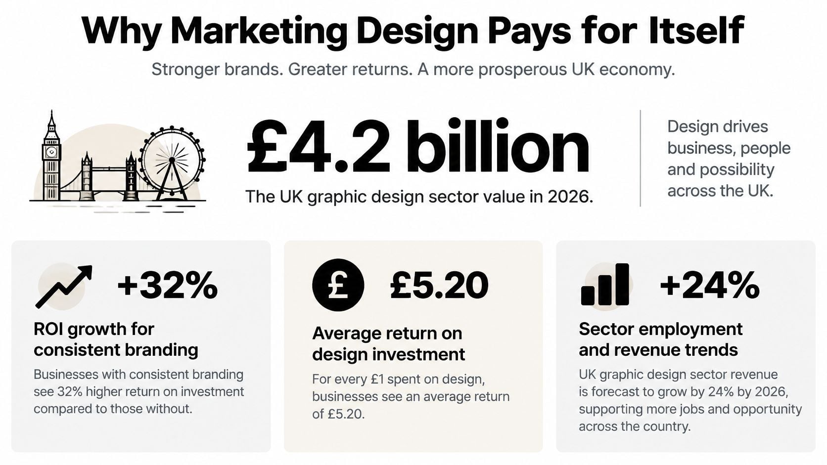
The return evidence is older, but it still points the same way. The historical Design Council study summarised in DesignStack's overview of why graphic design matters for any business reported that design-integrated businesses achieved turnover 14% above predicted levels, profits 9% above predicted levels, and employment 13% higher than forecasts. The same summary reported that for every £100 a design-alert business spent on design, turnover increased by £225.
Don't read that as a promise. It's an association from a study, not a guaranteed return on your next leaflet. The useful lesson is where the return came from. It came from businesses treating design as part of strategy, not as a finishing touch ordered the day before launch.
How to judge payback as an SME
Put design inside your marketing budget, next to the advert spend, print run, or website it supports. A cheap graphic that nobody recognises is expensive. A reusable template system that produces a year of coherent campaigns can be cheap per use, even if the invoice looks larger at first.
Use a simple check before you commission work:
- Reuse value: Will this layout, icon set, or template work repeatedly?
- Attribution value: Will people know it's you without hunting for the logo?
- Friction removed: Does it make pricing, booking, or enquiry clearer?
- Replacement avoided: Does it stop you redesigning the same asset next quarter?
Frequent redesigns destroy the compounding effect. Every time you change your core colours, type, or photography style because you're bored, you reset familiarity your customers haven't had time to build. You're bored because you see it daily. They aren't, because they don't.
Core Use-Cases Every SME Should Cover
Most SMEs don't need every asset a national brand produces. You need four buckets covered properly, in the order your customers encounter you. Start with the bucket closest to revenue, not the one that's easiest to make pretty.
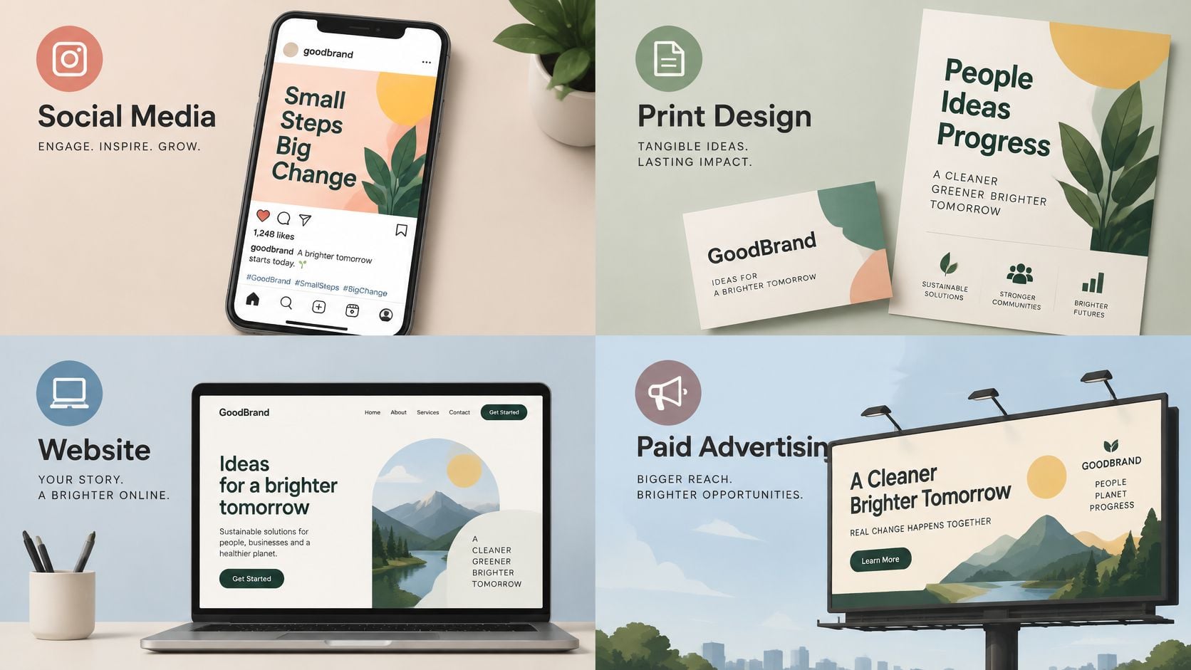
Social media graphics are usually the highest volume and the fastest to drift. Build a small set of templates for offers, testimonials, events, new stock, and team updates. If you're testing short-form video but nobody wants to appear on camera, tools that help you make faceless reels with AI can fill a gap, provided the captions, colours, and type still follow your brand rules. For Facebook-specific formats and habits, work through DesignStack's Designs on Facebook resources before you invent sizes and layouts from scratch.
Print, web, and paid media
Print collateral still matters in Dorset, where menus, price lists, vehicle graphics, packaging, and event posters do real selling work. A café that refreshes its printed menu and Instagram grid together stops customers photographing one price and reading another. Design print from the same files and rules as digital, not as an afterthought for the printer.
Your website and landing pages carry the heaviest burden. Hero imagery, service icons, diagrams, and calls to action must explain the offer before a visitor reads a full paragraph. A professional services firm that aligns its LinkedIn banners with its proposal template and website headers looks like one firm giving one account of itself, which is exactly what a cautious buyer wants.
Paid and display advertising is where weak systems get exposed. You've paid for attention, so the advert must be attributable instantly and land on a page that looks like the same promise. If the advert is bold red and the landing page is pale corporate blue, you've created doubt at the exact moment you paid to remove it.
The short example below is useful for seeing how these buckets connect in practice rather than treating each channel as a separate project.
Pick one or two buckets for the next quarter based on evidence. If enquiries come from search, fix landing pages first. If footfall matters, fix signage, menus, and local print. Don't spread a small budget thinly across everything and wonder why nothing changed.
Building a Brand System That Compounds Trust
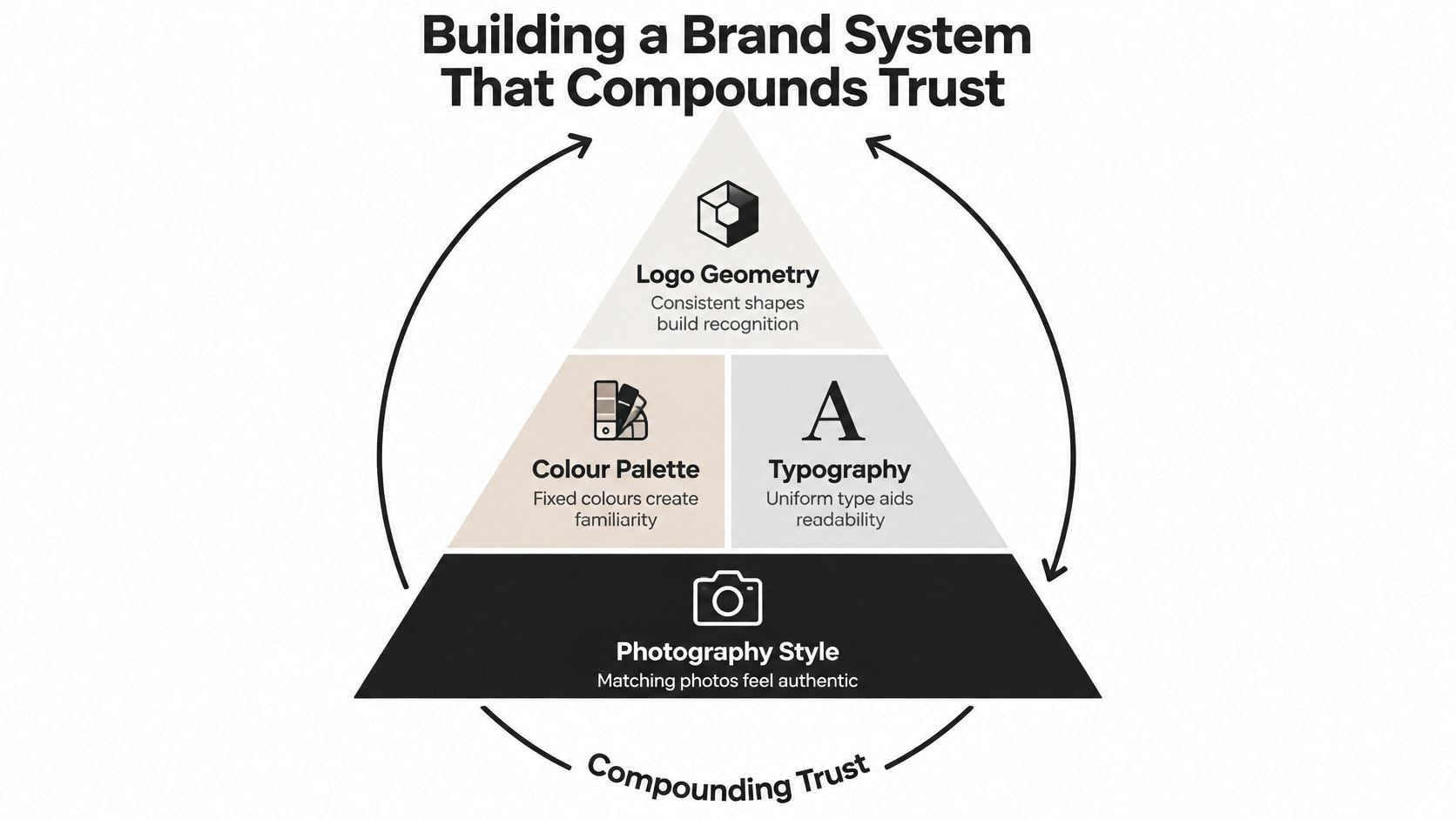
Consistency isn't a style preference. It's how a small business borrows the familiarity that big brands buy with constant exposure. When the same colour palette, typography, logo geometry, and photography style turn up in every advert, email, invoice, and shop window, each impression adds to the last instead of starting again.
The commercial logic is strong. IPA analysis of trust-building advertising examined 812 campaigns and found that 93% of for-profit campaigns reporting very large increases in brand trust also reported at least one very large business effect. The strongest trust-building campaigns reported very large improvements in perceived quality at 59% versus 20% for the databank average, and brand loyalty at 56% versus 23%, according to the same IPA analysis.
You don't need a hundred-page brand book to get this benefit. You need a working one-page brand sheet that your team and suppliers use. If you want the fuller structure behind that sheet, read DesignStack's explanation of what a design system is and then cut it down to what your business will follow on a busy Tuesday.
What belongs on the sheet
- Core marks: Primary logo, secondary version, clear space, and backgrounds where each version works.
- Colour values: Exact print and screen values, plus approved pairings for text and buttons.
- Type rules: Headline and body fonts, sizes for common formats, and what never to substitute.
- Image direction: The photography and illustration style you want, with examples to copy and examples to avoid.
- Templates: Locked social, proposal, email, and presentation files with editable areas clearly marked.
Approval rule worth copying: Anyone can change the words and photo inside a template. Nobody changes the typeface, colour, logo position, or spacing without a proper brand review.
Measure more than clicks when you test creative. Ask whether people remember who the advert was for, whether the business looked credible, and whether they'd enquire again. Novelty that weakens attribution is a bad trade for an SME. You can't outspend confusion, so brief designers to extend the system you own rather than reinvent it for every campaign.
Authenticity, AI, and Sustainable Design Choices
Polished isn't always persuasive. For a local retailer, trades business, café, or professional firm, design that looks too synthetic can make real people suspicious. UK-focused research reported by SMEToday on trust in small business marketing found that 80% of British consumers do not trust social media content because of misinformation, while 97% say authentic images and videos are important for earning trust. The same research found that 86% believe AI-generated advertising should be clearly labelled, and 61% accept AI content only when it is used ethically.
That doesn't mean banning AI or stock imagery. It means building an authenticity system with an image hierarchy. Use real staff, premises, customers with consent, and work in progress first. Use stock for generic contexts your customers won't mistake for your own business. Use AI for concepts, backgrounds, mock-ups, or product visualisation where disclosure is appropriate and the result doesn't pretend to be a real event.
For a clothing label, for example, an ai photoshoot for clothing brand workflow can help you test styling and contexts before paying for a full shoot. Don't then present synthetic models as happy local customers. The short-term convenience isn't worth the credibility hit when someone spots it, and someone usually does.
| Design Choice | Authentic Signal | Risk of Over-Polish |
|---|---|---|
| People | Named staff and consenting customers in your real setting | Generic models who clearly have never visited Dorset |
| Product images | True colours, scale shown, minor real-world context | Floating renders with impossible lighting and no texture |
| Templates | Consistent layout carrying varied real photography | Identical stock scenes repeated until the feed looks automated |
| Sustainability claims | Material facts, disposal guidance, and named certification | Green leaves, beige palettes, and vague eco wording |
| Reviews | Short attributed quotes beside the relevant service | Star graphics with no names, dates, or context |
Sustainability needs the same discipline. Smurfit Kappa's summary of UK consumer packaging trends reports that 78% of consumers consider sustainability important when shopping, and that 42% want manufacturers to prioritise recyclable packaging while the same proportion said sustainability matters only if it does not significantly increase costs. It also reports YouGov 2025 UK findings where recyclable or biodegradable packaging was the strongest stated influence at 34%, whereas attractive packaging influenced 19%, rising to 37% among 18 to 24 year olds.
So don't lead every design with an eco badge and assume you've won. Put material, recyclability, disposal instructions, price impact, and product performance in a clear hierarchy for the audience you're serving. Younger shoppers may reward distinctive design more, while a broader audience may want proof and convenience first. Test the hierarchy. Never let a green palette do the work that evidence should do.
Before a campaign goes live, check consent for every recognisable person, label AI assistance where a customer could reasonably feel misled, and remove any sustainability claim you can't substantiate in one sentence. If you can't defend it in the shop, don't print it on the box.
The Design Process and Brief That Get Results
Good outcomes rarely come from a vague brief and hopeful revisions. They come from a short, disciplined process where you supply the commercial facts and the designer supplies the visual judgement. Don't micromanage fonts before the designer has understood the audience, channel, and constraint driving the project.
Start with the brief. DesignStack's guide to writing a design brief is a practical starting point if you've never written one, but your version only needs to answer the questions a competent designer will ask anyway. Write it before the kickoff call, not during it.
What to put in the brief
- Objective: The action you want, such as bookings, enquiries, sales, attendance, or downloads.
- Audience: Who it is for, what they already believe, and what might stop them acting.
- Channels and sizes: Every place the design will appear, from Instagram to print to signage.
- Must-keeps: Logo version, legal wording, partner marks, prices, dates, and accessibility needs.
- References: Examples you like and dislike, with one sentence explaining why in each case.
- Deliverables: File types, print specifications, editable templates, and who owns the working files.
The process after that should be moodboard or direction, first concepts, one structured revision round, then final artwork and handover. Group feedback into decisions, not a stream of separate opinions from everyone who walked past the screen. If you're commissioning a physical presence as well as campaign graphics, experienced exhibition stand designers show why dimensions, sightlines, and production constraints belong in the brief at the start, not after the artwork is approved.
Accessibility isn't a final polish either. UK Government Commercial Agency guidance on accessible content recommends a minimum contrast ratio of 4.5:1 for normal text, 3:1 for large text, and generally at least 3:1 for graphical objects and non-text interface elements. Test those pairings with a contrast checker, not by eye. Pale grey text on a brand-tinted background might look refined in the studio and disappear on a phone in daylight.
Define accessible light and dark variants for each brand colour, and never encode meaning through colour alone. Add labels, icons, patterns, or wording so pricing, charts, buttons, and navigation still make sense to people with low vision or colour vision deficiencies. Sign off only when those checks pass on the actual formats you're shipping.
Pricing, Hiring, and Choosing a Design Partner
You'll usually choose between an in-house designer, a freelancer, and an agency. In-house makes sense when you produce design every week and need someone embedded in daily decisions. A freelancer suits a defined project or specialist skill, provided you can brief clearly and manage availability. An agency suits connected work across branding, web, print, and campaigns, where handovers between separate suppliers would cost you time.
Pricing follows the same logic. Hourly billing is flexible but can drift without a tight scope. Project fees work when deliverables are fixed. Retainers suit steady output, such as social templates, campaign assets, and website graphics, because the designer learns your system and stops charging you to rediscover it. Fixed-scope packages can be the lowest-friction option for an SME if revisions, updates, and file ownership are explicit.
As one local model, DesignStack works on fixed-cost pricing with three design revisions as standard, regular project updates, and one month of post-launch updates. Whether you choose that studio or another, use the structure as a benchmark when you compare quotes through DesignStack's UK graphic design agency page and against freelance proposals.
Questions that expose weak offers
- Relevant portfolio: Have they designed for businesses of your size and sales model?
- Revision policy: How many rounds are included, and what counts as a new direction?
- Working files: Will you receive editable templates and print-ready exports?
- Brand stewardship: Will they document the system so staff and suppliers can follow it?
- Aftercare: Who fixes a sizing error, outdated price, or broken web graphic after launch?
Avoid partners who won't discuss constraints, can't explain why a layout helps the customer act, or sell a logo without asking where it must work. Cheap design that leaves you without usable files, accessible colour pairings, or templates isn't cheap. You'll pay again to rebuild it properly.
Dorset Case Studies and Your Next Steps
Local proof matters because Dorset SMEs rarely compete on budget. They compete on recognition, service, and trust built over repeated encounters. Work connected with CrossFit Durnovaria, The Lobster Pot, and the Weymouth and Portland Chamber of Commerce shows the same pattern across fitness, hospitality, and membership organisations. The useful lesson isn't copying their look. It's giving each audience one coherent visual account of the organisation, whether they meet it on a phone, a menu, a poster, or a sign.
Do this week, in order:
- Audit ten assets: Remove or replace anything using the wrong logo, font, or colour pairing.
- Create the brand sheet: Lock colours, type, image direction, and two core templates.
- Check contrast: Fix any text and button pairing that fails the required ratio.
- Photograph reality: Capture staff, premises, products, and customers with consent.
- Write one brief: Commission the single asset closest to revenue, not a general redesign.
Pick one or two actions and finish them. A tight starter system used consistently will beat an ambitious rebrand that stalls in a shared drive.
If your marketing looks like several businesses sharing one name, DesignStack can build the brand system, website graphics, and print templates that pull it back into line. Start with a focused brand audit or a small starter asset pack, then extend the same visual rules across every channel that earns you enquiries.