What Is a Design System and Why Your Business Needs One
A design system is a reusable set of components, rules, and documentation that keeps a website or app consistent. For a small business, it stops every page, checkout, and landing page from becoming a fresh design debate.
You know the feeling if you've ever opened three tabs and seen three slightly different blues for the same button. The homepage says one thing, the blog another, and the checkout nudges people with a third version that almost matches. That's usually the moment a business realises it doesn't have a system, it has a collection of one-off decisions.
Table of Contents
- A Working Definition You Can Use Today
- The Five Core Components of a Design System
- Real Benefits for Small and Medium Businesses
- Design Systems in the Wild for Agency Work
- When to Build Your Own and When to Adopt
- A Practical Six-Month Implementation Roadmap
- Common Pitfalls and How to Avoid Them
- Maintenance Checklist and Frequently Asked Questions
A Working Definition You Can Use Today
A design system is a shared way of building digital products, so the same buttons, spacing, type, and behaviour show up the same way everywhere. It's not just a folder of pretty assets, it's the rulebook, the parts box, and the handover notes all in one.
A well-organised kitchen pantry. Flour, salt, oil, and herbs are your raw ingredients, but the value comes from knowing where they live, how much to use, and what happens when someone else cooks from the same cupboard.
For a Dorset business owner, that matters because websites rarely stay still. You add a new service page, a seasonal landing page, a checkout tweak, maybe a blog redesign, and suddenly every freelancer or internal teammate is making fresh choices about the same button, card, or form field. A design system cuts that repetition down by giving everyone one place to look before they build.
Simple rule: if your team keeps redrawing the same interface decisions, you've already got the problem a design system solves.
A lot of people confuse a design system with a style guide. A style guide might tell you what the logo looks like or which blue to use, but a design system goes further, it tells the team how that blue appears in a button, when the button is disabled, how it behaves on mobile, and what developers should do when they implement it. If you want a contrast with a lighter-weight approach, the differences are easier to spot in a style guide versus system comparison.
By the time you've got that straight, the phrase stops sounding abstract. It becomes a practical way to keep your website from drifting every time someone new touches it.
The Five Core Components of a Design System
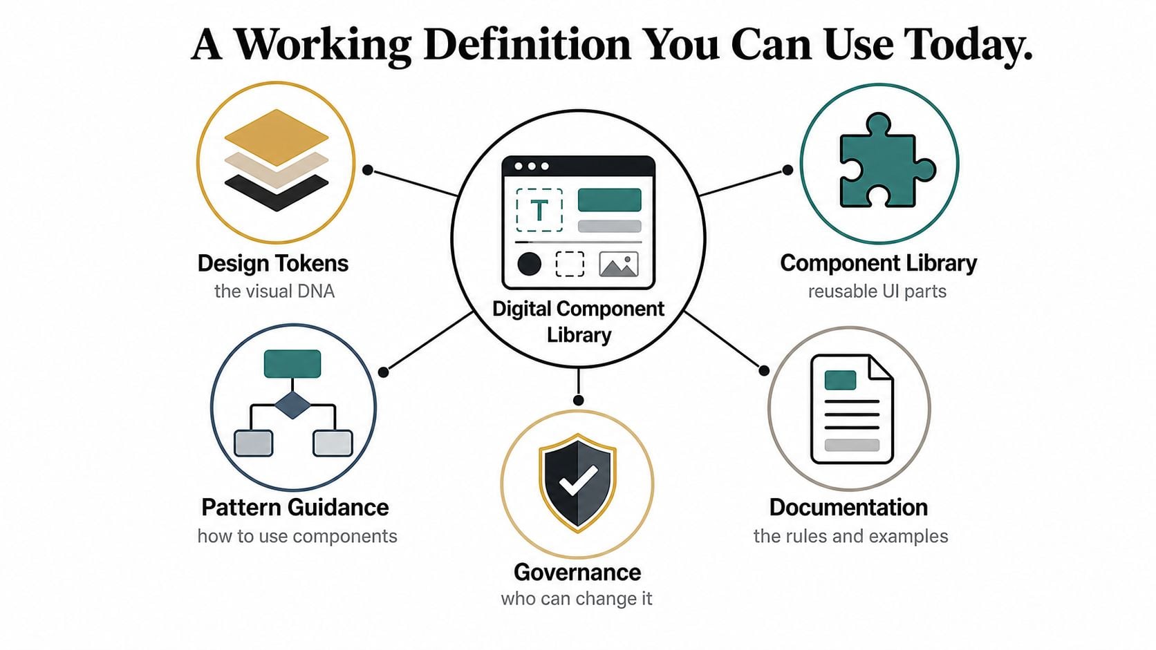
A proper design system needs more than a few reusable blocks. It works because the parts connect, the values are defined, the components are reusable, the patterns show how to use them, the documentation explains the decisions, and governance keeps the whole thing from turning into chaos.
Start with the values underneath
The first layer is the quiet one, the bits people don't see but feel everywhere. Design tokens are those shared values for colour, type, spacing, radius, and similar foundations, so when the team changes one value, the whole interface stays in sync.
That's why tokens matter for WordPress and eCommerce builds. If a headline size, spacing scale, or button colour lives in one place, a product card, checkout step, and contact form can all draw from the same source instead of copying the same number into ten different files.
Build reusable pieces next
The second layer is the actual set of parts people use day to day. A component library is the cupboard full of repeated interface pieces, things like buttons, form fields, alerts, cards, and navigation elements.
A button is the simplest example. In a design system, that button isn't just one rectangle with text on it. It includes its normal state, hover state, focus state, loading state, disabled state, and the code rules needed for each version to behave properly across different devices.
Put usage rules around those pieces
The third layer is the guide that tells people how to combine the parts. Pattern guidance is the recipe card that shows when to use a component, when not to use it, and what order the pieces should appear in.
That's where confusion gets removed before it reaches development. A checkout button, a promotional banner, and a navigation link might all look similar at first glance, but the pattern guidance decides which one should be a button, which one should be a link, and which one should never be styled like either.
If the team has to guess how a component should behave, the system isn't finished yet.
Make the rules visible and searchable
The fourth layer is the reference material everyone can use. Documentation turns the system from tribal knowledge into something a new designer, developer, or freelancer can follow without asking five Slack questions.
Good documentation doesn't just show what something looks like. It explains the intended use, the edge cases, the accessibility notes, and the code-friendly details so a handoff doesn't rely on a memory test.
Decide who can change it
The fifth layer is governance, which sounds formal but is really just the agreement about who updates what, how changes get approved, and how the system stays trustworthy. Without that, teams keep adding exceptions until the system stops being a system at all.
For a small agency or SMB, that might be a single owner, a shared review process, and a simple habit of logging changes before they reach production. It doesn't need bureaucracy, it needs clarity.
If you want the technical side of this in one place, the idea maps closely to the interface-design perspective on reusable parts and visual rules.
Real Benefits for Small and Medium Businesses
A design system pays off fastest when a team ships often and can't afford repeated handoff friction. That's why it's useful for SMBs, not just big product organisations, because the same small team is often handling marketing pages, store updates, and redesigns at the same time.
Speed shows up in everyday work
When the team has a shared system, they spend less time rebuilding familiar pages from scratch. Figma's measurement found that people with access to a design system completed tasks 34% faster than those without one, which helps explain why businesses treat the system as working infrastructure rather than decoration (Figma design systems overview).
In practical terms, that means a seasonal landing page doesn't need a whole new visual language. The designer pulls from the existing card, button, and spacing rules, and the developer builds against the same reference instead of interpreting a fresh mockup from scratch.
Consistency protects the brand
When a site, a store, and a campaign page all follow the same set of rules, the business looks more intentional. That consistency matters because customers notice when checkout feels like a different product from the homepage, even if they can't explain why.
A system keeps branding steady across WordPress pages, product templates, and email layouts. It also makes small updates safer, because one team member can add a new CTA or content block without drifting away from the established look and feel.
Handoffs get cleaner
A design system gives developers more than a picture to copy. It gives them component states, responsive rules, accessibility notes, ARIA labels, and semantic HTML guidance, so they can implement the same interaction logic across multiple builds without re-deciding every detail (design system implementation playbook).
That's a real benefit when an agency hands work to a freelancer or a client's internal dev. The conversation shifts from “can you make it look like the mockup?” to “here's the approved component, here's how it behaves, and here's what should happen on mobile.”
Accessibility and SEO hygiene improve by default
The other win is quieter but just as important. When the same component structure is reused properly, teams are more likely to keep heading order, button semantics, and form behaviour consistent, which supports better accessibility and cleaner implementation habits.
Practical rule: if a component can't explain its own behaviour clearly, it usually won't survive handoff cleanly.
This is also where a design system reduces rework. The better the shared rules, the fewer last-minute fixes you need during QA, and the less often the same mistake gets repeated on the next build. For a small business, that can be the difference between a calm launch and a week of revisions.
If you're weighing the brand side of that argument, the logic sits neatly alongside the role of graphic design in business growth.
Design Systems in the Wild for Agency Work
A Dorset retailer and a professional services firm don't need the same vocabulary to feel the same pain. Both need pages built quickly, both need consistency, and both need handoffs that don't turn into long clarification threads.
The retailer with a busy WooCommerce shop
A local retailer rebuilding a WooCommerce store usually starts with the visible pieces, product cards, filters, checkout steps, and email templates. Without a shared system, each of those can drift, so the basket button on one page looks slightly different from the one in the checkout flow, and the customer experiences the site as a series of separate decisions.
With a design system, the team uses the same button, form, and messaging rules in all of those places. The payoff is not abstract polish, it's fewer awkward mismatches when the product page, promotional landing page, and confirmation emails all need updates at the same time.
The agency handoff that needed less guessing
A professional services firm often has a different problem. They might be launching a new site with a freelancer or external developer, and the main risk is ambiguity, not volume. If the button sizes, spacing rules, and content patterns are documented properly, the developer doesn't have to infer intent from a static mockup.
That matters when a project brief leaves room for interpretation. The documented system shows which components are fixed, which ones are flexible, and which ones should never be altered just because a new page looks “nearly the same”.
A short note in the brief often prevents a long redesign later.
“If the component is documented well, the handoff gets shorter and the build gets calmer.”
Public systems make the idea easier to recognise
It also helps to look at public examples. Material Design and the GOV.UK Design System both show how reusable rules, documented components, and clear patterns can support consistent digital experiences at scale. They're not templates to copy blindly, but they do make the operating model easier to see in the wild.
If you want the agency angle in more local context, the same thinking applies to a creative agency workflow in the UK where different team members touch the same interface over time.
When to Build Your Own and When to Adopt
The build-versus-adopt decision gets easier when you stop treating it as ideological. Some teams need a custom system because the brand itself is distinctive, while others should adopt a proven foundation and move faster with fewer decisions.
| Signal | Lean Towards Build | Lean Towards Adopt |
|---|---|---|
| Team size | You have repeated design and development work across several projects | You need a lightweight starting point for a small team |
| Design maturity | Your brand already has strong visual rules and you need more control | Your team needs structure more than deep customisation |
| Brand differentiation | The interface itself is part of the brand experience | The site needs to be clear, reliable, and quick to ship |
| Budget | You can support ongoing system ownership and maintenance | You want fewer upfront decisions and less setup overhead |
If you're a smaller business with limited internal capacity, adopting an established system can be a sensible shortcut, especially for straightforward public-facing builds. If your visual identity is a competitive advantage, a custom token-and-component setup gives you more control over the details that make you look different.
The trick is to be honest about the bottleneck. If your team keeps losing time because every new page starts from zero, adoption wins. If your business depends on a very specific look and feel, building your own system becomes part of the brand work, not a nice extra.
The budget question usually sits behind the decision too, because ownership matters as much as launch speed. A custom system needs someone to keep it alive, and that has to be planned rather than assumed, which is where a branding-agency pricing discussion becomes relevant to the wider project budget.
A Practical Six-Month Implementation Roadmap
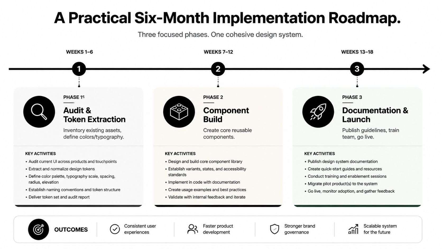
A useful rollout starts small, not heroic. For most SMBs, the goal is not to launch a perfect enterprise platform, it's to create a working foundation that reduces handoff friction and grows with real projects.
Months one and two
The first phase is audit and token extraction. Pull together the most repeated colours, type styles, spacing values, border rules, and button treatments from your current site and brand files, then decide which ones deserve to become shared tokens.
A sensible deliverable here is a short foundation sheet, plus a list of the components that need to be standardised first. You'll know you're on track when the team stops debating the same visual values in every design review.
Months three and four
The second phase is component build. Start with the pieces that appear everywhere, usually buttons, form fields, cards, alerts, and basic content blocks.
The win here is not quantity, it's reuse. If your developer can build a new page by assembling approved parts instead of recreating them, the system is doing its job.
Months five and six
The third phase is documentation and launch. Write the rules for when to use each component, how it behaves, what states it supports, and what a new team member needs to know to use it properly.
A good rollout also includes governance and feedback, even if the process is simple. Decide who approves changes, where requests live, and when the system gets reviewed so it doesn't become shelf-ware after the first shiny release.
Video can help teams understand the sequence faster, especially when the same person is juggling design, content, and delivery.
A small team doesn't need to do everything at once. It needs a plan that turns repeated decisions into shared assets, then keeps those assets current enough to matter.
Common Pitfalls and How to Avoid Them
Most systems don't collapse because the idea was wrong. They fade because the team treated them like a one-off project, a visual library, or a task that someone else would keep alive later.
The system gets launched and then abandoned
A design system is living work. If nobody updates the components after launch, the library drifts away from the product, and people stop trusting it.
The fix is simple enough to say and easy to skip, which is why it matters. Assign one owner, even if that owner is just the steward of the process, and schedule regular reviews so tokens and components reflect what's in production.
Documentation gets left for “later”
Teams often assume the visuals are self-explanatory. They aren't, especially once a new developer joins or a freelancer needs to deliver against a deadline.
Practical rule: if the component can be used incorrectly, the documentation isn't finished.
Write the usage notes while the component is still fresh in your head. That habit turns handoff notes into a real reference instead of an emergency FAQ.
Nobody owns governance
When everyone is allowed to change the system, no one feels responsible for keeping it coherent. That's how one-off exceptions pile up until the design system no longer feels authoritative.
The solution is a light governance model, not a committee. A named owner, a simple request path, and a regular review point are enough to stop drift before it becomes expensive.
A small business doesn't need endless process. It needs enough structure to keep the system useful, and enough discipline to stop it from becoming another folder nobody opens.
Maintenance Checklist and Frequently Asked Questions
A design system only stays useful if someone keeps touching it. Pin this kind of checklist to the project board and make maintenance part of normal delivery, not a rescue mission after things break.
- Review tokens regularly: check whether colours, spacing, and typography still match the live brand and current build.
- Audit components: confirm the most used elements still behave correctly across pages, devices, and states.
- Check accessibility details: look at labels, focus states, keyboard behaviour, and semantic markup.
- Refresh documentation: update usage notes whenever a component changes, not after the fact.
- Name a steward: make sure one person knows where change requests live and what counts as approved.
What does a design system typically cost
The cost is less about a single purchase and more about the time to define, build, document, and maintain it. A small team can start lean by standardising the components it already repeats most often, then expand as the system proves useful.
How long before it feels worthwhile
You usually notice the value when repeated work starts going faster and handoffs get quieter. If the team is still debating the same button or form field on every project, the system hasn't been embedded enough yet.
Does one landing page count
Yes, if that landing page uses reusable parts and a shared rule set that can be applied again. One page alone isn't a design system, but it can be the first pilot that proves the method works.
How is it different from a brand guideline
A brand guideline tells people how the brand should look and sound. A design system takes those ideas and turns them into reusable interface parts, behaviour rules, and implementation guidance that people can build from.
A good next move is to start with one audit, one token list, or one pilot component. That gives you a concrete base to judge whether the system will help your team ship faster and hand off cleaner.
If you want a Dorset team to turn messy handoffs into a clearer way of working, DesignStack can help shape the website, branding, and component rules behind it. Visit DesignStack to talk through a design system-minded website rebuild, a cleaner eCommerce handoff, or a brand refresh that needs to stay consistent after launch.