What Is User Interface Design: A Guide for UK Businesses
User interface design is the craft of making a business's website or app easy, intuitive, and enjoyable to use, and when it's done with intent it can raise conversion rates by as much as 400% and return up to £100 for every £1 spent. For a UK business owner, that means UI design isn't just about appearance. It's about turning more visitors into enquiries, orders, and loyal customers.
If you're looking at your website and thinking, “It looks fine, so why isn't it doing more?”, you're asking the right question. Many business owners invest in a site, add their services, upload a few photos, and expect results. Then the phone doesn't ring enough, checkout drop-offs happen, or people visit but never enquire.
That gap often comes down to the interface.
A good interface helps people move forward without stopping to think too hard. They can find what they need, trust what they see, and complete the next step with confidence. A poor one does the opposite. It creates hesitation, confusion, and friction, even when the product or service itself is excellent.
For UK SMEs, that matters more than ever. Customers browse on mobile, switch between devices, compare options quickly, and make fast decisions. Your website interface is often your first salesperson. If it's unclear, inconsistent, or awkward to use, you lose opportunities before a conversation even begins.
Table of Contents
- What Is User Interface Design Really
- UI vs UX Why You Need Both
- Core Principles of Effective UI Design
- The UI Design Process From Start to Finish
- Common UI Deliverables and Tools of the Trade
- Why Good UI Is Great for Your Business
- How to Work With a UI Design Agency A Checklist
- Conclusion The Future of User Interface Design
What Is User Interface Design Really
Think of your website like a physical shop.
The building layout decides where people enter, how they move around, and whether they can find the till. The signs tell them where to go. The shelving makes products easy to browse. The lighting, colours, and spacing shape how the place feels. In digital terms, that's close to what user interface design does.
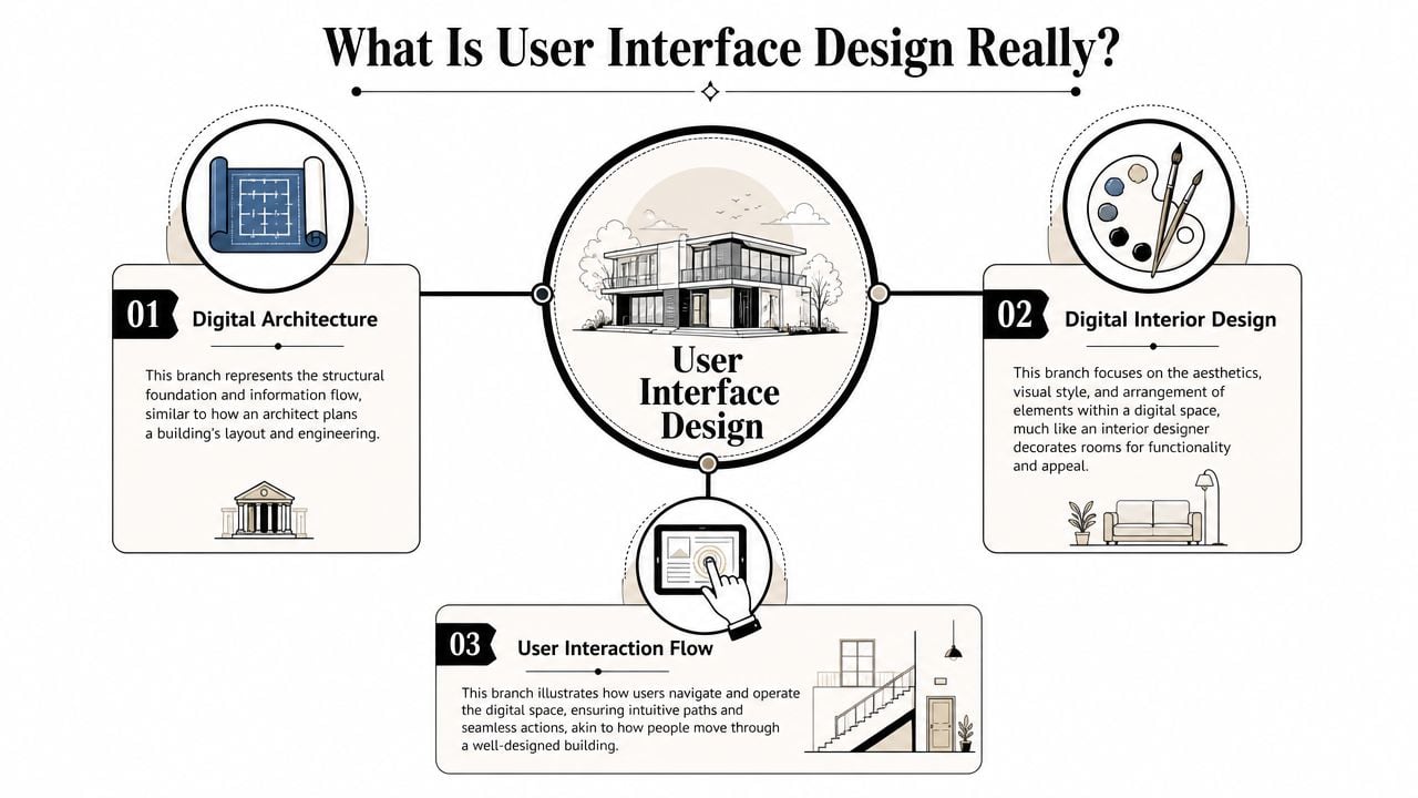
UI design is the part of digital design that people directly see and use. It includes the layout, buttons, menus, forms, icons, spacing, colours, and visual cues that help someone move through a site or app. If a visitor clicks “Book now”, fills in a contact form, filters products, or opens a mobile menu, they're interacting with the interface.
Digital design that guides behaviour
A lot of people hear “UI” and assume it means making something look modern. That's only part of it.
A well-designed interface helps users answer simple questions quickly:
- Where am I
- What can I do here
- What should I click next
- Can I trust this page
- Did that action work
If those answers aren't obvious, users slow down. Some leave. Some get frustrated. Some assume the business behind the site is less reliable than it really is.
Practical rule: Good UI removes tiny moments of doubt. Those small moments are often what stop a sale or enquiry.
More than visual polish
Many business owners make a significant error when they approve a homepage based on appearance alone. However, the ultimate test comes later. Can someone use it easily on a phone? Can they complete a form without confusion? Can they scan the page and spot the next step?
That's why UI design sits between brand and function. It has to look right for your business, but it also has to help customers complete tasks.
If you want a deeper look at the broader customer journey around the interface, this guide to what user experience design means in practice fills in that wider picture.
UI vs UX Why You Need Both
UI and UX are often treated as the same thing, but they solve different business problems.
UI is the part your customer uses on the screen. UX is the full experience of trying to get something done. For a UK SME, that difference matters because a website does not earn its keep through appearance alone. It earns its keep when people can understand your offer, trust your business, and complete the next step without hesitation.
Here is the practical distinction. A visitor might arrive on your site ready to book, enquire, or buy. If the page layout is clear, the button labels make sense, and the form feels easy to complete, that is UI doing its job. If the visitor also finds the right information in the right order, feels confident at each step, and reaches their goal without frustration, that is UX working properly.
One shapes the screen. The other shapes the journey.
A simple side-by-side view
| Area | UI | UX |
|---|---|---|
| Focus | Screens, controls, layout, visual hierarchy | Overall journey, flow, ease, satisfaction |
| Main question | “Can people use this screen easily?” | “Does the whole experience help them reach their goal?” |
| Examples | Buttons, forms, menus, page sections | Customer journey, content order, task flow |
| Business effect | Helps people act without friction | Makes the whole interaction feel useful and trustworthy |
Business owners often get caught out. A site can look polished and still underperform because the path to action is muddled. It can also have a sensible plan behind it, yet lose enquiries because the actual interface feels cluttered, awkward, or hard to use on a phone.
For example, a local service business might have the right pages, a fair price, and strong reviews. But if the quote form is hard to spot, the call-to-action blends into the page, or the navigation hides key services, the customer journey weakens at the point of action. That is not just a design issue. It affects leads, sales, and the return on your website investment.
A useful way to separate the two is this:
- UI handles the moments of interaction. It covers what people tap, read, choose, and submit.
- UX handles the flow between those moments. It covers whether the full process feels logical, clear, and worthwhile.
- Both affect conversion. Good UI helps people act. Good UX helps them keep going.
If you want a clearer breakdown of where each discipline begins and overlaps, this guide to the difference between UX and UI design explains it in more detail.
A short explainer helps if you prefer to see the distinction discussed visually.
Strong digital results depend on both. Clear screens help people take action. A well-planned journey gives them a reason to continue.
Core Principles of Effective UI Design
When a website feels easy to use, a few core principles are usually doing the heavy lifting in the background. They aren't flashy, but they shape whether people trust the interface and keep moving.
Clarity comes first
Clarity means the next step is obvious.
The page headline tells users what the page is about. Buttons say what they do. Forms don't ask for unnecessary information. Key actions stand out. Secondary actions stay in the background. If someone lands on a service page and has to hunt for the contact button, the interface is already making the work harder than it needs to be.
For a business, clarity matters because visitors don't arrive with patience to spare. They're comparing, scanning, and deciding quickly.
Consistency builds trust
Consistency means similar things look and behave in similar ways. If one button style means “take action”, it should keep meaning that across the site. If product cards, form fields, and headings all follow the same pattern, the site feels organised.
That has a business effect people often underestimate. Consistency makes a company feel more dependable. It reduces the small mental effort users spend re-learning the interface on each page.
A style system also helps here. Colour choice plays a role in that consistency, especially when brand and usability need to work together. This overview of colour psychology in branding is useful if you're weighing appearance against clarity.
Feedback reduces doubt
People need signs that the system heard them.
When a button changes state after being clicked, when a form highlights a missing field clearly, or when a success message confirms a booking request has gone through, users feel in control. Without that feedback, they wonder if the page is broken.
That uncertainty leads to repeat clicks, abandoned forms, and unnecessary support queries.
A clean interface isn't the one with the fewest elements. It's the one that gives the right signal at the right moment.
Responsive and accessible design are business requirements
Modern UI has to work across devices because user behaviour already does. Around 90% of digital users engage with multiple screens and 98% switch between devices, which is why responsive interfaces have become the norm rather than a bonus, according to these UI and UX usage statistics. For a UK SME, that means a customer might browse on mobile, compare on a laptop, and complete an enquiry later on a different device.
Accessibility matters for the same reason. A usable interface doesn't only serve people with perfect vision, precise motor control, and a mouse. It also needs clear contrast, visible focus states, readable form labels, and sensible error handling. Practical guidance around accessibility has become mainstream in UK digital work, and this overview of user interface design reflects why accessibility can't be treated as an afterthought.
A site that excludes users is not just harder to use. It limits who can buy, enquire, book, or trust the business in the first place.
The UI Design Process From Start to Finish
From the outside, UI design can look like someone opens Figma, chooses some colours, and sends over a homepage. The process is more structured than that, and that's a good thing. It reduces guesswork.
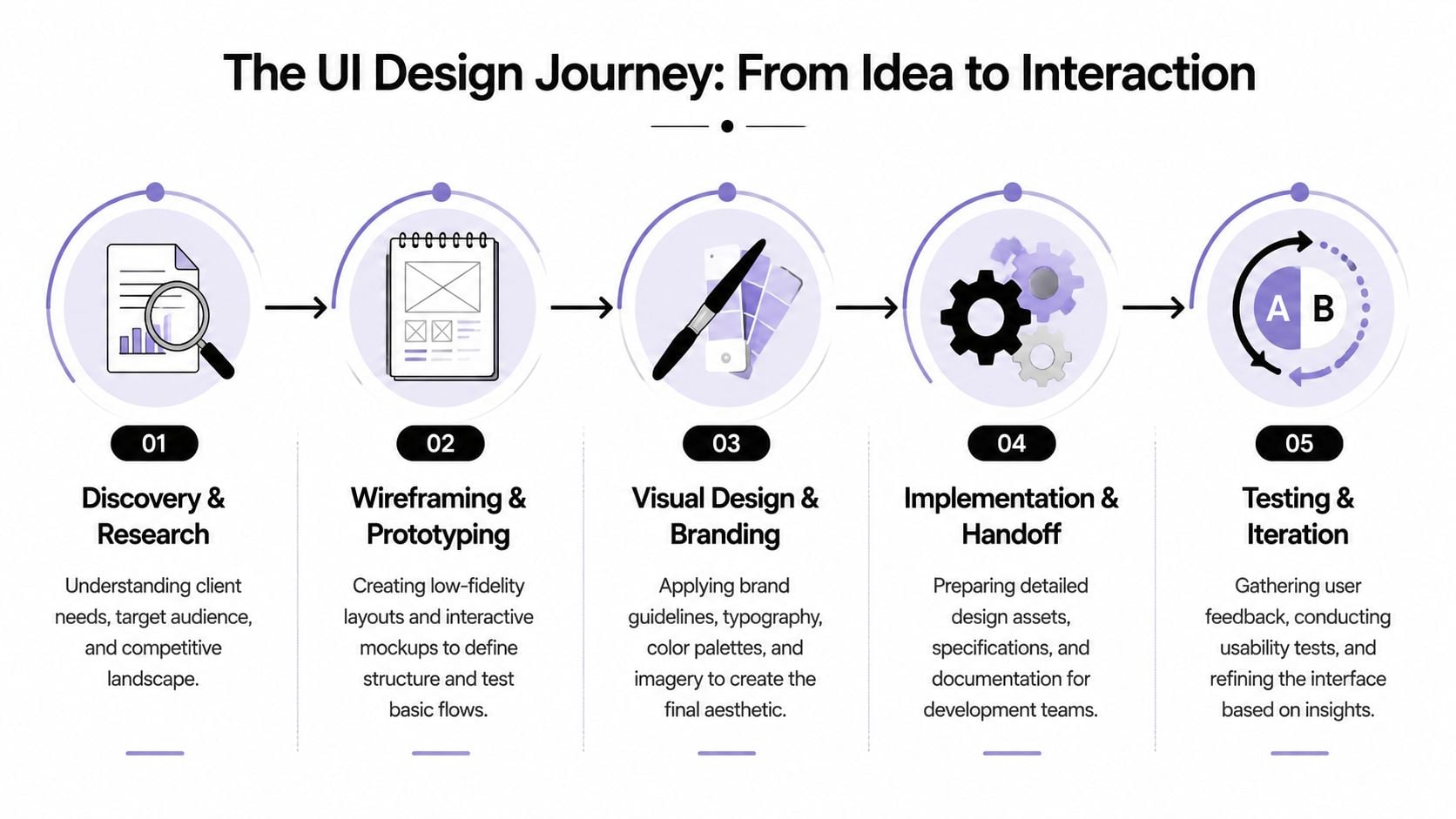
What happens before anything looks polished
The first stage is discovery. That usually means understanding your business goals, your audience, your offers, and the actions the site needs to support. A trades business may need quote requests fast. An eCommerce brand may need easier product filtering and checkout flow. A membership organisation may need sign-up, renewals, and content access to feel simple.
Then comes structure. Designers create wireframes, which are basic page layouts without final styling. They're useful because they separate logic from decoration. A rough wireframe can answer important questions early. Does the page order make sense? Is the call to action in the right place? Are we asking for too much in the form?
If you've never seen one before, this guide on what a wireframe is in web design shows why it's such a practical project stage.
Where the interface takes shape
After wireframes, designers build mock-ups and prototypes. At this stage, branding, typography, spacing, colour, imagery, and interface states start to come together. A prototype lets you click through the journey before development starts.
That matters because changes are easier here than after code has been written.
Typical project stages often look like this:
- Discovery and research. Business goals, user needs, page priorities.
- Wireframing. Basic structure and content hierarchy.
- Prototyping. Clickable journeys that show how the interface behaves.
- Visual design. Branding, layout refinement, states, and polish.
- Handoff and build support. Specs and files prepared for developers.
For many software teams, especially product-led ones, more formal guidance on usability testing for SaaS products can also help shape what to test once those prototypes are ready.
How testing proves the design works
A good interface isn't judged by opinion alone. It's judged by whether people can complete tasks.
Research summarised in this user interface design review notes that platform-convention adherence and predictable controls can improve task-completion speed by about 30%. The same source recommends validating interfaces with Task Success Rate, critical-error rate, and time-on-task rather than relying on visual preference alone.
That's a useful shift for business owners. Instead of asking only “Do we like this page?”, you start asking better questions.
- Can users complete the enquiry form without mistakes
- Can they find pricing or service details quickly
- Do they get stuck at any point
- Does the mobile journey slow them down
Those questions move UI design away from taste and toward results.
Common UI Deliverables and Tools of the Trade
A UI project creates tangible outputs. You're not only paying for ideas. You're paying for assets that guide decisions, reduce confusion, and make development smoother.
What you actually receive
The first common deliverable is the wireframe. This is the stripped-back skeleton of a page. It shows placement and priority, not final appearance.
Then you usually get mock-ups. These are static designs that show what the finished interface should look like. They include brand colours, typography, imagery, spacing, and component styling.
After that comes the interactive prototype. This is a clickable version of the design. It doesn't run like a fully built site, but it does show how a user moves from one step to the next.
Many teams also create a style guide or simple design system. That document sets rules for buttons, colours, headings, form fields, spacing, and reusable components. It helps everyone keep the site consistent.
If the design files don't make development easier, the handoff still has work left to do.
Tools designers use
Figma is the tool many teams now use for interface design, prototyping, and collaboration. Sketch is still familiar to some design teams, and Adobe tools may support brand asset creation and image work around the UI process.
What matters most isn't the software name on its own. It's whether the tool supports comments, reusable components, responsive thinking, and a clear developer handoff.
For businesses comparing suppliers, it's worth asking what files and working documents you'll receive, what revision process is included, and how the agency handles changes during design and build. DesignStack, for example, offers web design as part of its wider digital service mix alongside branding, WordPress development, and ongoing support, which is relevant when one project needs both interface design and implementation.
Why Good UI Is Great for Your Business
For most SMEs, the primary question isn't “What is user interface design?” It's “Will this help the business grow?”
The short answer is yes, if the interface removes friction at the points where customers decide whether to continue.
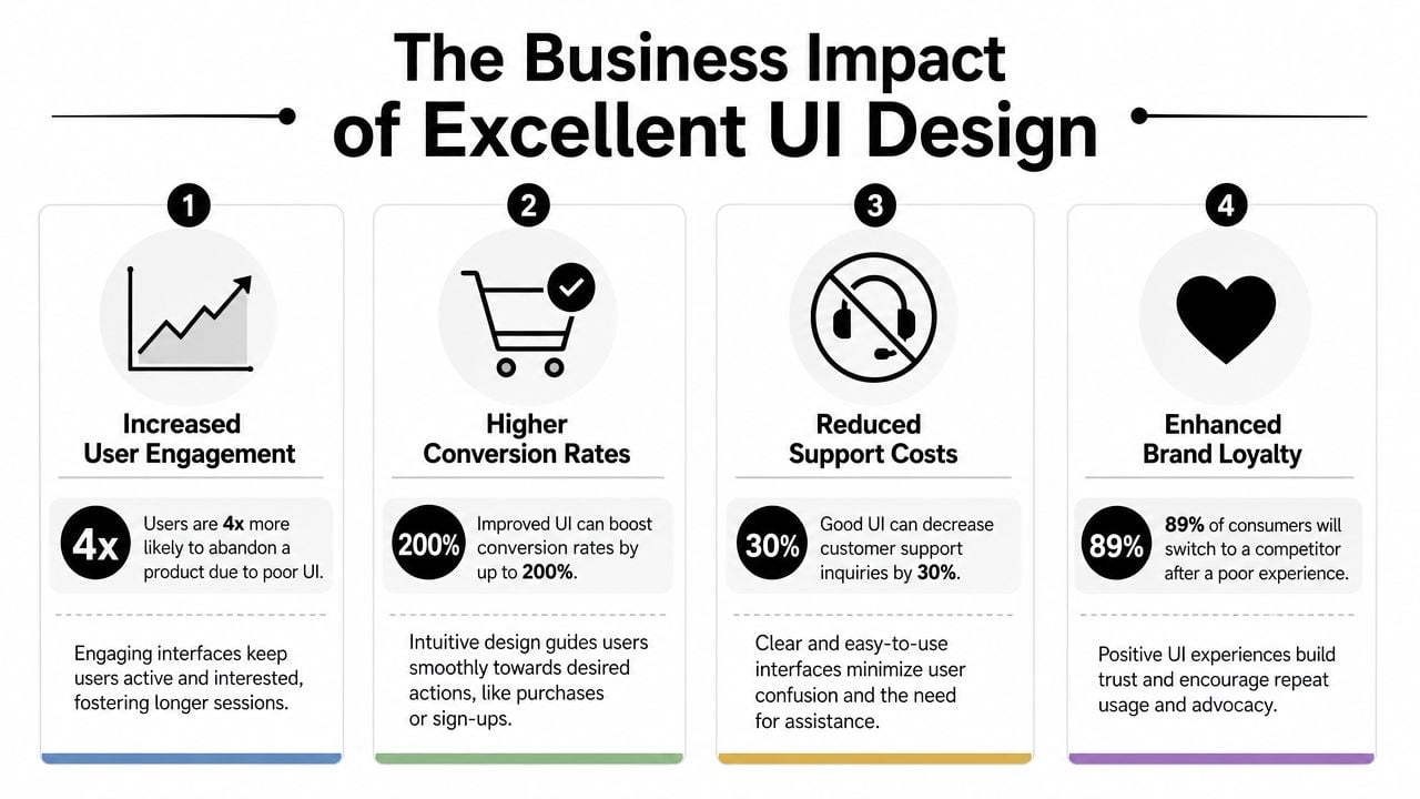
It helps customers act
A better interface makes key actions easier. That could mean completing a checkout, sending an enquiry, booking an appointment, downloading a brochure, or requesting a quote. When people can act quickly, the website starts doing more commercial work.
That's why the numbers often get attention. Adobe cites Forrester research showing that intentional UX can raise conversion rates by as much as 400%, while UX investment can return up to £100 for every £1 spent, as outlined in Adobe's user experience statistics summary. For a UK SME, the practical meaning is simple. Interface quality has a direct effect on sales, enquiries, and lead generation.
It strengthens trust and reduces wasted effort
People judge a business quickly online. If the interface feels clumsy, inconsistent, or hard to use, trust drops before anyone reads your credentials.
Good UI also reduces internal waste. When users understand the site, your team spends less time answering avoidable questions, resending links, or helping people complete basic tasks.
A strong website experience usually improves several things at once:
- Conversion quality. More visitors complete the actions that matter to the business.
- Brand perception. The business looks organised, current, and credible.
- Operational efficiency. Users find answers and complete tasks with less support.
- Competitive advantage. A clearer journey often wins against a better-known but clumsier rival.
If you're reviewing an existing site, this guide on how to improve website user experience can help you spot practical issues before a full redesign.
How to Work With a UI Design Agency A Checklist
Hiring a UI design agency doesn't need to feel mysterious. The best working relationships are usually the ones where expectations are clear from the start.
Questions worth asking early
Start with the portfolio, but don't stop at visuals. Ask what each project was trying to achieve. A page can look polished and still fail to support enquiries or sales.
Useful questions include:
What type of businesses have you worked with before
Relevance matters. An agency that understands service businesses, retailers, or membership organisations will ask better questions.How do you approach mobile and responsive design
Your audience won't use one device in one context. The agency should design for real behaviour, not ideal conditions.How do you handle accessibility in day-to-day design work
You're looking for practical answers about contrast, keyboard use, form labels, and error states.What does the revision process look like
You need to know how feedback is gathered, how many rounds are included, and what happens if priorities shift.
What a healthy working relationship looks like
A solid agency won't disappear for weeks and return with a surprise homepage. They'll involve you at decision points, explain trade-offs clearly, and show work in stages.
Look for signs of a process you can trust:
- Clear project stages. Discovery, design, review, build, and support should be easy to understand.
- Visible reasoning. They should explain why a layout or interaction has been chosen.
- Collaboration, not guesswork. Good agencies ask about business goals before discussing visual style.
- Post-launch support. Websites rarely end at launch. Small fixes and refinements matter.
The right agency doesn't just deliver screens. They help you make better decisions before expensive mistakes are built in.
If an agency can talk comfortably about customers, tasks, conversions, content hierarchy, and accessibility, not just colours and trends, you're probably speaking to the right kind of partner.
Conclusion The Future of User Interface Design
User interface design starts with screens, but it doesn't end there. At its core, it's still about helping people understand what to do, trust what they see, and complete tasks with as little friction as possible.
That principle stays steady even as interfaces change.
Recent guidance has started to reflect a broader definition of interface design that includes voice-controlled and gesture-based interfaces, along with the growing impact of AI-assisted interactions, as discussed in Figma's overview of modern UI design. For UK businesses, that has real implications. Customers increasingly expect conversational help, faster paths to answers, and interfaces that fit short, mobile-first moments rather than long sessions at a desk.
That doesn't mean every SME needs a voice interface or an AI assistant tomorrow. It means the role of UI design is expanding. Designers now need to think about content hierarchy, trust signals, and task flow across more than just standard pages and buttons.
The future of UI will keep changing in format. The fundamentals won't. Clear choices, predictable interactions, accessible journeys, and business-focused thinking will still separate websites that merely exist from websites that perform.
If you're reviewing your current site or planning a redesign, DesignStack can help you turn interface decisions into practical business results with web design, branding, and ongoing support for UK businesses.


Leave a Reply