
What Is a Wireframe in Web Design A Simple Guide
Ever tried to build something without a plan? A piece of flat-pack furniture, a new recipe, anything? It usually ends in chaos. In web design, our plan—our essential first step before any fancy visuals come into play—is the wireframe.
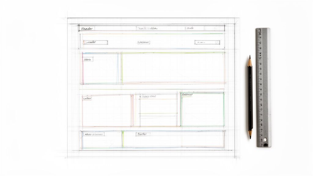
Put simply, a wireframe is the basic structural drawing for a website. It’s a black-and-white layout that shows where everything will go, from the navigation menu to the "contact us" button. It's all about structure, not style.
The Blueprint for Your Website
Think of a wireframe as the architectural blueprint for a house. An architect doesn't start by picking out curtain colours; they figure out where the walls, doors, and windows go first. That’s exactly what a wireframe does for your website.
This bare-bones approach forces everyone involved—the client, the designer, the developer—to focus on what truly matters at the start: the user's journey and the website's core purpose. It's common for a UI/UX Design Consultant to use wireframing to map out the user flow before diving into the visual design.
Getting this right early on helps answer the most important questions first. Is the navigation logical? Is the most critical information easy to find?
A wireframe turns an abstract idea into a tangible plan. It’s the first real test of a concept, ensuring the user's journey is logical and the website's goals are achievable before any significant time or money is invested.
In our work with UK businesses, we’ve seen first-hand how wireframes prevent misunderstandings down the line. In fact, projects that start with detailed wireframes often see 52% higher client satisfaction rates. It’s all about aligning expectations from day one, which is vital for organisations like the Weymouth & Portland Chamber of Commerce, where clear communication is key.
What a Wireframe Actually Shows
To really get your head around a wireframe, it's just as important to know what it doesn't show as what it does. The deliberate lack of colour, fonts, and images is a feature, not a bug. It keeps the team focused on the foundation.
Here’s a simple breakdown to clarify what goes into a wireframe and what is purposefully left out.
Wireframe Components at a Glance
| What a Wireframe Includes | What a Wireframe Excludes |
|---|---|
| Structure & Layout: The grid and positioning of key page sections. | Colours: Stays strictly black, white, and grey. |
| Content Hierarchy: Which information gets top billing. | Fonts: Uses a generic system font, like Arial or Times New Roman. |
| User Navigation: The flow of menus, links, and buttons. | Images: Uses simple placeholders (e.g., a box with an 'X'). |
| Core Functionality: Placement of forms, search bars, and calls-to-action. | Branding: No logos or specific brand elements. |
By focusing only on the items in the first column, you create a solid foundation for the entire project. This structural thinking is fundamental as you explore the art of crafting digital experiences and build websites that don't just look good, but work beautifully.
From Simple Sketches to Detailed Plans
Wireframing isn't a single, rigid step in a project. It’s a process that grows and evolves right alongside your ideas. Think of it like an architect designing a house: you wouldn't start by picking out paint colours. You'd start with a rough floor plan, and only then would you create detailed blueprints.
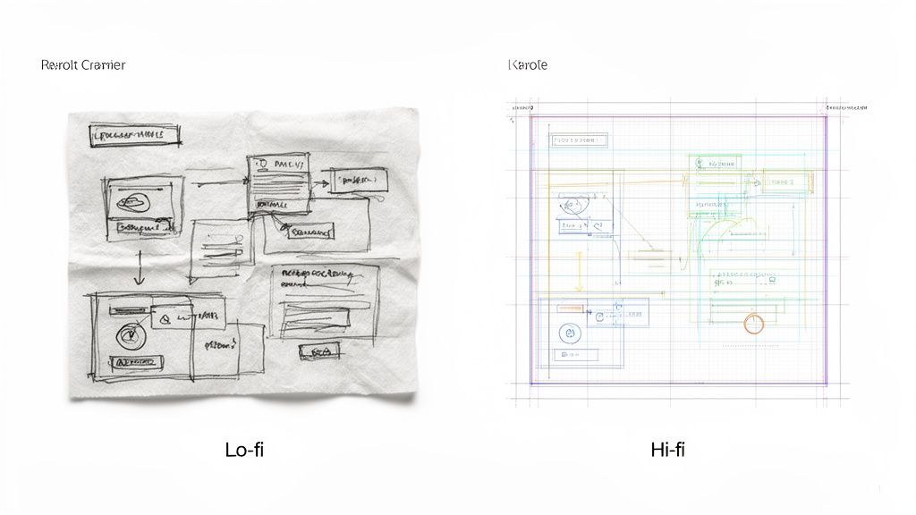
This journey from a broad concept to a specific plan is captured in two distinct types of wireframes: low-fidelity and high-fidelity.
Each type has its own job to do at different stages of a project. Getting to grips with both helps you understand how a design comes to life, piece by piece, before anyone writes a single line of code.
Starting with Low-Fidelity Wireframes
A low-fidelity (lo-fi) wireframe is basically a quick sketch. It’s the fastest way to get an idea out of your head and onto a whiteboard or even the back of a napkin. The whole point here is speed and brainstorming, not perfection.
These early drafts are deliberately rough. We use simple boxes, lines, and scribbles to map out where things will go. The focus is purely on the structure, the user's journey, and the most important information on the page. We aren't worried about exact sizing, fonts, or colours at this point—we’re just making big, foundational decisions quickly and cheaply.
Lo-fi wireframes are conversation starters. Their simplicity invites feedback and makes it easy for everyone—from stakeholders to developers—to contribute ideas without feeling intimidated by a polished design.
Because they’re so raw, lo-fi wireframes are perfect for early collaboration. They let us test our core ideas and make sure the fundamental layout is right before we invest more time and resources.
Moving to High-Fidelity Wireframes
Once we’ve locked in the basic structure, we move on to high-fidelity (hi-fi) wireframes. These are much more detailed and precise, looking a lot closer to the final webpage—though still without the final branding, colours, or polished images. We build these using digital tools like Figma or Adobe XD.
This is where the specifics come into play. Instead of just a box for a button, we define its actual size and position. A hi-fi wireframe acts as a clear, actionable guide for the whole team and usually includes:
- Precise Layout and Spacing: It nails down the grid system and the exact dimensions for every element on the page.
- Real or Representative Content: We often drop in the actual headlines and body copy instead of "lorem ipsum" to see how everything truly fits and flows.
- Specific Interactive Elements: It clearly shows where forms, menus, and other user-interactive components will live and how they might behave.
This detailed blueprint ensures that when we move into visual design and development, everyone is working from the same playbook. It’s our best defence against expensive, time-consuming changes further down the line.
How Wireframing Saves You Time and Money
In our world, time and money are always in short supply. When it comes to building a website, making changes once the developers are involved can get expensive, fast. This is where wireframing becomes your project's best friend, acting as a simple, low-cost safety net that keeps everything on track.
Think about it like building a house. It’s a breeze to erase a line on a blueprint, but knocking down a wall that’s already been built is a costly nightmare. Web design works exactly the same way. A wireframe lets us spot structural issues, awkward user journeys, or missing features when fixing them is just a matter of a few clicks, not hundreds of pounds in coding fees.
Preventing Expensive Rework
Honestly, the biggest way wireframes save money is by catching mistakes before they become expensive problems. Without this blueprint, it's almost a given that the client, designer, and developer will have slightly different ideas in their heads. That gap in understanding is what leads to painful rework, blown deadlines, and a website that just doesn't feel right.
A wireframe gets everyone on the same page, literally. It’s the agreed-upon plan for the website's structure before a single pixel of design or line of code is created. With developer rates often sitting between £48-£120 per hour, getting the structure right first can easily save 10-15 hours of a developer's time on a typical project. You can explore more data-informed web design insights to see just how much of a difference a planned approach makes.
The real power of a wireframe isn't just in the boxes and lines on the screen. It's in the conversations it forces. It makes the whole team agree on what goes where before anyone gets attached to colours and fonts, preventing so many arguments down the line.
As a Dorset-based agency, we've seen this play out time and time again. Using wireframes helps our clients get their sites live much faster because we’ve ironed out the structural kinks early on. It's a core practice for any efficient UK agency looking to avoid budget creep and delays.
Improving User Experience from the Start
A fantastic user experience (UX) is never an accident—it's planned from the ground up. Wireframing forces you to think about your visitor first by focusing purely on layout, flow, and function. It’s the stage where you answer the most important questions about how people will actually use your site.
When reviewing a wireframe, use this actionable checklist to test its effectiveness:
- Identify the Main Goal: Can you tell what the page wants you to do within 5 seconds? The primary call-to-action should be unmissable.
- Test the Navigation: Is it intuitive to find key pages like 'Contact' or 'Services'? Imagine you're a brand new visitor.
- Check Information Priority: Is the most critical information visible "above the fold" (before you scroll)?
- Assess the Layout: Does the page feel balanced and uncluttered, or is it a confusing wall of boxes?
- Follow the User Path: Where does the main button or link take you? Does that next step make logical sense?
By stripping away all the visual gloss, you’re left with the bare bones—the functional skeleton of your website. Getting this right is the foundation of a site that not only looks great but actually works for your users and achieves your business goals.
Wireframe vs Mockup vs Prototype
In the world of web design, you'll hear the terms wireframe, mockup, and prototype thrown around a lot. It’s easy to get them mixed up, and honestly, many people use them interchangeably. But for a project to run smoothly, it's vital to know what each one is for, as they represent three very different stages of the design process.
Let's stick with our house-building analogy to make the differences really clear. Each one builds on the last, taking you from a rough sketch to a fully realised plan, ensuring everyone is on the same page before a single line of code is written.
The Architect's Blueprint: Wireframe
As we covered earlier, a wireframe is the architect's blueprint. It’s a simple, black-and-white diagram showing the bare-bones structure of your website. Think of it as a skeleton—no skin, no clothes, just the essential layout.
Its sole purpose is to answer one critical question: "Where will everything go?" We intentionally leave out colours, fonts, and images to focus purely on structure and layout. It’s all about getting the foundation right before we start thinking about paint colours and furniture.
The Interior Designer's Mood Board: Mockup
Next up is the mockup. If the wireframe is the blueprint, the mockup is the interior designer's mood board come to life. It’s a static but high-fidelity preview that shows you what the finished website will actually look like.
A mockup takes the skeletal structure from the wireframe and dresses it up with:
- Colour Palette: Your exact brand colours applied to the layout.
- Typography: The real fonts you'll see on the live site.
- Imagery and Icons: Actual photos and graphics that bring the design to life.
- Branding: Your logo and other key brand elements, all in place.
The mockup defines the site's visual personality. It’s a picture of the final product, but it’s not clickable—you can look, but you can’t touch just yet.
The Interactive Walkthrough: Prototype
Finally, we have the prototype. This is the interactive 3D model of the house you can walk through. A prototype is a high-fidelity, clickable simulation of your website that lets you experience its functionality and user flow. You can click buttons, test forms, and navigate between pages as if it were a real site.
A prototype bridges the gap between a static picture and a fully coded website. It allows everyone to test the user experience in a tangible way, catching any awkward navigation or confusing flows before development even starts.
Prototypes are absolutely essential for user testing and getting that final green light. They confirm that the design isn't just pretty, but that it's also intuitive and easy to use. This distinction between how a site looks and how it behaves is a fundamental concept, touching on the difference between web design and web development.
To help you see the differences at a glance, we've put together a quick comparison of these key design deliverables.
Design Deliverables Compared
This table breaks down the three main design stages to help you understand their unique purpose, look, and function.
| Deliverable | Purpose | Fidelity (Look) | Interactivity (Feel) |
|---|---|---|---|
| Wireframe | Defines structure and content hierarchy | Low: Black & white, boxes, and lines | None: A static blueprint. |
| Mockup | Defines the visual identity and aesthetic | High: Full colour, typography, and imagery | None: A static picture of the site. |
| Prototype | Simulates user interaction and experience | High: Looks just like the final product | High: Clickable and fully navigable. |
Understanding this progression from wireframe to mockup to prototype is key. Each step confirms a different aspect of the project, ensuring a solid foundation, a compelling visual design, and an intuitive user experience are all in place before the final build begins.
A 5-Step Guide to Creating Your First Wireframe
You don't need fancy software or a design degree to start wireframing. Honestly, all you really need is a pen and paper. At its heart, wireframing is just a way to organise your thoughts and give your website idea a basic structure.
Think of it as the first step in a much larger design process. You start with the wireframe to get the layout right, then move to a mockup for the visual design, and finally build a prototype to make it interactive.
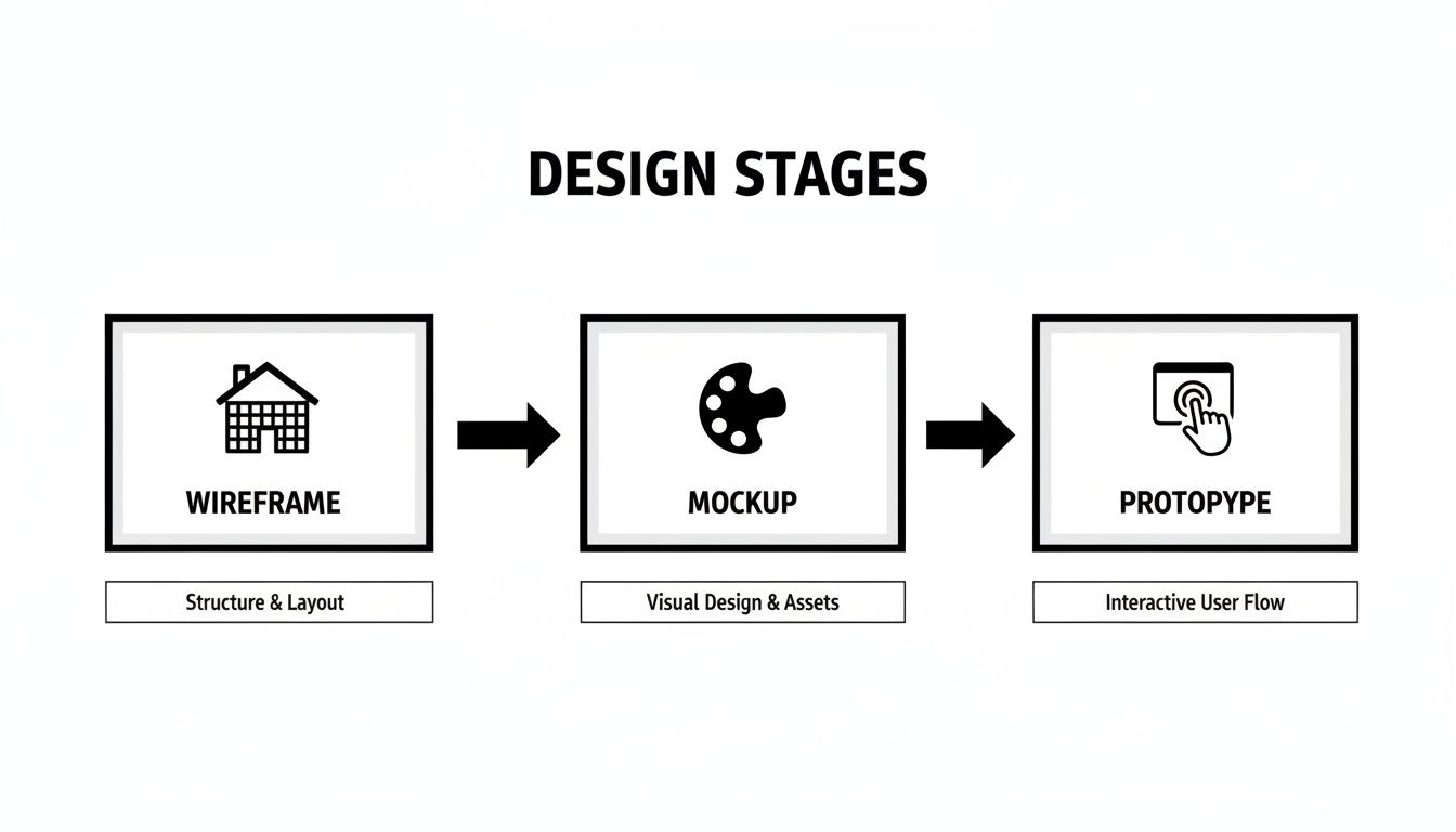
As you can see, each stage adds a new layer of detail. We go from a simple blueprint to a polished visual and, finally, to something users can actually click on.
A Practical Method for Nailing the Basics
Right, let’s get started. Grab a piece of paper or open a simple text document. The goal here isn't to create something pretty; it's to map out where everything should go and how the page should work. This is where you lay the foundation.
Here’s a simple, five-step process that cuts through the noise and focuses on what actually matters:
Define the Page’s Main Goal. Before you draw a single line, ask yourself: what is the one thing this page must do? Is it for generating leads? Selling a specific product? Just providing information? Every single element you add from here on out needs to serve that primary objective.
Map Out the User Journey. Think about how someone will land on this page and, just as importantly, where they should go next. Sketch out the user’s path. Are they coming from an ad? Where do you want them to click? This helps you define the page's role within the bigger picture of your website.
Draw the Basic Structure. Now it’s time to start drawing. Use simple boxes and lines to represent the main sections: the header, footer, content area, and maybe a sidebar. This creates the fundamental layout and shows what’s most important without getting bogged down in details.
Place Key Content and Calls to Action. Inside your boxes, add placeholders for the most important elements. Where will the main headline go? Where will you put the primary image? And crucially, where does the main call-to-action (CTA) button live? This step ensures your most critical content stands out.
Get Some Early Feedback. This is a big one. Show your sketch to someone—a colleague, a friend, anyone. Ask them if they can tell what the page is for and what they're supposed to do next. Catching confusing layouts at this stage is so much easier (and cheaper) than fixing them after the design is built.
A wireframe isn't a masterpiece; it's a conversation starter. Its real job is to get everyone on the same page about the website’s structure and function before you get lost in the subjective world of colours and fonts.
Once you’ve got these fundamentals down, you can explore more advanced tips on how to create wireframes for better product design. Following these steps ensures your project is built on a solid foundation, which is vital whether you're working on your own or need to find a website designer who understands your vision.
Popular Wireframing Tools for 2026
While you can’t beat a pen and paper for that first spark of an idea, digital tools are where the real work happens. They give you the flexibility, collaborative power, and precision needed to build a proper blueprint. The right tool for you really comes down to what you’re building, how confident you are with tech, and of course, your budget.
Let's break down the main types of software designers are using, from quick-and-dirty brainstorming aids to the sophisticated platforms we use here at DesignStack.
Whiteboard and Sketching Tools
Think of these as your digital napkin sketches, but on an infinite canvas. Tools like Miro or Mural are perfect for those very early, messy brainstorming sessions. They let the whole team get involved, dragging and dropping simple shapes, connecting them with arrows to map out user flows, and throwing ideas around in real-time.
Their main advantage is speed. You're not bogged down by design details, so they are the ideal choice for creating the first, roughest low-fidelity wireframes and getting everyone on the same page.
Beginner-Friendly Wireframing Apps
Moving up a notch, what if you need more structure than a whiteboard but don't want to get lost in a complex, professional design suite? This is where dedicated wireframing apps shine. The classic example is Balsamiq, which is famous for its deliberately sketchy, hand-drawn look.
This is a clever feature, not a limitation. It constantly reminds everyone that they’re looking at a work-in-progress, which helps keep the feedback focused on layout and functionality, not fonts and colours. It’s built for one job—creating clean lo-fi wireframes, fast—making it a huge favourite with product managers and startup founders.
A wireframe's job is to focus the conversation on structure and function. Tools that intentionally limit visual polish can be incredibly effective at keeping everyone focused on the blueprint, not the paint colour.
Professional Design Platforms
This is the top tier, where most agencies, including our team at DesignStack, spend their time. All-in-one powerhouses like Figma, Sketch, and Adobe XD are the industry standard. They give designers the control to create incredibly detailed, pixel-perfect wireframes.
Better still, these wireframes don't live in isolation. They are the foundation that seamlessly evolves into high-fidelity mockups and fully interactive prototypes, all within the same environment. This streamlined process is why we're seeing such a huge uptake in these tools. In fact, there's been a 62% rise in Figma and Framer adoption among UK firms specifically for their powerful wireframing capabilities.
This shift reflects how modern web design is getting smarter. By 2026, 48% of agencies are using AI features within these platforms to adapt layouts based on predicted user behaviour. This isn't just a gimmick; it leads to a real-world average cost saving of 35% on development. To see more on this trend, you can read about how modern UK websites are built on luminarybrands.co.uk.
Common Wireframing Questions
Even with a clear understanding of the benefits, it's natural to wonder how wireframing actually fits into a real-world project. Getting to grips with the practical side of things can make you a more confident partner in your website's creation. Let's dive into some of the questions we hear most often from clients.
How Much Does a Wireframe Cost?
This is usually one of the first questions people ask, but it’s helpful to look at it from a different angle. A wireframe isn't an expense—it's an investment that saves you money down the line. While we factor the time for wireframing into a project's total cost, this early stage is all about preventing much more expensive fixes later on.
By catching structural problems or clunky user journeys at the blueprint stage, you avoid the headache of recoding a live design. Think of it as a small, smart investment to protect the much larger one you're making in your website.
Can I Make My Own Wireframe?
Absolutely! For simpler projects, or even just to get your initial thoughts in order, sketching out a lo-fi wireframe on a piece of paper can be incredibly valuable. It’s a brilliant way to organise your ideas and show a designer exactly what you’re picturing.
However, when it comes to complex websites with multiple user paths or specific technical needs, that's where professional expertise really counts. A skilled designer knows how to translate your business goals into a functional layout that works for your users and adheres to technical best practices.
How Long Does Wireframing Usually Take?
The timeline can vary quite a bit depending on how complex the project is. For a small website with only a handful of pages, we might get the wireframes squared away in just a few days. But for a large e-commerce platform or a custom web application, it could take several weeks of back-and-forth and refinement.
Here are the key things that shape the timeline:
- Project Size: The more unique pages and templates you need, the longer it will take to map them all out.
- Complexity of Features: A straightforward blog is much quicker to wireframe than a site with custom user accounts and interactive dashboards.
- Feedback and Revisions: This is a big one. The speed and clarity of feedback from you and your team play a huge part. Quick, decisive feedback helps keep the momentum going.
Ultimately, the goal isn't to rush through wireframing. It's about using the time effectively to build a rock-solid foundation. A week spent refining the blueprint is always better than a month spent fixing a flawed final product.


Leave a Reply