The Ultimate Guide to Colour Psychology in Branding
Colour psychology in branding is about more than just picking shades you like. It's the art and science of using colour to connect with people, stir specific emotions, and ultimately, guide their decisions. It’s not just about aesthetics; it’s about communication.
The right colours can tell your brand's story in an instant, building trust and forging a memorable identity long before a customer reads a single word.
Why Your Brand's Colour Is a Powerful Business Asset
Think of your brand's colour palette as its silent salesperson. It works around the clock, shaping perceptions and defining your message without ever saying a thing. For small and medium-sized businesses, particularly in a competitive local market like Dorset, a strong visual identity isn't just a nice-to-have—it's essential for survival.
Getting your colours right can be the very thing that makes a customer choose you over a competitor. It’s one of your most powerful, yet frequently overlooked, business tools.
The Immediate Impact of Colour
Colour works much faster than words. It taps directly into our subconscious, using deep-seated associations to frame a customer's entire experience with your brand. When applied with care, colour can:
Skyrocket Brand Recognition: A consistent colour palette makes your brand sticky. In fact, research from a UNBXD report shows that the right colour can boost brand recognition by up to 80%. In a crowded marketplace, that’s a game-changing advantage.
Shape Purchasing Decisions: Certain colours trigger emotional responses that prompt action. That bright, high-contrast "Buy Now" button isn't an accident; it’s a deliberate choice designed to draw the eye and encourage a click.
Communicate Your Core Values: Are you a serious, dependable financial advisor or a fun, high-energy café? Your colour scheme instantly sets that expectation, telling customers what you’re all about from the very first glance.
The table below breaks down just how quickly and effectively colour choices can translate into tangible business outcomes.
The Instant Impact of Colour on Brand Perception
| Area of Impact | How Colour Influences It | Example Metric |
|---|---|---|
| First Impression | Forms an initial judgement about the brand's personality (e.g., trustworthy, playful, premium) in milliseconds. | Bounce Rate |
| Memorability | Creates a strong visual hook that helps customers remember and recognise your brand across different platforms. | Brand Recall Surveys |
| Action & Conversion | Guides the user's eye towards key actions like "Sign Up" or "Add to Cart" using contrast and emotional triggers. | Click-Through Rate (CTR) |
As you can see, these aren't vague concepts. Colour has a direct and measurable effect on how customers interact with your business.
The goal here is to stop seeing colour as a decorative afterthought and start treating it as a strategic asset. When chosen deliberately, your brand colours will build loyalty, drive sales, and forge a genuine connection with your audience.
This concept extends far beyond websites and logos. Understanding the broader field of visual merchandising in retail shows how colour and other visual cues work together to shape customer behaviour in physical spaces, too. The principles are the same whether on a shop floor or a webpage: what people see guides how they feel and act.
Ultimately, getting your brand colours right is about making an unforgettable first impression that truly reflects who you are. It ensures every visual touchpoint is working hard to grow your business.
What Your Brand Colours Are Really Saying
Think about the brands you trust or the products that catch your eye. Chances are, their colour has a lot to do with that first impression. Choosing a colour for your business isn't just about picking your favourite; it’s about deciding what you want your customers to feel. Each colour carries a set of unspoken messages, a kind of emotional shorthand that shapes perception instantly.
This isn't a rigid science with unbreakable rules. Instead, think of it as a painter’s palette for your brand’s personality. The key is understanding what each colour tends to communicate and picking the ones that genuinely reflect who you are and who you want to attract. Let’s break down the common associations for key colours, specifically within a UK context.
Before we dive in, this chart shows just how directly your colour choice can influence your business's success, from building memory right through to boosting sales.
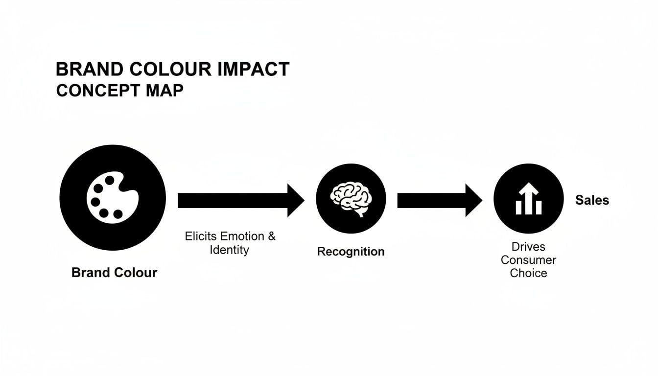
As you can see, getting the colour right is the first step in a chain reaction that builds brand recognition and drives real commercial results.
Blue: The Trustworthy Professional
Blue is the corporate world’s equivalent of a firm handshake. It’s overwhelmingly associated with trust, stability, and competence. Just think of the reassuring blue of the NHS logo or the confident branding of financial giants like Barclays and tech companies like Meta.
This colour sends a message of calm and reliability, making it a fantastic choice for any business where building deep customer confidence is non-negotiable. It suggests security and professionalism, which is why you see it so often in sectors where trust is everything.
The only catch? Its popularity means you can risk looking a bit conventional or blending into a sea of competitors. An over-reliance on cool, dark blues can sometimes feel a bit cold or impersonal if not handled with care.
Red: The Energetic Pioneer
Red is a colour that simply refuses to be ignored. It’s bursting with energy, passion, and excitement. From the iconic red of a London bus to the bold branding of Virgin, red creates a sense of urgency and serves as a powerful call to action.
It's a potent choice for brands wanting to appear dynamic, bold, and ahead of the curve. Food and retail brands often use it to stimulate appetite and create a buzz around sales. For a small business, a touch of red can make a "Buy Now" button or a special offer feel unmissable.
But there’s a flip side. Red can also signal danger or aggression. You have to use it wisely to avoid overwhelming customers, especially in fields like healthcare or wellness where a calm, measured tone is essential.
It’s easy to underestimate the power of a first impression. A study on product judgements found that up to 90% of snap decisions can be based on colour alone. That’s how much weight a single hue carries.
To really get to grips with how these associations work, it's worth exploring the principles of color psychology for branding. Understanding this will help you make choices that are not just visually appealing but also strategically powerful.
Green: The Naturalist and The Grower
Green is a versatile colour with two distinct personalities. On one hand, it's the undisputed colour of nature, health, and tranquillity. Brands like Holland & Barrett use it perfectly to communicate their organic, sustainable, and wellness-focused ethos.
On the other hand, green is strongly linked to wealth, prosperity, and growth. This makes it a great fit for financial services or investment firms looking to project success. It neatly bridges the gap between the seriousness of blue and the optimism of yellow.
Just be mindful of the specific shade, as its meaning can change dramatically. A bright, zesty lime green feels modern and energetic, whereas a deep forest green feels more traditional and established. A dull, olive green, however, can sometimes carry negative associations.
Yellow: The Optimistic Innovator
Yellow is pure sunshine. It’s the colour of happiness, optimism, and creativity. It’s bright, cheerful, and grabs your attention with its friendly, accessible energy. Brands like IKEA and McDonald's use it to feel welcoming and approachable.
This colour is ideal for businesses that want to project positivity and innovation. It can make a brand feel youthful and fun, cutting through the visual clutter with its inherent brightness.
Use it carefully, though. A pure, bright yellow can be tiring on the eyes, especially on screens. In some contexts, it can also be associated with caution tape or even a "cheap" feel, so it’s important to balance it with other colours and strong design to maintain a polished image.
A Quick Guide to Colour Associations
Here's a simple breakdown of what other common colours can say about your brand.
Orange (The Confident Motivator): A blend of red's energy and yellow's friendliness. Orange feels vibrant, adventurous, and confident—think Sainsbury's or easyJet. It’s fantastic for calls to action and for brands aiming to be fun and approachable.
Purple (The Luxurious Creative): With historical ties to royalty, purple communicates luxury, wisdom, and creativity. Cadbury’s rich purple is a classic example, signifying quality and indulgence. A great choice for premium products or creative services that need a sophisticated edge.
Black (The Sophisticated Powerhouse): Black is the ultimate in sophistication, power, and elegance. High-end fashion, tech, and luxury car brands use it to create a feeling of exclusivity and authority. It also makes other colours pop, giving them centre stage.
White (The Clean Minimalist): White stands for simplicity, cleanliness, and modernity. Tech companies like Apple have used it masterfully to create a sense of effortless style. In design, white space is vital—it improves readability and gives your design elements room to breathe.
Going Deeper: Colour, Culture, and Accessibility
While understanding the general emotions colours evoke is a great place to start, it's really just scratching the surface. A professional brand can’t rely on broad strokes. Colour isn't a universal language; its meaning is deeply shaped by culture, context, and personal experience. What feels trustworthy in one country might send a completely different signal in another—a critical detail for any business with big ambitions.
And there's an even more fundamental layer: accessibility. What good is a beautiful colour palette if a huge part of your audience can't actually read your message? This is where we move beyond theory and into the crucial, practical details of building a brand for everyone.
Navigating the Global Colour Map
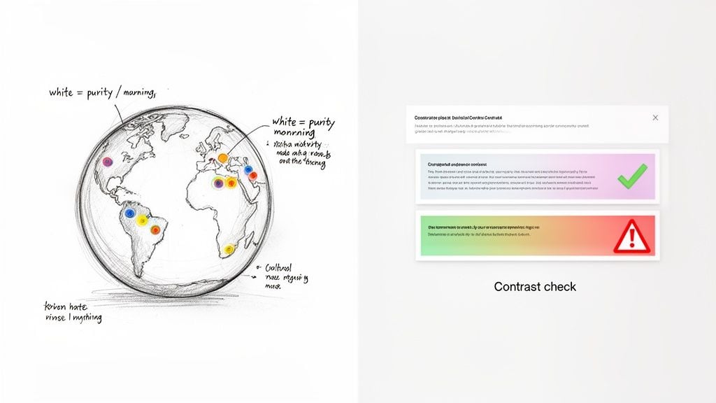
The symbolism of a colour can shift dramatically from one border to the next. For brands selling internationally, or even just operating in the UK's diverse communities, getting this wrong can lead to some awkward missteps and turn customers away before you've even said hello.
Take white, for instance. In Western cultures, it often speaks of purity and clean, minimal design. But in many East Asian countries, it's the traditional colour of mourning. Red can mean luck and fortune in China, yet it’s associated with grief in South Africa.
This all boils down to one of the most important rules in branding: context is king. Your colours don't exist in a vacuum; they interact with the real-world experiences and cultural backgrounds of your audience.
Putting Accessibility First with WCAG
Beyond cultural awareness is a responsibility that every modern brand must take seriously: digital accessibility. A stunning website that isn’t accessible is, quite simply, a failed design. It can't do its most important job—communicating with people.
The gold standard for this is the Web Content Accessibility Guidelines (WCAG). These guidelines are all about making the web usable for people with disabilities, including various forms of colour blindness or low vision. For your brand's colours, the most important idea from WCAG is colour contrast.
Simply put, this is the difference in brightness between a foreground element (like your text) and its background. Low contrast makes things difficult or even impossible to read for many people. Good contrast, on the other hand, means your message is clear and welcoming to all.
Your Actionable Accessibility Checklist
Making your brand accessible isn't a complex, technical hurdle. It's a straightforward, respectful habit to build into your design process. Here’s a quick-start list to get it right:
- Aim for the Right Ratios: For regular-sized text, WCAG requires a contrast ratio of at least 4.5:1. For larger text (like headings), the minimum is 3:1.
- Use Free Contrast Checkers: Search for "colour contrast checker" online. These free tools instantly tell you if your text and background colours pass WCAG standards.
- Test All Key Elements: Don’t just check body text. Test your buttons, navigation links, form labels, and any text that sits on an image. Every word counts.
- Don’t Rely on Colour Alone: Never use colour as the only way to signal something important. For example, if a form error is only shown in red text, someone with colour blindness might miss it. Add an icon or make the text bold to provide a second visual cue.
By taking these simple steps, you show that your brand genuinely cares about every single customer. If you’re keen to learn more about creating inclusive platforms, a great next step is to explore the principles of understanding web design. An accessible brand isn't just an ethical choice; it's smart business that opens your doors to a wider audience and builds deep, lasting trust.
How Leading UK Brands Master Colour Psychology
Theory is one thing, but seeing how colour psychology actually works in the wild is where the real lessons are. The best way to learn is to look at what the pros are doing. Let’s break down how a few top UK brands have used deliberate colour choices to become household names, giving you a clear blueprint to follow.
These aren't just happy accidents. They are calculated decisions that shape how we feel about a brand from the moment we first see it. By digging into these examples, we can move from abstract ideas to practical action.
Lush: The Minimalist Hero
Walk past a Lush store, and what grabs your attention? It’s not the logo or the shopfront. It's the explosion of vibrant, fizzing colours inside the store. This is a masterclass in using contrast.
Lush builds its core brand around a stark, simple black and white palette. The plain black logo on a white background doesn't shout; it whispers. It’s a quiet, confident stage that lets the products do all the talking.
The Message: This monochrome scheme sends a clear signal of simplicity, honesty, and a no-frills attitude. It’s the visual equivalent of their promise of raw, fresh, handmade ingredients without any unnecessary fluff.
The Result: By letting the rainbow of bath bombs, soaps, and jellies be the stars of the show, Lush creates a visual feast that’s hard to resist. The understated branding makes the products feel more authentic and special, turning their shops into sensory playgrounds that invite you to touch, smell, and ultimately, buy.
Pink: The UK’s Surprising Power Colour
Often pigeonholed as soft or gentle, pink has become a surprisingly potent and strategic choice in the UK, especially for retail and hospitality brands. It's a way to stand out, create an uplifting atmosphere, and break away from the sea of corporate blues and greens.
Pink can signal joy, energy, and even a bit of playful rebellion. It's a fantastic tool for any business that wants to wrap its customers in a feeling of positivity. Simply put, it's a colour that makes people feel good—a powerful edge in today's experience-driven market.
A fascinating UK survey really highlights this. An incredible 82% of people linked the colour pink with joy, and 49% said it made them feel more energised.
This emotional pull has a direct impact on business. The same study showed that 76% of people felt a noticeable energy boost in restaurants that used a pink palette. If your business is all about the customer experience, those are numbers you can’t afford to ignore, as you can see from the full branding research findings.
Your Actionable Colour Blueprint
Learning from these brands doesn’t mean you should just go out and paint your shop pink or switch to a black-and-white logo. The real takeaway is to start thinking strategically. How can your colour choices help you stand out, or better yet, perfectly frame what you sell?
Here’s a quick guide to get your thought process started.
Find Your Visual Hero: Are your products themselves visually stunning, like Lush's? If so, think about a neutral brand palette (black, white, greys) that lets them take centre stage. It tells your customers, "the product is the main event."
Define the Core Feeling: What's the one emotion you want customers to feel? Do you want them buzzing with energy (like the pink effect), or do you want them to feel calm and safe? Pick a primary brand colour that directly connects to that feeling.
Use Contrast to Guide the Eye: Your brand colours should work together to make your call-to-action—whether that's a product on a shelf or a "Buy Now" button online—pop. A bright, contrasting accent colour is perfect for this. You can see some brilliant examples in our portfolio of branded packaging designs.
Think About the Environment: Consider where your customers will actually encounter your brand. A lively café could use warm, energetic colours to create a social buzz, while a therapist’s website would lean on calm, cool tones to build a sense of trust and security from the first click.
When you start thinking this way, colour stops being just decoration. It becomes one of your hardest-working business assets.
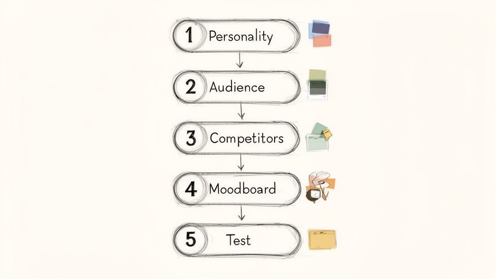
Your 5-Step Process for Choosing a Powerful Brand Palette
Knowing what colours mean is one thing. Actually choosing a palette that works for your business? That's where things get tricky. It's so easy to just pick colours you personally like, but that's a shot in the dark, not a strategy.
To get this right, you need a repeatable process. We've honed our approach over the years into a simple, five-step roadmap. Follow this, and you’ll build a brand palette that doesn't just look good, but does the heavy lifting of connecting with the right people and helping you hit your goals.
Step 1: Define Your Brand Personality
Before you even glance at a colour wheel, you need to know who your brand is. If your brand walked into a room, what would people think? What kind of personality would it have? Your colours are the quickest way to communicate that vibe.
So, start by brainstorming. Scribble down a list of adjectives that capture the feeling you want your brand to give off. Are you all about trust and security, or do you bring energy and excitement?
Think of your brand as a character in a story. Its personality dictates its every action, word, and, most importantly, its appearance. Getting this right is the foundation for every other decision you’ll make.
A few questions to get you started:
- Is my brand serious and professional, or is it more playful and approachable?
- Are we trying to look innovative and modern, or traditional and established?
- Is our core message about luxury and sophistication, or affordability and value?
Aim to nail down three to five core personality traits. These words become your compass, guiding every choice you make from here on out.
Step 2: Identify Your Target Audience
This is crucial: your brand colours aren't for you. They’re for your customers. A palette that resonates with young, tech-savvy founders will almost certainly miss the mark with retirees looking for financial advice.
Of course, there are generalisations out there—research suggests men might lean towards bolder colours while women respond to softer tints—but context is everything. Don't get too bogged down in stereotypes.
Instead, focus on the emotional world of your ideal customer. What are they looking for when they find you? Reassurance? Inspiration? A simple solution to a frustrating problem? Your colours should meet them where they are, making them feel instantly understood.
Step 3: Analyse Your Competitors
In a crowded market, the goal is to stand out, not blend in. A quick audit of your competitors' brand colours is one of the smartest moves you can make to find your own unique spot.
Create a simple gallery. Take screenshots of the logos and homepages of your top five competitors and lay them out. You’ll probably spot a pattern pretty quickly. Entire industries often default to the same one or two colours—just think of all the blue in finance and tech.
This is your opportunity. There’s a psychological principle called the Isolation Effect, which basically says that an item that looks different from its peers is much more likely to be noticed and remembered. If everyone else is blue, a warm, energetic orange or a natural, trustworthy green could make your brand instantly memorable. The aim isn't just to be different; it's to be distinctive.
Step 4: Build and Test a Colour Mood Board
Alright, now for the fun part. A mood board is simply a visual scrapbook—a collection of images, textures, and colours that together capture the feeling of your brand.
Start gathering inspiration from everywhere. Photography, art, nature, interior design—anything goes. Save images that just feel right based on the personality traits you defined back in Step 1. Don't just look at other logos; focus on the overall mood.
Once you’ve got a good collection, start pulling colours directly from those images. Identify a few dominant shades that could work as your primaries, and then find some complementary accent colours. Play around with different combinations. Do they feel right together? More importantly, do they reflect the brand personality you're building?
Step 5: Test, Refine, and Finalise
You should now have a shortlist of one to three potential palettes. The final, critical step is to get some outside perspective before you lock anything in. It's incredibly easy to fall in love with your own ideas, but feedback is gold.
Show your top palettes to a small group of people who fit your target audience profile. But don't just ask, "Which one do you like best?" That's a beauty contest. You need to ask questions that reveal their perception:
- "Which of these brands would you trust more with your finances?"
- "Which of these cafés looks more fun and energetic?"
- "Based on these colours, what kind of service would you expect from this company?"
Their answers will tell you whether your colours are sending the right signals. Use that feedback to make your final choice. For a small business, getting this right is a huge advantage, and professional graphic design services can be invaluable in making sure your final palette is both beautiful and built to perform.
Frequently Asked Questions About Brand Colours
You’ve got the theory down, you’ve seen how the big brands do it, and you’ve even started mapping out a strategy. But when it comes to the crunch, a few practical questions always seem to pop up. Let's get them answered so you can move forward with your brand palette feeling completely confident.
How Many Colours Should My Brand Palette Have?
A brilliant starting point, borrowed from the world of interior design, is the 60-30-10 rule. It’s a simple way to create a palette that feels balanced and professional, never messy or chaotic.
60% Your Primary Colour: This is the heart of your brand's visual identity. It’s the dominant colour you’ll use on things like website backgrounds or your main packaging. It sets the whole mood.
30% Your Secondary Colour: This colour is there to support the primary one. It provides contrast and breaks things up, making it perfect for subheadings, info boxes, and secondary graphics.
10% Your Accent Colour: Think of this as your secret weapon. It’s a pop of colour used sparingly to grab attention for the most important things – think "Add to Cart" buttons, special offers, or crucial icons.
This isn’t a rigid law, but it’s a fantastic framework for making sure everything looks harmonious.
What If My Taste Conflicts With the Best Colour?
This is a classic dilemma, and it happens all the time. You might personally adore a deep, moody charcoal grey, but if you’re opening a fun-filled soft play centre for children, your own taste is fighting against your brand’s actual mission.
When this happens, the answer is simple, but it takes discipline: your audience comes first.
Your brand colours aren't for you. They are a powerful communication tool, chosen specifically to connect with the people you want to reach. Great branding makes your customer feel seen and understood.
Always bring it back to your brand personality and the audience you defined. If your research points to a colour you wouldn't paint your own living room, trust the strategy. The goal here is to build a successful business, and that means making smart, customer-focused decisions.
Can I Change My Brand Colours Later?
Technically, yes, you can. But it’s a huge deal and should never be a casual tweak. Changing your core colours is a rebrand, and it comes with some serious risks—the biggest being that you could undo all the brand recognition you’ve worked so hard to build.
A rebrand really only makes sense when your business has gone through a fundamental change. Maybe you’re pivoting to a whole new market, your mission has evolved, or your original colours just look dated and out of sync. When you see giants like Instagram or eBay overhaul their colours, it's a massive, calculated move designed to signal a new era for the company.
How Should Colour Use Differ Between a Logo and a Website?
Your logo and your website are different tools in your marketing toolbox, and they use your colour palette in very different ways.
Your Logo: This needs to be clean, memorable, and incredibly versatile. It will likely only feature one or two of your brand colours. Crucially, it has to work perfectly as a single-colour version (all black or all white) for things like watermarks or printing on tricky surfaces.
Your Website: This is where your full 60-30-10 palette gets to shine. Your primary colour might form the backdrop of your main homepage banner, the secondary colour might be used for testimonial sections, and that punchy accent colour is reserved for the "Book a Demo" or "Buy Now" buttons that you need users to click.
Here’s a good way to think about it: your logo is the short, sharp signature, while your website is the full, detailed letter explaining who you are.
Ready to create a brand identity that not only looks professional but also drives results? At DesignStack, we specialise in crafting strategic branding and web design for businesses in Dorset and across the UK.


Leave a Reply