
What is User Experience Design? A UK Business Guide
You’re probably here because your website exists, but it isn’t pulling its weight. People visit, look around for a few seconds, and leave. Enquiries feel patchy. Online sales don’t match the effort you’ve put in. Or perhaps you’re about to commission a new site and you keep hearing terms like UX, UI, wireframes, journeys, prototypes, and conversion optimisation.
Most small business owners don’t need jargon. They need a clear answer to one question. What is user experience design, and how does it help the business grow?
The short answer is this. User experience design is the practice of making your website easier, clearer, faster, and more useful for the people you want to reach. When it’s done properly, visitors don’t have to work hard to understand what you offer, where to click, or what to do next. That usually leads to more trust, more action, and fewer lost sales.
Beyond Aesthetics The True Meaning of User Experience
A Dorset business owner pays for a smart-looking website, launches it, and waits for more enquiries. Traffic arrives. Sales do not. In many cases, the problem is not the brand, the offer, or even the visual design. The problem is that the site makes people work too hard.
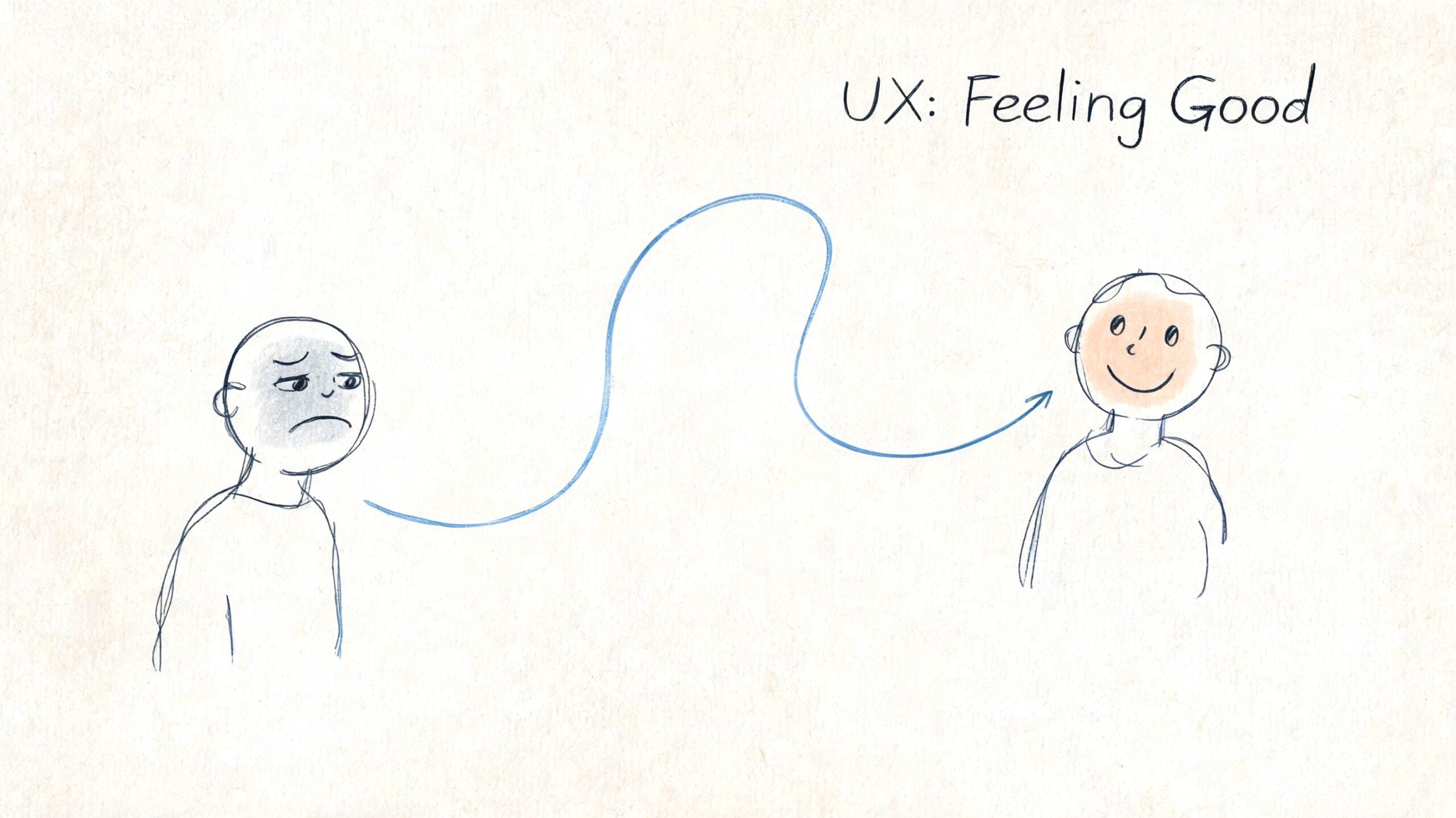
That is the meaning of UX. User experience design is the way your website helps people understand, trust, and complete a task without friction. It covers what they see, what they expect, how quickly they find answers, and whether the next step feels obvious enough to take.
A physical shop makes this easy to spot. If customers can find the entrance, understand the layout, get answers fast, and pay without delay, more of them buy. The same logic applies online, except the cost of confusion shows up faster. People leave, search for a competitor, or abandon the basket.
What people feel when UX is working, or failing
Visitors do not describe websites in design terminology. They describe effort, doubt, and delay.
They say things like:
- I can’t find the price
- I’m not sure this business is right for me
- Why is this taking so long on my phone?
- This form asks for too much
- I’ll do it later
For a small business, each of those reactions has a financial cost. Poor UX reduces conversion rates. It can also weaken SEO performance if users bounce quickly, fail to engage with key pages, or return to search results because the page did not meet their needs. Good UX supports both visibility and conversion. That is why it matters to profit, not just presentation.
A strong user experience usually depends on a few basics working together:
- Useful content. The page answers the question the visitor came with.
- Clear paths. People can move from interest to action without guessing.
- Fast performance. Pages load quickly, especially on mobile connections.
- Accessible structure. More people can use the site with screen readers, keyboards, or zoom tools.
- Consistent patterns. Buttons, labels, forms, and calls to action behave the way people expect.
At DesignStack, we often see the same trade-off. Businesses invest heavily in branding and page visuals, then underestimate how much revenue is lost through unclear journeys, weak service-page structure, or forms that ask for too much too early. The site looks polished, but it does not convert as well as it should.
Why UX reaches beyond usability
UX shapes how reliable your business feels. A confusing website makes a capable company look disorganised. A clear, calm experience makes people more willing to enquire, buy, or return.
It also affects who feels included. If your wording is vague, your contrast is poor, or your messaging ignores different audiences, you create friction before a conversation even starts. That is one reason content and interaction choices need care, not just style. For a useful example of messaging risks, this guide on avoiding cultural insensitivity in tech is worth reading.
Good UX also supports long-term growth. Clear page structure helps users find what they need. It also helps search engines understand your content. Faster pages, clearer intent, and better task completion can improve both rankings and revenue over time. If you want a broader view of how user experience fits into modern website planning, this guide to crafting digital experiences through web design explains the wider context well.
A website can look polished and still underperform. If it does not help the right customer take the right next step, the design is not doing its job.
UX vs UI The Crucial Difference for Your Business
Business owners often use UX and UI as if they mean the same thing. They’re connected, but they’re not interchangeable.
UX is the structure and logic of the experience. UI is the visual layer people interact with. If you’re planning a new website, understanding that difference helps you spend money in the right place.
The house analogy that actually works
A simple way to separate them is this:
| Area | UX | UI |
|---|---|---|
| Main role | How the site works | How the site looks and feels |
| Equivalent in a house | Floor plan and room layout | Paint, lighting, furniture |
| Business question | Can people complete tasks easily? | Does the presentation support trust and clarity? |
| Typical outputs | User flows, wireframes, page structure | Colours, typography, buttons, icons |
A beautiful interface on top of poor UX is like fitting a stylish kitchen into a house with a bad layout. It may look impressive in photos, but living in it becomes irritating very quickly.
What goes wrong when businesses confuse them
This happens a lot on website projects. A business asks for a site that feels “clean and premium”, which is a fair goal. But if no one addresses page hierarchy, navigation, mobile flow, or the enquiry process, the finished site can still underperform.
Common examples include:
- A sleek homepage with no obvious next step
- Well-designed service pages that bury key information
- Strong branding paired with awkward mobile menus
- Attractive product pages with a clumsy checkout path
That’s why visual design should support the experience, not replace it.
If you want a broader look at how visual design and digital usability work together, this article on crafting digital experiences through web design is a useful companion read.
UI can improve first impressions. UX determines whether those impressions survive contact with real use.
What this means for budget and decision-making
If your current website looks dated but still works logically, a visual refresh might be enough. If people can’t find information, struggle to complete forms, or drop off on mobile, the issue is deeper. In that case, polishing the interface alone won’t solve much.
For a small business, that distinction matters because it changes the brief:
- If the problem is appearance, you’re mostly discussing brand presentation.
- If the problem is performance, you need someone to review the customer journey.
- If the problem is both, the project needs proper sequencing so structure comes before styling.
That’s the practical answer to the UX vs UI debate. UX decides whether the website is useful. UI decides how that usefulness is presented.
The Five-Stage UX Design Process That Drives Results
A Dorset business owner usually sees the problem before they see the process. Traffic looks healthy, but enquiries stay flat. Product pages get visits, but baskets are abandoned. Rankings improve, yet sales do not follow at the same rate.
That gap is where UX earns its keep.
A five-stage UX process helps a business find where revenue is leaking before more budget goes into design or development. The standard model is empathise, define, ideate, prototype, and test. Used properly, it reduces guesswork, improves conversion paths, and supports SEO by making pages easier to use, easier to understand, and easier to act on.
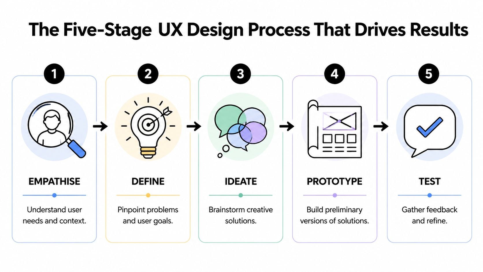
Empathise
Research starts with behaviour, not opinions.
The aim is to understand what customers are trying to do, what slows them down, and what persuades them to continue. For a local retailer, that may mean reviewing mobile journeys, checking internal search terms, reading support emails, and comparing landing pages with the pages that convert. For a service business, it often means looking at how people move from Google search to service page to contact form, then spotting where they hesitate or leave.
If you want a useful starting exercise before any design work begins, it helps to map your customer experience. That gives the business a clearer view of the moments that affect trust, enquiries, repeat purchases, and customer loyalty.
Define
This stage turns research into a business problem worth fixing.
Good teams write the issue in plain English. Examples include: users cannot find delivery information quickly enough to complete a purchase, mobile visitors struggle to compare service options, or category pages attract search traffic but fail to move people toward checkout. That level of definition changes the quality of decisions because the team is solving a specific commercial problem instead of discussing vague ideas about making the site feel more modern.
I see this stage save clients money more often than any other. If the underlying issue is poor product filtering or an unclear quote request path, a visual refresh alone will not improve much.
Ideate
Once the problem is clear, solution work becomes more disciplined.
The structure takes shape as teams review page hierarchy, content order, navigation labels, search behaviour, calls to action, and the route from landing page to conversion. For eCommerce sites, that may include category logic, filter design, product detail layouts, cart behaviour, and checkout steps. For service businesses, it may centre on trust signals, pricing cues, page scannability, and enquiry flows.
A useful benchmark is whether the idea supports both discovery and action. If a page is meant to rank in search but gives visitors no clear next step, it may help SEO visibility while underperforming commercially. Our advice on running a successful online store with stronger eCommerce performance covers many of these practical conversion considerations.
Strong UX ideas usually remove friction from a buying journey that was already trying to happen.
Prototype
Prototype work lets a business check the logic before paying to build the full thing.
That matters because changes are cheaper here. Reworking a wireframe takes hours. Reworking a developed template after content, integrations, and approval rounds are in place can take days or weeks. For a small business with a fixed budget, that difference is not academic. It affects launch dates, development cost, and the amount of scope left for improvements that increase revenue.
Prototype work often includes:
- Low-fidelity wireframes for layout, hierarchy, and page flow
- Clickable journeys for tasks such as checkout, booking, quote requests, or sign-up
- Realistic content prompts so the team tests actual messaging, not filler copy
- Desktop and mobile comparisons to check where layout priorities need to change
Test
Testing checks whether the proposed journey works for the people expected to use it.
It does not need to be expensive or complicated. For many UK SMEs, a short round of task-based testing with representative users is enough to expose the biggest blockers. Ask someone to find a product, compare options, book a service, or complete an enquiry. Then watch where they pause, backtrack, or lose confidence.
The value is practical. Testing often reveals missed details that affect revenue directly: labels that are too vague, forms that ask for too much, product pages that hide delivery terms, or mobile layouts that bury the call to action. Those issues are much easier to correct before launch than after a drop in conversion rate shows up in reporting.
A practical checklist for business owners
If you are reviewing a UX project or hiring an agency, look for signs that the process is tied to outcomes rather than presentation alone:
- Research happened before solutions were proposed
- The problem is written clearly in business terms
- SEO landing pages and conversion pages are considered together
- Wireframes or prototypes appear before polished design
- Key journeys are tested before launch
- Mobile behaviour gets proper attention
- Feedback leads to revisions, not just a report
- Post-launch measurement is part of the plan
That is the five-stage process in its useful form. It helps a business avoid building pages that rank but do not convert, or redesigning a site that still fails to turn visits into sales.
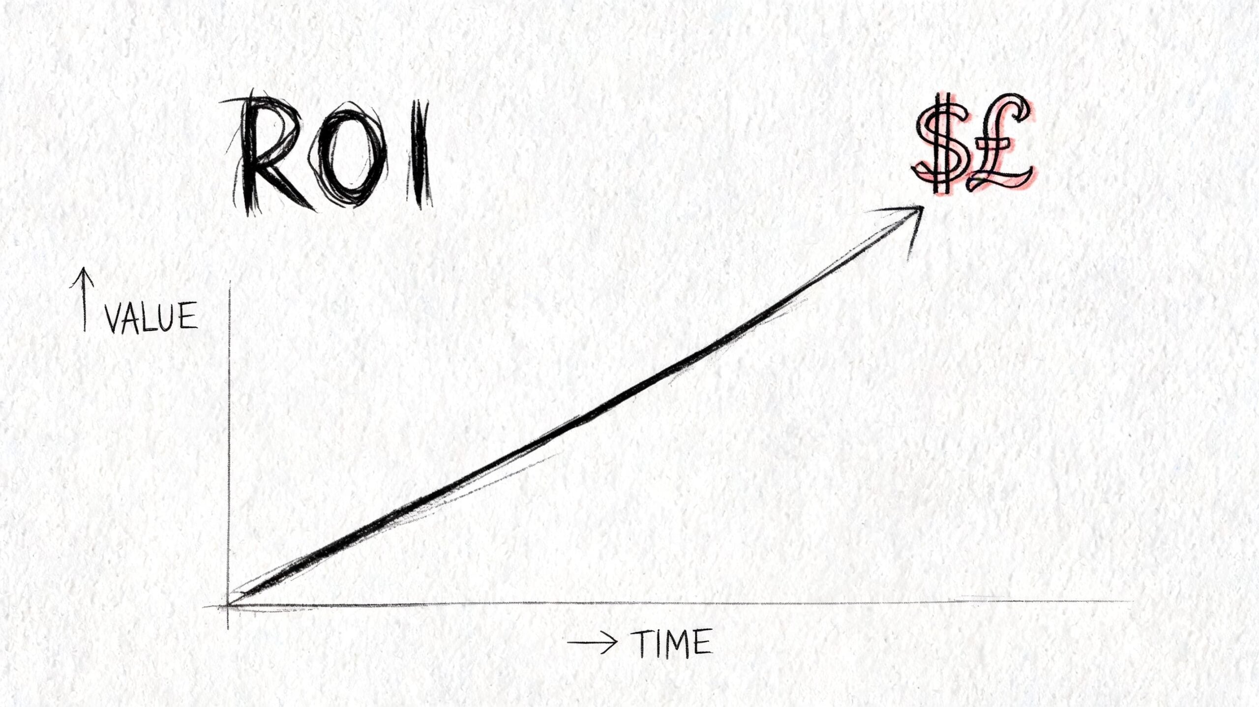
How Good UX Design Boosts Your Bottom Line
A Dorset shop owner can spend months improving rankings, adding products, and posting on social media, then still watch online sales stall. In practice, the problem is often not demand. It is friction between arrival and action.
For a small business, UX earns its place when it improves revenue, lead quality, repeat custom, and the cost of acquiring each customer. Poor UX drains margin in quieter ways. It wastes paid traffic, depresses conversion rates, increases support queries, and gives hesitant buyers a reason to leave before they commit.
Where revenue leaks usually happen
The losses rarely come from one dramatic failure. They come from small points of resistance across the journey.
A product page answers only part of the buyer’s questions. The mobile menu takes too many taps. The enquiry form asks for budget, phone number, and full project details before trust is built. A slow page delays the next step. A button looks clickable but does nothing.
Each issue sounds minor on its own. Together, they lower the number of people who buy, book, or enquire.
I see this often on SME websites. Owners focus on getting traffic through SEO or ads, but the commercial problem sits further down the funnel. If the experience creates doubt at the point of decision, more traffic means more lost opportunities.
UX, SEO, and conversion affect the same result
Small businesses often treat SEO, design, and conversion work as separate budgets. On a real site, they overlap.
Search visibility depends partly on experience signals such as speed, mobile usability, and page structure. Conversion depends on many of those same things, plus clarity, trust, and ease of action. If category pages are hard to scan, if service pages bury the next step, or if key information sits too far down the page, rankings can suffer and sales can suffer with them.
That is why UX work should be judged against commercial outcomes, not taste. A page that attracts visits but fails to turn them into orders is underperforming. A page that converts well but attracts no traffic is underperforming too.
For online shops, this connection is even tighter. Product discovery, filtering, stock visibility, delivery information, and checkout flow all shape whether search traffic becomes revenue. Our guide to running a successful online store covers the operational side of that equation, but the design side matters just as much.
What measurable UX work usually involves
Useful UX improvements tend to be specific and testable:
- Reducing form friction: removing unnecessary fields, improving label clarity, and ordering questions logically
- Improving call-to-action visibility: especially on mobile product pages, landing pages, and service pages
- Fixing content hierarchy: putting pricing, delivery, trust signals, and next steps before decorative sections
- Reviewing user behaviour: using analytics, heatmaps, and session recordings to spot hesitation, exits, and repeated failed clicks
- Improving accessibility and responsive behaviour: helping more people complete tasks successfully on more devices
Here’s a useful explainer before the video below.
The trade-off is straightforward. A visually striking redesign can make a business feel modern, but appearance on its own rarely improves profit for long. The stronger return comes from removing friction in the journeys that make money, then measuring what changed in conversion rate, average order value, enquiry quality, and repeat purchases after launch.
UX Design in Action Real-World UK Business Scenarios
Theory becomes clearer when you put it inside a business problem. Here are two realistic examples based on the kinds of issues UK firms run into.
A Dorset retailer with mobile friction
A local retailer has a decent-looking WordPress shop, but sales from mobile users feel weak. The owner assumes the issue is traffic, yet product pages are getting visits. The problem sits lower down.
On review, the site shows several classic UX issues. Category pages are cluttered. Product information is pushed too far down. Delivery details are hard to find. Buttons compete for attention. On mobile, the menu feels cramped and the basket path isn’t obvious.
The fix isn’t dramatic. It’s structural. Navigation is simplified. Product pages are reorganised around the questions shoppers usually ask. Calls to action are made clearer. Checkout steps are reduced and reassurance content is moved closer to decision points.
The result is a smoother buying journey. Customers don’t need to “figure out” the shop before they can buy from it.
A professional services firm with weak enquiries
A second example is a UK services business. The team does solid work, but the website doesn’t generate enough useful leads. Visitors land on service pages, skim, then disappear.
This usually isn’t because the business lacks expertise. It’s because the site asks people to do too much interpretation. The navigation is broad, the copy is vague, and the call to action arrives before the page has built enough confidence.
A UX-led redesign would usually tighten the service structure, clarify what each service is for, add trust signals in the right places, and make the next step feel smaller and safer. Instead of one generic “contact us” prompt, the site might guide users towards a consultation request, a project discussion, or a direct enquiry based on intent.
When enquiries improve, it’s often because the website stopped behaving like a brochure and started behaving like a salesperson.
Neither of these examples relies on flashy design. They rely on reducing uncertainty. That’s where UX earns its value.
Hiring a UX Agency What to Expect from Your Partner
A Dorset business owner usually spots the problem before they know to call it UX. Traffic is coming in, but too few people buy, book, or enquire. The site may look polished, yet key pages underperform. A good agency helps you find where money is being lost, decide what to fix first, and turn those decisions into measurable gains in conversion rate, lead quality, and repeat custom.
That is the standard to use when you hire. You are not paying for page visuals on their own. You are paying for clearer customer journeys, fewer drop-offs, stronger search performance from a better site structure, and a website that does more sales work without adding headcount.
The deliverables you should expect
A proper UX project produces working evidence, not just polished screens. The exact mix depends on scope, but most small business website projects should include some version of the following.
| Deliverable | Purpose | Stage |
|---|---|---|
| User interviews or research notes | Understand customer needs, objections, and behaviour | Empathise |
| Analytics review | Identify drop-offs, weak pages, and friction points | Empathise |
| User journeys | Map how people move from arrival to action | Define |
| Sitemap or information architecture | Organise pages and navigation logically | Ideate |
| Wireframes | Show layout, content priority, and task flow | Prototype |
| Interactive prototype | Let people test journeys before development | Prototype |
| Usability findings | Capture what users struggled with and what changed | Test |
| Revision rounds | Refine the design based on feedback and business goals | Test and refinement |
If an agency jumps straight into homepage concepts, ask what those layouts are based on. For a small eCommerce business, the answer should relate to product discovery, basket flow, mobile behaviour, and search intent. For a lead generation site, it should relate to trust, service clarity, and the path from landing page to enquiry.
What communication should feel like
Good agency communication is clear, steady, and tied to decisions. You should know what is being worked on, what feedback is needed, and how each recommendation connects to business performance.
Look for a partner who provides:
- Clear milestones: so you know when research, wireframes, design, and build work happen
- Reasoned recommendations: linked to user behaviour, not personal taste
- Regular updates: enough to stay informed without turning the project into a meeting cycle
- A defined revision process: so feedback is structured and scope stays under control
- Post-launch support: because real user behaviour often reveals the next round of improvements
For businesses weighing up suppliers, a clear website design service for UK businesses should explain scope, outputs, and support before any proposal is signed.
Fixed project or ongoing retainer
Both models can work. The right choice depends on whether you need a rebuild or a programme of improvement.
A fixed-cost project suits a business with a defined goal, such as replacing an outdated brochure site, restructuring a service website, or improving an online shop with known friction points. It gives budget clarity and a clear delivery window.
An ongoing retainer suits a business that wants to keep improving performance after launch. That often includes landing page tests, form improvements, checkout refinement, content changes shaped by search demand, and regular UX reviews against conversion data.
UX return rarely comes from one big reveal. It often comes from a series of smaller fixes that remove friction at profitable points in the journey. A better category structure can help rankings. Better internal linking can increase page discovery. Clearer product pages can lift add-to-basket rates. Shorter forms can improve lead volume without lowering quality.
Questions worth asking before you hire
The best questions are commercial, not decorative.
- How do you identify the main UX problem before designing?
- What happens before visual design starts?
- How do you test ideas before build or launch?
- How do you handle revisions and feedback?
- What happens after the site goes live?
- How do you balance UX with SEO and conversion goals?
- How will you measure whether the project made the business more money?
Those answers tell you a lot. A design supplier talks about pages, styles, and deliverables. A strong UX partner talks about customer behaviour, trade-offs, implementation, and how the work should improve sales, enquiries, and loyalty over time.
Frequently Asked Questions About UX Design
Is UX design only for large companies
No. In many ways, smaller businesses feel the impact faster because they have less margin for wasted traffic and weaker conversion paths. If your site gets modest traffic, every lost visitor matters more.
UX is useful anywhere customers need to understand, compare, trust, and act.
Can I do UX myself with a website builder
You can improve basic usability yourself. Clearer headings, shorter forms, better page structure, and simpler navigation all help. Many businesses should start there.
The limit is usually objectivity. It’s hard to spot friction on a site you already know inside out. DIY tools also make it easy to build pages that look decent while still creating confusion in the customer journey.
What’s the difference between UX and conversion rate optimisation
They overlap, but they aren’t identical. Conversion rate optimisation focuses tightly on improving desired actions such as purchases or enquiries. UX looks at the wider experience, including usability, clarity, accessibility, trust, and satisfaction.
In practice, good UX often supports conversion work because it removes the friction that stops users acting.
Does UX matter if my business mainly gets referrals
Yes. Referred visitors still vet you online. They check the site before calling, compare you with alternatives, and look for reassurance that you’re credible and current.
A weak site can cool off warm leads. A clear one helps referral traffic convert.
How long does a UX process take
It depends on project size and complexity. A small brochure site will move faster than a large eCommerce build or a membership platform with multiple user types.
What matters more than speed is sequence. Research, structure, prototyping, and testing need enough space to be useful. Rushing straight to development usually stores problems for later.
What should I prepare before speaking to an agency
Bring the basics:
- Business goals: more sales, better leads, fewer support queries, stronger search visibility
- Existing pain points: where users seem to drop off or get confused
- Customer insight: common questions, objections, and purchase triggers
- Access to data: analytics, search data, support feedback, or sales observations
- Practical constraints: budget, timeline, internal approvals, content ownership
The clearer your starting point, the easier it is to identify where UX can help.
Is UX just for websites
No. It applies to apps, online systems, portals, booking tools, and digital services generally. If people need to complete tasks through a screen, UX is relevant.
For small businesses, the website is usually the first and most important place to get it right.
What’s one sign my site has a UX problem
If people regularly contact you to ask questions that the website should already answer, that’s a strong sign. Another is when visitors reach key pages but don’t move forward.
The issue isn’t always the offer. Often, the site isn’t presenting the offer in a way that feels clear and easy to act on.
Is accessibility part of UX or a separate issue
It’s part of UX. If someone can’t use the site properly because of weak contrast, poor structure, missing labels, or keyboard barriers, the experience has failed.
Accessibility also tends to improve clarity for everyone, not just users with specific needs.
What does good UX feel like to a customer
Usually, it feels uneventful. People find what they need, trust what they see, and complete the next step without frustration.
That’s the point. The experience supports the decision instead of getting in the way.
If your website looks acceptable but isn’t generating the sales, enquiries, or loyalty it should, a UX review is often the fastest way to find out why. DesignStack works with UK businesses on websites, branding, and digital projects where usability, SEO, and conversion need to work together rather than compete.


Leave a Reply