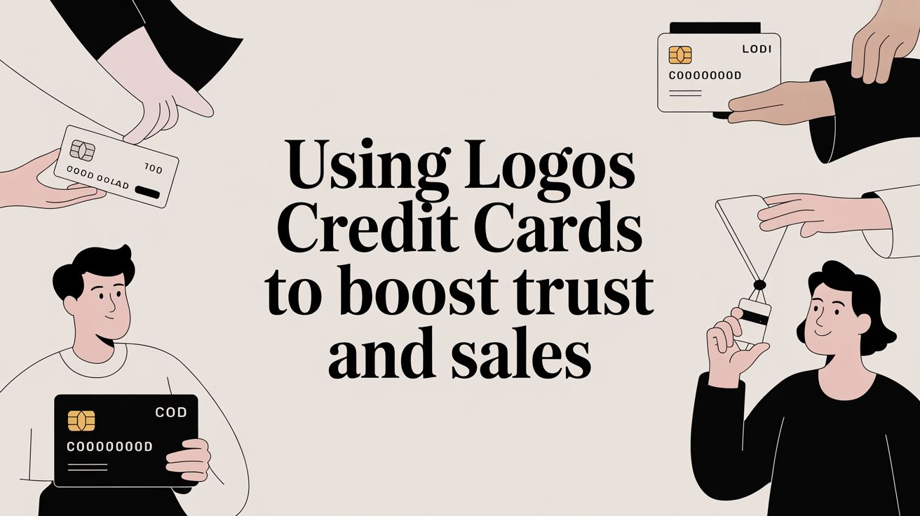
Using Logos Credit Cards to Boost Trust and Sales
Putting logos for credit cards like Visa or Mastercard on your website is one of the simplest, most effective ways to build immediate trust. These aren't just decorative icons; they're powerful psychological signals that tell your visitors the checkout is safe and legitimate. Get this right, and you can see a real drop in abandoned carts.
Why Credit Card Logos Are a Must-Have Trust Signal

Imagine a customer has just landed on your checkout page. This is the moment of truth. Every single element they see will either build their confidence or spark a little flicker of doubt. A clunky payment form or a missing familiar logo can be all it takes for them to hesitate and click away.
This is where displaying those simple logos becomes a real game-changer. These small images do more than just show what cards you accept—they act as globally recognised symbols of security and reliability.
The Psychology of Trust and Recognition
For years, people have seen logos like Visa and Mastercard every time they've paid for something online or in a shop. Seeing them on your site taps into that deep-seated familiarity, creating an instant feeling of safety. It's a non-verbal way of saying, "This is a real business, and we handle payments properly."
That reassurance is absolutely vital, especially if you're a small or new business still building your brand reputation. You're effectively borrowing credibility from these financial giants. In the UK market, this is particularly true—Visa and Mastercard process over 95% of all debit and credit card payments by value. Their logos are woven into the fabric of British consumer behaviour.
Key Takeaway: By placing these trusted marks on your site, you’re sending a clear message: "We are a professional and secure place to do business." This simple visual cue can genuinely be the difference between a completed sale and another abandoned cart.
Displaying the right logos helps customers feel secure enough to complete their purchase. This simple addition can have a significant impact on your conversion rates and overall business success.
Here's a quick look at how displaying payment logos connects directly to tangible business outcomes.
Key Benefits of Displaying Credit Card Logos
| Benefit | Impact on Your Business | Essential Logos to Include |
|---|---|---|
| Increased Trust | Reduces hesitation and builds immediate confidence in your brand's legitimacy. | Visa, Mastercard, American Express |
| Reduced Cart Abandonment | Reassures customers at the final step, lowering the chance they'll drop out. | All payment methods you accept |
| Improved Conversion Rates | A trustworthy checkout experience directly leads to more completed sales. | PayPal, Apple Pay, Google Pay (if offered) |
| Enhanced Professionalism | Signals that your business is established and adheres to industry standards. | Discover, Maestro, and other regional cards |
By thoughtfully integrating these visual cues, you are reinforcing a professional image that encourages customers to finalise their transactions with confidence.
An Actionable Checklist for Building Checkout Confidence
Of course, adding logos is just one piece of the puzzle. A dated or poorly designed website can quickly undo all the trust you're trying to build. If your site looks unprofessional, those logos might seem out of place. It’s always worth checking for the common red flags that your website needs a makeover.
To make sure you're getting the most out of these trust signals, here is an actionable list to follow:
- Display the Key Players: Show logos for major card networks you accept, such as Visa, Mastercard, and American Express. Also include digital wallets like PayPal or Apple Pay if you offer them.
- Use Official, High-Quality Logos: Only use official versions of the logos. Avoid stretching, distorting, or using low-resolution files that look blurry and unprofessional. This maintains the integrity of the trust signal.
- Place Logos in High-Impact Zones: The two most important places are your website footer (for site-wide visibility) and directly on your checkout page, right where customers are about to enter their payment details.
- Integrate Seamlessly: The logos should feel like a natural part of your site's design, not a tacked-on afterthought. A clean, organised display reinforces the professional feel you're aiming for.
Where to Find Official Credit Card Logos (and Stay on the Right Side of the Law)
It’s tempting to just grab a credit card logo from a quick Google search when you need one for your checkout page. We’ve all been there. But trust me, that's a shortcut you don't want to take. You could end up with a blurry, outdated, or legally problematic image that makes your site look unprofessional and untrustworthy.
Getting this right is simple, though. It just means going straight to the approved sources. This way, you’re guaranteed to get high-resolution files that are fully compliant with brand guidelines.
The first place I always tell clients to look is their payment processor's resource library. Whether you use Stripe, PayPal, or Adyen, they almost always provide a comprehensive media kit for merchants. These kits are absolute gold, packed with pre-approved logos for every card network they support, saving you the headache of hunting each one down.
Go Directly to the Source
If for some reason your payment processor doesn't have what you need, your next stop should be the card brands themselves. Visa, Mastercard, and American Express all have official brand centres online. These aren't just image libraries; they are dedicated portals that provide the correct assets along with crystal-clear rules on how to use them, from spacing requirements to specific colour codes.
Take a look at the download page from the official Mastercard Brand Center, for instance.
You can see they offer different versions for various backgrounds—full colour, black, and white. This is the level of detail you should be looking for. It ensures their brand mark looks exactly as it should, no matter where you place it.
Your Sourcing Checklist
To keep things straightforward and ensure you’re always compliant, here’s a simple process to follow. Think of it as a safety net that protects your business and respects the payment brands you partner with.
- Start with your payment gateway. Check their developer resources or media kits first. It's the quickest and safest route.
- Move on to official brand centres. If you can't find the logos you need, go directly to the portals for Visa, Mastercard, American Express, and others.
- Never use Google Images. It’s a lottery you’re unlikely to win. The files are often low-quality, unofficial, and you have no way of verifying their copyright status.
- Actually read the guidelines. This is crucial. Most brands have strict rules against altering their logos—no stretching, no new colours, no funky drop shadows.
- Choose the right file format. For the web, you should always grab a vector file like an SVG. They are infinitely scalable, meaning they'll look perfectly sharp on a tiny mobile screen or a massive retina display.
Following this approach ensures the logos on your website are always professional and, most importantly, legal. This kind of attention to detail goes a long way in reinforcing customer trust. In the UK, for example, a handful of major banks dominate the market. Getting the branding right for cards issued by a giant like Lloyds Banking Group, which holds £15.7 billion in credit card debt, instantly aligns your business with that established trust. It's a small detail that has a big impact on how shoppers perceive your checkout experience and the overall UK credit card market dynamics.
Preparing Logos for Optimal Web Performance

Alright, you’ve tracked down and licensed the official credit card logos. Now for a step many people overlook: prepping them correctly for your website. This isn’t just a simple upload. Getting this wrong can slow your site to a crawl, hurt your search rankings, and create a frustrating experience for your visitors — undoing all the trust you’re trying to build.
The most important decision you'll make here is choosing the right file format. When it comes to logos, there's a clear winner: SVG (Scalable Vector Graphics). Forget about old-school formats like PNGs if you can help it. SVGs are built from code, not pixels.
What does that mean for you? It means they are incredibly lightweight and look perfectly sharp no matter the screen size. From a tiny mobile phone to a huge 4K monitor, an SVG logo will stay crisp and clear, all while keeping your page load times incredibly fast.
Optimising Your Logo Files
Whether you’re working with a shiny new SVG or have to use a PNG as a last resort, you absolutely must optimise the file. Every kilobyte you can shave off adds up. Page speed is a massive factor in user experience and a known ranking signal for search engines like Google.
Before you even think about uploading, run your logos through a compression tool. It only takes a few seconds. If you're stuck with a PNG, a tool like TinyPNG works wonders, shrinking the file size without any obvious loss in quality. For SVGs, I always use SVGOMG to strip out junk code and make the file as lean as possible.
A fast-loading site isn't a luxury; it's a necessity. Studies consistently show that even a one-second delay in page load time can lead to a significant drop in conversions. Optimising your logos is a small effort with a big return.
This quick step is one of the easiest wins for ensuring your payment icons are helping, not hurting, your site's performance.
Making Your Logos Accessible
Accessibility is not an optional extra. Think about a visually impaired customer using a screen reader to navigate your checkout. They can't see the logos, so how will they know which cards you accept? This is where alt text (alternative text) is essential.
Alt text is a simple text description you add to an image's code. It's read aloud by screen readers, and it also helps search engines understand what your images are about. For payment logos, the alt text needs to be clear and functional.
Here’s a practical checklist I run through to make sure every logo is optimised and accessible:
- Go for SVG First: Always prioritise SVGs for their scalability and tiny file size. Only fall back to PNG if you have no other choice.
- Compress Every Single File: Don't skip this. Run every logo, SVG or PNG, through an online optimiser before it touches your website.
- Write Meaningful Alt Text: Avoid lazy descriptions like "logo." Be specific. Use phrases like "Visa card accepted" or "We accept Mastercard."
- Handle Groups of Logos: If your logos are in one image block, describe the whole group. For example: "Accepted payment methods: Visa, Mastercard, and American Express."
- Use Clean File Names: Give your files logical names like
visa-logo.svginstead ofIMG_0512.svg. It makes managing your site much easier and gives a tiny nod to your SEO.
Strategic Placement for Maximum Conversion Impact

So, you’ve got your official logos sorted and optimised them so they don’t slow your site down. Now for the crucial part: where do you actually put them? Just having the logos on your site isn't the whole story. Where you place them is a strategic decision that can genuinely influence a customer's journey and their confidence to buy from you.
Think of these logos as little trust signals. Placing them in the right spots at the right moments provides consistent reassurance, gently nudging a visitor from a casual browser into a confident buyer. Get this wrong, and you might find they lose their nerve before even making it to the checkout.
High-Impact Placement Zones
Imagine your website is a physical shop. You wouldn't hide the "We Accept Cards" sign behind the counter until a customer is ready to pay. You'd have it on the door, in the window, and near the till. The same logic applies online, and there are three key areas where placing logos credit cards really pays off.
An organised, thoughtful display of these symbols is a massive part of https://designstack.co.uk/maximizing-your-ecommerce-potential-tips-for-running-a-successful-online-store/. Your goal is to build a seamless path to purchase, reinforcing trust at every single step.
Here are the prime locations I always recommend for placing your payment logos:
- The Website Footer: This is your sitewide safety net. Putting the logos here ensures they’re visible on every single page, from your homepage to your blog. It’s a constant, low-key reminder that you're a legitimate business accepting secure payments.
- The Product Page: When a customer is looking at a product and thinking about buying, seeing those familiar logos can be a powerful nudge. It answers a key question—"Can I pay the way I want to?"—before it even becomes a potential hurdle, making them more likely to click "Add to Basket."
- The Checkout Page: This is the most critical spot of all. Displaying the logos right next to the payment fields is the final, powerful piece of reassurance a customer needs. It eliminates any last-second doubt and confirms they are in the right place to complete their purchase securely.
Designing the Checkout Flow
When you get to the checkout page itself, how you arrange the logos credit cards really matters. Clarity is everything. Don't just scatter them randomly. A clean, horizontal row of logos, placed either directly above or just below the card number field, is the standard for a reason—it works.
And remember, at this final stage, speed is essential. Before you upload those final logo files, make sure they’re fully optimised. Learning how to optimize images for web is a skill that will prevent customer frustration and cart abandonment when it matters most.
Pro Tip: Keep the display consistent. The logos you show at checkout should match the ones in your footer and on your product pages. This continuity builds a sense of professionalism and makes the entire payment process feel safer and more intuitive.
The evolution of UK credit card logos is also tied directly to the rise of contactless technology. By 2026, the number of contactless credit cards in use is expected to surpass 60 million. Those modern Visa and Mastercard logos, with their NFC wave symbols, now represent speed and convenience—an essential trust signal for any up-to-date website. You can find more insights on UK payment card trends on Statista.
Adding Logos to Your WordPress Site
So, you've got your official credit card logos and you're ready to add them to your website. If you’re on WordPress, you’re in luck. There are a few different ways to get this done, and most don't require you to be a coding wizard.
Let's look at the most common approaches, starting with the simplest fix and working our way up to more custom solutions.
Check Your Payment Gateway Settings First
Before you start manually uploading images, take a moment to check your payment gateway's settings. This is often the quickest win. Providers like Stripe, PayPal, or Worldpay, especially when integrated via a WooCommerce extension, frequently have a built-in feature to do this for you.
This is the best-case scenario because the plugin handles everything. It automatically displays the correct, up-to-date logos for the payment methods you’ve actually enabled.
Here’s where to look in your WordPress dashboard:
- Head over to
WooCommerce>Settingsand click on thePaymentstab. - Find your active payment gateway in the list (e.g., "Stripe") and click to manage it.
- Look for an option labelled something like "Display credit card icons," "Show accepted card logos," or "Enable payment method branding."
- Tick that box, save your changes, and then pop over to your checkout page to see the logos credit cards in action.
If you find that setting, your job is done. The gateway takes care of placement and ensures everything is current.
Manually Adding Logos to Your Footer
What if your gateway plugin doesn't have that handy option? Or maybe you want to display the logos in your website's footer for that constant, site-wide reassurance. No problem. This is where the WordPress Block Editor comes in.
The footer is a fantastic place for these trust signals since it’s visible on nearly every page of your site.
First, make sure you have your optimised SVG files ready to go. Then, in your dashboard, navigate to Appearance > Editor. From here, you can select your footer template and simply add an "Image" or "Gallery" block where you’d like the logos to sit.
Upload the logos, and don't forget to fill in the alt text for each one (e.g., "Visa accepted"). This little step is crucial for accessibility and SEO. If you're looking for more advanced ways to manage site elements, exploring the best WordPress plugins of 2023 can often uncover tools that make adding custom content to headers and footers even easier.
Key Insight: When you're adding logos manually, think about order and presentation. A clean, horizontal row usually looks best. A common, professional arrangement is Visa, Mastercard, American Express, followed by digital wallets like PayPal or Apple Pay. This layout is neat and lets customers see their preferred option at a glance.
Comparing WordPress Logo Implementation Methods
To help you decide, here’s a quick comparison of the different ways you can add logos to your WordPress site. Your choice will likely come down to your technical comfort level and how much control you want.
| Method | Best For | Technical Skill Required | Flexibility |
|---|---|---|---|
| Payment Gateway Setting | Simplicity and accuracy. The plugin does all the work. | None | Low (placement is usually fixed) |
| Manual Block Editor | Placing logos in specific areas like the footer or sidebar. | Basic (uploading images) | Medium (control over location) |
| Custom CSS | Total control over styling, spacing, and placement anywhere. | Intermediate (basic CSS knowledge) | High (complete design control) |
Ultimately, starting with your gateway settings is the easiest path. If that's not an option, the Block Editor provides a solid, code-free alternative.
Custom Placement with a Touch of CSS
For those who want granular control, a little bit of CSS is the answer. This method lets you place and style the logos exactly how you envision them, perhaps on a key landing page or within a custom-designed section. It’s a bit more technical, but it offers complete freedom.
First, add your logos using a standard Image block. In the block's settings on the right-hand side, find the "Advanced" panel and give the block a unique CSS class, like payment-logos.
Next, go to the WordPress Customiser by navigating to Appearance > Customise > Additional CSS. Here, you can write CSS rules to target your new class. For example, you could add code to perfectly align the images or adjust the spacing between them. This approach gives you pixel-perfect control without having to edit your theme’s core files directly.
Common Questions About Using Credit Card Logos
Even when you've done your homework, the rules around using credit card logos can feel a bit fuzzy. Let's tackle some of the most common questions I hear from business owners. The goal is to get you feeling completely confident about displaying these powerful trust signals.
Where Should I Get My Logos From?
This is easily the most important question, and the answer is refreshingly simple: always use official sources.
Your first stop should be the media kit provided by your payment processor. Companies like Stripe, PayPal, or Adyen offer pre-approved logo packs for merchants. They're high-quality and ready to go.
Failing that, head straight to the source. Visa, Mastercard, and American Express all have official brand centres online. These sites are the only places to find legally sanctioned logos and the strict guidelines that come with them. Whatever you do, don't just pull an image from a Google search. You could end up with an old, pixelated, or legally risky file that completely undermines the trust you’re trying to build.
Do I Need to Show Every Single Card Logo?
You’re not legally required to show a logo for every single card you accept, but from a customer experience perspective, you absolutely should. At a bare minimum, the Visa and Mastercard logos will cover most UK customers and establish a baseline of trust.
Think of it this way: if a customer is holding an Amex and doesn't see the logo, they might just assume you don't take it and head elsewhere—even if you do. By showing all your accepted payment methods, including digital wallets like Apple Pay, you remove any doubt and prevent needless cart abandonment.
A complete set of logos acts as a final, reassuring checklist for customers. It confirms that their preferred payment method is welcome, smoothing the final step of their purchase journey.
If you're using WordPress, the process usually follows one of three paths, from easy to more advanced.

As you can see, you can start with your gateway's built-in settings, use the editor for simple placement, or dive into CSS for full control over the layout.
Can I Change Logo Colours to Match My Website?
I get why people ask this, but the answer is a hard no.
The brand guidelines from all major card networks are incredibly strict on this point. You cannot alter their logos. That means no changing the colours to match your brand palette, no adding drop shadows, and no stretching or distorting the image.
The official, full-colour versions are non-negotiable for a reason. Their colours are recognised worldwide and are essential to their brand identity. Messing with them only makes your site look amateurish and less credible, defeating the whole purpose. Stick to the assets provided by official sources to keep that instant recognition factor intact.
Building a professional, trustworthy online presence is all about getting these details right. If you need help creating a website that not only looks great but is built to convert visitors into loyal customers, DesignStack is here to help. Find out more about our web design services.


Leave a Reply