Why Graphic Design Is Important for Any Business
You're probably in one of two positions right now.
Either your business is good, your customers are happy, and yet your website, brochure, packaging, or social posts don't reflect that. Or you're watching a competitor with a slicker look win attention faster, get more enquiries, and look more established, even when you know your actual service is better.
That gap is where design does its work.
Small businesses across Dorset run into this all the time. A trades business in Weymouth might do excellent work but still lose leads because its van graphics, quote PDF, and website all look like they came from three different companies. A local retailer might stock strong products but struggle online because the mobile shop feels awkward and untrustworthy. A startup might know design matters from day one, but still freeze because a full rebrand feels too expensive to tackle in one go.
That's why graphic design is important for any business. It shapes how people judge you before they speak to you, helps them remember you after they leave, and removes friction when they're ready to buy. If you want a practical starting point, this guide on how to build a brand from scratch is useful before you commission anything.
Table of Contents
- Your Business Is More Than a Product It Is a Perception
- Beyond a Pretty Picture How Design Builds Immediate Trust
- Creating a Lasting Brand Identity That Stands Out
- How Good Design Boosts Sales and User Experience
- Measuring the Real Return on Your Design Investment
- A Practical Guide to Commissioning Design for Your Business
- Your Next Step Towards Better Business Design
Your Business Is More Than a Product It Is a Perception
A customer rarely meets your business in person first now. They meet a Google result, an Instagram post, an online shop, a flyer on a counter, or a logo on a van.
That first contact does a lot of heavy lifting. If it looks polished, clear, and organised, people assume the business behind it is the same. If it looks hurried, inconsistent, or dated, they carry that feeling into everything else you say.
Many owners encounter this pitfall. They think design sits at the end of the process, after the substantive work is done. In practice, design often decides whether people even stay long enough to notice the substantive work.
A useful way to think about it is this. If you built a brilliant shop but left the signage crooked, the windows cluttered, and the entrance hard to find, you wouldn't be shocked if fewer people walked in. Digital businesses do the same thing every day with poor visual presentation.
Good design doesn't decorate a business. It gives the business a shape customers can understand quickly.
That applies whether you run a café, legal practice, online store, gym, landscaping company, or membership organisation. The format changes, but the outcome is the same. Design influences trust, clarity, recall, and action.
When owners ask why graphic design is important for any business, the shortest honest answer is this. Customers judge the quality of your business through the quality of what they see.
Beyond a Pretty Picture How Design Builds Immediate Trust
Trust starts before someone reads your copy.
A visitor lands on your website and makes a snap call. A potential customer glances at your menu, price list, leaflet, product label, or social advert and decides whether you look credible enough to consider. Those choices feel rational, but they're heavily shaped by visual cues.
Your website is your shopfront
A physical shopfront tells people what to expect inside. Clean windows, clear signs, organised displays, and consistent presentation suggest care and competence. Peeling paint, clutter, and confusing signs suggest the opposite.
Your website does exactly the same thing.
In the UK market, 94% of first impressions are design-related, according to graphic design statistics highlighted by Quirk Design. That matters because first impressions don't sit in a neat branding bucket. They affect whether people read further, click, enquire, or leave.
When a Dorset business owner says, “People just aren't converting,” I usually look for trust leaks first, not just traffic issues. Common ones include:
- Mismatched visuals: one style on the homepage, another on social media, and something else on printed material.
- Weak readability: pale text, cramped layouts, awkward spacing, or too many fonts fighting each other.
- Outdated design signals: old imagery, generic stock graphics, and layouts that feel neglected.
- Poor mobile presentation: buttons too small, text too dense, or product pages that feel fiddly to use.
What people read from design
Customers don't say, “This kerning is poor,” or “The visual hierarchy is inconsistent.” They say things like, “It felt a bit off,” or “I wasn't sure if they were legit.” Those are the practical implications of design decisions.
Here's what strong design communicates fast:
| Visual signal | What customers tend to infer |
|---|---|
| Clean layout | This business is organised |
| Consistent colours and type | This business is established |
| Clear calls to action | This business is easy to deal with |
| Good spacing and readable text | This business respects my time |
Poor design sends a message too, and it's rarely flattering.
Practical rule: if a page makes a customer work to trust you, many won't bother.
That's why design isn't just about looking modern. It's about reducing doubt. A tidy layout, a properly built brand system, and clear visual structure create confidence before your sales message starts doing its job.
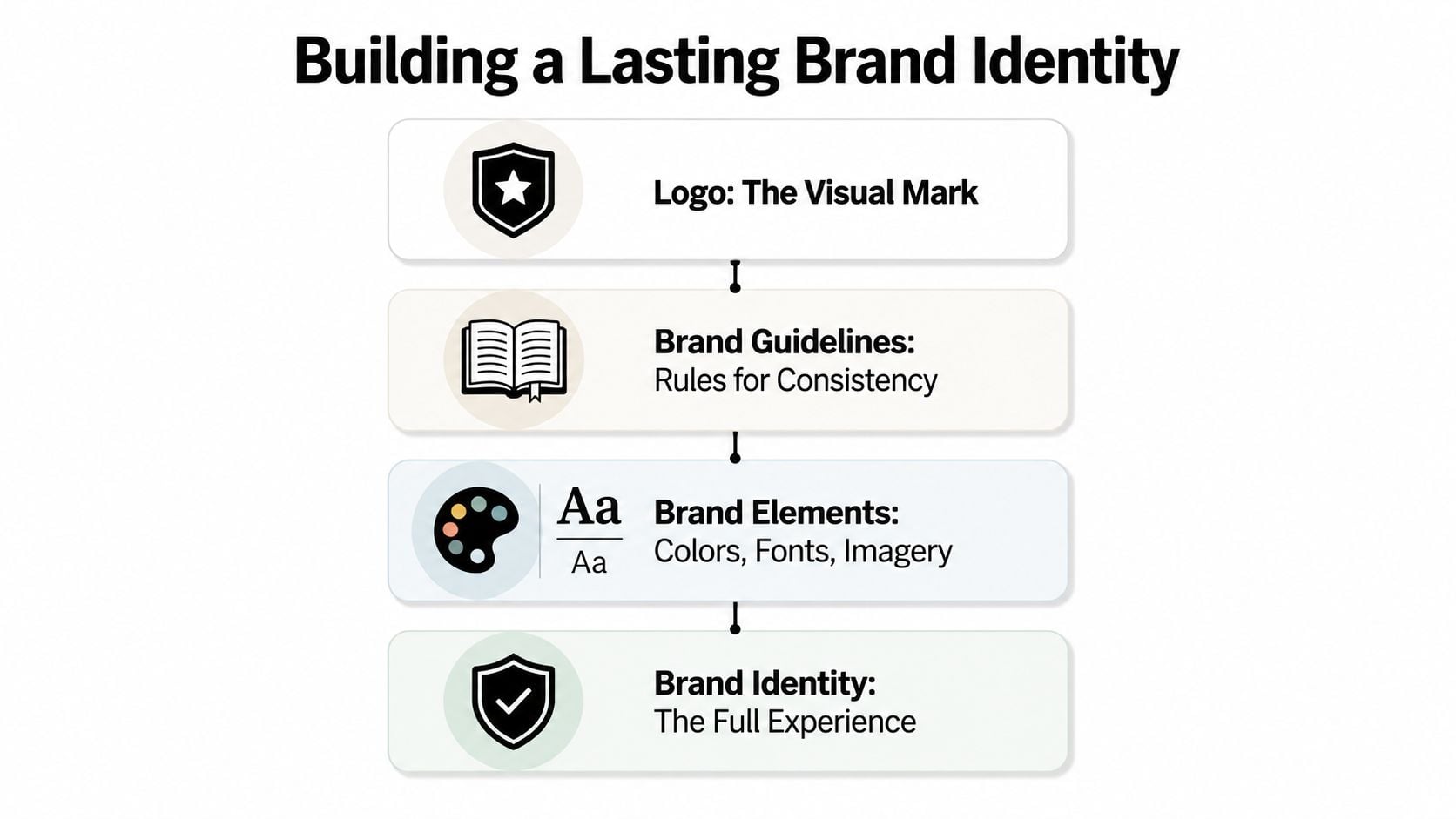
Creating a Lasting Brand Identity That Stands Out
Looking professional once isn't enough. Businesses grow when customers remember them and recognise them quickly the next time they appear.
That's the difference between a logo and a brand identity.
A logo is not the whole brand
A logo is one visual mark. A brand identity is the wider system that tells people who you are and how to recognise you wherever they find you.
That usually includes:
- Logo use: primary logo, alternate versions, spacing rules, and where not to stretch or distort it.
- Colour palette: the core colours that make your business feel familiar at a glance.
- Typography: the fonts and text styles used on your website, proposals, menus, packaging, and social graphics.
- Imagery style: the way your photography, icons, and illustrations should look and feel.
A lot of small businesses make the same mistake. They pay for a logo, then improvise everything else. Six months later, the website uses one blue, the leaflet uses another, social posts use random fonts, and nothing feels connected. The business exists, but the identity doesn't.
A short guide on what brand consistency means in practice helps if you want to tighten that up without starting again from scratch.
Consistency creates memory
Consistency matters because repetition builds recognition. If customers keep seeing the same visual cues across your site, emails, signage, social posts, packaging, and print, they start to remember you without effort.
Data cited by SketchDeck says companies with consistent branding see an average revenue increase of 33%, which is one reason businesses take visual consistency seriously instead of treating it as decoration. You can read that figure in their roundup on statistics that connect graphic design and business success.
In Dorset terms, this is simple. If a customer sees your café on Instagram, visits your website, then walks past your printed window graphics in town, each touchpoint should feel like the same business. If it doesn't, you lose recall.
Strong brands don't need to shout. They need to look the same often enough that customers know them on sight.
That's also why smaller firms can compete well. You don't need a huge budget to create a recognisable identity. You need clear choices, written rules, and enough discipline to apply them everywhere.
How Good Design Boosts Sales and User Experience
Design affects sales most when someone is close to taking action.
At that point, they're not asking whether your palette is stylish. They're asking, often subconsciously, “Can I understand this quickly?” and “Can I complete this without hassle?”
A sales journey is easier to diagnose when you see it visually.
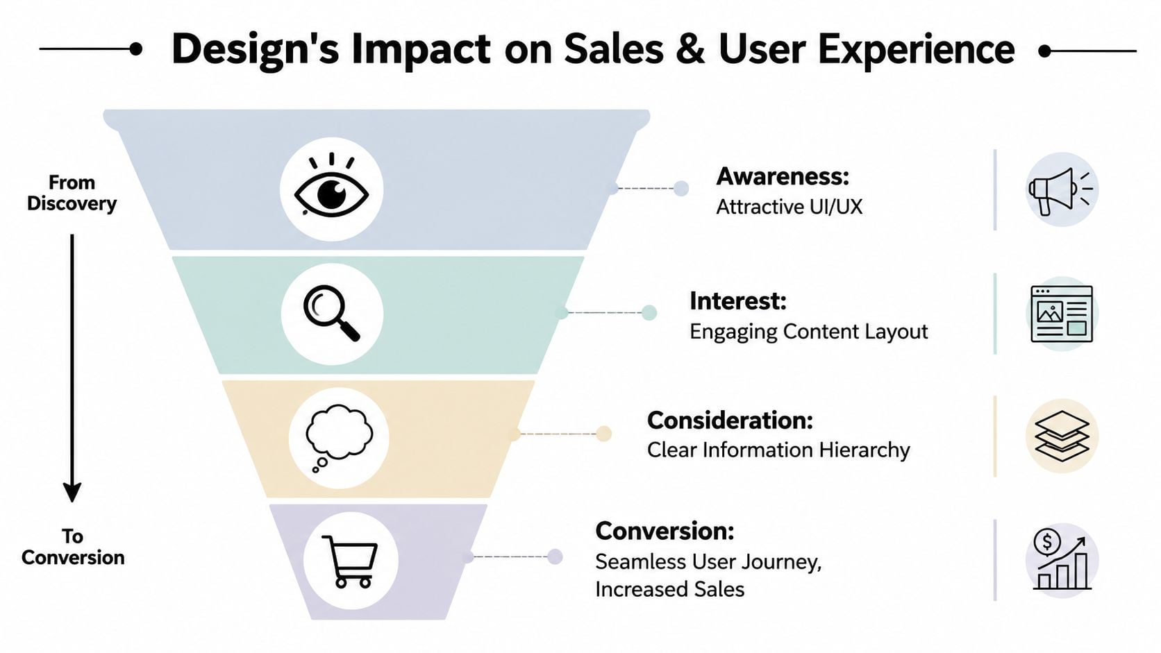
Where customers drop off
Most conversion problems aren't dramatic. They're small moments of friction that stack up.
A customer lands on a product page. The images are weak. The layout feels crowded. Delivery information is buried. The add-to-basket button doesn't stand out. On mobile, the text feels cramped and the trust signals are easy to miss. None of those issues alone looks catastrophic. Together, they create hesitation.
A 2025 study by the UK Retail Technology Forum found that poor graphic design on mobile accounts for 34% of abandoned carts among consumers aged 18 to 34 in the South West, as referenced in this discussion of design-driven cart abandonment. For local eCommerce brands, that's not a branding issue in the abstract. It's a funnel leak.
Later in the journey, product presentation matters just as much as page layout. If you sell on marketplaces as well as your own site, this guide to driving Amazon sales with effective images is worth reading because it shows how visual quality affects buyer confidence when attention is short.
For a practical breakdown of the basics, this page on how to improve website user experience covers the kind of issues owners should check first.
What better design changes
Good design removes effort. It helps people scan a page, compare options, find reassurance, and act.
That usually means improving things like:
- Navigation flow: customers should know where to go next without thinking.
- Visual hierarchy: the most important information should stand out first, not compete with everything else.
- Readability: strong contrast, sensible spacing, and mobile-friendly text make buying easier.
- Call to action clarity: one obvious next step beats several competing ones.
- Trust placement: reviews, policies, delivery details, and contact information should appear where doubt naturally shows up.
If a customer wants to buy and your design slows them down, design is costing you sales.
This is one of the clearest answers to why graphic design is important for any business. It doesn't just shape perception at the top of the funnel. It helps customers complete the journey at the bottom.
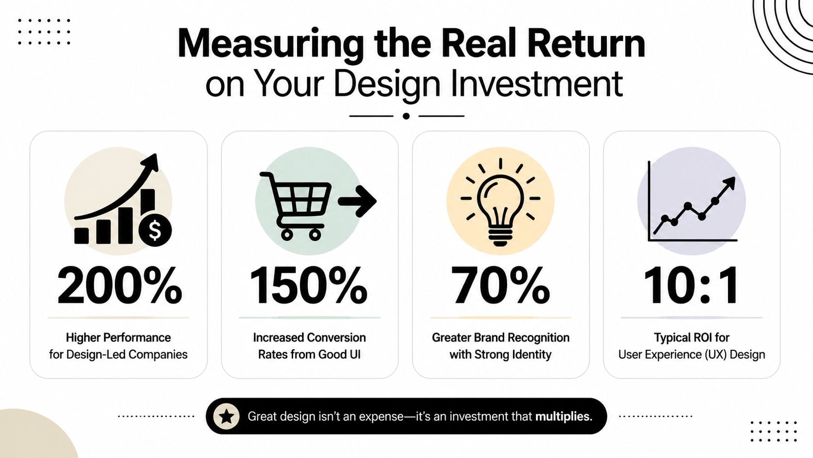
Measuring the Real Return on Your Design Investment
Business owners don't need another lecture about “good branding”. They need to know whether design earns its keep.
It can, and in the UK there's credible evidence to back that up.
What the numbers say in the UK
The strongest case comes from the Design Council. According to The Value of Design Factfinder from the Design Council, for every £100 a UK design-alert business spends on design, turnover increases by £225. That gives owners a practical way to think about design. Not as a soft cost, but as an investment tied to commercial performance.
The same report says shares in design-led businesses outperform key stock market indices by 200% over sustained periods. It also reports that 75% of UK companies where design is integral saw increased competitiveness and turnover attributed to design, with turnover 14% above predicted levels, profit 9% above predicted, and employment 13% higher than forecasts.
Those figures don't mean every logo project will instantly transform a business. They do mean design has a documented business relationship with growth, competitiveness, and stronger performance when it's built into operations properly.
How to judge design properly
The mistake I see most often is measuring design by taste alone. Owners ask, “Do I like it?” That matters, but it's not enough.
A better set of questions is:
Does it improve trust?
Are people spending more time on key pages, submitting more enquiries, or dropping off less often?Does it improve clarity?
Are customers asking fewer basic questions because the design answers them visually?Does it improve conversion?
Are more visitors booking, buying, calling, or requesting quotes?Does it improve consistency?
Can your team now create materials without reinventing the look every time?
A lot of value appears after the launch. Better templates, cleaner brand rules, stronger product visuals, and a more usable website all reduce waste inside the business too.
If you want to review this properly, measuring website success with the right indicators gives you a more useful frame than checking traffic and hoping for the best.
A Practical Guide to Commissioning Design for Your Business
A Dorset business owner often reaches the same point. The website was built quickly, the flyer came from Canva, the van signage came from one supplier, and the quote PDF was made later by someone else. Each piece is cheap on its own. Together, they make the business look less settled than it really is.
That gap costs money.
I see it most with small firms trying to stay careful with cash. They delay professional design because a full rebrand feels too big, then spend months patching things together. The result is the micro-budget paradox. Small savings at the start create muddle, rework, and lost enquiries later. Good commissioning avoids that trap by focusing on the commercial job first, then buying only what the business needs now.
Start with the job that needs doing
Commission design around a problem you can name.
A café in Bournemouth might need clearer menus, better window signage, and social templates that stop every post looking different. A Wimborne trades business might need a homepage and quote document that look established enough to win higher-value work. An independent shop in Dorchester might need stronger product photography and cleaner mobile product pages because customers are dropping out before checkout.
Those are different jobs, with different budgets.
Use this filter before you buy anything:
- Weak trust: fix the homepage, proposal or quote document, and brand basics.
- Inconsistent materials: commission a short brand guide with type, colours, logo rules, and template examples.
- Poor online sales: improve product pages, mobile layouts, imagery, and checkout screens.
- New launch: get the core kit right first. Logo, colour palette, key web pages, signage, and a few reusable templates.
A phased approach usually gives SMEs better control. You can fund it in stages, test what changes behaviour, and avoid paying for assets that sit unused.
What to put in a simple brief
A good brief cuts wasted time. It also protects a small budget because the designer spends fewer hours guessing what you meant.
Keep it plain:
- What your business does: one paragraph, no slogans.
- Who you need to convince: local families, trade buyers, tourists, homeowners, professional clients, or another defined group.
- What you need designed: website refresh, brochure, packaging, signage, pitch deck, or social templates.
- What is going wrong now: low enquiries, poor conversion, inconsistent appearance, weak perceived quality, or slow production of marketing materials.
- What success looks like: more quote requests, better average order value, fewer customer questions, faster sales conversations, or stronger repeatability across channels.
- What you can spend and when you need it: even a rough range helps.
If you want a solid starting point, this guide on how to write a design brief is practical and easy to use.
How to choose a design partner
The right hire depends on the job. A freelancer can suit a focused task such as packaging artwork or a one-off brochure. A studio makes more sense when the work touches brand identity, website structure, copy direction, and rollout across several assets.
Ask direct questions before you commit:
| Question | Why it matters |
|---|---|
| Have they solved this business problem before? | Nice visuals do not fix weak conversion on their own |
| Can they show relevant examples? | A restaurant brief and a B2B engineering brief need different judgement |
| What is included in the price? | SMEs need clarity on revisions, file types, and handover |
| Who is actually doing the work? | Some agencies sell senior thinking and pass delivery elsewhere |
| What happens after launch? | You may need support with templates, updates, or rollout |
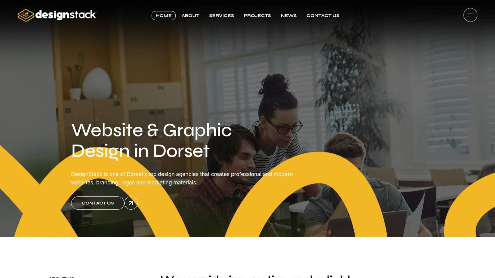
One local option is DesignStack, a Dorset-based studio that handles branding, web design, graphic design, and fixed-cost projects. That model suits businesses that want clearer scope, timelines, and revision control, rather than an open-ended monthly arrangement.
One more practical point. If your marketing plan includes short-form video as well as static design, the AI video creation blog is a useful companion read.
Commission for reuse, not just launch day
This is the part many owners miss. Its value is rarely the logo file on its own. It is the system around it.
Ask for assets your team can keep using. That might mean editable proposal templates, social post layouts, email signature rules, signage specs, presentation slides, and a simple set of brand instructions. A business in Poole or Weymouth does not need a huge brand manual to get value. It needs enough structure to stop every new leaflet, page, and promotion from starting again from scratch.
That is how design becomes easier to manage on a tight budget. You buy clarity once, then use it repeatedly.
Your Next Step Towards Better Business Design
The businesses that benefit most from design aren't always the biggest. They're usually the clearest.
They understand that design affects what customers think when they first arrive, how well they remember the business later, and how easily they can take action when they're ready. That's why graphic design is important for any business. It sits at the point where perception, trust, usability, and revenue meet.
For a small business in Dorset, this doesn't need to start with a huge rebrand. It can start with one honest review of what customers see today. Look at your homepage on a phone. Look at your quote document. Look at your signage, your social posts, your product pages, and your email headers. Ask one simple question. Do these pieces look like they belong to the same competent business?
If the answer is no, that's useful. You've found the next job.
And if you're exploring wider content formats as part of a modern brand presence, the AI video creation blog is a useful read for thinking about how visual communication keeps expanding beyond static graphics alone.
Better design usually starts smaller than people think. A clearer brief. A tighter brand system. A stronger mobile experience. Better product imagery. One practical decision at a time.
If you'd like a clear view of what to fix first, DesignStack can help you assess your current brand, website, or marketing materials and turn that into a realistic design plan for your business.

Leave a Reply