
Funnel Analysis: A Guide for UK Business Websites
You open Analytics, see a healthy stream of visitors, and still end the week wondering why the phone isn't ringing more often, why quote forms stay quiet, or why carts get abandoned before payment. That gap between traffic and results is where most website frustration lives.
For local businesses and WordPress site owners, the problem usually isn't a total lack of interest. It's that somewhere between first visit and final action, people stall, get distracted, lose confidence, or hit friction you can't see from the surface. Funnel analysis is how you find that friction.
This isn't just for enterprise teams. A leading financial services firm using Adobe Customer Journey Analytics reduced application abandonment by 22% in under 30 days after identifying drop-off points in its funnel, according to Adobe's funnel metrics example. The useful lesson isn't that every business will get the same result. It's that when you measure each step properly, you can spot bottlenecks quickly enough to affect short-term performance, not just long-term planning.
Table of Contents
- Why Your Website Traffic Isnt Converting
- Mapping Your Customer Journey Funnel
- Setting Up Your Tracking Toolbox
- Calculating Key Funnel Metrics
- Diagnosing Friction and Finding Opportunities
- Optimisation and a WordPress Case Study
Why Your Website Traffic Isnt Converting
A familiar pattern shows up on small business websites. The site ranks for a few useful searches. Some people arrive from Facebook or Google Ads. A few browse service pages. Then nothing much happens.
The business owner often assumes the issue is traffic quality. Sometimes that's true. More often, the site has a journey problem rather than a visitor problem. People don't always leave because they aren't interested. They leave because the next step isn't clear, the form asks too much, the checkout feels awkward, or the site gives them a reason to postpone.
On WordPress sites, this can be surprisingly ordinary. A contact form sits too low on the page. A mobile menu hides key services. A WooCommerce checkout asks for information that doesn't feel necessary. A booking process looks longer than it needs to be. None of these issues look dramatic in isolation, but each one creates a leak.
Practical rule: If you only measure visits, you'll keep guessing. If you measure each step toward enquiry or sale, you can see where intent starts to fade.
That's why funnel analysis matters. It turns a vague complaint like "we get traffic but not enough leads" into a concrete question. Where exactly are people stopping?
For some businesses, the biggest issue appears right at the start. For others, the serious loss happens later, when someone is already halfway to converting. That distinction changes what you should fix first. There's no point rewriting your homepage if the actual problem sits on your quote form or payment page.
If your early-stage pages show a lot of exits, it also helps to review how well those pages hold attention. Design, page speed, messaging, and relevance all play a part. A useful next read on that side of the problem is how to reduce website bounce rate.
The local business version of the problem
A Dorset trades business and a national eCommerce brand can both have the same funnel issue, even if their websites look completely different. One wants calls and quote requests. The other wants completed orders. In both cases, the site needs to move people from interest to action without adding unnecessary resistance.
That's the primary value of funnel analysis. It gives you a way to diagnose conversion problems before you spend time redesigning the wrong page.
Mapping Your Customer Journey Funnel
Before you track anything, you need to decide what the funnel is for your business. Most websites don't need a textbook marketing funnel. They need a practical map of the steps a real customer takes before becoming a lead or buyer.
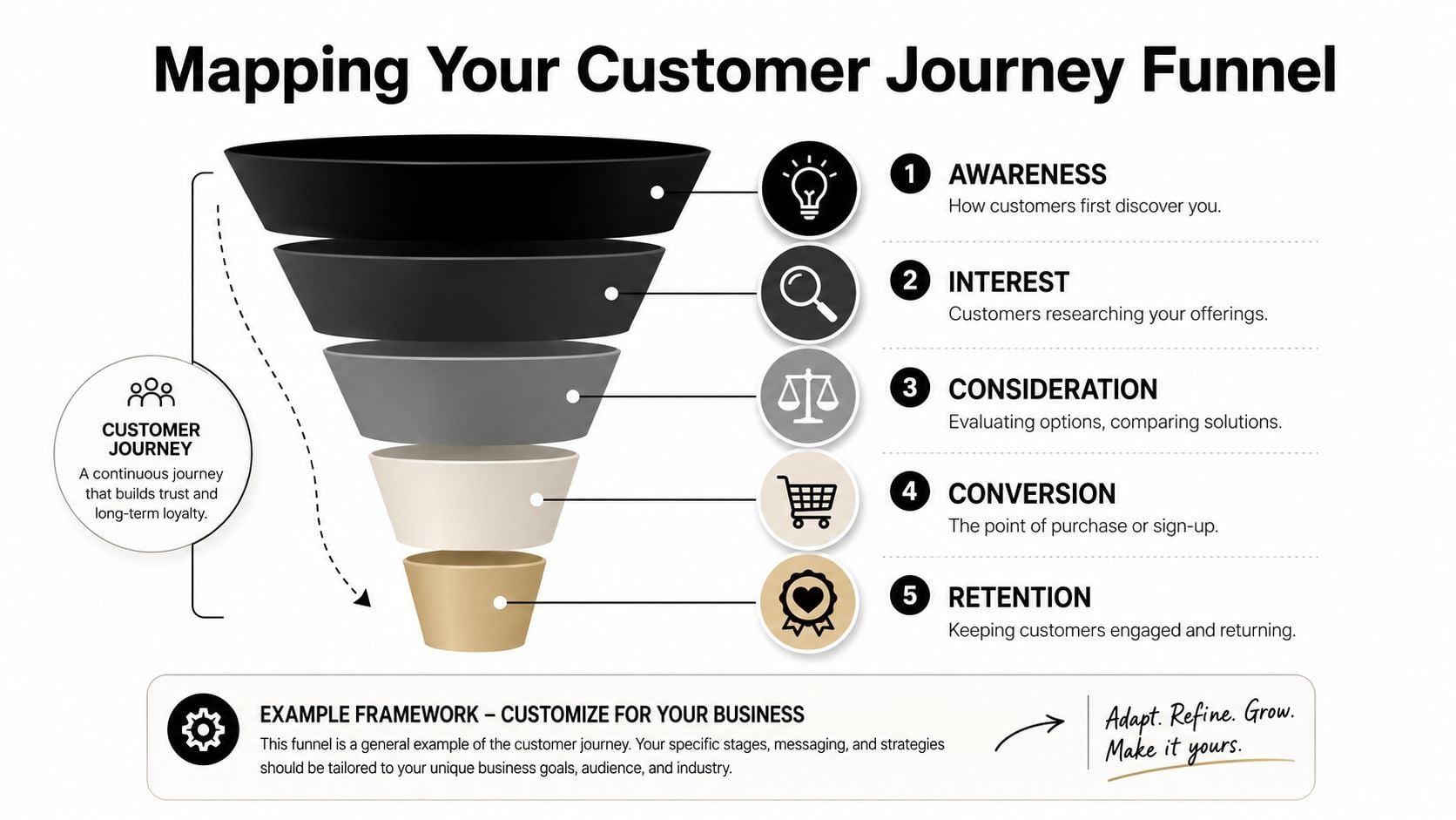
Start with the real action you want
For a service business, the end goal might be a submitted form, a booked consultation, or a click-to-call action. For a WooCommerce shop, it's usually a completed purchase. Everything before that should be a meaningful step, not just a pageview for its own sake.
A simple local service funnel might look like this:
- Homepage or landing page visit. Someone arrives from search, social, or referral.
- Service page view. They check whether you do the kind of work they need.
- Quote or contact click. They show clear intent.
- Form submission. They become a lead.
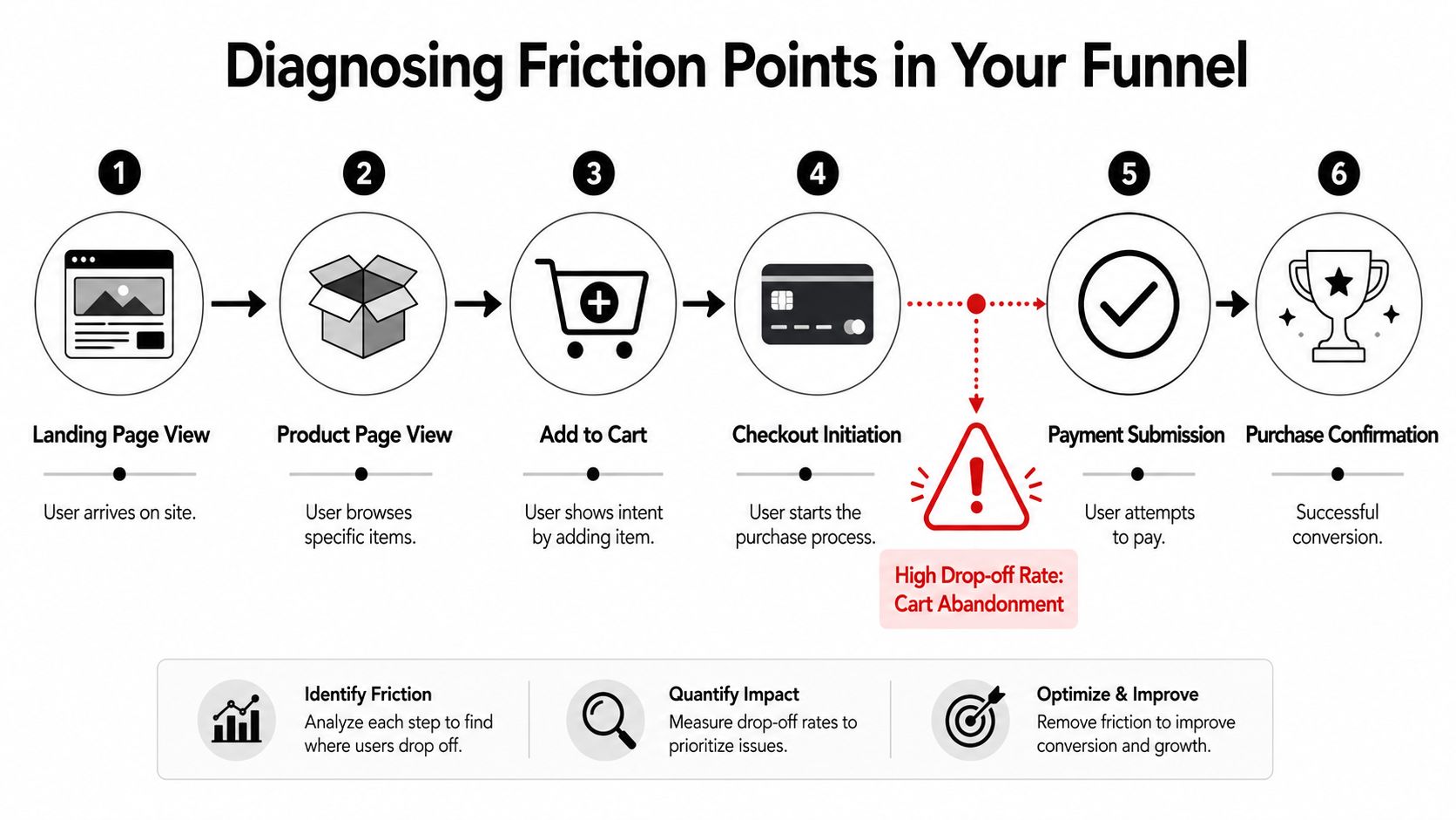
An eCommerce funnel is often closer to this:
- Product page view
- Add to cart
- Start checkout
- Payment completion
The point isn't to make the funnel look elaborate. The point is to make it trackable.
The best funnel maps feel slightly boring on paper. That's usually a good sign. It means you've described real user behaviour rather than a marketing theory.
Keep the stages simple enough to measure
Business owners often make the same mistake here. They create too many stages. If you break the journey into tiny micro-steps before you have reliable data, reporting gets messy fast.
Use stages that meet three tests:
- The step reflects buyer intent. Visiting a service page matters more than viewing a blog archive.
- You can track it consistently. If a stage depends on manual interpretation, it won't stay reliable.
- The step helps decisions. If knowing the number won't change what you do, it probably doesn't belong in the funnel.
For some businesses, that means keeping it very lean. A plumber in Dorset may only need four stages. A retailer with filters, product pages, baskets, shipping options, and payment methods may need a few more.
A useful way to sense-check your map is to compare it with other practical funnel builds in adjacent industries. For example, this guide on creating a fitness sales system is aimed at gyms, but the logic transfers well to local lead generation. The labels differ. The structure of moving people from interest to commitment is much the same.
Two examples that work in practice
| Business type | Funnel stages that are worth tracking |
|---|---|
| Local service firm | Homepage or landing page, service page, contact or quote click, form submission |
| WooCommerce shop | Product view, add to cart, begin checkout, completed order |
If you're not sure where to start, map the shortest route a genuine customer takes from arrival to conversion. Ignore edge cases for now. Get the main route clear first, then refine it later.
Setting Up Your Tracking Toolbox
Once the funnel is mapped, you need tools that tell you both what happened and why it might have happened. For most SMEs, that starts with Google Analytics 4 and then adds a behaviour tool such as Microsoft Clarity or Hotjar.
![]()
GA4 handles the event data. It can track actions like view_item, add_to_cart, begin_checkout, form submissions, and clicks on key buttons. For service sites, you may need custom events for actions such as quote button clicks, file downloads, or contact form completions. For WooCommerce, many of the important commerce events can be configured through existing integrations, but they still need checking.
Use a small set of meaningful events
You don't need dozens of events on day one. You need a clean setup that matches the funnel you defined.
A practical starter setup often includes:
- Arrival and key page views. Track the landing pages and service or product pages that matter most.
- Intent signals. Track actions such as add to cart, quote-button clicks, or booking-start clicks.
- Conversion events. Record the final action, whether that's a submitted form or a purchase confirmation.
- Supporting context. Device type, source, and landing page become useful when you compare performance later.
For WordPress sites, this setup is usually manageable without a big technical project. The core task is not adding tags everywhere. It's deciding which actions are commercially meaningful.
A lot of bad tracking comes from measuring too much. Teams tag every click, drown in reports, then still can't answer a basic question like "where are we losing serious buyers?" Clean event design beats noisy event design every time.
If you need a practical overview of what to configure and how to read it, Google Analytics guidance for business websites is a useful reference point.
Pair numbers with behaviour
Analytics tells you where the drop-off happened. It rarely tells you why. That's where Clarity or Hotjar earns its keep. Heatmaps can show whether people miss a call to action, and session recordings can reveal hesitations that metrics alone won't explain.
A few common examples:
- Form struggle. Users click into a field, pause, backtrack, then leave.
- Scroll mismatch. Important trust content sits below the point where most visitors stop reading.
- Mobile friction. A sticky element covers the button or makes a field hard to tap.
- Checkout confusion. People repeatedly edit delivery details or bounce between steps.
Field note: When a page "looks fine" to the business owner but users still drop out, recordings usually expose the mismatch faster than a redesign workshop does.
One more practical point matters here. Tracking ownership. Someone needs to review the data regularly and decide what counts as a meaningful issue. On some sites that's done in-house. On others, a web partner handles the setup and reporting. DesignStack, for example, offers Google Analytics support as one option among the tools and services businesses use to monitor user behaviour and conversion paths.
The toolbox doesn't need to be fancy. It needs to be trustworthy.
Calculating Key Funnel Metrics
Once the tracking is working, the next step is reading the numbers properly. Most business owners don't need advanced modelling. They need a small set of metrics that reveal whether people are progressing or dropping out.
The number that matters most
The core metric in funnel analysis is the stage-by-stage conversion rate. The calculation is straightforward. Divide the number of users who moved to the next stage by the number who entered the current stage, then multiply by 100.
A simple example from sales-funnel teaching shows how this works. If 50 prospects enter qualification and 20 become opportunities, the conversion rate for that stage is 40%, as shown in monday.com's explanation of sales funnel analysis.
That matters because it isolates the weak point. If traffic looks healthy overall but one stage converts poorly, that's where you focus first.
Essential Funnel Analysis Metrics
| Metric | What It Measures | Simple Calculation |
|---|---|---|
| Stage conversion rate | How many people move from one step to the next | Next-stage users divided by current-stage users, then multiplied by 100 |
| Drop-off rate | How many people fail to continue from a step | Current-stage users minus next-stage users, viewed as the lost share of that step |
| Funnel completion | How many users reach the final goal from the entry point | Final conversions compared with starting users |
| Time to convert | How long users take to complete the journey | Measure elapsed time between first tracked step and conversion |
| Segment comparison | Which audiences or devices perform better or worse | Compare the same funnel across source, device, location, or landing page |
What the metrics tell you in practice
A high drop-off on a product page points to a different problem than a high drop-off on the final payment step. The first often relates to offer clarity, product detail, pricing confidence, or audience mismatch. The second usually points to trust, usability, technical errors, or process friction.
This is why total conversion rate on its own can be misleading. It tells you the outcome, but not the reason. A funnel breaks that outcome into stages that you can act on.
For local service firms, one of the most useful comparisons is between different landing pages. A homepage may send people into the site loosely, while a focused service page may push more visitors toward contact. For eCommerce, comparing device type often exposes weaknesses in mobile navigation or checkout flow.
Good funnel analysis doesn't ask "is the website working?" It asks "which exact step is underperforming, and for whom?"
If you want a broader framework for judging whether site performance is healthy beyond raw traffic, how to measure website success helps connect funnel numbers to wider business outcomes.
The maths itself isn't the hard part. The discipline is in defining the stages properly, then resisting the urge to fix five things before you've identified the one stage doing the most damage.
Diagnosing Friction and Finding Opportunities
A funnel report shows the break. Diagnosis starts when you ask why that break appears where it does.
Look for sharp breaks, not just weak totals
Not every drop-off deserves equal attention. Every funnel loses people. The useful question is where the drop becomes unusually steep or commercially expensive.
On service websites, common friction points include:
- Vague service pages. Visitors don't quickly understand whether you cover their area, budget, or type of project.
- Weak calls to action. The next step exists, but doesn't feel urgent or obvious.
- Heavy forms. People don't want to complete long forms just to ask a simple question.
- Trust gaps. No testimonials, sparse examples, and unclear contact details make people hesitate.
On eCommerce sites, the pattern often shifts:
- Unexpected costs. Delivery or fee information appears too late.
- Checkout fatigue. Too many steps, too many fields, or poor mobile layout.
- Payment anxiety. A lack of reassurance near payment can reduce confidence.
- Technical snags. Errors, slow loads, or coupon-field distractions can push people out.
This kind of friction isn't limited to retail. Appointment-led businesses deal with similar problems. In salons, for instance, the handoff between booking intent and actual attendance creates its own drop-off pattern. That's why articles like CHAIR's insights on salon no-shows are useful reading. They show how operational friction can affect conversion even after a customer appears committed.
When the problem is tracking, not UX
One of the most common mistakes in funnel analysis is assuming every apparent abandonment is real abandonment. Sometimes the issue sits in your measurement setup.
A key example is cross-device behaviour. According to Funnel's discussion of measurement quality, Ofcom reports that UK adults frequently switch between phones, laptops, and tablets. A simple single-session funnel can therefore overstate drop-off if it doesn't account for people returning on another device to complete the journey.
That matters more than many small businesses realise. Someone may browse on mobile during lunch, then complete the enquiry or purchase on a laptop later that evening. If your setup can't connect those moments, the mobile step looks weaker than it really is.
Sometimes the right fix isn't a design change. It's cleaner tracking, clearer attribution, or a better understanding of how customers return.
A practical way to diagnose properly is to combine three views:
- Stage data from GA4 to see where the drop appears.
- Session recordings or heatmaps to observe behaviour on the page.
- Device and source breakdowns to check whether the issue is concentrated in one audience or context.
If a checkout page looks weak only on mobile, that points you in one direction. If it looks weak across all devices, but recordings show little hesitation, that may point to a measurement problem instead.
For service businesses, the equivalent issue can be offline completion. A user may browse the site, then phone directly without submitting the form. If you're only watching form conversions, the funnel understates actual intent. That's why funnel analysis works best when it's connected to how your business really closes leads, not just what your website logs.
For sites where usability is the likely culprit, how to improve website user experience is a sensible companion read because many funnel leaks are, at root, UX problems.
Optimisation and a WordPress Case Study
Good analysis should end in a small, deliberate change. Not a redesign sprint. Not a list of twenty "ideas". One clear hypothesis, one sensible fix, then another review.
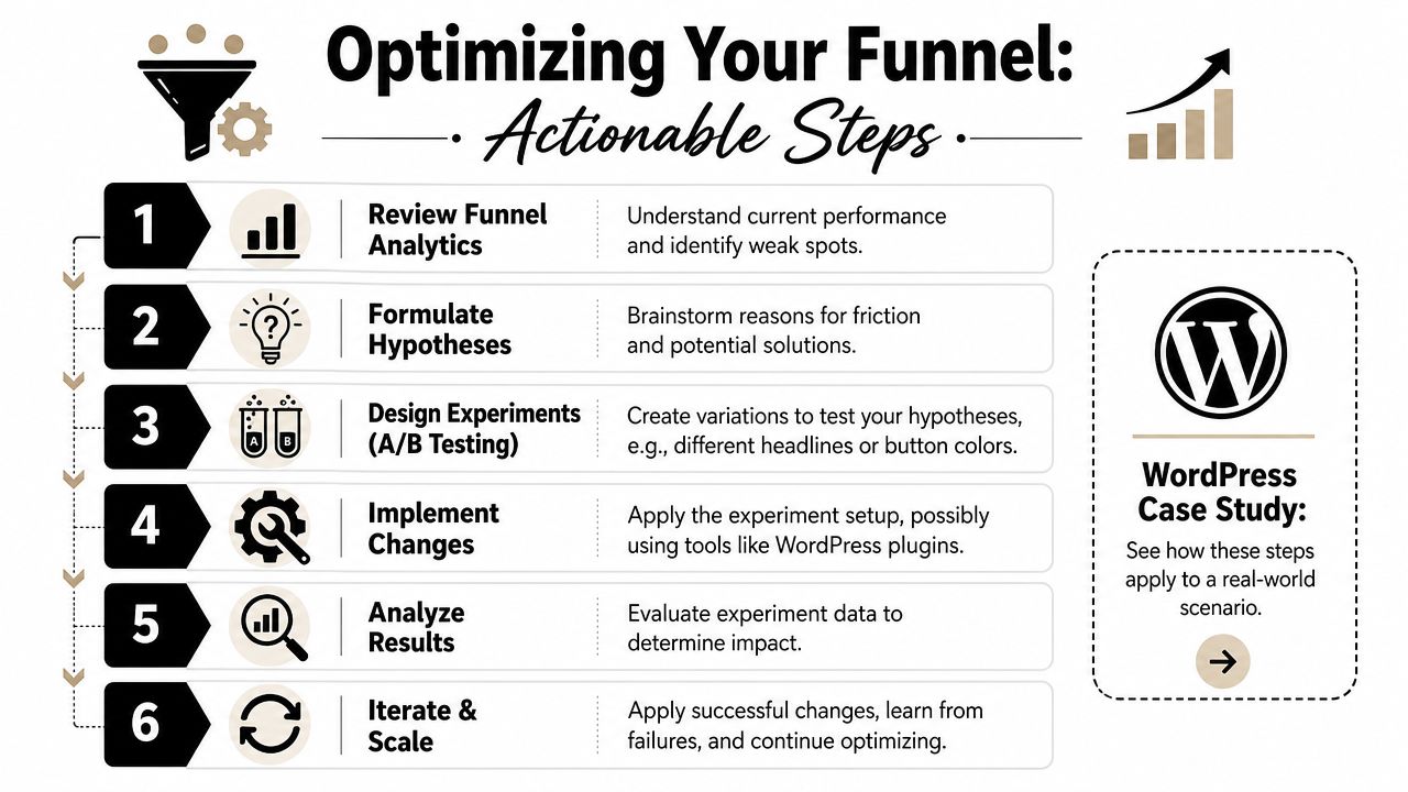
A lot of business owners overcomplicate this stage. They assume optimisation means formal enterprise testing software and a huge traffic volume. In reality, many WordPress improvements start with straightforward changes. Shorter forms. Clearer buttons. Better field labels. Simpler mobile layouts. More obvious delivery or returns information.
A local WooCommerce example
Take a fictional but very typical case. A local Dorset bakery runs a WooCommerce site for celebration cakes, treat boxes, and local delivery orders. Traffic is decent during seasonal peaks. Product pages get attention. Carts are being used. Orders still fall away too often before completion.
The funnel shows the biggest weakness near payment. Session recordings then reveal a pattern. People reach checkout, begin entering address details, hesitate around the address fields, backspace several times, and leave. On mobile, the process feels especially fiddly.
The bakery doesn't need a full rebuild. It needs a cleaner path through checkout.
So the team makes a focused change:
- Simplify the address step with a clearer layout and postcode lookup.
- Reduce distractions by removing non-essential checkout clutter.
- Clarify delivery information earlier in the journey so people don't discover key details too late.
- Retest the path on mobile before changing anything else.
That's a classic funnel-analysis win. The business found a specific leak, matched it with observable behaviour, and improved the part of the journey causing avoidable friction.
For store owners comparing approaches on different platforms, this roundup of proven tips for Shopify growth is worth a look. It's Shopify-focused, but many of the CRO principles apply just as well to WooCommerce.
A visual walkthrough can also help if you want to see how optimisation thinking gets applied in practice:
What to test on a WordPress site first
On a typical WordPress lead-gen or eCommerce site, these are usually the first things worth testing:
- Button clarity. Replace vague calls to action with direct next steps.
- Form length. Remove fields that don't help qualification or fulfilment.
- Page hierarchy. Move trust signals and key benefits closer to the action point.
- Mobile usability. Check field spacing, tap targets, sticky bars, and accordion content.
- Checkout flow. Reduce uncertainty around delivery, payment, and returns.
Test one meaningful change at a time. If you alter the copy, the layout, and the offer together, you won't know what actually improved the result.
If you're looking for examples of how WordPress can support stronger commercial journeys, WordPress eCommerce website examples can help you assess structure, presentation, and buying flow more critically.
A simple review checklist for local businesses looks like this:
| Checkpoint | What to look for |
|---|---|
| Landing pages | Is the offer clear within seconds? |
| Service or product pages | Do they answer the practical questions buyers have before acting? |
| Calls to action | Is the next step obvious and easy to take? |
| Forms and checkout | Are you asking only for information that matters? |
| Mobile journey | Can someone convert comfortably on a phone? |
| Tracking | Can you see each major step without guessing? |
Funnel analysis works best when it becomes a habit rather than a rescue exercise. Review the path. Spot the leak. Fix the friction. Measure again.
If your website gets traffic but isn't turning enough of it into enquiries or sales, DesignStack can help you review the journey, tighten the weak points, and build a WordPress or eCommerce experience that makes the next step easier for customers.


Leave a Reply