How to reduce website bounce rate: Practical Tips to Keep Visitors Engaged
Before we can start fixing a high bounce rate, we need to get on the same page about what it actually is and, just as importantly, what it isn't.
So, what are we talking about? A "bounce" is when someone lands on a page on your website and then leaves without doing anything else. No clicks, no form submissions, no further exploration. They just arrive and leave.
Think of it like someone walking into your physical shop, taking one look at the first display, and immediately turning around and walking out. It stings a bit, doesn't it? For any UK business, a consistently high bounce rate can be a serious red flag, pointing to lost sales and missed leads.
What Bounce Rate Actually Means for Your Business
Now, here's where it gets nuanced. Not every bounce is a disaster. Context is everything.
Imagine a customer searches for your phone number, lands on your contact page, finds it straight away, and calls you. Technically, in Google Analytics, that’s a bounce. But for your business? That's a win. The user got exactly what they needed, quickly and efficiently.
The real problem pops up when the pages that should be engaging your visitors—like your service pages, product categories, or blog posts—are the ones with the high bounce rates. That’s a clear sign that people aren't finding what they expected or aren't being given a good enough reason to stick around.
Good Bounces vs Bad Bounces
Learning to tell the difference is the first step in focusing your efforts where they'll actually make an impact. A high bounce rate is only a problem when it directly clashes with what you want that page to achieve.
Let’s look at a few real-world examples:
- A "Good" Bounce: Someone lands on your FAQ page, finds the answer to their question right at the top, and leaves happy. The page did its job perfectly.
- A "Bad" Bounce: A potential customer clicks your paid ad for "WordPress Web Design Dorset." They land on your homepage, but there’s no immediate, obvious mention of your web design services. They get confused and click away. That's a missed opportunity and wasted ad spend.
- Another "Bad" Bounce: A visitor reads one of your brilliant blog posts but finds no links to related articles or a clear call to action, like a newsletter sign-up. Once they finish reading, there's nowhere else to go, so they simply leave.
The key takeaway is this: bounce rate isn't just some abstract number. It's a direct reflection of relevance and how well you're meeting your visitor's expectations. A high bounce rate on a crucial landing page means you're failing to connect with your audience when it matters most.
Before you can truly understand what's going on, you need to know that not all traffic is created equal. Where your visitors come from has a massive impact on how they behave. This is why looking at your site-wide average can be so misleading.
Typical Bounce Rates by Traffic Source
Understanding the source of your traffic helps you set realistic benchmarks. For example, you'd expect social media traffic to bounce more often than someone who searched for your brand by name.
| Traffic Source | Average Bounce Rate | What This Means for You |
|---|---|---|
| Organic Search | 25-55% | Visitors are actively seeking answers. If your content matches their search query, they're more likely to stick around. |
| Paid Search | 20-60% | Highly dependent on ad-to-landing-page relevance. A mismatch here is a classic reason for a high bounce rate. |
| Direct | 15-40% | These are often your most engaged visitors—people who know your brand. A high bounce rate here is a major red flag. |
| Referral | 30-60% | The quality of the referring site matters a lot. A strong recommendation can lead to low bounces. |
| Social Media | 40-70% | Users are often casually browsing, not actively buying. Engagement is a bigger challenge, so expect higher bounce rates. |
| Display Ads | 50-80% | This traffic is often the least engaged. Users click out of curiosity (or by accident) and leave quickly. |
So, the first real step in diagnosing the problem is to stop obsessing over your site-wide average. It's time to dive into your analytics and start looking at the bounce rates of individual pages and traffic sources. This is where you'll find the specific leaks that are costing you customers and learn exactly how to fix them.
Finding the Leaks in Your Website with Analytics
Trying to fix a high bounce rate by making random changes is like trying to patch a leaky pipe in the dark. You might get lucky, but you’ll probably just make a bigger mess. The real solution is to switch on the lights, and for any website owner, that light is Google Analytics 4 (GA4).
Let’s stop the guesswork. It's time to let data guide your decisions. This isn’t about needing a degree in data science; it's about knowing exactly where to look to find the real reasons people are leaving your site. Once you pinpoint the actual problem areas, you can make targeted, effective changes that work.
This flowchart breaks down the basic user journey: they land on your site, and then they either leave (a bounce) or they take some kind of action. Simple as that.
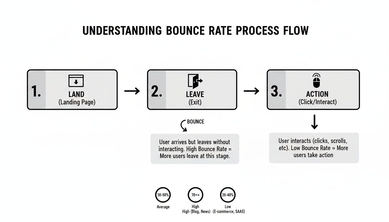
The goal is to interrupt that "Leave" path. We need to give visitors a compelling reason to stick around and move them onto the "Action" path instead.
Pinpoint Your Worst-Performing Pages
First things first, you need to identify which pages are bleeding the most visitors. In GA4, your go-to report for this is 'Pages and screens'. It tells you which pages get the most traffic and, more importantly, how engaged that traffic actually is.
Once you’ve added the bounce rate metric to this report, you can sort your pages from the highest bounce rate to the lowest. Don't panic if some pages, like a simple 'Thank You' page, have high numbers—that’s often normal. What you really need to focus on are the pages that are supposed to be driving action:
- Service Pages: Are potential clients landing and leaving almost immediately?
- Blog Posts: Are people reading your content and then hitting a dead end with nowhere else to go?
- Product Category Pages: Are shoppers abandoning their journey before they even click on a single product?
A high bounce rate on these critical pages is a massive red flag. It tells you there's a serious disconnect between what the visitor expected to find and what you're actually showing them. For a deeper dive into navigating these reports, check out our guide on essential tips and tricks for Google Analytics 4 mastery.
Uncover Problematic Traffic Sources
Knowing which pages are failing is only half the battle. The other half is understanding where these disengaged visitors are coming from. For that, we turn to the 'Traffic acquisition' report in GA4.
This report breaks down your visitors by channel—Organic Search, Direct, Social, Referral, you name it. By looking at the bounce rate for each channel, you can spot some powerful, and often surprising, trends.
For example, you might discover that visitors arriving from organic search are highly engaged and have a low bounce rate. But then you see that traffic from a specific Facebook ad campaign has a staggering 90% bounce rate. That’s a crystal-clear signal that your ad's messaging or creative is out of sync with the landing page experience.
Key Takeaway: A high bounce rate is rarely a site-wide issue. It's almost always concentrated on specific pages or driven by specific traffic sources. Your job is to use analytics to find these hotspots and focus your energy there.
Understanding these patterns is especially crucial for local businesses. For small businesses in Weymouth and Portland, for instance, UK data reveals stark differences in traffic quality. Display ads often have 56.50% bounce rates and social media sits around 54%, likely because users are just browsing casually. On the flip side, referral and email traffic boast the lowest rates at 37.50% and 35.20%, respectively, as these audiences are already warmed up.
By analysing your sources, a Dorset-based eCommerce brand could realise it’s better to shift focus from ad-heavy traffic towards boosting organic search (which has an average 43.60% bounce rate) to significantly improve engagement and sales.
When you combine insights from both the 'Pages and screens' and 'Traffic acquisition' reports, you get the full picture. You can see not just that "Page X has a high bounce rate," but that "Page X has a high bounce rate specifically for visitors coming from LinkedIn." Now you have a specific, actionable problem you can actually solve.
Winning the Race with a Faster Website
Let's be blunt: a slow website is one of the fastest ways to send visitors packing. Online, patience is in short supply. Every extra second your site takes to load is an open invitation for a user to hit the back button and head straight to a competitor. Site speed isn't just some technical box to tick; it's a fundamental part of the user experience that hits your bounce rate hard.
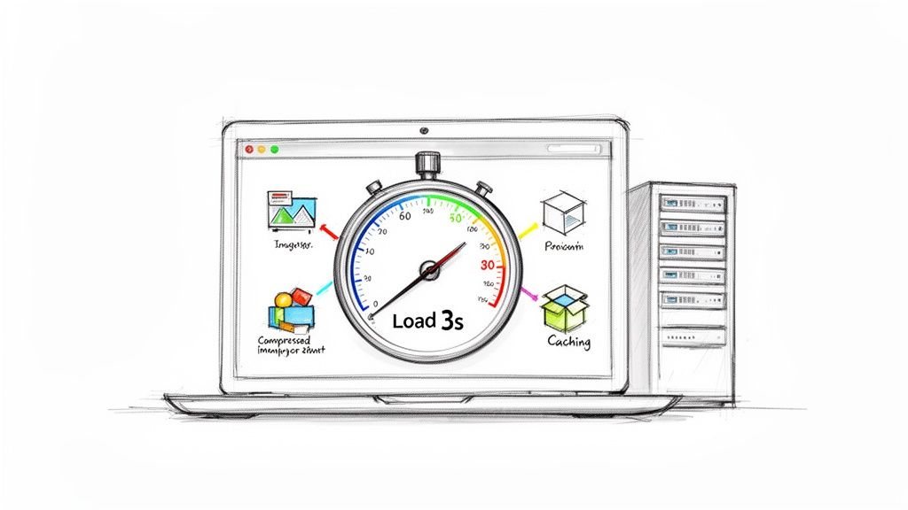
The numbers don't lie. For UK businesses, a sluggish site can cost an average of £1.5 million a year in lost conversions and high bounce rates. One analysis found that by slashing load time from 4.5 to 1.8 seconds, bounce rates plummeted from 65% to 28% and monthly revenue tripled.
The drop-off is severe. Even a 3-second load time can increase bounces by 32%. At 5 seconds, it jumps to 38%—a world away from the 7% bounce rate for pages loading in under 3 seconds. The story is clear: speed matters.
Your Actionable Speed Optimisation Checklist
You don't need to be a developer to make a real difference to your site's performance. Focusing on a few high-impact areas can drastically cut your load times and, in turn, your bounce rate. Here’s where to start.
- Compress Your Images: Huge, unoptimised images are the number one cause of a slow site. Before you upload any picture, run it through a free tool like TinyPNG or Squoosh. They shrink file sizes with almost no noticeable drop in quality.
- Enable Browser Caching: Caching allows a visitor's browser to save parts of your site (like your logo and CSS files). When they return, the site loads much faster because their browser doesn't have to re-download everything. A good performance plugin can enable this with one click.
- Minify Your Code (CSS, HTML, JavaScript): Minification strips out unnecessary characters (spaces, comments) from your site's code. This makes the files smaller and quicker for browsers to process. It sounds technical, but it’s a standard feature in almost every caching plugin.
- Upgrade Your Hosting: Cheap, shared hosting is a common bottleneck. Your site is competing for resources with hundreds of others. Investing in quality managed hosting gives your site the power it needs for consistently fast load times.
- Use a Content Delivery Network (CDN): A CDN stores copies of your site on servers around the world. When a user visits, content is delivered from the server closest to them, dramatically speeding up the experience, especially for international audiences.
Pro Tip: If you're on WordPress, a solid performance plugin is non-negotiable. Tools like WP Rocket or LiteSpeed Cache are brilliant because they handle image compression, browser caching, and code minification all in one place. It saves a huge amount of time and technical faff.
The Foundation Your Website Is Built On
You can have the most beautifully optimised images and squeaky-clean code, but if your web hosting is poor, your site will never be truly fast. Your hosting is the foundation.
You wouldn't build a house on a swamp, would you? Using cheap, overcrowded shared hosting is the digital equivalent. When your site is crammed onto a server with hundreds of others, you're all competing for the same limited resources. Performance will always suffer, especially when you get a traffic spike.
Investing in quality managed WordPress hosting or a decent Virtual Private Server (VPS) gives your site the dedicated resources it needs to breathe. This translates directly to faster server response times and a more stable experience for your users—which is crucial for keeping them around long enough to see what you have to offer.
Choosing the Right Tools for the Job
For most small and medium businesses, especially those running on WordPress, trying to manage all of this manually is a recipe for a headache. This is where plugins become your best friend, acting as a technical assistant to get the job done right.
Here’s a quick rundown of the plugin types you should be looking at:
Caching Plugins (e.g., WP Rocket, W3 Total Cache): These are the workhorses of site speed. They create static, ready-to-go versions of your pages, so the server doesn't have to build them from scratch for every single visitor. It's a game-changer for speed.
Image Optimisation Plugins (e.g., Smush, ShortPixel): As mentioned, these automatically shrink your images. Many also add "lazy loading," a clever trick that only loads images when a user scrolls down to them, making that initial page load feel lightning-fast.
Asset Management Plugins (e.g., Perfmatters): These are for when you want to get more granular. They let you control which scripts load on which pages. For example, you can stop your contact form plugin from loading its code on your homepage, trimming unnecessary bloat and speeding things up.
By putting these strategies into practice, you're tackling one of the biggest reasons people bounce. A faster site makes a great first impression and gives your content a fighting chance to be seen. To get started, you can revolutionize your website with these top WordPress plugins.
Improving Your User Experience and Content Clarity
A fast website gets visitors through the door, but a brilliant user experience is what convinces them to stay and look around. If your page loads quickly but it’s a confusing mess of text with unclear navigation, visitors will still leave in seconds. The goal is to make your site intuitive, your content crystal clear, and the whole experience feel completely effortless.
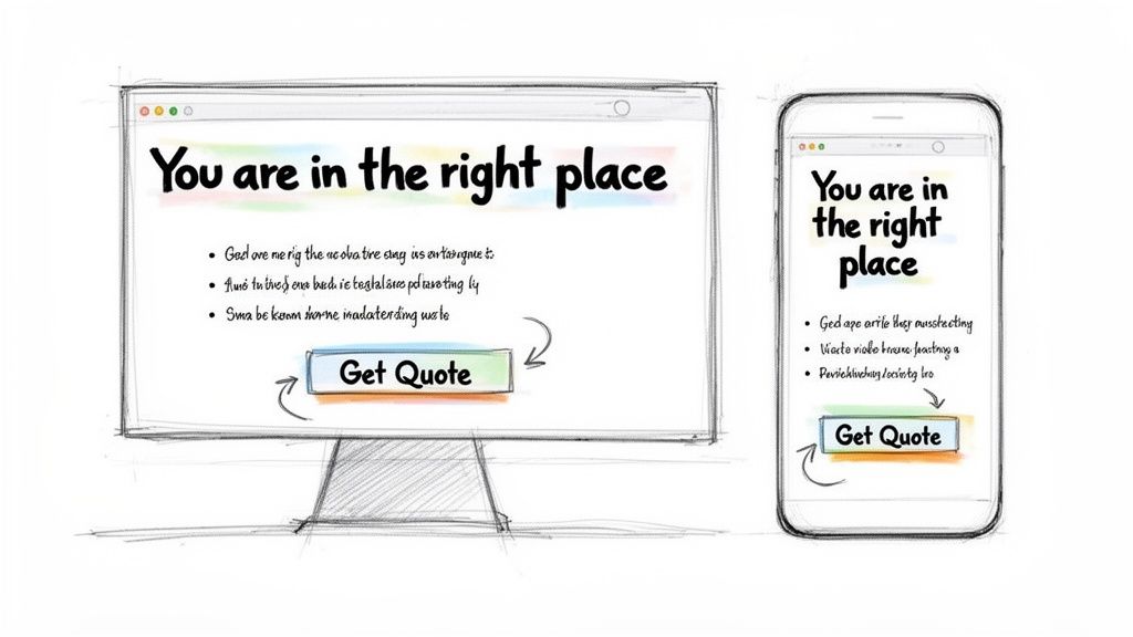
Think of your website as a conversation. Are you answering your potential customer's questions clearly and concisely, or are you just rambling on with dense paragraphs and industry jargon? Let's walk through a practical checklist to audit and improve your site's usability, making sure every visitor feels understood and guided from the moment they land.
The Five-Second Test: Does Your Headline Deliver?
When someone lands on your page, you have roughly five seconds to convince them they’re in the right place. Your main headline, or H1 tag, is your best tool for the job. It has to immediately match what they were expecting when they clicked the link.
Let’s say a plumber in Weymouth runs a Google Ad with the headline "Emergency Boiler Repair Dorset." If a user clicks that ad and lands on a page with a generic headline like "Our Plumbing Services," there’s a serious disconnect. The visitor has to stop and think, "Is this what I was looking for?" That moment of hesitation is often all it takes for them to hit the back button.
The fix is simple but incredibly effective. The landing page headline should mirror the ad: "Emergency Boiler Repair in Dorset—Available 24/7." This instantly confirms the user has found exactly what they need, reassuring them and encouraging them to stick around.
Make Your Content Scannable, Not a Wall of Text
Let's be honest, nobody reads a website word-for-word, at least not at first. We scan. We look for headings, bullet points, and keywords that jump out at us. If your page is just one solid block of text, you're making it incredibly difficult for people to find what they need.
High bounce rates are often a symptom of user fatigue. If your content looks like hard work, visitors will simply choose not to bother. Break it up, or they’ll break up with you.
Making your content scannable is one of the most powerful ways to lower your bounce rate. This isn’t about "dumbing down" your information; it’s about presenting it in a much more digestible way.
Here’s a quick checklist to improve your content clarity:
- Use Clear Headings and Subheadings: Break your content into logical sections with descriptive headings (like the ones in this article). This creates a clear structure and lets users jump to the parts they care about most.
- Keep Paragraphs Short: Aim for a maximum of 1-3 sentences per paragraph. Short paragraphs create valuable white space, making the page feel less intimidating and much easier to read, especially on mobile.
- Embrace Bullet Points and Numbered Lists: Any time you're listing features, benefits, or steps, use a list. It’s far easier to scan than a long sentence packed with commas.
- Use Bold Text Strategically: Draw the reader’s eye to key phrases, statistics, or important takeaways by making them bold. This helps guide them through the most important information on the page.
If you suspect your overall design is part of the problem, it might be worth reviewing these 10 red flags that your website needs a makeover ASAP. Sometimes a fresh look is the key to better engagement.
Optimise Your Mobile Experience
It's no longer enough for your website to just "work" on mobile; it needs to be designed for it. Mobile users are notoriously impatient. A clunky, hard-to-navigate mobile site is a guaranteed bounce-rate disaster.
Pinching and zooming to read text, trying to tap tiny buttons that are too close together, or waiting for a massive desktop image to load on a 4G connection are all common frustrations. The solution is a responsive design that automatically adjusts your layout to any screen size, ensuring a seamless experience for every single user.
Beyond the visuals, implementing strong UX writing best practices is crucial for crafting clear, user-focused copy that boosts usability and directly reduces your bounce rate. On a small screen, every word counts. Menus should be simplified, buttons should be large and easy to tap, and forms should be incredibly simple to fill out. Your goal is to make it as easy as possible for a mobile user to achieve what they came for, whether that's finding your address or buying a product.
Giving Visitors a Clear Next Step
So, a visitor lands on your page, reads your content, and finds exactly what they were looking for. Fantastic. But then what? If you don't give them an obvious next step, they'll just leave. This is such a common and completely avoidable reason for a bounce. You've already done the hard work of getting them to your site; don't lose them now by creating a dead end.
Leaving visitors to figure out what to do next is a guaranteed recipe for a high bounce rate. Your job is to guide their journey, making the next logical step so clear and compelling that they can't help but take it. This is where mastering your calls to action (CTAs) and internal linking really comes into play.
Crafting Calls to Action That Actually Work
A weak call to action is a massive wasted opportunity. Vague, passive buttons like "Submit" or "Click Here" have no urgency or inspiration. Crucially, they don't tell the user what they get in return for clicking. To really make a dent in your bounce rate, your CTAs need to be powerful, specific, and action-oriented.
Think about the psychology behind that click. A visitor needs to know exactly what’s going to happen when they interact with a button. You can do this by using strong command verbs and shouting about the value for them.
Instead of those generic phrases, try something a bit more compelling:
- Instead of "Submit": Try "Get Your Free Quote Now"
- Instead of "Learn More": Try "Explore Our Design Services"
- Instead of "Download": Try "Download My Free Ebook"
- Instead of "Subscribe": Try "Join Our Insider Community"
The difference is subtle but powerful. Action-oriented language sets a clear expectation and connects the click to a tangible outcome, making users far more likely to engage rather than bounce.
To truly get this right and guide visitors toward your goals, it’s worth digging into broader Conversion Rate Optimization best practices. This wider view helps you ensure every single element on your page is working together to push the user forward.
The Untapped Power of Internal Linking
Beyond your main CTA, internal linking is your secret weapon for cutting bounce rates and boosting your SEO at the same time. Every page on your site should offer a few pathways for visitors to explore related content. It’s all about turning a single page view into a multi-page session.
Picture a blog post about "The Best WordPress Plugins for SEO." A visitor might find the information useful, but once they've finished reading, they'll leave if there's nowhere else to go.
Now, imagine that same article with thoughtful internal links woven into the text. You could link to:
- A detailed review of a specific plugin you mentioned.
- A guide on "How to Install a WordPress Plugin."
- Your main "SEO Services" page.
By providing these relevant, contextual links, you're inviting the reader to continue their journey on your site. You’re basically anticipating their next question and providing the answer before they even have to think about it. This simple act can dramatically increase time on site and show search engines that your website is a valuable, interconnected resource.
An Actionable Framework for Every Page
Don't leave this to chance. For every important page on your website, apply this simple framework to make sure you've eliminated dead ends and provided clear guidance.
Just ask yourself these three questions for each page:
What is the primary action I want a visitor to take on this page?
This defines your main CTA. Make it stand out visually—using a contrasting colour for the button is a classic and effective technique that works wonders.What is a good secondary action for someone not ready for the main CTA?
Not everyone is ready to "Buy Now." You need to offer a lower-commitment option, like "Download a Brochure" or "Sign Up for Our Newsletter," to capture their interest and keep them in your orbit.Where can I naturally link to other relevant content on my site?
Scan your page copy and look for opportunities to link to other blog posts, service pages, or case studies. Always use descriptive anchor text (the clickable words) so users know exactly where the link is taking them.
By systematically applying this thinking, you transform each page from a potential exit point into a gateway for deeper engagement. You give visitors a reason to stick around, explore what you have to offer, and ultimately move that little bit closer to becoming a customer.
Your Bounce Rate Questions Answered
Even with a solid plan, a few questions always come up when you start getting into the nitty-gritty of bounce rate. Here are some of the most common ones I hear from UK business owners, with straight-to-the-point answers to keep you on track.
What’s a Good Bounce Rate for a UK Business?
Honestly, there isn't a single magic number. What's considered "good" really depends on your industry and, crucially, the type of page you're looking at.
For a UK eCommerce site, anything between 26% and 40% is brilliant. It means shoppers are clicking around and looking at different products. But for a blog post or a news article, a bounce rate from 40% to 60% can be completely fine. Someone might land, get the answer they needed, and leave perfectly happy.
As a general rule of thumb, it's time to start asking questions if your site-wide bounce rate is consistently creeping over 70%. That’s usually a strong hint that something isn't right—be it site speed, user experience, or your marketing promises not matching what's on the landing page.
How Long Should I Wait to See Results After Making Changes?
I know it's tempting to check your analytics every five minutes, but you've got to be patient. After making any significant change, give it at least two to four weeks before you make a final judgement.
This window gives you enough time to gather meaningful data in Google Analytics and see a real trend, rather than just reacting to the usual daily ups and downs. A big improvement in site speed might show an effect in days, but tweaks to your content or layout often take longer for user behaviour to adjust. The best approach? Make one focused change at a time, measure its impact over a few weeks, and then decide what to do next.
My Homepage Has a High Bounce Rate. Is That Bad?
Not always, but it’s definitely something you should investigate. It all comes down to what you want your homepage to do. If its main job is to be a navigation hub—directing people to "Shop Men's" or "Shop Women's"—then a high bounce rate isn't necessarily a disaster, because a click to another page isn't counted as a bounce.
On the other hand, if your homepage is designed to grab leads or get your main message across, then yes, a high bounce rate is a problem. It could mean your value proposition is confusing, the design is off-putting, or it's just taking too long to load. Think of your homepage as your digital shop window; it needs to be compelling enough to make people want to step inside.
Can Adding More Media Lower My Bounce Rate?
Absolutely, but this one is a classic double-edged sword. Engaging videos and images can definitely keep people on the page longer, but they can also backfire in a big way if you're not careful. Large, unoptimised media files are one of the biggest culprits behind slow-loading pages, which will kill your bounce rate.
If you’re going to add more visuals, you need to play by the rules:
- Optimise everything. Compress images before you upload them and use modern formats like WebP where possible.
- Keep it relevant. Only add media that actually adds value and helps explain your content.
- Use lazy loading. This feature makes sure images and videos further down the page only load when a user actually scrolls to them.
The aim is to enhance the user's experience, not bog it down with heavy, unnecessary files.
Ready to turn those bounces into customers with a professional, high-performing website? The team at DesignStack specialises in creating bespoke WordPress sites that not only look fantastic but are built to keep your visitors engaged. Let's work together to build a site that grows with your business. Get in touch with us today.