What Is Brand Consistency: Your 2026 Guide to Success
Brand consistency is the practice of presenting your business the same way across every customer touchpoint, and it matters because 68% of businesses reported it contributed to 10% or more revenue growth, while 32% said it helped drive more than 20% revenue increases. In simple terms, when your website, social posts, signage, emails, and printed materials all look and sound like the same company, people recognise you faster and trust you more.
A lot of small businesses already know something feels off. The van livery uses one logo. Facebook uses an older one. The website feels polished, but the printed flyer looks like it came from a different business. Then a customer walks into the shop or office and gets another version again. None of these issues seem major on their own, but together they make the brand harder to remember.
That's usually what people mean when they ask what is brand consistency. They're not asking for a textbook definition. They want to know why their business feels a bit disjointed, why marketing takes too long, and why customers don't always connect the dots between online and offline touchpoints.
For UK SMEs, branding transitions from decorative to commercial. If you want a practical example of what a clear branded system looks like, it helps to download Orbit Forms brand kit and look at how rules for colours, logo usage, and layouts are packaged for repeat use. If you also want to tighten the story behind the visuals, this guide on brand storytelling for businesses is a useful companion.
Table of Contents
- What Is Brand Consistency and Why Should You Care
- The Three Pillars of a Consistent Brand
- The Real-World ROI of Brand Consistency
- Common Brand Consistency Mistakes to Avoid
- How to Implement and Manage Brand Consistency
- Your Next Steps to a Consistent Brand
What Is Brand Consistency and Why Should You Care
A customer finds your business on Instagram. Later, they visit your website. A week after that, they see your shop sign, your proposal document, or a printed leaflet. If each interaction feels slightly different, they have to work harder to remember who you are.
That's the simplest answer to what is brand consistency. It means using the same visual identity, messaging, and tone wherever people encounter your business. Not identical wording on every channel, but a recognisable pattern that tells customers they're dealing with the same company every time.
A robust definition treats brand consistency as a governed system. The visual rules, messaging rules, and tone rules are applied across channels so people don't have to relearn your brand at every touchpoint, as outlined in MediaValet's explanation of brand consistency and central brand guidelines.
Why small businesses feel the effect faster
Large brands can absorb a bit of inconsistency and still stay recognisable. A small local business usually can't. If your website looks premium but your quote template looks homemade, or your signage is modern but your social graphics feel random, customers don't see polish. They see uncertainty.
That matters because buyers use shortcuts. They don't analyse every design choice. They ask themselves whether the business looks organised, trustworthy, and established.
Practical rule: If a customer covers your business name and still can't tell your assets belong together, your brand isn't consistent enough.
What consistency is not
It doesn't mean making every channel look rigid or robotic. A LinkedIn post shouldn't read like a printed brochure, and shop signage doesn't need the same layout as an email footer. The point is alignment, not copy-and-paste repetition.
Good consistency usually includes:
- One approved logo system with clear rules for main, stacked, icon, and reversed versions
- A fixed colour palette with exact values so print and digital don't drift
- Defined typography for headings, body text, and practical substitutes
- Core messaging that keeps your value proposition steady
- A recognisable tone of voice so sales, support, and marketing don't sound like different businesses
When those basics are in place, your brand becomes easier to manage. Teams stop improvising. Suppliers stop guessing. Customers stop seeing mixed signals.
The Three Pillars of a Consistent Brand
A small business can have a well-designed website and still look disjointed. It happens when the van livery uses one set of colours, the Instagram posts use another, and the printed quote pack looks like it belongs to a different firm entirely.
That gap between digital and physical assets is where consistency usually breaks down. For UK SMBs, the fix is to manage the brand across three pillars: visual, verbal, and experiential. If one slips, the whole brand feels less reliable.
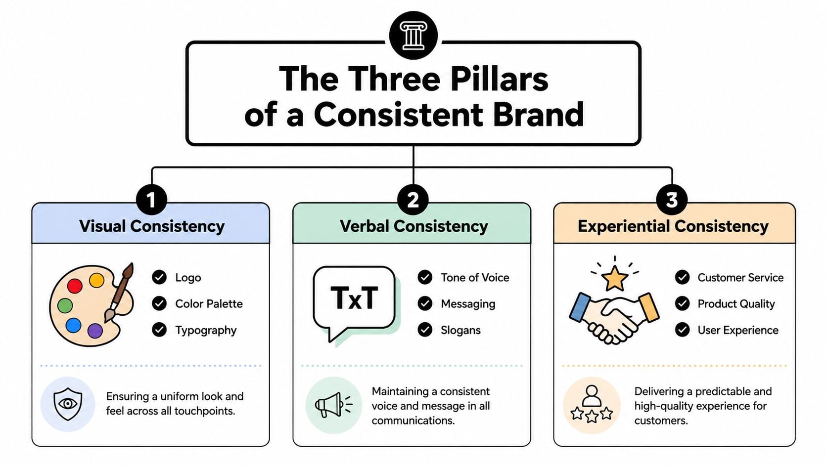
Visual consistency
Visual consistency is the system people recognise before they read a word. It covers your logo, colour palette, typography, photography style, icons, layouts, and spacing.
The trade-off is straightforward. A brand needs enough structure to stay recognisable, but enough flexibility to work everywhere. Your website header, shop sign, invoice, and pull-up banner do not need identical layouts. They do need to look like they came from the same business.
Colour is often where drift starts. Screens, printers, sign makers, and office templates can all shift a brand if nobody has fixed colour values and approved versions. If that is an issue, this guide to colour psychology in branding is a useful starting point for choosing colours people read the right way.
A practical audit works well here. Put your homepage, business card, proposal PDF, exterior signage, and a recent social post next to each other. If the fonts, colours, image style, or logo use keep changing, your visual pillar needs tighter rules.
For a useful reference on how major brands maintain distinction through repeatable visual cues, this marketer's guide to sportswear brands shows the point clearly.
Verbal consistency
Visuals get attention. Words shape trust.
Verbal consistency means your business sounds like itself in every channel. That includes homepage copy, sales emails, social captions, enquiry replies, printed brochures, and even the wording on your quotes and invoices. For many small firms, brand work often falls apart because different people write in different styles and nobody has set the standard.
It helps to define three things:
- Tone of voice such as direct, friendly, expert, calm, or no-nonsense
- Core messages covering what you do, who you help, and why clients choose you
- Preferred wording for common claims, service descriptions, and calls to action
The wording should still adapt to context. A complaint response should not read like a promotional leaflet. A van graphic should not carry the same copy as an About page. But the personality underneath should stay consistent, whether someone is reading a web page or a printed leave-behind after a sales visit.
If your branding says high-end joinery, but your emails read rushed and generic, people notice.
Experiential consistency
This pillar is less visible, but it has the biggest effect on whether the brand promise feels real. Experiential consistency is what customers get when they deal with you. It includes website usability, enquiry handling, proposal quality, packaging, customer service, printed materials, signage, and billing.
For UK SMBs, this is usually the hardest part because it sits across departments and suppliers. The web designer controls the site. A printer handles brochures. A sign company fits the fascia. The office team sends estimates. If each part is handled in isolation, the customer gets a mixed experience even when each individual piece is decent.
A polished website followed by a clumsy quote process weakens the brand. So does smart signage paired with inconsistent service emails. Customers judge the whole experience, not the org chart behind it.
The strongest brands treat consistency as an operating standard. Not just a design task.
The Real-World ROI of Brand Consistency
A small business usually feels brand inconsistency in the budget before it spots it in the design. The website looks polished, but the quote PDF uses an old logo. The shop sign says one thing, the van says another, and the social posts feel like they belong to a different company. That gap chips away at trust, slows enquiries, and wastes money on rework.
Consistency improves commercial performance because it makes the business easier to recognise and easier to trust. Earlier branding research cited in this article points to a clear link between consistent presentation and stronger revenue performance. That matters for UK SMBs because growth rarely comes from one big rebrand reveal. It comes from steady gains across repeated customer touchpoints.
Why consistency changes commercial results
Customers do not audit your brand in neat categories. They get a quick impression from your website, your signage, your packaging, your proposal, your emails, and your social feed, then decide whether you feel reliable enough to contact or buy from.
That is where consistency earns its keep.
For a local retailer, the payoff shows up when the window display, printed till receipts, Google Business photos, and Instagram posts all signal the same level of care. For a trades business, it shows up when the van livery, website, estimate, and follow-up email feel like they came from one organised company rather than four separate suppliers.
The practical result is lower hesitation. People recognise you faster, remember you more easily, and feel less risk at the point of enquiry. If you want a clearer way to track the digital side of that, this guide on how to measure website success helps tie brand presentation back to conversion and lead quality.
What return looks like in day-to-day terms
For smaller firms, ROI often comes from ordinary operational wins rather than headline campaigns.
- Faster recognition: Your website, fascia, leaflets, vehicle graphics, and social posts start reinforcing each other instead of competing.
- Stronger conversion: Prospects feel more confident that the business behind the ad, search listing, or referral is established and dependable.
- Lower production waste: Staff and suppliers spend less time hunting for files, recreating artwork, or correcting off-brand materials.
- Better value from each channel: Paid ads, print, email, and local signage work harder when they all build the same memory in the customer's mind.
I see this most often where digital and physical assets have been handled separately for years. A business invests in a better website but leaves old brochures in circulation. Or it updates the shopfront while the Facebook cover image and quote template stay untouched. The spend is real, but the effect gets diluted because the brand is still fragmented.
A useful comparison sits outside the SMB world. In this marketer's guide to sportswear brands, the standout lesson is repetition. Strong brands use the same distinctive cues again and again until recognition becomes automatic. Small businesses do not need a global budget to apply that principle. They need discipline across the assets customers see.
A consistent brand makes each marketing pound go further and reduces friction across sales, service, and delivery. That is why consistency is not a cosmetic exercise. It is a commercial one.
Common Brand Consistency Mistakes to Avoid
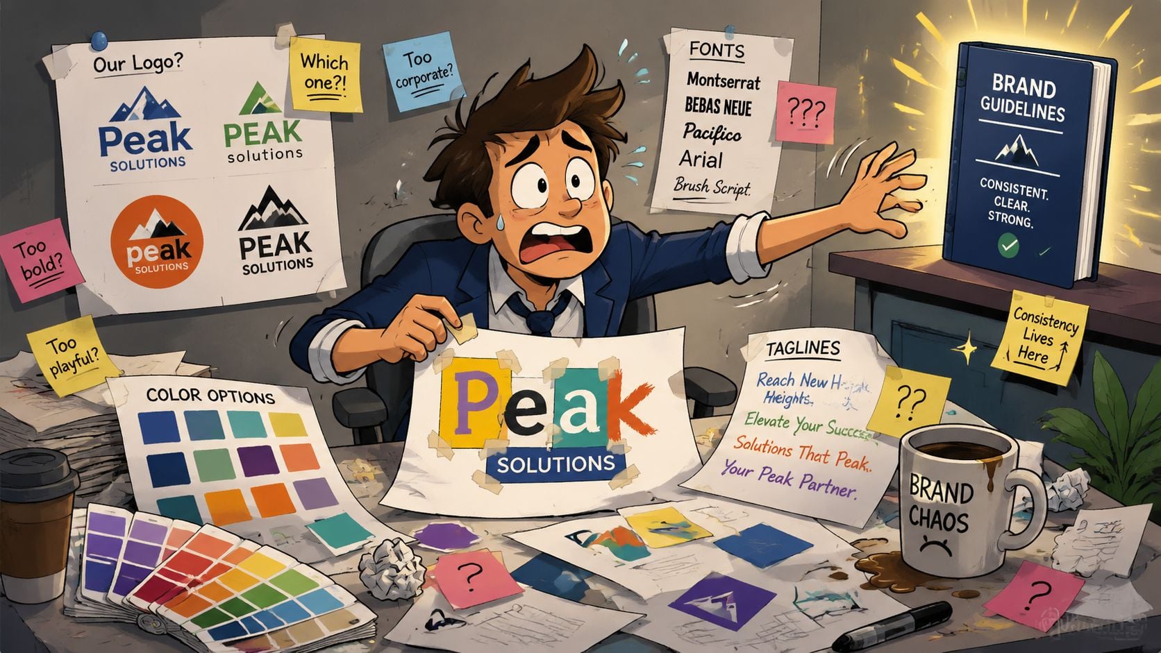
The biggest mistake is thinking inconsistency is a design problem. Most of the time, it's a management problem. The business has no clear rules, no current asset folder, and no one who owns approvals.
Frontify's guide makes the point well. A key challenge for UK businesses is managing brand presentation across multiple touchpoints, and consistency is often a process and governance issue. Without clear guidelines, it becomes unclear how much variation is acceptable before recognition starts to weaken, as noted in Frontify's article on brand consistency across touchpoints.
Where small businesses usually drift off-brand
Drift tends to happen subtly. A designer updates the logo. The social profile photo doesn't change. Someone creates a PowerPoint in a substitute font. The printer uses an old file. A staff member writes sales copy in a completely different tone.
Common weak spots include:
- Multiple logo versions in circulation used randomly across print and digital
- Colour drift between channels because nobody has exact colour values to follow
- Mixed tone of voice between marketing, sales, and customer service
- Supplier-led design decisions where printers, sign makers, or freelancers fill gaps differently
- Template sprawl with old proposals, brochures, and social post files still being reused
A practical local read for this stage is branding tips for small businesses, especially if your materials have grown organically over time.
How much variation is too much
Some variation is healthy. Social media needs a bit more flexibility than a tender document. A roadside sign has different constraints from a mobile homepage. The issue is whether the variation still feels like it comes from the same source.
Use this rule of thumb:
| Situation | Healthy variation | Risky variation |
|---|---|---|
| Social graphics | Adapting layouts for platform size | Changing colours, fonts, and logo treatment each week |
| Printed materials | Adjusting format for flyers or brochures | Rewriting the core message every time |
| Website pages | Tailoring page content by service | Different tone and visual style page to page |
If variation helps communication while preserving recognition, keep it. If variation makes assets feel unrelated, cut it.
The danger isn't creative experimentation on its own. The danger is unmanaged experimentation.
How to Implement and Manage Brand Consistency
Brand consistency is usually won or lost in ordinary day-to-day work. A member of staff needs a flyer by Friday, the sign maker asks for a logo file, someone updates the Facebook cover, and a salesperson pulls an old proposal from a desktop folder because it is quicker. If there is no clear system, the brand starts drifting through convenience rather than choice.
The fix is simple in principle. Give people one place to find the right assets, clear rules for using them, and one person who can approve exceptions. For a small business, that matters more than a long document full of theory.
Start with a simple brand guideline
Keep the guide short enough that people will use it. For many UK SMBs, six practical sections are enough:
- Logo rules: primary logo, alternate versions, minimum size, clear space, and banned uses
- Colour specs: exact values for screen and print, including RGB, HEX, and CMYK
- Typography: main fonts, backup fonts, and how to use them in headings, body copy, quotes, and captions
- Core messaging: your main value proposition, service descriptions, and wording that should stay consistent
- Tone of voice: how the business sounds on the website, in emails, on social posts, and in printed material
- Templates: approved files for quotes, proposals, social graphics, leaflets, presentations, and email signatures
The print and digital split needs special attention. I see this constantly with local firms. The website uses one blue, the brochure uses a close-but-not-quite version chosen by the printer, and the shop sign ends up darker again because nobody supplied the correct spec. The same problem happens with fonts, imagery, and straplines.
A single named partner can also help here. If you are trying to bring your website, social content, printed collateral, and signage into line, brand identity development support for small businesses can give you one joined-up set of decisions instead of separate fixes from different suppliers.
Run a practical brand audit
Once the rules exist, check what customers see.
Do this with real items on the table, not just files on a screen. Open the website. Print the proposal PDF. Pull out the business card. Check the van livery photo on your phone. Look at your Google Business profile and your latest social posts side by side. That side-by-side review is often the quickest way to spot gaps between digital and physical assets.
Start with high-visibility touchpoints:
- Website and key landing pages
- Social media profiles and post templates
- Google Business imagery
- Email signatures and proposal documents
- Business cards, flyers, menus, packaging, or brochures
- Shop signage, vehicle graphics, and exhibition materials
If you sell products, photography needs the same discipline. Inconsistent product images can make a catalogue, an Instagram grid, and a printed leaflet feel unrelated even when the logo is correct. Tools such as flat lay to model ai can help create more consistent product visuals from existing shots, which is useful if the same range appears online and in print.
Working rule: If a member of staff cannot find the correct logo, colours, font, and template within a minute, the system is still too messy.
Brand Consistency Audit Checklist for SMBs
| Touchpoint | Check for Consistent Logo | Check for Consistent Colours/Fonts | Check for Consistent Messaging/Tone |
|---|---|---|---|
| Website | Yes or no | Yes or no | Yes or no |
| Social media profiles | Yes or no | Yes or no | Yes or no |
| Social post templates | Yes or no | Yes or no | Yes or no |
| Email signatures | Yes or no | Yes or no | Yes or no |
| Proposal or quote documents | Yes or no | Yes or no | Yes or no |
| Business cards | Yes or no | Yes or no | Yes or no |
| Flyers or brochures | Yes or no | Yes or no | Yes or no |
| Signage | Yes or no | Yes or no | Yes or no |
| Packaging or labels | Yes or no | Yes or no | Yes or no |
Reviewing this once is useful. Reviewing it every quarter is what keeps standards from slipping.
Small businesses do not need heavy brand governance. They need a usable operating system for everyday marketing, sales, and customer communication. That is what keeps the website, the leaflet rack, the email footer, and the sign above the door pulling in the same direction.
Your Next Steps to a Consistent Brand
The easiest way to understand brand consistency is to look around your own area. Dorset businesses that feel established usually don't rely on one brilliant logo alone. Their signage, website, menus, social posts, leaflets, and customer communications all feel connected. Whether it's a hospitality business, a local retailer, or a member organisation, you can usually spot the ones that have a joined-up identity within seconds.
That's the standard worth aiming for. Not because every asset has to be polished to perfection, but because customers notice when the whole business feels coherent. They may not say, “your visual and verbal systems are aligned”. They'll just feel more confident buying from you.
Start with a mini-audit this week. Open your website on one screen and gather your latest brochure, business card, proposal PDF, email signature, Facebook page, and any signage photos. Ask three blunt questions:
- Does this all look like the same business
- Does it all sound like the same business
- Would a new customer recognise these assets as connected without effort
If the answer is no, don't overcomplicate the fix. Choose one approved logo set. Lock in your colour palette. Standardise your fonts. Write down your core message and tone. Then update the assets customers see most often first.
Small improvements compound when they're applied consistently. That's the key benefit here. Better recognition, fewer mixed signals, and less wasted time recreating materials that should already have clear rules.
If your brand feels inconsistent across your website, social channels, printed materials, or signage, DesignStack can help you review what's in use, tighten the rules, and turn scattered assets into one clear brand system that works online and in print.


Leave a Reply