
Inclusive Design Principles: Boost Your UK Business UX
About 24% of the population in England and Wales, or approximately 16 million people, are known to be affected by a disability. For a UK business owner, that changes the conversation straight away. Inclusive design isn't a niche feature for a small minority. It's part of serving the market in front of you.
Think about your business like a high street shop. If the entrance has a steep step and no ramp, some people can't get in at all. Others can get in, but only with extra effort. The same thing happens online. A website can look polished and still subtly block customers because the text is hard to read, the menu is confusing, or the checkout only works one way.
That's why inclusive design principles matter. They help you remove friction before it costs you trust, enquiries, and sales. For Dorset businesses, from restaurants and membership groups to trades and professional services, this isn't abstract theory. It's practical design that helps more people use what you've built.
Table of Contents
- Why Inclusive Design Is a Business Superpower
- What Inclusive Design Really Means for Your Business
- Exploring the Core Inclusive Design Principles
- Putting Inclusive Principles into Practice
- An Inclusive Design Checklist for Your Next Project
- Start Building a More Inclusive Brand Today
- Your Inclusive Design Questions Answered
Why Inclusive Design Is a Business Superpower
Nearly a quarter of people in England and Wales live with a disability, as noted earlier in this guide. For a small business, that is not a niche audience. It is part of your everyday market, whether you run a bakery in Bridport, a law firm in Dorchester, or an online shop serving customers across the UK.
Inclusive design turns that reality into better business decisions. It helps you remove the small bits of friction that stop people from booking, buying, or getting in touch. A form with clear labels gets completed more often. A menu that works properly on a phone gets read more often. Buttons that are easy to tap reduce mistakes for everyone, not only for people with permanent impairments.
A good high street comparison is a well-laid-out shop. Clear signs help a blind customer using magnification, a new visitor in a rush, and a parent managing two children at once. Digital design works in much the same way. When your website is easier to read, easier to operate, and easier to understand, more people make it through to the point of enquiry or sale.
Practical rule: If you remove effort for one group of customers, you usually remove effort for many others too.
The commercial effect is straightforward. You get fewer abandoned enquiries, fewer support calls caused by confusion, and less money spent fixing avoidable problems after launch. For Dorset companies in particular, that can mean stronger returns from the traffic you already have, instead of paying for more clicks to a website that turns people away. If you are already focused on turning visits into enquiries, this UK conversion rate optimization guide pairs well with inclusive design because both disciplines focus on removing friction.
Inclusive design also gives you a more practical view of user experience design for business websites. The question is no longer only whether a page technically works. The better question is whether a real customer can use it easily, confidently, and without needing extra help.
That is why inclusive design acts like a business superpower for small firms. It widens your reach, improves day-to-day usability, and helps local brands grow by serving people better from the start.
What Inclusive Design Really Means for Your Business
Some business owners hear “inclusive design” and assume it just means accessibility checks at the end of a project. That's the usual point of confusion. Accessibility matters, but it isn't the whole story.
Accessibility is the result, inclusive design is the method
Inclusive design is the way you think and make decisions from the start. Accessibility is one of the outcomes of doing that work properly.
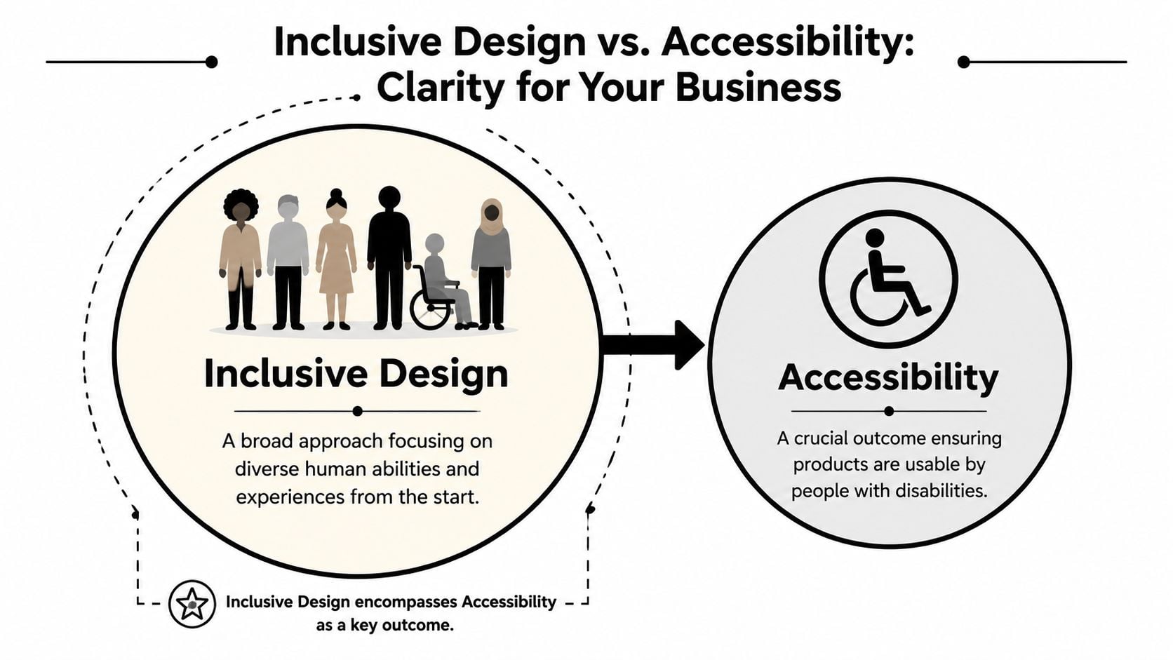
If that sounds abstract, use a shopfit example. Accessibility is making sure the entrance can be used. Inclusive design is asking earlier questions. Is the doorway obvious? Is the handle easy to use? Is the sign readable? Can someone understand where to pay without asking for help?
That same mindset applies online:
- On a website homepage: Can visitors tell what you do in seconds?
- On a booking form: Can people complete it without wrestling with tiny fields or unclear labels?
- On a menu page: Can somebody read it without pinching and zooming through a badly formatted PDF?
The formal language around these ideas has been around for some time. The guide to the Inclusive Design Principles notes that the Inclusive Design Principles were first published in 2016 by Ian Pouncey, Léonie Watson, and Heydon Pickering. That matters because it shows this isn't a passing trend. It's an established design approach.
Why small businesses benefit first
Large organisations can hide poor experiences behind bigger teams and bigger budgets. Small businesses usually can't. If your contact form is frustrating, people may leave. If your navigation is unclear, they may ring you for basic information that should've been easy to find.
Inclusive design principles help in practical ways:
| Business need | Inclusive design response |
|---|---|
| More trust | Clear layouts, readable content, and predictable interactions feel professional |
| Better visibility | Well-structured content is easier for people and search engines to understand |
| Stronger reputation | Customers notice when a business has taken care to make things easier |
| Fewer fixes later | Problems are cheaper to avoid in planning than to patch after launch |
It also overlaps with the difference between UX and UI. UI is what the customer sees. UX is how the journey works. Inclusive design strengthens both by making sure the interface isn't just attractive, but usable for more people in more situations.
Accessibility asks, “Can people use this?” Inclusive design asks, “Who might we be leaving out before we even launch?”
Exploring the Core Inclusive Design Principles
The phrase “inclusive design principles” can sound academic. In practice, it comes down to a handful of common-sense habits that make websites easier to use.
A useful benchmark from Inclusive Design Principles says interfaces should provide a “comparable experience” and should not suppress standard browser settings like font size, zoom, and contrast. In plain language, people should still be able to get things done in the way that works for them.
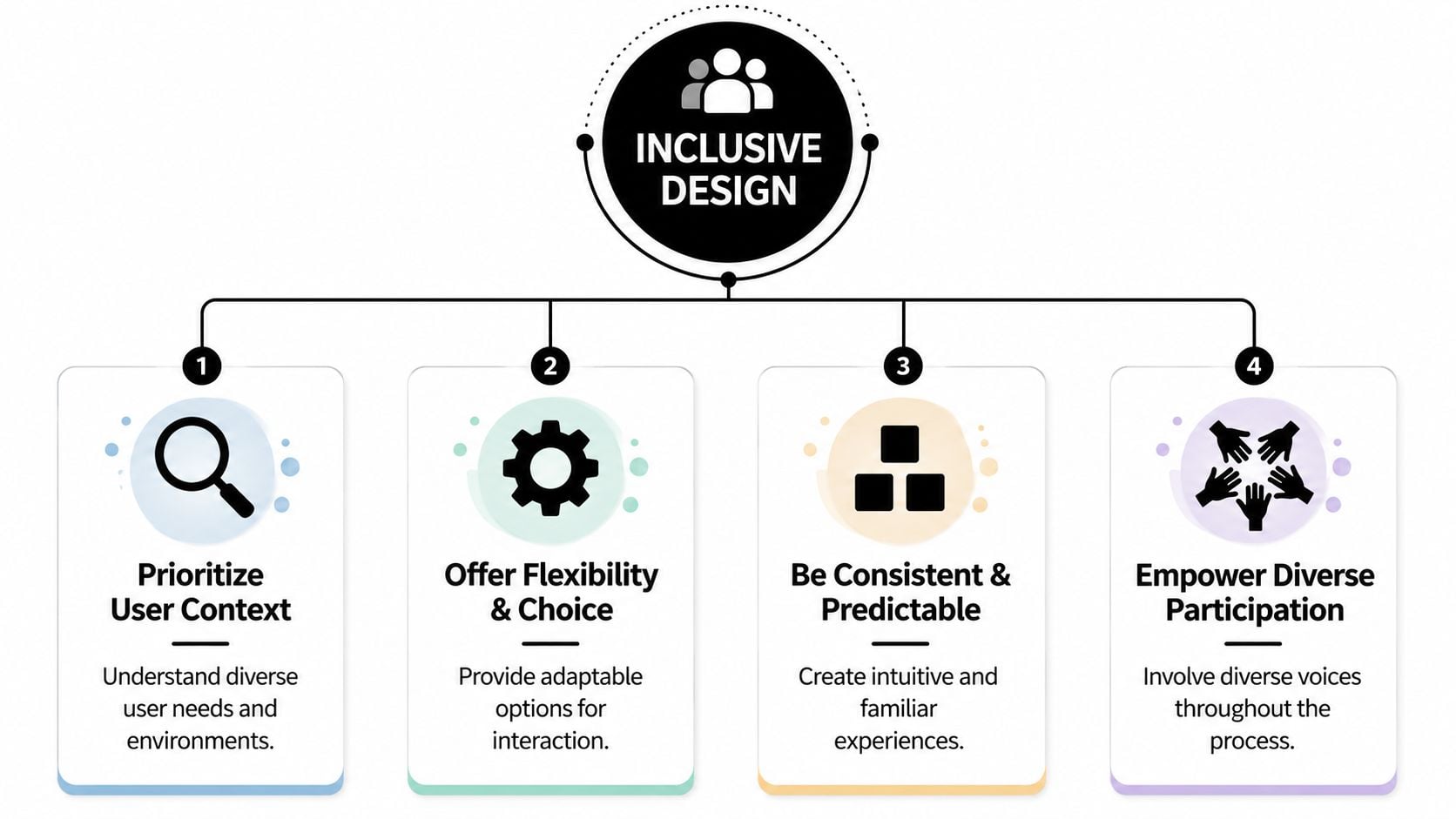
Comparable experience
This means different users should be able to complete the same task, even if they use different tools or methods.
A simple example is a product image. If a customer can see the image, they get information instantly. If another customer uses a screen reader, the site still needs to communicate what matters. The experience doesn't have to look identical. It does need to be equally useful.
For a Dorset holiday let website, that could mean room details written clearly in text rather than relying only on photo galleries.
Control and choice
People need room to adjust things to suit them. Some prefer keyboard navigation. Some increase text size. Some need more contrast. Some want moving content to stop.
A good everyday example is a homepage carousel. If slides rotate automatically and there is no way to pause them, many visitors will miss information or feel rushed. Giving control is often as simple as letting users stop motion, zoom in, or choose a standard form instead of a drag-and-drop tool.
You can see why this connects closely with information architecture. If the structure is confusing, extra controls won't rescue the experience.
Consistency and content priority
People use websites with patterns in mind. They expect the logo to link home. They expect navigation near the top. They expect buttons to look clickable.
When those patterns change page by page, people work harder than they should. That's tiring for everyone, especially visitors who rely on predictability. Content priority matters too. The most important actions should be easy to find. A restaurant's opening hours, phone number, and booking link shouldn't be buried under decorative content.
Keep the main task near the surface. If a visitor has to hunt for the next step, the design is serving itself instead of the user.
Real participation
Teams often guess what people need. Inclusive work improves when you ask and observe instead.
That doesn't always require a large formal research programme. A small business can still gather useful feedback from a broader mix of customers. Ask someone older, someone less confident online, and someone using only a phone to try your key tasks. Watch where they hesitate. Those moments tell you more than internal opinions.
Putting Inclusive Principles into Practice
Inclusive design becomes useful when it shapes actual project decisions. The same principles that guide public spaces also help digital teams make better choices. The Design Council describes five core principles for the built environment as Inclusive, Responsive, Flexible, Convenient, and Accommodating, with alignment to the principles of inclusive design and BS 8300 guidance. That language works surprisingly well for websites too.
UX design
A local restaurant website is a good example. Think about a business such as The Lobster Pot. A customer often visits on a phone, perhaps while walking, talking, or deciding where to eat with friends. Inclusive UX means the menu is easy to find, booking details are obvious, and the contact number is tap-friendly.
It also means key journeys don't depend on perfect conditions. If someone has patchy signal, the page should still load in a sensible order. If they use only a keyboard or assistive technology, the booking path should remain clear. If you want a practical view of these issues, this guide on how to make a website accessible is a good reference point.
Visual and brand design
Brand design often causes accidental barriers. Pale grey text can look elegant in a mock-up but become frustrating on a real screen. Fancy script fonts may suit a logo, yet fail when used for body text or headings. Colour-only cues can also create problems. If an error message is shown only in red, some people won't catch it.
For a Dorset professional services firm, inclusive visual design means the site still feels polished while using readable text, strong contrast, clear button states, and enough spacing around links and form fields. It is possible to look premium without making visitors work.
A useful mental check is this. If your branding choices force customers to concentrate harder than necessary, the brand is getting in the way of the business.
Content strategy
Content is where many inclusive projects succeed or fail. Businesses usually know what they want to say, but customers need information in a sequence that helps them act.
Take a chamber of commerce or local membership group. A visitor wants to know who it's for, what they get, how much effort is involved, and how to join. If that answer is hidden under slogans, long paragraphs, or jargon, the page becomes exclusive without meaning to.
Inclusive content usually looks like this:
- Plain language: Replace internal terms with words customers already use.
- Helpful headings: Let people scan the page and jump to the part they need.
- Descriptive links: “Download membership form” is clearer than “Click here”.
- Clear error guidance: Tell people what went wrong and how to fix it.
Business lens: Every unclear sentence adds effort. Every extra bit of effort loses some people.
For local businesses, this approach has a direct payoff. Easier reading leads to easier decisions. Easier decisions lead to more enquiries, better bookings, and fewer support requests.
An Inclusive Design Checklist for Your Next Project
You don't need to be a designer to ask good questions. A short checklist can reveal whether a new website proposal is built around real users or just surface-level visuals.
Planning and briefing
Use these questions at the start of a project:
- Who might struggle with this journey? Think beyond your ideal customer. Consider older users, people on mobile, people in a rush, and people who aren't confident online.
- What is the single most important action on each page? If the answer isn't clear, the design may become cluttered.
- Have we allowed for flexibility? Ask whether the site can support zoom, keyboard use, and different reading styles.
- Are we testing ideas early? Even a simple wireframe in web design can expose problems before development starts.
Visual design review
When you review mock-ups, ask practical questions rather than aesthetic ones alone.
- Can people understand information without relying only on colour?
- Is body text comfortable to read, not just stylish?
- Do buttons look like buttons and links look like links?
- Is there enough space around interactive elements for touch use?
A polished layout should reduce effort. If the design feels clever but needs explaining, it's probably hiding friction.
Content and functionality checks
These questions catch common issues before launch:
- Can forms be completed clearly and calmly? Labels should be obvious, and errors should explain what to fix.
- Are important details written in text, not trapped in images or PDFs?
- Can moving content be paused or avoided?
- Do navigation labels match what customers expect to find?
If you'd like a second checklist from a different angle, the Exclusive Addons accessibility guide is a useful extra resource for reviewing common website barriers.
A simple local example
A membership organisation such as the Weymouth & Portland Chamber of Commerce doesn't need a flashy interface to be inclusive. It needs a site where local businesses can quickly understand benefits, find events, read updates, and join without confusion.
That kind of project often improves when teams focus on straightforward wins:
| Area | Inclusive question |
|---|---|
| Homepage | Can a first-time visitor tell what the organisation does straight away? |
| Events | Are dates, venues, and booking actions easy to spot? |
| Membership | Is the join process clear, with simple next steps? |
| Contact | Can people choose the contact method that suits them? |
Small improvements in these moments can reshape how welcoming the whole brand feels.
Start Building a More Inclusive Brand Today
Inclusive design isn't a one-off fix. It's a habit of removing barriers, simplifying decisions, and giving more people a fair chance to use your website or service well.
For a small business, that's good for customers and good for the brand. You reach a wider audience, reduce avoidable friction, and present your business as thoughtful and trustworthy. You also avoid the common trap of launching something that looks modern but excludes people in everyday situations.
Start with one customer journey. Your contact form, your booking path, your menu page, or your checkout are all good places. Small improvements made early are usually far more valuable than big repairs later.
Your Inclusive Design Questions Answered
Is inclusive design expensive for a small business
It doesn't have to be. The expensive route is usually building quickly, discovering barriers later, and paying to rework layouts, content, and code after launch.
Inclusive design is more cost-effective when it's part of the brief from day one. Clear structure, readable content, sensible forms, and consistent navigation aren't luxury extras. They're good foundations. For many smaller sites, the first improvements are straightforward and don't require a full rebuild.
What if my customers do not identify as disabled
You almost certainly serve more varied needs than you realise. Some people have long-term disabilities. Others deal with temporary injuries, stress, fatigue, poor signal, bright sunlight, or one-handed phone use. Inclusive design helps in all of those situations.
The wider lesson is simple. When you solve a problem for someone at the edge of the experience, you often improve the journey for everyone else too. That's why features like clear headings, larger buttons, and better contrast help such a broad mix of people.
Where should I start if money is tight
Start where customers most often get stuck. For most businesses, that means the pages and tasks closest to an enquiry or sale.
A sensible low-cost starting list looks like this:
- Fix readability: Improve text contrast, spacing, and heading structure.
- Improve forms: Use clear labels and helpful error messages.
- Add text alternatives: Make sure important images and visual information are described properly.
- Simplify navigation: Reduce clutter and make key actions obvious.
- Check mobile use: Try your own site one-handed on a phone and notice where it becomes awkward.
You don't need perfection to begin. You need a willingness to spot friction and remove it, one decision at a time.
If you'd like help reviewing your website through an inclusive design lens, DesignStack can help you identify friction, improve usability, and build a site that feels clearer, more welcoming, and easier for customers to use.


Leave a Reply