eCommerce Website Features: 10 Essentials That Convert
Most online stores don't lose sales because they need a prettier homepage. They lose them because shoppers can't find the right size, discover delivery charges too late, or get stuck paying on a phone. A beautiful storefront can still be difficult to buy from.
The better question isn't which design trend to copy. It's which moment in the buying journey your website needs to protect: arrival, discovery, decision, checkout or repeat purchase. Even an experience positioned around luxury shopping with Cedar & Lily Clothier needs practical buying tools beneath the presentation.
Online retail is an established sales channel, not an optional extension of a physical shop. The Office for National Statistics reported that online sales increased from 3.4% of all Great Britain retail sales in 2007 to 27.9% in 2020.
Choose ecommerce website features by the buying problem they solve, not by how impressive they look in a demonstration.
For WordPress and WooCommerce stores, that means looking beyond the theme. Product attributes, shipping rules, payment settings and plugin compatibility all shape whether someone can complete an order. These essentials connect the customer-facing experience to the configuration underneath it.
Table of Contents
- 1. Mobile-Responsive Design
- 2. Product Search, Navigation and Filtering
- 3. Detailed and Conversion-Focused Product Pages
- 4. Shopping Basket (Cart) Management
- 5. Streamlined Checkout with Guest Option
- 6. Secure and Flexible Payment Options
- 7. Customer Accounts and Order Management
- 8. Customer Reviews, Ratings and Social Proof
- 9. Transparent Delivery, Returns and Policy Information
- 10. Site Speed, SEO and Technical Foundations
- The 10 Essential eCommerce Website Features at a Glance
- Building It Right and Turning These Features Into a Store That Sells
1. Mobile-Responsive Design
Protects the arrival moment. A shopper opens your store from a message, an advert or a search result. They need readable information and usable controls immediately, without pinching the screen or dismissing overlapping panels.
A responsive layout should preserve the buying journey across screen sizes.
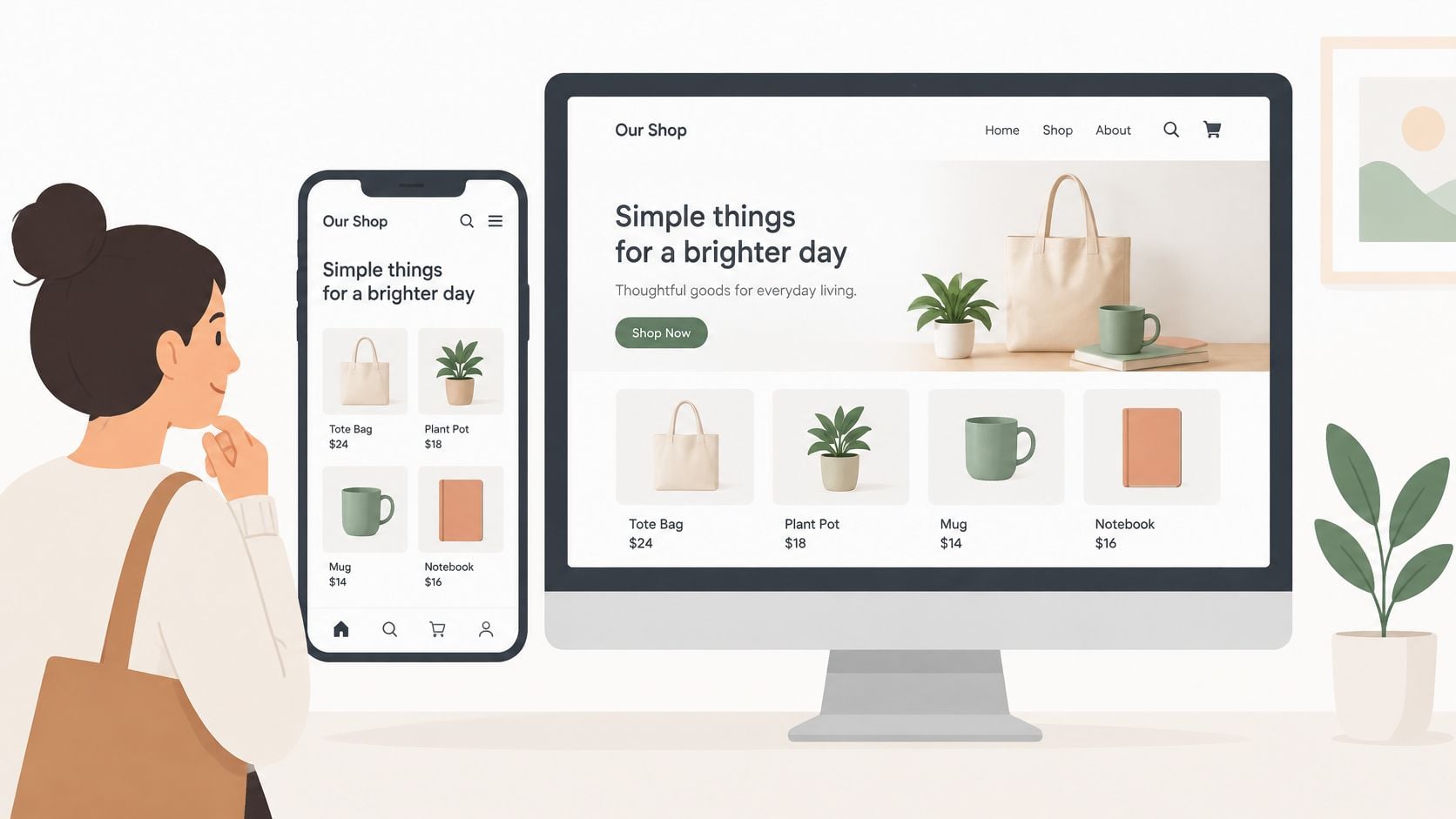
The Office for National Statistics reported that the proportion of adults shopping online rose from 53% in 2008 to 82% in 2019. That establishes familiarity with online shopping, rather than a mobile-shopping share, but the practical expectation is clear: customers shouldn't need instructions to operate your store.
Test the journey, not just the homepage
A WooCommerce theme such as Storefront can provide a responsive starting point. It won't automatically fix a size-guide extension, an oversized cookie banner or a payment widget that overflows its container.
Test on real phones with realistic tasks:
- Browse comfortably: Open the menu, search, apply filters and return from a product without losing your place.
- Select accurately: Check variation selectors, quantity controls and the add-to-basket button with touch input.
- Complete payment: Use the on-screen keyboard, address autofill and any available wallet buttons.
Say a Dorset clothing shop adds a sticky purchase bar. It's useful only if it doesn't cover the size selector or compete with the cookie controls.
Keep the mobile header compact, preserve visible keyboard focus and check enlarged text. A desktop layout squeezed onto a phone isn't the same as a usable mobile shop.
2. Product Search, Navigation and Filtering
A customer looking for waterproof walking boots shouldn't have to understand your stockroom categories. Discovery works when the catalogue uses customer language.
Protect this moment with clear category names, a prominent search field and filters that match genuine buying decisions. Footwear needs size and fit; furniture needs dimensions and material. Adding every available attribute creates clutter rather than useful choice.
Build the catalogue before buying a search plugin
In WooCommerce, use global product attributes for reusable properties such as colour, size and material. Inconsistent free-text values make filtering difficult: navy, navy blue and dark blue may unintentionally become separate choices.
For a broad catalogue, mega menu design can help group departments and useful subcategories. A compact shop may need only straightforward navigation, so don't install a large menu system just to fill the header.
- Handle customer vocabulary: Map trainers and running shoes where appropriate, and include product codes in searchable fields.
- Make filters reversible: Display selected filters clearly and provide an obvious way to remove them.
- Help unsuccessful searches: Offer relevant categories or spelling suggestions instead of an empty results page.
Consider a homeware shop selling lamps. A shopper who filters for brass should still see suitable products even when the product title describes the finish differently.
Review failed searches regularly before paying for more advanced search technology. A dedicated search extension can improve relevance and typo handling, but it can't compensate for missing attributes or poorly named products.
Keep filter URLs under deliberate SEO control rather than allowing every combination to become a separate indexable landing page.
3. Detailed and Conversion-Focused Product Pages
Protects the decision moment. Customers need to establish whether the product suits them, what they'll receive and what it will cost before committing.
For a backpack, the gallery should help explain shape, storage and scale.
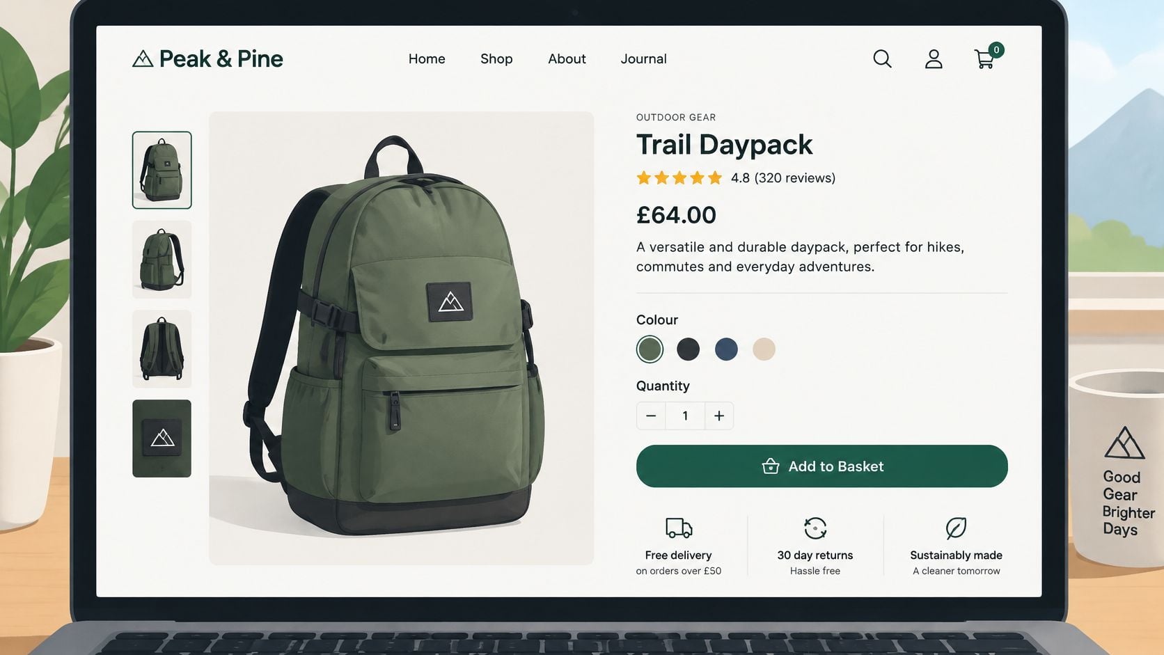
A useful page combines a concise benefit statement with specifications, price, stock status and clear variation choices. Don't hide everything beneath a long brand story. Someone buying that backpack needs dimensions, material, carrying features and an explanation of what fits inside.
Keep essential information beside the purchase controls
WooCommerce variable products need accurate prices, stock and images for each relevant variation. Selecting a different colour should show the corresponding product, not leave the customer guessing whether the gallery represents their choice.
Apply product page design best practices to the questions customers ask:
- Explain suitability: Describe who the product is for and any limitations.
- Show practical detail: Include measurements, care instructions and compatibility where relevant.
- Clarify fulfilment: Display delivery information or explain what location details are needed to calculate it.
Compress images using an appropriate format such as WebP or AVIF, but inspect the result. Fine fabric texture and product labels must remain legible. Lazy-load lower-page imagery rather than delaying the main product image unnecessarily.
Video can support a demonstration when movement or assembly is difficult to explain through photographs.
Give any embedded video a descriptive title and provide an accessible text explanation of essential information. Customers shouldn't have to watch it to discover a product's basic specifications.
4. Shopping Basket (Cart) Management
A customer adds a product, changes their mind about quantity and checks the total. The basket protects that review moment, when they need confidence that the order is correct.
Show product names, selected variations, recognisable images and editable quantities. Make removal straightforward, and don't require customers to restart their shopping journey to correct a simple mistake.
Practical rule: Every basket change should produce an understandable total and a clear next action.
Make totals dependable
WooCommerce basket behaviour depends on shipping zones, tax settings, coupons and any extensions that alter pricing. Test them together rather than assuming each plugin's successful installation proves the combined calculation works.
For example, a food retailer might sell individual jars alongside a subscription box. The basket must distinguish recurring charges from the immediate payment and explain whether delivery is charged separately.
- Show delivery clearly: If the cost depends on postcode, provide a calculator or label the amount as an estimate.
- Preserve useful progress: Test returning-customer baskets and session behaviour across your chosen configuration.
- Validate promotions: Check exclusions, minimum-spend conditions and what happens when products are removed.
A free-delivery progress message can be helpful, but only when it follows the same eligibility rules as checkout. A misleading message is worse than no message.
Keep the checkout button prominent and cross-sells restrained. The basket isn't the place for a second catalogue.
Use abandoned cart recovery only after resolving obvious basket problems. Recovery messages need appropriate permission, sensible timing and accurate links back to the saved contents. They shouldn't chase a customer who has already completed the purchase.
5. Streamlined Checkout with Guest Option
Protects the commitment moment. Someone has decided to buy; checkout should collect what's necessary to fulfil the order, not demand an unnecessary account or marketing profile.
Start by enabling guest checkout where the product and business model allow it. Some subscriptions or account-based services need a different approach, but ordinary retail purchases shouldn't inherit those restrictions by default.
Test checkout with the keyboard open, not just on a clean desktop screen.
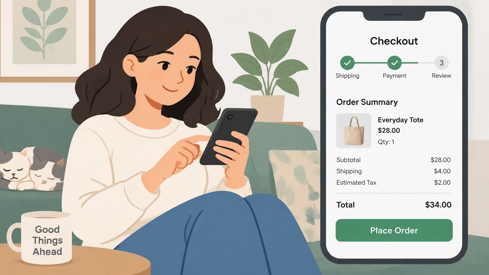
Accessibility belongs in checkout testing. UK findings reported by Ecommerce News state that 38% of disabled consumers abandon checkout because of accessibility barriers.
Remove obstacles without removing clarity
WooCommerce's block checkout and classic checkout have different extension requirements. Choose the approach your payment, shipping and checkout-field tools support, then test the complete combination.
For a local florist, postcode lookup can simplify delivery-address entry. It should still allow manual entry when a customer's address isn't found.
- Label fields properly: Keep labels visible and connect error messages to the affected inputs.
- Preserve entered details: Don't erase the form after an invalid postcode or failed payment.
- Support independent completion: Check keyboard navigation, focus order, screen-reader announcements and verification alternatives.
A short checkout isn't automatically a good checkout. Removing a useful delivery instruction field may create more work for customers and staff.
Keep the order summary and delivery choice accessible throughout. Invite account creation after purchase where practical, and test unsuccessful submissions as thoroughly as successful ones. Customers need a clear route forward when something goes wrong.
6. Secure and Flexible Payment Options
A customer reaches payment with their phone nearby and their card elsewhere. A suitable wallet option may let them finish without leaving checkout. Payment choice protects the final authorisation moment.
Start with reliable card processing and payment methods appropriate to your customers. Stripe and PayPal are options to evaluate for WooCommerce; Apple Pay and Google Pay availability depends on the gateway, device and integration configuration.
Treat payment as a complete workflow
A payment button appearing on screen doesn't prove the integration works. Order status updates, gateway notifications, refunds and failed authorisations all need testing.
A sound payment gateway integration should cover:
- Hosted or tokenised handling: Avoid collecting raw card details through custom WordPress forms.
- Authentication: Test additional verification flows, including cancellation and failure.
- Order reconciliation: Confirm gateway notifications update the correct order without duplicate fulfilment.
- Refunds: Check how full and partial refunds appear in both systems.
Say a customer pays successfully but closes the browser before returning to your shop. The order should still update through the gateway's server-to-server notification, rather than depending entirely on the browser redirect.
Security badges aren't a substitute for maintained software, correct gateway settings and working payment notifications.
Keep WordPress, WooCommerce and gateway extensions maintained, and review the responsibilities associated with your chosen payment setup. An encrypted connection alone doesn't establish that everything else is secure.
More payment methods also mean more reconciliation and support work. Add buy now, pay later only when it suits your products and you can explain the terms clearly, not just because another store displays the logo.
7. Customer Accounts and Order Management
An account should earn its place. It protects the post-purchase and repeat-purchase moments by making orders easier to manage, not by blocking the initial sale.
WooCommerce's My Account area provides a starting point for order history, addresses and account details. Build around the tasks your customers need rather than adding a dashboard full of empty features.
For a pet-food retailer, a useful reorder function could help customers buy their usual products again. It still needs to check current prices, stock and available variations before adding anything to the basket.
Make self-service genuinely useful
Give customers a clear route to order details, tracking and support. Distinguish an order being processed from a parcel being dispatched; those statuses shouldn't mean whatever a particular plugin happens to assume.
- Explain order progress: Use customer-friendly status messages and send relevant transactional emails.
- Handle payment details safely: Let the gateway manage supported saved-payment tokens rather than storing raw card information.
- Provide guest access: Offer secure order lookup or tracking for customers who didn't create an account.
- Keep marketing separate: Don't treat an account registration as automatic permission for promotional messages.
Test password resets, expired links and the account experience on mobile. A customer who can't regain access may contact support merely to find a delivery update.
Wishlists can help with considered purchases, but they add little to a shop selling urgent replacement parts. Prioritise order management before optional personalisation.
For subscriptions, make upcoming charges and available management actions understandable. Don't promise cancellation, skipping or address-change functions until the subscription extension and fulfilment process support them.
8. Customer Reviews, Ratings and Social Proof
A shopper may understand the specification and still wonder whether the product is right for them. Reviews protect the reassurance moment, especially when customers need information about fit, comfort or everyday use.
WooCommerce's product reviews are a practical starting point. Independent business-review services such as Trustpilot serve a different purpose: they can help customers assess the retailer rather than a particular item.
Keep that distinction visible. A business rating shouldn't be presented as though it describes the product currently on screen.
Collect useful feedback, not just praise
For a footwear store, comments about width and sizing can be more helpful than a star rating alone. Structured prompts can encourage that detail without dictating the customer's opinion.
- Request reviews after delivery: Base the timing on fulfilment rather than automatically asking as soon as payment clears.
- Identify verified purchases accurately: Apply labels only when the review system can establish the relationship.
- Moderate consistently: Remove spam and personal information without suppressing reasonable criticism.
- Respond constructively: Explain the next step and move private order details into a suitable support channel.
Don't manufacture testimonials or hide the context of an incentive. Establish a review policy and make sure imported reviews retain accurate product associations.
Photo reviews can answer appearance questions, but image uploads need moderation, file controls and accessible display. Specialist tools such as Yotpo or Bazaarvoice may suit a more complex operation, although their capabilities need weighing against cost and integration work.
A smaller store is usually better served by genuine, specific feedback than an elaborate carousel of vague praise. Place relevant reviews near the buying decision, not solely on a separate testimonials page.
9. Transparent Delivery, Returns and Policy Information
Delivery isn't an administrative detail to reveal after payment. It protects the handover between buying and receiving, while a clear returns process helps customers judge the risk before ordering.
In DHL's UK shopper research, 80% of British consumers said they would abandon a purchase when their preferred delivery option was unavailable. That makes delivery configuration part of the buying experience, not just the warehouse setup.
Make promises your operation can keep
Configure WooCommerce shipping zones deliberately, including postcode restrictions and relevant service exceptions. Distinguish dispatch estimates from delivery estimates, and don't advertise a date your fulfilment team can't support.
For a Dorset gift shop offering local collection, customers need the collection location, opening arrangements and notification process. A checkout label saying collection isn't enough.
- Explain costs early: Show applicable charges or provide a location-based estimate.
- Summarise returns clearly: Explain how customers start a return, who handles the next step and where the full terms are available.
- Support the process: Consider order lookup, eligibility checks and return-status updates where suitable.
- Keep policies aligned: Match product-page summaries, checkout messages and operational instructions.
For clothing, ClothME's fit-first returns playbook is a relevant companion to reviewing the information customers receive before buying. Better measurements and fit explanations belong alongside a usable returns process.
Have cancellation and refund terms checked against the requirements that apply to your products. Avoid copying another retailer's policy, particularly when you sell personalised, perishable or otherwise specialised goods. A clear policy must also be an accurate one.
10. Site Speed, SEO and Technical Foundations
Protects every moment, from the search result that introduces your store to the confirmation page after payment. A technically fragile shop can undermine otherwise thoughtful ecommerce website features.
Start with representative templates: category pages, simple products, variable products, basket and checkout. A fast homepage doesn't establish that filtered results or a variation-heavy product page work well.
Optimise the actual buying journey
Use PageSpeed Insights to investigate loading and layout problems, and Search Console to inspect search visibility and indexing. Test logged-out shopping sessions as well as administrator views.
- Cache selectively: Cache suitable public pages while excluding personalised basket, checkout and account responses.
- Audit extensions: Remove redundant plugins and investigate unnecessary scripts before adding another optimisation tool.
- Validate product markup: Keep structured prices, availability and review information consistent with visible content.
- Plan product changes: Redirect discontinued pages only when there's a relevant replacement.
Consider a furniture store that replaces a dining table range. Redirecting every old product to the homepage frustrates shoppers; a close replacement or a useful retained page may serve them better.
A practical SEO approach for ecommerce websites also needs useful category copy, descriptive titles and controlled filter indexing. Buying guides should connect content to relevant products when that helps readers choose.
Avoid installing overlapping schema or caching plugins without checking their output. Conflicting tools can make diagnosis harder.
Finally, test updates on staging, maintain restorable backups and monitor failed scheduled tasks. Performance isn't just about image compression: stock updates, payment notifications and transactional emails must remain dependable too.
The 10 Essential eCommerce Website Features at a Glance
| Feature | Journey Stage | Conversion Impact | Key Implementation Note |
|---|---|---|---|
| Mobile-Responsive Design | Browse and checkout across devices | Supports mobile sales and reduces friction | Use flexible layouts, touch-friendly controls, and test key journeys on real phones |
| Product Search, Navigation and Filtering | Product discovery | Helps shoppers find relevant products faster | Add typo-tolerant predictive search, clear categories, and useful filters |
| Detailed and Conversion-Focused Product Pages | Product evaluation | Builds confidence and supports purchase decisions | Show clear imagery, accurate details, pricing, stock, and a prominent add-to-basket button |
| Shopping Basket (Cart) Management | Pre-checkout | Reduces uncertainty and helps shoppers continue to checkout | Keep totals transparent, update quantities reliably, and preserve basket items |
| Streamlined Checkout with Guest Option | Checkout | Reduces abandonment from unnecessary steps or forced sign-up | Offer guest checkout, clear progress, address autofill, and visible delivery costs |
| Secure and Flexible Payment Options | Payment | Reduces hesitation and supports preferred payment methods | Use a PCI DSS-compliant gateway and offer relevant cards and digital wallets |
| Customer Accounts and Order Management | Post-purchase and repeat purchase | Supports loyalty, reordering, and customer service | Keep accounts optional at checkout and store payment details only as tokens |
| Customer Reviews, Ratings and Social Proof | Product evaluation | Builds trust and helps shoppers compare products | Display verified reviews and respond constructively to feedback |
| Transparent Delivery, Returns and Policy Information | Evaluation and checkout | Reduces uncertainty and unexpected-cost abandonment | Explain delivery costs, dates, returns, and cancellation terms in plain English |
| Site Speed, SEO and Technical Foundations | Discovery and site-wide experience | Supports organic visibility and reduces speed-related drop-offs | Monitor Core Web Vitals, optimise assets, and maintain structured data and redirects |
Building It Right and Turning These Features Into a Store That Sells
Start with a real purchase, not a redesign mood board. Open your store on a phone, find a suitable product, select a variation, calculate delivery and complete payment. Then check the confirmation email, order record and fulfilment instructions.
Record where you hesitated, what information was missing and which actions failed. Separate problems customers can't work around from improvements that would make the store nicer to use. A broken payment flow deserves attention before a new homepage animation.
Prioritise by customer impact
Work through the store in a practical order:
- Remove purchase blockers: Fix payment failures, inaccessible forms, incorrect totals and unavailable delivery choices.
- Strengthen decisions: Improve product details, variation images, stock messages and delivery explanations.
- Improve discovery: Correct categories, attributes, unsuccessful searches and confusing filters.
- Address technical weaknesses: Resolve slow templates, indexing problems, plugin conflicts and unreliable background tasks.
- Support returning customers: Improve order tracking, account access, reviews and relevant reorder options.
Give each change an owner and a clear acceptance test. Replacing a checkout extension isn't complete when it's installed; it's complete when the supported payment and shipping combinations work, errors are understandable and the resulting orders reach the right place.
Measure the journey with appropriate ecommerce events, gateway logs and customer-support feedback. Treat analytics as directional when consent settings or blocked scripts limit what you can observe. Don't assume an apparent improvement proves causation if you changed pricing, advertising and checkout at the same time.
Launch discipline: A feature is ready when customers can use it and staff can support what happens afterwards.
Keep the same discipline after launch. Theme changes, payment updates and new shipping rules can alter a journey that previously worked, so repeat the relevant tests whenever those components change.
For a small retailer, the sensible next investment may be better product information rather than another plugin. For an established catalogue, it may be search relevance or shipping integration. Choose the work that resolves a demonstrated obstacle.
The strongest store isn't the one with the longest feature list. It's the one that helps customers choose confidently, pay successfully and understand what happens next.
DesignStack is a Weymouth-based Dorset agency with over 20 years of experience, building responsive WordPress and WooCommerce stores with Stripe and PayPal integration, eBay and Amazon marketplace connections, customized shipping, subscription box setups and low-stock alerts. We offer fixed-cost pricing, three design revisions and one month of post-launch support, alongside UK-based, renewable-energy LiteSpeed hosting. Visit DesignStack to arrange a review of your store against these essentials and identify the buying obstacles worth fixing first.