Brand Identity Package Explained for SMBs
The most popular advice about branding is to start with a memorable logo. That's incomplete. A lovely mark won't help much if your website, quotation and shopfront look as though they belong to different businesses.
A useful brand identity package is business kit, not decoration. It gives your team the files, decisions and instructions needed to publish confidently across web, social and print. The important question isn't just whether you like the design. It's whether someone else can use it correctly without you supervising every choice.
Table of Contents
- What a Brand Identity Package Contains
- Why SMBs Invest in a Repeatable System
- Sample UK Price Bands by Scope
- How the Package Is Built
- Specs That Keep the Identity Usable
- Packages in Real Customer Touchpoints
- Agree Scope Price and Revisions First
What a Brand Identity Package Contains
A brand identity package is the working kit that makes your business look like the same organisation on a website, a quote and a shopfront.
What to expect in a brand identity package
| Piece | What you receive | Formats to ask for | Used on |
|---|---|---|---|
| Logo | Primary, lockup, icon and single-colour versions with clear space and minimum size | SVG, PDF, PNG | Website, signage, social, print |
| Colour palette | Primary, secondary and neutral colours with screen and print values | HEX, RGB, CMYK or Pantone | Screens, packaging, stationery |
| Typography | Heading face, body face, fallback and a simple size hierarchy | Named fonts and licence notes | Web, documents, ads |
| Brand guidelines | Logo rules, tone of voice and imagery direction | Staff, printers, freelancers | |
| Stationery | Business card, letterhead and email signature | Print-ready PDF, editable document and email-compatible assets | Day-to-day communication |
| Asset files | Organised master artwork and social sizes | SVG, PDF, PNG | Developers, printers, social managers |
The design decisions you're buying
Logo means more than a drawing. The primary mark might work beautifully above a shop entrance but become illegible in a circular social avatar. A horizontal or stacked lockup, simplified icon and single-colour version give you suitable alternatives. Clear-space and minimum-size instructions stop people squeezing the artwork into places it can't reasonably fit.
Colour needs both visual choices and production values. HEX and RGB describe colours for screens; CMYK or Pantone specifications support physical production. These aren't promises that every material will look identical. Paper, ink, finishes and screen settings affect the result, so important print work still needs a proof.
Typography should identify the heading face, body face and fallback font, with a hierarchy from headline to caption. Licence notes matter because permission to use a font in a printed brochure doesn't automatically settle its use on a website. Your developer also needs to know what should appear if the preferred web font fails to load.
The GOV.UK brand system demonstrates the broader principle by documenting logo use, colour, typography, imagery and applications across different contexts. A small business doesn't need government-sized documentation, but it does need decisions that survive a change of supplier.
The instructions and usable files
Brand guidelines explain how to apply those decisions. Include examples of incorrect logo use, a practical description of your tone, and imagery notes such as natural workplace photography rather than unrelated stock pictures. For businesses exhibiting or hosting launches, the PSW Events guide to event branding is a useful companion when considering how an identity extends into a physical event.
Stationery turns the identity into everyday communication. A letterhead needs an editable version if staff will type into it; an email signature needs email-compatible artwork and implementation guidance, not just a PDF preview.
Asset files are the organised handover. SVG provides scalable artwork, print PDFs support production, and transparent PNGs are handy where vector files aren't accepted. Keep editable masters separate from ready-to-use exports so nobody accidentally overwrites the originals.
Scope check: Treat a missing row as something to agree before commissioning, not a detail to sort out after approval.
Why SMBs Invest in a Repeatable System
Clear rules can be a better investment than a flashier logo. A distinctive mark helps people remember you, but documented instructions help staff and freelancers preserve that recognition when they publish something new.
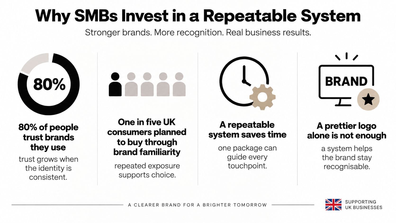
In Edelman's 2025 UK brand trust report, 80% of people trust brands they use. That finding doesn't prove that visual consistency creates trust by itself. It does underline why familiar customer relationships deserve care rather than a different visual treatment at every encounter.
The practical case for a repeatable system goes beyond appearance.
Make the customer's journey feel connected
Say a Dorset retailer publishes an Instagram offer. A customer follows it to a product page, adds an item to their basket and receives an order email. Those moments should feel connected, even though their layouts serve different purposes.
A mobile logo that loses its lettering makes identification harder. A checkout button with no consistent visual treatment makes the next action less obvious. Photography that changes from polished studio images to heavily filtered snapshots can make the offer feel less coherent.
These aren't reasons to make every page identical. They're reasons to define what stays constant and where variation is useful. Our explanation of why businesses use branding explores that distinction between recognisable presentation and decoration.
Measure more than approval of the artwork
Choose outcome measures before launch, then compare results over a meaningful period without assuming design caused every change.
- Enquiries or completed purchases: Check whether people complete the intended action, and note changes to promotions, prices or traffic sources.
- Repeat visits: Look for returning visitors alongside sales or enquiry quality, rather than treating visits alone as success.
- Recognition: Show customers an application with the name concealed and ask which business they think it represents. Treat this as practical feedback, not a formal market study.
For ideas about maintaining visibility after launch, revid.ai's guide to brand awareness can help you think about repeated exposure. The package supplies the visual rules; your publishing and customer service still have to earn attention.
The useful handover test is simple: give the same folder to separate suppliers. If they can produce an on-brand leaflet and social post without inventing new rules, the system is doing its job.
Sample UK Price Bands by Scope
Compare scope before comparing fees. There isn't a substantiated UK market price range available here for each package level, so presenting precise pound bands would give you false confidence. The reliable comparison is what the fee covers.
These scope categories help you organise quotes, but they aren't standardised industry products. A designer's essential package may contain work another studio prices separately.
Sample UK brand identity package price bands
| Scope | Usually included | Best for |
|---|---|---|
| Logo only | Mark plus basic file types | Sole trader needing a name mark |
| Essential package | Logo, colour, type, short guidelines | New business with a simple site |
| Standard SMB package | Essential items plus stationery, social and web files | Retailer or professional firm in print and online |
| Full identity system | Guidelines, templates, sub-brand or campaign rules | Growing brand with several suppliers |
What makes a quote larger
A logo-only commission involves fewer applications than a coordinated rollout across packaging, documents and digital channels. Extra concepts, bespoke illustration, packaging dielines, photography direction and more stakeholder reviews all add work.
A compressed deadline can also change how a project must be staffed. Editable source files, font licensing and production support need explicit treatment because they aren't interchangeable with receiving final artwork.
The sensible question isn't whether the larger quote contains more pages. It's whether the additional work removes a problem you have.
- A simple launch: A sole trader may reasonably prioritise a legible mark, basic colour guidance and usable exports.
- A business publishing regularly: Reusable document and social templates may matter more than another presentation of logo concepts.
- A growing organisation: Campaign rules and approval responsibilities become useful when different teams commission work independently.
A low fee can be fair for a narrow job. It becomes poor value when you discover that the files needed to use the design weren't included.
Our guide to how much branding agencies charge offers further context for discussing a proposal. Bring the contents checklist to that conversation and mark each item as included, excluded or optional.
Agree the commercial boundaries
Request a fixed project figure once the scope is settled, with revisions, usage rights and handover requirements written down. Where additional work might be needed, agree how it will be authorised before anyone starts it.
Don't choose a full system because it sounds more professional. Buy enough structure for the materials you publish and the people who will maintain them.
How the Package Is Built
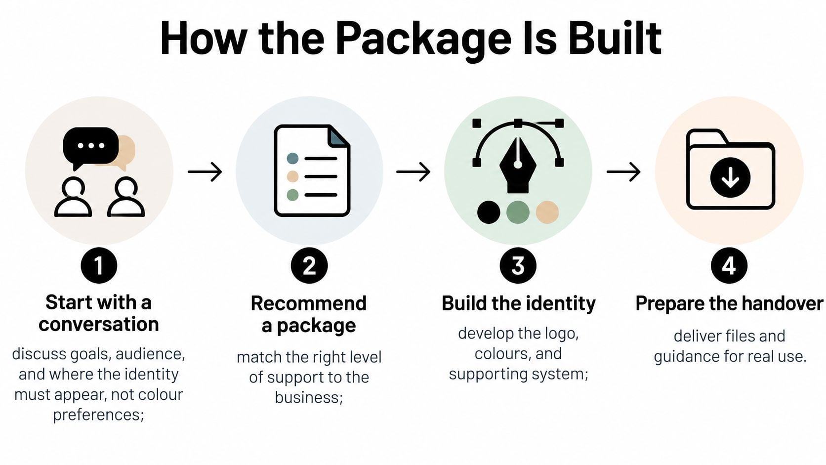
A good process makes decisions in an order that prevents expensive backtracking. At DesignStack, we start with a conversation about what the client wants to achieve, then recommend a package after discussing their requirements.
The broad workflow is straightforward, even when the creative exploration takes longer than expected.
From business brief to tested direction
Discuss goals, audience and applications. Start with who needs to recognise the business and what they should do next. Bring existing materials, explain what isn't working and identify the places the identity must appear. Our guide to writing a design brief helps turn those concerns into useful instructions rather than a list of favourite colours.
Match the package to the job. Agree the deliverable list and fee before design begins. Include practical dependencies such as whether a printer needs artwork for a scheduled opening or a developer needs assets before building page templates. This prevents an apparently finished identity from holding up the launch.
Investigate the context. Review competitors, customer language and credible local or sector cues. A coastal business doesn't automatically need a wave symbol; a professional firm doesn't automatically need dark blue. The aim is to distinguish useful signals from habits everyone in the category repeats.
Explore, compare and refine. Develop logo sketches alongside colour and type directions. Multiple concepts are normal, and brainstorming can take days: our Below the Hook Services logo process involved days of brainstorming ideas. Refine the strongest direction rather than combining favourite fragments that don't belong together.
Apply the direction to real material. A homepage header, business card or proposal cover exposes problems that a floating logo presentation can hide. Check the mark in black and white and at a small size before approval. Judge whether the business comes across appropriately, not just whether the symbol looks clever.
From approval to handover
Document the decisions and export the assets. Turn the approved direction into instructions someone else can follow. Export the formats named in the scope, check them in their intended software and distinguish editable masters from publishing files. A visual preview sheet helps non-designers find the right variant.
Explain permissions and responsibilities. Record who may edit the artwork, which assets rely on third-party licences and who approves future changes. Walk through a practical task, such as selecting a logo for a dark background, rather than assuming the folder names explain everything.
Completion means the printer and web developer can each find and use the appropriate files without needing a follow-up call to discover what was intended.
Specs That Keep the Identity Usable
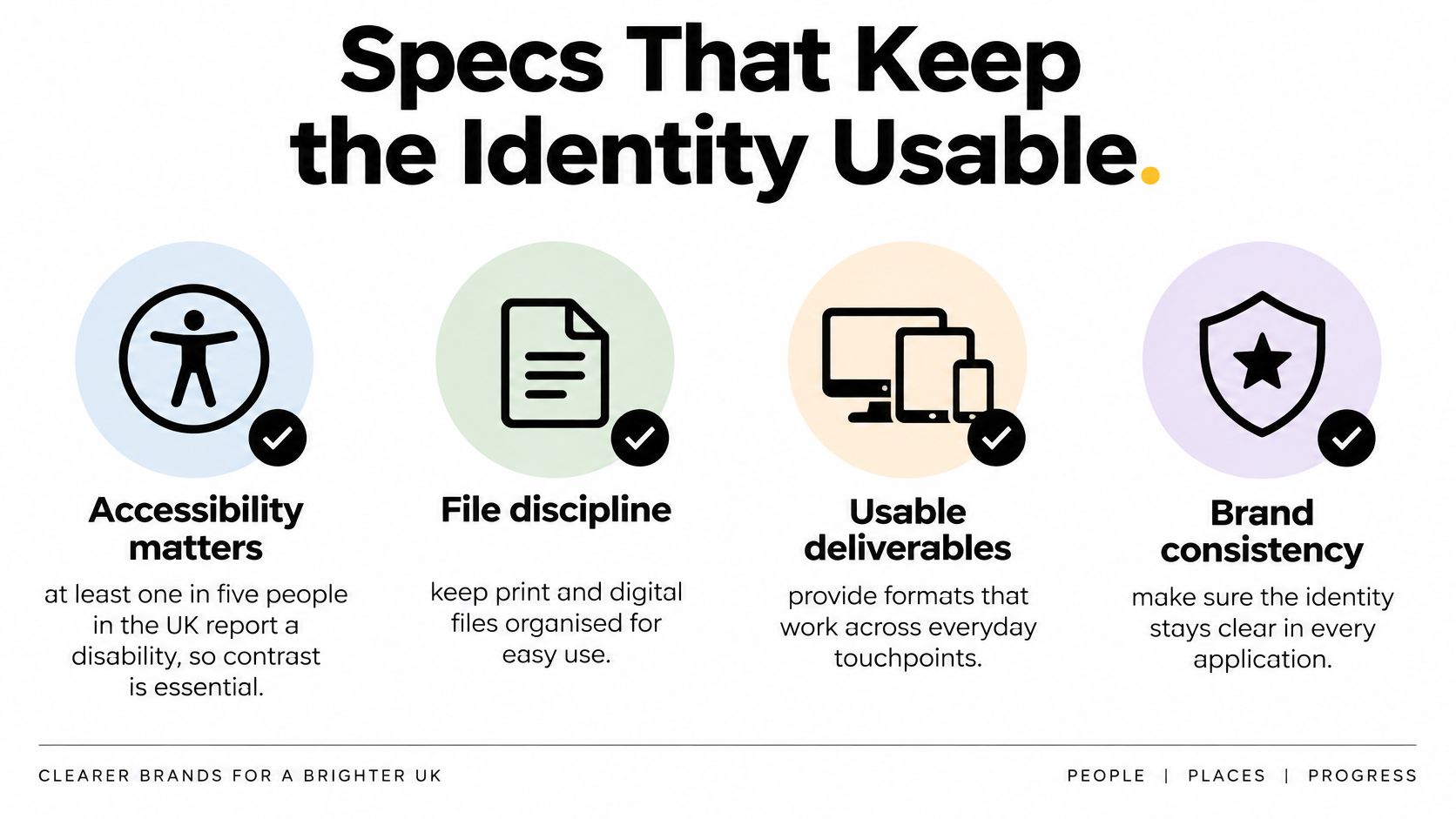
At least one in five people in the UK report having a disability, according to the GOV.UK accessibility strategy. Accessibility belongs in the specification from the outset, not in a final check after everyone has approved the colours.
That means testing combinations and interactions, rather than labelling an entire palette accessible. A colour can work for a large heading but be unsuitable for small text on the same background.
Use the following checklist as a sign-off aid, not just a visual review.
Turn specifications into pass conditions
Ask for documented contrast ratios, permitted foreground and background combinations, visible keyboard-focus styles and a non-colour way to communicate status. An error message should include understandable text or an icon, not just a red border.
Typography needs a readable scale and print guidance suited to the audience, with larger text where readers need it. SVG artwork should remain sharp when resized, while simplified variants should remain identifiable without relying on colour.
Acceptance checks by touchpoint
| Touchpoint | Check | Pass condition |
|---|---|---|
| Homepage | Approved logo and heading scale | Logo is the approved file and headings follow the type scale |
| Mobile navigation | Menu contrast and touch targets | Colour pair passes the contrast checker and targets meet the documented accessibility minimum |
| Invoice | Colour and font use | Approved palette and specified document or fallback font only |
| Email signature | Logo size and link colour | Approved logo meets its minimum size and links remain readable |
| Social profile | Avatar and cover assets | Approved assets, appropriate crops and approved colours |
| Printed leaflet | Print values and body size | CMYK or Pantone values used and text meets the agreed readable print specification |
| Paid advert | Contrast and status indicators | Colour pair passes the checker and status uses more than colour |
| Proposal PDF | Reading order and text handling | Text remains selectable and document structure supports accessible reading |
Keep the approved version identifiable
Our explanation of what a style guide is provides context for recording these decisions. Alongside design rules, name the asset owner, use clear version labels and identify who can approve a campaign variant.
A bright presentation screen can conceal weak contrast. A phone in sunlight or an ordinary office printout can expose it immediately, so test representative outputs rather than relying on polished mock-ups.
Before sign-off: Refuse a palette that arrives without contrast notes and examples of permitted combinations.
Packages in Real Customer Touchpoints
The following illustrative composites show how design decisions become useful customer-facing material. They're scenarios, not claims about named clients.
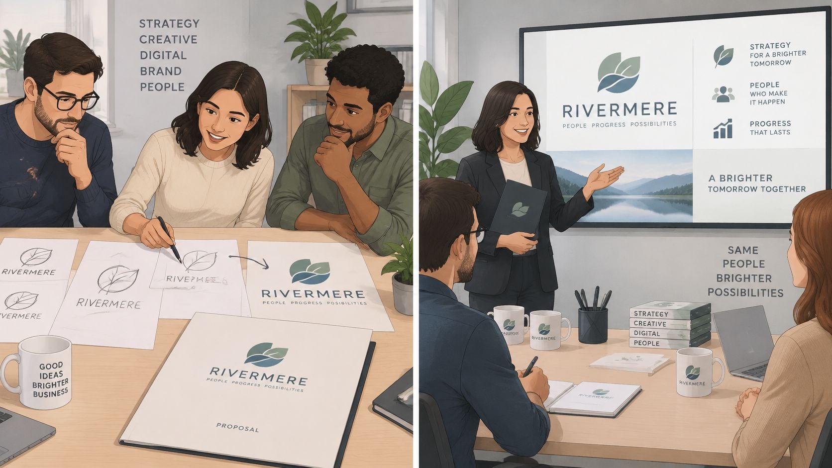
The useful discussion happens when people review an identity in context.
A multi-service firm with a complicated offer
Say a maintenance firm provides several related services but looks like a different company on every service sheet. During sketch review, the team chooses an abstract symbol whose connected elements suggest its combined offer, using core colours customers already associate with the business.
The important test isn't whether customers can decode every part of the symbol. It's whether the full identity helps them understand the offer. Consistent service headings, photography and layout can do more explanatory work than forcing the logo to describe everything.
On the website, services share a page structure. In a proposal, the same colour roles distinguish headings from supporting information. On a vehicle, the simplified mark leaves enough room for the business name and contact details.
A healthcare provider needing clarity
For a healthcare provider, an illustrative design review might reveal that an appealing display font feels too informal in appointment information. The team tests alternative type and colour combinations on a booking page, letter and mobile header before settling on a direction.
Colour and typography are decided together because they change how the same words feel. A restrained palette won't compensate for lettering that's difficult to read, and a serious typeface won't rescue confusing page hierarchy.
Use the video alongside those examples to consider how design choices become a wider identity.
Use provenance that you can substantiate
Among UK exporters, 52% said Britain's national brand helps their organisations grow and increase sales, while one-third of the public said they actively go out of their way to buy British, according to the Ipsos, JKR and British Chambers of Commerce Brand Britain report. Those findings support exploring meaningful provenance, not assuming that national imagery suits every business.
For a Dorset firm, authentic cues might include photographs of local work, specific craft processes or accurate place references in copy. A Union flag or coastal illustration added without a reason can distract from what makes the business credible.
Choose a true cue that can appear naturally on your website, printed material, and social posts. What could your customers recognize as distinctly yours?
Agree Scope Price and Revisions First
Match the contents to what you publish, choose scope that includes usable guidance and files, and agree revisions before the first sketch.
At DesignStack, we work on a flat fee per project for graphic design and branding, so clients know the cost before work starts. We offer three redesigns as standard and bring over 20 years of industry experience from our base in Weymouth.
Bring a brief that exposes the awkward bits
Bring examples of materials that already feel off-brand: the proposal nobody wants to send, the social avatar that crops badly or the letterhead staff keep rebuilding. Explain where the identity needs to work and whether print, social assets or a WordPress site must launch together.
Include who will provide feedback and who makes the final decision. Conflicting comments from different stakeholders are easier to resolve when the business goal and approval responsibility are clear.
Use our graphic design services contract guidance to prepare the commercial questions. The written agreement should settle:
- Deliverables: The actual artwork, templates, guidance and file formats included.
- Revisions: What counts as a revision, how feedback is submitted and the cost of additional changes.
- Ownership and rights: Who owns editable source files after payment, and whether print and web usage rights are included.
- Handover: The delivery date, outstanding dependencies and responsibility for supplying final content.
A package name isn't enough to commission against. Approve the work only when the deliverable list, revision allowance and fee are written down, with exclusions visible rather than assumed.
DesignStack offers branding, graphic design and WordPress web design, helping businesses carry the same identity into everyday print and digital use. Visit DesignStack to arrange a conversation about your goals, bring examples of materials that aren't working, and agree the package your business needs.