Ecommerce Conversion Optimization: A Practical CRO Playbook
A Dorset retailer can have a healthy stream of visitors, a respectable add-to-cart rate and a product range people clearly want, yet still watch revenue sit stubbornly still. The usual instinct is to buy more traffic. That's often the most expensive response, because extra visitors pour into the same leaky funnel.
Ecommerce conversion optimization starts elsewhere. You identify where shoppers hesitate, separate mobile problems from desktop problems, and fix the parts of the WooCommerce journey that prevent intent from becoming an order. The benchmark data is useful, but only when it's applied to your category, device mix and customer journey rather than treated as a universal target.
Table of Contents
- Why Your Store Is Leaking Revenue
- Setting a Baseline That Actually Means Something
- Diagnosing Where the Friction Really Lives
- Fixing Your Product Pages Before Anything Else
- Rewiring the Checkout for UK Shoppers
- Running A/B Tests Without Fooling Yourself
- Tracking the Right KPIs and What to Do Next
Why Your Store Is Leaking Revenue
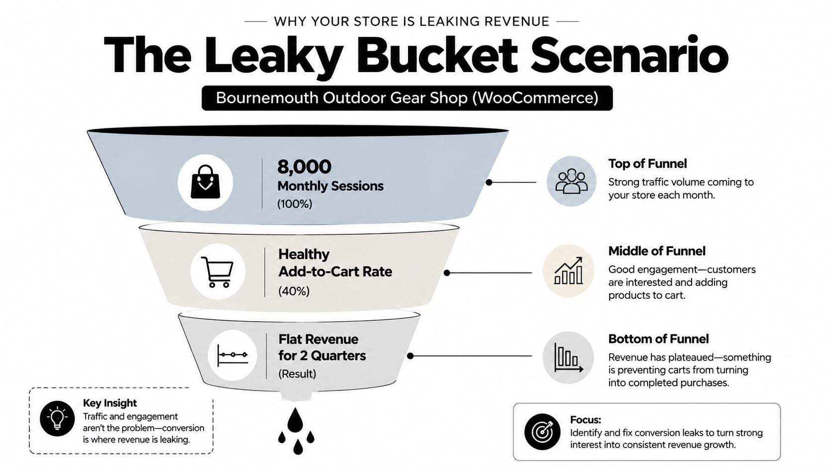
Take a Bournemouth outdoor gear shop running on WooCommerce. It's attracting around 8,000 monthly sessions, shoppers are adding products to baskets, and the owner has seen no meaningful revenue movement for two quarters. That isn't automatically a marketing problem. It's a funnel problem.
The store may be losing buyers in three places:
- Product page hesitation: Mobile visitors might struggle with variant selection, delivery information, images or proof that the product suits their needs.
- Checkout abandonment: UK data cited by Novuna's checkout abandonment study reports that 74% of UK carts created in the last quarter of 2024 didn't end in a completed order, with mobile abandonment at 76% and computer abandonment at 67%.
- Micro-friction: A delivery charge revealed too late, forced account creation, a postcode field that rejects normal input or a payment button that fails on a small screen can each interrupt a purchase.
The exact leak differs from store to store. The diagnosis shouldn't rely on guesswork. A funnel report, device split and session recordings will show whether visitors are failing to understand the offer, failing to trust the shop or failing to complete a technically awkward process.
Treat the funnel as a leaky bucket
Start by checking four numbers in the same reporting view: sessions, product views, add-to-cart events and completed purchases. Segment every stage by mobile and desktop. A blended result can make a store look healthy while its largest device segment underperforms.
Practical rule: Don't increase acquisition spend until you know which funnel stage is wasting the traffic you already have.
Conversion optimisation usually beats acquisition when the store already attracts relevant visitors but fails to turn enough of them into customers. Improving a product page or removing a checkout obstacle helps future organic, paid and referral traffic, whereas another campaign only increases the volume entering the broken journey.
For a useful overview of the broader principles, the practical conversion rate guide is a sensible companion. For a more detailed view of how visitors move from landing page to purchase, review your sales funnel optimisation before changing templates or plugins.
Setting a Baseline That Actually Means Something
A site-wide conversion rate gives you a starting point, not a diagnosis. One 2026 Great Britain benchmark reports an average of 3.4% and a median of 2.35%, showing how stronger stores can lift the average above the result typical stores achieve. A separate UK market report places the live average at 1.93% in May 2026, up from 1.76% a year earlier. The headline figure changes with the dataset and period, so treat it as context rather than a target (Behaviour Digital).
Category changes the comparison again. The benchmark reports 5.01% for arts and crafts, 3.00% for kitchen and home appliances, 2.56% for pet care, 1.53% for fashion clothing and accessories, and 1.20% for food and drink. A specialist craft shop and a fashion retailer should not share one conversion target. Their buying journeys, product margins and customer intent differ.
Build your own weighted baseline
Export or inspect 90 days of GA4 data, then segment the report by:
- Device, at least mobile and desktop.
- Category, using product or item-group dimensions.
- Traffic source, separating organic, paid, direct, email and referral traffic.
- Trading conditions, including promotions, stockouts and unusual delivery periods.
A store with a blended rate of 2.5% might look close to a general benchmark while its highest-volume category converts at 1.1% on mobile. The blended figure conceals the opportunity because segments that already perform well carry more weight.
Use market figures to set the frame, then create a category-specific baseline for your own WooCommerce store. The UK benchmark method outlined by JW Digital supports comparing market data with device and category splits before changing a user interface. That order prevents a common CRO mistake: testing a button or layout before identifying the segment with the largest commercial gap.
| Category | Mobile Median | Mobile Top Quartile | Desktop Median | Desktop Top Quartile |
|---|---|---|---|---|
| Arts and crafts | Not provided | Not provided | Not provided | Not provided |
| Kitchen and home appliances | Not provided | Not provided | Not provided | Not provided |
| Pet care | Not provided | Not provided | Not provided | Not provided |
| Fashion clothing and accessories | Not provided | Not provided | Not provided | Not provided |
| Food and drink | Not provided | Not provided | Not provided | Not provided |
The verified material provides category-wide rates, not mobile and desktop quartile figures for every category. Leave those cells unfilled rather than manufacturing precision that could send a testing roadmap in the wrong direction.
Allow the baseline to settle
A promotion, stockout or seasonal buying pattern can distort the result. Label unusual periods instead of folding them into the baseline. Before judging a meaningful test, collect enough normal trading data to cover two full trading cycles, then compare equivalent conditions.
A Dorset homewares shop might first see a blended rate of 2.1%, while a category-weighted mobile view shows a working baseline of 1.4% for its main product group. The lower figure is more useful because it describes the shoppers and products the business needs to improve. It also gives the team a fair control for later mobile-first tests, instead of hiding performance behind desktop traffic.
Keep the measurement definitions consistent. Connect GA4 events through a simple analytics setup for websites and check that each order produces one transaction record. If “purchase” fires twice, no product-page change can repair the reporting.
Diagnosing Where the Friction Really Lives
You don't need a large analytics contract to find the first serious problem. A WordPress or WooCommerce store can produce useful evidence with GA4, a behaviour tool and a disciplined review of a few real journeys.
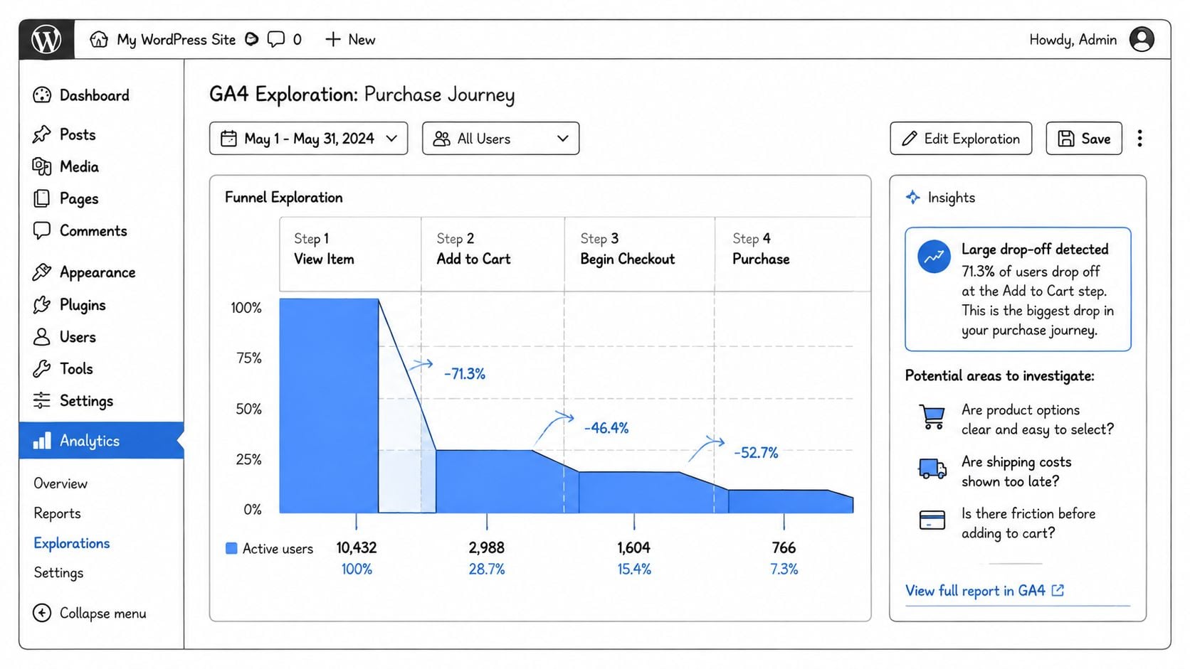
Begin in GA4 Explorations. Build a funnel using view_item, add_to_cart, begin_checkout, add_shipping, add_payment_info and purchase. The event names matter less than consistent implementation, but this sequence gives you a practical view of where intent disappears.
Combine numbers with observed behaviour
Plugins such as Analytify and ExactMetrics can make WooCommerce event visibility easier for teams that don't want to work directly in every GA4 report. Treat plugin dashboards as a convenience layer, though. Verify that the underlying events, product values and transaction IDs are correct before trusting a conversion trend.
Then open Microsoft Clarity, which is free, or use Hotjar if its research features suit the team. Watch recordings from product and checkout pages, prioritising mobile sessions. Look for:
- Rage clicks: Repeated taps around a variant selector, gallery control or disabled button often indicate that shoppers expect an interaction that isn't working.
- Dead taps: Visitors may repeatedly tap a cart icon, image or delivery accordion that looks interactive but has no useful response.
- Scroll stopping points: If sessions consistently stop where delivery charges, returns information or payment details appear, inspect that content before rewriting the headline.
- Form struggles: Repeated corrections, keyboard switching and backtracking often point to field order or validation problems.
Heatmaps add context, but they don't explain motivation by themselves. A click map can show activity around a trust badge. The recording tells you whether visitors understood it, ignored it or tried to click it.
Run a short technical check
Use PageSpeed Insights and field data where available. A slow mobile product template can undermine every copy, layout and trust change you make. Check image weight, unused theme CSS, third-party scripts, caching and the behaviour of sticky elements rather than accepting a generic “mobile friendly” label.
A practical 30-minute routine looks like this:
- Five minutes: Check GA4 funnel drop-off by device.
- Ten minutes: Watch several mobile recordings from a product page and checkout.
- Five minutes: Review heatmaps and scroll depth on the same URLs.
- Five minutes: Run PageSpeed Insights on a key product page and checkout.
- Five minutes: Write one evidence-based hypothesis, including the page, device, friction and intended measure.
That evidence becomes more useful when you map the complete customer journey rather than looking at checkout in isolation.
Fixing Your Product Pages Before Anything Else
Product pages carry the sales argument. They must answer the buyer's practical questions quickly, especially on a phone: what is it, does it fit my need, is it available, when will it arrive and what happens if I change my mind?
Start with performance on the product pages that generate the most commercial value. Use PageSpeed Insights alongside your available field data, then inspect the first screen before touching the copy. Compress oversized images, serve modern formats such as WebP, lazy-load below-the-fold media and remove theme or plugin assets that the page doesn't use.
Audit the page in buyer order
The order matters because shoppers don't read the page like a brochure.
- Hero image and gallery: Show the product clearly, include useful angles and make thumbnails easy to tap.
- Price and stock: State the current price, availability and any relevant purchase limitation directly.
- Variant selection: Make sizes, colours or pack choices obvious, with useful error messages when a selection is missing.
- Reviews: Put relevant feedback close enough to the buying decision that visitors don't need to hunt for reassurance.
- Delivery and returns: Explain the practical promise in plain English, not as a collection of generic badge graphics.
- Cross-sells: Recommend related products after the primary decision is clear.
On WooCommerce, a focused gallery extension, a review system such as Judge.me and a lightweight structured-data plugin can earn their place. Heavy page builders often create a poor trade-off when they add scripts, styling and layout complexity to a page that needed a faster, clearer buying path.
Specificity beats decoration: “DPD next-day cut-off 4pm” gives a shopper a usable promise. Five unnamed trust badges give them something to ignore.
Trust signals should match the concern. A clothing shop may need sizing confidence and returns clarity. An outdoor retailer may need material details, weather suitability and delivery timing. Where fit is central to the purchase, this complete guide to fit technology provides useful context for options beyond static size charts.
For practical page structure, use these five layouts as a working swipe file:
- Fast decision page: Image, price, availability, delivery promise and add-to-basket action above the fold.
- Technical product page: Benefits first, specifications in an expandable section, then reviews and supporting content.
- Variant-heavy page: Selection controls near the main image, with clear state changes and stock feedback.
- High-consideration page: Comparison points, proof, returns and delivery information placed before secondary recommendations.
- Bundle page: Primary product first, compatible additions second, with the total value explained without obscuring the main price.
The wider product page design guidance is useful when your existing template has grown through years of additions and no longer has a clear hierarchy.
Rewiring the Checkout for UK Shoppers
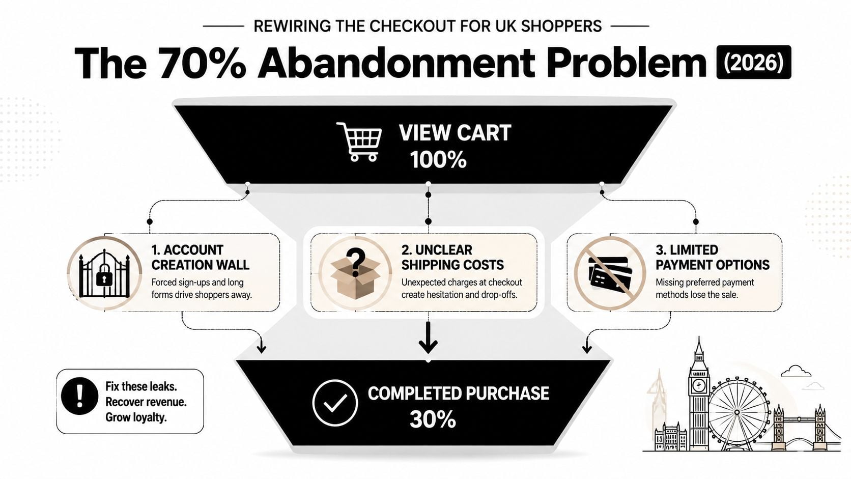
A shopper reaches the payment step on a phone, sees an unexpected delivery charge, then leaves. That failure is usually preventable. The earlier Novuna finding that 74% of UK carts created in Q4 2024 failed to complete, rising to 76% on mobile, makes checkout prevention more valuable than building an abandoned-cart sequence around a form that creates friction. Recovery rates below 5% reinforce the same point.
Remove the obstacles buyers did not ask for
Start with the shortest checkout your fulfilment and compliance requirements allow. Add a field only when it serves a clear operational purpose.
- Guest checkout: Let customers place an order without creating an account. Offer account creation after payment, when the shopper has a reason to return.
- Delivery clarity: Show delivery costs and timing before the final payment action. The total should not appear as a late surprise.
- Address entry: Use reliable postcode lookup, sensible autocomplete and validation that explains the required correction.
- Field reduction: Remove company details, order notes and duplicate address fields unless your operation needs them.
- Payment choice: Present card payment and suitable express options clearly, with controls that remain usable on mobile.
A longer form does not automatically create a safer order. Each unnecessary field adds another decision or another chance to make a correction. Set billing to match delivery by default, and place error messages beside the relevant field instead of sending the shopper back to the top.
Choose payment options from your device data, not from a plugin checklist. Stripe or Square can support express buttons such as Apple Pay and Google Pay, but test them across the WooCommerce theme, tax settings, shipping rules and mobile browsers before exposing them to customers. Buy-now-pay-later may suit some retailers. Fees, reconciliation and customer-service work make it a commercial decision, not an automatic CRO win.
Run the checkout as a new customer before launch:
- Trust: Confirm that returns, privacy, payment security and contact details are easy to find.
- Errors: Submit missing, invalid and corrected fields on a phone.
- Postcodes: Test ordinary formatting variations and lookup failures.
- Shipping: Check that the promised delivery option matches the final order summary.
- Confirmation: Verify that order, payment and analytics events fire once.
The credit card icon resource can support visual payment cues. Icons cannot repair unclear costs, weak error handling or a payment flow that fails on mobile.
Here is a short implementation walkthrough for a WooCommerce checkout review:
Running A/B Tests Without Fooling Yourself
A test should answer a commercial question, not fill a reporting calendar. Write the hypothesis before changing the page, define the audience, and choose the metric expected to move. “We'll make the page better” cannot be tested. “Clearer delivery wording should reduce mobile checkout drop-off because recordings show shoppers pausing at delivery” can.
Keep the expected effect grounded in your baseline. Use a sample-size calculator with the current conversion rate, traffic and minimum meaningful effect before launching. If the store cannot collect enough observations to separate a useful change from ordinary variation, the test will create more confidence than evidence.
Choose the smallest useful experiment
Test one meaningful friction point at a time:
- Product page: Delivery promise versus the current copy.
- Checkout: Guest checkout versus account-first checkout.
- Navigation: A clearer category label versus the existing label.
- Payment: Express payment placement versus its current position.
Changing the headline, images, layout, reviews and button together may produce a different page, but it will not show which change caused the result. A major redesign can make commercial sense as a project. Treat it separately from a clean experiment.
Google Optimize is no longer available. WordPress teams can assess options such as VWO, Google Ads experiments for eligible campaign work, or a lightweight testing plugin where the theme supports it. Check how each tool handles WooCommerce sessions, consent, caching and purchase attribution. A test that misfires on one of those layers can produce a misleading result even when the page variation works as intended.
Run tests through normal trading conditions and include two full business cycles before interpreting the result. The UK methodology referenced in JW Digital's benchmark guidance supports allowing enough normal trading variation before making a decision. Pause or annotate major campaigns, stock changes and unusual promotions. One unusually strong day is not a winner.
| Field | Example |
|---|---|
| Hypothesis | Clearer delivery wording will reduce mobile checkout hesitation |
| Audience | Mobile visitors reaching the delivery step |
| Primary metric | Checkout completion rate |
| Secondary metric | Revenue per visitor |
| Change | Delivery cost and timing shown earlier |
| Test period | Two normal trading cycles |
| Decision rule | Review the result with segment and revenue context |
| Learning | Record what the result suggests for the next test |
Keep the brief in a shared document with the baseline, implementation date, exclusions, result and learning. Record mobile performance separately where traffic or friction differs by device. A losing variation can show that the problem was misdiagnosed, which is more useful than deleting the test and repeating the same assumption.
Tracking the Right KPIs and What to Do Next
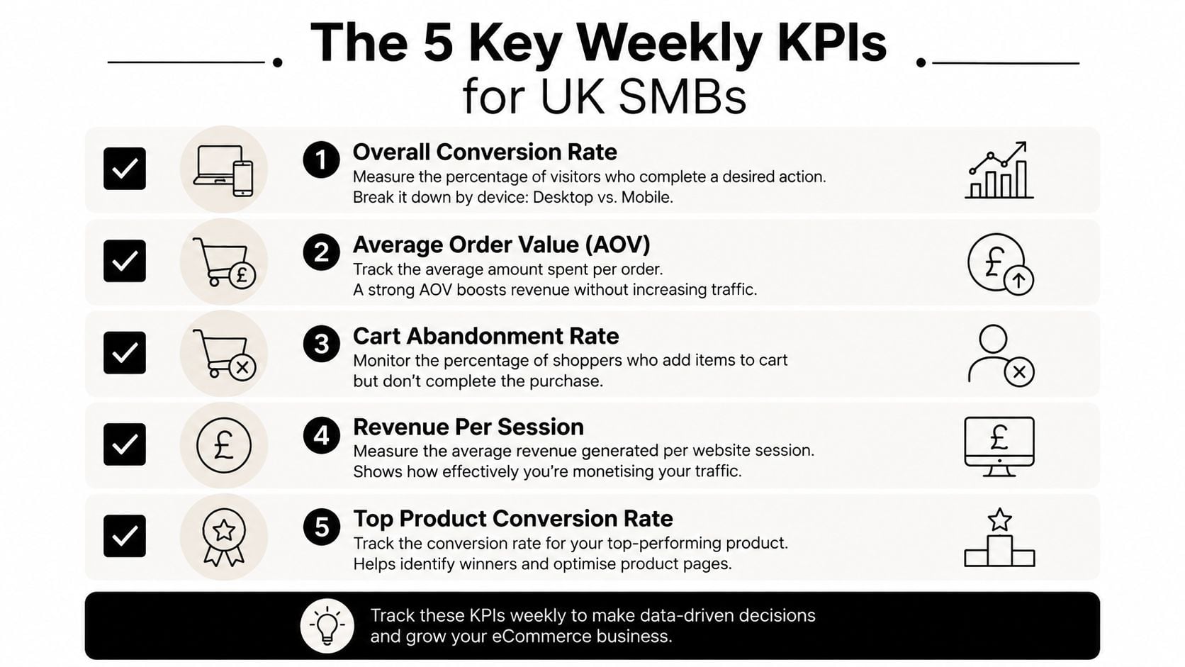
A useful CRO dashboard should help a shop owner decide what to inspect next. It shouldn't reward the team for collecting attractive but disconnected figures. Review performance weekly, segmented by device and category wherever the data supports it.
Track these five measures:
- Conversion rate by device: Compare mobile and desktop rather than relying on a blended result. UK market data reports mobile conversion at 1.8% in 2026, while mobile also accounts for over 70% of web traffic in the cited IRP market discussion (IRP UK market data.)
- Average order value: Watch whether bundles, recommendations or payment changes alter order composition, not just order count.
- Checkout completion rate: Separate cart creation from checkout entry so you can identify form and payment problems.
- Revenue per visitor: This brings conversion and order value into one commercial view.
- Returning customer rate: A better first order experience should support future purchasing, but don't treat repeat business as an immediate result of every page test.
The benchmark range needs careful handling. UK sources place average ecommerce conversion between 1.93% and 3.4%, with a 2.35% median, while category and device differences can make a general target misleading (Behaviour Digital's UK benchmark guide). Use those values as context, then set targets for the segments that matter to your shop.
Use a 90-day operating rhythm
Weeks one and two should establish event tracking, inspect data quality and record the current funnel. Weeks three to six should address obvious product page and checkout friction before you spend time on subtle visual experiments. Weeks seven to ten can hold controlled A/B tests. Weeks eleven and twelve are for reviewing revenue impact, documenting learning and choosing the next bottleneck.
A lightweight GA4 and Looker Studio view is enough for many small stores if the events are reliable. Include device, category, source and landing page filters, then schedule a short weekly review. The point isn't to create a larger report. It's to make the next action obvious.
This week, take three actions:
- Install or verify checkout funnel tracking: Confirm that shipping, payment and purchase events record correctly on mobile.
- Capture a product-page heatmap: Choose a revenue-driving product and inspect where visitors stop, tap or ignore the page.
- Write one test hypothesis: State the evidence, the audience, the change and the primary KPI before anyone edits the template.
DesignStack helps Dorset and UK businesses review customer journeys, build conversion-focused WordPress and WooCommerce websites, and tighten the weak points between product discovery and purchase. If your store needs a practical ecommerce conversion audit or a clearer testing roadmap, visit DesignStack and start the conversation with the pages and data you already have.