WordPress Theme Customization: A Practical Guide for UK
Most advice about WordPress theme customisation starts with colours, fonts and a polished homepage. That's the easy part. The harder question is what your changes do to keyboard navigation, semantic markup, loading behaviour and maintainability after launch.
An “accessibility-ready” label helps you choose a sensible starting point, but it doesn't protect a site from a branded colour override, a page-builder wrapper or a replacement header. In the UK, that distinction matters. WordPress is embedded in the market, with one 2026 estimate placing it at 85.8% of UK websites that use a CMS, and another source ranking the UK as the world's third-largest country for WordPress usage, with roughly 1.4 million live sites (UK WordPress market data). A theme decision affects a large and varied base of business, retail, charity and public-facing websites.
The practical approach is to treat customisation as an engineering change, not a styling exercise. You choose a base theme for its structure, protect your work, control the cascade, test the rendered output and deploy only when the templates behave properly.
Table of Contents
- Why Customisation Often Breaks What the Theme Got Right
- Choosing a Base Theme That Supports Your Goals
- Working with Child Themes and CSS Overrides
- Page Builders Versus Direct Template Edits
- Testing Responsive Behaviour and Accessibility After Changes
- Deployment Checklist for a Stable Launch
Why Customisation Often Breaks What the Theme Got Right
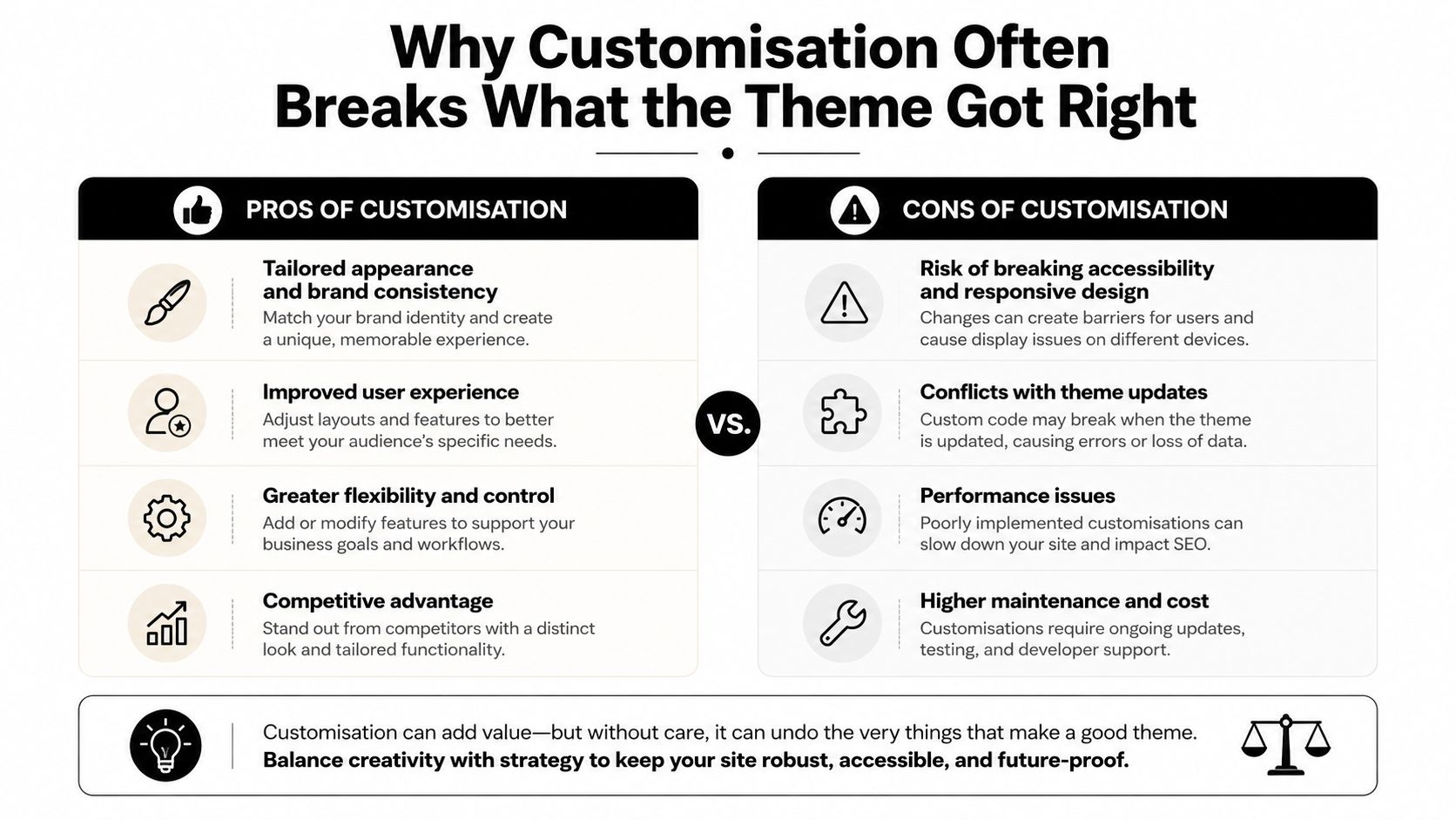
Customising an accessibility-ready theme can make an accessible starting point fail after launch. The label confirms that the theme met an initial set of requirements. It does not cover altered templates, colours, navigation or components. Those changes create a fresh responsibility to check the rendered site.
The failures are often small and easy to miss. A theme button may have enough contrast, while a lighter brand colour fails against the same background. A parent header may provide a working skip link, but a replacement header can change its target ID or remove the main content landmark. A table that works in the original layout can become difficult to use when a page builder puts it inside nested columns.
The label is a starting point
WordPress guidance requires relative font units, 4.5:1 AA contrast for plain text, visible keyboard focus states, keyboard-reachable links and controls, labelled form fields, and testing across browsers and screen widths (WordPress accessibility requirements). These are build requirements, not visual preferences.
A UK institutional accessibility guide states the same requirement practically. It recommends choosing themes marked “accessibility-ready”, then testing menus, colour contrast and responsive behaviour instead of treating the label as a guarantee (Lancaster University WordPress accessibility guidance). That matters particularly for public-sector services, where the GOV.UK Design System supplies accessible styles, components and patterns for services using a .service.gov.uk address.
Practical rule: Every template or component change creates a new testing obligation.
Visual confidence causes many post-launch defects. A developer checks the desktop page, confirms the logo and brand colours, and assumes the theme's original quality remains intact. Custom navigation may lose meaningful landmark names, a redesigned form may drop accessible labels, and a builder can produce an illogical heading hierarchy when editors add sections.
A good business website needs a coherent identity and a structure that supports users, assistive technology and future editing. A practical business website planning guide should therefore sit alongside theme decisions. Responsibility transfers as soon as customisation begins. Test the final templates, keyboard paths and mobile layouts, not the theme demo.
Choosing a Base Theme That Supports Your Goals
A base theme should reduce future work, not merely make the first page look impressive. Ignore listicles that rank themes without explaining their architecture. Instead, assess the theme against the content model, editing needs and technical constraints of the project.
Start with the template model
A block theme suits organisations that want to manage templates and reusable parts through the Site Editor. It can work well where headers, footers, archive layouts and design tokens need to remain editable by a capable internal team. A classic theme is often more comfortable for a PHP-led build with established template files, custom hooks and a development team that wants tight control over rendering.
Neither approach wins automatically. Ask whether the project needs full-site editing, whether the team understands block patterns, and whether the planned custom functionality fits naturally into the theme's template hierarchy.
Inspect the assets and CSS
Open a clean installation and inspect what the theme loads before adding content. Look for unnecessary stylesheets, scripts that appear on pages that don't use them, and a CSS structure that forces you into repeated !important declarations. A theme with clear component classes and predictable hooks gives you room to adapt layouts without fighting the cascade.
JavaScript deserves the same scrutiny. Menus, sliders, pop-ups and filters can create useful interactions, but every dependency adds another opportunity for conflicts, delayed rendering or keyboard problems. A lightweight starter theme such as GeneratePress or Blocksy can be a better foundation for a brochure or service site than a multipurpose theme full of unused modules. A full-site-editing theme becomes more attractive when editors need to adjust global templates themselves.
Score the theme against the project
Use a written decision rather than relying on familiarity. The matrix below is a starting point, not an affiliate ranking.
| Project Type | Recommended Base Theme | Key Trade-off | CSS Architecture |
|---|---|---|---|
| Brochure site | Lightweight classic or block starter theme | Lean output may require more bespoke styling | Modular component classes or theme.json tokens |
| E-commerce | WooCommerce-compatible lightweight theme | Fewer built-in features mean more deliberate product-template work | Predictable product and utility classes |
| Membership portal | Extensible classic theme or carefully selected block theme | More hooks and integrations increase testing responsibility | Structured components with controlled overrides |
Check the theme directory for the accessibility-ready tag, then verify the demo yourself. Test the keyboard path, focus visibility, colour combinations and small-screen layout before you commit. A theme that exposes useful action hooks may save more development time than one that offers a large visual options panel.
For eCommerce work, theme decisions also need to account for product grids, category archives, cart interfaces and recurring content blocks. A practical WordPress eCommerce theme guide is useful as a planning reference, but your own staging test should decide whether the theme fits the actual shop.
Working with Child Themes and CSS Overrides
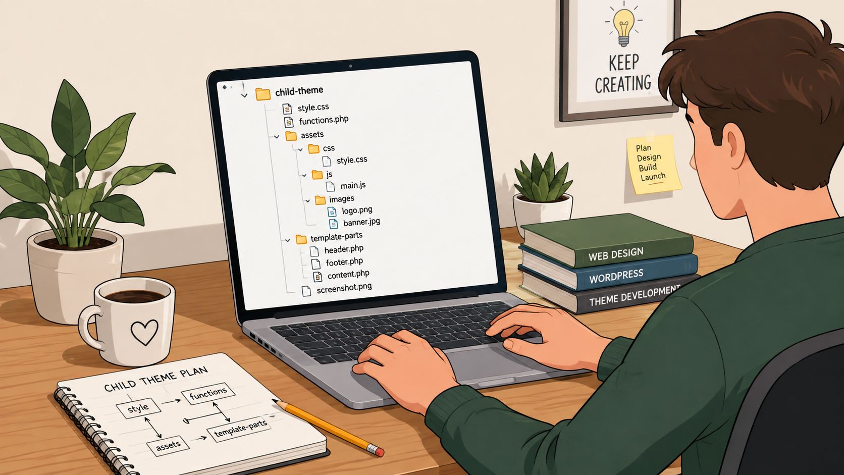
A child theme is the minimum protection against losing custom work during a parent-theme update. It keeps your templates and styles separate, gives you a controlled place for PHP changes, and makes the ownership of each override clear.
A simple structure might look like this:
your-child-theme/style.cssyour-child-theme/functions.phpyour-child-theme/template-parts/your-child-theme/templates/your-child-theme/assets/css/your-child-theme/assets/js/
The style.css header identifies the parent theme:
/*
Theme Name: Your Child Theme
Template: parent-theme-directory
*/
The Template value must match the parent theme's directory name. In functions.php, enqueue the parent stylesheet first, then the child stylesheet with the parent as its dependency:
<?php
function your_child_theme_assets() {
    wp_enqueue_style(
        'parent-theme-style',
        get_template_directory_uri() . '/style.css'
    );

    wp_enqueue_style(
        'child-theme-style',
        get_stylesheet_directory_uri() . '/style.css',
        array( 'parent-theme-style' )
    );
}
add_action( 'wp_enqueue_scripts', 'your_child_theme_assets' );
The dependency matters because it tells WordPress how the styles relate. If the child stylesheet loads before the parent, the parent can overwrite your work.
Override the component, not the whole site
Use the parent theme's class naming conventions where possible. If the theme uses .site-header .primary-navigation, extend that path rather than writing a broad rule that affects every navigation element.
For example:
@media (max-width: 48rem) {
    .site-header .primary-navigation {
        display: none;
    }

    .site-header .menu-toggle {
        display: inline-flex;
    }
}

.card-grid .card {
    padding: 1.5rem;
}

.site-content .button,
.site-content a.button {
    border-radius: 0.25rem;
    font-weight: 700;
}
The navigation rule is scoped to the header, so it doesn't accidentally hide a secondary menu. The card rule targets the component rather than every div, while the button rule includes the link variant commonly used by WordPress themes. This level of specificity should normally win without resorting to !important.
Good CSS is easy to remove. If an override depends on a long selector chain and several exceptions, the base theme probably isn't the right foundation.
The Additional CSS panel is fine for a quick client adjustment or a single property that needs testing. It becomes a maintenance liability when it holds hundreds of lines with no comments, naming system or version history. Move stable work into the child theme, organise rules by component and use DevTools to inspect the winning declaration before adding another selector.
A developer should also document template overrides and update risks in the handover. If the project needs a specialist to keep that structure healthy, a WordPress developer near you can review the child theme, cascade and update strategy before changes become difficult to unwind.
The following walkthrough provides useful visual context for the relationship between parent and child theme files:
Page Builders Versus Direct Template Edits
Page builders solve a real problem. They let a marketing team create landing pages, adjust content sections and manage visual layouts without opening PHP files. That speed can be valuable, especially for campaigns where the content changes frequently.
The trade-off appears when a builder becomes the default solution for every template. Nested wrappers, widget-specific CSS and additional scripts can make the rendered page harder to inspect and maintain. The same flexibility that helps an editor create a complex hero section can make it difficult to preserve heading order, focus behaviour and predictable spacing across the site.
Direct template edits take longer at the beginning, but they give the developer control over markup, loops, queries and conditional logic. They're usually the stronger choice for custom post type archives, WooCommerce product loops, site-wide headers and footers, and components that must behave consistently across many pages.
Match the tool to the content
Elementor or Beaver Builder can be appropriate for a small number of marketing pages with clearly defined editable zones. They're less suitable when every archive, product card and content block receives a separate visual treatment. In those cases, the site can accumulate variations that editors struggle to maintain and developers have to debug repeatedly.
A useful decision matrix looks like this:
| Factor | Page Builder | Template Edits |
|---|---|---|
| Development speed | Fast for visual page composition | Slower initially, especially for bespoke layouts |
| Long-term maintainability | Depends heavily on disciplined widget use | Strong when files and components are organised |
| Performance overhead | Can add wrappers, styles and scripts | Usually leaner and more predictable |
| Accessibility control | Depends on generated markup and widget settings | Direct control over landmarks, labels and headings |
| Client handoff | Familiar for visual editing | Requires documented fields, blocks or editorial guidance |
Don't rely on an isolated homepage result to judge the approach. A customised shop needs testing on product, category, basket, contact and blog templates. A service firm needs to inspect enquiry forms, case-study layouts and recurring content sections. Real output matters more than the theme demo because plugin additions and editorial changes create the conditions users experience.
The WordPress ecosystem's scale makes this discipline more important, not less. A mature installed base encourages reusable themes and workflows, but reuse only helps when the resulting markup remains coherent. Choose a builder for a defined editorial need, not because it avoids every PHP decision.
Testing Responsive Behaviour and Accessibility After Changes
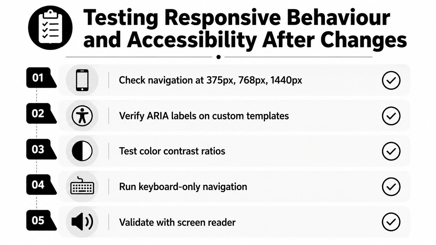
A desktop screenshot proves little. A navigation override can look correct at a wide viewport, then fail on a narrow screen. A copied template may also discard the ARIA label or landmark structure provided by the parent theme. The hidden risk appears after launch, when plugin output, editor content and real devices interact with the custom code.
Treat testing as a release gate, not a final visual check. Test rendered pages at 320px, 375px, 768px, 1024px and 1440px, then repeat the review across the templates that matter to the business. Text must reflow, controls must remain usable, and content must not sit behind fixed headers or overflow containers.
Run automated checks, then use the site manually
Run axe DevTools to identify likely WCAG 2.2 AA issues, then investigate every result rather than treating the scan as an audit. Check keyboard focus order, visible focus indicators and accessible names on buttons. Submit forms without a mouse. A screen reader pass often exposes failures in custom navigation, dialogs and status messages that visual review misses.
Lighthouse CI can flag performance regressions between builds. BrowserStack extends the review to combinations such as iOS Safari and Android Chrome, where touch behaviour, viewport changes and browser controls can expose faults that a desktop emulator misses.
Set clear pass criteria:
- Automated results: No critical or serious axe violations remain unexplained.
- Contrast: Plain text maintains at least 4.5:1 AA contrast.
- Keyboard operation: Every link, menu control, form field and interactive component works without a mouse.
- Responsive output: No horizontal scroll appears at a tested viewport unless content, such as a data table, deliberately requires it and explains that behaviour.
- Assistive technology: Headings, landmarks, labels and status messages remain understandable without visual styling.
Record each result against a specific template in a shared ticket, assign an owner and note any accepted exception. This applies the same discipline used in quality assurance for creative work, while keeping the review tied to the actual WordPress build rather than a generic checklist.
For UK organisations, public-facing services should include keyboard and assistive technology checks in their accessibility workflow. An accessible website testing guide provides a practical review list. Run the scan after brand styling, plugins and editor content are present. That final rendered output is where customisation-related regressions usually surface, so test again after meaningful content or plugin changes.
Deployment Checklist for a Stable Launch
A careful theme build can still fail during deployment. A cache can serve an old stylesheet, a minification setting can break a script, or a production-only plugin can alter the markup you tested on staging. Use a sequential gate, and don't move to the next stage until the previous one passes.
Gate one, assets and caching
Purge unused CSS where your build process supports it, defer non-critical JavaScript and serve appropriately optimised images. WebP is a practical default, with AVIF fallbacks where your delivery setup supports them. Check that object caching, such as Redis, is configured safely, and exclude dynamic areas from page caching rather than caching logged-in or cart-specific output.
Gate two, content and data
Remove obsolete revisions, orphaned post metadata and stale transient entries only after a backup and a review of what the site needs. Never perform database cleanup as an unexplained launch ritual. Record what was changed, keep a restore point and verify forms, search and editorial workflows afterwards.
Gate three, SEO and accessibility
Check canonical URLs, XML sitemap output, Open Graph rendering and structured data with Google's Rich Results Test. Then run the final axe scan and complete keyboard navigation manually on the key templates. The test must reflect the production configuration, including analytics, consent tools, forms and eCommerce extensions.
Gate four, rollback and monitoring
Staging should mirror production closely enough to expose plugin, cache and server differences. Keep a documented handover file with the theme version, custom templates, CSS decisions, integrations and known limitations. Tag the release in Git so the team can revert to a known version instead of reconstructing the previous state from memory.
A detailed website launch checklist can help teams assign these tasks and record sign-off. After launch, monitor error logs, forms, search, checkout and the most important page templates. A stable launch is not just a successful deployment. It's a verified transition from controlled staging to the site your customers and editors use.
DesignStack builds and customises responsive WordPress and WooCommerce websites, with support for branding, hosting and launch preparation. If your current theme has become difficult to maintain or you need accessibility and performance checked properly, visit DesignStack to discuss the project and next steps.