10 Homepage Design Tips for SMEs in 2026
A potential customer finds your business from their phone, lands on the homepage, and sees a large image, a vague slogan and no obvious next step. They can't tell whether you provide the service they need, whether you work in their area or how to contact you, so they leave and try another company. The problem isn't that your branding looks dated. It's that the page hasn't answered the visitor's first questions quickly enough.
Effective homepage design tips aren't about adding more decoration. They're about creating a guided path from clarity, to confidence, to conversion. Your homepage should explain what you do, help people find the right service or product page, remove doubts and make an action such as calling, booking, buying or requesting a quote feel straightforward.
This guide follows the journey an SME visitor takes. You'll find practical WordPress implementation notes, local-business examples, before-and-after contrasts and a final audit checklist. If your website also needs to be understood consistently by search engines and AI-led discovery tools, Nuwtonic Agentic SEO and GEO Platform is relevant to that wider visibility challenge.
Table of Contents
- 1. Clear Value Proposition Above the Fold
- 2. Mobile-First Responsive Design
- 3. Intuitive Navigation Structure
- 4. High-Quality Visual Design and Branding
- 5. Strategic Call-to-Action Placement
- 6. Social Proof and Testimonials
- 7. Fast Page Load Speed and Performance
- 8. SEO Optimisation and Keyword Strategy
- 9. Trust Signals and Security Badges
- 10. Content Strategy and Storytelling
- Top 10 Homepage Design Tips Comparison
- Turn the Homepage Into a Practical Growth Tool
1. Clear Value Proposition Above the Fold
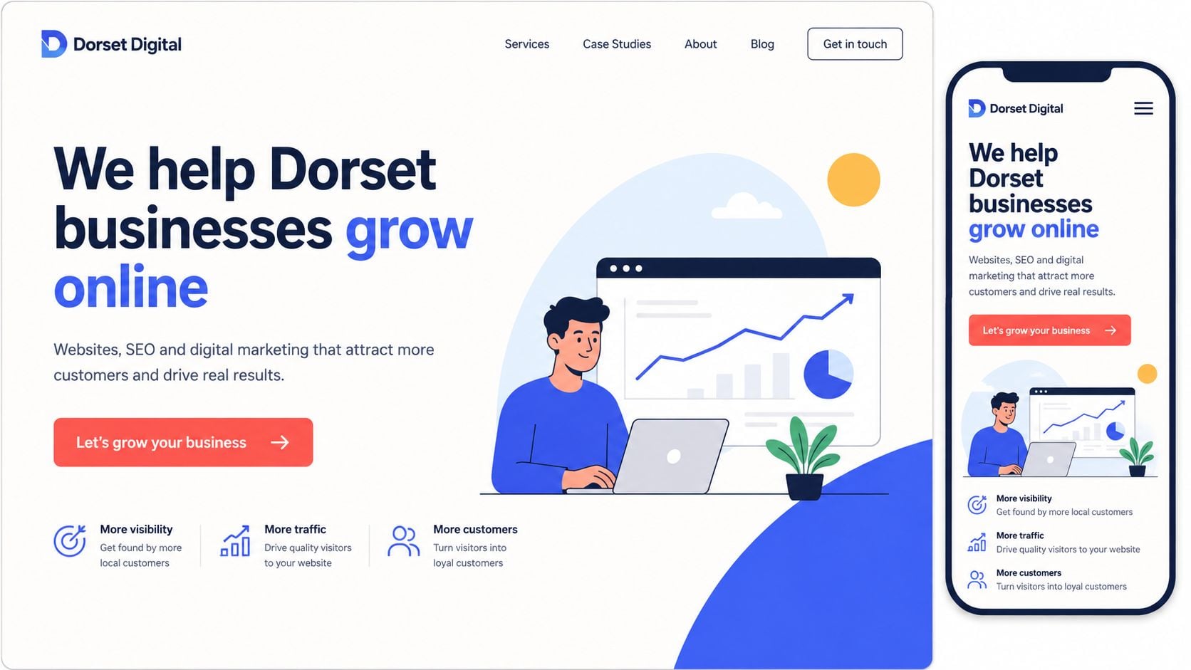
A visitor should understand what you do, who you help and what they can do next before scrolling. “Welcome to our website” spends that first screen without answering those questions. A Dorset web studio might use “Professional Web Design for Dorset Businesses”, add a line about responsive WordPress websites and offer a button to discuss a project.
Lead with the customer's outcome, then explain the service that delivers it. “Increase online sales with a clearer eCommerce website” gives a retailer a stronger reason to continue than “Responsive WordPress development”. The guide to unique value propositions provides useful context for shaping that message.
A clear first screen also helps visitors choose the right route. Keep the core message visible on mobile, with one primary action rather than several competing buttons. A UK design source reports that 85% of adults believe a business website on mobile should look as good as or better than the desktop version, while 70% of small business websites lack a homepage CTA (UK homepage design statistics). Use that evidence to check four elements:
- Headline: State the main offer in familiar language.
- Supporting text: Identify the audience, location or practical benefit.
- Primary CTA: Choose an action such as “Get My Quote” or “Book a Consultation”.
- Proof point: Add a genuine credential, review or experience statement only when you can substantiate it.
In WordPress, build the headline and CTA as editable hero-block text, not as part of the image. Busy photography can reduce contrast and hide the action on smaller screens. Compare a vague hero, such as “Digital solutions for modern businesses”, with “WordPress websites for Dorset trades and professional services”. The second gives visitors a clearer reason to view services or request a conversation.
Test one meaningful headline or CTA change at a time through analytics or an A/B testing tool, then check whether enquiries, bookings or quote requests change.
2. Mobile-First Responsive Design
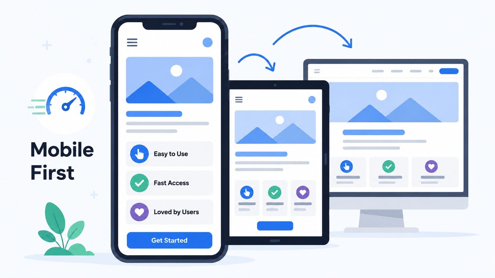
A visitor checking a local business on a phone may be standing outside the premises, comparing providers or trying to book before moving on. The homepage should make that task easy. Mobile-first design sets the small-screen structure first, then adds desktop refinements. Visitors should read the main message, recognise the next action, open the menu and tap the phone number without pinching, zooming or dealing with overlapping elements.
Performance affects whether that journey starts at all. 75% of people in the UK say page-load speed has the biggest impact on their overall experience, and 53% of mobile users leave a site if it takes more than 3 seconds to load, according to Google's Mobile Site Speed Playbook. The same source reports that users regard a satisfactory load time as 2 seconds or less. Plan layout, imagery and performance together rather than treating speed as a later technical task.
A responsive WordPress homepage changes content order, spacing and interactions for each screen size. It does not just shrink the desktop version. For The Lobster Pot, the booking button should stay easy to tap, the menu should open cleanly and location details should be easy to use on a phone. Six promotional tiles across a desktop page may work better as a clear vertical sequence on mobile. That choice may reduce visual variety, but it can make the booking route clearer.
Test the homepage on real devices
Browser resizing catches some layout faults, but real phones expose touch, keyboard and scrolling problems. Test the homepage on devices used by your customers and check:
- Hero content: The headline and CTA remain visible and readable.
- Touch controls: Buttons and menu links have enough space around them.
- Forms: Fields are easy to select, and the keyboard does not cover the submit button.
- Images: Files are resized and served in modern formats such as WebP.
- Orientation: The layout still works when the device rotates.
In WordPress, confirm the theme has the correct viewport setting. Review responsive controls in the block editor or page builder, then test the result with Google PageSpeed Insights. Use this explanation of responsive web design when deciding whether a theme adapts or merely compresses its desktop layout.
3. Intuitive Navigation Structure
Visitors arrive with a task, not an understanding of your internal organisation. A prospective customer may want to compare services, a local shopper may need opening hours, and a membership visitor may be looking for classes or joining information. Build the menu around those needs, using labels people already recognise.
A clear primary menu might contain Services, About, Portfolio, Insights and Contact. Crossfit Durnovaria could keep its route focused on classes, membership, timetable and contact details. A chamber of commerce needs different paths for members, events and business resources. The right structure depends on the audience and the enquiries you want to generate, not on a fashionable navigation pattern.
Keep the header focused. Listing every page forces visitors to process choices before they understand the offer. Place secondary information in a structured footer, then group related solutions under service category pages. Information architecture guidance can help you map those relationships before editing the WordPress menu.
Make the next page obvious
The homepage should send visitors towards the page that answers their immediate question. If customers usually check products or services first, feature those destinations near the opening content and repeat them at relevant points. Visitors commonly review a business's products or services before exploring other sections, so make that route easy to spot. Use descriptive links such as “Explore commercial web design” instead of repeating “Learn more” on every card.
A before-and-after change can be simple. “Learn more” gives little context, while “View wedding catering menus” tells a local customer exactly what happens after the click. That clarity can reduce hesitation and help turn browsing into an enquiry or booking.
Sticky headers can support movement through a long homepage, provided the bar stays compact on mobile. Check that it does not cover headings after anchor jumps and that keyboard users can see the focus state. Add breadcrumbs to internal pages when the site has several levels. In WordPress, review every menu item, redirect and form destination after publishing. Broken links or confusing redirects weaken trust before visitors reach the contact page.
4. High-Quality Visual Design and Branding
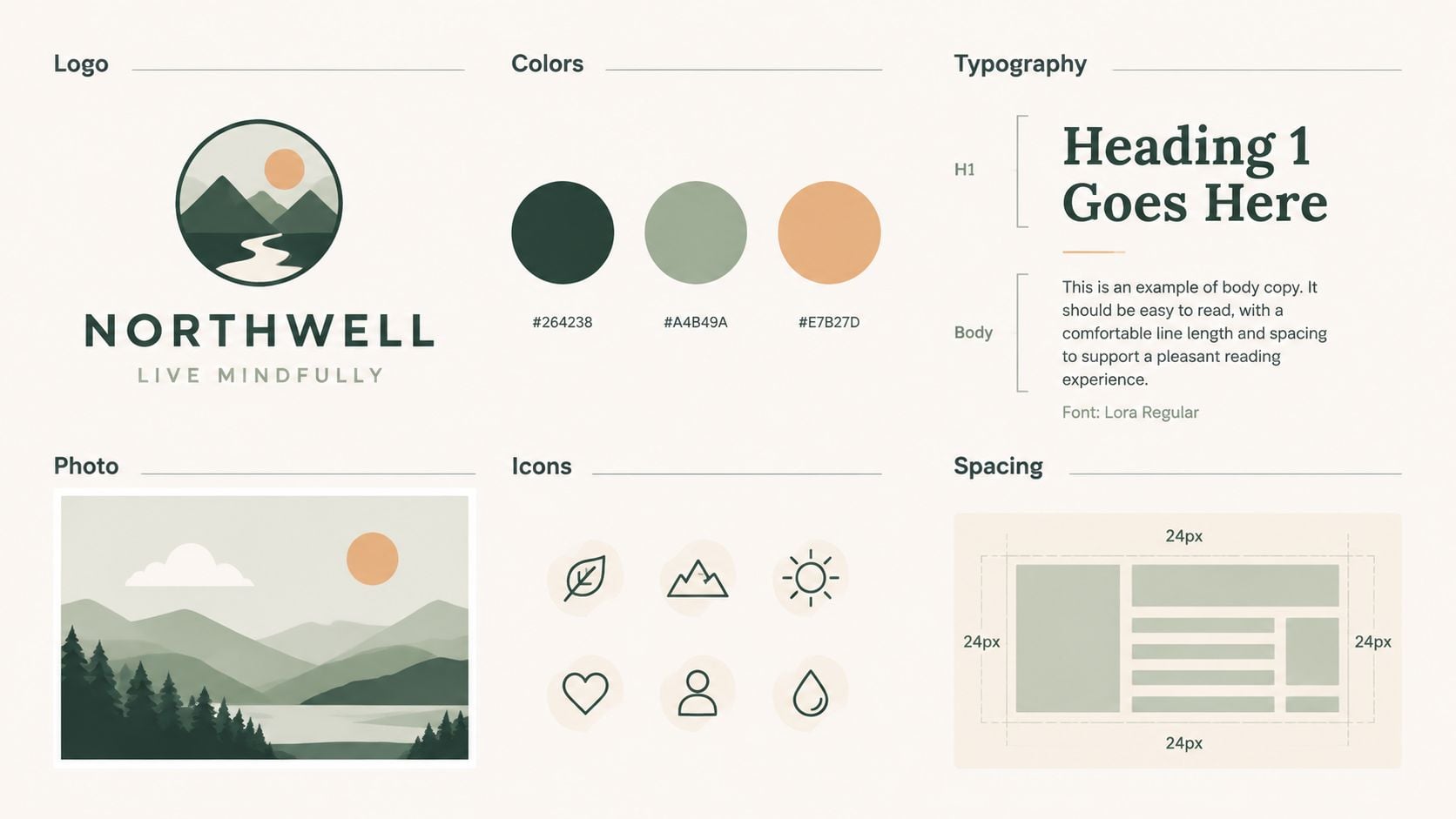
Good visual design helps visitors decide whether your business feels credible, relevant and suitable for their needs. It doesn't mean filling the homepage with expensive effects. It means using a consistent visual system, with purposeful imagery, readable typography, clear spacing and a colour palette that supports the action you want people to take.
A local retailer should show its own products, premises or team wherever possible. A professional photograph of a Dorset shop can establish place and personality more effectively than a generic stock image of a shop assistant. If original photography isn't available, choose curated imagery that matches the business rather than selecting unrelated images because they happen to fit a template.
Build a system, not a collection of decorations
Set rules for the elements that repeat across the homepage:
- Colour: Assign colours to backgrounds, text, links and CTAs, then check the combinations for readable contrast.
- Typography: Use a limited font system with clear differences between headings, body copy and labels.
- Spacing: Repeat consistent gaps so sections feel related rather than randomly assembled.
- Photography: Decide whether the brand feels documentary, editorial, technical, warm or playful.
- Components: Reuse button styles, card layouts and testimonial treatments across the site.
A style guide makes future WordPress updates safer because a new page doesn't need to reinvent the brand. Keep image files appropriately sized and avoid placing essential information only inside graphics. Tools such as an AI image upscaler guide from ClipNova may help when preparing visual assets, but enlargement won't repair a poor original photograph or compensate for weak page structure.
Before-and-after comparison is useful here. Before: a dark hero image, small grey text, three competing button colours and six unrelated fonts. After: one clear image, high-contrast text, one primary CTA, a restrained type system and enough white space to separate the offer from the supporting proof. The second version may feel less dramatic, but it gives visitors fewer reasons to hesitate.
5. Strategic Call-to-Action Placement
A homepage CTA should match the action your business can fulfil. A builder may need quote requests, a restaurant may need bookings, a retailer may need product browsing and a consultant may need a call. “Submit” describes a form control, not a meaningful outcome. “Get My Free Quote” or “Book a Table” tells visitors what happens next.
Place the primary action near the value proposition, then repeat it where a visitor has enough information to act. A portfolio section can lead to “View Our Work”, while the final section can return to “Discuss Your Project”. Repetition is useful when each CTA follows a relevant piece of information. It becomes irritating when every block shouts for attention.
For practical guidance on reducing friction, see this resource on improving website conversion rates. The key decision is whether your homepage needs one dominant action or a primary and secondary route. A business that serves urgent local enquiries might give “Call Now” priority and keep “See Our Services” as the secondary option. A considered B2B purchase may need “View Case Studies” before “Arrange a Consultation”.
Make the action easy to complete
Keep the first contact form focused on information you need. Name, email and a short description may be enough for an initial enquiry. Asking for a long project brief before someone has spoken to you can discourage good prospects, especially on mobile.
Use a high-contrast button colour that belongs to the brand, and test the whole interaction rather than judging the colour in isolation. Track clicks, form starts, completed submissions, booking visits and phone link taps in Google Analytics or another analytics platform. Heatmaps can reveal whether visitors notice the button, but they won't explain every reason someone abandons a form, so combine behavioural data with customer feedback.
Urgency elements deserve caution. A countdown can suit a genuine event or limited booking window, but it feels manipulative when a local service business uses artificial scarcity. Trust grows when the CTA accurately represents what will happen after the click.
6. Social Proof and Testimonials
Visitors often want evidence before they enquire, particularly when the service is unfamiliar or the purchase carries risk. Your homepage can reduce that uncertainty with carefully selected reviews, client logos, project examples and concise case studies. The proof should answer a practical question, such as whether you understand the sector, communicate well or deliver the result promised.
A Dorset agency might show a project for a local retailer, a membership organisation and a hospitality business, with each example linking to a fuller case study. A restaurant could feature genuine customer reviews beside food photography, while a gym could present member experiences that describe the support and atmosphere. Don't use a wall of praise with no context. A named review with a role, business and relevant detail usually does more work than a collection of anonymous compliments.
Ask for useful evidence
Request testimonials soon after a successful project or milestone, while the experience remains clear to the client. Ask questions that produce specifics:
- Starting point: What problem were you trying to solve?
- Working experience: What made the process easier?
- Outcome: What changed for your organisation or customers?
- Recommendation: Who would benefit from this service?
Only include measurable results when the client has approved the wording and you can substantiate it. The planned example of a percentage improvement should not be used without verified evidence. Honest qualitative feedback is stronger than an impressive but unsupported claim.
Refresh the selection when your business changes. Old reviews can still be valuable, but a homepage should also show that the business serves customers now. If you embed Google reviews, check that the display remains accessible, loads efficiently and doesn't turn the page into a third-party script bundle.
For longer projects, publish a case study with the problem, approach and result. A short video can add personality, but provide captions and a written alternative so visitors aren't required to hear the story.
7. Fast Page Load Speed and Performance
A potential customer visiting a local tradesperson's homepage may leave before seeing the phone number if the page loads slowly. Speed affects whether visitors understand the offer, reach a service page and submit an enquiry. Earlier guidance highlights how quickly mobile visitors can abandon a slow page, so protect the first useful view rather than chasing a perfect laboratory score.
Start with the hero area. A full-screen video, oversized background image and several marketing scripts can delay the content visitors need. Use an image sized for its display area, compress it, preload only the priority asset and defer media below the fold. For a plumber, salon or café, a clear service image and booking button often support sales better than decorative motion.
GOV.UK provides a useful engineering comparison. Its reported median page load time was 0.455 seconds across all pages and devices, with 83% of visitors experiencing a load time classed as good under CrUX's 1-second definition (GOV.UK performance data). Your site may need different resources, but the comparison shows what a lightweight, well-maintained homepage can achieve.
A sensible WordPress performance pass
- Measure first: Use PageSpeed Insights, GTmetrix and field data where available.
- Reduce media weight: Resize images for their display dimensions and use modern formats.
- Control plugins: Remove inactive or overlapping plugins instead of adding another optimiser.
- Improve delivery: Choose quality hosting, caching and, where appropriate, a CDN such as Cloudflare.
- Protect layout stability: Reserve space for images, banners and embeds so content does not jump.
- Review scripts: Defer non-essential analytics, chat, social feeds and animation libraries.
WordPress tools such as WP Super Cache, Autoptimize and Smush can help, but configuration matters. Test after each major change, because combining or delaying scripts can break menus, forms or consent tools. The WordPress loading speed guide offers a practical starting point.
Before publishing, test the homepage on a mobile connection, open its main menu, submit the form and check the booking or contact path. A fast page that loses enquiries to a broken form is not performing well.
8. SEO Optimisation and Keyword Strategy
Your homepage needs to make sense to people first, but search engines still need clear signals about the business, location and main services. A Dorset web agency might naturally explain that it provides web design in Dorset, WordPress development in Weymouth and eCommerce support across the UK. Those phrases should appear where they make sense, not be repeated in every heading.
Start by identifying the main intent behind the homepage. It usually represents the business broadly, while dedicated service pages target more specific needs. If you want enquiries for web design in Dorset, the homepage can establish that relevance and link to detailed pages for eCommerce, branding, hosting or WordPress support. Don't force every keyword into one page. A crowded homepage often becomes harder to read and less persuasive.
Put the essentials in place
Set a descriptive title tag, write a meta description that reflects the offer, use one clear H1 and organise supporting content with logical H2 and H3 headings. Add relevant structured data, such as Organisation, LocalBusiness, Product or Service markup, only when the page represents that entity. Keep business name, address, phone number and service area consistent across the site and legitimate local listings.
Internal links should use meaningful anchor text. “See our WordPress website services” gives more context than “Read more”. Link from the homepage to priority service pages, useful resources and contact routes, then check those links after site migrations or permalink changes.
Search Console can show which queries and pages attract visibility, while analytics can show what visitors do after arriving. Use that information to refine the message and links. Don't treat rankings as the only outcome. For an SME, qualified calls, booking completions, quote requests and product journeys matter more than traffic that never reaches a relevant page.
9. Trust Signals and Security Badges
A visitor deciding whether to share contact details or payment information needs reassurance. Trust signals work best when they answer a specific concern, such as “Is this a real business?”, “Will someone respond?” or “What happens if the project goes wrong?”
Display the evidence you have. A local business can show its address, phone number, company information, service area, privacy policy and terms. A professional services firm might include relevant memberships or certifications. An eCommerce business can show accepted payment methods and explain delivery, returns and support near the point of purchase. A web agency might state fixed-cost pricing, included design revisions or post-launch support if those are actual terms of its service.
Place reassurance beside the risk
Don't hide every trust signal in the footer. Put privacy reassurance near an enquiry form, payment information near checkout and guarantees beside the relevant CTA. Use HTTPS throughout the site and make sure certificates, forms and third-party services work correctly. A padlock alone doesn't prove that a company delivers well, so combine technical security with human evidence such as reviews, team details and work examples.
Legitimacy matters more than decoration. Only display badges from real programmes or organisations you belong to, and link to an explanation where appropriate. Fake or vague “secure site” graphics can create the opposite impression if visitors can't verify them.
Accessibility is part of trust, not a separate technical concern. WebAIM's 2026 analysis of the top one million homepages found 95.9% had WCAG 2 failures, while the .uk subset averaged 40.9 accessibility errors per homepage across 25,325 pages. That widespread problem gives UK SMEs a practical opportunity to demonstrate care through proper headings, usable keyboard navigation, sufficient contrast, descriptive button labels and meaningful alt text.
The same principle applies to retail. Level Access reports that 84% of the UK's 100 most popular retail homepages had issues that could create critical barriers for disabled users, and every tested homepage had at least one WCAG 2.1 AA violation. A homepage that works for screen-reader users, low-vision visitors and keyboard-only customers is more trustworthy because it remains usable when the visitor's circumstances differ from your own.
10. Content Strategy and Storytelling
A homepage shouldn't tell your entire company history. It should give the right visitor enough context to understand the offer, recognise the problem you solve and feel comfortable taking the next step. The strongest content usually moves from customer benefit, to service or product explanation, to evidence, then action.
A founder story can help a small business feel human, especially when local relationships matter. “We started after seeing Dorset businesses struggle with unclear websites” creates a more memorable frame than a paragraph full of agency terminology. The story needs to support the buying decision, though. Keep the detail that explains your perspective, experience or approach, and move the rest to an About page.
Write for scanning and decision-making
Use short paragraphs, descriptive subheadings and bullets where they help visitors compare options. Address common questions in concise homepage copy, then link to fuller answers about process, timescale, costs, guarantees or support. Avoid unsupported numbers. If you state years of experience, client totals or project outcomes, make sure the business can prove them and that the wording remains current.
We deliver digital solutions through a full suite of integrated services.
After: “We build and support WordPress websites for Dorset businesses that need more enquiries, bookings or online sales.”
The second version uses language a prospect might use when looking for help. It also leaves room for the visitor to choose a path, such as viewing web design, eCommerce or SEO services.
Recent accessibility coverage points towards a useful contrarian decision for SME owners. Priority Pixels' summary of WebAIM's 2025 report says 94.8% of the top one million pages had at least one WCAG failure, with low-contrast text on 79.1% and missing meaningful alt text on 55.5%. Adding more 3D motion, autoplay effects or personalisation won't automatically make a homepage more persuasive. For many SMEs, simplifying the hero, improving contrast, writing useful labels and making the contact path reliable is a safer first investment.
Top 10 Homepage Design Tips Comparison
| Feature / Metric | Implementation Complexity 🔄 | Resource Requirements 💡 | Expected Outcomes ⭐📊 | Ideal Use Cases |
|---|---|---|---|---|
| Clear Value Proposition Above the Fold | 🔄 Medium, concise copy + hero layout, A/B testing | 💡 Copywriter, designer, basic analytics | ⭐ High conversion uplift; 📊 lower bounce, clearer visitor intent | Homepages, lead-gen, service SMEs |
| Mobile-First Responsive Design | 🔄 Medium–High, planning, breakpoints, testing | 💡 Front-end dev, QA on devices, responsive assets | ⭐ Consistent UX; 📊 better SEO and mobile conversions | All sites, mobile-heavy audiences, eCommerce |
| Intuitive Navigation Structure | 🔄 Low–Medium, IA, labeling, testing | 💡 UX/IA designer, content audit, CMS config | ⭐ Improved discoverability; 📊 lower bounce, higher time-on-site | Content-rich sites, eCommerce, service sites |
| High-Quality Visual Design & Branding | 🔄 Medium, design system and creative execution | 💡 Designer, photographer/illustrator, brand guidelines | ⭐ Higher trust and credibility; 📊 increased engagement & recall | SMEs needing differentiation, agencies, retail |
| Strategic CTA Placement | 🔄 Low–Medium, copy + placement + A/B testing | 💡 Copywriter, designer, analytics tools | ⭐ Direct lead uplift; 📊 measurable conversion increases | Lead-gen, SaaS, eCommerce, service pages |
| Social Proof & Testimonials | 🔄 Low, collect, verify, format content | 💡 Client outreach, editing, media (photos/videos) | ⭐ Increased trust; 📊 reduced hesitation and higher conversions | Service businesses, B2B, local SMEs |
| Fast Page Load Speed & Performance | 🔄 High, technical optimization & monitoring | 💡 DevOps/dev, quality hosting, performance tools | ⭐ Better UX & rankings; 📊 lower bounce and higher conversions | eCommerce, media-heavy sites, mobile users |
| SEO Optimization & Keyword Strategy | 🔄 Medium–High, research, technical and content work | 💡 SEO specialist, content creators, keyword tools | ⭐ Sustainable organic traffic; 📊 long-term lead growth | Local businesses, service providers, content sites |
| Trust Signals & Security Badges | 🔄 Low, enable SSL, display badges, compliance | 💡 SSL, payment integrations, legal/privacy input | ⭐ Increased confidence; 📊 reduced cart abandonment | eCommerce, sites handling payments or personal data |
| Content Strategy & Storytelling | 🔄 Medium, messaging framework and skilled copy | 💡 Content strategist, copywriter, ongoing updates | ⭐ Stronger brand connection; 📊 improved engagement and conversions | Brand-driven SMEs, B2B, professional services |
Turn the Homepage Into a Practical Growth Tool
A homepage becomes commercially useful when each part supports the visitor's next decision. The hero explains the offer. The service or product links help people choose a route. The navigation prevents wandering. Visual design makes the business feel coherent, while testimonials, project examples and trust signals answer the question, “Why should I believe you?”
Performance keeps that journey intact. A slow homepage can lose attention before the visitor sees your best evidence, and an inaccessible page can exclude people who want to buy, book or enquire. GOV.UK's service manual established a useful mindset for digital teams by encouraging measurable usability testing, including task completion, task time, abandonment, perceived difficulty and confidence on a 1-to-5 scale (GOV.UK usability benchmarking guidance). Use that approach at SME scale. Give someone a realistic task, such as finding a service, checking availability or contacting the business, then watch where they hesitate.
Run this quick homepage audit:
- Hero message: Can a new visitor identify what you do and who you serve without scrolling?
- Primary CTA: Is the main action visible, specific and easy to complete on a phone?
- Menu labels: Do menu items use familiar words and lead to working pages?
- Mobile layout: Are text, buttons, forms and images comfortable to use on a real device?
- Image sizes: Are hero media and below-the-fold images compressed and correctly sized?
- Page title and H1: Do they describe the business and its primary relevance without keyword stuffing?
- Accessibility basics: Can visitors use a keyboard, read the contrast, understand headings and access meaningful alt text?
- Trust signals: Are company details, reviews, credentials, policies and guarantees genuine and easy to find?
- Contact path: Does the phone link, form, booking system or checkout work from start to finish?
- Analytics tracking: Can you measure CTA clicks, form completions, bookings, calls or product journeys?
Don't redesign everything at once. Choose the most obvious obstacle, such as an unclear headline, missing CTA or oversized hero image, then make that change and compare behaviour over a meaningful period. Record the starting position, check qualitative feedback and avoid changing several unrelated elements at the same time.
WordPress gives SMEs a practical platform for making these improvements, provided someone maintains the theme, plugins, forms, hosting, backups and security. DesignStack supports businesses with responsive WordPress websites, eCommerce builds, branding, SEO guidance, hosting and post-launch updates. For teams exploring AI-assisted customer support, an Expressify AI 24/7 assistant may also fit a wider plan for handling visitor questions, but it should support a clear homepage rather than compensate for one that doesn't explain the offer.
The best homepage isn't the one with the most sections or the latest visual trend. It's the one that helps the right visitor understand, trust and act with less effort.
DesignStack creates responsive WordPress websites, branding and SEO-led homepage experiences for SMEs in Dorset and across the UK, with fixed-cost pricing, three design revisions and post-launch support available. Visit DesignStack to discuss a homepage that makes your offer clearer and turns more relevant visits into enquiries, bookings or sales.