User Experience Design Principles for UK Businesses
In 2025, 61% of monthly GOV.UK visits came from mobile devices, according to GOV.UK's review of how people used the service. That single figure should change how UK businesses think about websites. Your customer may be checking delivery information on a phone, comparing products on an older device, or trying to complete a form while distracted. A polished desktop layout isn't enough.
User experience design principles give you a practical way to remove friction from those moments. They help you decide what belongs on a page, how a button should behave, how quickly users should understand their next step, and how people with different abilities can complete the same task. The strongest websites aren't designed around decoration. They're designed around helping real people achieve something with confidence.
Table of Contents
- Why User Experience Design Principles Matter More Than Ever
- The Five Core Principles Every Business Should Know
- Accessibility as a Competitive Advantage Not Just Compliance
- Designing with Data to Measure What Actually Matters
- Applying Hierarchy and Consistency Across Your Digital Presence
- Bringing UX Principles to Life in a Real Project
- Common Mistakes That Undermine Good UX Intentions
Why User Experience Design Principles Matter More Than Ever
A small navigation change on GOV.UK increased menu interaction by 58% and clickthrough rate by 36%, according to its account of the menu bar launch. For a business owner, the lesson is practical: design changes that remove a real obstacle can affect behaviour more than visual polish. The same principle applies to a local service website, online shop, or professional firm.
Mobile use exposes weak decisions quickly. Small text, crowded menus, slow media, awkward forms, and difficult-to-tap buttons become obvious when someone is using a phone in bright light or with one hand. These problems are not limited to mobile visitors. They often reveal unclear content structure that affects everyone.
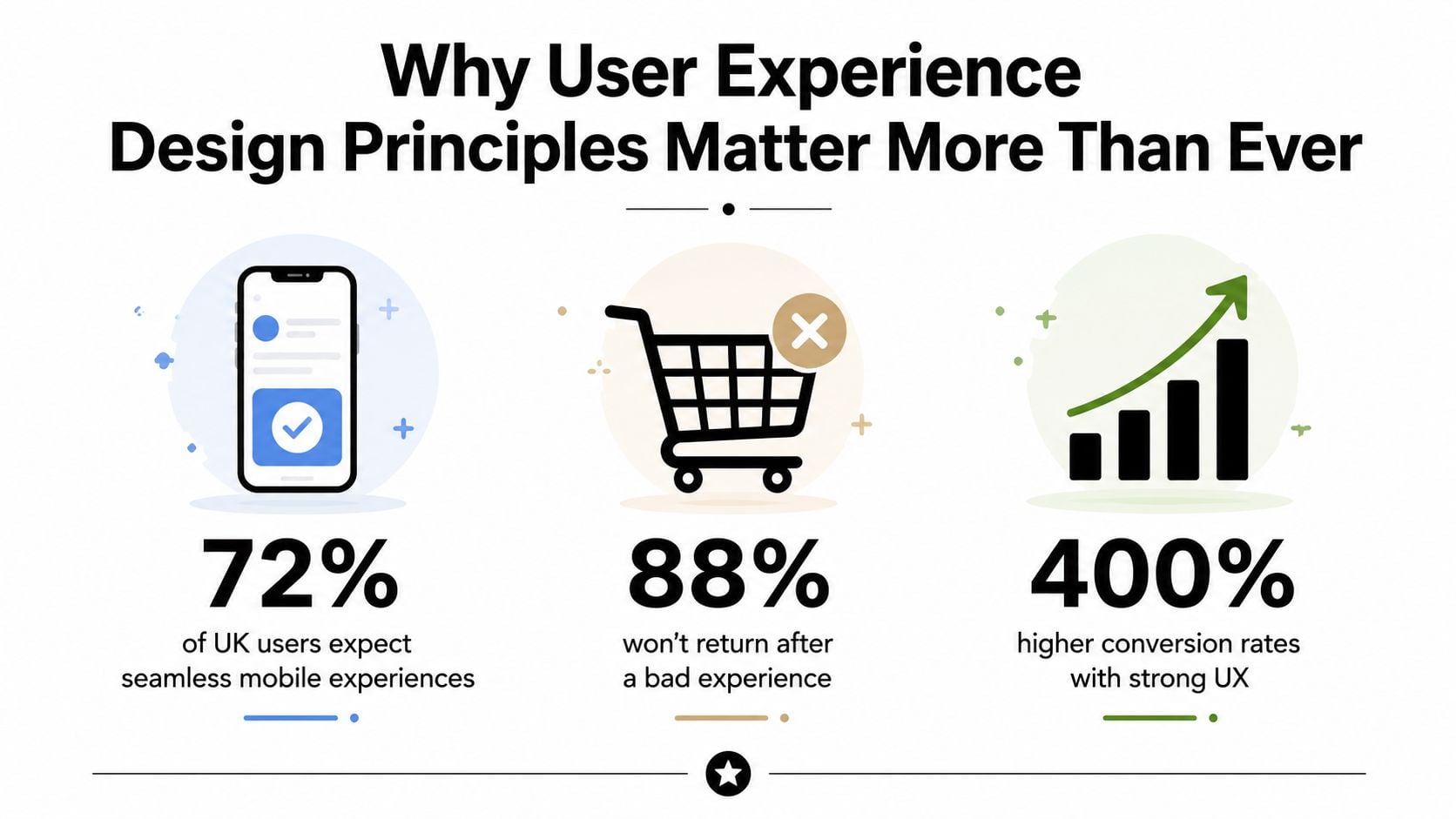
UX affects trust before customers contact you
Visitors assess practical signals before they decide whether to enquire or buy. Can they understand what you offer? Can they find pricing, delivery details, opening times, or evidence that the business is legitimate? Does the checkout explain what will happen next? Each answer either reduces uncertainty or creates another reason to leave.
A striking animation or large photograph may look impressive in a design review. Customers judge the page by a different standard. They need to know whether the service suits their situation, whether the business appears reliable, and whether completing the task will be straightforward.
The guide to what user experience means from DesignStack separates UX from visual styling and considers the whole experience, from the first visit through to confirmation. For a broader reference, these user experience design principles provide a useful framework for connecting interface decisions with user needs.
Practical rule: If a design decision looks impressive but makes the next action less clear, it isn't improving the experience.
Good UX also supports retention. A customer who cannot amend an order, understand a form error, or find support may remember the frustration more strongly than the original design. A government-grade approach does not require an SME website to look like GOV.UK. It requires important journeys to be clear, accessible, predictable, and easy to recover when something goes wrong.
The Five Core Principles Every Business Should Know
The five principles below work together. Usability helps people complete tasks. Accessibility makes those tasks available to more people. Visual hierarchy shows users where to look. Feedback confirms what the interface has done. Consistency makes the whole journey feel familiar.
Usability
Usability is the digital equivalent of a well-organised shop. Products have sensible categories, signs point towards useful areas, and customers don't need to ask staff how to pay. On a website, usability means people can understand the interface and complete a task without unnecessary effort.
For an eCommerce site, that might mean filtering products by meaningful attributes, showing delivery information beside the purchase decision, and keeping the basket easy to find. Poor usability hides important details, uses unfamiliar labels, or sends users through steps that don't help them decide.
A simple test is to give someone a task, such as “find the right service and request a quote”, then watch without helping. Their questions and pauses reveal more than internal opinions about whether the page feels intuitive.
Accessibility
Accessibility is like providing a ramp, readable signs, and assistance for every person entering a shop. Digital accessibility includes keyboard operation, clear labels, sufficient contrast, logical headings, useful error messages, and compatibility with assistive technologies.
This principle matters beyond disability access. Captions help when sound isn't practical. Clear contrast helps someone using a phone outdoors. Large, well-spaced controls help anyone operating a device in a hurry.
For a broader example of inclusive thinking beyond websites, see Waymap's discussion of designing inclusive transit hubs. The setting differs, but the underlying lesson is similar. Designers should remove barriers from the beginning rather than add workarounds after launch.
Visual hierarchy
A newspaper front page gives the lead story the strongest headline, places supporting articles beneath it, and uses spacing to separate unrelated information. Websites need the same discipline.
Your homepage should make the primary proposition obvious, explain who the service is for, and present a clear next action. A product page should give priority to the product name, useful imagery, price, availability, and purchase control. If every heading, banner, and button demands attention, nothing has a clear priority.
Feedback
Feedback is the shop assistant acknowledging that they've received your request. Digital interfaces need to communicate what happened after an action. A button might show a loading state, a form might confirm successful submission, or a checkout might display a clear order summary before payment.
Without feedback, users may click repeatedly, abandon the page, or wonder whether their information disappeared. Error feedback needs equal care. “Something went wrong” doesn't help someone correct a missing field. A useful message identifies the problem in plain language and points to the affected input.
Consistency
Consistency lets users transfer knowledge from one page to the next. Navigation should stay in a familiar place, primary buttons should look and behave alike, and form fields should use the same conventions throughout the journey.
A visitor shouldn't encounter one label on a service page and a completely different label at checkout for the same action. Consistency doesn't mean every page must look identical. It means variations have a reason and the underlying system remains dependable.
A short video can help teams see how principles translate into interface decisions. Use it as a prompt for discussion, not as a substitute for testing.
Accessibility as a Competitive Advantage Not Just Compliance
Treating accessibility as a compliance box misses the business problem. If a customer can't read your content, operate your navigation, understand a label, or submit a form, your website has failed at its central job. The failure may affect a disabled user directly, but the design weakness can also inconvenience people using mobile devices, temporary injuries, poor connections, or noisy surroundings.
The scale of the opportunity is clear. The UK Parliament cites the 2019 Click Away Pound report's estimate of 7.15 million disabled internet users in the UK with access needs in its report on digital exclusion and accessibility. The same source notes that a 2023 WebAIM analysis found 96% of the one million most visited home pages failed accessibility standards. These figures describe a persistent structural problem, not a niche concern.
The UK benchmark is higher than a tick box
For public services, accessibility became a formal legal baseline through the UK accessibility regulations guidance. The regulations came into force on 23 September 2018, require websites and mobile applications to be perceivable, operable, understandable, and durable, and require an accessibility statement.
The deadlines were phased, covering new public-sector websites from 23 September 2018, existing public-sector websites from 23 September 2020, and mobile applications from 23 June 2021. A private business may face a different legal context, but the design expectation remains instructive. Users should be able to understand known limitations and available workarounds rather than discover barriers halfway through an important task.
Commercial audits show why this standard still matters. Public-sector monitoring recorded English websites at 74.5% compliance, while a 2025 UK retail audit found 84% of top retail homepages had critical accessibility issues, and every tested homepage had at least one WCAG 2.1 AA violation, as reported in the UK public-sector accessibility monitoring. Businesses shouldn't assume that familiar retail patterns are automatically usable.
Prioritise barriers in revenue journeys
Start with the pages that carry commercial risk:
- Sign-in: Make labels, password errors, and recovery routes clear.
- Product selection: Keep headings, filters, price information, and controls understandable.
- Checkout: Ensure every field works by keyboard and every error identifies what needs changing.
- Contact forms: Confirm successful submission and offer a non-digital route where appropriate.
Use automated checks to find obvious defects, then test with keyboard navigation, screen readers, zoom, different browsers, and real users. Inclusive design principles can help your team turn accessibility from a late-stage audit into part of planning, content, design, and development.
Designing with Data to Measure What Actually Matters
A page view tells you that a page loaded. It doesn't tell you whether someone understood the offer, found the right product, completed the form, or gave up after an error. Data-driven UX starts by defining the user task and the business outcome before anyone chooses a colour or layout.
UK government service design makes this expectation explicit. GOV.UK requires services to publish four mandatory KPIs, cost per transaction, user satisfaction, completion rate, and digital take-up, as set out in its service performance measurement guidance. User satisfaction must be reported as a percentage with counts across five response levels, which turns a vague question into a trackable measure.
Choose metrics that explain behaviour
A useful measurement plan connects each journey to a small group of signals. For example, a quote-request journey might track form starts, completion rate, field errors, abandonment by step, and time to completion. An online shop might track product-listing interaction, basket progression, payment errors, and completed purchases.
GOV.UK's Government Design Principles tell teams to design with data and define what success looks like before publishing performance information. For a UK SME, that means writing a short success statement such as: “Visitors who need a replacement part can identify the correct product, understand delivery, and complete the order without contacting support.”
| Metric Type | Example | What It Tells You | Action It Drives |
|---|---|---|---|
| Task completion | Completed quote request | Whether users reach the intended outcome | Review steps where people stop |
| User satisfaction | Post-task rating | How users perceive the experience | Investigate recurring frustration |
| Error rate | Failed form submissions | Where the interface creates mistakes | Improve labels, validation, and instructions |
| Abandonment | Users leaving during checkout | Which stage loses intent | Simplify that stage and test alternatives |
| Completion time | Time taken to submit a form | How much effort the task requires | Remove unnecessary questions or decisions |
Turn evidence into a prioritised backlog
Don't redesign the whole website because one stakeholder dislikes the homepage. Combine analytics with support messages, search terms, session recordings where appropriate, accessibility testing, and short user interviews. If several sources point to the same obstacle, it deserves attention before a decorative improvement.
A sensible sequence is to fix blocked tasks first, clarify confusing content second, and refine visual polish third. Analytics guidance for websites can support that process, but the tool matters less than the question you're asking.
GOV.UK also recommends giving users the information they need to decide whether to start, including cost and expected duration, then handling eligibility checks inside the service. That sequencing is useful for businesses too. Put decision-making information near the entry point, and reserve detailed validation for the journey itself.
Applying Hierarchy and Consistency Across Your Digital Presence
Visual hierarchy answers one question: what should a visitor notice first, second, and third? Consistency answers another: will the next page behave in a familiar way? Together, they reduce the mental work required to understand a website.
Start with the homepage. A visitor should quickly identify the business, the audience served, the main value offered, and the most useful next action. If a rotating banner, promotional strip, cookie notice, and several equal-sized buttons all compete for attention, the page has no clear lead.
Audit the page in passes
First, read only the headings. Do they tell a coherent story without the supporting paragraphs? If they don't, the information architecture needs work.
Next, blur your eyes or view the page at a distance. The strongest visual weight should land on the primary proposition and action, not on an ornamental image or a secondary promotion. Then inspect the page on a phone. Check whether the important content appears early, whether touch targets have enough room, and whether users can reach navigation and forms without awkward scrolling.
Use this page-by-page checklist:
- Homepage: State who you help and what you provide before introducing secondary messages.
- Service page: Lead with the customer problem, explain the approach, and make enquiry options easy to find.
- Product listing: Keep filters, product names, prices, availability, and sorting controls visually related.
- Product page: Put essential purchase information close together, with delivery and returns easy to locate.
- Checkout: Remove competing navigation and preserve a clear sense of progress.
Build a recognisable system
Consistency becomes easier when you document decisions. Set rules for headings, body text, links, buttons, spacing, forms, error messages, imagery, and tone. A website style guide gives designers, developers, content writers, and future staff a shared reference point.
The system should extend beyond the website. Email templates, invoices, social profiles, and downloadable documents should feel related without becoming identical. Even a practical detail such as a consistent font across email clients supports recognition and readability across touchpoints.
Design check: Remove the logo and brand colours from a page. If users can still recognise how to navigate and complete actions, your interaction system is doing useful work.
Don't confuse consistency with rigidity. A checkout may simplify navigation because the user's task has changed. That variation is acceptable when it supports the journey and remains understandable.
Bringing UX Principles to Life in a Real Project
A small business website project usually begins with a conversation about goals, but UX work adds a sharper question: what must users be able to do, and what prevents them doing it today? A Dorset retailer might need customers to find products, understand delivery, and complete an order. A professional service might need visitors to assess suitability and request a consultation.
Discovery identifies the real task
The team gathers existing analytics, support questions, search behaviour, competitor conventions, business priorities, and user concerns. They map the current route from first visit to completed action, including points where people need reassurance or make errors. A user journey mapping guide provides a useful way to visualise those stages.
Wireframes test structure cheaply
Low-fidelity wireframes establish page order, navigation, content priority, and calls to action before visual styling takes over. At this stage, changing the position of a form or removing an unnecessary step is inexpensive. The business owner can challenge the structure using real customer questions rather than debating font preferences.
Prototypes expose interaction problems
An interactive prototype demonstrates how menus open, forms progress, filters behave, and confirmation states appear. Stakeholders can follow realistic scenarios, while designers can identify missing feedback and unclear labels before development.
User testing replaces confident guesses
Give participants specific tasks and observe what they do. Don't lead them towards the intended button or explain the interface when they hesitate. Record where they misinterpret content, lose confidence, or look for information that isn't available.
Launch creates a feedback loop
After launch, compare the agreed success measures with actual behaviour. Prioritise blocked journeys and repeated errors, then release improvements in manageable batches. A project may have a clear initial delivery window, but the strongest experience develops through continued measurement and refinement rather than a single “finished” redesign.
Common Mistakes That Undermine Good UX Intentions
Many UX problems begin with reasonable intentions. A business owner wants to explain every service, showcase every product, or make the website feel distinctive. The result can be a crowded page where visitors can't tell what matters.
Assuming people read everything
Most visitors scan before they commit to detailed reading. Lead with clear headings, short paragraphs, meaningful labels, and useful summaries. Put supporting detail where someone can access it when needed, rather than forcing every visitor through a wall of introductory copy.
Designing for the office desktop
A desktop review can hide cramped controls, difficult menus, and long forms. Test the complete journey on a phone, including orientation changes, keyboard behaviour, autofill, error recovery, and payment. Mobile design isn't a smaller version of desktop design. It requires decisions about priority and effort.
Choosing appearance over operation
A fashionable animation can't repair an unclear offer. A minimalist interface may look elegant while hiding navigation, weakening contrast, or removing useful instructions. Judge each design through a task, such as finding a product, comparing options, submitting an enquiry, or correcting an error.
Copying a competitor
Your competitor's audience, catalogue, pricing, content, technology, and customer service may differ from yours. Borrowing a pattern can be sensible when it matches established expectations, but copying an entire layout doesn't tell you whether it solves your users' problems.
Adding features without a job
Chat widgets, pop-ups, recommendation tools, sliders, and complex filters all create interaction costs. Add a feature only when you can explain which user need it serves, how it will behave on mobile, and how you'll know whether it helps.
Treating UX as a one-off project
User needs change, products expand, and content becomes outdated. Create a regular review rhythm around analytics, support questions, accessibility checks, and observed task failures. Ask users what they're trying to accomplish, then observe whether the current interface lets them do it. Their stated preferences can be useful, but behaviour during a realistic task often reveals the more important problem.
Strong user experience design principles give your team a decision framework when opinions conflict. They direct attention towards clarity, access, control, consistency, and measurable task success, rather than whichever visual trend happens to be popular.
DesignStack helps UK businesses plan and build responsive WordPress websites, eCommerce experiences, branding, and supporting digital systems around real user journeys. Visit DesignStack to discuss a website or rebrand that makes important tasks clearer, more accessible, and easier to measure.