What Makes a Good Business Website? A 2026 UK Guide
You might already have a website. It may even look respectable. The harder question is whether it’s doing a job.
For many business owners, the site sits there like a digital brochure that gets updated once in a while, costs money every year, and doesn’t clearly answer a simple question. Is it bringing in enquiries, sales, bookings, or phone calls?
That’s the difference between having a website and having a good business website. A good one doesn’t just exist. It helps a customer trust you, understand what you do, and take the next step without friction.
Is Your Website an Asset or Just a Cost
A lot of owners come to this point after the same pattern. They launched a site a few years ago, paid for some design work, added a few pages, then left it alone. The business moved on, but the website didn’t.
That creates a gap. Your team knows how your service works. Your existing customers know why people buy from you. A new visitor doesn’t. They make a judgement in seconds based on what they can see, how easy the site feels, and whether it looks credible.
In the UK, approximately 78% of small businesses have a website, and nearly 84% of those say their website played a big part in their overall success, according to small business website statistics collected here. That tells you something important. For most SMEs, a website isn’t optional overhead. It’s part of how the business earns trust and wins work.
What an asset website does
An asset website usually does four things well:
- Explains the offer quickly so a visitor knows what you do and who it’s for.
- Removes doubt with clear contact details, credible content, and proof that you’re a real business.
- Guides action with strong calls to book, call, buy, or enquire.
- Supports sales outside office hours so people can move forward even when you’re busy.
A cost website does the opposite. It looks dated, says too little or too much, hides important information, and gives people easy reasons to leave.
A business website should answer the questions your sales team hears every week. If it doesn’t, it’s adding work instead of reducing it.
The trade-off most businesses miss
Cheap websites often look economical at the start and expensive later. You save on build cost, then lose time on edits, lose enquiries because pages are unclear, and end up rebuilding sooner than expected. If that sounds familiar, this look at the hidden costs of cheap website design is worth reading.
What makes a good business website starts with this mindset shift. Don’t judge it like a design purchase. Judge it like a working business asset.
The Three Pillars of a High-Performing Website
Think of your website like a high-street shop.
If the front window looks neglected, people hesitate. If the layout inside is confusing, they leave. If the door sticks and the queue moves slowly, they give up. Websites work the same way. A strong business site rests on three pillars.
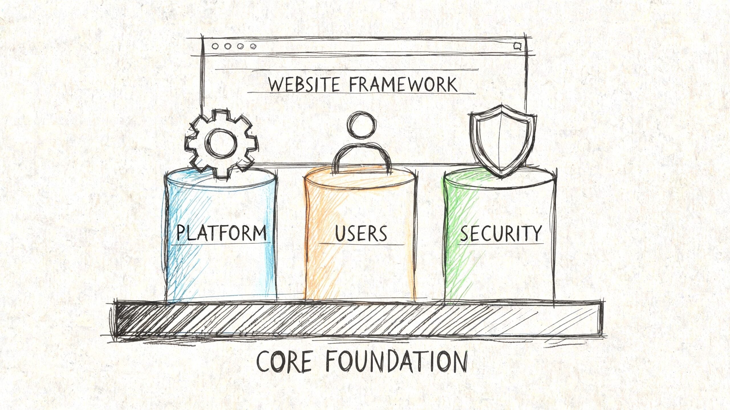
Visual appeal and branding
Design matters, but not in the way many owners think.
Good branding isn’t about making the site look trendy. It’s about making it feel coherent and trustworthy. Your colours, typography, photography, tone of voice, and page layouts should all support the same message. If you’re a solicitor, an independent retailer, a trades business, or a local membership organisation, the design should fit the kind of decision your customer is making.
A polished brand presentation helps people feel they’re in the right place. A messy one creates doubt.
User experience and usability
This is the practical side. Can someone find what they need without effort?
A lot of websites fail here because the owner organises pages around internal thinking instead of customer intent. Visitors don’t care about your department structure. They care about questions like:
- What do you offer
- How much does it roughly cost
- Do you serve my area
- Can I trust you
- What should I do next
If your navigation, page structure, and calls to action don’t answer those questions cleanly, the site looks busy but underperforms.
Technical performance and speed
A good-looking website that feels slow still feels poor.
Performance covers loading speed, mobile responsiveness, security, hosting quality, and code health. Most visitors won’t describe the problem technically. They’ll just feel that the site is awkward or unreliable and leave.
That’s also why security can’t be treated as an afterthought. Businesses handling customer data, bookings, contact forms, or ecommerce need routine checks and sensible protection. If you want an external benchmark on that side, it’s useful to discover affordable security assessments and understand what practical testing can uncover before a problem affects customers.
Practical rule: If one pillar is weak, the whole website feels weak. Strong branding can’t rescue poor usability, and good content can’t rescue slow performance.
Here’s the simple version:
| Pillar | What the customer notices | What the business gets |
|---|---|---|
| Branding | “This looks credible” | Better first impressions |
| Usability | “This is easy to use” | More enquiries and fewer drop-offs |
| Performance | “This works smoothly” | Better retention and conversion potential |
Designing for Your Customer Not Yourself
The fastest way to weaken a website is to build it around personal taste.
Owners often focus on colours, animations, and whether they personally like the homepage banner. Customers focus on something else entirely. They want speed, clarity, and a straightforward path to the information they came for.

What visitors actually care about
If someone lands on your site from Google, a social post, or a recommendation, they usually want to do one of these things:
- Check relevance and confirm you offer what they need
- Sense credibility before they invest time
- Find specifics such as services, pricing approach, location, or availability
- Take action with minimal effort
That means good UX is rarely flashy. It’s organised. The homepage leads somewhere useful. The menu uses plain language. Key pages don’t bury the answer halfway down. Contact options are easy to spot.
Many businesses often overcomplicate things. They add too many menu items, write headlines that sound clever but say very little, and fill pages with generic copy. That creates friction. Friction costs leads.
Mobile is the real test
A website that looks fine on a desktop monitor can still fail badly on a phone.
That matters because 53% of mobile site visits are abandoned if pages take longer than 3 seconds to load, according to these mobile website statistics. The same source notes that a one-second improvement in page load time can increase conversion rates by up to 13.5% for UK small business websites.
Those numbers matter because they translate technical issues into business outcomes. Slow pages don’t just annoy people. They cut off intent before a conversation starts.
If your site is slow on mobile, many visitors never reach the part you spent the most time writing.
What works and what doesn’t
Here’s a practical comparison I see often:
| Works | Usually fails |
|---|---|
| One clear primary call to action | Multiple competing buttons on every screen |
| Short, direct headings | Vague brand slogans with no service context |
| Service pages built around buyer questions | Pages built around internal company language |
| Compressed images and restrained scripts | Heavy video headers and unnecessary effects |
| Mobile-first layouts | Desktop layouts squeezed onto smaller screens |
A better way to review your own site
Open your website on your phone and test it like a stranger. Don’t skim it as the owner. Try to complete one task.
Ask yourself:
- Can I tell what this business does within a few seconds
- Can I get to the right page without guessing
- Does the page load quickly enough that I stay engaged
- Is the next action obvious
- Would I trust this business if I’d never heard of it before
If any answer is “not really”, that’s where the work is.
The best websites don’t force visitors to work things out. They reduce effort. That’s what makes them effective.
How to Build Trust with UK Customers
Many articles on what makes a good business website stop at polished design, testimonials, and an SSL certificate. Those things matter, but they’re not enough on their own for many UK businesses.
Local customers often want proof that you’re established, accountable, and part of the market they’re buying from. That means trust should be visible in a specifically British and often hyperlocal way.

Local relevance matters more than generic credibility
Research from Econsultancy found that 68% of UK consumers prioritise locally relevant content and community credentials when evaluating SMBs, as noted in this discussion of trust-building website qualities.
That fits what many local agencies see in practice. People don’t just want to know that you exist. They want signals that you serve their area, understand their context, and stand behind your work.
A Dorset business, for example, can strengthen trust by showing real ties to Weymouth, Portland, Dorchester, Bournemouth, or the wider region rather than presenting itself like a faceless national template brand.
Trust signals that carry weight in the UK
Some trust markers are subtle, but they make a difference:
- Local memberships such as a Chamber of Commerce, trade association, or relevant professional body
- UK contact details with a real address, phone number, and named points of contact
- Area-specific pages that show where you work and who you help
- British client proof through recognisable testimonials, case examples, or partner logos
- Clear compliance language around privacy, cookies, and data handling
- Familiar payment and support expectations for UK buyers where relevant
These details reassure people that your business is reachable and answerable. That’s especially important for service firms, local retailers, home improvement businesses, consultants, and membership organisations.
Local trust signal: If a customer has to work hard to figure out where you’re based, who runs the business, or how to contact you, confidence drops quickly.
Where businesses often get it wrong
The common mistake is relying on abstract credibility. Stock photos. Generic claims about quality. Anonymous reviews. Overly broad “serving everyone” language.
That kind of content can make a business look less real, not more.
A better approach is to show grounded proof:
- Use testimonials with proper names and company names where permission allows
- Mention places you serve naturally in service pages
- Show team photos, premises, or project imagery that reflects your real business
- Include an About page that sounds human and specific
- Explain policies in plain English rather than legal fog
For UK ecommerce, trust also extends to checkout clarity, returns information, and familiar support expectations. For service businesses, it often comes down to whether the site feels transparent and accountable.
If your site already looks professional but still isn’t converting as well as it should, trust is often the missing layer.
Getting Found Online and Driving Action
A good website can still underperform if the right people never see it.
That’s where search visibility and content strategy come in. SEO sounds technical, but for most SMEs the basics are straightforward. You need pages that match what customers search for, and those pages need to lead people somewhere useful once they arrive.
Start with search intent, not keywords alone
Business owners often think SEO means stuffing town names into page titles. It doesn’t.
The better approach is to align each important page with a real customer intent. Someone searching for a local service usually wants one of three things. They want to compare providers, check if you serve their area, or understand whether you’re the right fit.
That changes how you structure the site. Instead of one vague services page, you may need clear individual pages for your main offers. Instead of a generic homepage paragraph, you need headings that say what you do in plain language.
For businesses that want support with the search side, Search Engine Optimisation services can help shape page structure, targeting, and ongoing improvements.
Content that helps people buy
Good content isn’t filler. It does sales work.
A strong service page answers practical questions. What do you do. Who is it for. What problems do you solve. What happens next. Why should someone trust you. If the page avoids these questions because the business wants to sound overly complex, performance usually suffers.
Here’s a simple content framework that works well for many SMEs:
- Homepage with a clear offer, location context, and direct next step
- Service pages focused on individual services rather than broad categories
- About page that explains who you are and how you work
- Proof pages such as case studies, testimonials, or portfolio examples
- Contact page that removes friction and makes outreach easy
Local SEO is often about clarity
For a local business, relevance beats volume-chasing.
If you want to appear for searches connected to your area, your site should naturally mention where you work, show those places in context, and make your contact details easy to verify. That doesn’t mean repeating place names awkwardly. It means writing pages that effectively serve local searchers.
The best-performing local pages usually answer a real customer question better than the nearest competitor, not louder.
Don’t separate visibility from conversion
Traffic on its own isn’t the goal. Qualified action is.
That’s why SEO and conversion writing should sit together. There’s no point ranking for a useful search term if the landing page feels confusing, thin, or generic. When someone arrives, the page should continue the same logic that got them there in the first place.
A good business website gets found by the right people, then gives them a clear reason to act.
Measuring Success and Planning for Growth
A website launch isn’t the finish line. It’s the point where the useful data starts.
Too many businesses still treat websites like printed brochures. Build it, publish it, and assume the job is done. Then months pass, leads feel inconsistent, and nobody can say which pages help or where people drop off.
The measurement gap is real
A 2025 UK Federation of Small Businesses report indicated that 42% of UK SMBs lack proper analytics implementation on their websites, which creates a serious blind spot around return on investment, according to this summary discussing what makes a good website.
That’s a bigger issue than most owners realise. Without proper tracking, you can’t reliably answer basic commercial questions. Which pages generate enquiries. Which contact forms are working. Which traffic sources bring people who convert. Which services attract interest but fail to turn into leads.
Measure business outcomes, not vanity metrics
Page views have their place, but they don’t tell the whole story.
A better reporting view focuses on indicators tied to outcomes:
| Better metric | Why it matters |
|---|---|
| Qualified enquiries | Shows whether the site attracts the right audience |
| Call or form completion trends | Reveals whether key actions are easy to take |
| Landing page performance | Shows which pages persuade and which don’t |
| Sales or checkout behaviour | Helps ecommerce businesses spot friction |
| Source quality | Separates useful traffic from noise |
If you run a product-based business, it also helps to look at specialist resources such as Carti insights on Shopify analytics, especially when you need more clarity on ecommerce KPIs and what to monitor after launch.
Build for updates, not just launch day
The right platform matters because businesses change.
You may add services, publish news, refine messaging, test new landing pages, or update seasonal offers. A flexible CMS like WordPress usually makes that easier than a rigid setup that requires developer input for every small change. Hosting quality, plugin maintenance, backups, and security updates matter too, because a neglected website degrades even if the design still looks current.
One practical place to start is tightening your measurement setup. If your reporting feels vague or inconsistent, these Google Analytics 4 tips and tricks can help you get clearer data from the site you already have.
A website becomes more valuable when the business uses it as a system to test, learn, and improve. Not when it’s left untouched for years.
This is also the stage where the publisher’s type of support becomes relevant. A Dorset agency such as DesignStack offers WordPress design, hosting, and post-launch support, which is useful for businesses that want one supplier handling both the build and the practical upkeep.
Your Actionable Business Website Checklist
If you want a straightforward way to assess what makes a good business website, use this as a working audit. It’s practical enough to review yourself and useful when comparing agency proposals.
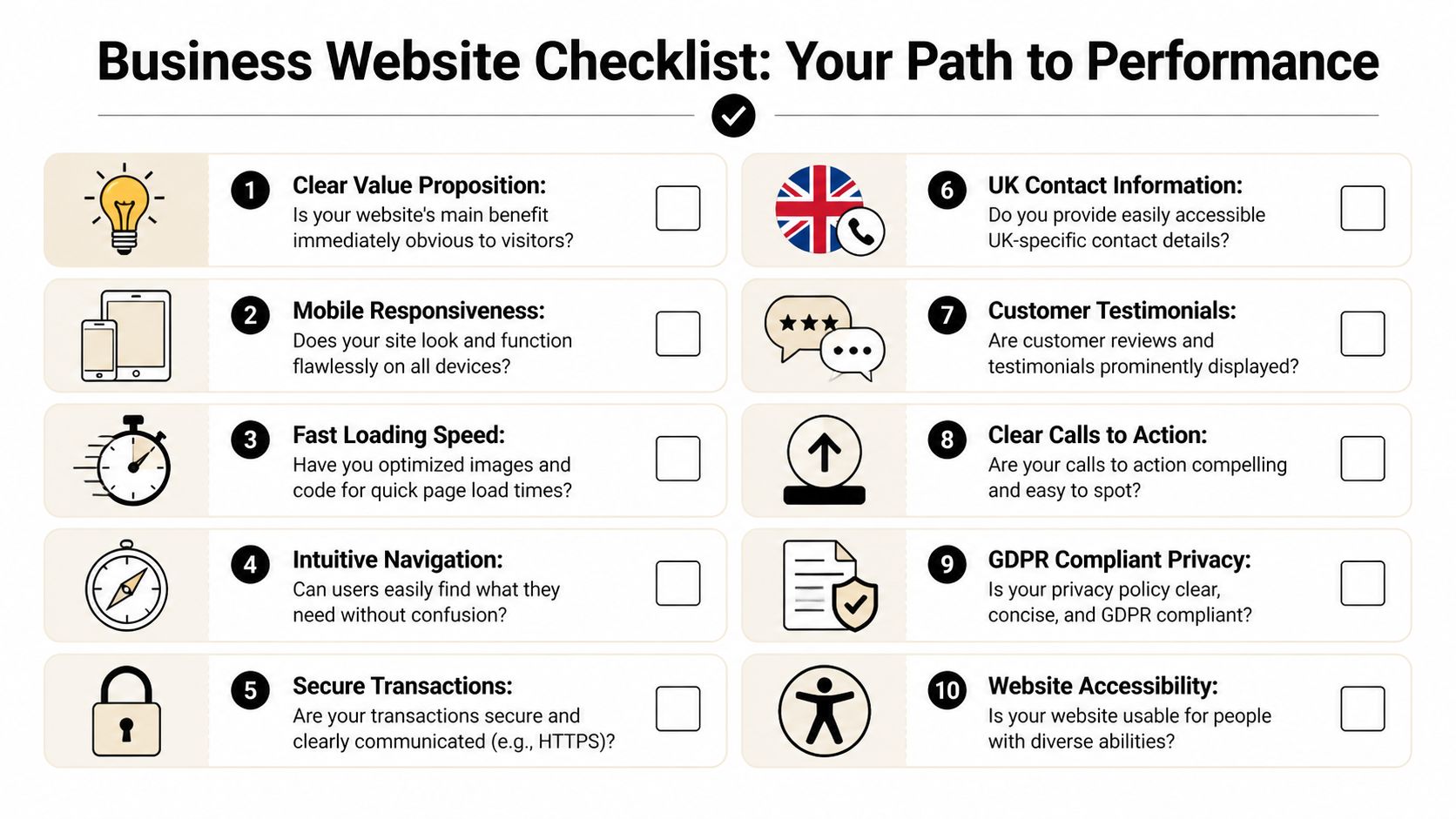
Ten questions worth asking today
- Clear value proposition. Can a first-time visitor tell what you do and who you help without scrolling too far?
- Mobile responsiveness. Does the site feel easy to use on a phone, not just acceptable on a desktop?
- Loading speed. Do key pages load quickly, especially service pages, product pages, and contact forms?
- Navigation. Can someone find the right information without digging through awkward menus?
- Calls to action. Is the next step obvious on every important page?
- Trust markers. Do you show real proof such as testimonials, memberships, accreditations, or recognisable client examples?
- UK business details. Are your address, phone number, service area, and contact options easy to find?
- Privacy and compliance. Are your privacy information and consent choices clear and written in plain English?
- Content quality. Do your pages answer buyer questions directly instead of relying on vague marketing language?
- Measurement. Can you see which pages and actions contribute to enquiries or sales?
What to do if the answer is no
Don’t treat the checklist like a pass or fail test. Use it to prioritise.
Start with the issues that block trust or action. That usually means unclear messaging, weak mobile experience, missing proof, or poor tracking. Cosmetic tweaks can wait. Business-critical fixes shouldn’t.
If your website feels more like overhead than an asset, DesignStack can help you review what’s working, what’s holding the site back, and what to improve first. For Dorset businesses and UK SMEs, that usually starts with clearer messaging, better structure, stronger trust signals, and a setup you can maintain.