

8 Logo Design Tips for a Stronger Brand
A logo has to work before it has to impress. A striking presentation mock-up can hide problems that become obvious when the same mark appears in a browser tab, on an eCommerce product page, beside a social profile, on printed stationery or across outdoor signage. If customers can't recognise it, read it or place it confidently in context, visual drama won't rescue it.
The strongest identity behaves like a working system, not a decorative graphic. These logo design tips follow the decisions that make that system useful: establish longevity and distinctiveness, simplify the concept, choose colour and typography with purpose, prepare flexible variants, test the work in real situations and protect the finished asset. For businesses in Dorset and across the UK, that approach also makes it easier to connect branding with responsive WordPress websites, eCommerce builds and other digital touchpoints. DesignStack can support that connection through branding, web design and digital implementation.
Table of Contents
- 1. Simplicity Is Key for Scalable Design
- 2. Choose Timeless Over Trendy
- 3. Develop a Memorable Mark
- 4. Use Colour with Purpose
- 5. Treat Typography as Part of the Mark
- 6. Build a Flexible Logo System
- 7. Test and Validate in Real Contexts
- 8. Prepare the Logo for Legal Protection
- 8-Point Logo Design Comparison
- Turn a Finished Logo into a Working Brand Asset
1. Simplicity Is Key for Scalable Design
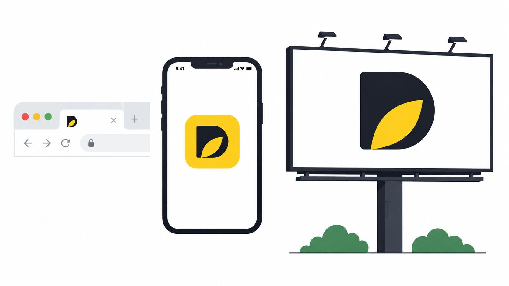
A logo earns its place by staying clear when its size, surroundings and reproduction method change. A detailed illustration may look impressive on a large presentation board, then collapse into an indistinct shape in a browser tab or social profile image. Simple forms give the eye fewer elements to process, which helps people identify the mark quickly.
Apple's silhouette, the Nike Swoosh and McDonald's Golden Arches show how a focused visual idea can work without extensive explanation. That doesn't mean every business needs a symbol. A clean wordmark, such as Google's, can perform just as well when the lettering, spacing and proportions are distinctive.
Start with rough pencil sketches rather than polishing the first digital concept. Draw several versions using basic shapes, then remove any line, detail or decorative feature that doesn't improve recognition. Whitespace matters, because the space around and within a mark can prevent separate elements from merging at small sizes. DesignStack's guide to what whitespace means in design is useful when you're judging whether a concept has enough room to breathe.
Remove detail before adding effects
Test the mark in black and white before relying on colour, texture or gradients. If the shape loses its identity without colour, the underlying concept probably needs more work. Check it on a product thumbnail, website header, printed card and sign, because each setting exposes different weaknesses.
Practical rule: If a detail disappears at small size and doesn't carry meaning, it probably doesn't belong in the primary logo.
For a UK small business, simplicity also supports sensible commissioning decisions. One UK price study covering real logo purchases found that the average small-business spend was £121 in 2025, while the median across 2024 to 2026 was £108. The same study found that 61% of purchases sat in the £100 to £149 band and fewer than 3% cost more than £150. Those figures don't dictate what your identity should cost, but they do suggest that many SMEs need a focused, versatile solution rather than an elaborate system built around effects. See the UK logo design price report for the study details.
2. Choose Timeless Over Trendy
A logo should reflect the business you intend to build, not the design trend that happens to dominate your social feed. Trend-led choices can make a new identity feel current at launch, but they also create pressure to redesign when the visual language starts to look dated. That can confuse existing customers and force changes across websites, packaging, signage and templates.
Timeless doesn't mean bland. Coca-Cola's script, IBM's structured wordmark, Chanel's interlocking Cs and the Mercedes-Benz star each use a clear organising idea rather than a collection of fashionable effects. Their lesson isn't that a new business should copy a heritage brand. It's that a recognisable concept, controlled proportions and disciplined typography tend to outlast surface treatments.
Separate a trend from a useful technique
Gradients, shadows, distorted lettering and unusual colour combinations can all have a place. The problem starts when the effect is doing the work that the logo's structure should do. Remove the gradient and shadow, then ask whether the mark still feels intentional. If it becomes generic or unreadable, the effect is acting as a crutch.
Create the first design in vector format so curves and edges remain clean across print and digital uses. Then review it against the business's likely future, including changes in product range, audience, location or service mix. A logo for a professional services firm may need to sit on reports and proposals for years. An eCommerce identity may need to remain credible as products and platforms evolve.
- Review competitors: Look for repeated visual conventions, then decide whether joining or avoiding that pattern helps recognition.
- Interrogate decoration: Keep an effect only when it improves meaning, hierarchy or practical use.
- Check future contexts: Consider websites, packaging, vehicles, uniforms and documents before approving the concept.
- Protect continuity: Keep the central form stable if you later refresh colours, spacing or supporting typography.
A timeless approach can feel less exciting in the design meeting. That's a worthwhile trade-off when the alternative is an identity that demands frequent replacement.
3. Develop a Memorable Mark
Distinctiveness comes from a specific visual idea, not from making every part of a logo unusual. A mark becomes memorable when people can separate it from nearby competitors and connect it with the business's experience. That connection may come from a shape, a meaningful negative space detail, an unexpected letterform or a symbol that expresses the brand's purpose without spelling it out.
Spotify's circular mark, Dropbox's angled box and Airbnb's Bélo show different routes to recognition. The point isn't to imitate them. Study why each example can operate beside, or sometimes apart from, its wordmark. A local retailer might need an icon for a social avatar, while a consultancy may gain more value from a distinctive typographic treatment of its name.
Start with quantity during exploration. Sketch a broad range of concepts, including literal, abstract and typographic directions, before refining the strongest few. Reject ideas that rely on a familiar stock symbol unless you can give that symbol a distinct, ownable treatment. A common leaf, globe or handshake can communicate a category quickly, but it may also make your brand difficult to distinguish.
Test recognition without the name
Show the symbol alone and ask what people notice first. Don't ask whether they “like” it, because personal taste often overwhelms useful feedback. Ask whether it feels appropriate for the business, what category it suggests and which visual detail they remember after a short distraction.
For an app or eCommerce business, test the mark as a profile image, product badge and app-style icon. For a physical brand, consider how it will translate to labels, packaging, vehicles or merchandise. Even a niche application, such as Honda winged logo decals, illustrates why a mark must retain its essential shape when reproduced away from the original brand presentation.
A memorable mark shouldn't require a paragraph of explanation. Subtle symbolism can reward attention, but immediate clarity comes first. If the clever detail works only after someone points it out, treat it as an optional benefit rather than the central reason to approve the design.
4. Use Colour with Purpose
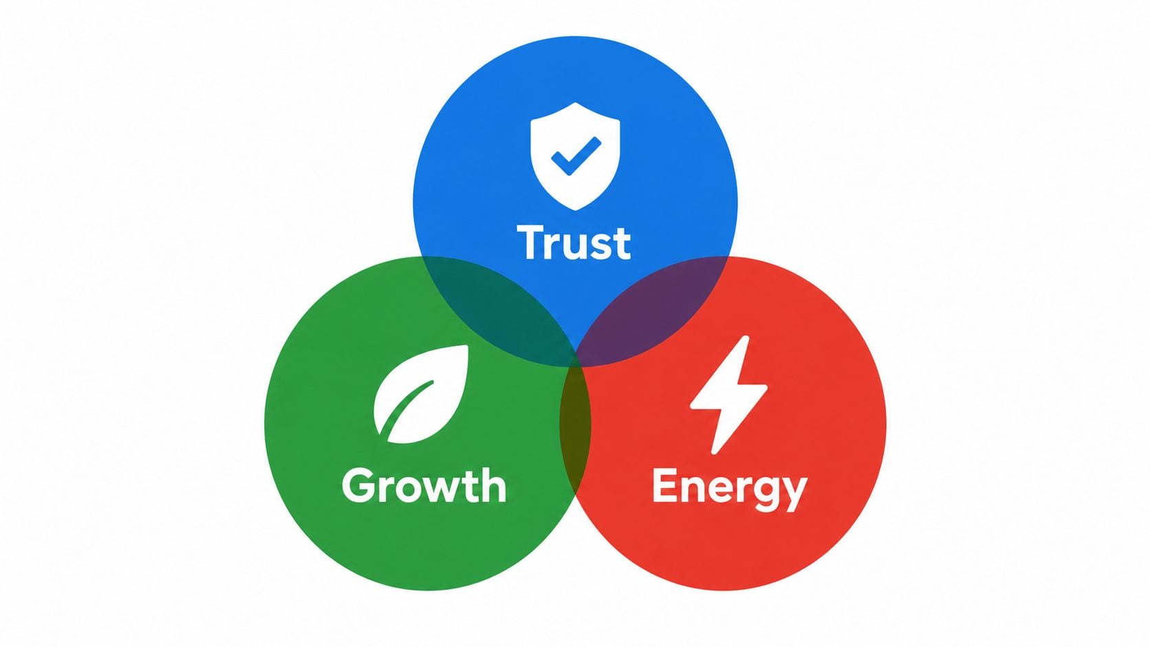
Colour influences the first impression of a logo, but it can't compensate for weak form or poor contrast. Blue may suggest trust in one context, green may support an environmental position and red may feel energetic, yet these associations change with category, culture and execution. A colour choice should reinforce the brand's character rather than substitute for a clear strategy.
Build the mark in monochrome before choosing the final palette. This forces you to resolve shape, balance and hierarchy without letting a bright accent distract from structural problems. Then test the proposed colours on white, dark surfaces, photography and low-quality screens. A combination that looks balanced on a designer's monitor may lose contrast on a mobile display or disappear against a busy image.
DesignStack's guide to colour psychology in branding can help you connect colour decisions with wider brand meaning. Treat colour psychology as a prompt for discussion, not a fixed formula. A bank, food brand and creative studio may all use blue, but their typography, imagery and tone will determine whether that blue feels formal, friendly or expressive.
Design for access as well as atmosphere
Accessibility belongs in the first design pass. UK government brand guidance says logos should not be altered, should avoid busy backgrounds and should have clear exclusion zones. The same guidance states that a logo shouldn't appear smaller than 70 pixels on screen, as set out in the UK government brand guidelines.
Prepare RGB values for digital work and CMYK specifications for print, then document how the logo behaves on light and dark backgrounds. Check that meaning doesn't depend on colour alone, especially if the mark contains categories, status indicators or directional information. A logo that looks attractive but becomes unreadable for some users is not finished.
5. Treat Typography as Part of the Mark
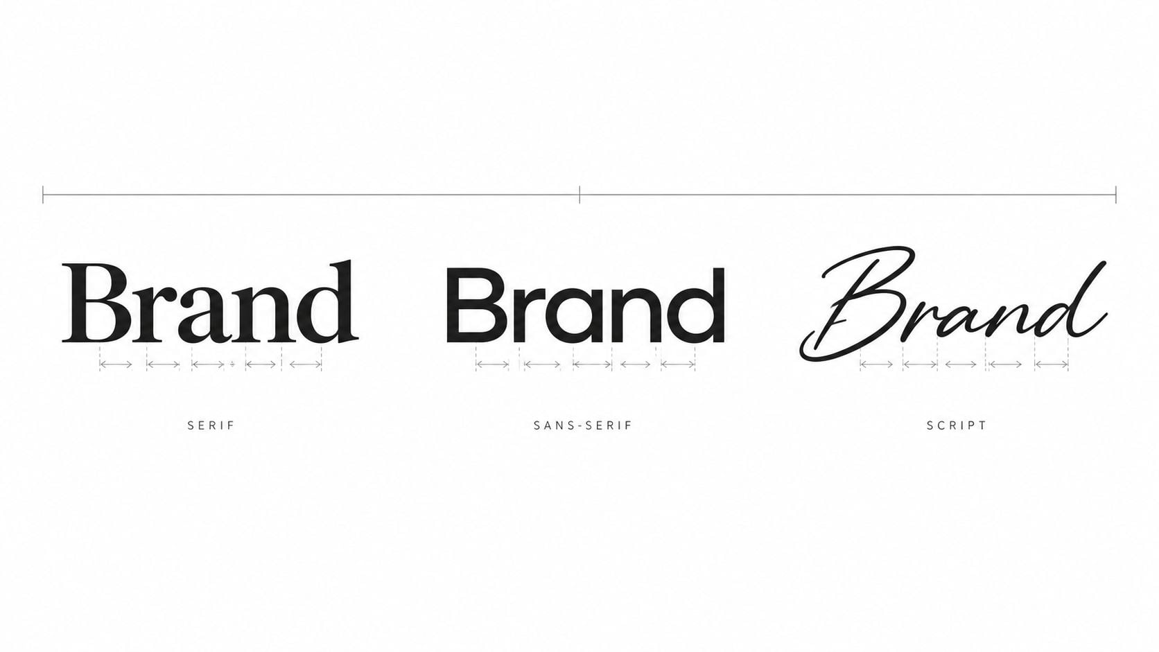
Typography communicates before people read every word. A serif can suggest heritage or authority, a sans-serif can feel direct and modern, and a script can bring elegance or personality. None of those associations is automatic, so judge the typeface against the business's audience, service and intended applications.
A wordmark also has a practical advantage: it can make a less familiar business name easier to learn. Google, IBM and Coca-Cola demonstrate how lettering can become a recognisable asset in its own right. For a smaller business, custom lettering doesn't need to mean drawing every character from scratch. Carefully modifying a letter, adjusting spacing or creating a distinctive ligature may be enough to give the name a more ownable character.
Readability beats novelty
Test the wordmark at small and large sizes, in regular text and in a single colour. Thin strokes, tightly packed capitals and elaborate joins often fail first on screens, embroidered garments and low-resolution print. Long company names may need a responsive arrangement, such as a shortened lock-up for narrow spaces and a fuller version for proposals or signage.
Avoid choosing a font solely because it looks distinctive in a specimen. Check its licensing terms for web, print, app and commercial use, and confirm that the necessary characters exist for the names and markets you serve. A typeface that can't support the full range of content around the logo can create inconsistency later.
- Check the name: Look for awkward joins, confusing letter shapes and spacing that changes the perceived meaning.
- Control the pairing: Choose supporting website and document fonts that complement rather than compete with the wordmark.
- Record the decision: Note the typeface, custom alterations, approved weights and permitted uses.
- Secure the licence: Keep evidence that your business can use the font in every required medium.
A useful style guide turns a good typographic decision into consistent practice. DesignStack's guide to creating a style guide covers the rules that help teams use visual assets reliably after launch.
6. Build a Flexible Logo System
A single master file rarely covers every brand touchpoint. A wide horizontal lock-up may work in a website header but become too small in a square social profile. An icon may work in a browser tab but provide too little context on an invoice. Designing these situations in advance prevents staff from stretching, cropping or rebuilding the logo themselves.
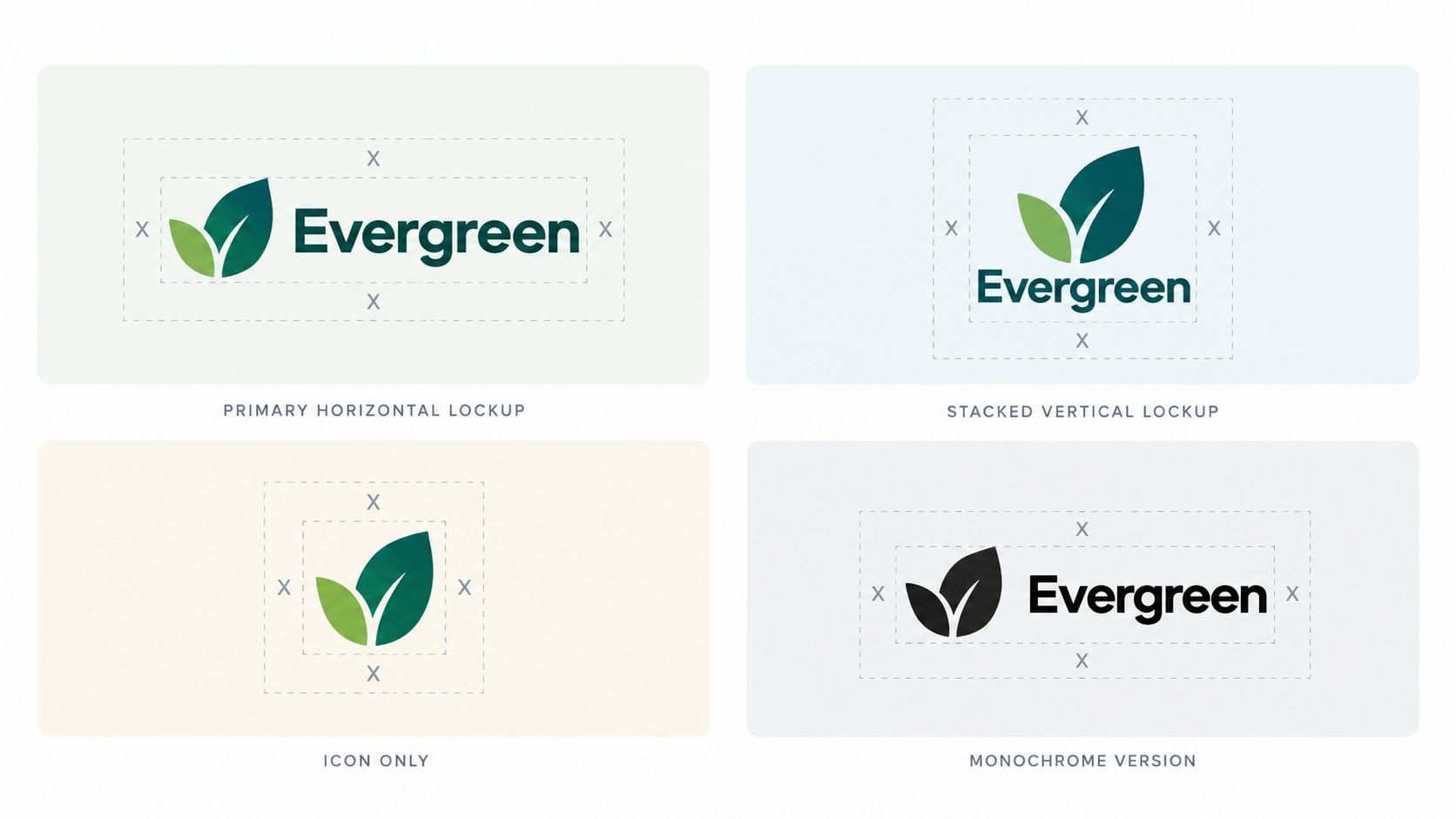
A practical system can include a primary lock-up, horizontal and stacked arrangements, an icon-only version and monochrome alternatives. Each variant needs a defined job, not permission for everyone to use whichever version they prefer. The visual relationship between the symbol, wordmark, spacing and colour should remain consistent across the set.
Document the rules
Create guidance that shows approved versions, clear space, minimum display sizes, background treatment, colour specifications and incorrect uses. Include examples of distortion, unapproved recolouring, crowded placement and low-contrast application. Clear rules reduce avoidable questions for web developers, printers, social media managers and suppliers.
For digital products, prepare suitable files for favicons, profile images and app interfaces. For print and merchandise, provide vector artwork and production-ready colour information. If the logo might be embroidered, ask how fine details, gaps and small text will reproduce before promising a particular finish. The guide on how to digitise embroidery logos explains why artwork prepared for screen or print may need different treatment for stitched output.
DesignStack's logo design process also highlights the value of testing small sizes, light and dark backgrounds and real applications. Those checks should happen before delivery, while changes are still affordable and the design team still has the working files.
A UK pricing study found that 46% of growth-stage SMEs buy mid-market studio work in the £129 to £499 range, while 12% use established agencies at £1,500 to £5,000, and 4% pay £10,000 or more. The study also identifies the distinction between a single logo file and a complete brand identity system as the strongest predictor of spend. Read the UK logo pricing research when defining your brief, ownership terms and expected deliverables.
7. Test and Validate in Real Contexts
A logo can pass a presentation review and still fail on a live website. Context changes everything. A pale mark may disappear over a hero image, a detailed icon may become muddy in a social thumbnail and a wordmark may force an awkward mobile header. Test the actual artwork where customers will encounter it, not just on a neutral artboard.
Build realistic mock-ups for a homepage header, product page, social profile, business card, email signature, sign or relevant piece of packaging. View the work on phones, laptops and printed samples. For a WordPress site, inspect the browser tab, mobile navigation and cookie or checkout interfaces. For eCommerce, check whether the logo competes with product imagery, price information and calls to action.
Ask focused questions
Feedback becomes more useful when each reviewer has a clear task. Ask whether the mark is legible, what kind of business it suggests, what they remember and whether it feels appropriate beside competitors. Don't let a large group vote on personal preference without explaining the decision criteria. The loudest opinion isn't necessarily the most relevant one.
A useful test doesn't ask, “Do you like this?” It asks, “What do you notice, understand and remember when this appears without explanation?”
Record feedback by theme, then make deliberate revisions rather than changing the design in response to every comment. If people consistently misread the name, solve the typography. If they understand the category but can't distinguish the business, revisit the mark. If the design works on screen but fails in print, adjust the production version rather than compromising every application.
The supplied logo testing video can provide another practical prompt for reviewing the design in use.
For a UK audience, familiarity is commercially relevant. A 2026 UK brand-identity report states that 25% of UK adults are more likely to buy from a business whose branding or logo feels familiar, as reported in this UK brand identity insight report. Repeated, consistent exposure gives a usable logo the opportunity to become familiar. Testing helps ensure the mark survives long enough and clearly enough to earn that recognition.
8. Prepare the Logo for Legal Protection
Creative approval isn't the end of the process. Before launch, check whether the proposed mark could conflict with an existing brand in the markets and categories that matter to your business. A logo that resembles another registered mark can create expensive disruption after you've invested in signage, packaging, advertising and website development.
Search the UK Intellectual Property Office database and relevant international registers, including EUIPO or USPTO where appropriate. Search more than exact matches. Consider similar names, related symbols, comparable industries and variations in spelling. A distinctive, non-descriptive mark generally gives you a stronger basis for ownership than a generic symbol that many businesses could reasonably use.
Copyright may apply automatically to original artwork, but ownership still needs to be clear. If a freelancer or agency created the logo, check the contract for transfer of rights, permitted uses, source files, font licences, third-party assets and the point at which payment transfers ownership. DesignStack's graphic design services contract guide is a useful prompt for the issues that should be documented.
Separate design delivery from trademark advice
A designer can help create an original and distinctive identity, but trademark registration and infringement strategy may require an intellectual property professional. Ask a qualified adviser about searches, classes, territories and filing decisions before you commit to a large rollout. Don't assume that buying a logo file gives you unrestricted rights to every element inside it.
Keep the working files, dated concepts, agreements, invoices and final approval records. Store the approved master files and usage guide together, then nominate someone to monitor unauthorised use. Legal protection has little practical value if the business can't prove ownership or doesn't notice misuse.
The right sequence is straightforward. Explore distinctive concepts, test them in use, complete clearance checks, document ownership and then publish the identity with consistent rules. That discipline protects the investment without allowing legal concerns to flatten the creative work.
8-Point Logo Design Comparison
| Item | 🔄 Implementation Complexity | ⚡ Resource Requirements | 📊 Expected Outcomes | 💡 Ideal Use Cases | ⭐ Key Advantages |
|---|---|---|---|---|---|
| Simplicity is Key – Design for Scalability | Low–Moderate, simplify conceptually, requires skilled reduction | Low, few colors, simple assets, lower production cost | High legibility and recognizability at all sizes | Favicons, app icons, business cards, signage, eCommerce thumbnails | Timeless, cost-effective, consistent brand presence |
| Choose Timeless Over Trendy – Long-Term Brand Value | Moderate, research and restraint needed | Low–Medium, quality design & vector deliverables | Long-term relevance; fewer rebrands and lower lifecycle cost | Professional services, retailers, established brands | Enduring recognition, stability, reduced future costs |
| Develop a Memorable Mark – Distinctive Visual Identity | High, creative concepting and originality required | High, experienced designers, time, possible trademark prep | Strong recall and differentiation in crowded markets | Startups, consumer brands, competitive eCommerce niches | Distinctiveness, higher perceived value, strong recall |
| Understand Color Psychology – Strategic Color Selection | Low–Moderate, research plus accessibility testing | Low, palette docs, contrast tests, color specs | Emotional alignment and improved recognition; accessibility benefits | Digital brands, eCommerce, service brands, global audiences | Emotional connection, differentiation, accessibility compliance |
| Typography Matters – Font Selection and Wordmarks | Moderate–High, typographic skill and kerning finesse | Medium, font licensing or custom lettering costs | Clear brand voice and legibility across media | Wordmark-led identities, multilingual brands, editorial sites | Communicates personality, legal differentiation if custom |
| Versatility and Flexibility – Multi-Format Logo Systems | High, design multiple lockups and rules | Medium–High, asset library, guidelines, file variants | Seamless application across formats; faster implementation | Businesses with many touchpoints (WP sites, apps, merch) | Consistency, implementation efficiency, future-proofing |
| Test and Validate – Real-World Application Testing | Moderate, iterative testing, mockups, revisions | Medium, mockups, user tests, stakeholder sessions | Identifies flaws early; data-driven selections; fewer mistakes | eCommerce launches, rebrands, WordPress integrations | Validated decisions, reduced production errors, higher confidence |
| Legal Protection – Trademark and Copyright Considerations | Moderate–High, searches and filing complexity | High, legal fees, filing costs, maintenance | Enforceable rights and protected brand assets | Scaling startups, international brands, high-value IP | Legal exclusivity, asset value, enforcement capability |
Turn a Finished Logo into a Working Brand Asset
A strong logo starts with a clear job. Simplify the concept until it remains recognisable without unnecessary detail. Give it a distinctive feature that separates the business from competitors. Choose colour and typography because they support the brand's character and practical needs, not because they look fashionable in isolation.
Then build the identity as a set of controlled variants. The primary logo may suit a desktop website header, while a stacked lock-up, icon-only mark or monochrome version may be better for a mobile interface, invoice, product label or sign. Usage guidance should explain which version belongs in each situation, how much space it needs and what users must never alter.
Testing should happen before final approval. A logo needs to survive small screens, light and dark backgrounds, low-quality displays, print, social profiles, product pages and the other places customers will meet it. Gather focused feedback about recognition, legibility, relevance and memory. Revise the design when the evidence reveals a problem, but don't allow unstructured opinions to turn the process into endless preference changes.
UK consumers' relationship with familiar marks reinforces the value of consistency. In a 2025 FSC UK consumer survey, 76% of respondents recognised the FSC logo, with 24% confident they knew what it meant and another 25% saying they knew roughly what it meant. Those figures show the difference between seeing a mark and understanding it, which is why repeated use, clear context and accessible presentation matter. The survey details appear in the FSC logo recognition research. That source has already been cited above, so the point here is a qualitative application rather than a repeat of the figures.
Use this final review before signing off:
- Small-size readability: Confirm that the symbol and wordmark remain clear where customers will encounter them at their smallest.
- Monochrome performance: Check black, white and single-colour versions without relying on colour contrast to create recognition.
- Background contrast: Test light surfaces, dark surfaces, photography and busy layouts.
- Correct file formats: Keep editable vector masters alongside suitable digital and print exports.
- Usage guidance: Record approved variants, spacing, colours, minimum display requirements and incorrect applications.
- Trademark review: Search relevant registers and confirm ownership, licences and rights before the public launch.
Businesses that need support can explore DesignStack's branding and digital design services as part of a wider WordPress website, eCommerce build or digital identity project. Gather every intended touchpoint first, place the logo in each one, and approve the identity only after you've seen how it behaves in practice.
DesignStack provides branding, graphic design and responsive WordPress and eCommerce services for businesses that need their identity to work online and in print. If you're planning a rebrand or new website, visit DesignStack to discuss the logo system, digital touchpoints and ongoing support your business needs.


Leave a Reply