The Logo Design Process: Your Guide to a Great Brand
If you're reading this, there's a good chance you're stuck in one of three places. You've tried a free logo generator and ended up with something that looks like everyone else. You've paid for a cheap logo online and received a flat image that falls apart the moment you try to use it on signage, packaging or a website. Or you're speaking to a designer now and wondering why a “simple logo” seems to involve so many steps.
That confusion is normal. Most business owners don't buy logo design often, so the professional logo design process can look more complicated than it needs to be. It's simpler than it seems. A strong logo isn't the result of one clever idea. It's the result of a structured process that turns business goals into a clear visual identity you can use.
Table of Contents
- Beyond a Pretty Picture Why Your Business Needs a Process
- The Foundation Briefing and Strategic Discovery
- Creative Exploration Moodboards and Concept Sketching
- Refining the Vision Digital Drafts and Effective Revisions
- The Final Delivery Your Complete Brand Toolkit
- Project Realities Timelines Pricing and Common Pitfalls
- Frequently Asked Questions
Beyond a Pretty Picture Why Your Business Needs a Process
A logo isn't decoration. It's an operating asset for your business. It sits on your website header, invoice, social profile, packaging, uniforms, van graphics and presentation deck. If it fails in one of those places, the problem isn't cosmetic. It's commercial.
That's why the process matters more than is generally understood. A rushed logo might look acceptable in a square social icon, then become weak, cluttered or generic everywhere else. That often happens when businesses start with a quick AI result, tweak it a few times, and assume they're done. The file may not scale properly. The mark may not be distinctive. Ownership and originality may also be unclear.
The business case is stronger than many owners expect. 75% of consumers recognise a brand by its logo, and 60% actively avoid brands with outdated or unappealing logos, which is why testing and revision aren't optional parts of the logo statistics behind brand recognition.
What a process protects you from
A proper logo design process reduces avoidable mistakes early. It helps answer questions cheap, on paper, instead of expensive, after launch.
- Generic ideas: Quick generators tend to blend familiar symbols, common fonts and safe colour choices.
- Poor fit: A logo can look polished but still feel wrong for your market.
- Technical weakness: If the artwork isn't built properly, printers, sign makers and web developers all inherit the problem.
- Inconsistent use: Without variants and rules, teams stretch, recolour and misuse the logo within weeks.
A logo that only works in one place doesn't work.
For a small business, that's where professional design earns its keep. You're not paying for somebody to “make it nicer”. You're paying for someone to define what the mark needs to do, where it needs to work, and how it should hold up over time.
Why this matters more for small businesses
Large brands can absorb mistakes. Small businesses usually can't. If you're a local retailer, a trades business, a hospitality brand or a service firm, your identity has to create trust fast. It often has to do that before anyone has spoken to you.
That's also why broader design quality matters beyond the logo itself. If you want a useful companion read, this guide on why graphic design is important for any business explains how visual decisions affect trust, consistency and day-to-day marketing.
A good logo design process gives you clarity before creativity. That order matters. Without it, you don't get a brand asset. You get an opinion rendered as a graphic.
The Foundation Briefing and Strategic Discovery
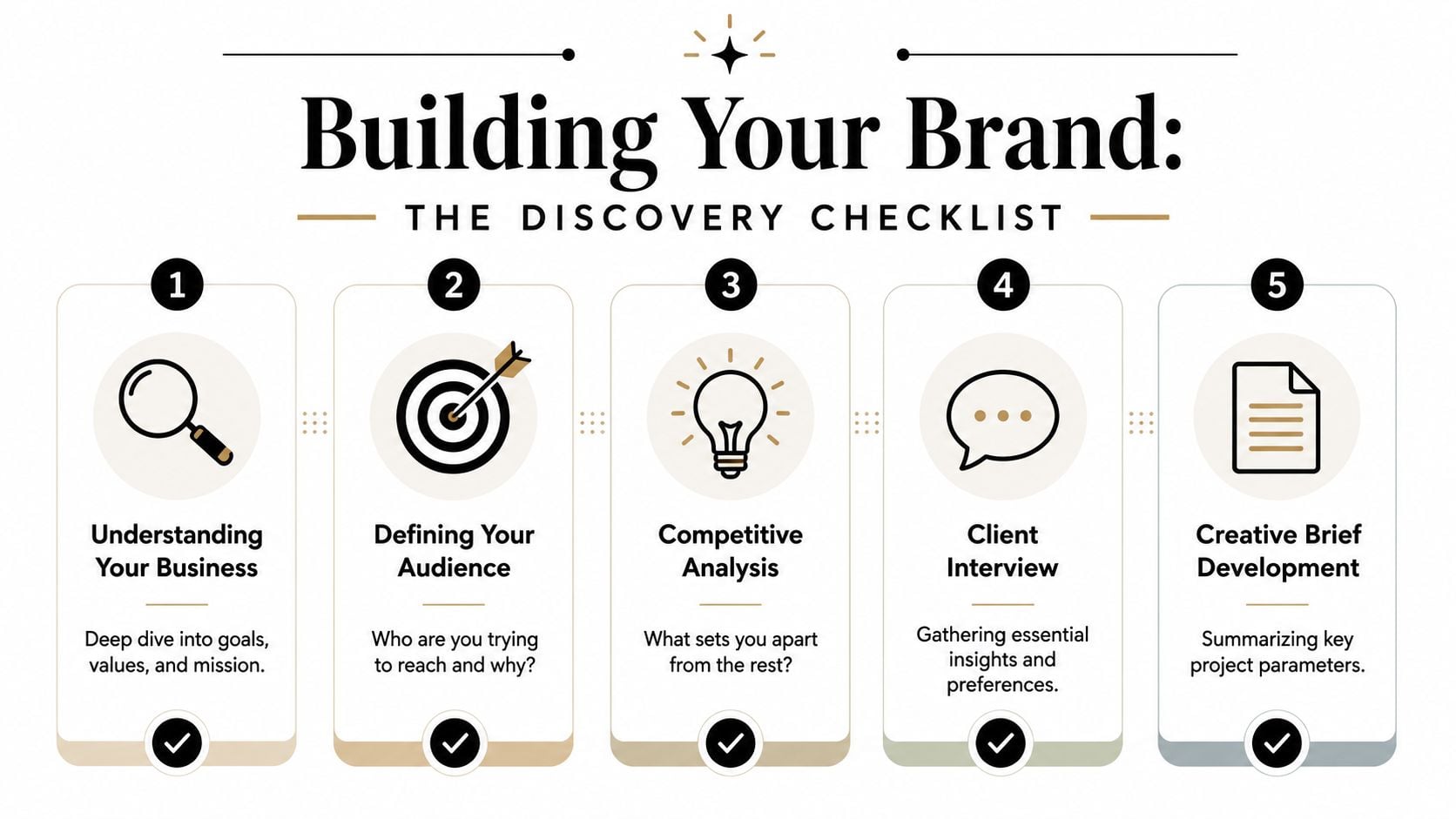
The strongest logo projects usually begin with questions that feel slightly unglamorous. That's a good sign. Before any sketching starts, the designer needs to understand the business behind the mark.
A professional UK-based logo designer typically starts with a research and data-gathering questionnaire to define business goals, followed by paper-based idea generation, so the logo targets the right market and communicates the right message, as outlined in Logo Geek's design process.
What a good brief actually covers
A proper brief goes beyond “we want it modern” or “we like blue”. Those comments can be useful, but they're not strategy.
A useful discovery conversation usually covers:
- Business goals: Are you launching, repositioning, attracting better-fit clients or moving upmarket?
- Audience: Who buys from you now, and who do you want to attract next?
- Offer: What do you sell, and what makes customers choose you?
- Competitors: Who else is in the same space, locally or nationally?
- Practical use: Where will the logo appear first, and what are the essential applications?
If a designer asks detailed questions here, that isn't delay. It's risk reduction.
Practical rule: The clearer the business brief, the fewer subjective design arguments you'll have later.
A lot of owners find that this stage also helps them sharpen their own thinking. It forces decisions about tone, audience and positioning that might have stayed vague otherwise. If that part feels difficult, it usually means the work is necessary.
For a deeper look at the strategy behind market perception, this guide to unlock powerful brand positioning is worth reading alongside the design brief.
What you should prepare before the first meeting
You don't need a perfect brand strategy document. You do need honest input.
Bring these into the first discussion:
| Item | Why it matters |
|---|---|
| Existing logo or materials | Shows what should be kept, dropped or improved |
| Competitor examples | Helps define what to avoid and where to differentiate |
| Customer profile notes | Gives the designer a real-world audience, not a vague “everyone” |
| Website or packaging plans | Shapes the technical and layout requirements |
| Internal decision-makers | Prevents delayed feedback and conflicting opinions |
It also helps to look at examples you like and explain why you like them. “Clean and confident” is useful. “Can you copy this style?” isn't.
If you need a practical starting point, this article on how to write a design brief is a solid way to organise your thoughts before the project begins.
Discovery is where the logo design process stops being guesswork. It gives every later decision a reason.
Creative Exploration Moodboards and Concept Sketching
A lot of business owners hit this stage expecting polished logo options straight away. Then they see references, rough layouts and pencil sketches and wonder whether the project has gone backwards.
It hasn't. At this stage, expensive mistakes get filtered out early, before anyone gets attached to the wrong idea.
For an SMB, that matters. You are not paying for decoration. You are paying to reduce the risk of choosing a logo that looks fine on day one, then feels generic on your shopfront, your van, your packaging or your website six months later. That risk is even higher now that AI tools can produce endless passable-looking marks in minutes. Speed is easy to get. Clear thinking is not.
How abstract ideas become visual direction
Moodboards give the project a visual point of reference before design software enters the picture. They help pin down what words like "premium", "approachable" or "established" should mean in practice.
A useful moodboard tests decisions such as:
- Whether the brand should feel classic or current
- Whether the typography should be restrained or full of personality
- Whether the overall tone should suggest warmth, authority, energy or quiet confidence
- Whether a symbol adds meaning or only adds clutter
That conversation saves time later. It is much easier to agree that a direction feels too corporate, too soft or too busy at moodboard stage than after a client has seen a polished concept and started showing it to colleagues.
Colour often enters carefully here as well. Used well, it shapes perception and recall long before a customer reads a single line of copy. This guide to colour psychology in branding gives a useful explanation of how colour choices influence brand perception without slipping into lazy stereotypes.
Why sketching still matters
After the visual territory is agreed, good designers usually sketch by hand. That is still standard practice for a reason.
Sketching is fast, cheap and honest. It lets a designer test proportions, symbols, initials, layouts and visual metaphors without wasting hours polishing weak ideas on screen. For clients, that hidden work is where a lot of the value sits. You are paying for judgment and elimination as much as creation.
This is also where professional process separates itself from AI-generated concepts. AI can give you volume. It cannot sit with the awkward trade-offs between distinctiveness, legibility, relevance and long-term use in the same deliberate way. For a local business, those trade-offs matter. A clever visual pun is useless if it disappears on signage. A trendy mark may date quickly. A generic icon may look acceptable until you realise three competitors nearby are using something close to it.
A common discipline at this stage is to test ideas in black and white first. That keeps the focus on shape, balance and recognition. If a concept only comes alive once colour effects are added, the idea underneath usually needs more work.
The work you never see is often the work that makes the final logo stronger.
Clients do not need to review every rough sketch. They need a designer who explores widely enough to avoid obvious answers, then edits hard enough to bring forward only the routes worth discussing.
How to give feedback that improves the work
This stage also depends on the quality of client feedback. The strongest comments are tied to the brief and the customer, not personal taste alone.
"Too playful for our market" is useful. "I just don't like orange" usually is not.
For small businesses with several decision-makers, this is often the point where projects drift. One person wants safe. Another wants bold. Someone else wants to use an AI draft they made over the weekend as a benchmark. The practical fix is simple. Judge every direction against the agreed business goal, not against whoever spoke last.
Moodboards and sketching may look less exciting than finished logo files, but they do a lot of the heavy lifting. They turn loose preferences into usable direction and reduce the chance of spending revision rounds fixing the wrong problem.
Refining the Vision Digital Drafts and Effective Revisions
Once the strongest directions survive sketching, the work moves into digital form. At this point, proportion, spacing, typography and precision start to matter at a much higher level.
Digital drafting is not tracing a sketch neatly. It's the stage where rough ideas are tested under pressure. Does the wordmark still read at small size? Does the icon hold up on its own? Is the spacing calm and confident, or slightly awkward in a way non-designers can feel but not name?
Why you usually see three concepts
Most clients don't need ten options. They need a small number of well-developed, meaningfully different directions.
In the UK market, a standard professional logo package typically includes three distinct logo concepts, which experienced designers treat as the right number for clear client decision-making. That benchmark is widely used in professional practice, even where the process behind it is explained more generally.
Three usually works because each route can do a different job. One may be the safest fit. One may push differentiation harder. One may sit in the middle and balance flexibility with character. Beyond that, the conversation often gets diluted instead of improved.
A good presentation should also explain the rationale. Not just what the logo looks like, but why the choices support the business brief.
How to give feedback that actually improves the work
Most revision problems are feedback problems.
Clients often say things like “make it pop”, “it feels off”, or “can we see ten more versions?” None of that gives the designer much to solve. Better feedback names the business concern behind the reaction.
Useful feedback sounds more like this:
Instead of “Make the icon bigger”
Say “The business name needs to feel more established than the symbol.”Instead of “Can you make it more premium?”
Say “It feels a bit friendly for the audience we're targeting. We need more authority.”Instead of “I don't like this font”
Say “The type feels too casual for a legal or financial audience.”
If you want to understand one detail clients often underestimate, this article on what whitespace is in design explains why spacing affects confidence, readability and perceived quality.
A good revision round should tighten the work, not reopen the entire project every time. Focused feedback makes that possible.
For a short visual look at how designers refine concepts, this video is useful:
Good revisions are directional, not decorative.
When this part goes well, the client feels heard and the designer has enough clarity to improve the concept without diluting it.
The Final Delivery Your Complete Brand Toolkit
Approval is not the end of the logo design process. It's the point where the project turns into usable assets.
Many business owners expect “the logo file” and don't realise how many versions are needed for real-world use. A professional handover should prepare you for websites, social media, print, signage, documents and future suppliers.
What files you should receive
A standard professional delivery often includes a full export set and usage variations, not one flattened image. Professional practice in the UK commonly includes a broad handover package with web and print formats, colour variations and a style guide.
Here's the practical version of what that means:
| File type | What it's for | Why it matters |
|---|---|---|
| AI or EPS | Professional print and future editing | Vector format scales without losing quality |
| SVG | Websites and digital interfaces | Sharp at different screen sizes |
| PNG | Websites, presentations, social media | Supports transparent backgrounds |
| JPG | General everyday use | Easy for non-design software and quick sharing |
| Proofing and print sharing | Useful when sending to printers or partners |
You should also receive variants. A full-colour version isn't enough on its own.
- Black version: Needed for one-colour print and simple applications
- White version: Useful on dark backgrounds and overlays
- Horizontal lock-up: Better for website headers or signage
- Stacked or vertical version: Better for square spaces
- Icon or symbol-only version: Useful for social avatars or favicons
Why guidelines matter after the logo is finished
A logo becomes inconsistent very quickly when nobody knows the rules. That's why even a simple style guide has value.
A useful guide usually covers:
- approved colours
- font pairings
- spacing rules
- minimum size guidance
- incorrect uses to avoid
Without that, teams improvise. They stretch the mark, swap colours, add effects or place it on backgrounds where it loses contrast.
The final package should make your life easier, not more technical. If you need to brief a printer, hand assets to a web developer or create a sponsorship banner six months later, the right files prevent confusion and rework.
This is the difference between buying a logo and receiving a brand toolkit. One gives you an image. The other gives you something you can run a business with.
Project Realities Timelines Pricing and Common Pitfalls
A typical small business logo project starts with good intentions, then stalls in a familiar way. The owner wants to move quickly, a few colleagues all have opinions, and somebody has already generated ideas with AI that look promising on screen but have not been tested in the actual places the logo has to work.
Three things usually shape the outcome. Budget, clarity, and decision-making. If one of them is weak, the project slows down or heads off course.
Price varies because the job itself varies. A lower-cost logo service often covers a lighter brief, fewer concepts, fewer revision rounds, and a basic file handover. A higher-fee project usually includes more strategy, more scrutiny, and more preparation for real use across your website, signage, print, social media, packaging, or uniforms.
What you are paying for is not only artwork. You are paying for judgment.
That includes:
- business discovery
- competitor review
- concept rationale you can evaluate
- testing against likely applications
- cleaner final files and clearer handover guidance
For SMBs, that difference matters. A cheap option can look acceptable in a presentation and still fail later when the signwriter asks for vector artwork, the embroiderer says the detail is too fine, or the mark disappears in a mobile header. If you want a broader sense of how much branding agencies charge for strategy, identity, and rollout work, it helps put logo pricing in the right business context.
Projects usually go wrong for practical reasons, not creative ones.
The first problem is vague feedback. “Can you make it pop?” does not help anyone make a better decision. Useful feedback names the issue. Too formal. Hard to read at small sizes. Feels too close to a competitor. The second problem is too many decision-makers. If five people comment and nobody has final authority, revision rounds multiply and the work gets watered down. The third problem is missing application needs early. A logo for a café, a building firm, and an accountancy practice may all need different things from the same process.
AI has added a new version of the same problem for local businesses. Owners often arrive with AI-generated options and ask for a quick tidy-up. Sometimes that saves time at the exploration stage. Often it creates extra work, because the files are not usable, the ideas are derivative, or the concept has no clear logic behind it. AI is useful for rough exploration. It is weak at accountability, originality checks, print readiness, and the small technical decisions that keep a logo usable for years.
Cheap design often becomes expensive when you have to replace it, rebuild it, or explain it to every supplier.
Timelines depend less on raw design speed than clients expect. A key variable is decision quality. A clear brief, one decision-maker, and feedback given in organised rounds will usually move faster than an urgent project with mixed opinions and changing goals. In practice, a well-run logo project takes as long as it takes to make sound choices once, instead of rushed choices twice.
Frequently Asked Questions
Can AI create my final logo?
It can create starting points. That's different from delivering a finished identity. Many AI outputs are useful for exploring styles or symbols, but they often need professional refinement to solve practical issues like scalability, consistency and file preparation.
Why do designers start in black and white?
Because shape comes first. A common professional rule is to start in monochrome so the concept works without relying on colour. Skipping that discipline can hide weak ideas. It's also tied to a known pitfall in the process. Missing the application discovery stage often leads to logos that don't adapt well across formats, and professional guidance stresses starting in black and white to focus on form, as explained in this overview of the professional logo design process and common mistakes.
Is a logo the same as a brand identity?
No. A logo is one part of your brand identity. Brand identity also includes colours, typography, imagery, tone and usage rules.
How many people should give feedback?
As few as possible. Gather input, but appoint one final decision-maker. Too many voices usually create mixed messages and weaker outcomes.
If your business needs a logo that works properly across web, print and day-to-day marketing, DesignStack can help you move from vague ideas to a clear, usable brand identity with a straightforward process and practical guidance at every stage.