

Branding and Graphic Design for UK Small Businesses
You already know the feeling. The logo still looks fine in the folder, the website still loads, the van livery still gets you around Dorset, but the whole thing feels split into separate businesses. The Instagram posts look one way, the brochure looks another, and the homepage sits somewhere in the middle trying to sound confident while the visuals argue with each other.
That's not a cosmetic problem. It's a conversion problem. Branding and graphic design work as one system, and when that system is loose, every marketing pound has to work harder than it should.
For UK SMEs, especially in places like Weymouth, Portland, Dorchester, and the smaller rural pockets in between, this matters more than most agencies admit. Buyers make fast visual judgements, trust consistency, and move on quickly when a business looks improvised. If your identity feels tired before your website does, the issue is usually not the website. It's the system underneath it.
Table of Contents
- Why Your Brand Feels Stale Before Your Website Does
- Branding and Graphic Design Explained Without the Jargon
- The Six-Stage Process a Good UK Studio Actually Runs
- Logo, Type, Colour, and Layout Working as One System
- Local Case Snippets From Dorset Brands You Have Probably Seen
- What Branding and Graphic Design Actually Return to a Business
- Realistic 2026 Pricing for Branding and Graphic Design in the UK
- AI, Accessibility, and the Questions UK Brands Should Be Asking
Why Your Brand Feels Stale Before Your Website Does
A Dorset business usually reaches this point after growth outpaces its identity. The service has improved, the team has changed, the audience has widened, but the logo, leaflet, social posts, and website still belong to an older version of the company. The brand has not broken. It has drifted.
That drift shows up in small ways first. A café menu uses one tone, the Instagram grid uses another, and the booking page feels borrowed from a different trade. A consultancy might have a crisp wordmark but clumsy slides, weak proposal layouts, and a homepage that does not match the promise in the sales conversation. The business is doing better than the identity suggests, and buyers notice that gap.
Practical rule: if your assets do not look like they came from the same system, customers feel the friction before they can explain it.
The fix is not to keep adding isolated design jobs. Set the brand first, then force every visual asset to obey the same rules. The logo, colour palette, typography, spacing, photography style, and page layout need to work as one system, not as separate art requests. That matters because consistency is where recognition and trust start to build. The broader trend still points the same way, with more than 80% of the world's largest companies using two or fewer colours in their logos and 30.8% using blue, while 81% of businesses worldwide use graphic design and 70% say they are more likely to repurchase from brands with consistent design across touchpoints, according to logo statistics reporting.
If you are comparing agencies, this guide gives you the working vocabulary, the process to expect, the pricing logic to challenge, and the questions that separate a decent creative supplier from a studio that understands commercial design.
Branding and Graphic Design Explained Without the Jargon
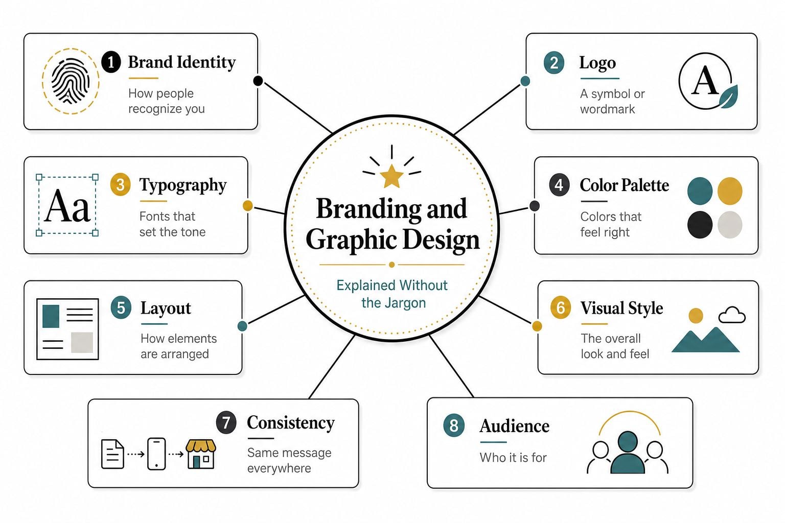
Think of the business as a person. Branding is the personality, values, voice, and promise. Graphic design is the clothing, posture, and presentation that makes that personality visible in public.
The distinction matters because people keep trying to solve a strategy problem with a visual answer. A lovely logo can't rescue a fuzzy offer. A polished brochure won't fix a company that can't explain why it exists. The strategic layer has to settle first, audience, positioning, message, proof, and tone. Only then does design become useful instead of decorative.
What branding actually covers
Branding sets the rules for how the business behaves in public. It includes the audience you're speaking to, the promise you're making, the things you won't pretend to be, and the voice you use when someone reads your website, brochure, or quote email. If that part is weak, every visual choice feels arbitrary.
A local builder, for example, needs different brand decisions from a membership gym, a chamber of commerce, or a seafood restaurant. They might all need a logo, but they don't need the same tone, image style, or hierarchy of information. That's why branding starts with judgment, not software.
What graphic design actually covers
Graphic design turns that judgment into things people can see and use. That includes the logo, typography, colour palette, page layout, icon style, social templates, signage, menus, flyers, business cards, and the structure of web pages. It's the practical layer that makes the brand recognisable on a phone, a van, a PDF, and a printed menu.
A good designer doesn't just make assets look tidy. They make them repeatable. If the system can't be reused, it isn't a system yet.
The Six-Stage Process a Good UK Studio Actually Runs
A proper studio doesn't start by sketching logos in a vacuum. It starts by asking what the business needs to change, who has to believe it, and where the identity will have to work. That sequence matters, because branding without evidence becomes taste-led guessing.
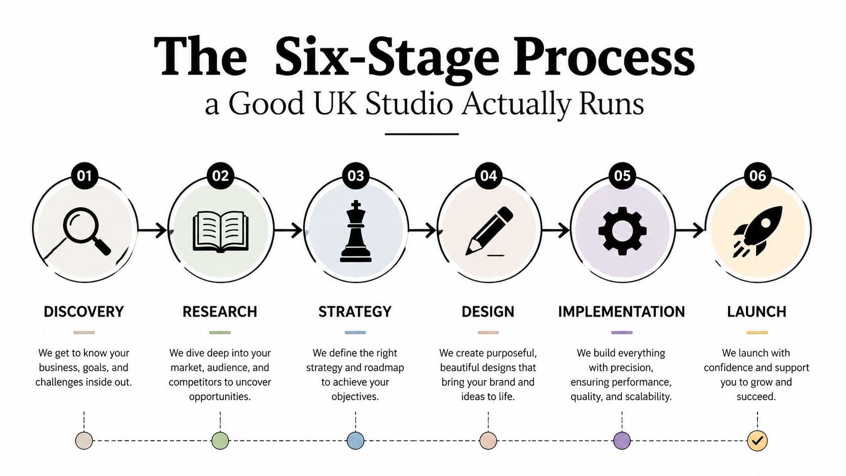
The process I'd expect from a serious Dorset studio includes discovery, research, strategy, design, implementation, and launch. Each stage should end with something concrete. If it doesn't, you're paying for meetings, not progress.
What each stage should produce
Discovery should give you a brief that reflects your goals, constraints, and audience. Research should turn that brief into evidence, competitor review, audience insight, and channel reality. Strategy should define the visual direction and the brand rules that the creative work has to obey.
Design should then produce concepts, not one vague “refinement” loop that never ends. Implementation should convert the approved system into files and templates that can live across web, print, and social. Launch should include handover, asset organisation, and enough support to make sure the rollout doesn't unravel in the first week.
If a studio skips research, you'll feel it later when the visuals don't fit your buyers. If it skips guidelines, your team will recreate the brand badly within a month. And if it skips accessibility checks, the whole identity may look neat but function poorly for real users.
For a useful example of how a focused identity project should be scoped, see DesignStack's brand identity development.
Bottom line: a good process reduces subjectivity. It doesn't eliminate opinion, it channels opinion into decisions you can defend.
Logo, Type, Colour, and Layout Working as One System
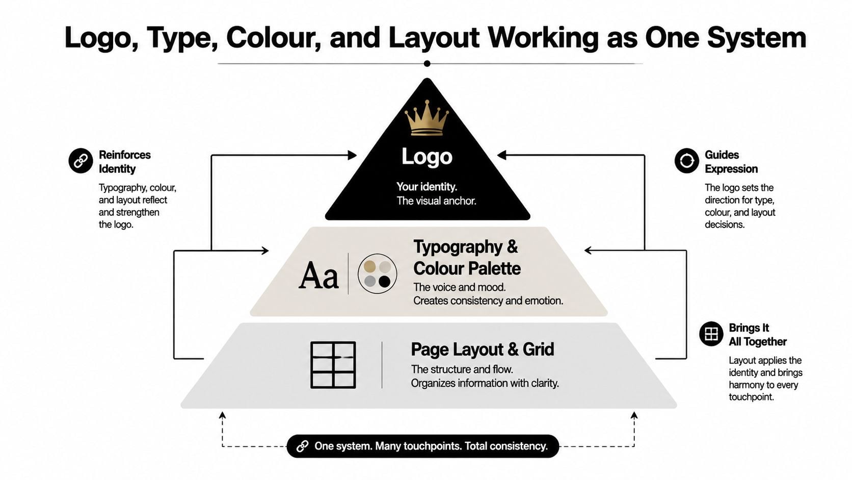
A Dorset SME does not need a prettier logo. It needs a visual system that makes people trust the business faster, understand the offer sooner, and remember the name later. The logo is one part of that system. The type, colour, and layout do the essential work.
Users form an opinion about a website almost immediately, and that first read is unforgiving. If the logo says premium, the typography says cheap, and the layout feels improvised, buyers notice the mismatch before they read a line. That is a conversion problem, not a design preference problem. A consistent presentation across platforms also supports revenue, as noted in brand design industry statistics, which is why visual coherence should be treated as commercial infrastructure, not decoration.
What to lock down first
Start with one logo family, not a pile of versions someone made for convenience. Then set one type pairing, a tight colour ratio, and a layout grid that can survive web, print, and social without looking patched together. If those four elements fail on a van, a menu, and a mobile screen, the system is not ready.
Simple logo systems usually travel better than owners expect. Many large brands keep their marks to two colours or fewer, and blue shows up again and again because it reproduces cleanly and reads well across formats. That is not a command to copy big corporates. It is a reminder that clarity scales better than cleverness, especially for smaller firms that need the identity to work on signage, email headers, invoices, and a phone screen in bad light.
Colour choice also changes how quickly people read the brand. If you want a practical explanation of that effect, colour psychology in branding is worth a look. If you want a plain-English example of how rules get written down, the mattress brand guidelines guide shows how a brand system becomes something a team can follow.
What to resist
Do not let the identity sprawl into novelty for its own sake. Extra logo marks, too many colours, multiple font families, and random spacing make the brand harder to recognise and more expensive to manage. They also make every new flyer, social tile, and web page into a one-off design decision, which is exactly how small brands drift off course.
Keep the rules tight. Decide what can change, what cannot, and who is allowed to approve exceptions. If your team can follow the system without a designer sitting beside them, the brand will hold together in the world. If they cannot, the identity is already leaking value.
Local Case Snippets From Dorset Brands You Have Probably Seen
Crossfit Durnovaria works because the system matches the behaviour of the audience. The name, the energy, the typography, and the colour treatment all need to feel immediate and physical, because the brand is selling movement, discipline, and community. On a van, a hoodie, or a phone screen, that kind of identity has to read in a second.
The Lobster Pot is a different challenge. Hospitality brands need heritage without looking trapped in it, especially when menus and booking journeys have to feel current. A design approach that uses restrained visual cues, cleaner layout choices, and easier navigation often does more work than ornate flourishes ever will.
The Weymouth and Portland Chamber of Commerce sits at the trust-led end of the spectrum, where clarity matters more than decoration. The typography, photography direction, and layout choices have to feel credible and organised, because the audience is judging professionalism before they judge personality. You can see that kind of discipline in this Weymouth Chamber portfolio example.
Some brands need to shout. Others need to sound competent. Most Dorset SMEs need to do both at different points in the funnel.
The lesson across all three is simple. The style changes, but the discipline doesn't. Each identity still has to be legible, repeatable, and consistent enough to move from print to web without falling apart.
What Branding and Graphic Design Actually Return to a Business
Owners often ask for a prettier logo when they really want more enquiries, more repeat custom, or a stronger reason to charge properly. That's the right instinct, but the wrong language. The return on branding and graphic design is recognition, trust, and reduced friction, not decoration.
The strongest commercial case is consistency. If customers see the same visual rules across your website, socials, van, signage, and proposals, they spend less energy figuring out who you are. That makes you easier to remember and easier to buy from. The evidence in the earlier section about consistent design and revenue uplift matters because it points to a simple truth, coherent presentation helps commercial performance.
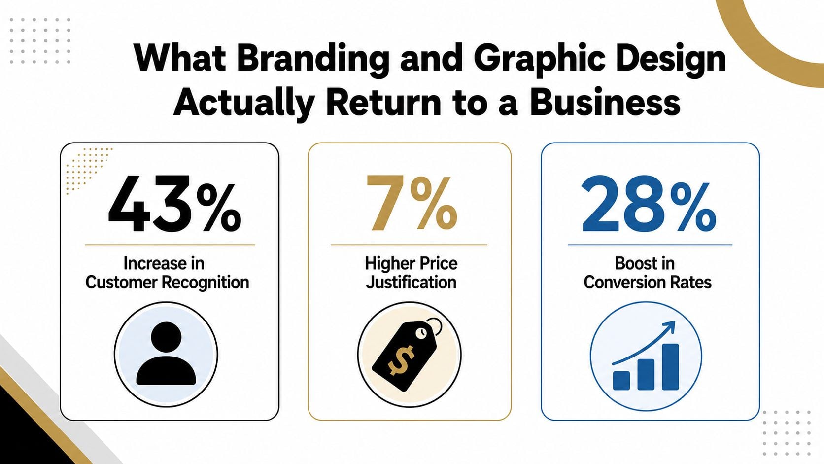
Where the money actually goes
A poor identity costs you in slow recognition. A confused checkout costs you in abandoned interest. Weak accessibility costs you in lost audience reach, especially when you remember that 24% of UK adults were disabled in 2024, according to the RMCAD summary of UK accessibility and rural design issues. If your brand is hard to read, hard to move through, or hard to trust, some buyers will leave.
The opposite is also true. A clearer identity can support price confidence, cleaner sales conversations, and more efficient marketing. That doesn't mean the logo itself causes those outcomes. It means the system around the logo makes your business easier to choose.
What to measure instead of asking for “better branding”
Track whether customers recognise you faster. Track whether the website feels easier to use. Track whether sales calls become shorter because your materials do the explaining for you. Track whether your team stops improvising visuals every time they need a new social post.
If you can't measure those things yet, start with a simple before-and-after audit of your touchpoints. That's usually more honest than pretending a mood board is a business case.
Realistic 2026 Pricing for Branding and Graphic Design in the UK
Pricing gets vague fast in this industry, so I'm going to be direct. In the UK, the cost depends on scope, revision risk, touchpoint count, and whether you want a one-off logo or a proper identity system that can live across web and print. The local salary benchmark for graphic designers sits at about £27,000 in the UK, while broader global market reports place the industry at roughly $45.8 billion in 2021 to 2024 and project continued growth through 2030, which shows why design is a real business cost, not a vanity expense, according to graphic design statistics and facts.
UK Branding and Graphic Design Pricing Bands for 2026
| Project scope | Indicative 2026 range | Typical deliverables |
|---|---|---|
| Logo and starter identity only | Lower mid four figures to higher mid four figures | Logo suite, colour palette, type pairing, simple usage rules |
| Full brand identity plus guidelines | Mid four figures to low five figures | Strategy, identity system, brand guidelines, social and print templates |
| Brand plus conversion-focused WordPress site | Higher five figures and up, depending on scope | Identity, web design, WordPress build, core page templates, launch support |
That table is a working range, not a promise. If someone quotes far below it without a discovery phase, revision limits, or file ownership clarity, they're usually under-scoping the work. If they quote far above it, ask what extra risk, depth, or service layer is included.
What moves the price up or down
The number of stakeholders matters. So does the number of touchpoints, because a brand that has to work on signage, vehicles, social, menus, and PDFs takes more thinking than one that only needs a logo file. Illustration, custom photography direction, copywriting, accessibility review, and multi-page brand guidelines all add time.
Local studios like DesignStack have a practical edge for some Dorset businesses. Face-to-face discovery in Weymouth, tighter post-launch support, and direct communication suit owners who want fewer layers between the brief and the output. Larger agencies can offer broader sector experience and more bench strength, while freelance designers can be leaner and faster on narrow jobs. None of those options is automatically better.
Questions I'd ask before signing anything
- What happens before design starts? If the answer doesn't include discovery and research, be wary.
- How many revision rounds are included? Unlimited revisions usually means fuzzy scope.
- Who owns the source files? You should know exactly what you get at handover.
- What does launch support include? The job isn't finished when the files land in your inbox.
- How are accessibility and mobile use checked? If that question gets brushed aside, expect trouble later.
- How does the studio handle hosting and technical fit? Brand and web work need to talk to each other.
- What's excluded from the quote? That answer is often more useful than the sales pitch.
- Is post-launch support timeboxed or open-ended? Know the boundary.
- Can the studio explain the strategy in plain English? If they can't, the work is probably style-first.
- Will the files be usable by your team next year? If not, you're buying a dependency, not an asset.
For more detail on the structure behind agency pricing, look at how much branding agencies charge.
AI, Accessibility, and the Questions UK Brands Should Be Asking
AI is useful, but it's not a brand strategy. It can help produce drafts, moodboard routes, rough copy, and content variants, but without brand rules it also accelerates inconsistency. That matters because the UK Government's latest AI adoption reporting says small businesses remain less likely to use AI than larger firms, and the ICO continues to update UK guidance around generative AI, copyright, and lawful use of personal data, which directly affects how brands create and manage assets.
Where AI helps and where it doesn't
Use AI for speed, variation, and first passes. Don't use it to decide your positioning, your visual standards, or your customer promise. If a team doesn't have clear rules, AI will happily produce five versions of the same weakness.
That's why brand governance matters. Someone needs to decide which assets are approved, which prompts are acceptable, what can be reused, what needs human review, and how consistency gets protected across social, web, print, and campaigns. Without that layer, the output gets faster but not better.
Why accessibility is not optional
A brand also has to work for people who don't interact with it the way designers do. The ONS reported that 24% of UK adults were disabled in 2024, and rural businesses serving places like Dorset still have to deal with uneven connectivity and different online habits. That means accessible colour contrast, legible typography, simple layouts, and mobile-first structure aren't optional refinements, they're basic usability.
If you want a practical standard to judge agencies against, use inclusive design principles as your filter. Ask whether the studio tests on smaller screens, keeps layouts readable, and understands that “premium” can still be clear.
A polished identity that fails on a weak signal or a small screen is not premium. It's fragile.
What to do next
Audit your current touchpoints for inconsistency. Write a one-page brief covering audience, promise, tone, and the problems your current brand is causing. Then book a discovery call with a Dorset studio like DesignStack if you want a phased rebrand or refresh that includes web, branding, and the support to roll it out properly.
DesignStack creates branding, graphic design, websites, and the supporting assets that keep them consistent across print and digital channels. If your current identity feels mismatched, stale, or hard to scale, visit DesignStack and ask for a discovery conversation about a brand system that fits how your business sells.

Leave a Reply