

Web Site Planning That Works: A Practical Guide for UK SMBs
You're staring at a brief, a designer has sent a few polished mock-ups, and the project already feels bigger than the budget you started with. That's the normal point where web site planning either becomes a clean decision document or turns into a long chain of “just one more tweak” requests. The difference shows up later in approval speed, content gaps, and whether the build still matches what the business needs.
A good plan doesn't try to predict every pixel. It fixes the scope, defines success, and gives everyone a shared map before anyone burns time on layouts or copy. That's why the strongest projects start with goals, journeys, content, and tracking, then use those decisions to keep design and development honest. The web itself was built on standards and structure from the start, with the core stack already working by December 1990 and the first website published on 20 December 1990, before the Web was publicly announced in 1991, which is a useful reminder that planning and structure were never optional add-ons in the first place.CERN's short history of the Web
Table of Contents
- Why Most SMB Websites Drift Before They Launch
- Define Goals Audience and Success Before Anything Else
- Map User Journeys and Build a Task-Led Sitemap
- Wireframes Content Strategy and SEO Planning
- Choose the Right CMS and Technical Stack
- Realistic Timeline and What Each Week Produces
- Launch Checklist and 30 Days of Post-Launch Support
Why Most SMB Websites Drift Before They Launch
The owner usually starts with a sensible ask. “We need a better website” often means the current one looks tired, doesn't convert, or doesn't reflect the business anymore. Then the brief grows teeth, because every department wants a say, every screenshot looks incomplete, and every page begins to feel like a separate negotiation.
That's where drift begins. A designer can make almost anything look coherent, but if the plan hasn't locked the business goal, the site becomes a collection of preferences instead of a tool. A planning document stops that drift by forcing early decisions about what the website is for, who it's for, and which actions matter most.
Practical rule: if a request can't be tied to a goal, a user task, or a page outcome, it doesn't belong in the build yet.
The three failure patterns a plan prevents
The first failure is unclear goals. A business says it wants “more leads”, but no one defines which enquiry counts, what form fields are needed, or whether phone calls matter more than form completions. That ambiguity reappears later when the site launches and nobody knows what success looks like.
The second failure is untested navigation. Menu labels get approved because they sound familiar internally, not because a visitor can use them quickly. On mobile especially, that usually means buried journeys, extra taps, and a homepage trying to do too much at once.
The third failure is missing content. Teams assume copy will appear later, then discover the homepage is ready and the service pages aren't. That creates a painful choice between delaying launch or publishing with placeholder text that damages the site from day one.
A planning document is not paperwork for its own sake. It's the thing that protects budget, deadlines, and the relationship between owner, designer, and developer. If you want a simple benchmark for what a useful website should do, the internal summary on what makes a good business website lines up with the same principle, clear purpose first, decoration second.
Define Goals Audience and Success Before Anything Else
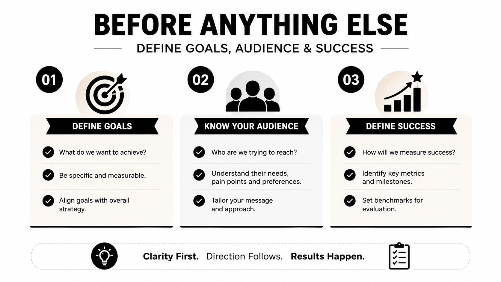
Start with a one-page brief, not a full creative deck. The brief should answer four questions before design starts, who the site is for, what business outcome matters, what users need to do, and how success will be judged. That's the point where vague ambition becomes a buildable plan.
The four discovery questions
Who is the primary audience?
Name the buyer, client, or member, not the entire market.What business outcome matters most?
Pick the lead type, booking type, sale type, or call type that pays for the site.What action should the visitor take?
Keep the primary CTA obvious, then leave secondary actions in support, not in competition.What counts as success on launch?
Define the event, form, call click, booking, or checkout step that proves the page is working.
A Dorset retailer is a good example. If the owner says, “We need more traffic”, that's too broad to design around. If the actual need is more in-store bookings for styling appointments, the brief gets sharper, the homepage CTA becomes specific, and the entire structure can support that one task instead of chasing clicks for their own sake.
That kind of brief should pass review fast. It doesn't need pages of strategy language, it needs enough clarity that a designer, writer, and developer can say yes or no without guessing. The stronger the brief, the easier it is to spot when a later request changes scope rather than improving the original plan.
For a practical structure, the design brief guide is a useful reference point, because it aligns the business goal with the decision-making that follows. The same logic applies if you're briefing an agency, a freelancer, or an in-house team.
Map User Journeys and Build a Task-Led Sitemap
Most bad site maps are disguised org charts. They mirror departments, not visitor intent, so the menu ends up with labels that make sense internally and frustrate everyone else. A task-led sitemap does the opposite, it starts with what people need to do and builds the structure around those journeys.
Task first, department second
For a small business, the top journeys are usually simple, buy, book, enquire, download, or call. The planning question is not “What pages do we have?” but “What must the visitor complete, and what page sequence helps them do it with the fewest distractions?”
That shift matters because navigation bloat is expensive. Every extra top-level item creates more decision pressure, more design clutter, and more room for confusion on smaller screens. A flatter structure is easier to scan, easier to maintain, and easier to validate during testing.
The sitemap is a working hypothesis, not a final monument. If user testing or analytics suggest a different route, the structure should change.
The best way to document it is as a template list. For each main page, record the page's intent, its primary CTA, the trust signals it needs, and the audience segment it serves. That gives the developer a blueprint and gives the client a clear way to spot when a page is doing too much.
One practical resource that pairs well with this stage is customer journey mapping, because it keeps the discussion on visitor tasks rather than internal preferences. The same logic is what keeps a sitemap usable on mobile, where the wrong structure turns a simple site into a frustrating hunt.
A quick sitemap test
- Primary journeys visible: the main money-making or enquiry-making tasks appear near the top, not hidden in submenus.
- Labels understood quickly: page names match how customers think, not how the office is organised.
- One route per intent: similar pages are grouped by purpose, so the menu doesn't split a single task into fragments.
- Support pages stay secondary: trust, legal, and background information exists, but it doesn't crowd the main path.
That's the difference between a site map that helps the build and a site map that merely records opinions. When the structure is task-led, the rest of the project becomes much easier to brief, design, and approve.
Wireframes Content Strategy and SEO Planning
Once the sitemap is stable, the next job is to separate layout, content, and search intent. Too many SMB projects mash those together, which is why the first design review often turns into a debate about missing copy, awkward spacing, and pages that can't rank for the right terms. The clean approach is to treat wireframes, content planning, and SEO planning as three distinct deliverables.
What each deliverable must contain
Wireframes should show hierarchy, not decoration. They need to answer where the CTA sits, what appears above the fold, how trust is introduced, and where supporting information belongs. They're the place to test whether the page can carry the message before anyone spends time on colour, imagery, or animation.
Content planning should assign an owner, a message, and a realistic word count to each page. That keeps the copywriter from guessing, and it stops the client from discovering too late that one page needs three times more substance than the layout allows.
SEO planning should lock the target query, the page's job in the internal link structure, and the basic metadata direction before copy is written. If that happens early, the site can be written for search and for humans at the same time, instead of being retrofitted later.
A useful external reference for content thinking is this church content strategy guide, because it reinforces the habit of planning message, audience, and purpose before production begins. The same principle applies whether the site is for a parish, a plumber, or a local retailer.
Practical rule: if a page's content is likely to outgrow the wireframe, fix the structure now, not after copy is approved.
The internal what is content strategy page fits naturally here, because content strategy only works when the page plan, the message, and the SEO target are already aligned. That is what keeps the writer, designer, and developer moving in the same direction.
Choose the Right CMS and Technical Stack
The stack should follow the job, not the sales pitch. For most UK SMB sites, the decision is between control, maintenance, and ease of editing, with the right answer changing depending on whether the site is content-led, catalogue-led, or tightly custom. A clean fit now is usually cheaper than rebuilding later.
CMS options for UK small businesses at a glance
| CMS | Best for | Typical annual cost (GBP) | SEO control | Maintenance effort |
|---|---|---|---|---|
| WordPress | Content-led marketing sites and small eCommerce catalogues | Varies by hosting, theme, and plugins | Strong | Moderate |
| Shopify | Product-led online shops | Varies by plan and apps | Good | Low to moderate |
| Webflow | Design-led brochure sites and smaller marketing builds | Varies by plan | Good | Low |
| Custom build | Complex workflows, unusual integrations, or highly specific systems | Higher and project-specific | Strong, if built well | High |
WordPress is the default choice for many content-led SMB projects because it balances flexibility, editing control, and long-term ownership. It also suits small catalogues when the product set is straightforward. That said, it isn't the right answer for every business, and it becomes a poor fit when the build depends on lots of one-off functionality that no one wants to maintain.
Hosting matters as much as the CMS. Managed WordPress hosting usually buys you better support and less firefighting, while cheap shared hosting can become a false economy if the site needs staging, regular backups, or dependable performance. A VPS can make sense when the site has outgrown shared hosting, but it also asks for more technical oversight.
Theme and plugin choices matter because they shape support later. A site built on obscure extensions might look fine at handover and then become awkward the moment you need updates, compatibility fixes, or security work. Custom builds are worth the extra spend only when the business needs functionality that standard platforms can't deliver cleanly.
DesignStack is one option in this space, since it delivers WordPress-based websites with fixed-cost pricing and structured revisions, which suits clients who want the planning document to remain tied to scope. If the stack discussion is still open, the internal what is a content management system page is a practical starting point for comparing how the editor experience affects the whole project.
Realistic Timeline and What Each Week Produces
A usable SMB website plan has to read like a schedule, not a mood board. If the timeline only says “discovery”, “design”, and “build”, no one can tell where the delays are coming from or which decisions must land before the next handover. A week-by-week plan makes the work visible and keeps the client accountable for the inputs that tend to slip.
An 8 to 10 week shape that holds up
Week 1 is discovery and brief sign-off. The team confirms the goal, audience, core journeys, content owners, and any hard constraints before design work begins.
Week 2 is sitemap and wireframes. The project becomes measurable at this stage, because the page list, page purpose, and navigation structure should be stable enough to test.
Weeks 3 and 4 are design direction and content gathering. The visuals start to settle, but this is also where delays often appear if the client hasn't provided images, service descriptions, or approvals.
Weeks 5 and 6 are build and content population. By this stage, the site should look real enough for internal review, even if some copy still needs polish.
Weeks 7 and 8 are testing, fixes, and launch prep. Forms, links, mobile layouts, and accessibility checks all need a proper review before go-live.
Weeks 9 and 10 are buffer, launch, and post-launch monitoring. The team handles the inevitable small issues that only show up once real users start moving through the site.
The biggest warning sign is late content. A project can survive one delayed approval, but it can't survive a page stack that arrives after the build is already under way.
Where buffer belongs
Buffer belongs where humans are involved, not where the software is. Give space for content gathering, client feedback, and accessibility testing, because those are the stages that most often expand without warning. If SEO targets change after design approval, that's another sign the project has lost its original boundaries.
That's where a fixed-cost, three-revision model earns its keep. A revision should mean adjustments inside an approved direction, such as text tweaks, spacing adjustments, image swaps, or small hierarchy changes. A new round starts when the request changes the layout, adds a new page, or introduces a fresh feature that wasn't in the brief.
A simple change-request rule
Use a one-page change request with these fields:
- Request owner: who asked for the change.
- Date raised: when it entered the project.
- What changes: the exact page, section, or feature.
- Why it changed: the business reason, not just the preference.
- Impact on scope: time, cost, or both.
- Decision: approved, deferred, or rejected.
Common scope creep shows up as extra pages, new integrations, or wholesale content rewrites after approval. Handle those by naming them clearly, quoting the impact, and moving them into a separate scope if they're no longer part of the original build. That protects the relationship as much as the invoice, because nobody enjoys arguing about work that was never clearly agreed in the first place.
Launch Checklist and 30 Days of Post-Launch Support
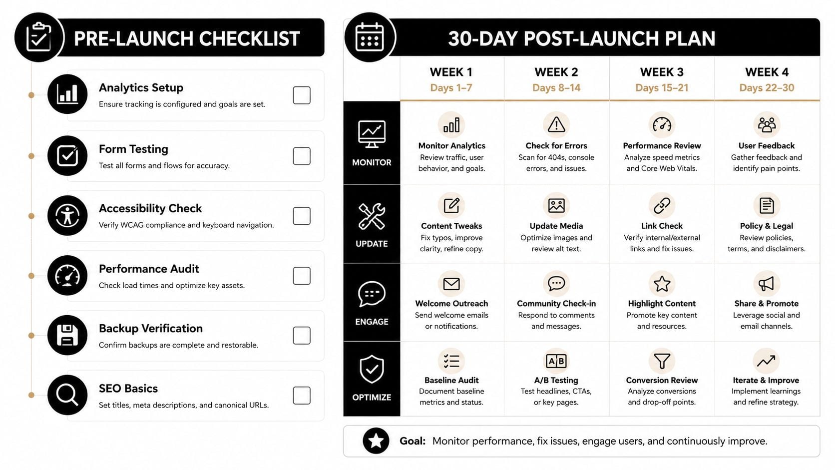
The final stage is operational, not ceremonial. A launch that goes live without checks is just a problem handed to users, and the first month after go-live is when the site proves whether the planning held together. The handover should include a checklist, a support window, and a simple way to measure what happened.
Pre-launch checks that matter
- Analytics setup: confirm the tracking is in place before launch so baseline data starts on day one.
- Form testing: submit every enquiry path and make sure messages reach the right inbox.
- Accessibility check: test keyboard use, readable contrast, and alternative text where it's needed.
- Performance audit: check that key pages load cleanly on mobile connections, not just on office broadband.
- Backup verification: make sure there's a recoverable copy before anything is published.
- SEO basics: confirm titles, meta descriptions, redirects, and internal links are in place.
What the first 30 days should include
The first month is for observation, small fixes, and decisions that depend on real user behaviour. Day-to-day monitoring usually catches broken forms, odd device issues, and pages that need clearer calls to action. It's also the right time to make content adjustments based on feedback, without turning the support window into an endless redesign.
A fixed-cost project should say plainly what counts as post-launch support and what counts as new work. Small corrections, broken links, and minor copy fixes belong inside the support window. New sections, fresh integrations, or strategic rewrites do not.
By day 30, review the site against the original brief. Check whether the main CTA is getting the right kind of attention, whether support requests are landing cleanly, and whether any pages need tightening because users are getting lost. That closes the loop properly, with lessons recorded instead of buried in email.
If you want a site plan that stays measurable from brief to launch, DesignStack builds that way, with fixed-cost scope, three revisions, and one month of post-launch updates baked into the process. Visit DesignStack if you'd like a planning-led website project that keeps the scope, the timeline, and the handover clear from the start.



Leave a Reply