What Is Kinetic Typography: Your Guide to Dynamic Text
Kinetic typography is text in motion. Its first major milestone came in 1959, when Alfred Hitchcock used it in the opening credits of North by Northwest, helping turn moving text into a recognised design technique that still shapes modern marketing today.
If you're a small business owner, you've probably felt the problem it solves. You post on social media and the message disappears into the feed. You update your website headline and it still feels flat. You explain your service, but people don't quite remember it afterwards.
That's where kinetic typography comes in. It takes words that would normally sit still and gives them movement, rhythm, and emphasis so people notice them, understand them faster, and remember them more easily. Used well, it can make a sale message feel sharper, a brand feel more polished, and a service explanation much easier to follow.
The technical side can sound intimidating. File sizes, mobile speed, WordPress compatibility, accessibility, motion settings. Most business owners don't want to become animators just to improve a homepage or advert. The good news is you don't need to. Once you understand the basics, kinetic typography becomes much easier to judge, plan, and use sensibly.
Table of Contents
- What Is Kinetic Typography and Why Should You Care
- From Film Credits to Digital Marketing
- How Kinetic Typography Can Grow Your Business
- Your Workflow for Creating Animated Text
- Designing Kinetic Typography That Actually Works
- Inspiring Examples of Kinetic Typography in Action
- Getting Started with Kinetic Typography
What Is Kinetic Typography and Why Should You Care
You've got a strong offer. Maybe it's a seasonal promotion, a new service, or a homepage headline you really need people to notice. The trouble is that plain text often asks the reader to do all the work.
Kinetic typography means animated text that moves on screen to communicate meaning, emotion, or emphasis. Instead of relying only on wording, it uses timing, scale, position, and rhythm to guide the eye.
For a business, that matters because attention is expensive. Whether someone finds you through Instagram, Google, an email campaign, or a landing page, you usually have a very short window to make the message clear. Moving text can help by making key words land harder. A discount can feel urgent. A testimonial can feel more human. A service explanation can feel simpler.
Why small businesses notice it faster than they realise
You've seen kinetic typography many times already, even if you didn't know the name for it. It shows up in social adverts, app onboarding screens, explainer videos, event promos, and video subtitles with personality.
Here's why it's useful in practice:
- It directs attention: Motion tells the eye where to look first.
- It adds tone: The same words can feel premium, playful, calm, or urgent depending on how they move.
- It makes messages easier to digest: A short sequence of animated phrases can feel lighter than a dense block of copy.
- It helps branding: Repeated movement styles can become part of your visual identity, just like colour or typeface.
Practical rule: If a message is important enough to be your headline, offer, or call to action, it may be important enough to animate.
A lot of small businesses think this kind of design only belongs in large brand campaigns. It doesn't. A short homepage hero, a product promo, or a service explainer can all benefit from motion when it's handled with restraint and tied to a clear brand system. That's also why it helps to understand your wider visual rules first, including things like how a style guide keeps your branding consistent.
From Film Credits to Digital Marketing
Kinetic typography didn't begin on TikTok, Instagram, or modern websites. It started much earlier, and that history helps explain why it still works so well.
Where it started
Its first major historical milestone came in 1959, when Alfred Hitchcock used kinetic typography in the opening credits of North by Northwest. That title sequence helped define the form, and Saul Bass is widely recognised as the pioneer who laid the groundwork for it by combining typography and motion in a way that shaped how viewers felt before the story had even begun. Educational Voice gives a useful overview in its piece on the history of kinetic typography in UK animation and design.
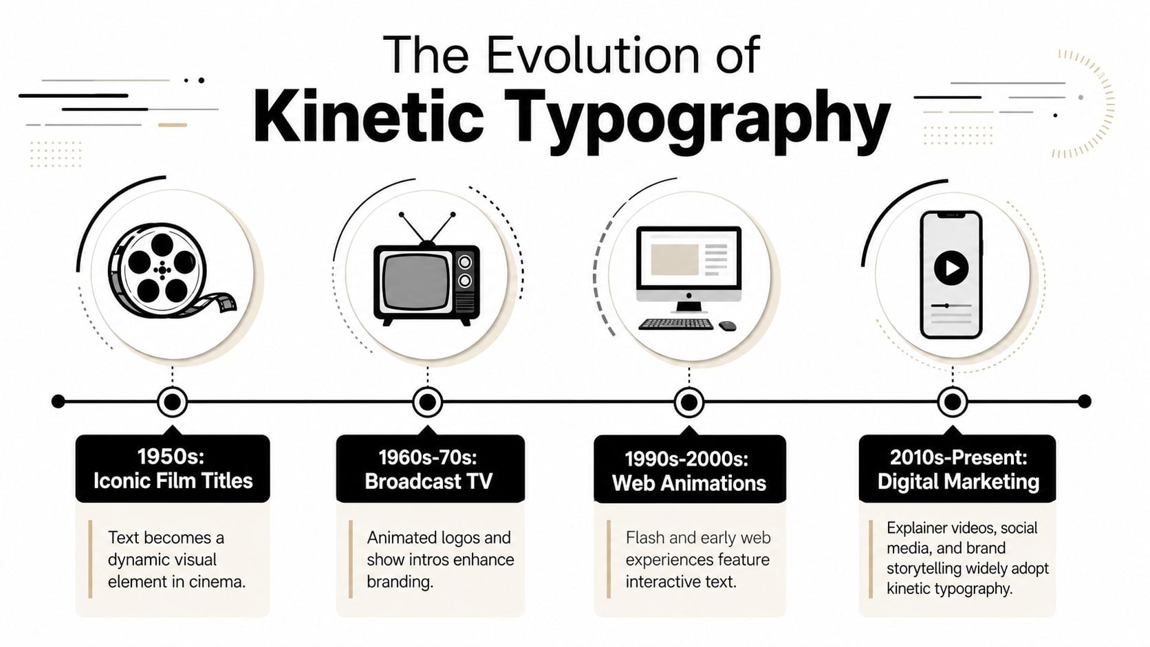
What changed over time was the role of text itself. In print, letters were fixed. On screen, letters could arrive, disappear, stretch, slide, and react in time. That turned typography into something temporal. It no longer just said something. It performed it.
For modern businesses, that shift matters because marketing now happens in moving environments. Social feeds scroll. Ads autoplay. Websites have interactive headers. If you're reviewing broader top 2026 digital marketing trends, you'll notice the same pattern again and again: brands need clearer, faster ways to communicate on screen.
The main styles you'll see today
Small businesses don't need a theory lesson. They need a vocabulary that helps them choose the right feel. Most kinetic typography you'll come across fits into a few practical styles.
| Style | What it looks like | Best fit |
|---|---|---|
| Expressive | Words pop, snap, bounce, or hit to a beat | Social adverts, launches, sales promos |
| Fluid | Letters stretch, morph, or soften into shape | Beauty, wellness, lifestyle, premium brands |
| Structured | Text appears in a clean sequence with clear hierarchy | Explainer videos, professional services, onboarding |
| Dimensional | Type moves through depth or layered space | Event promos, bold brand intros, video openers |
A local retailer might use expressive text for “Weekend Offer Ends Soon”. A consultancy might choose structured animation so service benefits appear one line at a time. A restaurant could use fluid movement to make menu wording feel more crafted and atmospheric.
Good motion doesn't just decorate text. It tells the viewer how the text should feel.
If you're looking at examples on social platforms, it also helps to notice how design choices carry across channels. A brand that already thinks carefully about designs on Facebook for business visibility often finds it easier to use animated text consistently rather than as a one-off gimmick.
How Kinetic Typography Can Grow Your Business
The commercial value of kinetic typography is simple. It helps important messages stand out, and that can support leads, sales, and brand recall when the message is tied to a real business goal.
A lot of business owners first think about it as “something for videos”. That's true, but it's too narrow. Animated text can improve how people absorb a headline, understand an offer, or follow a short explanation. Those are the moments that shape whether someone clicks, enquires, or buys.
Where it helps most
The strongest uses tend to be the simplest.
- Social adverts: Short bursts of moving text can carry a promotion even when the viewer has sound off.
- Explainer videos: Text can reinforce the message while a voiceover explains your product or service.
- Website hero sections: A homepage statement can rotate through a few phrases rather than trying to say everything at once.
- Presentations and proposals: Sales decks often become clearer when core points animate into view in a controlled order.
- Product launches: A sequence of short animated claims can build momentum around a release.
For service businesses, this is especially useful when the offer is hard to explain in one line. An accountant, solicitor, consultant, or training provider often needs to break a message into small, digestible chunks. Kinetic typography does that well because it controls sequence.
How to use it without hurting performance
Many UK businesses encounter a frequent obstacle. They like the idea, then worry it'll slow the site down or damage search visibility. That concern is real. According to Studio Magenta, 68% of Dorset and Southwest SMEs abandon animated text projects due to fears of slow load times, even though the same piece highlights practical optimisation methods and the 3-second load threshold preferred by UK Google users in this context of implementation concerns around WordPress and mobile performance in the UK market. Their discussion appears in this article on motion graphics agency trends for UK businesses.
That doesn't mean you should avoid kinetic typography. It means you should choose the right format for the job.
A few sensible approaches:
- Use CSS or lightweight SVG animation for simple web text effects.
- Reserve video-based text animation for campaigns, adverts, or landing page sections where motion is central.
- Avoid looping everything on the page at once.
- Test on mobile first, because that's often where readability and performance issues show up earliest.
- Animate one message at a time, not every heading, button, and label.
If you're planning paid campaigns alongside web updates, it can help to see how other teams launch TV and streaming ads fast without overcomplicating production. The same discipline applies here. Keep the message short, the motion purposeful, and the delivery lightweight.
A short example makes the point. If your homepage currently says “Reliable IT Support for Growing Businesses”, you don't need fireworks. Let “Reliable” settle first, then bring in “IT Support”, then finish with “for Growing Businesses”. The viewer gets a sense of order, emphasis, and professionalism from the movement itself.
Here's a practical example of the style in action:
Your Workflow for Creating Animated Text
It's often assumed animated text starts in software. It doesn't. It starts with a message.
A simple four-stage process
The cleanest workflow usually follows four stages, and each one solves a different problem.
Script and concept
Decide what the text needs to say and why motion will help. A five-word headline needs a different treatment from a sixty-second explainer. If the wording isn't sharp before animation begins, movement won't rescue it.Storyboard
Sketch the order of appearance. This can be rough. Boxes, arrows, and timing notes are enough. The goal is to answer practical questions such as which word appears first, what gets emphasis, and where the call to action lands.Design and animation
Choose typefaces, colours, spacing, and movement style. The visual identity takes shape through these selections. Fast cuts create urgency. Slower easing feels calmer. Clean hierarchy keeps the message readable.Sound and finishing
If the piece includes voiceover or music, the timing needs to support it. Even silent social content benefits from rhythm. A well-timed entrance or pause can make the message easier to absorb.
Start with the sentence you need the customer to remember. Animate that. Everything else is secondary.
Business owners often skip the planning and go straight to templates. That's usually where projects start to feel generic. A short brief saves time because it gives the designer, animator, or freelancer something concrete to build from. If you need help shaping that brief, this guide on how to write a design brief is a useful starting point.
Tools for different budgets and skill levels
You don't need to jump straight into a high-end production stack.
Here's a practical way to think about the tools:
Beginner-friendly tools
Canva and Biteable work well for quick social posts, short promos, and simple caption-led videos. They're accessible and fast, though you'll hit creative limits quickly.Mid-range options
Tools like Adobe Express or CapCut can handle more polished text animation for short-form content, especially if your team already creates regular video assets.Professional software
Adobe After Effects remains the standard for custom kinetic typography. It gives far more control over timing, easing, layering, masking, and brand-specific motion systems.Web-specific implementation
For live website animation, developers may use CSS, SVG, or lightweight JavaScript approaches depending on the design and performance goals.
A small business launching a one-off seasonal campaign can often start with a template-based tool. A company building a polished brand system across website, paid ads, and social content usually benefits from custom animation planning. The important part isn't the software. It's whether the motion supports the message rather than distracting from it.
Designing Kinetic Typography That Actually Works
Animated text can look impressive and still fail. The common reasons are predictable. It moves too fast, competes with itself, ignores accessibility, or clashes with the rest of the brand.
What to do
The first job is readability. In the UK market, implementations need to consider WCAG 2.1 AA standards, including a minimum contrast ratio of 4.5:1 for normal text. The same UK-focused guidance also notes practical legibility rules such as limiting rotation to under 15 degrees during active reading, pausing text for 3–5 seconds per phrase, and making sure motion remains readable even at half playback rate across mobile, tablet, and desktop breakpoints. Educational Voice outlines these requirements in its guide to UK kinetic typography accessibility and motion standards.
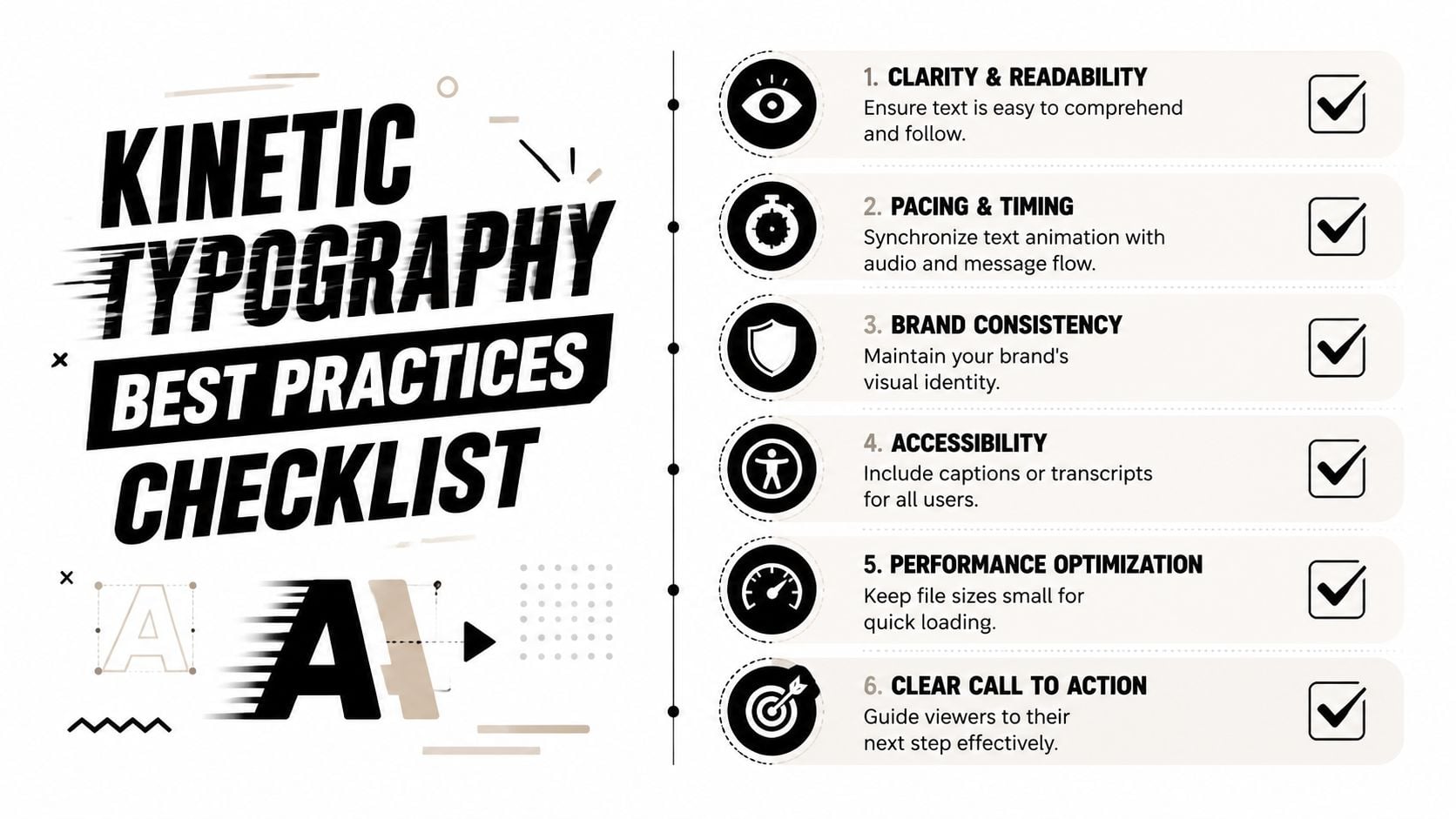
That may sound technical, but the design lesson is straightforward. If people can't comfortably read it, it isn't working.
A useful checklist:
- Keep one clear focal point: Don't animate every line at once.
- Use strong contrast: Moving text over a busy image often causes problems.
- Let text settle: Give the viewer a moment to read before the next transition starts.
- Match motion to tone: A legal firm and a streetwear brand shouldn't move in the same way.
- Respect screen size: What looks elegant on desktop can become cramped on mobile.
There's also a positive accessibility angle that many people miss. Educational Voice reports that properly timed kinetic typography, with transitions under 0.5 seconds and user-controlled pauses, improves comprehension by 23% for UK dyslexic readers compared to static text in the context of inclusive design guidance for UK businesses using motion text. That finding appears in its article on creative kinetic typography and accessibility.
That's a good reminder that accessibility isn't the enemy of creativity. Often it sharpens it.
Accessibility note: Motion should support reading, not force people to chase words around the screen.
Visual spacing matters too. When animated text feels cluttered, the issue often isn't the movement. It's the lack of room around the message. Good composition still depends on basics like alignment, hierarchy, and whitespace in design that gives content room to breathe.
What to avoid
A few mistakes come up constantly in business projects.
| Don't do this | Why it fails | Better option |
|---|---|---|
| Loop text endlessly | It becomes background noise | Animate once, then rest |
| Use decorative fonts in fast motion | Readability drops quickly | Choose cleaner, sturdier type |
| Stack multiple effects | Scale, rotation, blur, and bounce compete | Pick one motion idea |
| Animate over chaotic footage | Contrast and legibility suffer | Use a calmer overlay or solid panel |
| Ignore pause controls | Some users need more time or less motion | Offer control where possible |
The best kinetic typography usually feels inevitable. The viewer notices the message first and the animation second.
Inspiring Examples of Kinetic Typography in Action
Business owners often understand the idea faster when they can picture it in a real setting. Here are three realistic examples that show where animated text earns its place.
A local restaurant promotion
A restaurant in Weymouth wants to promote a midweek offer. A static post saying “2 courses this Thursday” gets the basic information across, but it doesn't build much atmosphere.
The better version uses short animated phrases. “Thursday Night”. Then “Two Courses”. Then the booking prompt. The type comes in with a bit of pace, settles long enough to read, and uses the restaurant's existing colours and font style.
The result isn't magic. It's clarity plus mood. The offer feels more immediate, and the brand feels more alive.
A professional services explainer
A B2B consultancy has a homepage problem. Their service is useful, but the language is dense and visitors don't quickly understand what they do.
Instead of opening with one large paragraph, they use a short animated hero statement that introduces the problem, then the service, then the outcome. The text sequence acts like a guided conversation. It gives structure before the visitor reaches the longer copy lower down the page.
When the service is complex, motion can create order. It turns a wall of meaning into a sequence people can follow.
This kind of structured kinetic typography works particularly well for firms selling expertise. It doesn't need to be flashy. It needs to feel calm, clear, and deliberate.
An eCommerce launch sequence
An online retailer is launching a new collection. They need assets for Instagram Stories, paid social, and an email teaser landing page.
Instead of designing separate static headlines for each placement, they create one motion system. Product category first. Key benefit second. Launch line third. The sequence is adapted to each platform, but the movement style stays consistent.
That consistency matters. It helps the audience recognise the campaign quickly, even when they only see it for a moment. The words don't just inform. They create memory through repetition and rhythm.
For many small businesses, that's the main strength of kinetic typography. It gives ordinary sales messages a clearer structure and a more distinctive presence without requiring a huge campaign concept.
Getting Started with Kinetic Typography
If you've been wondering what is kinetic typography and whether it's worth using, the practical answer is yes, provided the motion has a job to do. It's not about making everything move. It's about helping the right words work harder.
The DIY route
If you want to test it yourself, start small.
Pick one message:
- a homepage headline
- a social media offer
- a short explainer line
- a simple call to action
Use a lightweight tool and create one short version. Keep the wording tight. Give each phrase time to settle. Check it on your phone before you publish it. Then ask a simple question: does the movement make the message clearer, or just busier?
If accessibility is part of your checklist, and it should be, review practical guidance on how to make a website accessible before adding motion to live pages.
The professional route
If the animation needs to support a campaign, a homepage, or a wider rebrand, it usually makes sense to bring in a designer or agency. That's especially true when you need the motion to align with your brand, perform well on WordPress, stay readable on mobile, and meet accessibility expectations.
You can also explore emerging tools if you're gathering ideas for faster production. This roundup of top AI platforms for video creation is a helpful place to see what's now available for early experimentation.
The goal isn't to chase trends. It's to make your message easier to notice, easier to understand, and easier to remember. When animated text does that, it becomes a practical marketing tool rather than a visual extra.
If you'd like help turning these ideas into something polished, accessible, and on-brand, DesignStack can help. As a Dorset-based agency, they work with businesses that need websites, branding, and digital design that look sharp and perform properly, without unnecessary complexity.