Logo Design Concepts: 8 Styles and Their Thinking
You've settled on a business name, bought the domain and started thinking about your website. You send the designer your full name, perhaps something like Dorset Coastal Property Maintenance, and ask them to make it look professional. Surely it's mostly a matter of choosing a font?
Then the practical questions arrive. Will the name fit on a van door without becoming unreadable? What will customers recognise in a browser tab? If you expand beyond Dorset or add another service, will the logo still make sense?
A logo concept is the organising idea behind the artwork, not just its style. It determines whether customers recognise your name, your initials, a symbol or a character, and what you'll need to teach them through repeated use.
That decision deserves attention. In a survey of UK adults, 27% said they'd be more likely to shop with a small business if it had a well-designed logo, according to VistaPrint's consumer study. That's a statement of preference, not a guaranteed sales uplift, but it gives a small business a clear reason to take its identity seriously.
These eight logo design concepts offer different ways forward. The useful question isn't which looks most impressive on a presentation slide. It's which will represent your business clearly, reproduce reliably and leave room for growth.
Table of Contents
- 1. Wordmark (Logotype)
- 2. Lettermark (Monogram)
- 3. Pictorial Mark (Brandmark Illustration)
- 4. Abstract Mark
- 5. Emblem
- 6. Combination Mark
- 7. Mascot Logo
- 8. Negative Space Logo
- How the eight logo design concepts compare at a glance
- Turning Eight Concepts Into One Clear Choice
1. Wordmark (Logotype)
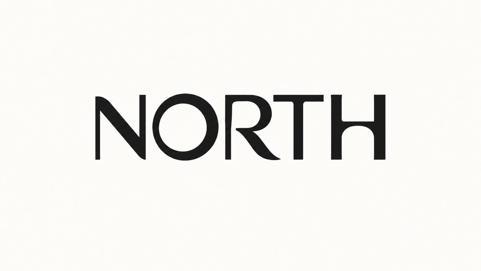
A wordmark makes the business name the logo, using distinctive typography or custom lettering rather than a separate symbol. It's a strong starting point when your name is short, memorable and easy to spell. A name such as North has much more room for typographic personality than a long description of services.
Before choosing a typeface, ask what the lettering should communicate. Rounded letters might suit an approachable consumer business; sharper, more restrained lettering might suit a specialist consultancy. Neither choice guarantees a particular response, so judge it against your audience and competitors rather than a font's category alone.
Make the lettering distinctive, not difficult
Customise selectively. A recognisable letter ending, carefully adjusted spacing or a distinctive join can give the name character without turning reading into a puzzle. The practical principles in these logo design tips are particularly useful when judging simplicity and reproduction.
For an existing identity, logo font identification for brand teams can help investigate the starting typeface. Treat a match as a lead, not proof, because the finished lettering may have been modified.
- Test the whole name: View it in a narrow mobile header and on a signage mock-up, not just enlarged on screen.
- Remove the colour: Keep a solid version for invoices, stamps and embroidery.
- Check permissions: Confirm the typeface licence covers the intended work before committing.
The trade-off is compactness. A beautiful wordmark can still be awkward in a square avatar. Don't squeeze a long name into that space; plan a related compact mark instead.
2. Lettermark (Monogram)
Dorset Coastal Property Maintenance might be unwieldy as a wordmark, but its initials could fit comfortably on workwear or a social profile. A lettermark replaces the full name with an abbreviation; a monogram often combines those letters into a single arrangement.
The first question isn't whether the initials look elegant. It's whether customers will understand them. An established organisation may already be known by its initials, while a startup usually needs to display the full name alongside them until people learn the connection.
Practical rule: Shortening the name solves a space problem. It doesn't automatically solve a recognition problem.
Start with plain letters and check their reading order. Overlapping strokes can make an attractive composition while accidentally changing what people read. A monogram that resembles another letter, a number or an unrelated symbol needs revisiting before decorative refinement.
Design for the smallest application first
Build the compact version early, using the approach in this guide to designing a favicon. Examine the actual exported file in a browser tab, where fine gaps and hairline strokes may disappear.
Colour can help distinguish otherwise ordinary initials, but the construction should remain recognisable without it. For a property business, that could mean sturdy, open lettering inside a distinctive frame rather than another generic roof outline.
Search the initials, the full name and visually similar marks before spending time on polish. Include the relevant goods and services in your trade mark checks, and seek professional advice where similarity is uncertain. An available domain isn't clearance to use a logo, and a quick search isn't a legal opinion.
Choose this route when space is tight and the abbreviation is worth teaching, not because the full name feels inconvenient.
3. Pictorial Mark (Brandmark Illustration)
A mountain, bird, loaf or tool gives customers something recognisable to look at. A pictorial mark uses a literal image rather than relying entirely on lettering, making it useful when there's a clear object or story associated with the business.
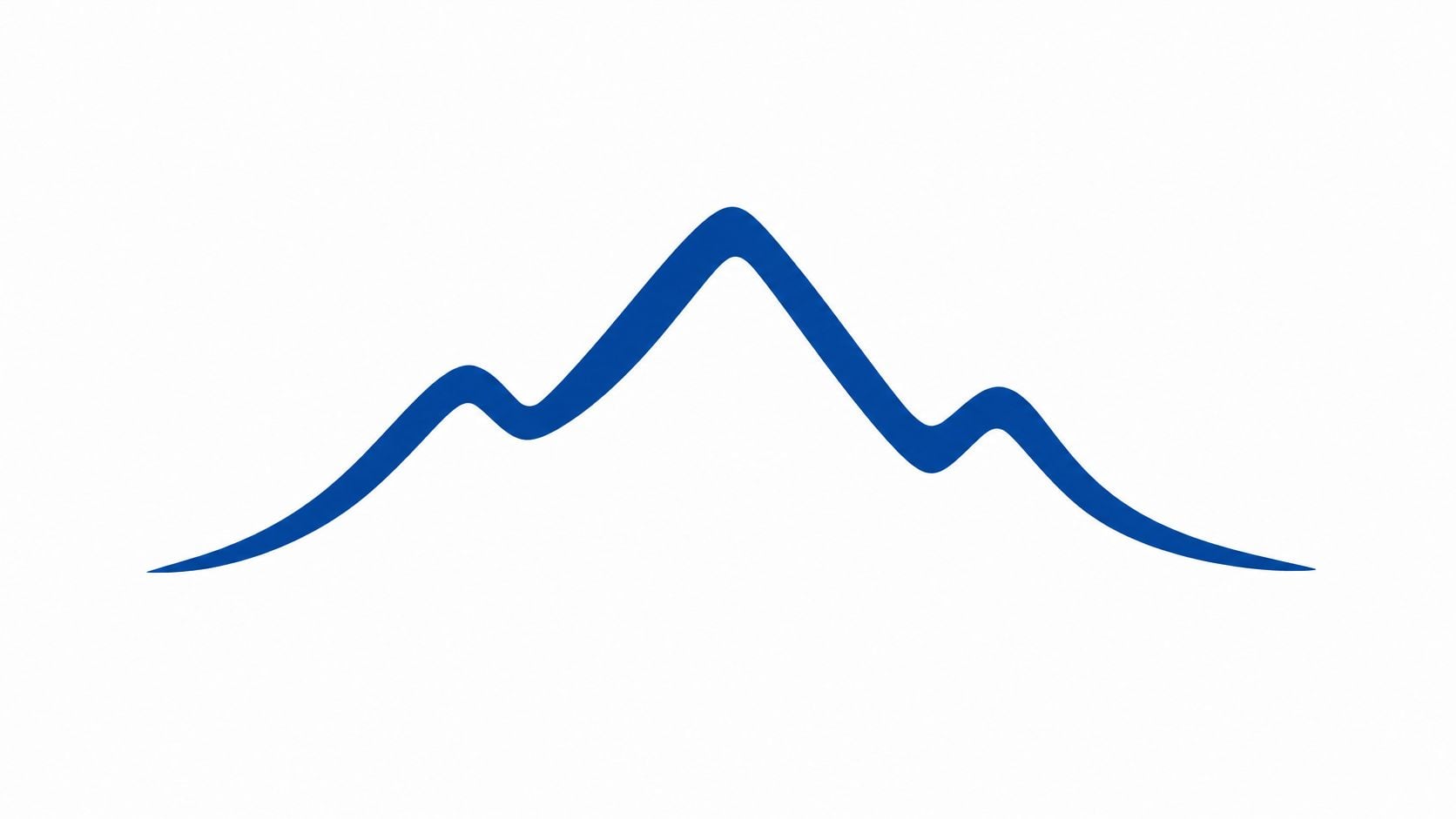
Say you run an outdoor equipment shop. A mountain symbol may fit the offer, but a stock triangular peak won't distinguish you from other outdoor brands. The designer's task is to find a particular silhouette, proportion or construction that belongs to your identity.
Choose the meaning before the object
Ask what customers should infer, and whether that inference is accurate. A leaf might suggest environmental credentials even when the business only intended to communicate freshness.
That distinction matters commercially: 62% of consumers believe companies engage in greenwashing, according to edie's reporting on consumer concerns. Don't add environmental imagery casually when customers could interpret it as a promise you can't substantiate.
For the outdoor shop, a distinctive local landform could express place, while a repair-related symbol could support a documented repair service. Neither needs decorative shading to explain the idea.
- Silhouette check: Fill the mark completely. Does its defining shape remain?
- Production check: Ask an embroiderer or signmaker whether small internal details will survive.
- Interpretation check: Show it without explanation and ask what people think it represents.
The trade-off is specificity. A literal product image can become restrictive if your range expands. Choose an object connected to the enduring business story, not merely the first thing you sell.
4. Abstract Mark
An abstract mark uses non-literal shapes to express an idea. Instead of drawing a building for an architectural practice, you might explore relationships between planes, openings and structural forms.
This gives you freedom, but it also creates a responsibility: customers won't necessarily know what the symbol means. You'll need consistent use alongside the name and clear communication elsewhere. An elegant geometric shape isn't self-explanatory just because its designer can describe it.
Start with a plain-language concept statement. For example, a logistics business might explore connected forms to suggest coordinated movement. That's a useful design direction; an elaborate story assigning a different company value to every curve usually isn't.
A strong abstract mark should remain visually convincing even when nobody has heard its explanation.
Separate recognition from understanding
The distinction is visible in certification branding. FSC's UK consumer surveys recorded 76% recognition of its logo in 2025, while 24% were confident they understood the mark, according to FSC UK's consumer insights. A familiar symbol and an accurately understood promise aren't the same thing.
For your own concept, ask separate questions: can people distinguish the shape, and what do they believe it represents? Don't lead them with the intended answer.
Colour needs similar discipline. If overlapping coloured shapes create the identity, develop a solid alternative that preserves the important relationships. Gradients can enrich digital applications, but they shouldn't be the only reason the mark works.
Abstract concepts suit businesses that expect their services to evolve because they don't depict a narrow product. The cost is more effort establishing meaning. Check competitors and image-search results carefully, too: simple geometry can look distinctive in isolation yet resemble many existing marks.
5. Emblem
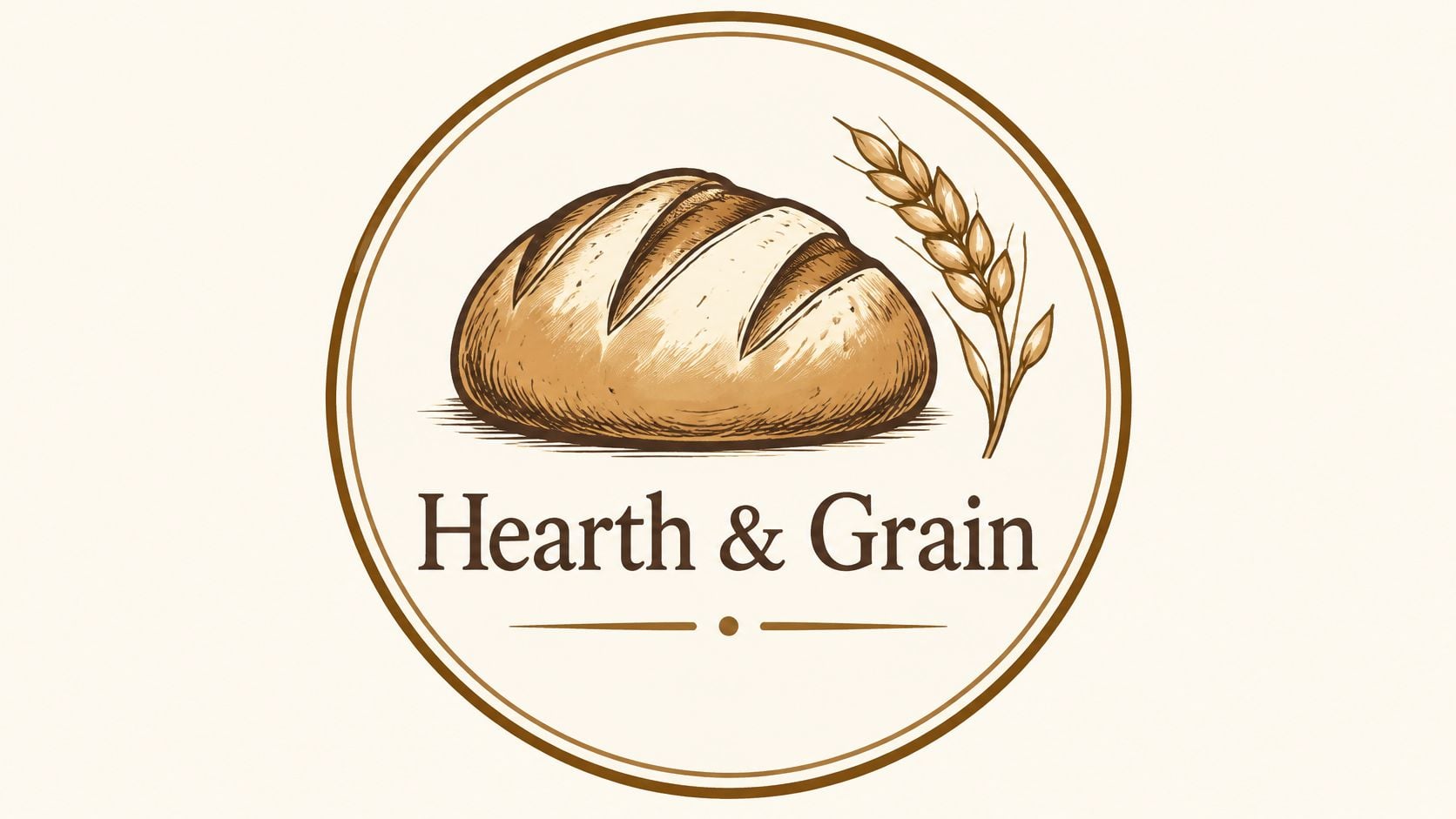
For a bakery, community club or heritage-focused business, an emblem can bring the name and imagery together inside a badge, crest or enclosed shape. It gives you a contained unit that can work naturally on packaging, membership materials and merchandise.
The appeal is coherence. The risk is crowding. A business name, establishment line, location, motto and illustration may all feel important, but placing them inside the same circle doesn't make them equally readable.
Decide what deserves to stay inside
For a bakery badge, prioritise the name and a clear bread or wheat motif. Put opening hours, provenance details and promotional messages on the packaging around it. The logo doesn't need to contain the entire business story.
Heritage also needs careful handling during a refresh. Harvey's Brewery retained classic typographic character while updating its wider identity; the rebrand case reported a 58% increase in on-trade sales, as documented by WARC's Harvey's case study. That's an outcome of the broader rebrand, not evidence that an emblem alone increases sales.
Build a simplified badge alongside the full version. Remove secondary wording, strengthen delicate outlines and check that curved lettering remains readable. Also develop a horizontal arrangement for narrow website headers.
For professional services, restraint matters more than decorative authority. The considerations in logo design for law firms help distinguish a credible identity from an unnecessarily ornate crest.
Choose an emblem because containment suits the applications and character of the organisation. Don't use a shield to manufacture history, or accept tiny lettering because it looks handsome on a large presentation.
6. Combination Mark
A combination mark pairs a name with a symbol. For a new business that needs customers to learn both, it's often a practical starting point: the name explains who you are while the symbol gives you a compact visual asset.
Consider a Weymouth café launching takeaway packaging, a website and loyalty cards. A horizontal name-and-symbol arrangement could suit the website, a stacked version could fit a cup, and the symbol could eventually work on a loyalty stamp. Those should be planned variations, not improvised rearrangements.
The process needs more than positioning an icon beside some text. A structured logo design process should establish the relationship between the elements and test whether they remain convincing together and apart.
- Fix the proportions: Define the symbol's size relative to the lettering.
- Control the spacing: Set the gap and surrounding clear space so suppliers don't guess.
- Specify the variants: Supply approved horizontal, stacked and symbol-only arrangements.
- Explain independent use: State when the name must remain visible and when the icon can stand alone.
Judge the system, not just the lock-up
Third Space extended its identity across club fascias, websites, interiors, uniforms and other customer touchpoints; membership enquiries doubled within the measured period, according to the Third Space rebrand case study. The useful lesson is the breadth and consistency of implementation, not a promise that changing a logo will reproduce that result.
The trade-off is management. More variants give you flexibility, but staff need to know which file to use. Supply clearly named artwork and examples on real applications.
Colour should connect the components without becoming essential to their relationship. If the symbol disappears beside the name in monochrome, adjust its weight or construction before approval.
7. Mascot Logo
A mascot gives your business a character rather than just a sign. For a family-focused food brand, pet service or community activity provider, that can offer a natural way to express warmth and personality.
It also commits you to a particular tone. A mischievous animal might work beautifully for a children's activity business and feel misplaced for a sensitive professional service. Ask whether the character fits the customer's situation, not just whether the drawing is likeable.
Before sketching, define how the mascot behaves. Is it helpful, energetic, calm or cheeky? Decide how it relates to customers, whether it speaks, and which expressions would feel wrong for the brand.
Production advice: Commission the simplest useful version alongside the expressive one. A detailed character illustration won't automatically work as a logo.
Give the character boundaries
Say a dog-grooming business chooses a cheerful terrier. The full character might work on appointment cards, while a simplified head suits a social avatar. Keep the ears, muzzle and overall silhouette consistent so it still looks like the same animal.
Prepare guidance for poses, facial expressions and props. Without it, a social media illustrator, animator and print supplier may each create a different personality.
Colour adds another decision. A richly shaded mascot can suit promotional artwork, but embroidery and small labels need flatter shapes and clearer separations. Approve a solid version before relying on highlights, fur texture or subtle expressions.
The ongoing trade-off is upkeep. A mascot creates opportunities for seasonal campaigns and explanatory illustrations, but someone must maintain its quality and consistency. Don't commission a character if you only want a static mark and have no appetite for managing the illustration system around it.
A restrained mascot can be effective. It doesn't need exaggerated features or constant jokes to feel approachable.
8. Negative Space Logo
A negative space logo uses the gaps within or between shapes to reveal another image. It can combine ideas economically, but the hidden element must support the business rather than distract from the name.
The concept map below outlines the main opportunities and compromises.
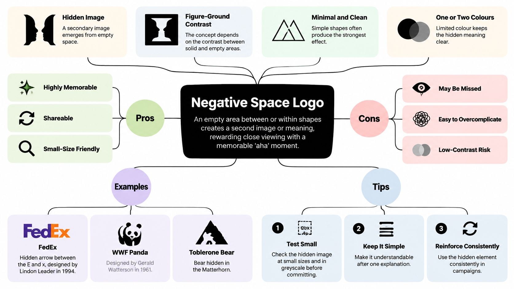
For a bookshop, the gap between open pages might suggest a doorway, connecting reading with discovery. The visible book should still work if a customer never notices the doorway. If the lettering has to become awkward to accommodate the trick, simplify the idea.
This is a specific use of whitespace in design, where the unprinted area forms part of the image rather than merely surrounding it.
Test the gap as carefully as the shape
Small-size testing is particularly important because narrow openings can close up. Convert the mark to greyscale, make solid dark and reversed versions, and inspect exports on an ordinary phone rather than only inside vector software.
DesignStack's branding and graphic design guidance highlights the need to evaluate concepts across real applications and disabled users' needs. Minimal detail alone doesn't make a logo accessible; the remaining shapes still need to be distinguishable.
This video offers another way to examine the technique.
Ask people what they see before explaining the intended image. If the hidden element is missed but the main mark remains clear, that may be acceptable. If people misread the name or see an unintended image, it isn't.
Treat the reveal as a bonus, not an entrance requirement. Customers shouldn't need to solve your logo before they can recognise your business.
How the eight logo design concepts compare at a glance
| Item | Best For | Works at Small Sizes | Main Drawback |
|---|---|---|---|
| Wordmark (Logotype) | Short, distinctive business names | Usually scales well | Long names can be hard to read |
| Lettermark (Monogram) | Organisations with long names | Works well in compact spaces | Initials may be generic or unclear |
| Pictorial Mark (Brandmark Illustration) | Brands wanting an instantly recognisable symbol | Works if simplified | Detailed images lose clarity |
| Abstract Mark | Brands seeking a distinctive, flexible symbol | Depends on the shape's simplicity | Meaning is not immediately clear |
| Emblem | Heritage, schools, clubs, and membership brands | Often loses detail when small | Complex designs are hard to simplify |
| Combination Mark | Brands wanting both name recognition and an icon | Flexible, especially with an icon-only version | Requires careful spacing and proportion |
| Mascot Logo | Approachable consumer brands seeking personality | Works best with a simplified character | Can feel childish or unprofessional |
| Negative Space Logo | Brands seeking a clever, memorable visual idea | Works well when simple | The hidden meaning may be missed |
Turning Eight Concepts Into One Clear Choice
Start with the name, the audience and the applications you can't avoid. A long business name may point towards a lettermark or combination mark; a distinctive short name may justify a wordmark. A symbol-led route makes more sense when you have a meaningful visual idea and the willingness to establish its connection with your business.
Shortlist two concepts, not a folder of unrelated styles. Give each the same brief and show each in the same practical settings. Comparing a polished shopfront mock-up with a plain black sketch won't tell you which concept is stronger.
Make approval a practical decision
Use a short decision routine before anyone finalises the artwork.
- Check small sizes: Place each concept in a mobile header, browser tab and social avatar. Judge the actual exports, not enlarged previews.
- Check greyscale and solid artwork: Look for disappearing boundaries, weak lettering and details that depend entirely on colour.
- Check potential conflicts: Search the name, initials and similar imagery, including relevant trade marks. Ask a qualified professional to assess uncertainty.
- Write the concept statement: Explain in a sentence what the idea represents, why it fits the business and how it will work.
Write that statement before approval, without leaning on vague words such as premium or forward-thinking. For a maintenance firm, it might explain that a sturdy monogram makes the long name recognisable on vehicles and workwear, while the full name remains prominent in customer-facing introductions.
Ask for feedback through concrete questions. Can people read the name? What kind of business do they expect? Which details disappear? Personal preference still matters, but it shouldn't overrule an obvious reproduction problem.
Finally, agree the handover. You'll need scalable master artwork, suitable digital exports, approved colour values, monochrome versions and clear usage guidance. Establish who will update the website, signage, stationery and social profiles so the old and new identities don't linger together unintentionally.
If that feels like a lot to coordinate, a studio can help turn the decisions into a manageable process. DesignStack is based in Weymouth and offers logo and brand identity design with fixed-cost pricing and regular project updates. The useful outcome isn't just a logo you like today, but a coherent identity you can apply confidently as the business grows.
DesignStack develops logo concepts from your business brief, then refines them into practical variations for online and print use, with three design revisions as standard. Visit DesignStack to discuss your name, audience and everyday applications, and choose a concept your business can grow into.