How to Design a Favicon: A Complete Guide
Most favicon advice starts with the wrong instruction: shrink your logo until it fits. That approach fails because a favicon isn't a miniature logo. It's a compact brand mark that must remain recognisable in browser tabs, bookmarks, pinned start or home screens, desktop interfaces, and app-like web experiences.
A detailed wordmark can look excellent on a website and disappear completely at tab size. A low-contrast symbol can merge into browser chrome. An otherwise correct file can remain invisible after an update because a browser has cached the previous version. Designing a favicon means solving all three problems together, visual clarity, platform coverage, and dependable delivery.
Table of Contents
- Why Your Favicon Is More Important Than You Think
- Designing a Favicon That Works at 16 Pixels
- Choosing the Right Sizes and Formats for Every Platform
- Creating Your Favicon Files with Free Tools
- Implementing Your Favicon Across Browsers and Platforms
- Avoiding Common Favicon Mistakes and Pro Tips
Why Your Favicon Is More Important Than You Think
A Dorset retailer may approve a polished logo, upload the full lock-up as a favicon, and only notice the problem when several browser tabs are open. At that scale, the lettering collapses, fine details vanish, and the brand becomes an indistinct patch of colour. The website still works, but the visual cue that helps a returning visitor find it has failed.
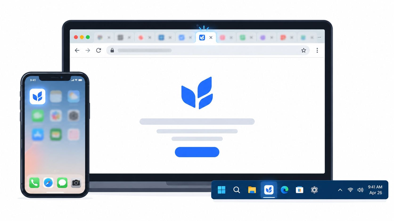
That small square appears wherever a platform needs a compact identifier. Browser tabs are the obvious example, but favicons can also support bookmarks, browser history, pinned shortcuts, mobile home screens, and progressive web app experiences. The British Antarctic Survey Style Kit specifically requires its favicon to work across browsers and devices, including when a site is pinned to start or home screens. A single export rarely gives every surface the file and resolution it needs.
Treat the icon as a brand system
The useful mental shift is to stop asking, “How do I make my logo tiny?” Ask instead, “Which part of this identity survives when everything non-essential is removed?” That answer might be a symbol, an initial, a geometric shape, or a deliberately redrawn version of the logo.
GOV.UK provides a strong UK benchmark. Its brand system uses a simplified crown specifically within web favicons to preserve legibility and recognition at very small sizes. The guidance gives the crown a minimum width of 16px, while the wordmark has a minimum width of 50px, showing why a favicon needs its own simplified mark rather than a full logo. See the GOV.UK web logo guidance for the source rule.
That principle supports wider brand consistency guidance, but consistency doesn't mean copying every element into every format. It means preserving the same visual idea while adapting the execution to its surroundings.
Practical rule: A favicon should be recognisable before it is detailed, accurate to the brand before it is decorative, and visible before it is colour-perfect.
Start with the most constrained surface, the browser tab. If the mark works there, you can develop larger versions for mobile and app contexts. If it only works at a large size, you've designed an illustration, not a reliable favicon system.
Designing a Favicon That Works at 16 Pixels
A favicon is not a shrunken logo. It is a separate brand surface with stricter limits, and the smallest version should guide the design from the start. If the mark only becomes clear at a larger export, it has failed its most demanding job.
Strip the identity down
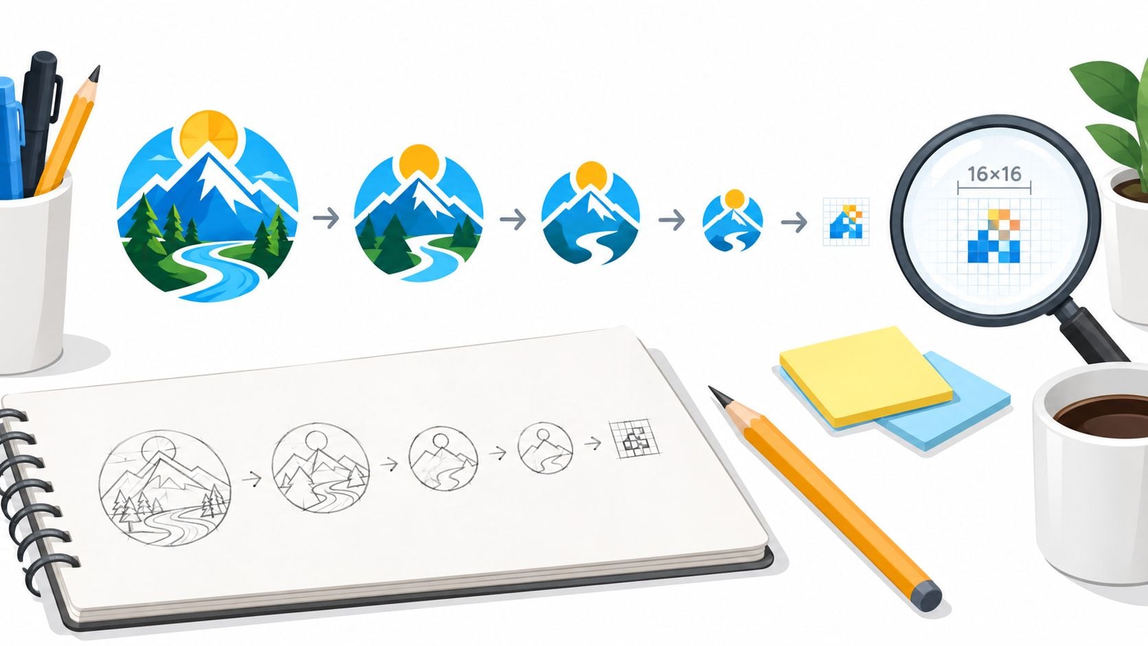
Keep the full logo on one side of the design file and build a square frame for the smallest browser version. Remove the wordmark, strapline, secondary shapes, thin rules, decorative textures, and details that collapse during reduction. Preserve the strongest recognisable feature, whether that is a symbol, initial, or distinctive geometric form.
An initial suits a business with a strong typographic identity, but a letter is not automatically clearer than a symbol. A generic “A” or “S” can resemble competitors' marks. A distinctive emblem will often create more recognition than a company name reduced to unreadable text.
Negative space needs deliberate control. Open counters, clear gaps, and bold silhouettes help the icon retain its shape when pixels merge. The principles in this guide to whitespace in design matter even more at tiny dimensions, because crowded artwork has no room to recover.
Prioritise contrast over colour fidelity
Brand colour supports recognition, but contrast determines whether the icon remains visible. Test it against light, dark, grey, and browser-like backgrounds. A pale yellow symbol may match the palette perfectly and still disappear on white.
Do not use colour as the only way to separate parts of the icon. GOV.UK accessibility guidance emphasises accessible communication, including respect for user settings and the use of HTML where possible. Applied to a favicon, the practical rule is clear: build distinction through shape and tonal difference, not colour alone. This matters across browser themes, operating-system settings, and reduced-contrast viewing conditions.
Test the actual viewing conditions
Export an early draft and inspect it in a real browser tab, rather than relying on a high-zoom Figma canvas. Check the mark when the tab is narrow, the title is shortened, and several tabs sit beside it. Then inspect the same design at a larger mobile or pinned-icon size. Look for awkward spacing, jagged diagonals, and a background that needs adjustment.
Use this checklist:
- Silhouette: Can you recognise the mark without reading it?
- Spacing: Do the edges and internal gaps remain open?
- Contrast: Does it stay visible on light and dark surroundings?
- Typography: Have you removed text that becomes illegible?
- Scalability: Does it still feel intentional when enlarged?
- Distinctiveness: Could it be confused with a generic app icon?
Gradients and fine shadows often flatten during reduction. Keep them only when the underlying shape works as a flat form. Outlines need the same scrutiny, since they can become uneven or vanish altogether.
Use the video below as a visual prompt for the design process, then return to the browser and judge your own artwork at its actual display size.
Choosing the Right Sizes and Formats for Every Platform
A production favicon is a package, not a solitary image. Different environments ask for different dimensions, and an icon that looks crisp in a tab may look soft or poorly framed when used as a home-screen asset.
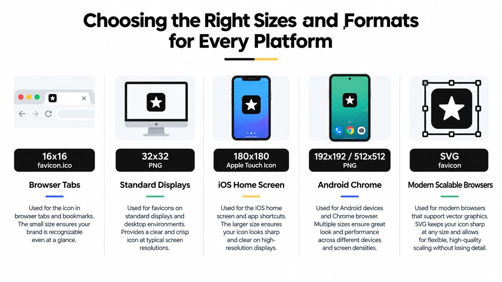
UK-oriented guidance identifies 16×16 and 32×32 pixels as core browser sizes, with 48×48 sometimes used for larger displays. Modern Android and progressive web app contexts commonly call for 192×192 and 512×512 assets. The IONOS UK favicon guide also describes the move away from ICO-only delivery, with PNG now widely preferred for transparency and visual quality.
Match each file to its job
| Asset type | Required code | Platform |
|---|---|---|
| 16×16 favicon.ico | <link rel="icon" href="/favicon.ico"> |
Browser tabs and legacy browser discovery |
| 32×32 PNG | <link rel="icon" type="image/png" sizes="32x32" href="/favicon-32.png"> |
Standard browser and desktop displays |
| 180×180 Apple touch icon | <link rel="apple-touch-icon" sizes="180x180" href="/apple-touch-icon.png"> |
Apple home-screen shortcuts |
| 192×192 PNG | Manifest icon entry | Android browser and PWA contexts |
| 512×512 PNG | Manifest icon entry | Larger PWA and app-like contexts |
| SVG favicon | <link rel="icon" type="image/svg+xml" href="/favicon.svg"> |
Modern browsers that support scalable artwork |
The table is a planning framework, not a reason to export every possible asset for every project. A brochure website may need browser and Apple touch assets, while an installable web application needs the larger manifest icons as well. Ask where users will encounter the brand, then build the package around those surfaces.
Choose formats with intent
ICO remains useful for compatibility, particularly when you want a broadly recognised fallback. PNG is practical for transparent backgrounds and predictable raster output. SVG can provide a sharp scalable mark in supporting modern browsers, but it shouldn't replace sensible fallback files when compatibility matters.
Keep the master artwork as vector geometry where possible. Export raster files from that master rather than resizing a small PNG upwards. Use image optimisation for websites as part of the delivery process, but don't compress away crisp edges or transparency.
The right package is the smallest complete package. It should cover the browsers, devices, and installation contexts your site supports, without leaving a platform to improvise with the wrong file.
Creating Your Favicon Files with Free Tools
You don't need expensive software to create a dependable favicon package. You do need a clean master file, clearly labelled artboards, and a habit of checking the smallest export before you publish.
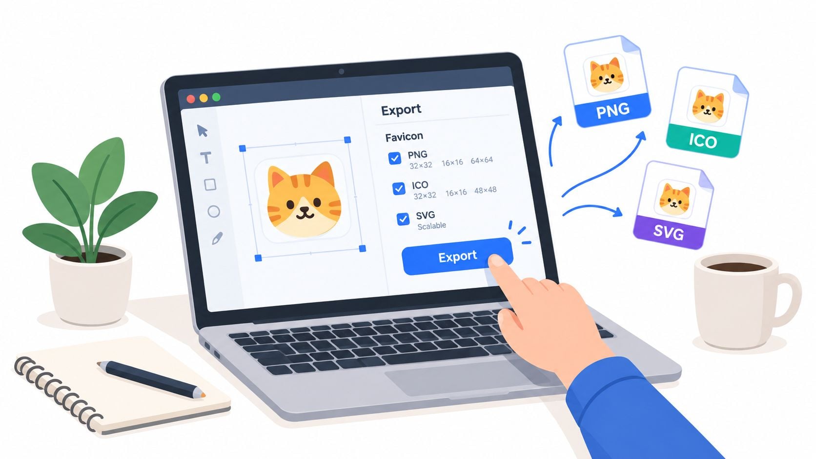
Start in Figma, Affinity Designer, Canva, or another tool you already understand. Figma is particularly useful when you want separate frames for the browser mark, the Apple touch icon, and the larger application icons. Keep the source vector intact, and create purposeful variants rather than asking one tiny export to do every job.
Build an organised export workflow
Create a square master symbol with enough surrounding space to prevent accidental clipping. Duplicate it into frames for the target sizes, then inspect each frame at actual size. If the smallest version needs a heavier stroke, wider gap, or different crop, make that adjustment in its own variant rather than damaging the master.
Export PNG files with transparency only when transparency improves the result. A transparent edge can look excellent against one surface and disappear against another, so test the background before deciding. Keep the artwork clean and avoid adding a white square because it makes the design easier to inspect in the design tool.
For ICO delivery, use a reputable free favicon generator or dedicated icon utility that can package the appropriate raster versions. Check the generated file rather than trusting the tool's preview. Some generators preserve a full logo, add unwanted padding, or produce a technically valid file that looks weak at the smallest size.
Name files so future updates stay manageable
Use descriptive names such as favicon-16.png, favicon-32.png, apple-touch-icon.png, and icon-512.png. A predictable folder structure makes implementation easier and reduces the chance that a developer links the wrong export.
Run a simple quality check before handing the files over:
- Open every image independently.
- Check transparency against light and dark backgrounds.
- Inspect the smallest raster at 100 per cent.
- Confirm the larger icons haven't gained excessive empty space.
- Make sure the filenames match the implementation notes.
- Keep the source file with the final exports.
A favicon is part of the wider logo system, so the source artwork deserves the same care as any other brand asset. DesignStack's guidance on creating a logo for a business is useful here because the icon-only version should be treated as a deliberate identity asset, not an automatic by-product.
Implementing Your Favicon Across Browsers and Platforms
Implementation depends on the platform, but the principle stays consistent: place the right references in the document head, keep the assets reachable, and test the result outside your development environment.
For a plain HTML site, upload the files to a stable public assets location and add the relevant link elements inside <head>. A practical baseline might reference the ICO fallback, the PNG browser version, the Apple touch icon, and an SVG where your browser support policy allows it. Don't add references to files you haven't uploaded, and don't point to a development path that won't exist in production.
WordPress offers a simpler route through the Site Icon or Customizer settings, depending on the version and theme. That option suits most small business sites because the content management system handles the basic markup. Custom implementation makes sense when you need a carefully controlled asset package, PWA support, a bespoke theme, or different icons for separate applications.
Compare the delivery options
| Asset type | Required code | Platform |
|---|---|---|
| ICO fallback | <link rel="icon" href="/favicon.ico"> |
Broad browser fallback |
| PNG browser icon | <link rel="icon" type="image/png" sizes="32x32" href="/favicon-32.png"> |
Modern browser tabs |
| Apple touch icon | <link rel="apple-touch-icon" href="/apple-touch-icon.png"> |
Apple home-screen shortcut |
| Manifest icons | "icons" entries in manifest.json |
Android and PWA installation |
| SVG icon | <link rel="icon" type="image/svg+xml" href="/favicon.svg"> |
Supporting modern browsers |
A PWA needs more than a browser link. Its manifest.json should reference the larger PNG assets, include the correct dimensions and media types, and use artwork with enough padding for the installation surface. Test the installed experience, not just the website tab.
The software development agency resource hub offers broader context for teams managing web builds, handovers, and technical delivery. That matters because favicon problems often appear after a project changes hands, when nobody knows which file is canonical.
Plan for caching before launch
Browsers can retain favicons longer than expected. If a new design doesn't appear, verify the file path first, then test in a private browsing window and on another device. For a live update, changing the filename, such as moving from favicon-v1.png to favicon-v2.png, can help browsers register a new asset, provided you also update every reference.
The British Antarctic Survey guidance reinforces the broader point, a favicon must work across browsers and devices and when pinned to start or home screens. Treat deployment as part of the design, not a separate technical afterthought.
Avoiding Common Favicon Mistakes and Pro Tips
The biggest favicon mistake is treating it like a tiny logo file. At browser-tab size, detail turns into clutter. A strong silhouette, clear spacing, and high contrast do more for recognition than a faithful miniature of a complex brand mark.
Four failures that show up repeatedly
Complexity: A wordmark, illustration, gradient, and fine outline may look polished on a large artboard. At favicon size, those elements fight for the same small area. Keep the shape people need to recognise in a split second, and cut the rest.
Low contrast: Colours that sit comfortably together in a brand palette can merge in a tab or on a dark interface. Test the icon on light and dark backgrounds, then adjust tonal separation where the shape starts to disappear.
Colour dependence: If the mark only works because one colour separates one area from another, it can fail for users who do not read colour clearly. Use structure first, and let the geometry carry the identity. That same discipline belongs in your wider brand style guide, so future updates stay consistent.
Unreliable updates: A correct replacement can still look wrong when a browser serves an older cached file. Change the asset filename when you release a materially different icon, update every reference, and check the result in a clean session.
Test beyond the design file
Check the icon in normal and private browsing, on at least one light interface and one dark interface, and on both a desktop browser and a mobile device. Look at the browser tab, bookmark display, history entry, pinned shortcut, and installed app surface where those contexts apply.
Create a compact handover checklist:
- Artwork: The smallest version has a clear silhouette.
- Contrast: The mark remains visible without relying on colour alone.
- Files: The package includes the dimensions and formats your platforms need.
- Markup: Every referenced path resolves to the intended asset.
- Manifest: PWA icons use the correct files and metadata.
- Caching: The update has a versioned filename or a verified refresh path.
- Ownership: The source file and final exports are stored together.
A style guide stops future teams from recreating the same problem. Record the approved symbol, colour usage, clear space, background tests, filenames, and implementation notes in a brand style guide.
Final check: If the favicon looks clever only when enlarged, simplify it again. Users usually meet it as a tiny visual cue, often while choosing between several tabs that all look similar.