Logo and Brand Identity Design: A 2026 Guide
You've probably reached the point where a quick logo no longer feels like enough. Your website, social profiles, proposals and printed materials may each look acceptable in isolation, yet together they don't quite look like the same business. A designer can produce a mark in a short time, but building a recognisable brand that supports sales, trust and day-to-day marketing requires more thought.
That's the practical difference between a logo and logo and brand identity design. A logo is the primary visual identifier. Brand identity is the wider system that controls how your business looks, sounds and behaves across every customer touchpoint. This guide follows the client-side journey, from deciding why you need a change to writing a useful brief, choosing a designer and judging the final work.
Table of Contents
- More Than Just a Pretty Picture
- Why Your Business Needs a Strong Brand Identity
- The Core Components of a Brand Identity System
- The Professional Brand Identity Design Process
- How to Choose Your Design Partner and Write a Brief
- Understanding Brand Identity Design Costs
- Frequently Asked Questions About Branding
More Than Just a Pretty Picture
A common conversation starts with, “We just need a logo.” The business owner may be launching a service, replacing an outdated mark or trying to make a website look more professional. The request sounds simple until the practical questions appear. What colours should the business use? Which typefaces belong on a proposal? How should the logo work on a van, a mobile screen or a social avatar? What should the company sound like when it writes to customers?
A logo is best understood as your company's face. Brand identity is its personality, clothing, voice and manner. The logo helps people identify you, while the wider identity gives them a consistent experience whenever they meet your business.
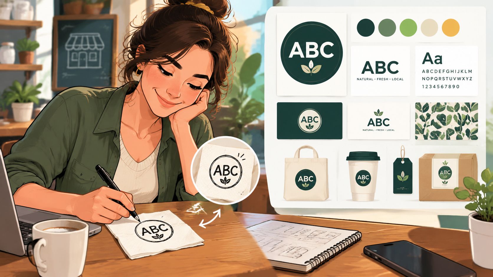
That distinction has deep roots in British commerce. The Trade Marks Registration Act took effect on 1 January 1876, and Bass Brewery was the first to register a mark, its red triangle, giving Britain its oldest trademark and an early example of a logo used to secure ownership and recognition. The story is useful because the mark wasn't merely decoration. It helped customers identify the brewery and gave the business a legally protectable sign in the marketplace. You can read more about this history in Campaign's account of Bass Brewery's red triangle.
Practical rule: Treat the logo as an important asset, not as the entire brand.
The same principle applies whether you run a Dorset trades business, a professional practice, an online shop or a growing national company. Your identity needs to help people recognise you, understand your offer and feel confident choosing you. A useful overview of the wider commercial role of design is available in this guide to why graphic design is important for any business.
The journey starts with the “why”. If your business has changed direction, outgrown its original presentation or lost consistency across channels, a new identity should solve a business problem. If the only issue is that the current logo feels slightly dated, a focused refresh may be more appropriate than a complete rebrand.
Why Your Business Needs a Strong Brand Identity
A strong identity earns its keep by making everyday communication easier and more coherent. Without one, every new asset becomes a fresh design decision. One team member chooses a dark blue, another uses a brighter shade, and a third downloads a different typeface. None of those choices may look disastrous alone, but the combined effect makes the business harder to recognise.
Consistency gives customers fewer visual signals to process. When the same logo treatment, colours, typography, photography and writing style appear across your website, email, social media and printed materials, people start to build a clearer mental picture of the business. That recognition matters particularly for smaller firms competing with organisations that have larger marketing teams and established reputations.
Trust is built through repeated details
Customers often judge professionalism before they've spoken to anyone. A well-organised identity suggests that the business pays attention to detail, understands its market and can be trusted to deliver a considered service. This doesn't mean adding decoration to every surface. It means making deliberate choices and applying them reliably.
The strongest result usually comes from the relationship between identity and customer experience. A polished logo can attract attention, but it can't compensate for confusing navigation, unclear pricing or poor service. Conversely, a capable business can lose credibility when its proposal, website and social presence appear unrelated.
Useful identity systems support practical work:
- Recognition: Customers can identify your content more quickly when recurring visual cues work together.
- Consistency: Staff and suppliers have clear decisions to follow instead of recreating the brand each time.
- Credibility: A coherent presentation makes a small business look organised without pretending to be something it isn't.
- Flexibility: A defined toolkit can adapt to campaigns, services and formats while retaining the core identity.
- Efficiency: Reusable templates and rules reduce unnecessary discussions and redesigns.
Brand assets need to represent real people
Photography is often where a visual identity either gains warmth or becomes generic. Stock images can be useful, but they need a clear style. If customers are meant to trust your team, show genuine people, places and working situations where possible. For businesses preparing staff photography, resources covering workflow options for professional headshots can help compare approaches before images are added to the brand system.
The return on identity investment is rarely a single isolated transaction. It appears in the accumulated effect of clearer communications, easier content production and stronger recognition. A good identity won't fix an unsuitable product or weak positioning, but it can make a sound business easier to understand and remember.
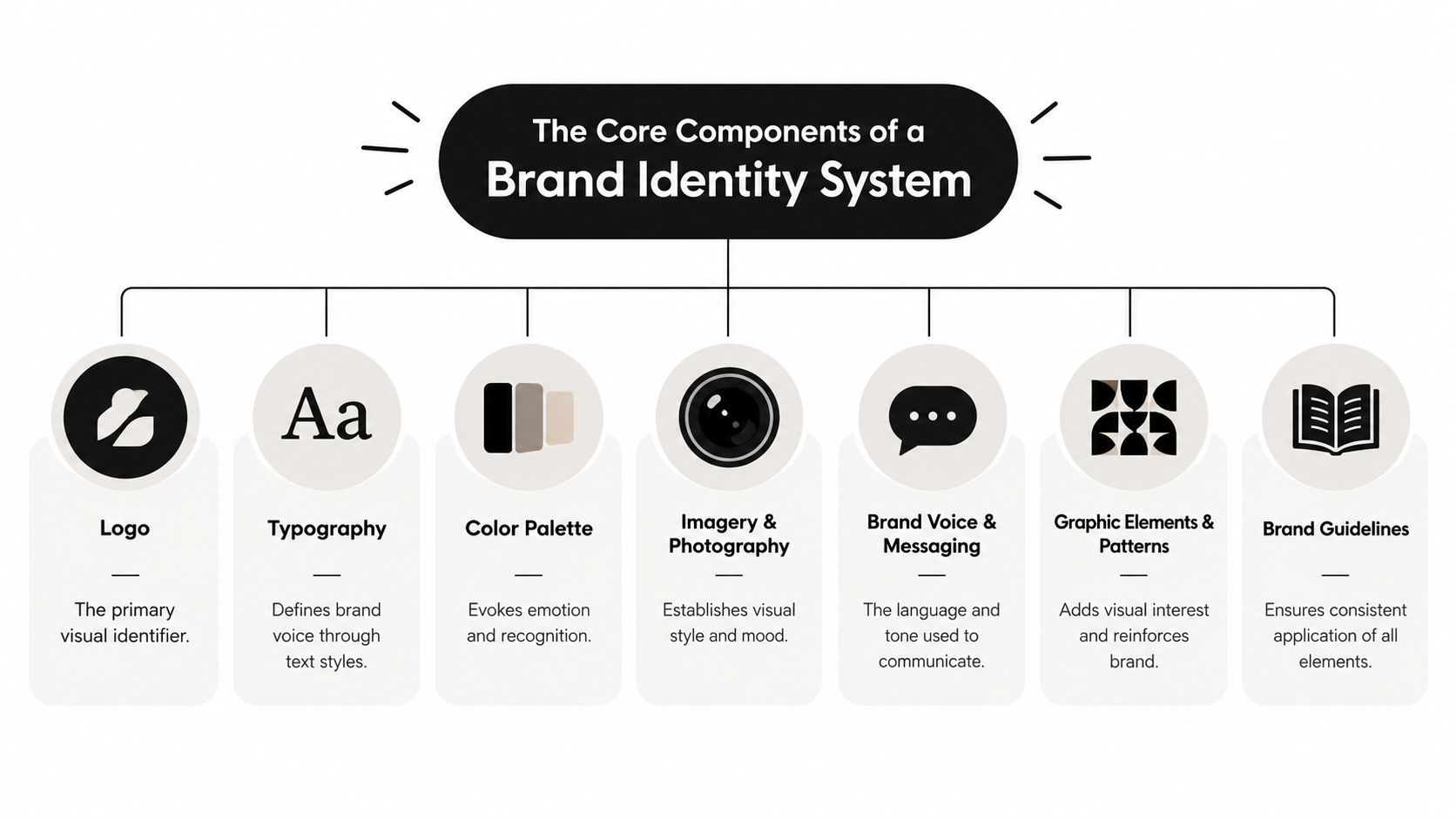
The Core Components of a Brand Identity System
Think of a brand identity as a house. The logo may be the front door, but it isn't the building. The structure works because the materials, layout, signs, lighting and instructions all support one another.
Logo
The logo is the most concentrated expression of the identity. It may include a wordmark, symbol, combination mark or a set of related lockups. Its job is recognition, not explanation. A logo shouldn't try to show every service you provide, list every value you hold or follow a short-lived visual trend.
Ask where it needs to work. A horizontal version may suit a website header, while a compact symbol could be needed for a social profile, favicon or app icon. Designers should supply appropriate variations rather than expecting one file to solve every application.
Colour palette
Colour acts like the lighting in the house. It changes mood, creates emphasis and helps users process information. A palette should include primary and supporting colours, with clear guidance on combinations, backgrounds and text use.
The most attractive colour combination on a presentation slide may fail on a small phone screen or in greyscale. Test practical applications early, particularly buttons, headings, text overlays and small icons.
Typography
Typography is the brand's spoken voice in visual form. A formal serif can suggest heritage, while a clean sans serif may feel direct and contemporary. The choice matters, but the system matters more. Define typefaces, hierarchy, weights, spacing and fallbacks so different people can create materials without making the brand look inconsistent.
Good typography also improves comprehension. Letterforms need to remain clear at small sizes, and headings should guide the reader rather than compete with the message.
Imagery and photography
Imagery establishes the world your business occupies. A construction company might use honest, grounded photography of people and materials. A consultancy may need a more editorial approach, supported by diagrams and restrained photography. The important decision is not merely whether images are “professional”. It's what subjects, compositions, lighting and cropping should recur.
Iconography, illustration and graphic elements can extend this visual vocabulary. Use them to clarify information and create rhythm, not to fill empty space.
Brand voice and messaging
A visual identity without a verbal identity feels incomplete. Decide whether the business sounds warm, precise, reassuring, challenging or practical. Then show how that tone changes across a website headline, service description, social post and customer email.
Finally, document the system. A style guide gives people usable rules for applying the identity, including examples of correct and incorrect use. The most helpful document answers real questions, such as which logo to use on a dark background and how much flexibility a campaign has.
The Professional Brand Identity Design Process
Professional identity work should feel structured, not mysterious. The designer doesn't produce options by chance until one looks appealing. They're reducing uncertainty, testing decisions and turning a strategic direction into a system that your business can use.
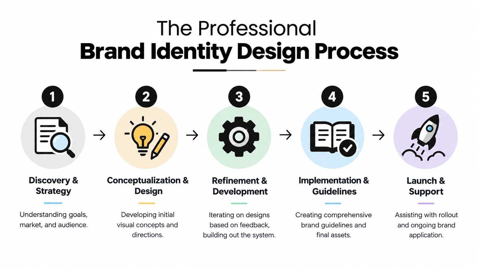
Discovery and strategy
The work begins with questions. What has changed in the business? Who needs to choose you? Which competitors are customers comparing you with? Where does the current identity fail? What must remain familiar, and what needs to change?
A good designer examines your existing materials, audience, positioning and practical requirements before drawing concepts. This phase prevents an attractive but unsuitable direction from dominating the project.
Conceptualisation and design
The designer develops a small number of considered creative routes. Each route should have a rationale linked to the brief, not just a description such as “modern” or “bold”. You should be able to discuss whether a concept feels appropriate for your audience, differentiates the business and can work across the required applications.
At this stage, mock-ups are useful because they show how a direction behaves in context. A mark that looks excellent on a presentation page may be weak on a vehicle, invoice or mobile header.
Refinement and development
Once a direction is selected, the designer builds it out. This may include logo variations, typography, colours, imagery, layouts, icons, patterns and example applications. Feedback works best when it relates to business objectives and usability rather than personal preference.
Limit feedback to the agreed decision-makers. Too many conflicting opinions can produce a safe identity that satisfies everyone in the room but says little to customers.
Accessibility and practical testing
Accessibility belongs inside the process, not as a last-minute correction. The Design Council's 2023 brand refresh kept its existing logo while rebuilding the wider identity around an audit based on WCAG 2.1 AA, demonstrating that a system can improve without discarding established recognition. The example is documented in the Design Council's accessibility-focused brand refresh release.
Test the identity in greyscale, at small sizes and against different backgrounds. Use vector artwork so the logo can scale cleanly, and check whether text remains distinct from its background. UK accessibility guidance from brand specialists also points to Scope's identity guidance, which cites at least a 70% difference in colour value between text and background in relevant applications, as discussed in inclusive branding and accessibility guidance.
Implementation and launch
Final delivery should include usable files, not just a finished image. Confirm that you'll receive suitable formats for print and digital use, colour versions, monochrome versions, social assets, font information, imagery guidance and the brand guidelines document.
A rollout plan helps prevent confusion. Update the website, templates, profiles, signage, documents and customer-facing materials in a sensible order. The practical stages of a professional logo design process should leave you with assets your team can use confidently after launch.
How to Choose Your Design Partner and Write a Brief
The right design partner depends on the problem you're trying to solve. A DIY logo tool can be adequate for a temporary project with limited exposure, but it usually offers little strategic thinking and may produce a result that resembles other available templates. A freelancer can provide close collaboration and focused craft. An agency or studio may suit a more involved rebrand requiring strategy, identity development, website application and coordinated delivery.
Don't choose solely from the portfolio. Look for evidence that the designer understands decisions, constraints and implementation. Ask how they handle research, feedback, accessibility, file delivery and brand guidelines. You should also check whether their examples show complete systems or only isolated logo presentations.
Give the designer a useful starting point
A brief doesn't need marketing jargon. It needs enough information for the designer to make informed decisions. Include:
- Business context: Explain what you sell, how the business began and what has changed.
- Audience: Describe the people who choose, use or influence the purchase. Include their concerns and expectations.
- Positioning: State what you want to be known for and where you sit relative to alternatives.
- Values and personality: Describe the traits the identity should communicate, along with qualities it must avoid.
- Competitors: Share relevant competitors and explain what you admire or want to avoid in their presentation.
- Objectives: Define the practical outcome, such as looking established, separating services or supporting a new website.
- Applications: List where the identity will appear, including signage, packaging, web pages, social profiles, documents and clothing.
- Constraints: Mention existing assets, legal considerations, technical requirements, deadlines and decision-makers.
- Success criteria: Describe how you'll judge the work. Recognition, clarity, flexibility and suitability are more useful than “make it pop”.
The guide to writing a design brief can help you turn these prompts into a document that supports a productive first conversation. Be honest about what you don't know. A capable designer can help refine the questions, but they can't solve a hidden business problem if you never mention it.
The best brief gives a designer boundaries to work within and a reason to make each decision.
Before appointing anyone, ask how many review stages are included, who owns the final artwork, what happens if the scope changes and whether the designer will help apply the identity to your website. Clear answers at the beginning protect both sides.
Understanding Brand Identity Design Costs
Price follows scope. A standalone logo involves fewer decisions and deliverables than a complete identity system with strategy, logo suites, typography, colours, graphic devices, photography direction, templates and guidelines. The more applications your business needs, the more testing and development the project requires.
Experience also affects the fee. A designer who only supplies artwork may cost less than a strategic studio that interviews stakeholders, reviews competitors, develops concepts, tests accessibility and supports implementation. Neither option is automatically right. The important question is whether the service matches the risk and complexity of the project.
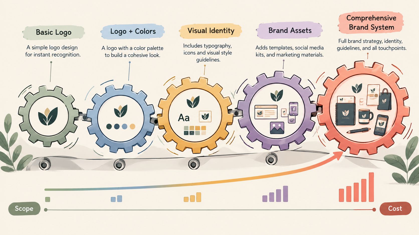
A sensible evaluation separates the deliverables from the investment:
| Project scope | Typically includes | Suitable when |
|---|---|---|
| Logo creation | Core mark and essential file formats | You need a focused identity asset |
| Logo suite | Primary mark, alternatives and application guidance | The logo must work across varied formats |
| Identity system | Logo, colours, typography, imagery and graphic rules | Several people or channels need consistency |
| Strategic rebrand | Research, positioning, identity, guidelines and rollout support | The business direction has materially changed |
These are scope categories, not fixed UK price promises. Ask for a written proposal showing the thinking, meetings, revisions, files and support included. The brand identity design cost guide provides another useful framework for comparing project depth.
This video can help you visualise how identity work moves from individual assets towards a connected system:
A cheaper quote may be perfectly suitable for a narrow requirement. It becomes poor value when you later pay to redraw files, create missing variants, repair inconsistent applications or replace an identity that never fitted the business. Judge the cost against the decisions the project needs to support and the length of time you expect to use the result.
Frequently Asked Questions About Branding
Can't I use a cheap online logo maker?
You can, particularly if you need a temporary mark or have a very limited requirement. The trade-off is that template-based tools rarely explore your positioning, audience, competitive context or future applications in depth. They may also leave you with limited originality, weak small-size performance and no coherent system for typography, imagery or messaging.
If the logo is going to represent a serious business across many touchpoints, compare the short-term saving with the work you'll still need to do afterwards. A professional process should produce decisions and assets, not only a picture.
What are brand guidelines?
Brand guidelines are the operating instructions for your identity. They explain how to use the logo, colours, typefaces, imagery, layouts and tone of voice, including examples of what to avoid.
A useful guide answers practical questions. It may show clear space around the mark, minimum readable sizes, approved colour combinations, typography hierarchy and examples for digital and print use. Without those instructions, staff and suppliers have to interpret the identity from memory.
How long does a brand identity project take?
The timeframe depends on the brief, the number of decision-makers, the amount of research, the number of applications and the speed of feedback. A focused logo project can move faster than a complete rebrand involving strategy, identity development, website work and a coordinated launch.
Ask for a project plan with milestones rather than accepting an unclear promise. The plan should show discovery, concept presentation, refinement, final artwork, guidelines and rollout support. Your own availability matters too. Delayed feedback can extend a project even when the designer is ready to proceed.
What should I receive at the end?
Confirm that the handover includes editable and export files, suitable colour versions, logo variations, font details, usage rules and any agreed templates or website assets. Also clarify ownership and licensing, especially for typefaces, photography and illustration.
DesignStack provides logo and brand identity work for businesses that need a connected visual system, including brand marks, font families, colour palettes, signature graphics, logo suites, guidelines and website assets. If you're planning a rebrand or need an identity that works across web and print, visit DesignStack to discuss the brief and next practical step.