What Is Whitespace in Design: Essential UX Guide 2026
Whitespace in design is the intentional breathing room around and between elements, much like the margins in a book or the space between furniture in a well-arranged room. In most modern UI systems, teams build that space on an 8px grid, using 8, 16, 24, 32, 40, and 48 pixel increments to keep layouts consistent and easy to scan.
If you're looking at your website and thinking it feels busy, cramped, or somehow less professional than it should, whitespace is often part of the answer. Many UK small businesses don't have a content problem. They have a spacing problem. The words may be right, the offer may be strong, and the products may be good, but if everything sits too close together, visitors have to work harder to read, trust, and act.
That matters even more on mobile, where space is limited and attention is short. A page with good whitespace feels calmer, clearer, and more credible. A page without it can feel like a leaflet that has had one paragraph too many squeezed in before print.
Table of Contents
- Why Empty Space Is Your Most Powerful Design Tool
- Understanding Whitespace or Negative Space
- The Business Case for Using Whitespace Effectively
- Whitespace in Action Before and After Examples
- Practical Guidelines for Applying Whitespace
- Start Seeing Space as a Strategy Not a Void
Why Empty Space Is Your Most Powerful Design Tool
Think about the difference between two physical shops.
The first has posters in every window, shelves packed tightly together, handwritten signs taped wherever there's room, and a till area crowded with last-minute offers. The second has clear signage, room to move, products grouped neatly, and one obvious place to pay. Both might sell good products. Trust in the second shop forms faster.
Websites work the same way.
Whitespace is what creates that sense of order. It gives each piece of information room to breathe so customers can tell what matters first, what supports it, and what they should do next. On a homepage, that might mean separating your headline from your supporting copy. On a services page, it might mean giving each service block enough margin so it reads like a clear offer rather than a wall of text.
A crowded layout doesn't just look untidy. It asks the visitor to do extra work.
That extra work has a business cost. If people have to search for your main message, work out which button matters, or reread a paragraph because the lines are too tight, they're more likely to leave without enquiring or buying.
Whitespace also shapes how people read your brand. Tight, inconsistent spacing can make even good businesses look rushed. Calm, deliberate spacing suggests confidence. That's one reason spacing plays such an important role in broader visual systems like brand identity design. It helps turn "we offer this" into "we look organised enough to trust with the job".
For small businesses in Dorset and across the UK, this is useful because you're often asking a website to do a lot at once. It has to explain, reassure, and convert. Whitespace helps it do all three without adding more copy.
Understanding Whitespace or Negative Space
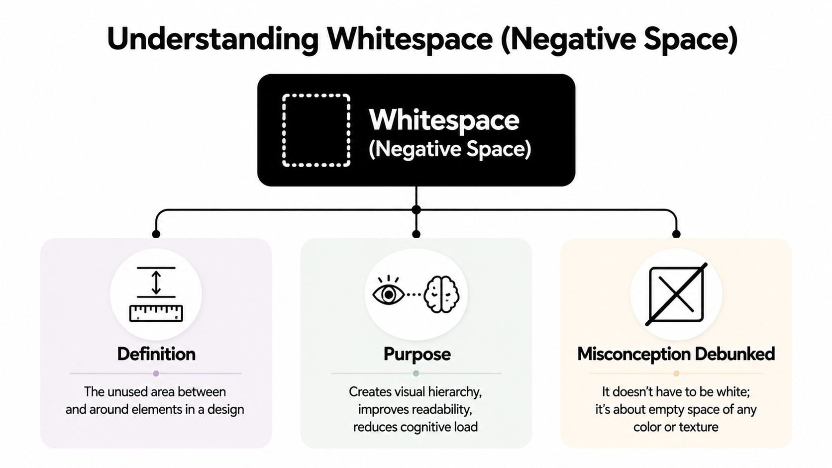
A lot of UK business owners hear "whitespace" and picture a sparse, expensive-looking website with lots of blank white areas. In practice, it means the space around and between things on the page.
Designers often call it negative space. It covers the gaps around headings, the padding inside a card, the margin between sections, and the line spacing in a paragraph. The background can be white, dark, coloured, textured, or photographic. The principle stays the same, as explained in this overview of whitespace in design.
What whitespace actually means
A shop display makes this easier to see. If every product is packed tightly onto one shelf, customers have to work harder to tell what belongs together and what deserves attention. Spread those products out with clear gaps, and the display feels more organised, more considered, and easier to trust.
Web pages behave in much the same way.
A black headline on a cream background with wide margins uses whitespace. A product card on a dark background with generous padding uses whitespace too. What matters is the empty area you leave on purpose so the content feels easier to scan and understand, especially on a phone screen where space is tight and every element competes harder for attention.
If you're comparing different layout principles, Raven SEO's web design guide is a useful companion because it places spacing alongside other building blocks like hierarchy, colour, and typography.
Macro and micro whitespace
Designers usually break whitespace into two levels.
Macro whitespace is the larger spacing that shapes the page structure. It sits between sections, columns, cards, images, and major content blocks. This is similar to the layout of a room. You notice whether the furniture has enough space around it before you notice the finer details.
Micro whitespace is the smaller spacing inside those blocks. It includes the gaps between lines of text, paragraphs, form fields, icons, labels, and buttons. This works more like arranging a desk or a bookshelf. Small spacing choices affect how comfortable everything feels when you start using it.
A printed book shows both at once:
- Macro whitespace is the outer margin around the text block and the gap between chapters.
- Micro whitespace is the line spacing, paragraph spacing, and the space around headings or page numbers.
Both types matter for business websites. A page can have plenty of space between sections and still feel awkward if the text is cramped. It can also have readable paragraphs but still feel confusing if each section runs into the next with no clear separation.
Many designers handle this with a spacing system. A common method in digital layout work is an 8px grid, where spacing follows steps such as 8, 16, 24, 32, 40, and 48 pixels. That approach helps keep rhythm consistent across a site, so one service card does not feel careful while the next feels squeezed.
That consistency is one reason some websites feel clearer before you've read much at all. Spacing affects what feels connected, what feels separate, and what your eye notices first. If you want to see how that fits into broader screen-based layout decisions, this guide to how spacing supports user interface design gives the wider context.
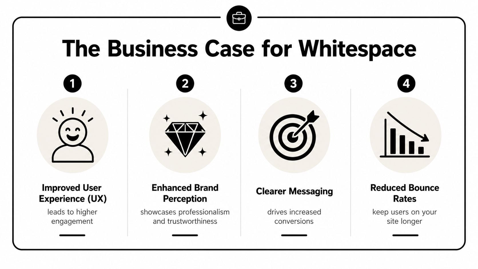
The Business Case for Using Whitespace Effectively
A lot of business owners hear "whitespace" and think "style choice". In practice, it's closer to a usability tool. It affects how easily people read, how clearly they understand your message, and how confidently they move towards an enquiry or sale.
For UK websites and eCommerce pages, adding breathing room around text improves readability and can improve comprehension, while reducing clutter and helping users focus on key actions, according to Webflow's explanation of whitespace.
Readability affects action
When people land on a service page, they rarely read every word in order. They scan. They look for cues. They decide whether the page feels easy or effortful.
Whitespace helps by doing three jobs at once:
- It groups related items: A heading, short paragraph, and button feel like one unit when they're spaced closely together and separated from the next section.
- It creates a scan path: Clear gaps between sections help users move down the page without losing their place.
- It reduces friction: Text with enough surrounding space feels easier to approach, especially on long pages.
If you sell services, that can mean your pricing explanation feels simpler. If you run an online shop, it can mean product options feel less overwhelming. If you rely on contact forms, it can mean the form feels easier to complete.
Trust often starts with presentation
Whitespace also changes the tone of a page. Sites with generous, controlled spacing tend to feel more considered. Sites with crowded panels, tiny gaps, and uneven padding often feel homemade, even when the business itself is excellent.
That's important because trust is built before a visitor reads your credentials. They make an early judgement based on how organised the page feels. If your design looks careful, people assume your process may be careful too.
Practical rule: If everything on the page is shouting for attention, nothing wins attention.
Whitespace helps you create visual hierarchy. A primary button becomes clearer when it isn't pressed up against other links. A testimonial feels more credible when it isn't trapped in a dense layout. A product price stands out more when nearby elements don't compete with it.
If your website is meant to persuade, spacing belongs in the same conversation as headlines, offers, and calls to action. That's why it often comes up in work focused on improving website conversion rates. Better spacing doesn't replace good strategy, but it helps good strategy land.
Whitespace in Action Before and After Examples
The easiest way to understand whitespace is to compare the same content arranged two different ways. Think of a typical product page for a small online retailer.
In the "before" version, the product title sits too close to the image. The price, review text, delivery note, and button are stacked with barely any separation. The paragraph below runs in one dense block. Nothing is technically missing, but the page feels tiring.
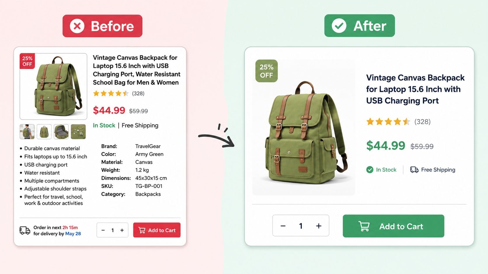
In the "after" version, the content hasn't changed much. The layout has. The image has more margin around it. The title and price form a clearer group. The delivery note is separated from the core purchase information. The button has enough room to become the obvious next step. The description is broken into shorter paragraphs.
A lot of effective eCommerce homepage design follows this same principle. You don't always need less content. You need better separation.
What changes in the after version
The improvements usually come from a few specific moves:
- Larger section gaps: Product details no longer blur into secondary information.
- Better padding inside cards or boxes: Content doesn't feel pressed against edges.
- More line spacing in paragraphs: The eye can move through the text more comfortably.
- Clear isolation of the main action: The buy button stops competing with nearby details.
Good whitespace doesn't remove information. It decides where each piece should breathe.
This video gives a helpful visual explanation of how spacing changes the way a page feels and functions.
A simple way to review your own pages
Open your homepage or a key service page on your phone and ask three practical questions:
| Check | What to look for | What it often means |
|---|---|---|
| Can I tell where one section ends? | Headings, cards, and blocks should have visible separation | If not, macro whitespace is weak |
| Can I read body text without effort? | Paragraphs should feel open, not cramped | If not, micro whitespace needs work |
| Is the main button obvious? | The primary action should have space around it | If not, hierarchy is competing with clutter |
This kind of before-and-after thinking is useful because it turns an abstract design term into something you can inspect on your own site today.
Practical Guidelines for Applying Whitespace
Knowing what whitespace is helps. Knowing how to use it is what changes a page.
For small business websites, the goal isn't to make everything sparse. It's to give important content enough room to be understood and acted on. That balance matters most when pages carry a lot of information, such as services, pricing, FAQs, or product details.
Start with proximity and consistency
One of the simplest rules is this: things that belong together should sit closer together than things that don't. Designers often call this proximity, but you don't need the label to use it well.
If a heading belongs to a paragraph, keep them visually connected. If a button completes that message, keep it in the same cluster. If a testimonial is separate from the next section, give it a stronger gap below.
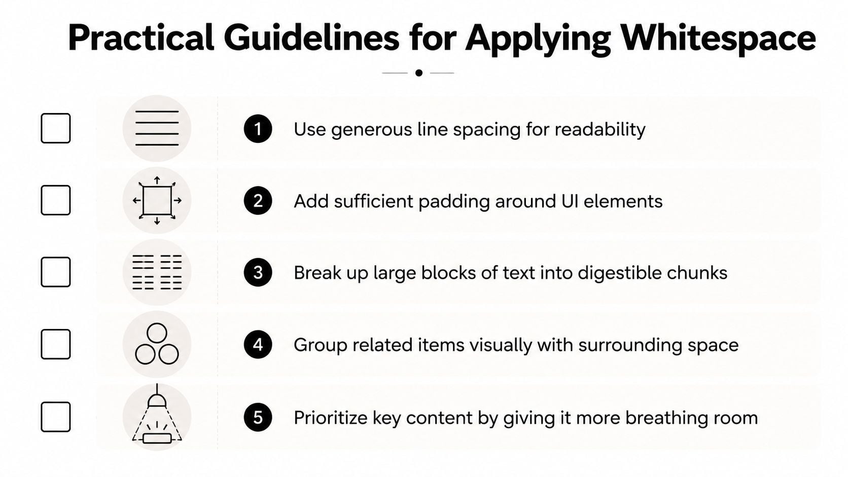
A consistent spacing system makes this easier. Many teams use an 8px grid, choosing spacing values like 8, 16, 24, 32, 40, and 48 pixels so the page feels organised rather than random. You can apply the same thinking when planning a page in a wireframe for web design, where spacing decisions are often clearer before colours and imagery are added.
Try these practical checks:
- Give text room: Increase line spacing and break long copy into shorter paragraphs so readers don't face a dense block.
- Pad interactive elements properly: Buttons, cards, and form fields need internal space so they feel intentional and easy to use.
- Use larger gaps to separate topics: A service overview shouldn't visually merge with testimonials or FAQs.
- Let priority show through space: Your main offer, headline, or button can stand out because nearby clutter has been reduced.
Make mobile spacing easier to use
Mobile creates a common worry. If screen space is tight, shouldn't you reduce whitespace to fit more in?
Usually, no.
A crowded mobile layout forces users to zoom, reread, and tap more carefully than they should. Guidance discussed in Venngage's whitespace article points to a key accessibility issue for UK websites: Government Digital Service requirements say content must remain readable at 200% zoom and across different devices. That means spacing isn't just a visual preference. It affects whether people can comfortably use your site.
Here are sensible mobile habits:
- Stack content cleanly: Let cards, sections, and form rows sit one after another with visible separation.
- Protect tap comfort: Buttons and linked items need enough space around them so users don't hit the wrong thing.
- Shorten paragraph width naturally: On smaller screens, even decent copy can feel cramped if headings and paragraphs are packed together.
- Trim noise before trimming space: Remove weak copy or duplicate messages before squeezing spacing down.
On mobile, whitespace works like pavement width. People can still move forward when the path is narrow, but it's far easier when they aren't bumping into everything.
If you're deciding between "fit more in" and "make the page easier to use", the second option usually serves the business better.
Start Seeing Space as a Strategy Not a Void
Once you start noticing whitespace, you see it everywhere. You notice why one landing page feels calm and convincing while another feels noisy. You notice why one product grid seems easy to browse while another feels crowded. You notice that good design isn't only about what gets added. It's also about what gets left open.
This is the answer to what is whitespace in design. It isn't leftover space. It's planned space. It shapes readability, hierarchy, trust, and the way customers move through a page.
For UK small businesses, that makes whitespace more than a design theory. It's a practical tool. It helps service pages feel clearer, product pages feel easier to buy from, and mobile layouts feel less frustrating. It also helps your brand look more assured, which matters when customers are deciding whether you're worth contacting.
A useful next step is to open your own website and review it with fresh eyes. Look at your homepage, a service page, and your contact page. Check where sections run together, where buttons get lost, and where text feels cramped. Often, a page doesn't need a rewrite. It needs room.
If you're reviewing your site and want help turning these principles into a clearer layout, DesignStack works on websites, branding, and digital design for UK businesses that need stronger structure, cleaner presentation, and a more usable customer journey.


Leave a Reply