What Is Brand Identity Design? A Guide for UK SMEs
You’re probably here because your business is doing decent work, but your presentation doesn’t quite match it.
Maybe your website looks one way, your social posts another, and your printed materials feel like they belong to a different company altogether. Maybe people buy once, but don’t remember you later. Or maybe you’re about to launch something new and you don’t want to look like every other small business using the same template, the same colours, and the same stock icons.
That’s where brand identity design comes in.
It isn’t just a logo. It’s the full system that helps people recognise your business, remember it, and decide whether it feels trustworthy. If you’ve ever looked at a product on a shelf and instantly felt it was premium, local, fun, serious, or reliable before reading much at all, you’ve seen brand identity doing its job. A strong example is easy to spot in packaging work such as branded cans and packaging design, where shape, colour, typography, and tone all work together before the product says a word.
For small and medium-sized businesses, this matters more than most owners realise. When buyers are busy, they don’t study every option in detail. They make quick judgments. Brand identity helps shape those judgments in your favour.
Your Brand Is More Than Just a Logo
A lot of business owners start with the same request. “I need a logo.”
That’s understandable. A logo is visible, concrete, and easy to ask for. But if all you have is a logo file, you don’t yet have a working identity. You have one piece of a much bigger puzzle.
Think of a local café with excellent coffee, friendly staff, and a loyal handful of regulars. If its sign looks dated, its menu uses three different fonts, its Instagram posts use random colours, and its takeaway cups don’t match anything else, people get a mixed signal. The quality may be there, but the presentation makes the business harder to remember and harder to trust at first glance.
That mismatch is common.
Practical rule: If your business looks different every time a customer encounters it, your brand identity isn’t doing its job.
Brand identity design solves that by creating a joined-up system. It gives your business a recognisable look, feel, and voice across the places customers experience you. That includes your website, signage, packaging, proposals, uniforms, social media, email signature, and printed materials.
A good identity doesn’t just make you look polished. It makes decision-making easier. You stop guessing which font to use, what colour to choose, or whether a leaflet feels “on brand”. Your team gets a framework. Your customers get consistency. And your business becomes easier to recognise in a crowded market.
For a busy UK SME, that’s the value. Brand identity isn’t decoration. It’s the practical design system behind recognition, trust, and repeat business.
The Foundation Your Brand Stands On
People often use brand, branding, and brand identity as if they mean the same thing. They don’t.
The easiest way to understand the difference is to think about a person.
Your brand is the person’s character. It’s what they believe, how they behave, what they care about, and how they want to be known. Branding is what they do to express that character over time. Brand identity is the visible and verbal expression people can recognise.
That distinction matters because many businesses jump straight into design without deciding what the design is supposed to say.
A simple way to separate the terms
| Term | What It Is | Analogy |
|---|---|---|
| Brand | The core meaning of your business, including values, positioning, and promise | Your personality |
| Branding | The ongoing actions that shape perception | How you behave, communicate, and show up |
| Brand identity | The visual and verbal system people recognise | Your clothes, voice, style, and manner |
If you skip the first part and only focus on the third, the work can look nice but still feel wrong. That’s why a serious brand identity project starts with questions before sketches.
What brand identity actually includes
Brand identity design turns business thinking into practical assets your team can use every day. It usually covers:
- Visual recognition tools: Your logo system, colours, fonts, graphic devices, and image style.
- Verbal expression: Your tone of voice, messaging approach, and the words you use to describe your offer.
- Usage rules: Guidelines that show how all of this should appear in real situations.
A useful test is this. If you removed your company name from a piece of marketing, would people still have a chance of recognising it as yours? If the answer is no, the identity probably isn’t strong enough yet.
A brand identity should make your business recognisable before someone reads the small print.
Why small businesses often get confused
Most SMEs don’t struggle because they lack effort. They struggle because brand identity sits between strategy and design, and that middle ground can feel fuzzy.
You might know your service is professional, approachable, and local. But how does that translate visually? Does “professional” mean dark navy and serif type? Does “approachable” mean softer colours and more human photography? Does “local” mean Dorset references, plain English, and familiar place-based cues?
Those are identity questions.
They can’t be solved by picking a logo style in isolation. They need a system. If the business is family-friendly, but the typography feels corporate, the message clashes. If the service is premium, but the visuals feel generic, pricing gets harder to defend.
The practical takeaway
When people ask what is brand identity design, the clearest answer is this:
It’s the set of visual and verbal choices that make your business look, sound, and feel like itself wherever customers meet it.
That’s why the work has to do two things at once. It must express who you are, and it must help customers recognise and trust you quickly.
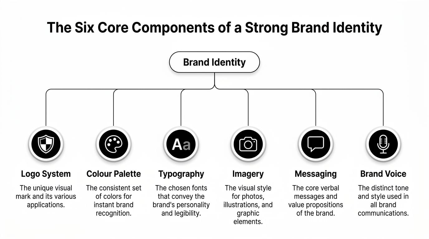
The Six Core Components of a Strong Brand Identity
A professional identity isn’t one clever logo. It’s a coordinated set of parts that support each other.
That system matters because buyers make fast visual judgments. According to brand recognition research compiled by Our Own Brand, consumers form opinions about a brand in 0.05 seconds, 75% recognise a brand by its logo over words, and colour improves brand recognition by up to 80%. Those figures explain why visual consistency carries real business weight.
If you’re exploring identity work alongside print or digital assets, a broad graphic design service often sits alongside the branding process because these components need to work in real applications, not just on a style board.
Logo system
A logo system is bigger than one version of a mark.
Most businesses need a primary logo, a secondary version, and a simplified mark for small spaces such as profile icons, favicons, labels, or embroidered clothing. If you only have one detailed logo, you’ll soon start forcing it into spaces where it doesn’t fit. That’s when legibility drops and consistency slips.
A good logo system gives you flexibility without changing your identity every time.
For example, a farm shop might use a full logo on signage, a stacked version on packaging stickers, and a simple icon on social media. All three should feel related.
Colour palette
Colour does two jobs at once. It helps people recognise you quickly, and it shapes emotional tone before anyone reads a word.
A solicitor’s firm might lean into calm, restrained tones because clients want clarity and confidence. A beachside food brand in Dorset might choose brighter, warmer colours that suggest freshness and energy. Neither approach is automatically right. The right palette depends on the market, the audience, and the feeling the business wants to create.
The mistake is choosing colours only because the owner likes them. Personal taste matters less than strategic fit.
Typography
Fonts speak early.
Before anyone reads the sentence itself, they’ve already taken in the way it looks. Serif fonts can feel traditional or established. Clean sans-serif typefaces can feel modern, direct, or friendly. Heavier weights can suggest confidence. Lighter styles can feel refined or understated.
Typography also affects usability. If your headings look smart but your body text is hard to read on mobile, the identity isn’t helping the business.
Imagery and iconography
This is the visual world around the logo.
It includes photography style, illustration style, icon sets, textures, shapes, and any recurring graphic motifs. A premium interior designer may use spacious photography with quiet tones and minimal icons. A family attraction may rely on energetic images, bold shapes, and playful illustrations.
Without rules for imagery, brands often drift. One month they use polished professional photography, the next they use low-quality stock imagery that sends a completely different signal.
Tone of voice
Many owners are surprised this belongs in identity, but it does.
The same business can sound formal, friendly, witty, expert, plain-speaking, or warm. Tone of voice decides which of those is appropriate. It affects headlines, emails, social captions, proposals, website copy, and even customer service replies.
A good tone of voice guide answers practical questions such as:
- How formal are we: Do we sound conversational or traditional?
- How simple is our language: Do we avoid jargon?
- How much personality is right: Are we calm and direct, or more playful?
- What do we never sound like: Pushy, vague, technical, or overly corporate?
Brand guidelines
This is the part that keeps everything usable.
Brand guidelines show people how to apply the identity properly. They include logo rules, colour codes, font choices, spacing, image direction, tone of voice notes, and examples of what good use looks like. Without them, even strong design work can unravel once different staff members, freelancers, printers, or social media tools start producing materials.
Useful test: If another designer or marketer couldn’t apply your brand consistently from the documents you’ve been given, the identity package is incomplete.
How the parts work together
The strength of a brand identity comes from combination, not isolation.
A logo can be decent on its own and still fail once paired with the wrong typeface, uneven photography, and inconsistent messaging. On the other hand, a relatively simple logo can work very well when the whole system is disciplined and distinctive.
That’s why effective identity design feels coherent. Every element points in the same direction. Customers don’t need to analyse it. They just get a clear impression, quickly.
The Professional Brand Identity Design Process
A proper brand identity project should feel structured, not mysterious.
When business owners have had a poor experience with design, it’s often because someone skipped straight to visuals. No real questions. No reasoning. Just a few logo options sent over by email and a request to “pick one”.
Professional identity work is more methodical than that.
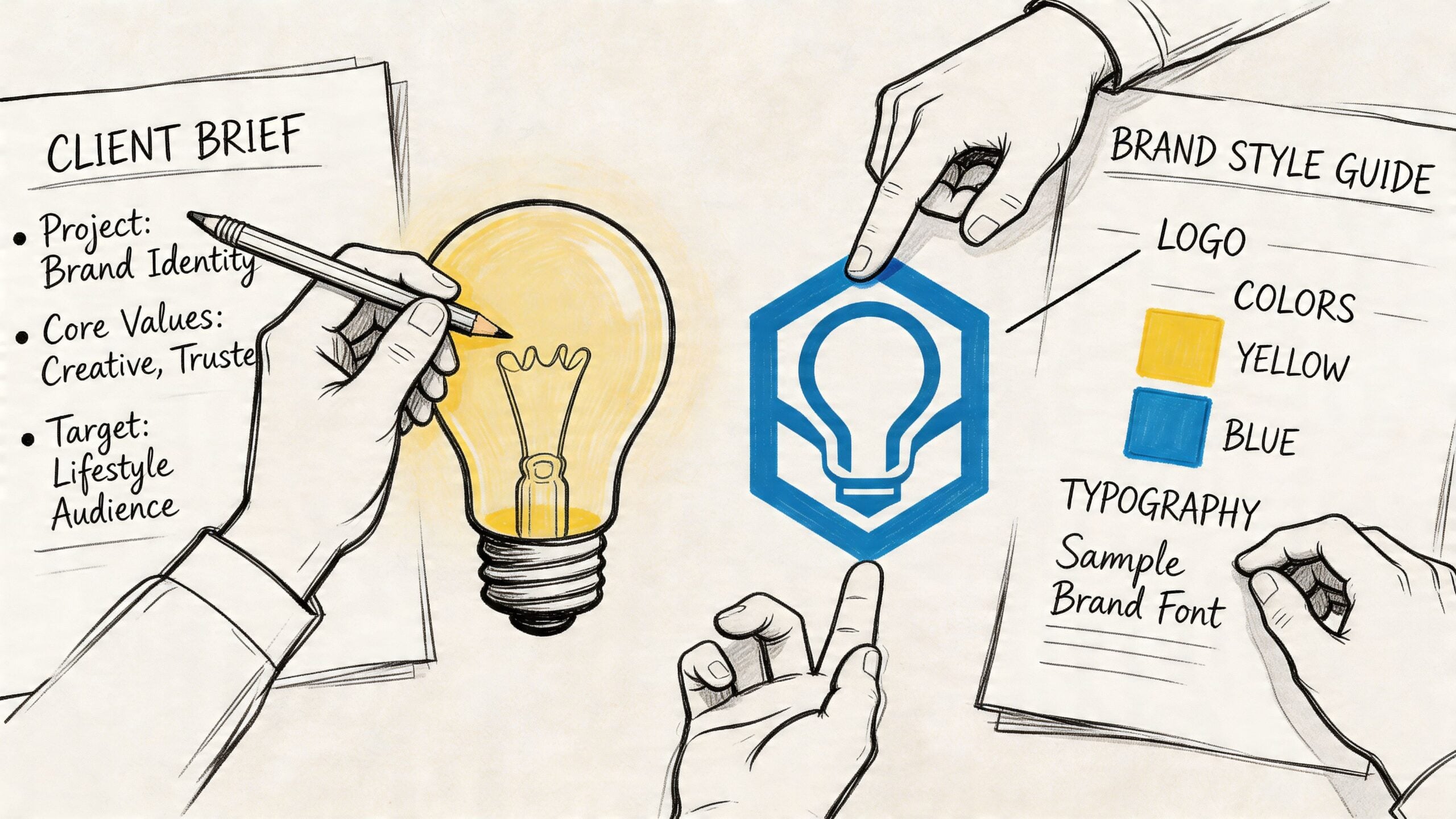
Discovery and strategy
The useful work begins here.
A designer or agency should ask about your audience, your competitors, your offer, your goals, and the practical places the identity needs to live. A café, accountant, outdoor brand, and local charity all need different things from a brand system. Discovery clarifies those needs before design choices start locking in.
At this stage, you’re looking for direction, not decoration.
Concept development
Once the strategy is clear, creative directions take shape.
This usually involves moodboards, visual routes, early logo thinking, and exploration of colour, typography, and overall style. The goal isn’t to flood you with random options. It’s to show a few distinct, reasoned directions based on the business problem.
The strongest concepts don’t just look good. They make sense.
Design and refinement
After one direction is chosen, the identity gets built into a usable system.
That means refining the logo suite, selecting colours, setting type rules, defining imagery style, and applying the identity across likely touchpoints such as web pages, signage, packaging, business cards, menus, brochures, or presentations. This phase also reveals whether the design works in practice.
A mark that looks fine on a white page may struggle on a van, a phone screen, or a dark background.
Final files and brand guidelines
Delivery should include more than a handful of exported images.
You need organised files for print and digital use, plus guidance that explains what each asset is for. If the identity only makes sense while the original designer is around to explain it, it hasn’t been delivered properly.
A sensible handover often includes:
- Logo formats: Files for web, print, transparent backgrounds, and small-scale use.
- Colour references: Clear colour specifications for digital and printed materials.
- Type rules: Which fonts to use for headings, body copy, and supporting text.
- Usage guidance: Basic dos and don’ts so the identity stays consistent.
Good brand identity work reduces future confusion. It shouldn’t create dependency on guesswork.
This process is why professional branding is a partnership, not a one-off purchase. You’re not buying a badge. You’re building a system your business can use repeatedly.
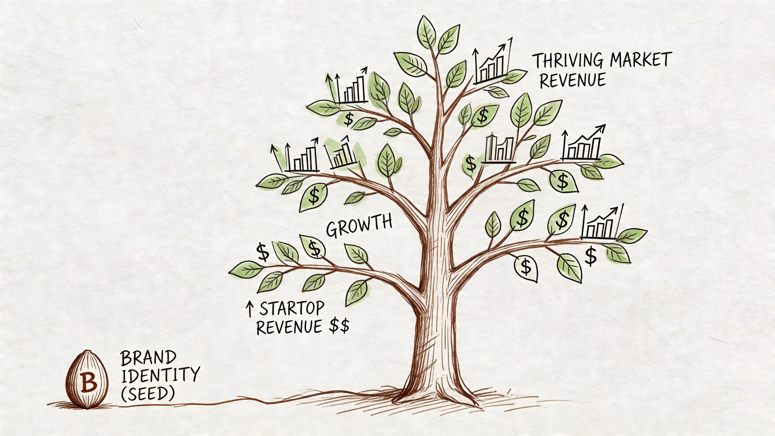
Why Smart Brand Identity Drives Business Growth
Many owners hesitate at this point because they see branding as a “nice to have”. That usually changes once they connect identity to everyday commercial outcomes.
The biggest shift is consistency. According to research on the ROI of brand consistency, businesses that maintain brand consistency across platforms can increase revenue by an average of 10 to 20%, with some findings showing increases up to 33%, and 68% of businesses report revenue growth of 10% or more thanks to brand consistency.
That doesn’t mean a new colour palette magically produces sales. It means a consistent identity makes the rest of your marketing work harder.
It builds trust faster
Small businesses rarely get endless chances to explain themselves.
People scan your website, your Google profile, your packaging, your signage, or your proposal and make a judgment. If all of those touchpoints feel aligned, the business appears more established and reliable. If they feel patched together, buyers may hesitate, even when the service itself is strong.
Trust is often a presentation problem before it’s a product problem.
It improves marketing efficiency
A clear identity speeds up content production because your team isn’t reinventing the wheel every week.
You know which colours to use. You know what your social graphics should look like. You know how the brand sounds in an email or a landing page. Campaigns get built faster, and they look related instead of accidental.
That matters even more when launching new offers. If you’re planning a rollout, this guide to strategies for launching new products is useful because it shows how messaging, positioning, and launch planning need to line up. Brand identity gives that launch a consistent face.
It supports stronger pricing
People don’t buy on logic alone.
They use cues. Presentation is one of those cues. If your brand identity looks disorganised, buyers may assume the service experience is too. If the identity feels thoughtful and coherent, it helps frame the offer as more valuable.
This doesn’t mean “make it fancy”. It means make it credible and appropriate for the market you want.
Here’s a useful explainer on the wider link between branding and performance:
It helps customers remember you
Recognition compounds.
Someone sees your van today, your Instagram post next week, your event banner next month, and your website when they’re finally ready to enquire. If every touchpoint looks and sounds connected, each one reinforces the last.
That repeated recognition is a practical advantage for local businesses where people often buy after several smaller impressions over time.
It gives your team a clearer standard
Growth puts pressure on consistency.
The more people involved in creating sales material, customer emails, packaging, adverts, or website updates, the easier it is for the brand to fragment. A strong identity gives staff and freelancers a shared reference point so the business still feels like one business.
For SMEs, that’s often where the return becomes obvious. Brand identity doesn’t just change how you look. It changes how smoothly the business communicates as it grows.
Common Mistakes That Weaken Your Brand Identity
Some weak identities aren’t badly designed. They’re badly managed.
A business may have a decent logo, acceptable colours, and a solid website, but still look inconsistent because the system breaks down in daily use. That’s where many SMEs lose the value of the work they’ve already paid for.
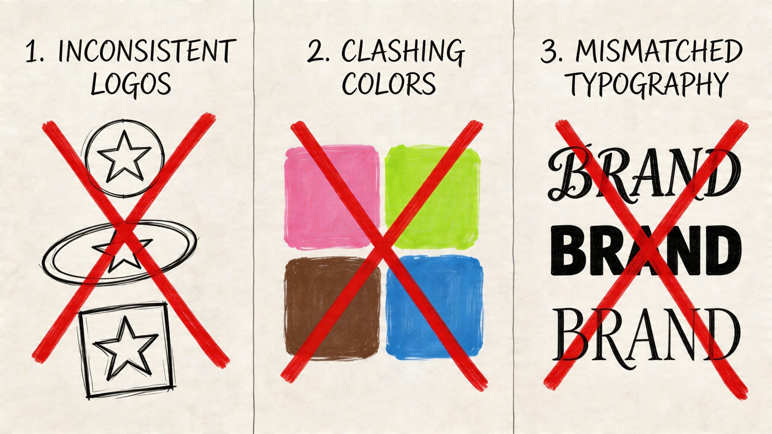
Inconsistency across channels
This is the most common issue.
Your website may look modern, but your Facebook cover uses an old logo. Your printed flyer has different colours. Your proposal template uses a random font because no one knew what the correct one was. Customers may not list these issues one by one, but they feel the mismatch.
The result is friction. The business feels less settled than it is.
Designing for yourself instead of your audience
Owners sometimes choose identity styles that reflect personal preference rather than customer expectation.
If you sell legal services, your audience may need reassurance and clarity, not edgy design experiments. If you run a family attraction, your identity may need warmth and approachability more than minimalist restraint. Effective branding starts with the buyer’s point of view.
A useful companion read on that wider topic is Adwave’s guide to small business branding strategies, especially if you’re trying to align recognition with customer expectations.
Chasing trends too hard
Design trends can be useful reference points, but they’re unreliable foundations.
If your whole identity is built around what looks current this month, it can age quickly. Then you’re left reworking materials earlier than necessary, often at extra cost and with avoidable confusion for customers.
A better approach is to make trend-aware decisions without letting trends run the show.
Treating identity as a one-off file drop
A lot of businesses commission a logo, save the files in a folder, and assume the job is finished.
Then six months later, a different printer recreates the colours. A staff member builds a leaflet in Word with substitute fonts. A web developer improvises button styles and iconography. Nothing is wildly wrong on its own, but the brand drifts.
One warning sign: If different suppliers keep “making their own version” of your brand, your guidelines are probably too thin.
Ignoring UK compliance and accessibility
This is the mistake many businesses don’t see coming.
Brand identity has to work within real-world rules. That includes accessibility, advertising standards, and digital trust signals. Colour contrast needs to support readability. Claims in marketing need to be defensible. Forms, websites, and digital experiences need to work for users, not just look polished.
According to UK-focused branding guidance summarised by Vistaprint, a 2026 Design Council UK study found that localised trust signals can boost loyalty by 48% for regional brands, while ICO reports from 2025 showed 62% of UK SMEs faced issues related to non-compliant branding. For a Dorset business, that’s a practical reminder that identity should reflect both local trust and operational reality.
Missing local trust cues
Regional businesses often copy national or global brand styles so closely that they erase what makes them believable locally.
That doesn’t mean your branding should be full of clichés. It means your identity can use local relevance intelligently. Familiar place references, clear service language, and visual cues that feel grounded in your market can help buyers feel that you understand them.
For Dorset firms especially, brand identity often works best when it feels professional and specific, not generic and interchangeable.
An Actionable Checklist for Hiring the Right Agency
Hiring for brand identity can feel difficult because many providers use the same language. Everyone says they do strategy. Everyone says they create distinctive brands. The useful differences appear when you ask practical questions.
A 2025 Dorset Growth Hub report noted that unproven value from design work was a key reason for client churn among local firms, and 72% of UK SMEs lack clear metrics for their rebrands, according to the summary cited in Linearity’s brand identity discussion. That’s why the right agency should help you think not only about visuals, but also about measurement.
Use this checklist before you sign anything.
The shortlist checklist
Check their portfolio properly: Don’t only ask whether the work looks nice. Ask whether it looks varied, appropriate, and applied in real situations. Can they show identity work on packaging, websites, signage, print, or social assets rather than just logo mock-ups?
Ask how they start: If the process begins with visual preference boards before business questions, be cautious. A stronger process starts with audience, offer, competitors, and goals.
Confirm what “brand identity” includes: Some providers mean one logo and a colour palette. Others include logo variations, typography, voice direction, imagery guidance, and brand rules. Get the scope in writing.
Ask for brand guidelines: This should be standard, not an afterthought. Without guidance, consistency usually breaks down once the project ends.
Discuss rollout, not just design: Will the identity be applied to your website, packaging, stationery, social templates, signage, or presentations? If not, you may be left to figure out the hardest part yourself.
Talk about ROI in plain terms: Ask how you’ll judge whether the work is helping. That might include better consistency across channels, smoother content creation, clearer positioning, stronger enquiries, or improved conversion on key pages.
Look for communication discipline: Who will contact you, how often, and what happens at each approval stage? A good process saves time and reduces revision chaos.
Check whether pricing is clear: Fixed-cost pricing can make planning easier for SMEs because you know what’s included and what isn’t.
If you want a broader framework for evaluating fit before you hire, this guide on finding a website designer who understands your vision is useful because many of the same questions apply to branding projects too.
One final point matters. Choose a partner who can connect identity to actual business use. For example, some agencies such as DesignStack handle branding alongside WordPress websites, graphic design, and rollout assets, which can make implementation simpler if you need more than a standalone logo package.
Frequently Asked Questions About Brand Identity
How long does a professional brand identity project take
It depends on the scope, feedback speed, and how many touchpoints need to be designed. A simple identity can move faster than a full system with packaging, web rollout, and printed materials. What matters more than speed is having enough time for discovery, concept development, and refinement.
Is it okay to design my own identity using an online tool
It can be okay at a very early stage if you need something temporary and your budget is tight. The risk is that DIY tools often produce generic results and give you assets without the strategy, flexibility, or guidelines needed for consistent use. For a business trying to grow, that usually becomes limiting.
How often should I refresh my brand identity
Only when there’s a reason. Good triggers include a change in audience, a shift in service level, a merger, a new market position, or clear signs that the current identity no longer reflects the quality of the business. Most brands need evolution more often than total reinvention.
If your business feels stronger than the way it currently looks, it may be time to fix that gap. DesignStack works with businesses that need brand identity, websites, and supporting design assets that function as a joined-up system, with clear process, fixed-cost pricing, and practical rollout support.
Leave a Reply