How to Write Website Copy That Converts
You’ve paid for a proper website. The design looks sharper than the old one. The logo is sorted, the photos are better, and the pages finally work on mobile. Then the site goes live and nothing much happens.
That usually isn’t a design problem. It’s a copy problem.
Most first-draft website copy from small businesses talks about the business in broad, internal language. It says things like “we are passionate”, “we provide bespoke solutions”, or “we pride ourselves on excellent service”. None of that helps a visitor decide whether you’re right for them. People don’t arrive on your site wanting your company history first. They want to know what you do, whether you understand their problem, and what they should do next.
That matters even more when trust is fragile. In the UK, 74% of web users pay close attention to spelling and grammar on company websites, and 59% actively avoid making a purchase from sites with obvious mistakes, according to Can I Have a Word’s summary of UK copywriting statistics. If your wording feels vague, messy, or careless, visitors often leave before your offer gets a fair chance.
Good website copy isn’t magic. It’s a process. The businesses that write effective sites usually do three things well. They plan the message before drafting. They write each page for a specific job. They edit and improve the copy after launch instead of treating it as finished forever.
Practical rule: Write for the customer’s decision, not your own description of the business.
That applies whether you run a Weymouth café, a Dorset trade business, a local solicitor’s practice, or an online shop selling nationally. If your website includes a founder page, team profile, or consultant bio, it also helps to study how to write a compelling personal bio so your credibility comes across clearly without sounding inflated.
Strong copy also works best when it supports the wider user experience. Clear wording, layout, and navigation all reinforce each other, which is why it helps to understand the relationship between content and design in this guide to crafting digital experiences.
The Foundation of Great Website Copy
A visitor doesn’t read your website the way you read your own business documents. They scan, judge, compare, and decide quickly. That means your copy has to do two jobs at once. It must be clear enough to understand at a glance, and persuasive enough to keep the right people moving.
What weak copy usually sounds like
Weak copy often falls into a few familiar traps:
- Business-first language: It starts with who you are instead of what the customer gets.
- Feature dumping: It lists deliverables without explaining why they matter.
- Safe wording: It relies on phrases every competitor also uses.
- No direction: It leaves visitors without a clear next step.
- Unpolished details: Small errors make the whole business feel less dependable.
A Dorset builder, for example, might write “We offer a wide range of building services to domestic and commercial clients.” That’s accurate, but it’s not useful. A stronger version speaks to the buyer’s concern. It might focus on reliable project communication, tidy site management, or help with planning the work in stages.
What strong copy actually does
Strong copy helps a visitor answer five questions fast:
- Am I in the right place
- What does this business do
- Is it relevant to my situation
- Can I trust them
- What should I do next
If those answers aren’t obvious, people hesitate. On the web, hesitation usually turns into a back click.
The best-performing websites rarely say more. They say the right thing sooner.
When people ask how to write website copy, they often focus on wording alone. Wording matters, but structure matters just as much. You need a message, a sequence, and an action. A page that says the right thing in the wrong order still underperforms.
The three-part working method
A practical way to approach your first major site is to think in three phases:
- Plan: identify who you’re talking to, what they care about, and how they search
- Write: build each page around one purpose instead of trying to say everything everywhere
- Optimise: edit for clarity, trust, search visibility, and conversion
This approach removes a lot of guesswork. It stops you writing from the inside out and pushes you to write from the buyer’s point of view.
That’s the difference between a website that looks finished and one that works.
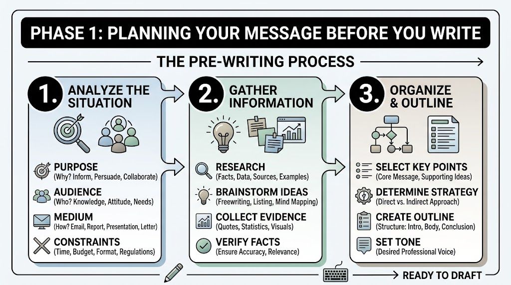
Phase 1 Planning Your Message Before You Write
Most copy problems start before the first sentence. Businesses rush into drafting homepage text with no message hierarchy, no audience notes, and no decision about tone. Then they wonder why the result feels generic.
Planning is where useful website copy is built. If you do this part properly, writing gets faster and the final copy sounds more focused.
A simple visual can help fix the order of work in your head:
Start with one primary audience
You don’t need a complicated persona deck. You do need a clear picture of the buyer most likely to take action.
For a local Dorset business, that audience might be one of these:
- A time-poor homeowner who wants a reliable tradesperson and worries about no-shows
- A retail customer comparing product quality, delivery information, and returns
- A small business owner looking for a professional supplier without agency jargon
- A committee member from a community organisation who needs a dependable partner and a clear quote
Write down four things for that person:
- Their immediate problem: what prompted them to search today
- Their concern: what might stop them enquiring
- Their desired result: what success looks like from their point of view
- Their decision trigger: what makes them choose one provider over another
That gives you a usable brief. Without it, you’ll default to bland company language.
Set your voice before your pages
Tone shouldn’t change wildly from page to page. A business can be friendly and still sound competent. It can be polished without sounding stiff. The easiest way to keep consistency is to define a few voice attributes early.
Here’s a practical template.
| Attribute | Spectrum End A | Spectrum End B | Our Choice & Why |
|---|---|---|---|
| Formality | Conversational | Formal | Friendly but professional, because customers want clarity without waffle |
| Expertise | Plain-speaking | Technical | Plain-speaking first, with technical detail where it helps buyers decide |
| Energy | Calm | Bold | Calm and confident, because overhype weakens trust |
| Personality | Reserved | Playful | Light personality, but not jokey, to suit a broad UK audience |
| Sales style | Consultative | Aggressive | Consultative, because pressure language puts people off |
| Local feel | Nationally generic | Strongly local | Local where relevant, especially for service areas and examples |
If several people contribute to the site, this table prevents mixed voices.
Working standard: If a sentence sounds like it could belong on any competitor’s website, rewrite it.
Map pages to buyer intent
Not every page needs to sell in the same way. A homepage reassures and directs. A service page explains and proves. An about page builds credibility. A contact page removes friction.
Before drafting, list your main pages and assign one job to each. For example:
- Homepage: confirm relevance and guide people to the right next step
- About page: show who’s behind the business and why they’re credible
- Service page: explain the offer, outcome, process, and fit
- Product page: answer buying questions and reduce uncertainty
- Contact page: make enquiry feel easy and safe
- FAQ page: handle objections and support search intent
This stops every page becoming a duplicate pitch.
A short explainer can also help if you want another perspective on organising your message before drafting:
Research search terms by intent, not vanity
Basic keyword research is useful, but it only helps if you understand why someone is searching. A phrase like “web design Dorset” suggests commercial intent. A phrase like “how much does a small business website cost” suggests someone earlier in the process. Both matter, but they belong in different places.
Use tools like Google Search, Google Search Console, Google Keyword Planner, AnswerThePublic, and the “People also ask” results. Look for:
- Service terms: what you sell
- Location terms: where you sell it
- Problem terms: the issue buyers want solved
- Comparison terms: signs that someone is close to a decision
- Question terms: strong material for FAQs
Write the way your customers speak, not the way your industry writes internally.
Plan for voice search while you’re at it
This is one of the most overlooked parts of modern website copy. UK voice search queries rose 35% year over year in 2025, according to Flying Orange’s summary of website copy trends. For local businesses, that means more people are asking full questions aloud instead of typing short phrases.
A typed search might be “accountant Weymouth”. A voice search is more likely to sound like “who’s a good accountant near me for a small limited company”. That changes how you structure headings, FAQs, and service descriptions.
Use natural phrasing such as:
- “Do you cover all of Dorset or just Weymouth and Portland?”
- “What’s included in your website support package?”
- “Can I order online and collect in store?”
Those questions don’t just help voice search. They make the site clearer for everyone.
Phase 2 The Writing Workflow for Core Pages
Once the planning is done, writing gets more mechanical in a good way. You’re no longer staring at a blank page trying to sound impressive. You’re building pages that each have a job.
The mistake many businesses make is giving every page the same shape. Every page opens with a welcome paragraph, then a block of vague company claims, then a list of features, then a weak contact prompt. That structure doesn’t help users choose.
Effective copy treats each core page differently.
Homepage copy that orients and directs
Your homepage is not your full brochure. It’s a routing page with persuasion built in. It should tell visitors they’re in the right place and send them to the page that matches their need.
A strong homepage usually needs:
- A clear headline that says what you do and who it’s for
- A short supporting line that explains the value or outcome
- A primary call to action that fits visitor intent
- A quick trust signal such as review quotes, client names, or relevant proof
- A simple service overview with links deeper into the site
- A brief “why choose us” section that focuses on buyer concerns
- A final action prompt for people ready to enquire
For a Poole-based accountant, “Helping small businesses stay compliant and make clearer financial decisions” is stronger than “Professional accountancy services with a personal touch”. The first one names the audience and value. The second could belong to almost anyone.
About page copy that earns trust
The About page often gets mishandled because businesses either treat it like a CV or avoid personality entirely. The right balance is credibility plus relevance.
Use this sequence:
- Start with the business belief or working approach
- Introduce the people behind the service
- Explain experience in practical terms
- Add local or sector context where useful
- Finish with a next step
If you’re a family-run Dorset retailer, that might mean explaining how products are chosen, how customer service is handled, and what standards shape your buying decisions. If you’re a consultant, it means showing what kind of problems you help solve, not just listing roles you’ve held.
People read the About page to answer a simple question. “If I contact you, what sort of people am I dealing with?”
Service pages that sell outcomes, not inventories
Many websites lose enquiries when businesses describe the service from their own operational view rather than the client’s buying view.
A weak service page says:
- what’s included
- what tools are used
- how experienced the team is
A strong service page also explains:
- what problem the service solves
- who it’s right for
- what the process feels like
- what happens after the initial enquiry
- what result the customer can expect
That distinction matters because benefit-focused copy can lift conversions by 20% to 40%, and adding testimonials or other social proof can increase conversions by up to 34%, according to Tailored Ink’s guide to web copy performance.
Here’s the practical shift:
- Feature-led: “Our package includes responsive design, content management, and SEO setup.”
- Benefit-led: “You’ll get a site that’s easy to update, simple to use on mobile, and structured so customers can find the services they need quickly.”
Same service. Better buying logic.
A page-by-page checklist you can use
For a first draft, use this workflow.
Write the top section last
Writing the hero section first often leads to getting stuck. Draft the middle of the page before the headline. Once the argument is clear, the opening gets easier.Turn features into outcomes
If you write “24-hour response time”, add why it matters. A customer cares because they won’t be left wondering if the enquiry disappeared.Handle objections in-line
If buyers often worry about cost, lead times, revisions, stock levels, or service area, answer that on the page. Don’t hide all of it in a contact conversation.Use proof near claims
Don’t make a strong statement and leave it hanging. If you say you’re dependable, support it with a testimonial, example, review snippet, or practical explanation of your process.End each page with one next action
If every button points somewhere different, momentum drops. Keep the path obvious.
Product pages that reduce uncertainty
For eCommerce, product copy has to do more than decorate the listing. Buyers need enough information to feel safe ordering.
Useful product copy usually includes:
- What the product is for
- Who it suits
- Key details that affect buying decisions
- What makes it different
- Delivery or returns reassurance
- A clear action prompt
For a Dorset food brand selling gift boxes, “locally packed with seasonal products from independent producers” is more persuasive than a generic “high-quality ingredients” claim, because it tells the buyer something distinctive and concrete.
Short copy can work well on lower-cost items. Buyers don’t always need a long sales page. They do need enough clarity to decide without doubt.
Contact pages that remove friction
A contact page shouldn’t feel like an admin form. It should feel like the easiest next step on the site.
Make it answer these concerns:
- what to do
- who the enquiry goes to
- what to include
- what happens next
- whether there’s any pressure
A simple contact section often outperforms a cluttered one. Use a short intro, plain field labels, and a sentence that reassures people they’re not committing to anything just by getting in touch.
If you manage content inside WordPress, product pages, service pages, and contact forms all become easier to maintain when the site structure is sound. That’s where a practical understanding of website content management systems pays off, because good copy only stays good if your team can update it cleanly.
What works better than sounding impressive
The strongest core pages usually share a few habits:
- They lead with relevance: Visitors can immediately see whether the page is for them.
- They use plain language: Industry terms appear only where they help understanding.
- They break up information: Subheadings, bullets, and spacing do a lot of conversion work.
- They sound specific: Not louder. Specific.
- They ask for action at the right moment: Not too early, not buried at the bottom.
A homepage shouldn’t try to explain everything. An about page shouldn’t read like a vanity profile. A service page shouldn’t feel like an internal specification sheet. A contact page shouldn’t make people work harder than necessary.
If you keep each page loyal to its job, the whole site becomes easier to write and easier to use.
Mastering Calls to Action and Microcopy
Big decisions on websites are often shaped by very small pieces of text. A button label. A line under a form. A note beside a checkbox. These details look minor in a draft, but they influence whether people click, continue, or hesitate.
That’s why calls to action and microcopy deserve separate attention. They sit at the point where interest turns into action.
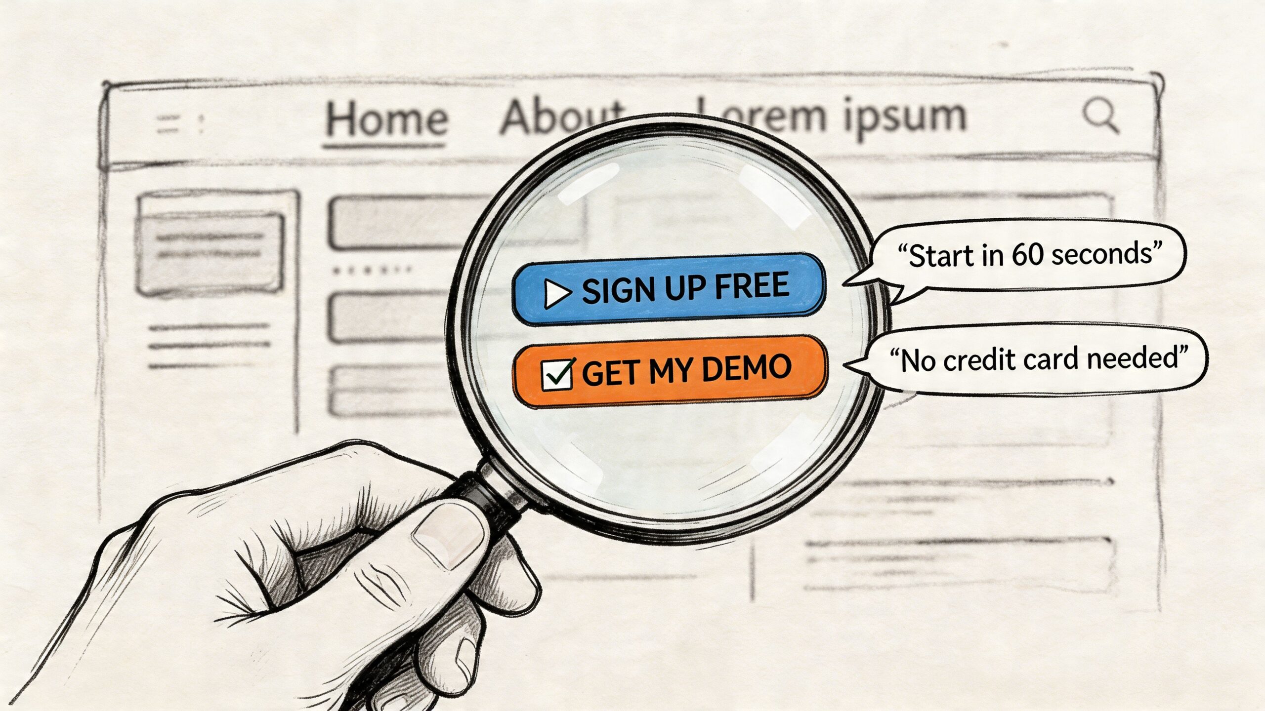
Write buttons for the next step, not the system action
Many websites still use labels like “Submit”, “Send”, or “Click here”. Those words describe the interface, not the outcome. Better CTAs tell users what they’re getting.
Compare these:
- Submit
- Send message
- Request a quote
- Book a call
- See pricing
- Check availability
- Download the guide
The stronger examples reduce uncertainty. They help users predict what happens next.
This also helps you match intent. Someone reading a high-commitment service page may respond better to “Request a quote” than “Buy now”. Someone comparing options may prefer “See our packages” or “Talk through your project”.
Useful test: If the button text would make sense on every page of your website, it’s probably too generic.
Microcopy is where reassurance lives
Microcopy is the small text around forms, buttons, uploads, search boxes, passwords, confirmation messages, and error states. It doesn’t look glamorous, but it often carries the reassurance that your main headline can’t.
Examples of good microcopy include:
- Under a contact form: “Tell us a little about your project and we’ll reply with the best next step.”
- Beside a phone field: “Optional, if you’d prefer a call back.”
- Near file upload: “You can attach plans, sketches, or screenshots if that helps.”
- After form completion: “Thanks, your message is through. We’ll review it and reply by email.”
Tone is important. Cold system language creates distance. Human language reduces friction.
Privacy copy can improve trust, not just compliance
A lot of small businesses treat privacy wording as something they have to bolt on at the last minute. That’s a mistake. Privacy messaging can support conversion because it deals directly with a fear many users already have.
A 2023 ICO report noted over 1,200 data breach fines in the UK, with SMEs strongly represented due to unclear consent language on websites. At the same time, A/B tests have shown privacy-focused CTAs can increase conversions by up to 28% in UK eCommerce, according to Twilio’s discussion of website copy rules and trust-building language.
For a small business site, that means your copy near forms should do three things:
- Explain what happens next
- State what you’ll do with the data
- Avoid vague or loaded consent wording
Instead of a bare checkbox with legal language, write something clearer and calmer. For example:
- “We’ll only use your details to reply to your enquiry.”
- “If you choose to join our email list, you can unsubscribe at any time.”
- “We won’t add you to marketing emails unless you ask us to.”
That’s good compliance practice and good conversion practice.
Where small wording changes make the biggest difference
Focus your effort on these high-impact spots:
- Form intros: Explain why the form is short, what to include, and what happens after submission.
- Field labels: Use plain English. “Project budget” is clearer than “anticipated investment range”.
- Error messages: Tell users how to fix the issue without sounding robotic.
- Confirmation pages: Reassure them the action worked and tell them what to expect next.
- Newsletter sign-ups: Make the value of subscribing explicit.
The reason this matters is simple. Main page copy earns attention. Microcopy protects momentum.
If your service pages are strong but the form feels uncertain, salesy, or legally murky, people stop right before conversion. Good microcopy closes that gap.
Phase 3 Editing and Optimising Your Copy
First drafts are usually too long, too inward-looking, or too polite to convert well. That’s normal. The quality of website copy often comes from revision, not inspiration.
Editing is where you remove ambiguity, sharpen the page structure, and make the copy easier to scan. It’s also where you turn decent content into something that performs in search and supports action.
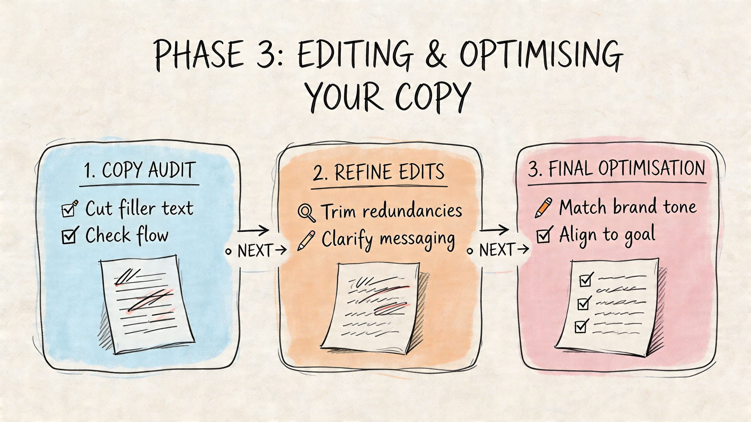
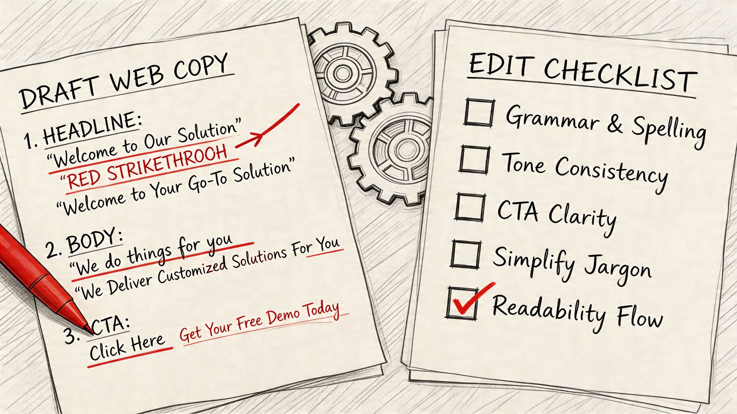
A practical editing pass
Don’t try to fix everything at once. Run the draft through separate checks.
- Clarity pass: remove jargon, filler, repeated claims, and internal language
- Structure pass: tighten headings, shorten paragraphs, and improve reading flow
- Trust pass: check facts, names, links, service details, and proofreading
- Conversion pass: strengthen CTAs, proof, and objection handling
- SEO pass: add key phrases naturally where they fit
Reading the page aloud helps. So does pasting it into Grammarly or Microsoft Word Editor for a fresh look at grammar and phrasing. Those tools won’t replace judgement, but they’re useful for catching avoidable mistakes.
Write for readers who scan
Online readers don’t move through a page in a neat line. They hop between headings, bullets, buttons, and highlighted phrases. Your layout needs to support that behaviour.
A well-edited page usually has:
- Short paragraphs
- Clear subheadings
- Bulleted lists where decisions need comparison
- Front-loaded sentences
- Minimal repetition
A useful test is to read only the headings and first lines of each section. If the meaning still holds together, the page is structured well.
This matters for SEO as well as usability. Search visibility improves when pages are clear about topic, intent, and relevance. For UK businesses, strategically updating and optimising website content can lead to a 20% to 70% gain in search traffic, and 45% of marketers cite copy quality as the top factor influencing conversion rates, according to Marketing LTB’s copywriting statistics roundup.
Use keywords like signposts, not stuffing
If you want to rank for “how to write website copy”, “website copywriter Dorset”, or “eCommerce product descriptions”, those phrases need to appear naturally in places that make sense.
Useful positions include:
- Page title
- Main heading
- Intro paragraph
- Relevant subheadings
- Image alt text where appropriate
- Meta description
- FAQ answers
Don’t force exact-match phrases into every paragraph. Search engines have become better at understanding context, and human readers have always disliked robotic wording.
Improve after launch, not just before it
Publishing is the start of the feedback loop. Once the page is live, review:
- Which pages attract visits
- Which pages hold attention
- Which pages lead to enquiries or sales
- Where users leave
- Which CTA gets used
Google Analytics 4 and Google Search Console are enough for most small businesses to begin. If you’re still getting comfortable with the reporting side, this practical guide to Google Analytics 4 mastery helps make the data more usable.
Simple tests can go a long way. Try a different headline. Move a testimonial higher. Rewrite one button. Add a short FAQ to a service page. Small, controlled changes are easier to learn from than a full rewrite every few months.
Common Questions About Writing Website Copy
Should I use AI to write my website copy
Yes, but carefully. AI is useful for brainstorming page structures, turning rough notes into a first draft, generating FAQ ideas, or spotting repetition. It’s much less reliable at capturing your actual voice, local nuance, buyer concerns, and the small trust signals that matter on a real business website.
Use it as a drafting assistant, not as the final author. If you publish raw AI copy, it often sounds smooth but empty. It tends to flatten brand personality, overuse generic claims, and miss the specific language your customers use.
How often should I update website copy
Update copy whenever the offer, audience, process, or customer questions change. That can happen more often than many businesses expect.
Your homepage, service pages, and contact page should be reviewed regularly for accuracy and clarity. Product pages may need more frequent updates if stock, seasonality, pricing structure, or delivery details shift. Testimonials, case examples, FAQs, and privacy wording should also stay current.
A simple rule works well. If a real sales conversation has changed, the website probably needs to change too.
How do I know if my copy is working
Measure it against business actions, not whether you personally like the wording.
Watch for signals such as:
- Enquiry quality: are better-fit leads coming through
- Conversion behaviour: are more visitors clicking key CTAs
- Engagement: are important pages being read, not abandoned quickly
- Search visibility: are the right pages gaining impressions and clicks
- Sales support: are you answering fewer repetitive questions manually
Good copy doesn’t just make a website sound better. It reduces confusion, improves trust, and helps the right customer act with less hesitation.
If you’re learning how to write website copy for the first time, keep the standard practical. Be clear before being clever. Be specific before being polished. Then keep improving based on what real visitors do.
If you want expert help turning rough ideas into clear, conversion-focused website copy, DesignStack can support the full process alongside web design, WordPress development, and brand work for Dorset businesses that want a site that looks good and performs properly.


Leave a Reply