Your Website Redesign Checklist for 2026
Your website might still “work”, but that doesn't mean it's helping the business. Maybe it looks dated on mobile, takes too long to load, buries key services three clicks deep, or sends enquiries into a black hole because forms aren't set up properly. That's usually the point where owners start talking about a redesign.
A good redesign isn't a paint job. It's a business project with design, content, SEO, user journeys, and technical decisions all tied together. If you skip the planning, the usual problems show up fast. Budgets drift, internal opinions take over, and the finished site looks better but performs no better.
That risk is real for UK businesses. One UK checklist reports that 54% of SMEs abandon redesign projects because of unexpected costs, and average small business budgets typically sit between £8,500 and £22,000, with 41% receiving quotes 25 to 35% above the original estimate because of hidden scope creep, according to LaunchWork Digital's UK website redesign checklist. That's why a proper website redesign checklist matters before anyone opens Figma or installs a WordPress theme.
At DesignStack, we see this most often with Dorset businesses that have outgrown an old site but haven't yet turned that frustration into a clear plan. This guide gives you that plan. It's practical, WordPress-aware, and grounded in how redesigns move from audit to launch. If you also run Shopify alongside WordPress or sell through multiple channels, these customer experience strategies for Shopify are worth reviewing alongside your redesign planning.
Table of Contents
- 1. Conduct a Comprehensive Audit of Your Current Website
- 2. Define Clear Business Goals and KPIs for the Redesign
- 3. Plan User Research and Create Buyer Personas
- 4. Audit Competitor Websites and Industry Best Practices
- 5. Develop a Detailed Site Architecture and Information Hierarchy
- 6. Create Wireframes and Prototypes for Key User Flows
- 7. Plan Content Strategy and Conduct Content Audit Refresh
- 8. Design Visual Identity, Branding, and User Interface Elements
- 9. Plan Technical Implementation, SEO, and Performance Optimisation
- 10. Plan Launch Strategy, Testing, Monitoring, and Post-Launch Support
- 10-Point Website Redesign Comparison
- From Checklist to Launch Your Next Steps
1. Conduct a Comprehensive Audit of Your Current Website
Most redesign mistakes start with guessing. A director says the homepage feels old, marketing wants a cleaner look, and someone else asks for “something more modern”. None of that tells you what's broken.
Start with evidence. Pull your analytics, review your top landing pages, check search visibility, test forms, inspect your mobile experience, and list every technical annoyance your team has been working around. Export your historical data before any changes are made so you've got a baseline to compare against later.

A proper audit should also look at whether you even need a redesign, or whether the site is waving bigger warning signs. If you're seeing several of these red flags that your website needs a makeover ASAP, don't jump straight to visual design. Diagnose the root issue first.
What to review before anything else
- Traffic behaviour: Check which pages attract visitors and which pages lose them.
- Mobile performance: Test key pages on iPhone and Android, not just in a browser preview.
- Lead handling: Submit every form and confirm where those enquiries go.
- Search footprint: List pages that already rank or bring in useful traffic so you don't wipe out existing value.
- Support friction: Read email threads, sales objections, and customer questions. They often expose missing content.
Practical rule: If you can't describe the current site's strongest page, weakest page, and biggest technical risk, you're not ready to redesign it.
For local businesses, this audit often uncovers local SEO gaps as well. A Dorset retailer might have strong branded traffic but weak location signals. A service firm in Weymouth may rank for its name but not for the services it wants to sell. Those aren't design problems on their own, but they should shape the redesign from day one.
2. Define Clear Business Goals and KPIs for the Redesign
Once the audit is done, pin down what success looks like. Not “better branding”. Not “nicer user experience”. Something operational. More qualified enquiries. Better online bookings. Higher-value basket sizes. Fewer irrelevant form submissions.
Redesigns attract opinions. Sales wants lead volume, operations wants fewer admin headaches, and leadership wants the site to feel credible. Without agreed goals, every review meeting turns into taste-based debate.
There's also a hard commercial reason to get this right. A VWO roundup reports that 80.8% of businesses begin a redesign because the existing site fails to convert visitors into customers, and 61.5% start because of poor user experience, according to VWO's web design statistics. That lines up with what agencies see in practice. Businesses rarely pay for redesigns just because they're bored of the current colour palette.
Set goals that shape decisions
Keep your targets tied to real actions on the site:
- Lead generation firms: Measure qualified contact forms, booked calls, or brochure downloads.
- eCommerce brands: Measure product page progression, add-to-basket behaviour, and completed checkouts.
- Hospitality businesses: Measure bookings, reservation calls, or menu page engagement.
- Membership organisations: Measure sign-ups, renewals, and event registrations.
A restaurant site like The Lobster Pot doesn't need the same KPI set as a B2B engineering company. One depends on quick decisions from mobile visitors. The other may need trust, service clarity, and longer consideration journeys.
A redesign works best when every design choice can be traced back to a business goal.
Set launch goals and longer-term goals separately. Launch goals usually cover technical stability, conversion tracking, and content completeness. Longer-term goals cover what happens after the site has had time to settle, rank, and gather enough traffic to judge properly.
3. Plan User Research and Create Buyer Personas
If you skip research, teams design for themselves. That's how you end up with jargon-heavy service pages, oversized homepage banners, and navigation labels that make sense internally but confuse customers.
UK agency processes are moving in the other direction. Marker.io reports that 78% of website redesign projects now include a dedicated UX research phase, and teams commonly build a 20 to 30% timeline buffer into each phase to allow for validation and iteration, according to Marker.io's website redesign checklist. That's sensible. Research up front is cheaper than redesigning the redesign later.
For a Dorset yoga studio, one useful persona might be a mobile-first local customer who wants class times, pricing, and a frictionless booking route. For a B2B supplier, you may need separate personas for the buyer, the technical evaluator, and the person who'll use the product day to day.
Good personas come from real conversations
Don't build personas from assumptions in a meeting room. Use:
- Sales calls: They reveal objections and buying triggers.
- Customer interviews: They uncover language customers use.
- Search queries: They show intent, not just demographics.
- Support emails: They expose confusion points and missing information.
A local service business might discover that customers don't care about “innovative solutions” but do care whether you cover their postcode and how quickly you respond. An eCommerce brand may learn that shoppers want delivery clarity earlier in the journey, not hidden in a footer link.
The best personas are simple enough to use. Name them, define what they need from the website, and identify what would stop them converting. Then pressure-test every page against those needs.
4. Audit Competitor Websites and Industry Best Practices
Competitor research isn't about copying layouts. It's about understanding the standards your buyers already expect, then deciding where to match them and where to do something clearer.
If you're a Dorset accountant, your prospects are comparing your site with nearby firms and national firms. If you're an independent retailer, customers may compare you with larger online stores that have stronger filters, faster category pages, and more polished checkout experiences. Your redesign has to acknowledge that reality.
The useful part of competitor review is pattern recognition. Which sites make pricing easy to find? Which ones explain services in plain English? Which ones feel trustworthy because they show real people, real examples, and obvious next steps?
What to compare properly
- Navigation labels: Are they obvious or overly clever?
- Homepage messaging: Does the site explain who it helps and what it offers quickly?
- Calls to action: Are they consistent and relevant to buying intent?
- Trust signals: Reviews, client logos, accreditations, case studies, or location proof.
- Platform clues: Can you tell if they're using WordPress, Shopify, WooCommerce, or a custom build?
A chamber of commerce site, for example, shouldn't behave like a fashion retailer. It needs community proof, event visibility, and member pathways. Looking at adjacent sectors can help too. A professional services firm can learn a lot from SaaS onboarding clarity, even if the products are completely different.
Borrow the logic, not the look.
Take screenshots and annotate them. Don't just save inspiration boards full of attractive hero sections. Note why a pattern works, what user question it answers, and whether it suits your audience.
5. Develop a Detailed Site Architecture and Information Hierarchy
A redesign gets expensive when the page structure is vague. Designers fill gaps with assumptions, developers build around incomplete decisions, and content teams end up rewriting pages to fit a navigation that never made sense.
Site architecture comes first. Decide what the main sections are, what each page needs to do, and how visitors move from one step to the next. This is particularly important for WordPress sites, where templates, custom post types, category structures, and URL rules all depend on clear planning.
For many SMBs, the strongest structures are simple. Home, core services or products, proof, about, contact. Add blog, FAQs, location pages, booking pages, or client resources only when they serve a real purpose.
Map Pages Before You Design Them
A practical service-based structure might look like this:
- Home: Explain the offer and route visitors to the right next step.
- Service pages: One page per service, written for search intent and buying questions.
- Proof pages: Testimonials, case studies, portfolio pieces, or sector experience.
- About page: Show who's behind the business and why trust is justified.
- Contact page: Make action easy with direct options and local details.
If you're unsure how this all fits together, DesignStack's guide to information architecture in web design is a useful reference point before design starts.
For eCommerce, the stakes are even higher. Category and filter logic affects both SEO and conversion. If a visitor can't move logically from category to subcategory to product, visual polish won't rescue the experience.
Keep key conversion pages close to the homepage. If someone has to dig through layered menus to find pricing, bookings, or products, you've already added friction.
6. Create Wireframes and Prototypes for Key User Flows
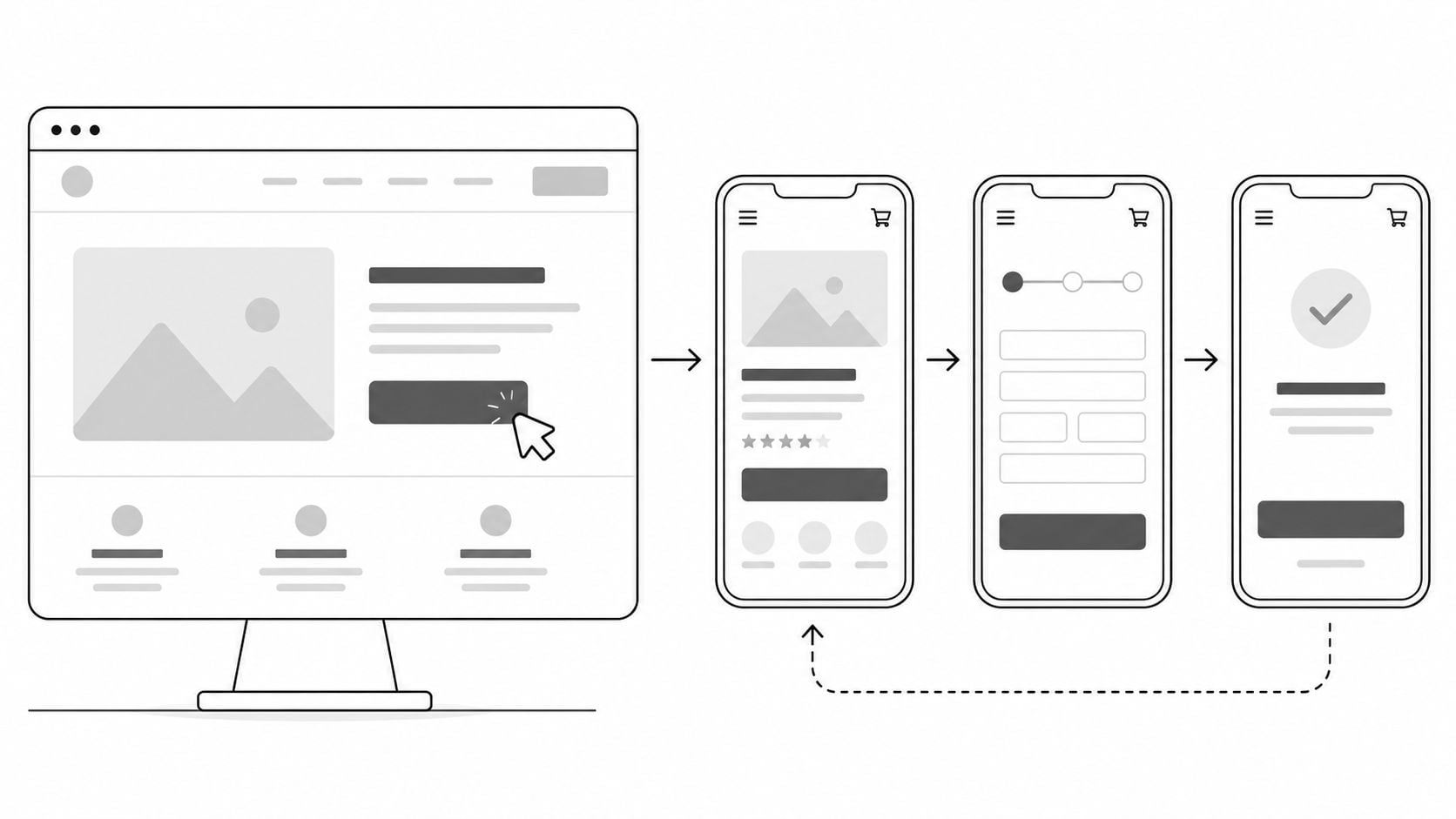
Wireframes stop redesigns from becoming expensive artwork. Before anyone debates colours, fonts, or animation, map the pages that carry the most commercial weight and test the route through them.
That usually means the journey from landing page to enquiry, product page to checkout, or homepage to booking form. If those flows are clumsy in black and white, they won't improve just because the final UI looks polished.
Start with the movement, not the decoration.
Prototype the Journeys That Make Money
For a lead generation website, I'd usually prototype:
- Homepage to service page
- Service page to contact or quote form
- Contact form to thank-you page
- Mobile nav to core conversion page
For WooCommerce or Shopify-style flows, include product listing, product detail, basket, and checkout. That's where confusion compounds fast. Small issues like unclear delivery copy, weak product filtering, or intrusive upsells can break the journey.
Use Figma or another collaborative tool and annotate your assumptions. If a professional services firm wants a short homepage, note where trust content moves instead. If a local gym needs mobile users to book quickly, test whether fixed calls to action help or distract.
A quick walkthrough can reveal structural problems faster than a finished mock-up can.
Show prototypes to real users if you can. Even a small round of feedback often catches things internal teams miss, especially around labels, form friction, and what people expect to happen next.
7. Plan Content Strategy and Conduct Content Audit Refresh
A lot of redesigns fail because the new design arrives before the new message. Then launch gets delayed while everyone scrambles to rewrite copy that should have been planned weeks earlier.
Content needs its own audit. Keep what still performs, rewrite what's out of date, combine overlapping pages, and delete the material that exists only because “it's always been there”. Most older websites carry too much copy, not too little.
This is especially important for local SEO and service clarity. A Dorset electrician, accountant, or clinic often needs stronger service pages, clearer area coverage, and better answers to the questions buyers ask before they enquire.
Decide What Stays, Goes, and Gets Rewritten
Review content page by page:
- Keep: Pages that still rank, convert, or explain the offer well.
- Refresh: Pages with good intent but weak wording, old screenshots, or outdated proof.
- Merge: Thin pages that compete with each other.
- Remove: Low-value content with no business case.
A restaurant site might need cleaner menu pages, stronger location details, and seasonal updates handled in a way staff can manage easily in WordPress. A B2B site may need fewer generic claims and more specific service detail, process explanation, and proof of outcomes.
Good content reduces sales friction before a human conversation starts.
Make sure each page has one main job. If a page tries to rank, educate, persuade, and close a sale all at once, it usually does none of them well. Keep calls to action specific and matched to user intent. “Book a table” works differently from “Request a proposal”.
8. Design Visual Identity, Branding, and User Interface Elements
Visual design should support trust and clarity first. Many businesses approach this stage wanting something modern, but “modern” isn't a usable brief. A better question is what the design needs to communicate.
A legal firm may need restraint, confidence, and order. A hospitality brand may need warmth and appetite appeal. A local creative studio can push personality much harder. The right UI depends on the business model, audience, and buying context.
That's where brand identity work matters. If your logo, colour system, imagery, and typography feel disconnected, the website won't feel coherent no matter how polished the layouts are. DesignStack's overview of brand identity design is a good starting point if your redesign is happening alongside a rebrand.
Build a Design System, Not Just Pretty Pages
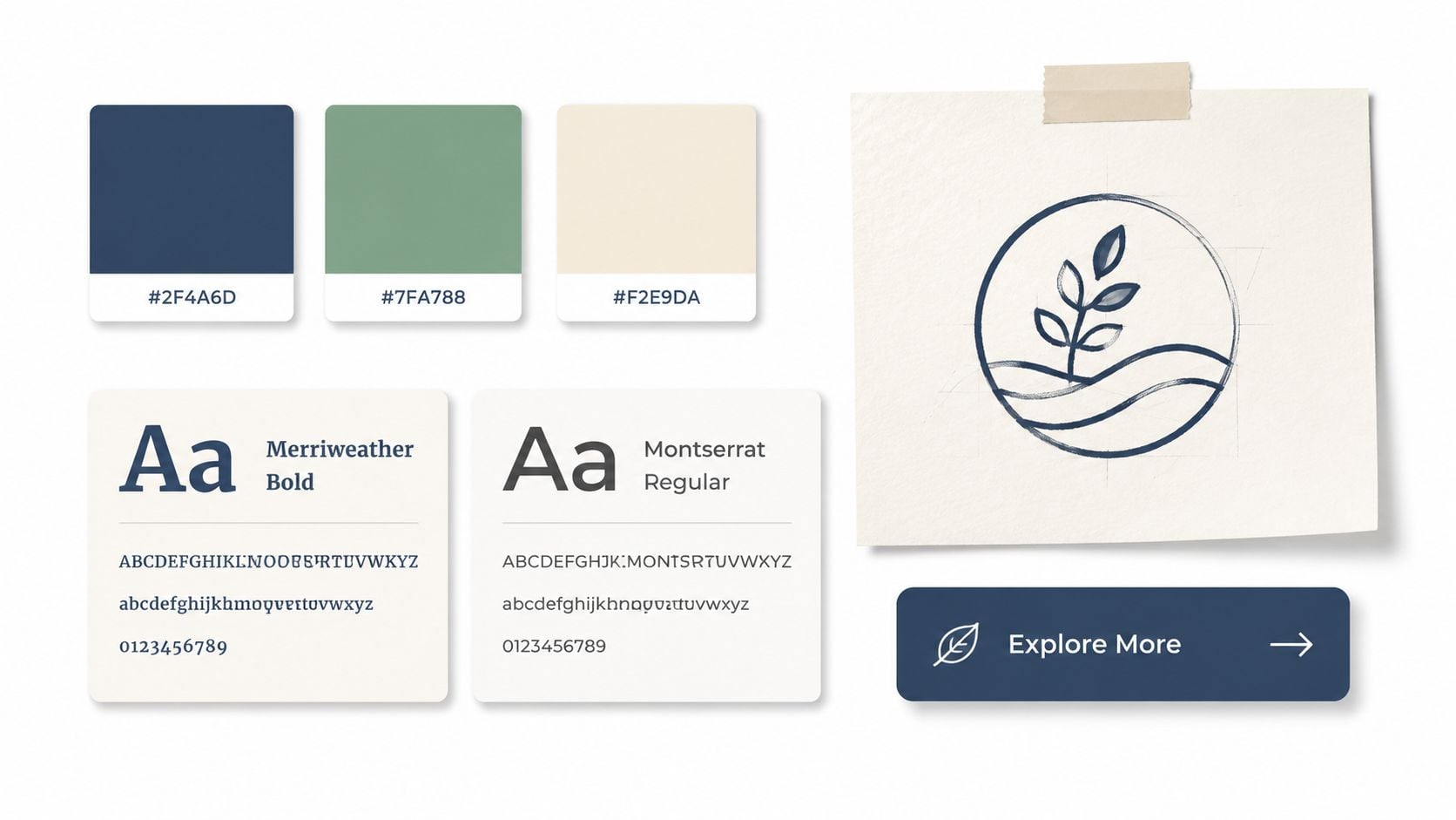
A useful UI system includes:
- Type hierarchy: Heading sizes, body text, form labels, captions.
- Colour roles: Primary, secondary, accent, success, warning, neutral.
- Button styles: Primary, secondary, hover, disabled, mobile behaviour.
- Content modules: Testimonials, service cards, FAQs, calls to action.
- Image rules: Photography style, icon usage, illustration consistency.
This matters most on growing WordPress sites. If each page gets designed in isolation, consistency breaks quickly once the client starts adding content. A reusable component system gives the site longevity.
Responsive design belongs here too, not as an afterthought. By 2024, 90% of UK websites had implemented responsive design, according to the VWO data cited earlier, which means visitors already expect mobile competence as standard. A redesign that still treats mobile as a secondary view will feel dated the day it launches.
9. Plan Technical Implementation, SEO, and Performance Optimisation
Many businesses frequently choose between a redesign and a rebuild, often making the wrong decision. If the site looks tired but the technical foundation is sound, a redesign may be enough. If the CMS is outdated, the templates are brittle, plugins are conflicting, and content structures are a mess, a fresh front end won't solve much.
That distinction matters. A UK analysis highlighted in a 2025 industry discussion reports that 68% of UK SME projects fail because teams mistake a rebuild problem for a redesign problem, leading to post-launch maintenance costs that are 30 to 45% higher when legacy issues are left in place, as referenced in this UK redesign vs rebuild discussion. That's a practical warning for any business running an old WordPress setup or custom platform no one wants to maintain.
Choose the Right Foundation First
For most SMBs, WordPress remains a strong choice because it's flexible, familiar, and manageable with the right setup. But don't let “WordPress” become shorthand for “install a theme and hope for the best”.
Plan these technical pieces before build starts:
- CMS and hosting: Decide where the site will live and how updates will be handled.
- Content structure: Pages, custom post types, categories, products, FAQs, case studies.
- SEO migration: Redirects, metadata, canonical rules, image alt text, and indexation controls.
- Performance basics: Compressed media, sensible plugins, caching, and script discipline.
- Security and access: User roles, backups, update procedures, and form protection.
Technical SEO should be built in, not taped on later. If you need a plain-English primer, this guide to technical SEO for business websites covers the fundamentals that usually get missed during redesign projects.
One more commercial point matters here. The UK web design services industry is projected to include 2,206 businesses in 2026, with a 3.5% compound annual growth rate between 2021 and 2026, even as revenue is projected to contract by 0.7% annually to £685.1 million, according to IBISWorld's UK web design services industry outlook. In plain terms, there are plenty of agencies competing for redesign work. That makes technical due diligence more important, not less.
10. Plan Launch Strategy, Testing, Monitoring, and Post-Launch Support
A launch should feel controlled, not dramatic. If your team is discovering broken forms, missing redirects, or mobile layout issues after the site is public, the launch plan was too loose.
Use a staging environment. Test every major path. Check forms, CRM routing, analytics events, redirect mapping, cookie behaviour, SEO settings, image rendering, and key pages on real devices. For eCommerce, place test orders and process the refund. For lead generation, confirm that emails arrive in the right inboxes and nowhere else.
Treat Launch as a Controlled Handover
A practical launch checklist usually includes:
- Content sign-off: Final proofing, metadata, alt text, and legal pages.
- Technical QA: Broken links, redirects, scripts, speed checks, and browser testing.
- Tracking setup: Analytics, conversion goals, call tracking, and Search Console.
- Fallback planning: Backups, rollback options, and contact points for urgent fixes.
- Post-launch monitoring: Daily checks during the first week for errors or odd behaviour.
One area that gets overlooked is post-launch support. LaunchWork Digital reports that 33% of agencies leave out essentials like SEO and analytics monitoring from their initial quotes in the UK checklist mentioned earlier. That's exactly why clients should ask what happens after go-live. If small fixes, monitoring, and updates aren't included, the project isn't really finished.
If you need a practical pre-flight list, DesignStack's website launch checklist is worth using before you switch domains or push changes live. And if you're collecting structured input from trial users or stakeholders during rollout, this guide on solving beta feedback challenges can help keep feedback organised instead of chaotic.
Launch week should be for verification, not surprise redesign decisions.
Use the first month well. Watch how real users behave, fix friction quickly, and prioritise improvements based on evidence instead of internal hunches.
10-Point Website Redesign Comparison
| Title | 🔄 Implementation complexity | ⚡ Resource requirements | 📊 Expected outcomes | Ideal use cases | ⭐ Key advantages & 💡 Tips |
|---|---|---|---|---|---|
| Conduct a Comprehensive Audit of Your Current Website | Medium–High, detailed data & technical checks | Analytics tools, SEO tools, time, specialist input | Baseline metrics, identified bottlenecks, quick wins | Pre-redesign; unclear performance drivers | ⭐⭐⭐⭐ Data-driven decisions; tip: export 6–12 months of analytics |
| Define Clear Business Goals and KPIs for the Redesign | Low–Medium, stakeholder alignment needed | Leadership time, analytics/dashboard setup | Focused scope, measurable targets, ROI visibility | Any redesign needing measurable outcomes | ⭐⭐⭐⭐ Prevents scope creep; tip: prioritise 3–5 primary goals |
| Plan User Research and Create Buyer Personas | Medium–High, qualitative research effort | Participant recruitment, interview time, analysis tools | User-centred requirements, improved messaging fit | When audience understanding is weak or complex products | ⭐⭐⭐⭐ Reduces assumptions; tip: interview 10–15 real customers |
| Audit Competitor Websites and Industry Best Practices | Low–Medium, research and synthesis | Time, competitor snapshots, benchmarking tools | Industry benchmarks, differentiation opportunities | Competitive markets or when seeking inspiration | ⭐⭐⭐ Identifies expected features; tip: analyse 5–10 competitors |
| Develop a Detailed Site Architecture and Information Hierarchy | Medium, requires strategic planning | UX/IA time, stakeholder workshops, sitemap tools | Intuitive navigation, SEO-friendly structure, fewer orphan pages | Large or content-heavy sites, migrating content | ⭐⭐⭐⭐ Improves findability and SEO; tip: use card sorting with users |
| Create Wireframes and Prototypes for Key User Flows | Medium, iterative design/testing | Prototyping tools, designer time, user testers | Validated flows, reduced development rework | Complex user journeys (eCommerce, SaaS onboarding) | ⭐⭐⭐⭐ Fast validation; tip: test with 5–10 users and focus on 2–3 journeys |
| Plan Content Strategy and Conduct Content Audit/Refresh | Medium, ongoing content effort | Writers, SEO tools, content calendar, time | Optimised pages, improved search rankings, sustained traffic | Content-heavy sites, SEO-focused projects | ⭐⭐⭐⭐ Long-term lead generation; tip: keep copy concise and add CTAs |
| Design Visual Identity, Branding, and UI Elements | Medium–High, creative & systematic work | Designer(s), asset production, style guide tooling | Consistent brand, improved trust, faster development via components | Brand refreshes, conversion-focused redesigns | ⭐⭐⭐⭐ Consistency and credibility; tip: meet WCAG contrast & document components |
| Plan Technical Implementation, SEO, and Performance Optimisation | High, technical planning and config | Developers, hosting, SEO specialists, performance tools | Fast, secure, maintainable site with preserved SEO value | eCommerce, high-traffic, or long-term SEO goals | ⭐⭐⭐⭐ Prevents costly issues; tip: plan 301 redirects and target Core Web Vitals |
| Plan Launch Strategy, Testing, Monitoring, and Post-Launch Support | High, coordination across teams | QA testers, staging, monitoring, support resources | Smooth launch, quick issue resolution, performance baseline | Any public launch, especially high-risk or transactional sites | ⭐⭐⭐⭐ Minimises downtime; tip: test on real devices and have rollback plan |
From Checklist to Launch Your Next Steps
A website redesign feels overwhelming when it's treated as one giant creative task. It becomes manageable when it's broken into decisions that happen in the right order. Audit first. Goals second. Research, structure, wireframes, content, design, technical planning, then launch. That sequence prevents the usual waste.
For UK SMBs, that discipline matters even more because budgets are tighter, internal teams are smaller, and the website usually has to do several jobs at once. It has to reassure prospects, generate leads, support search visibility, explain the offer clearly, and still be easy for staff to update after launch. A redesign that focuses only on visuals usually disappoints. A redesign built around user journeys, content, and technical fit tends to hold up much better.
The strongest projects also make an honest call on scope. Some businesses need a visual refresh with cleaner navigation and better content. Others need a deeper rebuild because the old setup can't support performance, SEO, or day-to-day maintenance. Getting that distinction right early saves time, avoids false starts, and keeps you from paying twice for the same job.
WordPress deserves a specific mention here because it's still a practical choice for many local businesses, service firms, and growing eCommerce brands. But a good WordPress site isn't just a nice theme with a page builder on top. It needs sound content structure, sensible plugin choices, responsive templates, clear editing rules, and support after launch. Without those pieces, even a good-looking redesign can become difficult to manage within months.
That's why post-launch support shouldn't be treated as an optional extra. The first few weeks after go-live are where real usage exposes small issues, content gaps, and opportunities to improve conversion paths. DesignStack's one-month post-launch update period is the kind of support model that helps a site settle properly instead of being left alone the moment it's live.
If you're planning your own website redesign checklist, keep it practical. Don't start with inspiration galleries. Start with what the site needs to do for the business and for the people using it. Then choose the agency, platform, and project scope that fit that reality.
A redesign should leave you with more than a nicer homepage. It should give you a clearer message, better user journeys, stronger technical foundations, and a site your team can rely on. If you're at that point now, the next step is simple. Get the current site assessed properly, define the scope, and turn the redesign into a project with clear decisions and accountability.
If your current site feels outdated, hard to manage, or isn't bringing in the right enquiries, DesignStack can help you plan the right next step. Whether you need a focused redesign, a full WordPress rebuild, clearer branding, or reliable post-launch support, the team brings a practical Dorset-based approach with fixed-cost pricing, three design revisions, and one month of post-launch updates.