Financial Services Website Design: A 2026 UK Playbook
Your website might already look respectable. It may even have the right logo, the right colours, and the right list of services. But if it's hard to use on a phone, unclear about what happens to personal data, or vague about who you are and why a visitor should trust you, it's not doing its job.
That gap is common in financial services. Firms are often strong operationally and weak digitally. The website ends up caught between marketing language, legal caution, and dated design choices that make simple tasks feel harder than they should.
A good financial services website design project fixes that by treating compliance, trust, and conversion as one system. The strongest sites don't bolt legal wording onto a pretty template at the end. They plan the user journey, shape the content around real questions, and build trust into every decision from the first workshop to the final launch check.
Table of Contents
- Introduction
- The Discovery and Strategy Foundation
- Architecting for Trust and Usability
- Designing for Credibility and Conversion
- Choosing Your Tech Stack and Ensuring Security
- Content Strategy and SEO Essentials
- The Pre-Launch Checklist and Beyond
Introduction
Most financial firms don't need a flashy website. They need one that reassures a cautious visitor quickly, explains complex services clearly, and removes friction from the first enquiry.
That sounds straightforward, but the main challenge is where projects usually go wrong. Marketing wants stronger lead generation. Compliance wants certainty. Leadership wants a polished brand. Users want clarity and speed. If those needs are handled separately, the final site feels disjointed.
Strong financial services website design brings those priorities together from day one. It starts with business goals, moves through user journeys and technical choices, and ends with a launch process that doesn't leave legal review until the last minute. When that work is done properly, the website stops being a brochure and starts acting like a reliable front door for the business.
The Discovery and Strategy Foundation
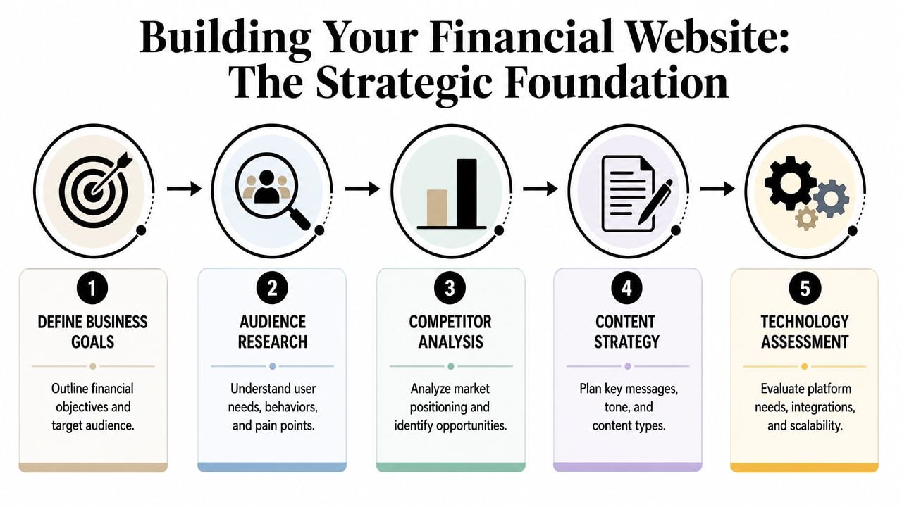
The most expensive mistake in a website project is starting with design references before defining what the site is supposed to do.
A financial website can serve very different jobs. One firm needs qualified leads for pension advice. Another needs a smoother route into mortgage enquiries. A third needs to support existing clients with secure document access, policy information, and contact pathways. If those priorities aren't ranked at the start, every later decision becomes harder.
Start with commercial goals, not page ideas
The first workshop should answer practical questions:
- Which audiences matter most: New prospects, existing clients, introducers, investors, or job applicants.
- Which actions matter most: Book a consultation, request a callback, download a guide, or contact a specialist.
- Which services drive the business: Wealth planning, insurance, lending, retirement advice, commercial finance, or something more niche.
- Which objections appear early: Fees, credentials, process, security, or uncertainty about suitability.
That work shapes everything. Navigation, content depth, page templates, forms, and tracking all depend on those answers.
A simple way to keep the project grounded is to define success in operational terms rather than vague language. “More leads” is weak. “Better quality enquiries for two priority services” is useful. “A clearer route for existing clients to find compliance documents” is useful too.
Practical rule: If the homepage has to speak equally to every audience, it usually serves none of them well.
Set scope before design starts
A lot of frustration comes from mismatched budget expectations. A standard financial services website in the UK with 10 to 15 pages, custom design, and CMS management typically costs between £15,000 and £35,000, while quotes under £3,000 usually indicate template-based solutions that miss essential compliance considerations, according to this UK financial website pricing guidance.
That range makes sense when you look at the actual work involved. Financial services sites often need careful content structure, compliance-aware forms, CMS controls, review rounds with multiple stakeholders, and testing across devices and browsers. Once gated documents, investor journeys, database integrations, or bespoke calculators are involved, complexity rises quickly.
Use a scope document early. It should set out:
| Project area | What to define early |
|---|---|
| Page inventory | Which pages are required for launch and which can wait |
| Content ownership | Who writes, edits, and approves regulated copy |
| Integrations | CRM, analytics, email systems, document libraries |
| Functional features | Forms, calculators, downloads, filtering, secure areas |
| Approval path | Who signs off brand, UX, legal, and compliance |
If you need a broader view of how structured planning works in adjacent sectors, this guide to professional services website design is a useful reference point.
A short explainer can help align internal teams before the actual work starts:
Put compliance into the workflow early
Leaving compliance until the end creates rewrites, delays, and awkward compromises. The site architecture, forms, disclosures, and content model should all reflect regulatory needs before visual design begins.
The best projects identify one person with regulatory responsibility and include them in milestone reviews. That matters because approval isn't just about wording on a page. It affects cookie consent, privacy notices, form language, marketing permissions, and how trust claims are presented.
In practice, that means decisions such as these should never be left vague:
- Form disclosures need clear privacy notices explaining where submitted data goes and who processes it.
- Cookie consent has to offer real choice and record user decisions.
- Marketing permissions need explicit consent. Pre-ticked boxes aren't acceptable under UK compliance standards in the verified guidance above.
- Document handling needs a process for updates, expiry, and ownership.
A strong strategy phase feels slower at the start. It saves time later because it prevents the familiar cycle of “design first, unravel later”.
Architecting for Trust and Usability
Visitors don't assess trust only by reading legal text. They judge it from structure, clarity, and how quickly they can understand where they are.
A confusing site map signals risk. In financial services, that reaction is stronger because the visitor is already cautious. They may be comparing providers, checking credentials, or trying to understand a service they don't buy often. If the website feels muddled, they assume the business may be too.
Structure is a trust signal
The architecture should follow the visitor's mental model, not the company's internal org chart.
That usually means grouping content by user need rather than department. “Retirement Planning”, “Mortgages”, or “Business Finance” are clearer than internal product labels. It also means giving legal and compliance material a visible home instead of hiding it in the footer and hoping nobody needs it.
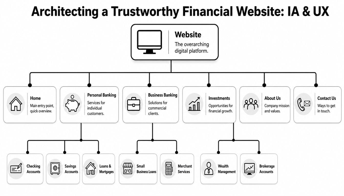
A good information architecture also reduces content duplication. If one service appears in three slightly different places with three slightly different descriptions, trust drops. Users notice inconsistency quickly, especially around eligibility, process, or fees.
For a deeper look at structuring content clearly, this overview of information architecture in web design gives a useful foundation.
What a clear financial site map usually includes
There isn't one universal sitemap, but strong financial services website design often includes these core areas:
- Homepage: Clear positioning, trust signals, primary services, and a direct next step.
- About section: Leadership, adviser profiles, credentials, values, and a plain explanation of who the firm helps.
- Service pages: One page per meaningful service line, written for client understanding rather than internal terminology.
- Compliance and legal pages: Privacy policy, cookie information, complaints procedure, disclosures, and terms where relevant.
- Resource hub: Articles, guides, FAQs, or market commentary that answers client questions.
- Contact pathways: General contact, office details, specialist enquiries, and forms with the right privacy wording.
If a visitor has to guess where to find your credentials, your complaints procedure, or your contact details, the structure is already working against you.
Mobile-first is no longer optional
In the UK financial services sector, over 60% of consumers now access websites via mobile devices, which makes responsive design a foundation rather than a nice extra, as noted in this analysis of financial services website design trends.
That changes how architecture should be tested. Don't review navigation only on a large desktop screen in a meeting room. Check what happens on a phone when the user wants to compare services, tap a number, read a disclosure, or complete a form with one hand.
A mobile-first structure tends to work better because it forces discipline. It removes bloated menus, vague labels, and oversized blocks of text. It also surfaces the trust signals that matter most. The same verified guidance notes that credibility is strengthened by certifications, partner logos, and client testimonials built into the architecture from the outset.
A practical mobile review should ask:
| Mobile question | Why it matters |
|---|---|
| Can a new visitor identify the firm's offer quickly? | Financial decisions often begin with short, cautious visits |
| Are service labels plain enough on a small screen? | Jargon becomes even harder to process on mobile |
| Are trust signals visible without hunting? | Users look for reassurance early |
| Do forms feel manageable? | Long, clumsy forms create drop-off |
When structure is clear, the site feels safer. That's not a visual trick. It's a usability decision.
Designing for Credibility and Conversion
Visual design in finance isn't there to entertain. It's there to reduce doubt.
That doesn't mean every firm needs to look the same. It means design choices need to support confidence. The fastest way to weaken that confidence is to chase trends that belong in fashion, media, or lifestyle brands rather than in services that handle sensitive data and serious decisions.
Visual restraint works better than visual noise
Most effective finance sites use a restrained palette, consistent spacing, strong contrast, and readable typography. The point is clarity. Visitors should notice the message, the people, and the next step before they notice decorative effects.
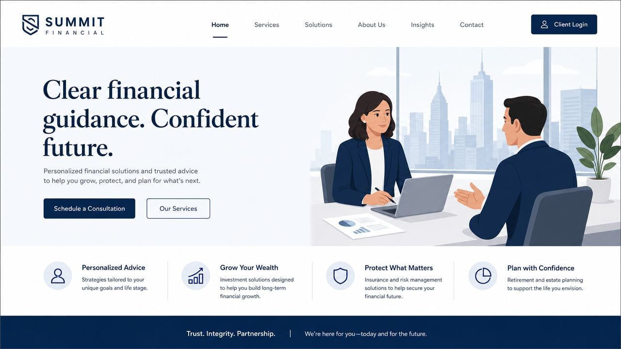
Typography deserves more attention than it usually gets. Financial content often involves detail. Fees, conditions, service descriptions, and process explanations all need to be easy to read. Sans-serif typefaces generally work well because they stay clean across screens and sizes. Body copy should feel calm and legible, not squeezed to fit more content above the fold.
Design also needs consistency between page types. If the homepage feels polished but the service pages look like a different site, visitors lose confidence. Repeated patterns help. Consistent CTA styling, card layouts, icon use, and spacing all signal care and competence.
What high-converting finance pages usually have in common
A conversion-focused page doesn't shout. It removes uncertainty in the right order.
This pattern works well on many financial pages:
- Clear headline first. State what the service is and who it helps.
- Short explanation next. Explain the offer without jargon.
- Proof close by. Use accreditations, testimonials, partner mentions, or team expertise.
- Process clarity. Show what happens after an enquiry.
- Focused CTA. Ask for one sensible next action.
That order matters because many firms rush to the form before earning trust. A “Book a Consultation” button is only effective when the visitor understands what they're booking, with whom, and why that step is safe and worthwhile.
A practical page audit often reveals common design mistakes:
- Competing CTAs: “Call now”, “Download guide”, “Read blog”, and “Request advice” all fighting for attention.
- Weak hierarchy: Important information buried under banners or decorative sections.
- Generic copy blocks: Text that could belong to any adviser, lender, or broker.
- Overdesigned forms: Fancy styling that makes completion harder, not easier.
If you want to assess whether your trust signals are convincing enough, reviewing strong web designer testimonials can help you see what credible proof looks like in practice.
The best-performing pages usually feel easier, not cleverer.
Imagery, proof, and the human layer
Stock imagery is one of the quickest tells that a site was assembled rather than considered. Generic handshakes, anonymous office shots, and staged family scenes don't say much about the actual firm.
Real photography usually does more work. Team portraits, office imagery, meeting environments, and candid service moments create recognition and accountability. For advisory businesses in particular, people often want to know who they'll be speaking to before they enquire.
Proof should be visible and specific. Useful examples include:
- Named advisers or team leads with short bios
- Professional memberships or certifications shown in context
- Client testimonials that sound natural and relevant
- Clear location details for firms serving a region or local market
The strongest design systems treat these as core components, not optional add-ons. A testimonial module, an adviser profile pattern, and a trust bar near primary CTAs all help carry credibility through the whole site.
Conversion improves when the page answers doubt before it asks for action. That's the design job.
Choosing Your Tech Stack and Ensuring Security
The technology behind the site needs to be boring in the best possible way. Stable. Maintainable. Secure. Fast enough that users don't notice it.
Many businesses either overcomplicate the stack or underspecify it. Both create problems. An overbuilt platform becomes expensive to manage. A cheap build with weak security and poor accessibility creates risk from the start.
CMS choices and their trade-offs
For many UK firms, WordPress is a sensible option because it offers flexible page management, a familiar editing environment, and a large ecosystem of plugins and developers. But it only works well when it's configured properly. Poor hosting, plugin overload, weak update discipline, and loose admin controls can turn a good CMS into a maintenance headache.
Other platforms may suit firms with specific needs, such as tightly managed enterprise workflows or bespoke application layers. The decision should come down to operational fit:
| Platform question | What to consider |
|---|---|
| Who will edit content? | Marketing teams usually need a manageable CMS, not developer-only workflows |
| How bespoke is the functionality? | Calculators, gated documents, portals, and integrations may change the recommendation |
| How important is flexibility? | Some systems are easier to customise, others are more locked down |
| What support model exists after launch? | A platform is only as good as the team maintaining it |
If your business is evaluating more specialist financial platforms or adjacent trading products, it can help to review how technical requirements differ in areas such as derivatives DEX development, where security, transaction handling, and product complexity create a very different build profile.
Security controls that belong in the build
Security shouldn't be treated as a plugin list added at the end. It starts with architecture and access.
A solid baseline for financial services website design includes SSL/TLS encryption across the site, Multi-Factor Authentication for admin access, and hosting that can handle the expected traffic and feature load. These choices are part of the build, not post-launch extras. If you need a practical reference point on encrypted website setup, this guide to SSL certificate installation is helpful.
Access control matters too. Limit who can publish. Separate admin roles from editor roles. Review dormant accounts. Keep plugins and themes current. Most website incidents come from ordinary operational gaps rather than dramatic attack scenarios.
A few decisions are worth making in writing:
- Who approves plugin installation
- Who owns update schedules
- Who receives alerts if a form fails
- Who checks backups and restore processes
- Who reviews third-party scripts before they're added
Accessibility and performance affect trust
A technically secure site can still fail users if it's slow, hard to read, or awkward to use.
Verified guidance on UK financial websites states that 88% of visitors are less likely to return after a bad experience, sites failing WCAG compliance face a 40% higher abandonment rate, and placing trust signals such as an FCA number above the fold is associated with a 35% increase in conversion, according to this UK financial website usability guidance.
Those are not separate concerns. Accessibility, performance, and trust work together. WCAG 2.1 AA compliance improves readability, keyboard use, contrast, and form usability. Faster page delivery improves first impressions and form completion. Visible trust details reduce hesitation.
A secure site that feels difficult still loses business.
Useful implementation checks include:
- Readable text: Body copy should be comfortable on mobile and desktop.
- Form validation: Error handling should be clear and immediate.
- Image handling: Compress assets and use sensible formats.
- Third-party restraint: Every tracking tag, widget, and script adds weight and risk.
- CDN support: Useful when your site serves users across locations and needs faster delivery.
Tech stack decisions aren't exciting to most clients. They matter anyway, because users feel the result long before they understand the cause.
Content Strategy and SEO Essentials
A financial website doesn't gain authority because it sounds formal. It gains authority because it answers important questions clearly and consistently.
Content strategy and SEO are often split into separate workstreams. That's a mistake. Search visibility improves when the site has well-structured pages that match user intent, and conversion improves when those same pages explain the service in language people understand.
Write for client questions, not internal jargon
The most useful content usually starts with sales calls, account manager conversations, and recurring client concerns. What do people ask before they commit? Where do they hesitate? Which terms confuse them? Which risks do they worry about?
Those questions should shape page topics, FAQs, downloadable resources, and article ideas.
A practical content plan often includes:
- Core service pages for each main offer
- Explainer articles that unpack common financial topics in plain English
- FAQ blocks that deal with eligibility, process, and timelines
- Supporting legal pages that help users understand rights, complaints, and privacy
Plain language matters more than many firms expect. Financial terminology can quickly become a barrier. If a sentence sounds like it was written for internal compliance review rather than public understanding, rewrite it.
Service pages should do real selling work
A service page shouldn't read like a summary slide. It needs enough substance to rank, reassure, and convert.
The strongest pages usually combine these ingredients:
| Page element | Why it matters |
|---|---|
| Clear service definition | Helps both users and search engines understand the page |
| Audience fit | Shows who the service is for |
| Problem-solution framing | Connects the offer to real needs |
| Process explanation | Reduces uncertainty about next steps |
| Trust components | Supports decision-making |
| Relevant CTA | Moves the visitor forward naturally |
Case studies can also help, but only if they're specific, truthful, and approved for use. If you don't have publishable case studies, don't fake them with vague success stories. A transparent explanation of your process is better than invented proof.
For firms building visibility in competitive niches, this guide to SEO for professional services firms is a strong companion resource.
SEO works best when structure and content support each other
Foundational SEO still matters. Strong title tags, useful meta descriptions, internal linking, heading hierarchy, image alt text, and indexable page architecture all support discoverability. But none of those basics can rescue weak content or muddled structure.
A healthy content and SEO workflow usually looks like this:
- Map search intent to actual services and user questions.
- Build dedicated pages instead of cramming multiple offers into one generic section.
- Link related content so users can move from broad topics to specific service pages.
- Use schema where relevant to help search engines interpret business and content details.
- Review content regularly so old references, staff changes, and outdated wording don't linger.
One of the biggest missed opportunities in financial services is thin content on high-value pages. Firms spend heavily on design and then give their most important service pages a few vague paragraphs. That weakens search performance and user confidence at the same time.
Good SEO in this sector isn't about publishing endless low-value blogs. It's about building a trustworthy, structured library of answers around the services you intend to sell.
The Pre-Launch Checklist and Beyond
The final weeks of a website project often create the most avoidable problems. Teams get tired, deadlines tighten, and people start treating launch as the finish line rather than the point where the site becomes public and accountable.
A disciplined pre-launch process protects the investment. It also protects the brand. Financial firms don't get much goodwill for broken forms, missing disclosures, or mobile issues on day one.
What to check before the site goes live
A reliable launch review should be explicit, not informal. Use a checklist and assign owners.
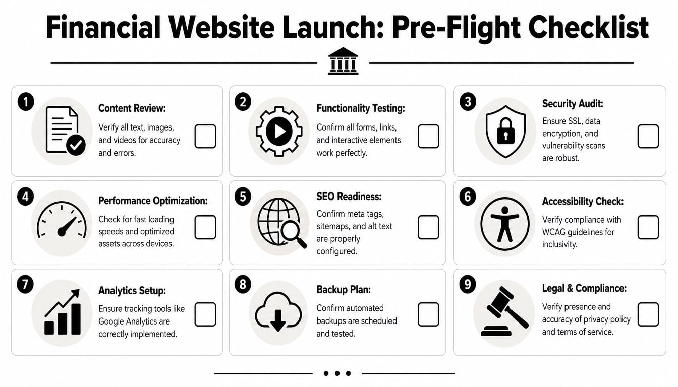
The essentials usually include:
- Content accuracy: Names, titles, service descriptions, legal wording, downloadable documents, and office details.
- Functional testing: Contact forms, CTA buttons, calculators, filters, downloads, cookie consent flows, and confirmation messages.
- Device review: Current iPhone and Android models, common laptop sizes, and at least the main modern browsers.
- Compliance approval: Final review by the designated regulatory owner, not just marketing or the web team.
- Tracking setup: Analytics, conversion events, and form submission tracking checked in a live-safe way.
A practical launch table can keep responsibility clear:
| Check area | Owner |
|---|---|
| Regulated wording and disclosures | Compliance lead |
| Service claims and positioning | Business owner or service lead |
| Technical performance and redirects | Developer |
| Tracking and reporting | Marketing lead or analyst |
| Final go-live approval | Named project sponsor |
Launch problems rarely come from one major failure. They usually come from five small checks nobody formally owned.
Launch day and the first few weeks after
Keep launch day controlled. Avoid adding fresh features, rewriting approved copy, or changing page layouts at the last minute. Small “quick fixes” often create new bugs.
The first post-launch period should focus on observation and correction:
- Check form submissions arrive in the right inbox or CRM path.
- Review analytics to confirm tracking is recording meaningful actions.
- Spot broken links and media issues that may have appeared during migration.
- Monitor user behaviour for signs of friction on key pages.
- Gather internal feedback from sales, compliance, and customer-facing teams.
It's also wise to review search indexing, sitemap submission, page titles, and robots instructions during this period. Technical mistakes here are common and easy to miss if everyone assumes the migration handled them perfectly.
Ongoing ownership keeps the site useful
A financial website isn't a one-off design file turned into code. It's an operational asset. That means it needs active ownership after launch.
At minimum, set a recurring rhythm for:
- Content reviews so service pages, people pages, and disclosures stay current
- Security maintenance including updates, access reviews, and backups
- UX improvements based on real user friction, not internal preference
- SEO upkeep so important pages remain visible and linked properly
- Compliance checks when services, wording, or data practices change
The strongest websites improve because someone keeps asking practical questions. Are the right enquiries coming in? Are users finding the right pages? Are disclosures still accurate? Are forms still easy to complete? That discipline is what keeps a launch from becoming another slow decline into outdated content and patchwork fixes.
If you need a site that balances compliance, usability, and conversion without turning the project into a drawn-out headache, DesignStack is a strong partner to speak with. Their team builds professional websites for UK businesses with clear project management, fixed-cost pricing, and practical post-launch support that helps new sites settle in properly.