Brand Identity and Positioning for SMBs: A Practical Guide
A Dorset accountant gets most new work through referrals. Clients trust the people who recommend them, but the website still looks like a 2009 template, the LinkedIn banner shows a stock city skyline, and the homepage could belong to any firm in the county. The logo suggests precision. The copy promises a commodity.
That mismatch creates familiar problems. Enquiries arrive from people looking for the cheapest option, good prospects can't tell why the firm is different, and staff explain the business in slightly different ways every time they speak to a new lead. The owner assumes the answer is a new logo. Usually, the logo is only the most visible symptom.
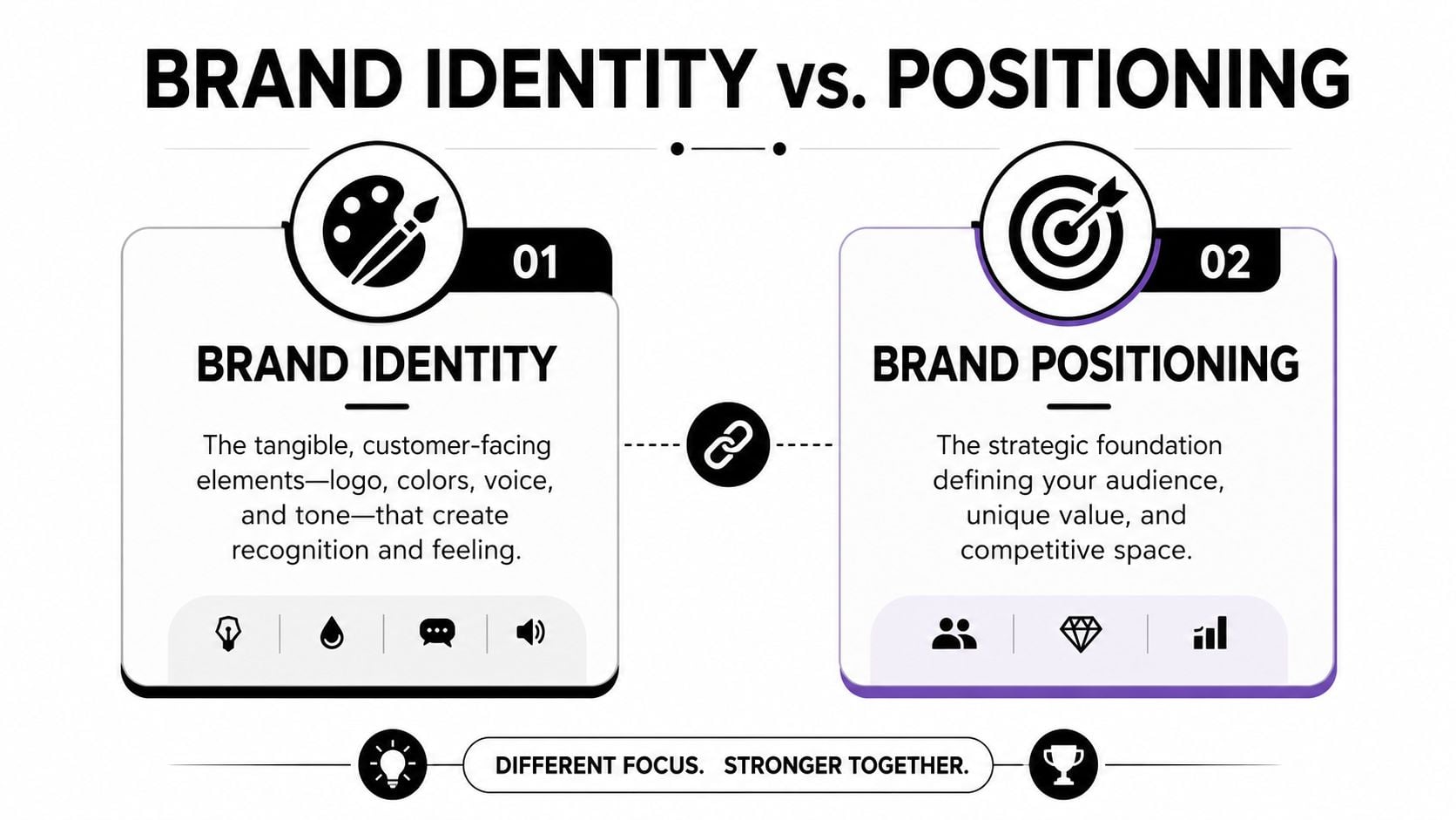
Brand identity and positioning work as two halves of one operating system. Positioning decides what the business should mean to a particular customer. Identity gives that meaning a recognisable shape in the logo, website, proposal, signage, social content, and sales conversation. Build them together, and the business becomes easier to recognise, understand, and choose.
Table of Contents
- When Your Logo and Your Story Disagree
- Brand Identity and Positioning Explained Simply
- Building a Positioning Statement That Actually Holds
- Turning Positioning Into a Visual Identity System
- Dorset Case Stories From Local Rebrands
- Common Mistakes UK SMBs Make With Branding
- A 90-Day Plan to Get Your Brand Working Harder
When Your Logo and Your Story Disagree
The first warning sign is rarely visual. Owners usually notice commercial symptoms before they diagnose a branding problem.
You may be getting enquiries, but not the enquiries you want. Prospects compare you with cheaper rivals because your website doesn't explain the value behind your price. Referral partners send work that sits outside your strengths because they can't describe your specialism clearly. Staff improvise their own pitch, so one person presents the firm as friendly and local while another describes it as technical and corporate.
Those inconsistencies make every conversation harder. A potential client forms an opinion before the first call, based on a Google result, a website page, a social profile, or a PDF proposal. If those touchpoints disagree, the prospect has to do the interpretation themselves. Most won't spend long working out what a small business is trying to say.
The real problem sits underneath the design
In many small firms, the visual identity and the verbal story were created in separate projects. A designer was asked for a logo, then a website supplier was asked to “make it look professional”. Nobody first agreed who the business serves, what problem it solves particularly well, or which alternatives it wants customers to reject.
That process produces attractive fragments rather than a usable system. The mark may look polished, but the homepage remains vague. The website may contain confident copy, but the social templates, email signatures, and proposals still use whatever someone found in an old folder.
Practical rule: If your team can't explain the business in the same plain sentence, don't start with colour palettes. Start with positioning.
Why the gap costs you
Trust can disappear before a buyer speaks to anyone. A dated, cluttered, or generic presentation makes a capable firm look less relevant, while inconsistent language forces every salesperson to rebuild confidence from scratch. Paid traffic then sends people into a customer journey that doesn't reinforce the promise that attracted them.
Referrals suffer too. A contact is more likely to recommend a business when they can describe its value without adding a long explanation. A clear position gives them the words. A coherent identity helps the referred prospect recognise the business when they land on the website.
Brand spending also has a wider economic role than many owners assume. A UK government-linked analysis estimated that around £16 billion was invested in creating and building brands, equal to 12% of all intangible investment, although this activity was historically under-recognised in official statistics because it was treated as intermediate consumption rather than investment. The same evidence base estimated £14 billion of branding was protected by trade marks and £126 billion of value by intellectual property rights, as reported in Campaign's analysis of the UK branding economy.
The practical conclusion is simple. Don't commission identity as decoration and positioning as a forgotten strategy document. Decide what you stand for, then express it consistently through design, copy, and daily behaviour.
Brand Identity and Positioning Explained Simply
Think of a business as a shop on a busy high street. Positioning is the decision about what kind of shop you are and why a particular customer should enter. Identity is the shopfront, sign, window display, language, and atmosphere that make that decision visible.
Positioning answers:
- Who is this for? A broad audience may sound safe, but it often produces bland language.
- What problem do we solve? Name the practical problem, not an empty benefit such as “excellent service”.
- Why should customers choose us? Expertise, locality, process, values, or proof become relevant.
- What alternatives are we competing with? The alternative may be a larger firm, a cheaper supplier, an internal team, or doing nothing.
Identity answers a different question: what does this business look and sound like when customers encounter it? It includes the logo, colour, typography, imagery, illustration, tone of voice, layouts, templates, and rules that hold those elements together.
Keep the two decisions connected
A positioning statement might say that a Dorset employment consultancy is the trusted, commercially minded adviser for independent hospitality employers dealing with complicated people issues. Identity then turns those qualities into choices. The firm might use direct language, warm but controlled photography, confident typography, and a visual system that feels local without relying on clichés.
The identity shouldn't invent a personality that the business can't deliver. A playful brand creates trouble if clients need calm, serious guidance. Likewise, a sharp positioning statement won't survive if every document uses a different logo, tone, or promise.
The Dorset accountant from the opening illustrates the difference. A new logo could improve recognition, but it can't decide whether the firm serves owner-managed businesses, property investors, contractors, or larger companies. Conversely, a strong focus on owner-managed firms will be weakened if the website still presents the business as a generic accountancy practice.
For a useful grounding in the visible and verbal components, see what brand identity design includes. Then treat identity as the expression of a strategic choice, not the choice itself. The next task is to turn that choice into language your team can defend and use.
Building a Positioning Statement That Actually Holds
A positioning statement shouldn't be a slogan. It should help an owner decide which work to pursue, which prospects to decline, what the website should say, and how a member of staff should describe the business without reaching for jargon.
Take a Bournemouth employment law consultancy that works with hospitality employers. Start with evidence from the business, not a workshop full of abstract adjectives.
Work from real commercial clues
-
Audit the last twenty enquiries. Record sector, organisation size, decision-maker, problem, source, outcome, and whether the work looked commercially worthwhile. Patterns often appear when you stop treating every enquiry as equal.
-
Speak to three strong clients and two lost prospects. Ask what prompted them to look, what alternatives they considered, which words they used to describe the problem, and what made the decision easier or harder. Customer language is more useful than internal claims such as “bespoke” or “solutions-led”.
-
Map the competitive field from Poole to Portsmouth. Review local firms, national advisers, specialist consultants, and the option of handling the issue internally. Look for a gap that the consultancy can credibly occupy, rather than a gap that merely sounds distinctive.
-
Define the customer narrowly. “Hospitality businesses” is a start. “Independent restaurant groups with growing teams, busy owners, and recurring employee issues who need practical advice before a dispute escalates” gives the team something to work with.
-
Write the statement using a fixed structure. Include the target customer, category, alternative, benefit, and proof. A useful companion resource is these actionable positioning tips, particularly when the first draft sounds more like advertising than strategy.
A workable template is:
For [specific customer], we are the [category] that helps them [valuable outcome] when compared with [main alternative], because [credible proof or reason to believe].
The Bournemouth consultancy might write:
For independent hospitality employers with growing teams, we are the practical employment adviser that helps owners handle people issues early and commercially, instead of relying on generic legal support or improvised internal decisions, because our advice is built around the realities of hospitality operations.
That statement isn't ready for a billboard. It is ready to challenge. Can the team defend “practical”? Can it show what “commercially” means? Does the business understand hospitality operations, or is it borrowing a sector label because it sounds useful?
Positioning becomes valuable when it changes behaviour. It should guide the unique value proposition, the service pages, the qualification questions, and the work the firm refuses. If it only appears in a presentation and never affects a decision, it isn't positioning. It's internal prose.
Turning Positioning Into a Visual Identity System
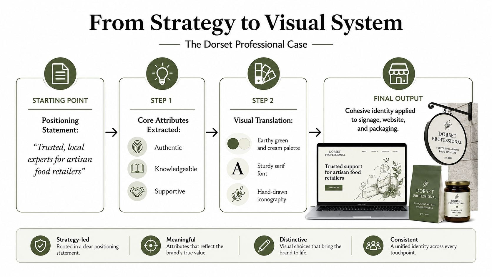
A strategy document doesn't change what customers see until someone translates it into repeatable choices. For the hospitality consultancy, words such as dependable, commercially minded, and regionally accessible need to influence every visible and verbal detail.
Start by extracting a small set of attributes. “Dependable” might lead to structured layouts, clear navigation, restrained typography, and proof placed where prospects need it. “Commercially minded” might mean headlines that describe business consequences rather than legal terminology. “Regionally accessible” could support real photography, plain English, and references to the working environments clients recognise.
Build the small system people will actually use
The core kit doesn't need to become a huge manual. It needs to answer practical questions quickly:
- Logo suite: primary mark, compact version, monochrome option, and rules for background use.
- Colour and type: named colours, accessible combinations, headline style, body text, and hierarchy.
- Imagery rules: what counts as credible photography, which stock imagery to avoid, and how images are cropped.
- Voice guidance: preferred words, banned clichés, sentence style, and examples for sales, service, and social posts.
- Templates: proposal, presentation, LinkedIn graphic, email signature, case study, and simple document layouts.
- Ownership: one named person checks the system, while everyone else has permission to use it without constant approval.
The same identity should flex rather than repeat mechanically. A website can use a strong headline and detailed service explanation. A proposal can lead with the client's situation and use the same type hierarchy. A LinkedIn post can be more conversational, but it should still sound like the same adviser. Signage may need the mark and contact detail at a distance, with less supporting copy.
For example, the consultancy could move from generic corporate blue-and-white pages saying “Professional legal services for your business” to a warmer system built around clear guidance for hospitality employers. The colour palette might retain a serious dark base but add a restrained regional accent. Photography could show real working environments rather than anonymous boardrooms. The copy could say, “Get a clear plan before a staffing problem disrupts service,” then explain the process and evidence behind the promise.
That is not decoration. It creates recognition through repeated decisions. If your team publishes regularly on LinkedIn but lacks the time to write and produce every asset, a specialist service such as BAMF's LinkedIn content support can handle production while your internal team retains the strategic direction. For the rules themselves, creating a usable style guide matters more than producing an impressive document nobody opens.
The studio's job is to make the system usable after handover. Templates, examples, and ownership will keep the identity alive longer than a beautifully bound brand book.
Dorset Case Stories From Local Rebrands
A joined-up rebrand changes more than the logo. It changes the questions a business asks, the leads it attracts, and the amount of explanation required before a prospect understands its value.
The Bournemouth accountant
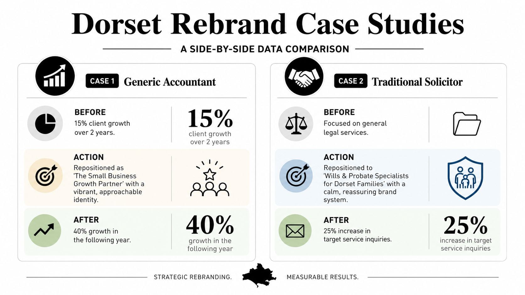
The first firm had a polished identity, but it was generic. Its website spoke to “businesses of all sizes”, its proposal led with a long company history, and its visual language looked similar to other professional services firms. The result was a steady stream of low-value enquiries and conversations that began with price.
The work started by repositioning the practice around clear advice for owner-managed businesses. The visual system became warmer without losing professional credibility. Website pages led with common decisions and pressures faced by owners, while proposal templates gave staff a consistent way to explain the firm's process, scope, and value.
The observable change wasn't a guaranteed revenue lift or a convenient headline percentage. It was better relevance. Enquiries became easier to qualify, sales conversations needed less repetition, and proposals gave prospects a clearer reason to choose the firm. The new system also made it easier for referral partners to describe whom the accountant helped.
The Dorset food producer
The second business made excellent products, but its packaging, trade-show materials, and social content looked as though different suppliers had created them at different times. The product quality suggested a premium, locally rooted position. The customer-facing identity suggested a collection of unrelated items.
The repositioning gave the producer a clearer place in the market. Photography, packaging layouts, tone of voice, and event materials were coordinated around provenance, quality, and the people behind the products. The business could then present the same story to a retailer, a market visitor, and an online customer without changing its character each time.
Retailer conversations became more focused because the producer could explain the range and its value more clearly. Campaigns took less production effort because the team had agreed imagery and copy rules. Customers had more consistent cues to remember across packaging and social content.
These examples show why a logo refresh alone rarely solves a commercial problem. A logo can mark the change, but positioning tells the business what to say and identity tells everyone how to repeat it.
Common Mistakes UK SMBs Make With Branding
Small firms rarely fail because they lack taste. They fail because branding decisions get made in the wrong order or without anyone owning the system.
The mistakes that create expensive rework
-
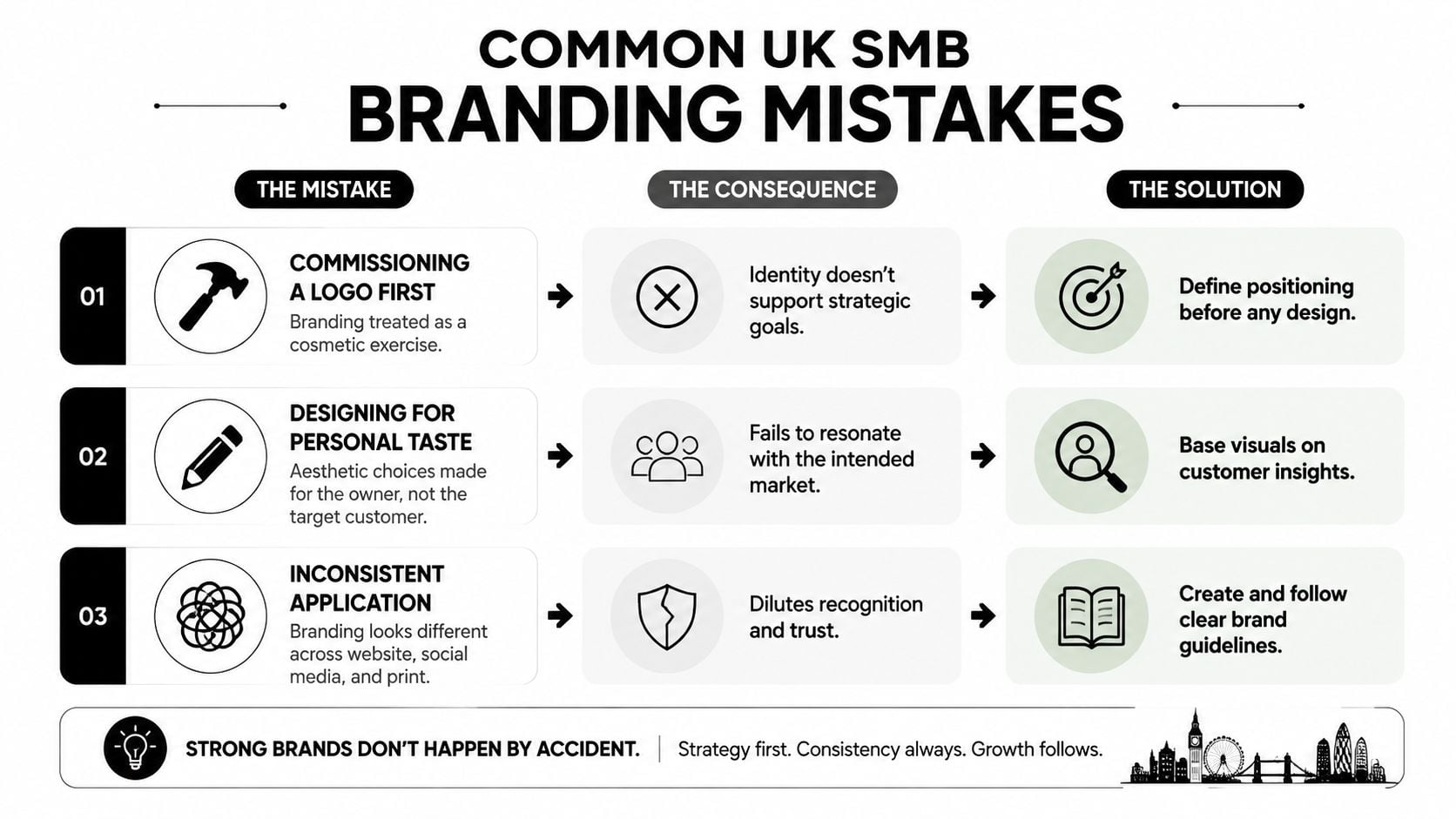
Commissioning a logo first: Without an agreed audience and competitive position, design becomes a preference exercise. The mark may be attractive, but it won't tell the website, sales team, or photographer what the business needs to communicate.
-
Designing for personal taste: Owners naturally judge colour, type, and imagery by what they like. Customers judge whether the business feels relevant, credible, clear, and easy to deal with. Those reactions may overlap, but they aren't the same test.
-
Copying nearby competitors: Borrowing the category's familiar colours and language can make a business look safe. It can also make it impossible to remember. Similar firms then compete on price because customers can't see a meaningful difference.
-
Changing the system campaign by campaign: A new accent colour for every promotion, a different typeface for every event, and inconsistent logos across documents gradually erase recognition. Staff also lose time deciding which version is current.
-
Filling the website with company history: Background matters, but customers first need to know whether you understand their problem, what happens next, and why they should trust the proposed approach.
-
Hiding the guidelines: A brand file buried in a shared drive isn't governance. People need templates, examples, and clear ownership when they create content under pressure.
UK consumer evidence makes the trust issue hard to dismiss. 46% of UK shoppers say they need to trust and connect with a brand before buying, while 32% say they trust brands less because of misinformation. In the same research, 31% named identity as a top-three brand quality, as reported in the UK consumer trust research.
Treat accessibility as part of the brand
Colour contrast, readable typography, clear buttons, sensible image alternatives, and mobile performance aren't separate from identity. They affect whether a customer can understand the offer and complete the next step. A brand that looks refined on a large desktop screen but becomes awkward on a phone has failed in a customer-facing moment.
UK SME research also found confusion between branding and marketing terminology, while limited resources made brand maintenance difficult during periods of change, according to research into branding practices among UK SMEs. The solution is not a larger document. It is a shorter set of rules that people can apply to web, print, and social content.
Use the practical recommendations in these branding tips for small businesses as a checklist, but keep the central test in view. Your identity should help the right customer recognise, understand, and choose you. It doesn't need to be the loudest identity in Dorset.
A 90-Day Plan to Get Your Brand Working Harder
You don't need to begin with a full rebrand. Start by finding the gap between what customers experience and what the business wants to be known for.
Days 1 to 30, collect the evidence
- Review recent enquiries: Note who contacted you, what they wanted, how they found you, and whether the work was a good fit.
- Read customer reviews: Copy the phrases customers use about your service, process, expertise, and outcomes.
- Audit competitor sites: Compare their audiences, promises, proof, language, visual cues, and calls to action.
- Gather existing material: Collect proposals, sales emails, social bios, brochures, screenshots, signage photos, and staff descriptions.
- Find the friction: Mark every place where the business sounds different, makes an unclear promise, or asks customers to guess what happens next.
Don't rush to name your values. Look for the profitable pattern and the language customers already understand.
Days 31 to 60, make the strategic choice
Draft a positioning statement using your best evidence. Test it with three target customers, asking what they think the business does, who it seems to serve, and what feels believable. Then ask staff to use the statement aloud in a sales conversation. Awkward phrases usually reveal themselves quickly.
Choose the position you can defend, deliver, and repeat. If you want a broader grounding in the wider process, use this guide to build a brand from scratch, but don't let a framework distract you from making a clear commercial decision.
Days 61 to 90, make it visible
Refine the logo only after the strategic direction is settled. Update the homepage, key service pages, social bios, email signatures, proposal templates, and essential print material. Create examples showing staff how the tone and visual system work in ordinary situations, not just in a presentation mock-up.
Bring in a studio when the business has more than one location, needs a genuine rebrand rather than a light refresh, or has sales pages converting below 2%. A half-day brand sprint is a sensible starting point for owners who want an experienced team to audit the evidence, sharpen the position, and turn the decision into a practical brief.
DesignStack helps Dorset and UK businesses align brand positioning with usable logos, websites, messaging, and visual identity systems that work across digital and print. Visit DesignStack to discuss a half-day brand sprint, a focused refresh, or a complete rebrand built around what your customers need to understand.