

Brand Identity Design Services: UK SME Guide 2026
You're probably in one of two places right now. Your business has grown, but your brand still looks like it belongs to an earlier version of the company. Or you've got a decent logo, a website that mostly works, a few social templates, and some printed bits, but none of it feels like it came from the same business.
That gap shows up fast. A van sign says one thing, your Instagram posts use different colours, your quote document looks generic, and the website feels more polished than the brochure. Customers might not complain about it directly, but they do notice the overall impression. In Dorset especially, where word of mouth and local reputation still matter, people make quick judgements from the small details.
A proper set of brand identity design services fixes that. Not by making things look fashionable for a few months, but by giving your business a usable system. One that works on a phone screen, on a shopfront, in a sales deck, and on the side of a vehicle heading through Weymouth or out towards Dorchester.
Table of Contents
- Why Your Brand Is More Than Just a Logo
- The Core Components of a Strong Brand Identity
- The Step-by-Step Brand Identity Design Process
- Business Benefits of Professional Branding Services
- How Are Brand Identity Services Priced
- Dorset Brand Success Stories
- Your Brand Identity Questions Answered
Why Your Brand Is More Than Just a Logo
A logo is one part of your identity. It is not the identity.
That distinction matters because most SMEs don't suffer from a “logo problem”. They suffer from a recognition problem, a consistency problem, or a trust problem. The logo gets blamed because it's the most visible part, but the underlying issue is usually the lack of a joined-up system.
In practice, your brand identity is what helps someone recognise your business when they move from your website to your packaging, from your social posts to your proposal PDF, or from your shop sign to your Google Business profile. If those touchpoints feel disconnected, the business feels less established than it really is.
The commercial side of this is often underestimated. The Design Council estimated that UK design-intensive industries generated £2.8 trillion in turnover in 2013, accounting for 7.2% of the nation's total, and by 2016, 74% of SMEs had an in-house designer or team, showing how embedded design had become in everyday business operations (Design Council figures referenced here).
A logo can't do every job
A single mark can't carry your pricing position, tone of voice, photography style, page layouts, ad templates, signage rules, and presentation style on its own.
That's why businesses often hit a ceiling with a logo-only approach. It might look fine on a business card, then fall apart on a website header, a roller banner, or a square social post. The result is patchwork branding. You keep paying for design, but each new item gets solved from scratch.
Practical rule: If every new leaflet, advert, social graphic, or web page starts with “What should this look like?”, you don't have a brand identity yet. You have isolated design assets.
For SMEs trying to build awareness consistently, it helps to look beyond visuals too. Useful thinking on repeat exposure, message consistency, and channel planning can be found in these ClipCreator.ai brand awareness strategies.
If you're tightening up your own foundations, these branding tips for small businesses are also worth a read.
The Core Components of a Strong Brand Identity
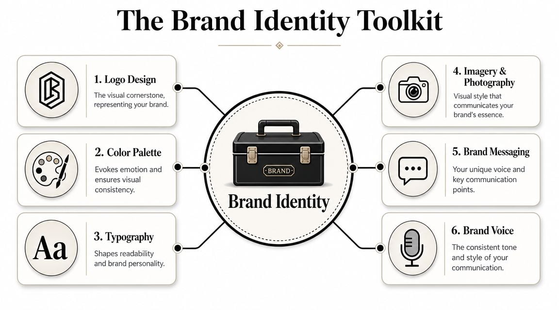
A good brand identity works like a toolkit. Not a mood board. Not a folder full of random design files. A toolkit gives your business usable parts that fit together properly.
What should be in the toolkit
Start with the logo suite. That usually means more than one version. You may need a primary logo, a simplified version, a stacked version, a favicon or icon mark, and reversed options for dark backgrounds. One file won't cover every use case.
Then there's colour. A practical colour palette isn't just “blue and green because they look nice together”. It needs primary colours, supporting tones, and clear rules for contrast and hierarchy. If your colours don't work on screen and in print, the brand won't stay consistent. Here, understanding colour psychology in branding becomes useful, especially when your visual choices need to support a specific market position.
Typography often gets overlooked by smaller firms, but it shapes how professional the business feels. Fonts affect readability, hierarchy, and tone. A heritage hospitality brand, a construction firm, and a modern eCommerce retailer shouldn't all sound the same typographically.
You'll also need a defined imagery and photography style. That can include guidance on product shots, team photos, textures, illustration style, iconography, and image treatment. If one photo feels polished and the next looks like a rushed phone snap, the whole brand starts wobbling.
Finally, there's messaging and brand voice. This element defines how the business speaks. Formal or conversational. Straight-talking or more expressive. Local and human or polished and corporate. Without that layer, the visuals may look coherent while the words still feel all over the place.
For broader inspiration and current thinking, these latest branding tips are a helpful extra read.
Why guidelines matter
A robust identity system should be built for consistency at scale and include a logo suite, typography rules, colour specifications, and photography style, all governed by brand guidelines. Those guidelines should cover both digital and print usage because font legibility and colour fidelity behave differently across media (guidance referenced here).
That sounds technical, but the day-to-day value is simple. It stops drift.
Without guidelines, each supplier improvises. The printer tweaks colours. The social media freelancer uses a similar font, but not the right one. The in-house team stretches the logo to fit a Facebook banner. A year later, the brand has effectively split into five versions of itself.
- Logo rules: Show spacing, minimum sizes, background control, and what not to do.
- Type rules: Specify heading fonts, body fonts, weights, and fallback choices.
- Colour specs: Include values for screen and print so materials stay close in appearance.
- Image direction: Set a recognisable visual tone for photography, graphics, and icons.
- Application examples: Demonstrate the identity on real assets, not just isolated swatches and logo pages.
Brand identity design services are strongest when they give your team a system you can actually use on a busy Tuesday, not just something that looks good in a presentation.
The Step-by-Step Brand Identity Design Process
Brand identity work goes wrong when the design starts too early.
A business owner asks for a new logo. The designer sends three options. Everyone picks the one they “like best”. Then the project stalls because nobody has agreed what the business is trying to signal in the first place. Premium or accessible. Local favourite or national challenger. Friendly or authoritative.
A better process is more structured.
Discovery before design
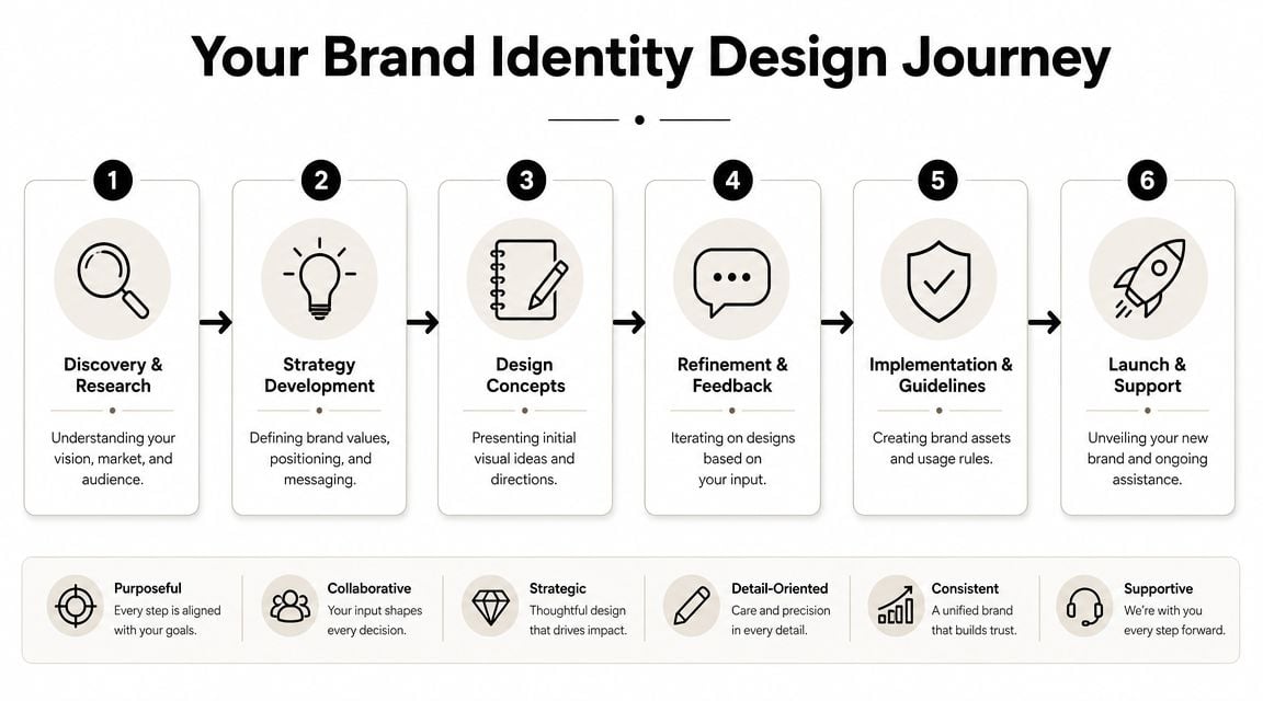
Most solid brand identity design services begin with discovery, competitive review, and audience insight. That stage is where you gather the raw material that stops the project becoming subjective.
A useful brief helps here. If you haven't written one before, this guide on how to write a design brief will make the early conversations far more productive.
Discovery usually covers things like:
Business direction
Where the company is heading, what's changed, and what the new identity needs to support.Audience understanding
Who you want to attract, what they care about, and what would put them off.Competitor patterns
What your sector already looks like, and where blending in would hurt you.Brand strategy
Positioning, values, tone, personality, and the practical role the brand needs to play.
A full brand identity project commonly takes 8 to 12 weeks, including roughly 2 to 3 weeks for discovery and research, 1 to 2 weeks for strategy, and 3 to 4 weeks for creative development and refinement before rollout planning (project timeline reference).
That timescale is useful because it sets a realistic expectation. Proper identity work isn't a quick logo job. It needs enough time for thinking, testing, and decision-making.
From concepts to rollout
Once strategy is clear, visual concepts become easier to judge. You're no longer asking, “Do I like this?” You're asking, “Does this represent the business we're building?”
That shift saves a lot of wasted revision rounds.
After concept development, the process should move into refinement, asset creation, and guideline building. That includes logo files, font recommendations or licences, colour specs, templates, image direction, and rollout examples.
If launch content matters, some firms also pair identity work with motion or short-form brand content. For teams producing visual assets in-house, a studio-quality video app can help keep output cleaner during rollout.
The strongest projects don't end at logo approval. They end when the business knows how to use the identity consistently across the channels that actually matter.
Business Benefits of Professional Branding Services
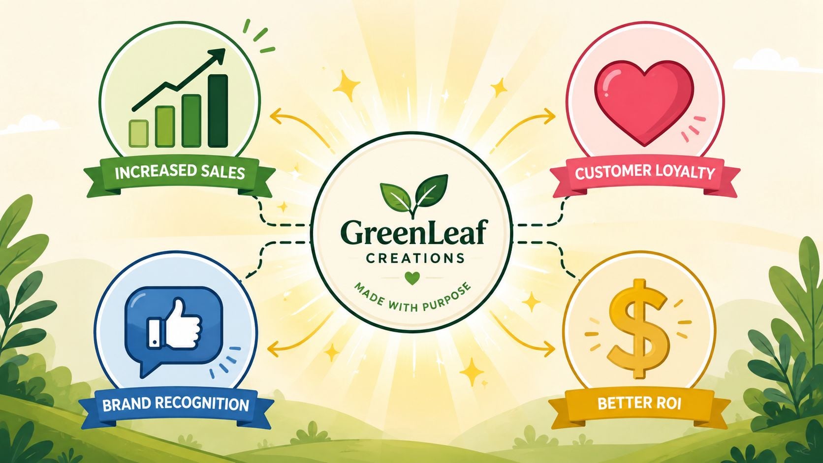
Most SME owners don't buy branding because they want a prettier logo. They buy it because the current setup is costing them confidence, clarity, or time.
Trust shows up in buying decisions
In 2024, around 94% of adults in Great Britain used the internet almost every day, which means most brand touchpoints are now online first (UK digital usage reference).
That changes the standard your brand has to meet. Your website, social posts, paid ads, email headers, and downloadable PDFs aren't side materials anymore. For many buyers, they are the first impression and the trust test.
If your branding feels joined up, customers assume the business is organised. If the website looks sharp but the brochure looks dated, or the ad looks modern but the landing page doesn't match it, confidence drops. People may still enquire, but they'll do it with more hesitation and more price sensitivity.
This matters even more in crowded local sectors. Think estate services, hospitality, trades, health and wellbeing, retail, or food brands around Dorset's coastal towns. Buyers often compare several businesses quickly. A clear visual identity helps them remember who you are and what kind of company you appear to be.
Consistency saves effort
The second benefit is operational. Good branding reduces friction inside the business.
When templates, styles, colours, and messaging are already defined, your team doesn't have to reinvent every flyer, pitch deck, or social post. Suppliers work faster too, because they aren't guessing your standards from an old JPEG logo and a screenshot from the website.
That matters for growing SMEs. Once marketing output increases, inconsistency becomes expensive in time if not always obvious in cash. A proper identity system gives structure.
- Sales teams work faster: Proposals and presentations can be assembled without starting from a blank page.
- Marketing gets cleaner: Ads, landing pages, and social assets look related, which improves overall coherence.
- Recruitment improves: Job adverts and careers pages feel more credible when the business presents itself clearly.
- Print stops becoming a headache: Signage, menus, packaging, and exhibition materials follow the same rules.
Professional branding services don't remove the need for good marketing. They make good marketing easier to produce and easier to recognise.
How Are Brand Identity Services Priced
Pricing varies because the scope varies. A simple logo update for a very small business is a different job from a full identity system with strategy, guidelines, templates, and rollout support.
That's why price conversations can feel confusing. Two agencies may both say “branding”, while one is quoting for visuals only and the other is quoting for strategy, design, implementation planning, and asset creation.
What you're actually paying for
You're not only paying for artwork. You're paying for judgement, process, and the reduction of expensive guesswork.
A cheaper provider may give you a logo quickly. That can be enough if your business is brand new, your offer is still evolving, and you only need a basic starting point. But if you already have multiple channels, staff, printed materials, or an established customer base, a logo-only route usually creates extra work later.
For businesses comparing options, this guide to brand identity cost helps break down what tends to affect pricing.
A more complete project typically includes:
- Research and strategy work: The thinking that shapes the direction before visuals start.
- Concept development: Exploring routes, not just drawing one mark and hoping it sticks.
- Asset creation: Logo suite, colour system, font choices, layouts, and practical files.
- Guidelines: Usage rules that help internal teams and suppliers stay consistent.
- Rollout input: Help applying the identity to web, print, signage, social, or packaging.
One practical option in the Dorset market is DesignStack, which offers branding and logo work alongside websites and graphic design on a fixed-cost basis. That model suits businesses that want scope clarity before the project begins.
Comparing Brand Identity Pricing Models
| Model | Best For | Pros | Cons |
|---|---|---|---|
| Fixed-cost project | SMEs with a defined brief and clear deliverables | Budget clarity, agreed scope, easier approval process | Can require change requests if the brief shifts mid-project |
| Hourly rate | Smaller tasks, consultancy, or evolving projects | Flexible, useful when scope is uncertain | Harder to predict final cost, can drift without tight management |
| Monthly retainer | Businesses needing ongoing brand support | Steady access to design input, useful for rollout and campaigns | Less suitable if you only need a one-off identity project |
The right model depends on what problem you're solving. If you need a full identity built from the ground up, fixed-cost usually makes the most sense. If the identity already exists and you need ongoing adaptation, a retainer may fit better.
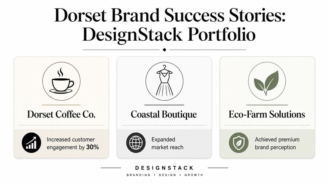
Dorset Brand Success Stories
Local businesses rarely ask for a rebrand just because they're bored of the old look. Usually, they've hit a practical issue. The business has grown up, the market has shifted, or the existing branding no longer reflects the standard of the service.
The kind of change local firms usually need
A hospitality business like The Lobster Pot faces a common challenge. The experience on site may be warm, established, and memorable, but the brand materials can lag behind. Menus, signage, social graphics, and web visuals often build up over time rather than being planned together. A stronger identity helps pull those touchpoints into one recognisable style.
For a membership organisation such as the Weymouth & Portland Chamber of Commerce, the pressure is different. The brand has to speak to multiple groups at once. Members, local partners, sponsors, event attendees, and the wider business community. In those cases, clarity matters as much as personality. The identity needs to feel credible, local, and organised without becoming stiff.
A fitness brand like Crossfit Durnovaria has another job again. Energy, discipline, and community all need to come through quickly. If the visual identity feels generic, the business risks looking like just another gym rather than a specific training environment with its own culture.
Local brands don't need to look “big city” to work well. They need to look deliberate, consistent, and right for the audience they serve.
What better branding changes day to day
The ultimate payoff is usually practical.
A business with a clear identity can brief printers faster, onboard a freelance marketer more easily, and keep social content from drifting off-brand. Staff know which files to use. Signage looks related to the website. Printed material doesn't feel like it came from another company altogether.
That's often what Dorset SME owners want most. Not branding for its own sake. A more coherent business presence that matches the service they already deliver.
In local markets, that matters because people often encounter your brand in fragments. A social post today. A shop sign next week. A recommendation from a friend. A website visit later that evening. When those fragments feel connected, the business feels more established.
Your Brand Identity Questions Answered
Do I need a full rebrand or just a new logo
If the business strategy, audience, offer, and tone still make sense, a logo refresh may be enough.
If you've changed direction, expanded services, moved upmarket, merged offers, or keep finding that every channel looks disconnected, you probably need a fuller identity system. That matters because 39% of smaller UK businesses expected to invest in digital marketing in 2024, and many are spending on outward-facing activity before clarifying brand strategy first (UK SME investment context).
A useful next step is reviewing examples of brand identity companies so you can compare the difference between logo-first and strategy-led approaches.
What should I prepare before speaking to an agency
Bring the practical stuff, not just opinions.
That usually means your current logo files, website, sales materials, social links, competitor examples, and a clear summary of what's changed in the business. It also helps to note where the existing branding causes friction. For example, poor readability, inconsistent colours, weak packaging, or no templates for proposals and social posts.
If several people are involved in approval, make that clear early. Brand projects slow down when decision-making is vague.
What happens after the files are delivered
Many businesses often stumble. They receive the assets, save them to a folder, yet continue using the old materials because the handover has not been properly planned.
A smooth transition usually includes updating the website, social profiles, proposal templates, signage, email signatures, sales documents, and any core printed items. You don't have to replace everything on day one, but you do need a rollout order.
Start with the touchpoints customers see most often. Website, social presence, proposals, and core print materials usually come first.
The aim isn't instant perfection. It's controlled consistency.
If your current brand feels patched together, or your business has outgrown the identity it started with, DesignStack can help you define what needs changing and what doesn't. As a Dorset-based agency working across branding, websites, and graphic design, the team handles brand identity projects with practical rollout in mind, so the final system works online, in print, and in the day-to-day reality of running an SME.

Leave a Reply