Service Page Design: 7 UK Conversion Tips for 2026
Your service page is probably doing its most important work when you're nowhere near your laptop. A potential customer finds it after a local search, checks whether you offer the right service, looks for evidence that you're credible, and decides whether contacting you feels worth the effort. If the page only says what you do and provides a phone number, it leaves too much of that decision to guesswork.
Good service page design turns that quiet sales conversation into a clear, measurable journey. The page should identify the visitor's need, explain your offer, reduce uncertainty, provide proof, and make one next step obvious. It should also work for people using a keyboard, a screen reader, a slow mobile connection, or a desktop browser during the working day.
Table of Contents
- What a Service Page Is Really For
- The Section Order That Earns Trust
- Writing Copy That Sounds Like a Human
- CTAs That Earn the Click
- Designing for Mobile Without Forgetting Desktop
- Accessibility as a Conversion Method
- Launch Checklist and What to Measure Next
What a Service Page Is Really For
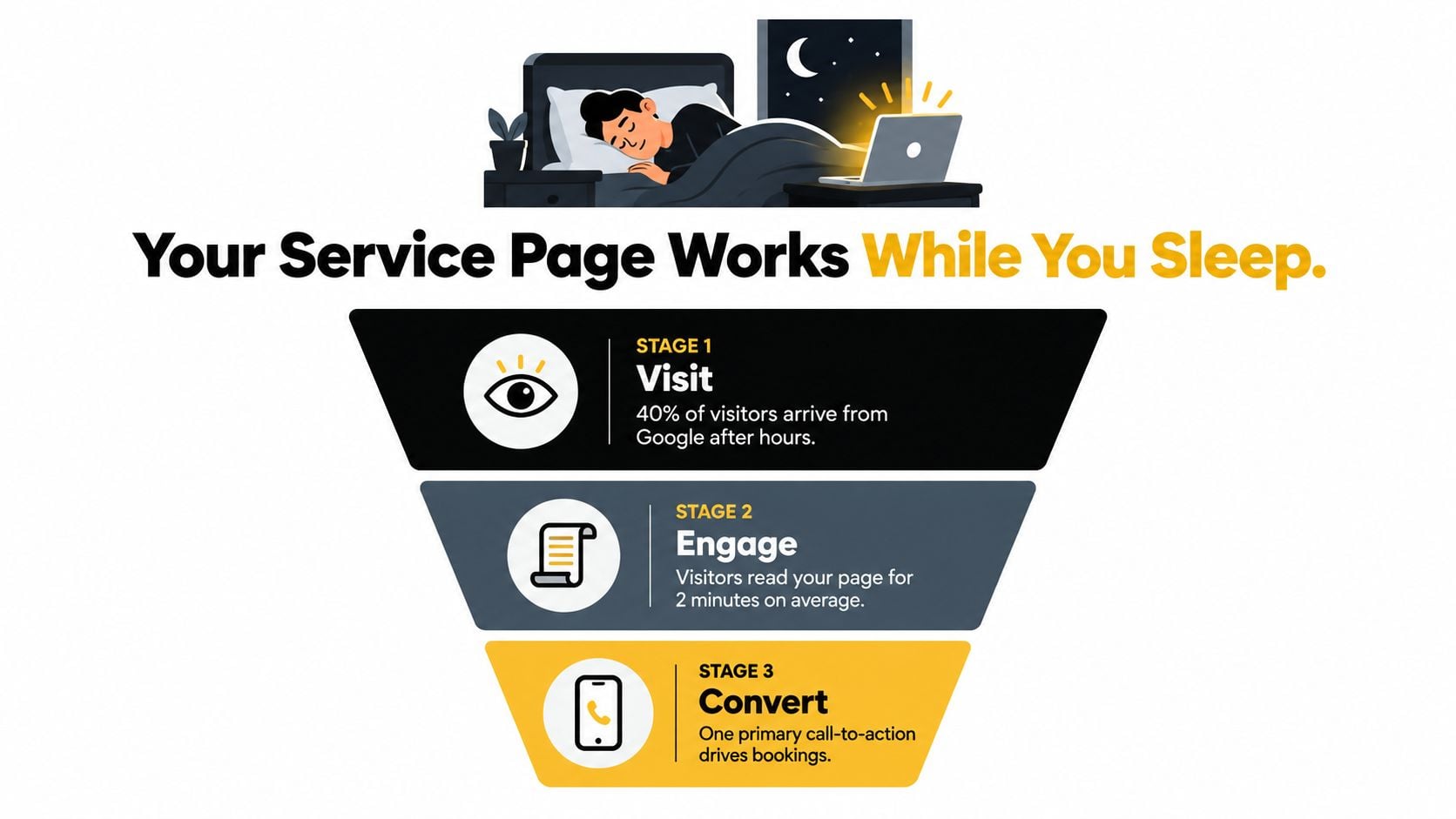
A service page isn't a spare room for copy you couldn't fit on the homepage. It's the page a visitor reaches when they're already considering a particular solution, such as bookkeeping, outdoor installation, plumbing, branding, or membership support. Its job is to help that person decide whether your service is relevant and whether you're a safe choice.
Start with one primary conversion. Choose a call, an enquiry form submission, or a quotation request, not all three as equal priorities. You can still offer an alternative route, but the page needs a clear main action so the layout, copy, tracking and design all support the same outcome.
The first screen has five jobs:
- Identify the service. Use a descriptive H1 that says what you provide and, where useful, where or for whom you provide it.
- Name the outcome. Explain the practical result, not an abstract promise.
- Signal relevance. Tell the right visitor they're in the right place.
- Offer evidence. Use a review, qualification, project image, client logo or specific detail that supports the claim.
- Show the next step. Make the primary CTA visible without forcing people to hunt.
UK research into the Office for National Statistics website found that only 20% of users scrolled through at least one-quarter of a statistical bulletin, while 53% left immediately, demonstrating how quickly visitors judge relevance before reading (UK Government Analysis Function accessibility guidance). A service page therefore needs to earn attention before it asks for it.
The page isn't your homepage, which introduces the wider business. It isn't your About page, which builds personal or organisational context. It isn't a blog post, which answers a question in depth. It's a focused sales and qualification page. For a useful example of how a specialist offer can be made explicit, compare the structure of Prescott landscape design-build services, where the visitor can quickly understand the type of work being offered.
Practical rule: Before writing the page, complete this sentence: “After reading this page, I want the visitor to…”
Then list the objections that could prevent that action. They might include price, service area, timescale, process, suitability, qualifications or what happens after the form is submitted. Your page doesn't need to answer every possible question, but it should answer the questions that repeatedly delay enquiries. For broader search and conversion planning, the SEO for service businesses guide provides a useful companion to this page-level approach.
The Section Order That Earns Trust
A strong page leads the reader from recognition to confidence, then from confidence to action. The sequence matters because visitors don't arrive with equal patience. Some scan the opening screen, some look for proof, and only engaged readers reach the detailed process and FAQs.
Use one clear idea per section. A page builder can then turn the structure into reusable blocks without making the visitor decode a dense wall of information.
Start with relevance
Use one descriptive H1, a short promise and a primary CTA. “Domestic bookkeeping for Dorset small businesses” is more useful than “Financial solutions for modern businesses”. The first version identifies the service and audience. The second could describe almost anything.
Follow the opening with a short explanation of who the service suits, what it includes and what makes the next step worthwhile. Don't cram every benefit into the hero. Visitors first need context, then reasons to trust you.
Prove the claim before expanding the detail
Place the most credible proof early. That might be a relevant testimonial, a project photograph, a named qualification, a service area, or a concise result that can be verified. Avoid placing generic praise in a prominent position if a more specific piece of evidence is available lower down the page.
Next, explain what the customer receives. Use plain labels, short paragraphs and meaningful subheadings. If the service has packages, distinguish them clearly. If each project is different, explain the factors that shape the scope instead of hiding behind “bespoke solutions”.
Make the process and qualification visible
A short process section reduces uncertainty. Explain what happens after contact, how you assess the request, what the customer needs to provide and when they can expect a response. Include pricing or qualification signals where appropriate. A starting price, a typical scope or a clear statement that quotations depend on a site visit can save both sides an unproductive conversation.
| Section | Reader job | Include | Skip if |
|---|---|---|---|
| Hero | Confirm relevance | Descriptive H1, promise, primary CTA | Decorative slogan with no service detail |
| Audience and outcome | Recognise the fit | Who it helps and what changes | Broad claims aimed at everyone |
| Proof | Assess credibility | Reviews, work samples, credentials | Unverified superlatives |
| What's included | Understand the offer | Deliverables, boundaries, exclusions | Vague “complete solutions” language |
| Process | Reduce uncertainty | Clear stages from enquiry to delivery | Internal jargon |
| Pricing or qualification | Decide whether to continue | Starting point, variables or requirements | “Contact us for everything” |
| FAQs | Resolve hesitation | Service-specific objections | Questions already answered elsewhere |
| Final enquiry block | Take action | Form, phone route and expectations | Multiple competing primary buttons |
Finish with service-specific FAQs and a final enquiry block. The FAQ shouldn't be a generic collection copied across the site. Answer the questions that arise for this service, including minimum project size, location, timing, preparation and what happens after submission.
The reusable structure is simple: relevance, outcome, proof, scope, process, qualification, objections and action. You can adapt it for a retailer, professional practice, community organisation or local contractor without turning every page into the same template.
Writing Copy That Sounds Like a Human
Visitors don't trust a service page because it contains polished adjectives. They trust it when the language helps them understand what will happen, what they'll receive and whether the business understands their situation.
Replace claims with details a buyer can check. “We deliver excellence” says nothing useful. “We reconcile your monthly accounts, flag unusual transactions and send a clear summary before your submission deadline” describes work the customer can recognise. “Reliable plumbing solutions” is weak. “We diagnose leaks, explain the repair options and leave the work area tidy” is clearer.
A few practical rewrites show the difference:
- Bookkeeping: “Supporting your financial journey” becomes “Monthly bookkeeping for small businesses that need accurate records without employing an in-house bookkeeper.”
- Plumbing: “Your trusted plumbing experts” becomes “Repairs for leaks, blocked drains and faulty taps in occupied homes across Weymouth and nearby areas.”
- Design retainers: “Creative solutions that elevate your brand” becomes “A monthly design service for marketing teams that need regular graphics without recruiting another designer.”
- Membership organisations: “Bringing the community together” becomes “Join local events, access member resources and get practical support from people working in the same sector.”
Use subheadings as questions visitors ask: Is this service right for my business? What does the first appointment involve? How much preparation do I need? What happens after I enquire? Those headings are easier to scan than abstract labels such as “Our approach” or “Added value”.
Plain English also protects performance. Google's mobile research reports that 53% of users leave when a page takes longer than three seconds to load, while bounce rates approach 60% after nine seconds (Google mobile site speed research). Heavy copy, oversized images, unnecessary animation and bloated page-builder components all compete for attention and loading time.
A practical editing pass
First, cut the opening sentence of each section. Businesses often spend those first words warming up instead of helping. Keep the sentence only if removing it makes the meaning less clear.
Next, replace nouns with verbs. “The provision of support for members” becomes “We support members”. “Implementation of a new identity” becomes “We create and launch a new identity”.
Finally, read the page aloud. Mark any sentence you wouldn't say to a customer. Check UK spelling, remove unnecessary Americanisms, and ask someone outside the business to explain what they think the service includes. The guide to writing website copy offers further practical direction, but your own customer conversations remain the best source of natural language.
CTAs That Earn the Click
A service page usually becomes less persuasive when every possible contact route receives equal visual weight. “Call now”, “Email us”, “Live chat” and “Book online” may all be useful, but four competing prompts make the visitor choose the journey before they understand the offer.
Choose one primary action. A local emergency service may use Call for immediate help. A design studio might use Request a project quote. A consultant could use Arrange an initial conversation. The wording should describe what happens next, not merely repeat “Submit”.
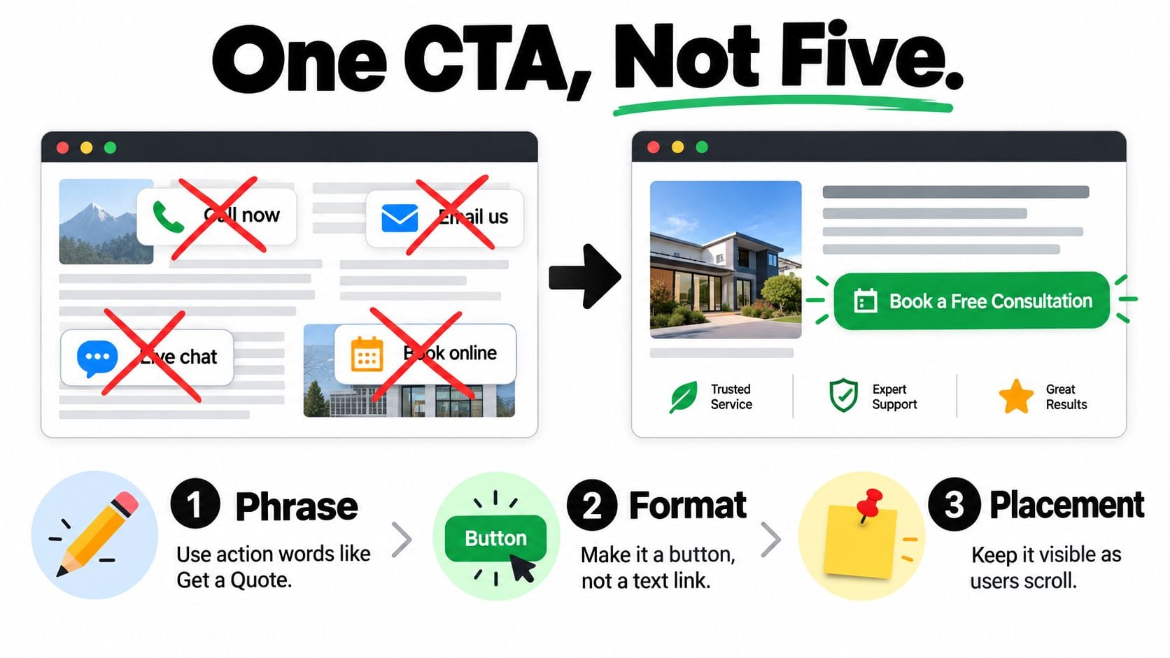
Make the primary action a button when it starts a meaningful journey, such as opening an enquiry form or booking process. Use a text link for secondary information, such as “See recent projects” or “Read our accessibility statement”. The distinction helps the visitor understand which action moves them towards contact and which action supports research.
Place the CTA in the hero, after the first substantial proof point, and in the final enquiry block. A sticky mobile action can work for a phone-led service, but it mustn't cover content, obscure focus indicators or make the page feel like an advertisement. Desktop users may need more context before they act, so keep the CTA visible without interrupting reading.
The primary CTA should be the easiest action for the business to fulfil and the clearest action for the visitor to understand.
Use a secondary route for people who aren't ready. That might be a short service guide, a portfolio link, a downloadable specification or a phone number for questions. Style it as a fallback rather than a rival. If the primary action is “Request a quote”, the secondary action could be “View recent work”.
The testing sequence can stay manageable:
- Test the verb. Compare “Request a quote” with “Get a project estimate”.
- Test the promise. Make the next step more explicit, such as “Request a quote and we'll review your requirements”.
- Test the position. Compare hero placement, post-proof placement and a persistent mobile action.
- Measure the completed enquiry. A click isn't the commercial outcome if the form is abandoned or the phone call never connects.
Track the primary conversion separately from secondary clicks. The explanation of what a call to action is can help teams agree on the role of each prompt before changing the design.
Review one change at a time where possible. If you change the wording, form length and page position together, you won't know what caused the result. Keep the language aligned with the actual conversation that follows. A button promising a quick answer creates a poor experience if the business takes several working days to respond.
Designing for Mobile Without Forgetting Desktop
Responsive design makes a page fit different screens. Mobile optimisation makes the decision easier on a small screen. Those are related, but they aren't the same task.
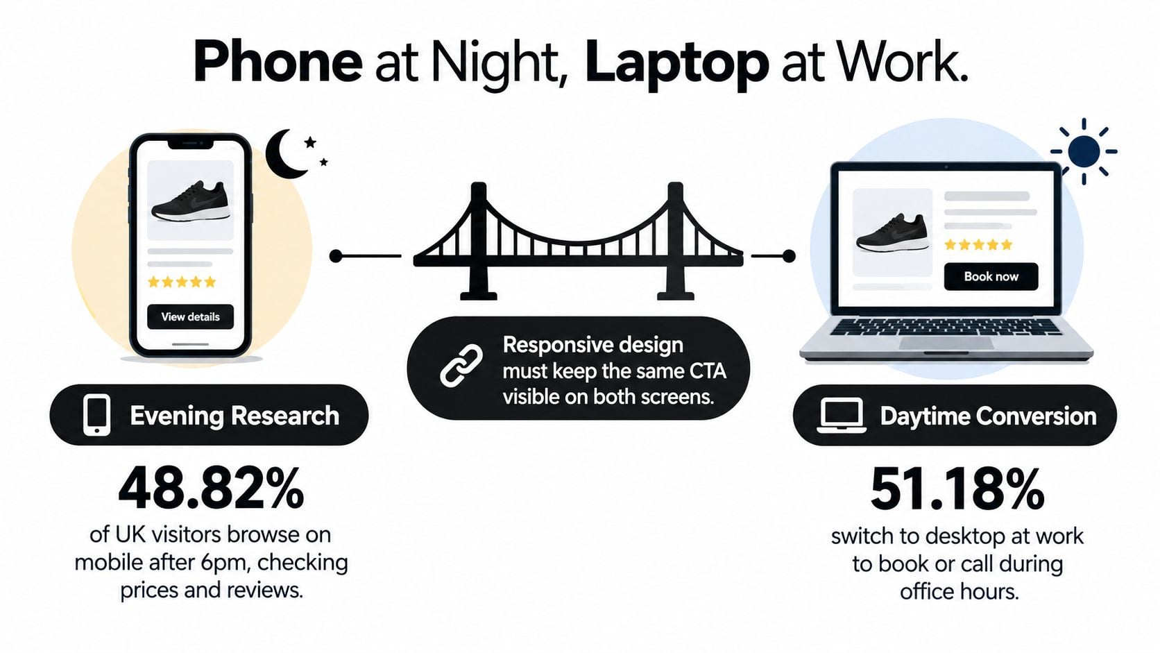
A 2025 UK dataset recorded web usage at 48.82% mobile and 46.76% desktop, while reported conversion was 1.82% on mobile compared with 3.90% on desktop (UK mobile optimisation dataset). The figures suggest a practical tension for service businesses. Mobile visitors may form an early view of the business, compare providers and save the page, while desktop visitors may complete a considered enquiry later.
That doesn't mean mobile visitors aren't valuable. It means the page needs to support different stages of the same decision rather than forcing one device to carry the whole sales journey.
Put decision support above the mobile fold
A mobile visitor should be able to answer four questions quickly:
- What is this service? Use a concise heading and an opening sentence that names the audience or problem.
- Is it relevant to me? State the service area, customer type or project type.
- Can I trust this business? Show a compact proof point, review or relevant image.
- What can I do now? Provide a tap-to-call action or a short enquiry route.
A starting price or pricing logic can also help, particularly where visitors need to decide whether the service is within reach. Don't hide every commercial signal behind a form just because the final quote varies. Explain what affects the price and what the first conversation covers.
Move supporting detail lower when it doesn't help the first decision. Long process explanations, extensive project galleries and secondary background information can remain available without dominating the first screen. Keep the important evidence scannable, with readable type, generous tap targets and no horizontal scrolling.
Preserve detail for desktop decision-makers
Desktop users can compare sections more comfortably, inspect project images and complete longer forms. Give them useful depth, not a stripped-back mobile page stretched across a larger canvas. A professional services buyer may need scope, exclusions, credentials and process detail before submitting an enquiry.
Cross-device continuity matters. Keep the service name, proof, pricing explanation and primary CTA consistent so someone who researches on a phone recognises the page when they return on a laptop. If you use a phone call on mobile and a form on desktop, track both as parts of the same conversion goal where your analytics setup allows it.
Visual assets need the same discipline. A property business reviewing 360 tour design ideas for listings should consider how interactive media affects loading, controls and mobile usability rather than assuming a richer visual automatically improves enquiries.
Measure enquiry completion by device, not just sessions or page views. If mobile traffic is strong but mobile enquiries are weak, investigate the first-screen message, form burden, tap targets, page speed and confidence signals before redesigning the entire site.
Accessibility as a Conversion Method
Accessibility is a design quality method, not a compliance task to leave until the final review. A visitor who can't identify a form field, see keyboard focus, read low-contrast text or understand a vague link may abandon the enquiry before your team knows there was an opportunity.
A UK scan of 475 websites covering 14,424 pages found that interior pages averaged 65.7 detected accessibility issues per page. The same scan reported that 71.1% of pages used vague link text and 91.1% contained links that didn't warn users before leaving the site (UK Digital Accessibility Index). Service pages deserve particular attention because they often contain forms, pricing blocks, booking controls and prominent external links.
Build the markup around the task
Use one descriptive H1, logical H2s and properly labelled form controls. Link text should describe the destination, such as “View our commercial cleaning service” rather than “click here”. Give images alternative text that explains their business value. A photograph of a completed extension might need to identify the project context, while a decorative background image can have empty alternative text.
Check the complete enquiry journey, not just the visible page:
- Keyboard navigation: Move through headings, links, buttons and form fields without a mouse.
- Focus visibility: Confirm that the active element is obvious against the page background.
- Contrast: Check text and interactive controls against their surrounding colours.
- Text resizing: Enlarge text and make sure content remains readable without horizontal scrolling.
- Error recovery: Submit an incomplete form and verify that errors are clearly described beside the relevant fields.
- Screen-reader flow: Test the heading structure, labels, instructions and confirmation message.
An accessibility plugin may highlight some issues, but it can't repair unclear copy, poor focus order, misleading labels or a form that asks for unnecessary information. Keep forms to essential fields and explain what happens after submission. Offer an accessible alternative contact route, such as a phone number or clearly labelled email option, when a visitor can't use the main form.
The practical guide to making a website accessible can support a small team, but manual testing still matters. Run the checks before launch, after template or plugin changes, and whenever you alter the enquiry journey.
Launch Checklist and What to Measure Next
Before publishing, check the page as if you're a new customer:
- Message: One descriptive H1, a clear audience, a specific outcome and one primary CTA.
- Trust: Relevant proof appears before the page becomes difficult to scan.
- Scope: The visitor can understand what's included, what affects pricing and what happens next.
- Mobile: The first screen works on a real phone, and the page loads in under three seconds as a practical acceptance target, based on the mobile speed evidence cited earlier.
- Accessibility: Headings, labels, contrast, focus states, alternative text and error messages have been tested.
- Search: The page has a useful title, descriptive URL, relevant internal links and appropriate service schema markup.
Then measure the funnel rather than celebrating page views. Track the primary enquiry completion, form starts, abandoned forms, phone interactions and meaningful secondary actions. Separate organic, paid and local traffic in reporting so you can see whether the page works for different visitor sources.
Review the data on a regular monthly rhythm. Change the headline, proof placement, form length or CTA when the evidence points to friction, and record what changed. Avoid oversized hero imagery, hidden contact details, several competing buttons, vague promises and forms that ask for information you don't need. The website launch checklist gives you a broader pre-publication reference.
UK inclusion-monitoring results report that 75% of surveyed organisations met WCAG 2.0 AA or higher, while 11% didn't know whether their service met the guideline (UK inclusion monitoring report). Treat that uncertainty as a prompt to test, document and improve, not as a reason to postpone the page.
A service page is never finished. It becomes more useful as you connect design decisions to real enquiries, failed forms, customer questions and device-specific behaviour.
DesignStack helps Dorset and UK businesses plan, design and develop responsive WordPress websites with clearer page layouts, calls to action, SEO support and ongoing refinement. Visit DesignStack to discuss a service page that gives visitors a clearer route from search to enquiry.