Landing Page Optimization: A Practical UK Guide
A dedicated landing page can convert at 9.7%, compared with 2.4% for equivalent homepage traffic, according to UK-focused benchmark data from Blackstone Media. That gap changes the optimisation conversation. Before you adjust a button colour, choose a page type that fits the visitor's intent and the traffic source that brought them there.
For a Dorset business, this is especially practical. You may be paying for Google Ads, social campaigns, email clicks or local search visibility, but each visitor arrives with a different question and level of readiness. A well-built landing page gives that visitor one clear next step instead of asking them to explore a general website.
The workflow below covers page selection, copy, trust, mobile performance, analytics, testing and WordPress implementation. It also uses UK benchmarks carefully, because the right comparison isn't always a broad industry average. Your own page history, traffic source, device mix and conversion goal usually provide the more useful decision signal.
Table of Contents
- Why Landing Page Optimization Matters for UK Businesses
- Choosing the Right Page Type Before You Write a Word
- The Conversion Levers That Move the Needle
- Speed, Mobile, and the Technical Foundations
- Analytics Events and A/B Testing Without False Wins
- WordPress Implementation Tips for Real-World Builds
- Your 30-60-90 Day Optimization Plan
Why Landing Page Optimization Matters for UK Businesses
UK businesses often focus on getting more traffic before checking whether the destination page deserves it. That order creates waste. The Shopify UK landing page benchmark places the median landing page conversion rate across industries at 6.6%, while nearly two out of three marketers report that their own average landing page conversion rate is below 10%. In practical terms, reaching the median means roughly one visitor in fifteen completes the intended action.
That action might be a quote request, a call click, a booking enquiry or a form submission. It isn't the same task as persuading somebody to explore a homepage, which is why a dedicated page needs a narrower message and fewer distractions.
Start with the economics
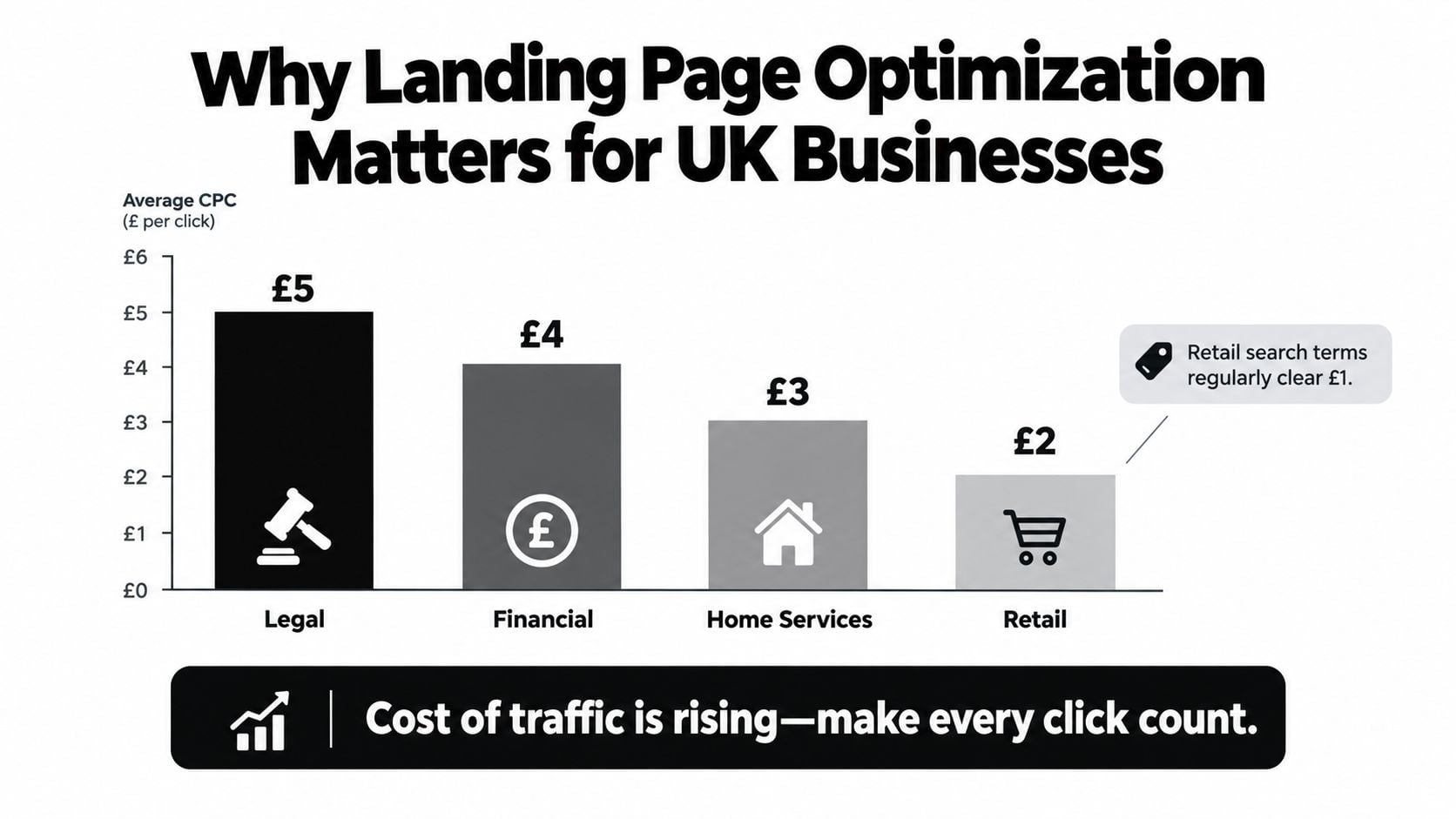
Paid traffic becomes expensive when every click lands on a page that makes the visitor work. A Dorset roofer sending a searcher to a broad services page may force them to identify the right service, find a phone number and decide whether the company serves their area. A focused page can present the relevant service, local reassurance and a direct call request immediately.
Ecommerce makes the contrast clearer. IRP Commerce's UK benchmark reported an average UK ecommerce conversion rate of 1.93% in May 2026. That doesn't make ecommerce pages unsuccessful. It shows that purchase journeys usually require more consideration than a simple lead-generation action, so the page needs to answer product, delivery, returns and payment objections without losing focus.
Practical rule: Don't buy more traffic to solve a page-intent problem. First confirm that the destination matches the promise made before the click.
What to fix first
A useful sprint starts with one priority page, one primary conversion and one reporting window. Record conversion rate as conversions divided by visitors over the same period, then split the result by source, device and page type. Growthline's UK landing page guidance recommends keeping one primary conversion goal for at least three months before judging performance, because short windows and mixed goals can distort the result.
By the end of this process, you should be able to audit an existing page, choose a destination for each channel, brief a WordPress change, and test a meaningful hypothesis. No single adjustment is a silver bullet. Clearer intent, stronger proof, simpler forms, better mobile usability and cleaner measurement work together.
For a broader look at how a landing page fits within the wider customer journey, see this guide to sales funnel optimization.
Choosing the Right Page Type Before You Write a Word
The most expensive landing page mistake is often made before the copywriter opens the document. A visitor searching for a specific product, service or offer shouldn't arrive at a page that makes them start the journey again.
Consider five destinations used by UK businesses: a product detail page, a category page, a lead-generation page, a homepage and a squeeze page. They can all be well designed, but they answer different levels of intent.
| Page Type | Avg UK Conversion Rate | Best Traffic Source | Weakest Traffic Source |
|---|---|---|---|
| Dedicated landing page | 4.8% | Paid search | Broad, low-intent social traffic |
| Pricing page | 11.2% | High-intent search | Early-stage awareness traffic |
| Contact page | 8.4% | Local and branded search | Informational blog traffic |
| Product page | 2.7% | Google Shopping and product search | General awareness traffic |
| Homepage | 1.1% | Branded search | Specific campaign traffic |
These figures come from UK benchmark data published by Visionary Marketing. They aren't a promise for your account. They show why page type deserves attention before visual refinement.
Match the destination to the visitor
A Google Shopping visitor has usually identified a product category or item. Send them to the relevant product page, with the product image, price, availability, delivery information and buying action visible without unnecessary detours. A service searcher looking for “emergency electrician Dorset” needs a lead-generation page with service relevance, coverage area, availability information and a call or enquiry action.
An organic blog reader is different. They may need a longer explanation, comparison content or a softer next step before contacting you. Email subscribers who clicked a specific offer generally need a squeeze or offer page that repeats the promise from the email and removes unrelated navigation.
Use this quick prompt for every campaign:
- Paid search for a named service: Send the visitor to a dedicated lead-generation page.
- Google Shopping or product search: Send them to the matching product page.
- Broad category search: Send them to a focused category page with useful filters.
- Email promoting one offer: Send the subscriber to an offer-specific squeeze page.
- Branded search: Consider a homepage, pricing page or contact page, depending on intent.
Score the current setup
Before rewriting a headline, score the existing destination against five questions. Give each answer a simple yes or no.
- Does the page repeat the promise made in the ad, email or search result?
- Can a visitor identify the primary action immediately?
- Does the page contain proof relevant to this audience?
- Does the form or checkout ask only for information needed at this stage?
- Does the mobile version preserve the same clarity and action path?
A page that fails several checks doesn't need a new shade of blue. It needs a better traffic-to-page decision. Guidance on information architecture for websites can help when the right destination exists but visitors can't find it through the site's structure.
The Conversion Levers That Move the Needle
Landing page optimisation works best when you rank changes by likely friction, not by how easy they are to show in a design presentation. Start with the visitor's expectation, then make the action obvious, credible and easy to complete.
1. Message match and headline clarity
The headline should confirm that the visitor has arrived at the right place. If the ad says “Boiler repairs in Weymouth,” a headline such as “Fast boiler repairs in Weymouth” is stronger than a vague line about quality heating solutions. The supporting text should add a specific outcome, service area or reassurance rather than repeat the company name.
A useful hero arrangement contains one offer, one relevant image and one primary CTA. A screenshot of an actual booking system, completed project or product in use usually gives the visitor more context than a generic handshake photograph.
2. Value proposition
State why the visitor should act now and why your business is a credible choice. For a professional service, that might mean explaining the type of problem solved, the next step after enquiry and what information the visitor will receive. Keep the language concrete. “Request a free quote” says more than “Discover our solutions”.
3. Call to action
Use a verb that describes the next action and, where possible, the benefit:
- Weak: Submit
- Clearer: Send Enquiry
- More specific: Get My Free Quote
Keep one primary CTA, use enough contrast for it to stand out and repeat it after substantial sections of a longer page. Repetition isn't a problem when every button performs the same action. Multiple competing actions are the problem.
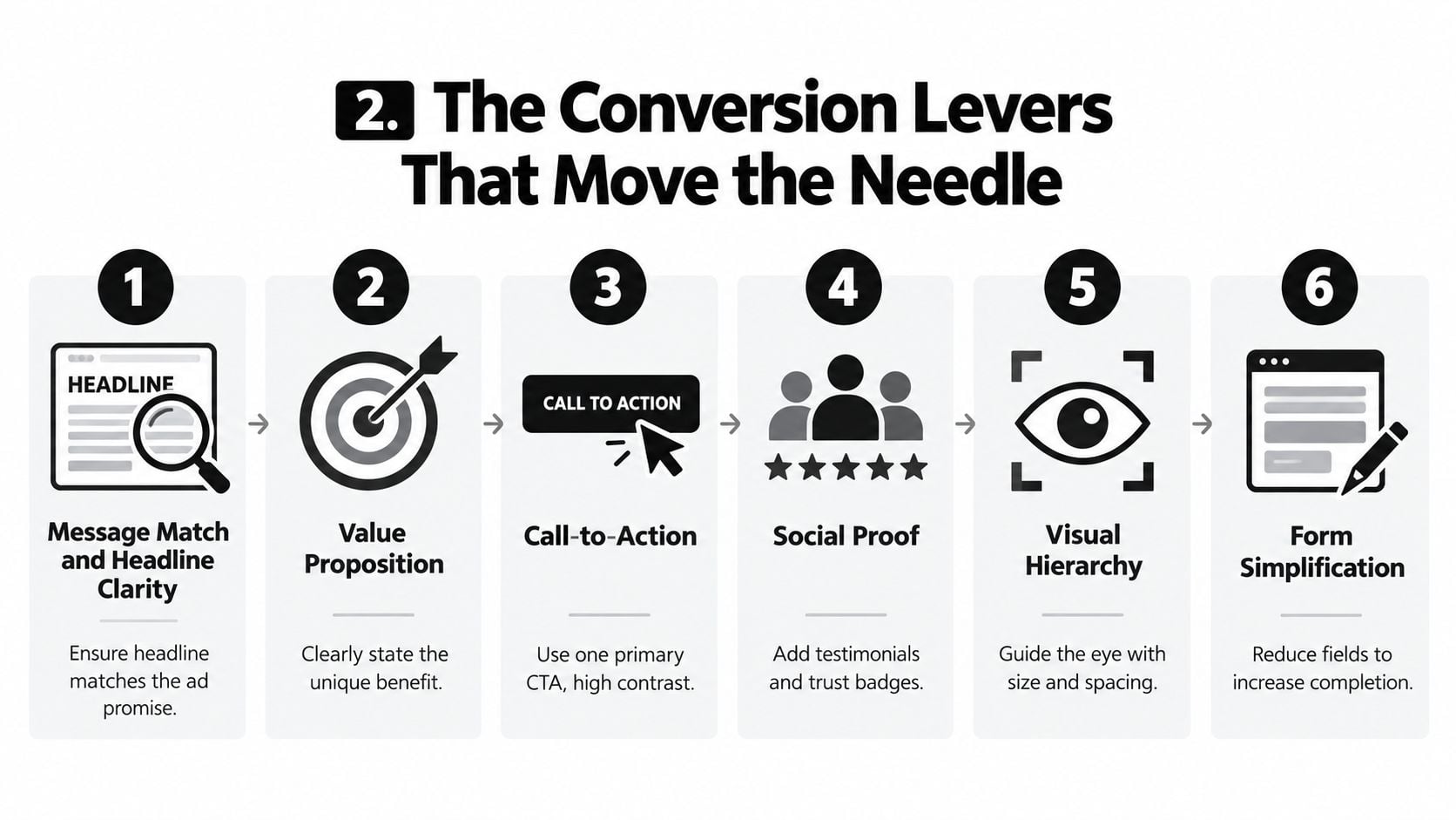
4. Trust and objections
Trust signals need to fit the audience. Relevant Which? reviews, Trustpilot evidence, Companies House details or FCA information where applicable can answer concerns more effectively than anonymous testimonials. Don't display a badge because it looks professional. Explain what it proves and place it near the decision it supports.
Deal with objections beside the relevant action. A retailer should clarify delivery, returns and stock information near the purchase route. A tradesperson should explain service coverage, response expectations and what happens after the form is sent. A finance business must be especially careful with claims and regulatory wording.
Design discipline: Every element should either explain the offer, reduce doubt or support the primary action. If it does none of those jobs, remove it or test its absence.
Forms deserve the same scrutiny. Ask only for details needed to respond or qualify the enquiry. A Dorset consultancy may need a name, email address and brief project description, but asking for a full address, company size and detailed budget at the first contact can create unnecessary hesitation. For further practical CRO guidance, see how to improve website conversion rate.
Speed, Mobile, and the Technical Foundations
A landing page that looks persuasive on a desktop monitor can still fail when a visitor loads it on a phone over a busy mobile connection. Performance belongs in the conversion brief, not in a developer's backlog that nobody reviews.
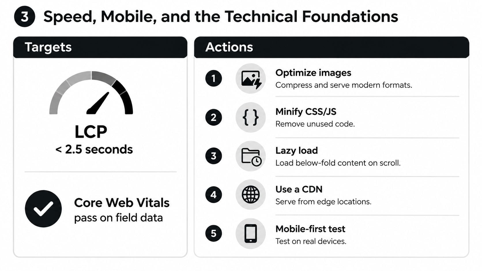
The main targets are Largest Contentful Paint under 2.5 seconds and a Core Web Vitals pass in field data for at least 75% of UK visitors, measured through Chrome User Experience Report data rather than synthetic testing alone. A laboratory score is useful for diagnosis, but real-user data tells you how the page behaves for the audience that matters.
Run a quick mobile diagnostic
Open the page on a throttled 4G connection and complete the conversion action yourself. Don't stop at the first screen. Check whether the hero image pushes the form down, whether the cookie message covers the CTA and whether the confirmation step works without a desktop keyboard.
Then ask a developer or technically confident colleague to review:
- Images: Serve appropriately sized AVIF or WebP files rather than uploading oversized originals.
- Loading order: Lazy-load below-the-fold media, but don't delay the main hero asset.
- Scripts: Identify render-blocking analytics, chat, video and advertising scripts.
- CSS: Remove unused styles generated by duplicated page-builder sections.
- Tap areas: Give buttons and form controls enough space for reliable use.
- Pop-ups: Don't interrupt the visitor before the page becomes interactive.
Mobile conversion trails desktop in the UK. One 2026 benchmark reports 3.84% mobile conversion compared with 6.42% on desktop, while another reports 2.8% mobile compared with 4.8% desktop, as summarised by Visionary Marketing's benchmark report. The exact gap varies by audience and page, but the direction is clear enough to justify mobile-first review.
Prioritise the brief
Fix the main content image and blocking scripts first. Next, remove layout shifts, simplify the mobile hero and make the form usable with one hand. Only after those changes should you spend time on decorative animation or complex visual effects.
The website loading speed guide provides a useful briefing reference for this work. A fast page won't compensate for a mismatched offer, but a slow or awkward page can prevent a good offer from being understood.
Analytics Events and A/B Testing Without False Wins
Measurement needs to exist before the change. Otherwise, a page redesign can appear successful because traffic quality changed, a campaign ended or a seasonal audience behaved differently.
For a lead-generation page, track the steps between arrival and commercial value. In GA4, that can include view_item where relevant, form_start, form_submit, qualify_lead and generate_lead. Add scroll-depth markers at 50% and 90% to show whether visitors reach the proof and objection-handling sections, but don't treat scrolling as a conversion.
The important distinction is between a submitted form and a useful lead. A form submission may contain an invalid phone number or a request outside your service area. Feed qualification information back into the reporting system so you can learn which page changes produce enquiries that sales can work.
Set a test before opening the dashboard
A clean A/B test has one primary goal, a defined audience, a planned runtime and a decision rule. UK-focused guidance recommends keeping one primary conversion goal for at least three months, which reduces the temptation to stop as soon as a variant looks promising. If traffic is limited, test larger changes and allow more time rather than running several tiny tests at once.
Don't declare victory from a confidence figure viewed in isolation. A redesign shipped without a holdout can't tell you whether the original would have improved too. A test stopped at a 60% confidence threshold is not a dependable basis for a permanent decision, and a short run can be flattered by seasonality or an unusual campaign mix.
| Field | What to Write |
|---|---|
| Hypothesis | What visitor problem do you believe the change addresses? |
| Primary goal | The single conversion that decides success |
| Secondary measures | Supporting signals such as form starts or qualified leads |
| Variant | The exact page element or page version being changed |
| Audience | Device, source, location or campaign segment included |
| MDE | The smallest meaningful difference worth acting on |
| Runtime | The planned period, with no early stopping |
| Decision rule | The result required to keep, reject or iterate |
Record the brief in a shared sheet before launch. The analytics for websites guidance can support the wider measurement setup, but the agency or owner still needs to agree what counts as a commercially useful result.
WordPress Implementation Tips for Real-World Builds
WordPress gives Dorset SMEs speed and flexibility, but it also makes duplication easy. A page builder can help you launch a campaign without a developer on retainer, then add repeated sections, unused styles and scripts that slow every related page.
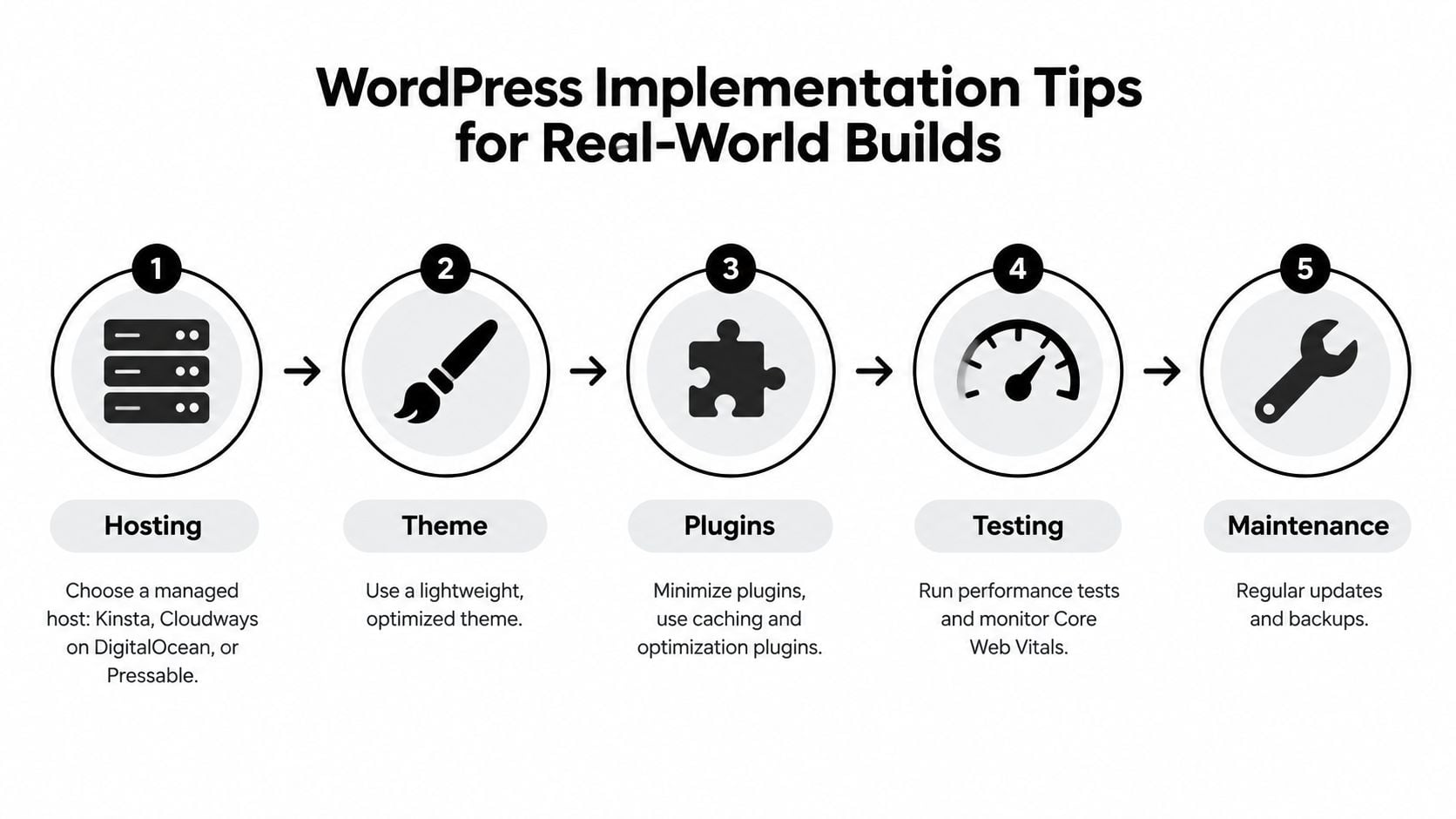
Hosting is the first practical decision. Managed options such as Kinsta, Cloudways on DigitalOcean and Pressable can provide server-level caching and edge delivery without requiring you to configure the server yourself. The cheapest shared package can become a false economy when a slow landing page weakens paid traffic performance.
Build one controlled template
Elementor Pro and Bricks are practical choices for teams that need visual editing. Use one master landing page template, then create controlled variations for different offers. Don't duplicate a complete page every time a campaign changes. Global styles and repeated builder sections can create unnecessary CSS, so audit each template rather than assuming the builder's defaults are efficient.
Useful plugin categories include:
- Script control: Perfmatters or Asset CleanUp can help prevent unrelated scripts loading on a campaign page.
- Image handling: ShortPixel or Imagify can support modern image formats and compression.
- Experimentation: Thrive Optimize or Nelio can support WordPress-based testing. A Google Tag Manager experiment can be a fallback where a dedicated testing tool isn't suitable.
Plugin names aren't a performance strategy by themselves. Each additional plugin adds maintenance, compatibility and loading considerations. Heavy builders can add 100 to 300KB of unused CSS, as noted in the WordPress implementation brief, so measure the actual template and remove assets that the page doesn't need.
Use a safer deployment routine
Create the page on staging, test forms and tracking, then warm the full-page cache before sending paid traffic. Check canonical settings, confirm the sitemap remains accurate and submit it again when the page structure changes. After launch, watch real-user performance for seven days through CrUX and your own analytics, then review errors, leads and device splits.
DesignStack is one Dorset-based option for businesses needing responsive WordPress websites, ecommerce builds, hosting and conversion-focused implementation. Whether you use an agency or manage the build internally, keep ownership of the tracking plan, page template and deployment checklist.
Your 30-60-90 Day Optimization Plan
A small business doesn't need a permanent redesign programme. It needs a sequence that gives one person clear ownership, limits the number of simultaneous changes and ties each phase to evidence.
Days 1 to 30
The owner or marketing lead should audit the current landing pages, traffic sources, devices and conversion actions. A WordPress specialist should install the key events, check form delivery and fix the worst Core Web Vitals problems on the priority page. Allow time for the audit, implementation and review rather than trying to rebuild the entire site.
Move forward when the page has reliable conversion tracking, a confirmed primary goal and a mobile journey that a real person can complete. Use the 6.6% median benchmark from Shopify's UK landing page statistics as context, not as a guarantee or a reason to ignore your own baseline.
Days 31 to 60
The copy owner should rewrite the hero headline, supporting value proposition and primary CTA to match the highest-value traffic source. The site owner or tester should launch one controlled variant against the original, while the customer-facing team recruits five customers for usability feedback. Ask each person what they expected to see, what made them hesitate and what they would do next.
Move forward when the test has a defined runtime and decision rule, and when the team has documented recurring objections. Don't change the form, hero image, navigation and pricing block in the same test unless the hypothesis concerns the complete page experience.
Days 61 to 90
Roll a winning approach to secondary pages only after checking that the audience and offer are comparable. The marketing lead should document the result, the developer should record technical debt and the owner should choose the next sprint based on commercial priority rather than visual preference.
Use this pre-launch checklist before every significant page release:
- Speed: The main content loads quickly on a throttled mobile connection.
- Mobile layout: Text, forms and buttons work without awkward zooming.
- Tracking: Page views, starts, submissions and qualified outcomes are recorded.
- Goal: One primary conversion action is clear.
- Message: The headline matches the source promise.
- Offer: The visitor understands the value and next step.
- CTA: The button uses specific, action-led wording.
- Proof: Trust signals are relevant and verifiable.
- Objections: Delivery, returns, pricing or process questions are answered.
- Form: Fields are limited to information needed at this stage.
- Legal: VAT display, privacy information and consent wording are accurate.
- Advertising: Claims used in UK ads meet ASA requirements and can be substantiated.
The useful benchmark is the one that helps you choose the next action. A dedicated landing page may outperform a homepage, but a pricing page may suit a high-intent visitor better than either. Start with page type and traffic fit, remove the largest friction, measure the complete journey and let evidence decide what stays.
DesignStack helps Dorset and UK businesses plan and build responsive WordPress websites, ecommerce experiences and conversion-focused landing pages, with support for hosting, SEO and ongoing updates. If your paid traffic is reaching the wrong page or your current WordPress build creates friction, visit DesignStack to discuss a practical optimisation project.