
Ecommerce Website Header Design: A Practical Guide
You're probably looking at your site header right now and thinking one of two things. Either it feels cluttered and dated, or it looks clean but doesn't seem to help people buy.
That's a common place for UK retailers to get stuck. The header has to do far more than hold a logo and a menu. It has to help people trust the shop, find products quickly, and move towards the basket without friction. For small and medium-sized ecommerce brands, that balancing act matters even more because you don't have the instant recognition of a national chain.
Good ecommerce website header design isn't about copying a fashionable theme. It's about deciding what deserves the most attention in the most valuable space on the page.
Table of Contents
- The Three Core Goals of Your eCommerce Header
- Anatomy of a High-Converting Header
- Arranging Your Header for Maximum Impact
- Designing for Mobile Shoppers First
- Beyond Visuals: Performance and Accessibility
- Testing Your Design and Final Implementation Tips
The Three Core Goals of Your eCommerce Header
A strong header does three jobs at once. It shows who you are, helps shoppers get oriented, and nudges commercial action.
Many business owners treat the header as a branding strip. That's too narrow. On an ecommerce site, the header is repeated across the whole journey, so it becomes one of the most commercially important parts of the interface. If it's vague, crowded, or badly prioritised, every visit feels harder than it should.
Brand recognition has to be immediate
The first job is simple. A shopper needs to know where they are and whether the site feels credible.
That starts with the logo, but it doesn't end there. Colour, spacing, typography, icon style, and tone all shape how the brand comes across. If the header feels generic, the shop feels generic. If it feels organised and intentional, the brand feels more trustworthy. That's why a clear understanding of brand identity design fundamentals matters before you start moving menu items around.
Navigation has to reduce effort
The second job is wayfinding. A header should help shoppers answer basic questions quickly. What do you sell? Where do I click next? How do I search? Where's my basket?
Many SME ecommerce sites often overcomplicate things. They try to surface every category, every sale, every service message, and every account option at once. The result is noise. A better header removes decisions that don't help someone move forward.
Practical rule: If a first-time visitor needs to stop and decode your header, it's already underperforming.
Every header element should support buying behaviour
The third job is commercial. Every part of the header should either help discovery, reduce hesitation, or support checkout.
That doesn't mean turning the top of the site into a billboard. It means assigning space based on value. For one shop, that may mean giving search more prominence because buyers arrive knowing what they want. For another, it may mean surfacing delivery or returns reassurance because trust is the main barrier.
A good header isn't the one with the fewest elements. It's the one where each element earns its place.
Anatomy of a High-Converting Header
Most effective ecommerce headers include the same five core components. The difference is how clearly each one is handled, and whether the design gives priority to the parts that move a sale forward.
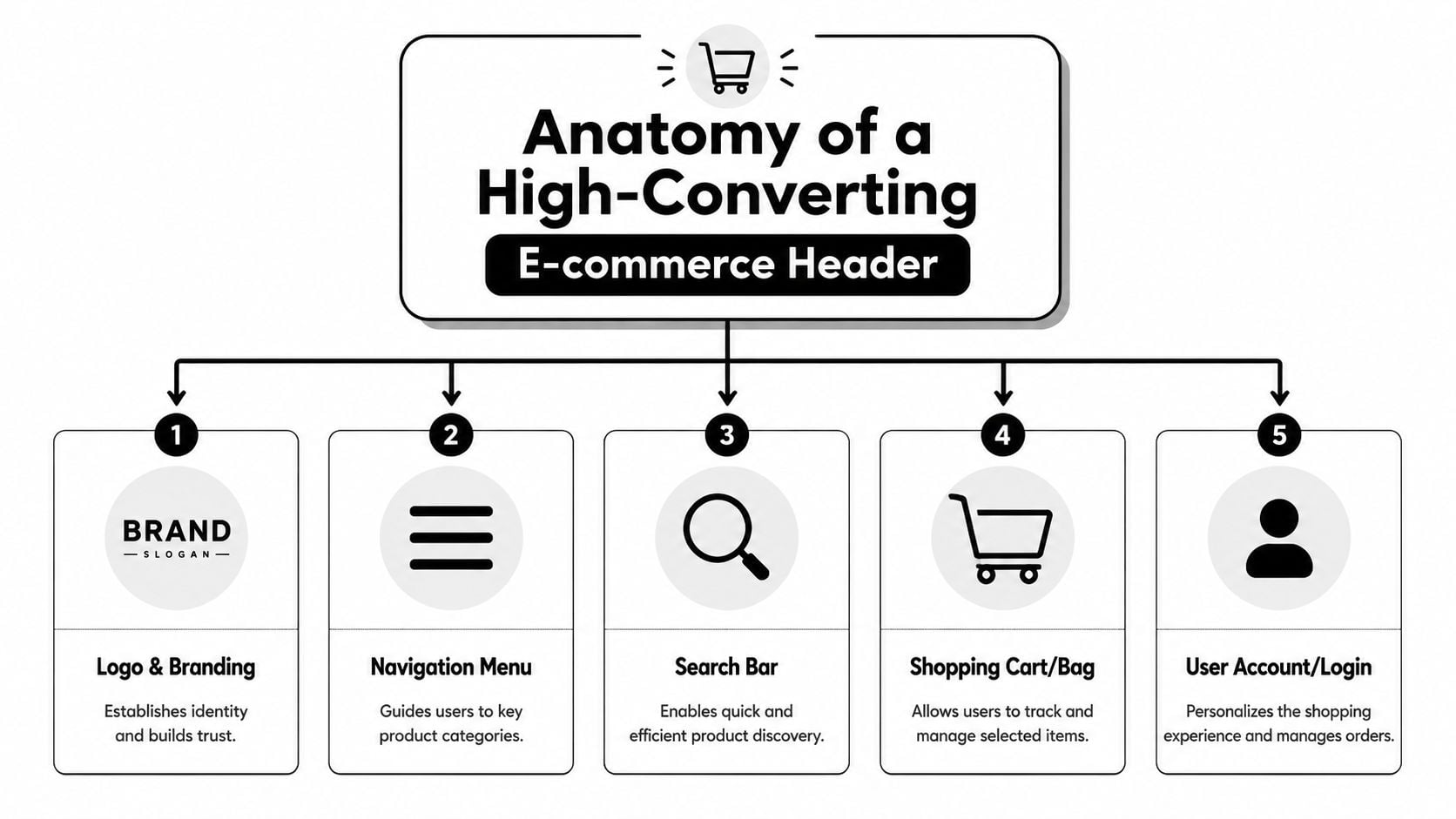
Logo and branding
The logo should anchor the header, not dominate it. In practice, that means it's easy to spot, readable at smaller sizes, and not fighting for attention with every other element.
A lot of ecommerce sites still use logos with awkward backgrounds, unnecessary effects, or poor contrast. If you're reviewing your assets, FurnitureConnect's transparent logo tips are useful because they address a practical issue many retailers run into when logos have to sit cleanly across different header backgrounds and breakpoints.
Main navigation
Navigation should reflect how customers shop, not how the business is internally organised. Product-led labels usually work better than clever labels. “Lighting”, “Furniture”, or “Outdoor” tells people more than abstract category names.
Keep category logic tight. If the menu tries to do too much, shoppers stop scanning and start hesitating. The most effective headers tend to make the next step obvious instead of exhaustive.
Search
Search matters most when users already have purchase intent. If someone wants “oak bedside table” or “size 10 black ankle boots”, search is often their fastest route.
That doesn't mean every site needs a massive desktop search bar. But it does mean search shouldn't be buried. On stores with broad catalogues, I'd usually prioritise search above lower-value header extras because it serves buyers who are closest to converting.
Account area
Account access often gets treated as a standard icon that can be tucked anywhere. It's more important than that. Returning customers use it to track orders, reorder products, manage details, and check status.
The design needs to be obvious without stealing attention from higher-priority actions. Clean iconography helps here. If you're refining visual language, this guide to credit card and payment icon design is a helpful reference point for keeping commerce-related icons consistent and recognisable.
Basket or cart
This is the one element that should never be visually timid. Baymard's ecommerce UX guidance recommends emphasising the cart link in the upper-right area of the sitewide header, using a clear contrasting icon or button with plenty of white space rather than a text-only link. That advice aligns with real shopping behaviour. Once people are ready to review items, they shouldn't have to hunt for the basket.
For mobile use, tap target size matters too. The same guidance notes that expert-recommended tap targets should be at least 44 x 44 pixels for mobile usability, which is exactly why tiny basket icons create avoidable friction.
A basket icon isn't decorative. It's a checkout shortcut.
Arranging Your Header for Maximum Impact
Once the core pieces are defined, layout becomes a prioritisation problem. The question isn't which arrangement looks nicest in a static mock-up. The question is which arrangement makes the site easier to shop.
Squarespace's header guidance recommends placing the logo prominently on the left or centre, keeping main navigation to five to seven items, and putting a primary CTA such as “Shop” in a contrasting style, usually on the right. That structure works because it creates a scannable flow rather than a visual pile-up.
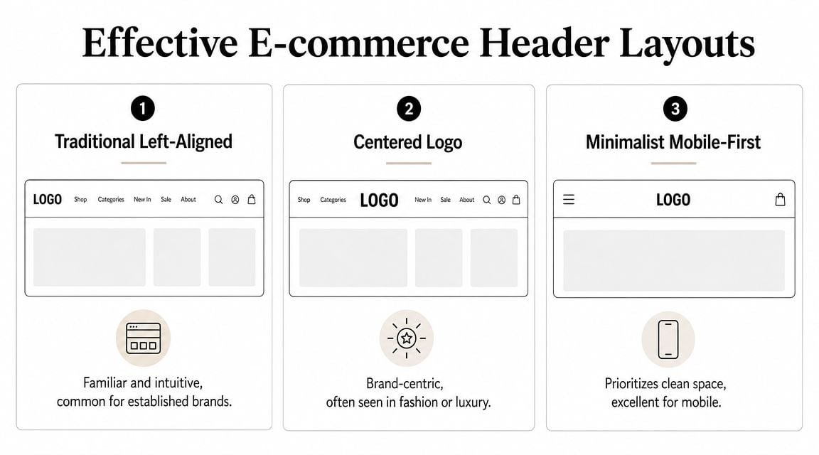
Common eCommerce Header Layouts
| Layout Pattern | Best For | Key Consideration |
|---|---|---|
| Traditional Left-Aligned | General retail, broad catalogues, familiar shopping journeys | Easy to scan, but can feel crowded if too many actions sit on the right |
| Centered Logo | Fashion, lifestyle, premium product brands | Stronger brand feel, but category discovery can become less direct |
| Minimalist Mobile-First | Smaller screens, focused ranges, simple purchase paths | Clean and efficient, but important trust cues can disappear if over-minimised |
The trade-off between clean and useful
A minimalist header often looks better in a design review than it performs in practice. That's because business owners and designers already know the site. First-time shoppers don't.
For UK SMBs, one of the biggest missed opportunities is the utility bar. This is the smaller strip above or within the header that carries service messages such as delivery details, returns links, or customer support access. Used well, it lets the main navigation stay clean while still surfacing reassurance.
Typical examples include:
- Delivery messaging such as free UK delivery thresholds
- Returns reassurance with a clear route to the policy
- Contact access for buyers who want a fast answer before ordering
- Promotional cues used sparingly, not as permanent clutter
Choose a layout based on product range and buying behaviour
The wrong way to choose a layout is to browse theme demos and pick the one that feels modern. The better route is to sketch user priorities first. A simple wireframe in web design is often enough to expose whether the header is overloaded before any polished design work starts.
What works in practice: broad catalogues usually benefit from familiar layouts. Brand-led stores can take more visual risks, but only if search, basket access, and category paths remain obvious.
If you sell many product types, the traditional pattern usually wins because it supports fast scanning. If your store sells a tighter, curated range, a more brand-led arrangement can work well. The mistake is assuming those choices are aesthetic. They're commercial.
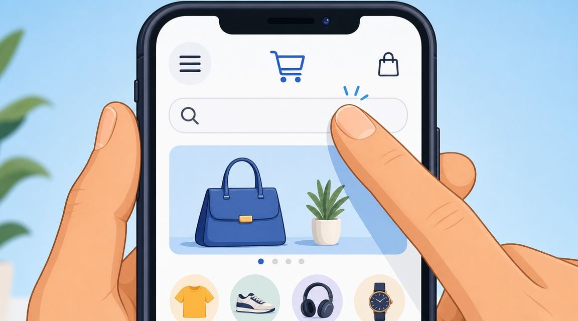
Designing for Mobile Shoppers First
Mobile header design forces honest decisions. Desktop lets you hide weak prioritisation behind extra space. Mobile doesn't.
For most ecommerce sites, the small-screen header is a significant test. You have limited room, a shorter attention window, and thumb-driven interactions. If the mobile header is confused, the whole shop feels harder to use.
Decide what stays visible
On mobile, not everything deserves permanent space. The essentials usually include the menu trigger, logo, search access, and basket. After that, each extra item has to justify itself.
Ecommerce website header design becomes strategic rather than merely stylistic. If your customers often browse by category, the menu needs to be prominent. If many buyers search directly for known products, search deserves more emphasis. If trust is the main barrier, a service cue may deserve to stay visible even when space is tight.
Regur's discussion of website header design highlights a useful tension here. Consumer research in the UK shows delivery transparency and return confidence are major purchase factors. That means a clean mobile header isn't automatically the best one. For smaller retailers, a compact trust cue such as “Free Returns” may do more commercial work than an extra navigation item.
Use progressive disclosure properly
A hamburger menu is fine when it hides lower-priority complexity, not when it becomes a dumping ground for everything the business couldn't decide on.
Good mobile menus are layered and predictable:
- Top level first with the most important categories
- Utility links second for help, delivery, returns, and contact
- Account options separated so they don't compete with product discovery
- Promotions used carefully so sale messages don't drown navigation
If you're reviewing the wider mobile journey, RapidNative's overview of essential mobile-first strategies is a useful companion read because it reinforces the discipline of starting with the constraints of smaller screens rather than trimming a desktop design after the fact.
A short walkthrough helps when you're assessing mobile interaction patterns:
Sticky headers can help, but only if they stay lean
Sticky mobile headers keep the basket and navigation within reach while people scroll. That's often useful on long category pages and product-heavy collections.
But sticky behaviour magnifies every weak decision. If the bar is too tall, too busy, or contains low-priority content, it steals space from the product list. The better approach is to keep the sticky state slimmer than the initial state.
If you're unsure whether your current setup meets that standard, review it through the lens of responsive web design principles. A mobile header shouldn't just shrink. It should reorganise around what matters most.
Beyond Visuals: Performance and Accessibility
A polished header can still be a bad header if it loads slowly or excludes part of your audience. Technical quality is part of conversion work, not a separate concern for developers to handle later.
Tubik Studio's header design guidance is clear on this point. It recommends compressing assets, using SVG logos, and deferring non-essential header scripts. It also warns that prioritising visual flair over speed can damage page performance and SEO. That's exactly what happens when retailers add oversized logos, rotating announcement bars, autoplay media, and script-heavy menu effects in the topmost part of the page.
What to strip out first
When a header feels slow or bloated, I'd usually review these items first:
- Heavy logo files that should be SVG instead of oversized raster images
- Decorative animation that doesn't improve discovery or trust
- Extra scripts tied to sliders, pop-ins, or fancy menu transitions
- Non-essential media loaded above the fold
This matters even more if your site relies on product video elsewhere. Retailers often spend time learning how to create effective dropshipping videos, but then accidentally overload the header with visual elements that make the site feel slower before shoppers even reach those assets.
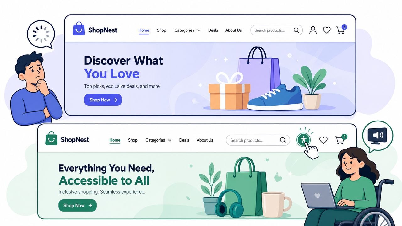
Accessibility has to be built in
An accessible header is easier for everyone to use. Clear labels, strong contrast, visible focus states, keyboard-friendly menus, and semantic navigation all improve the experience.
A header should work for a shopper using a mouse, a thumb, a keyboard, or a screen reader.
The practical test is simple. Can someone move through the header without guesswork? Can they tell where focus is? Are icons supported by labels where needed? Does the menu structure still make sense when visuals are stripped away?
For a useful technical review process, include the header in your regular website loading speed improvement checks. Fast, crawlable, accessible navigation supports both users and search visibility.
Testing Your Design and Final Implementation Tips
Header redesigns often fail for one reason. They launch as design decisions instead of being validated as shopping decisions.
You don't need a complicated research programme to improve that. You do need a disciplined review before and after launch. Start by testing the core journeys on real devices. Can a new visitor find a product category quickly? Can they search without friction? Can they get to the basket without hunting for it?
A practical pre-launch checklist
Use a short review list before anything goes live:
- Check visibility by looking at the header on desktop, tablet, and mobile without zooming
- Check hierarchy by asking whether the eye lands on the most important action first
- Check trust cues by deciding whether delivery, returns, or contact reassurance is helping or cluttering
- Check interaction by tapping every icon, menu level, and CTA on a phone
- Check consistency by making sure the header behaves the same way across templates
- Check edge cases such as long category names, sale periods, and logged-in account states
What to test after launch
Once live, monitor behaviour around the header rather than judging it by appearance alone. Watch how people use search, which menu items get selected, where they hesitate, and whether key routes are being ignored.
Useful tests include:
- Label changes such as “Shop” versus a more specific category-led CTA
- Trust signal placement in the utility bar versus within the main header
- Search visibility as an icon only versus a wider input field
- Mobile priority choices such as whether returns messaging deserves visible space
WordPress and WooCommerce tips
For WordPress and WooCommerce stores, don't begin by forcing a complex design into a theme that wasn't built for it. Review what the theme header builder can control cleanly, then customise only where necessary.
In practice, that usually means keeping the structure simple, using native WooCommerce basket behaviour where possible, and avoiding a stack of plugins just to create visual effects in the header. Plugin-heavy headers are harder to maintain and more likely to conflict during updates.
If you're using a page builder, treat the header as a system component, not a page section. Set rules for spacing, icon style, menu depth, and utility messaging before you start styling individual templates. That keeps the experience consistent across the entire shop.
If your current header looks fine but isn't guiding shoppers clearly, it's probably time for a proper review. DesignStack helps UK businesses build conversion-focused websites, ecommerce stores, and brand systems that are organised, fast, and practical to manage. If you want a header that supports trust, product discovery, and checkout behaviour without adding clutter, they're worth speaking to.


Leave a Reply