

Standout Packaging Design: A Guide for UK SMEs
You've put serious work into your product. The recipe is right, the finish feels premium, the margins are tight but workable, and customers who try it tend to come back. Then it goes into a stock carton, a plain label, or a pouch that looks like ten others on the same shelf.
That gap matters more than most first-time founders expect. Buyers judge quality before they judge performance. Retailers do it. Online shoppers do it. Wholesale buyers do it when they open a sample pack on a desk between meetings. Packaging design is often the first physical proof that your brand knows what it's doing.
For UK SMEs, this isn't a niche concern. The UK packaging sector includes around 4,200 companies, and 92% are SMEs, according to IBISWorld's UK packaging services industry data. That tells you two things. First, small and medium-sized firms make up most of the market around you. Second, packaging design is no longer something only large brands can justify.
Good packaging isn't decoration. It shapes perceived value, protects margin, supports compliance, and gives a customer a reason to trust what's inside. If your wider visual identity still feels inconsistent, it helps to understand why graphic design is important for any business before you commit packaging to print.
Table of Contents
- Introduction Why Your Product Deserves Better Than a Brown Box
- Your Packaging Is Your Most Valuable Salesperson
- The Anatomy of Effective Packaging Design
- The Professional Design Journey from Brief to Box
- Budgeting for Success DIY vs Professional Design
- Navigating UK Sustainability and Compliance Rules
- How to Write a Powerful Packaging Design Brief
Introduction Why Your Product Deserves Better Than a Brown Box
A common first-project mistake is spending months perfecting the product and only days thinking about the pack. A founder gets samples made, sorts the pricing, confirms a barcode, and then realises launch is close. The quickest option is a generic box, a template label, and hope that the product will speak for itself.
Sometimes it does. More often, the packaging design drags everything down.
A plain pack makes a good product look untested. An over-designed pack can make a practical product feel expensive in the wrong way. A flimsy transit carton can turn a strong first order into a complaints thread. These aren't design niceties. They affect repeat purchase, retailer confidence, and whether your brand looks established or improvised.
Good packaging design gives the customer one clear message. This product is worth paying attention to.
That matters whether you're selling coffee, candles, supplements, sauces, skincare, or a gift product. Customers don't experience your business in departments. They experience it as one joined-up impression. The website, the logo, the tone of voice, the box, the label stock, and the opening moment all sit together in their mind.
For a growing SME, better packaging doesn't mean making everything look luxurious. It means making the right promises, clearly and credibly.
Your Packaging Is Your Most Valuable Salesperson
Packaging keeps working when nobody from your team is in the room. It sells on a shelf, in a wholesale sample, in an unboxing video, on a kitchen counter, and in a delivery photo posted by a customer. That's why it deserves the same level of thought you'd give to your homepage or your sales deck.
The commercial logic is already visible in the size of the sector. The UK packaging market reached USD 60.94 billion in 2025 and is projected to reach USD 69.27 billion by 2031, while custom packaging design is projected to grow from USD 5.68 billion in 2025 to USD 8.74 billion by 2035, according to Mordor Intelligence's UK packaging market analysis. Businesses don't invest in custom packaging at that scale unless it helps them stand out.
Brand cues sell before claims do
Customers rarely read every word first. They read signals. Shape, weight, colour, finish, typography, and closure type all tell them what sort of brand they're dealing with.
A matte folding carton with restrained typography says something very different from a glossy pouch covered in callouts. Neither is automatically better. The right one depends on the category, price point, and what the customer needs to trust quickly.
If you're trying to tighten that visual language, it helps to understand what brand consistency looks like in practice. Strong packaging design works best when it matches the rest of the brand system instead of trying to rescue a weak one.
Shelf impact and delivery impact both matter
Retail packaging and e-commerce packaging aren't the same job, but both need to convert attention into action.
On shelf, your pack needs to interrupt scanning. Online, it needs to survive the route from thumbnail to doorstep without feeling generic when it arrives. SMEs often focus on one and neglect the other. A beautiful bottle label won't compensate for a shipper that arrives crushed. Equally, a sturdy transit box won't build much loyalty if the primary packaging feels forgettable.
Useful packaging design questions include:
- What does the customer notice first: Brand name, flavour, format, ingredient story, or gift appeal.
- What needs to be understood fast: Is it premium, natural, practical, indulgent, refillable, or family-friendly.
- Where will it be seen most: Shelf edge, Instagram reel, Amazon image, trade counter, or subscription delivery.
For food brands in particular, this guide on how to boost your brand with food packaging is a helpful companion because it looks at how packaging supports recognition and recall beyond basic containment.
Unboxing can reinforce the sale
The sale doesn't end at checkout. The arrival moment often decides whether a customer feels they made a smart purchase.
That doesn't mean every parcel needs tissue paper and ribbon. It means the experience should feel deliberate. If the outer box is oversized, the inserts slide around, and the label application is crooked, the product feels less trustworthy before it's even used.
A better approach is usually simpler:
- Reduce friction: Make it easy to open without damaging the product.
- Control the hierarchy: Let the customer see the product name and key benefit quickly.
- Use one memorable touch: A well-placed colour block, clean internal message, or precise fit can do more than a handful of gimmicks.
Practical rule: If a packaging idea looks good in a mock-up but slows packing, increases waste, or creates confusion at opening, it probably won't hold up in real use.
The Anatomy of Effective Packaging Design
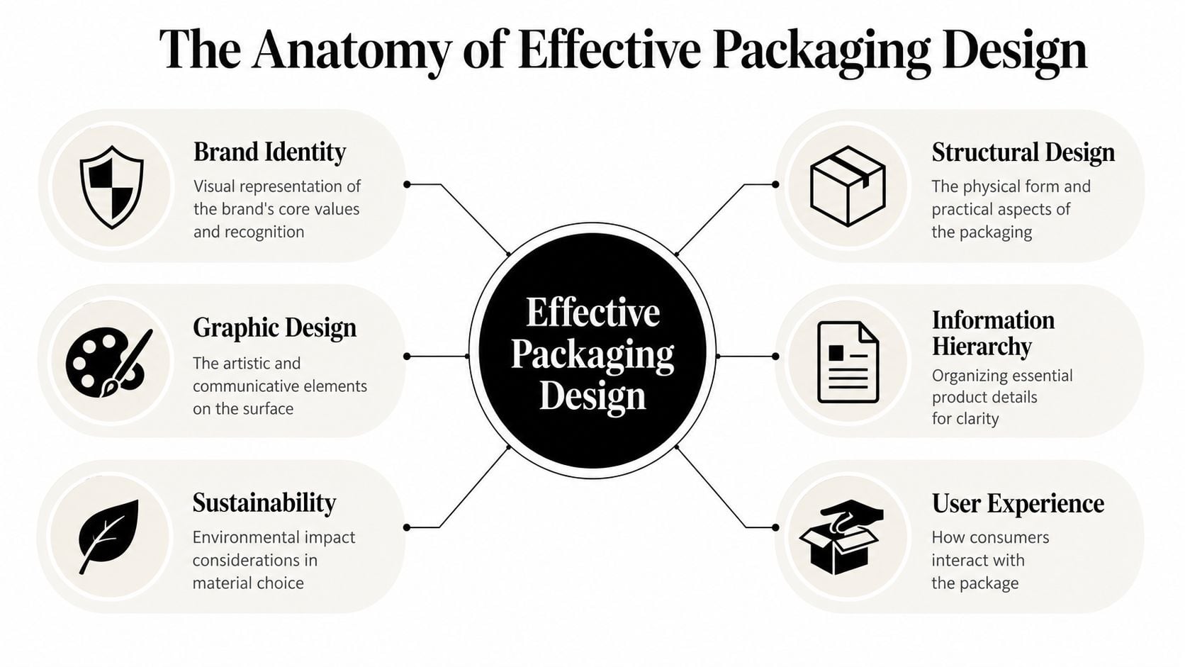
The best packaging design looks effortless because the hard decisions are hidden. Under the surface, it combines structure, graphic choices, information order, production limits, and user behaviour. When one part is weak, customers feel it even if they can't name the problem.
Structure comes first
Before anybody chooses fonts or colours, the pack needs to do its job physically. That means protecting the product, stacking properly, surviving handling, and making sense for the sales channel.
A jar, pouch, bottle, sleeve, folding carton, paper tube, and corrugated shipper each create a different customer expectation. They also create different production realities. A glass bottle may feel premium. It also brings handling risk, transit considerations, and label application constraints. A stand-up pouch may reduce bulk and simplify shipping, but it can struggle to communicate value if the artwork isn't disciplined.
The term dieline often sounds technical to new clients, but the idea is simple. It's the flat template that shows where a box or carton will cut, fold, glue, and print. Think of it as a sewing pattern for packaging. If the dieline is wrong, even a beautiful design can fail in production.
A good structural review asks:
- How will it be filled: By hand in a small batch setup, or on a production line.
- How will it travel: Shelf-ready, postal, wholesale, chilled, gift-packed, or fragile.
- How will it be opened: Tear strip, tuck flap, cap, peel, slide, or lift-off lid.
Graphics carry the message
Once the structure works, the surface has to communicate clearly. Many first-time projects falter at this stage. Owners try to say everything at once. The front panel ends up carrying the logo, product type, selling points, certifications, ingredients tease, social handle, and a slogan that could live anywhere.
Clarity wins.
Your front-facing panel usually needs one dominant message and a supporting message. Everything else can move elsewhere. When packaging design feels calm, it often means the information hierarchy is doing its job. Customers know where to look first, second, and third.
For brand owners still sharpening their visual identity, this resource on how to build a brand for your domain is useful because packaging works best when it grows out of a recognisable brand idea rather than a collection of isolated style choices.
Colour deserves more discipline than it usually gets. A lot of SMEs choose colours they personally like, then discover the result blends into the category or prints flatter than expected. If you want a practical grounding in that side of the process, colour psychology in branding is worth reviewing before final approval.
Transparent elements can do a lot of heavy lifting in food and drink. Oxford University research found that showing consumers what's inside increases perceived product quality and trust.
That doesn't mean every pack needs a window. It means visibility can be strategic when the product itself helps sell the product.
Materials and finishes change perception
Materials send signals before the customer reads a word. Uncoated board feels different from gloss laminate. Glass suggests permanence and weight. Paper labels can feel artisanal or low-budget depending on the print quality, adhesive performance, and surrounding design system.
Finishes are where many SMEs overspend. Foil, embossing, debossing, soft-touch lamination, spot UV, and speciality varnishes can all add character. They can also clutter the pack or create avoidable production complexity.
A practical way to think about finishes is this:
| Design choice | When it works | When it doesn't |
|---|---|---|
| Foil | Premium positioning, restrained layout, small focal areas | Large areas, weak contrast, packs that already feel busy |
| Emboss or deboss | Simple branding, tactile product categories, gift-led formats | Tiny text, crowded artwork, low-grade board |
| Matte finish | Premium, calm, modern presentation | Products that need high energy or easy wipe-clean handling |
| Window or transparency | Strong-looking product, trust-led categories, food gifting | Light-sensitive contents, messy fill lines, inconsistent product appearance |
Most effective packs don't use every option available. They choose one or two moves and do them properly.
The Professional Design Journey from Brief to Box
A founder approves artwork on a laptop on Friday. By the time the first printed boxes arrive, the colour is off, the barcode sits too close to a fold, the packer needs extra time on the line, and the material choice carries a higher EPR bill than expected. The design did its job on screen. The packaging failed in the business.
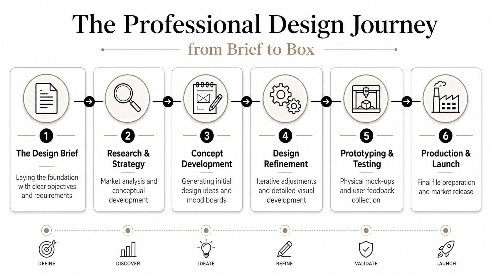
Good packaging projects avoid that pattern because the process is structured from the start. Decisions are made in an order that protects margin, reduces rework, and keeps compliance and production costs in view while the creative work is still flexible.
Discovery and concept work
The first useful conversation is commercial, not cosmetic. The designer needs to know where the product will be sold, the target retail price, the likely order volumes, the fulfilment method, what legal information must appear, and how much packaging weight and material choice will affect transport and EPR costs.
This stage usually exposes the expensive issues early.
A carton that looks generous on screen may waste shelf space, increase shipping charges, and use more material than the product needs. A premium rigid box may impress in a pitch meeting but damage repeat-order margins if the product sells at a mid-market price point. A label stock that feels right in the hand may slow application on the packing line or fail in chilled storage.
Concept development should produce a small number of clear routes with different commercial implications, not endless variations of the same idea. One route might prioritise shelf standout. Another might reduce material use and simplify assembly. Another might support a higher price point for gift or wholesale channels. That gives an SME a real decision to make, based on revenue potential and operating cost, not personal taste alone.
Refinement and technical artwork
Once a direction is approved, the work becomes more exacting. Hierarchy, copy fit, barcode placement, mandatory information, colour control, and cutter guides all need attention. This is also the point where design choices should be tested against unit economics.
Small changes matter. Adding a special finish can increase print cost and lead time. Choosing a darker board reverse can affect legibility. Expanding pack dimensions by a few millimetres can alter case counts, pallet efficiency, and postage bands. If your packaging falls under EPR reporting, extra material and hard-to-recycle components are not abstract sustainability concerns. They feed directly into future compliance costs.
Artwork preparation also needs discipline. Printers need files built to the dieline, with correct bleed, safe areas, colour settings, and overprint checks. A file that looks clean in a presentation PDF can still fail in production.
For a simple overview of how professional design assets are developed and presented, it can help to review a branding example like design works logo.
Here's a short visual explainer that shows why process matters once ideas become physical packaging.
Sampling and production support
Sampling is where assumptions get tested in practice. That includes physical feel, assembly time, transit protection, scuffing, seal performance, colour shift, and how full or underfilled the product appears once packed.
I usually advise SMEs not to skip this stage, even on a modest launch. A plain mock-up can catch structural problems. A press sample can reveal whether the chosen finish makes the pack look sharper or more expensive. If a label wrinkles, a tuck flap catches, or the pack feels oversized for the product, fixing it before sign-off is far cheaper than correcting it after a full run has been printed.
A straightforward project often follows this sequence:
- Brief and commercial review
- Concept routes with format and cost implications
- Chosen direction refined
- Artwork prepared for print
- Samples checked and adjusted
- Printer sign-off and production
The cheapest packaging mistake is the one found before the print run starts.
Budgeting for Success DIY vs Professional Design
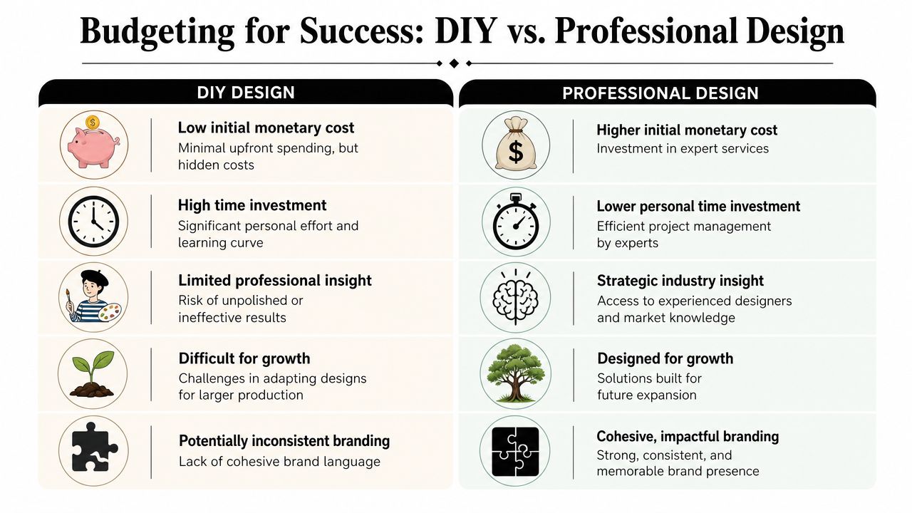
Most SME owners don't ask whether packaging matters. They ask whether professional packaging design is worth paying for now or whether they should patch something together and upgrade later.
That's a fair question. The wrong answer depends on what you're trying to launch, how fast you need to move, and how much risk the pack carries.
Where DIY works
DIY tools can be enough when the packaging task is simple. A temporary event label, a local test batch, or a one-off sleeve for a short run can sometimes be handled in-house if the format is fixed and the legal information is straightforward.
The hidden cost is usually time. Owners underestimate how long it takes to set type cleanly, control hierarchy, prepare print files, test colours, and spot production issues before they become paid mistakes.
DIY also struggles when the pack needs to do more than look acceptable. If it has to justify a premium price, support wholesale conversations, or hold together a product range, templates start to show.
Where freelancers fit
A good freelancer can be an excellent middle ground. You often get sharper creative thinking than a template platform and more flexibility than a larger studio process.
The trade-off is breadth. One person may be strong on visual identity but lighter on structural packaging. Another may understand print but not category positioning. That doesn't make freelancing risky by default. It just means the brief, feedback, and supplier coordination need to be tighter.
A freelancer is often a good fit when:
- The structure already exists: You're designing for a standard bottle, carton, tube, or pouch.
- The range is limited: One or a few SKUs, not a sprawling system.
- You can manage suppliers: You're comfortable speaking with printers and checking proofs.
When agency support pays for itself
Agency support makes more sense when packaging has commercial complexity. That might mean multiple SKUs, retailer requirements, regulatory burden, sustainability targets, or a launch that can't afford rework.
The value isn't only in nicer artwork. It's in decision-making. Which format is scalable. What information belongs where. Which print finish is worth using. What should be tested before production. How the pack extends into the next product line without starting from scratch.
A simple comparison helps:
| Approach | Best for | Main strength | Main risk |
|---|---|---|---|
| DIY | Early tests and low-stakes runs | Low cash outlay | Time drain and avoidable errors |
| Freelancer | Straightforward launches with clear scope | Flexibility and focused craft | Limited technical or strategic coverage |
| Agency | Growth-stage brands and complex packaging needs | Joined-up thinking across brand, print, and rollout | Higher upfront spend |
Cost reality: Cheap packaging design can become expensive if it creates reprints, weak shelf presence, poor line extensions, or a pack you outgrow within months.
Navigating UK Sustainability and Compliance Rules
A pack can look right in the studio and still become an expensive mistake once it hits production. I see this with growing UK brands that approve a carton, label, or pouch on visual merit, then discover later that the material mix is awkward to report, costly to recover, or difficult to justify once compliance checks begin. By that point, changing course means new artwork, new specs, new samples, and another delay.
For UK SMEs, sustainability and compliance now sit inside the commercial brief. They affect unit cost, reporting workload, supplier choice, storage efficiency, and margin.
EPR turns packaging design into a margin decision
Extended Producer Responsibility has changed the conversation. Packaging choices now carry a more direct financial consequence, especially for businesses nearing the reporting threshold or planning to scale into it.
That matters early.
A heavier pack costs more to buy, more to move, and can cost more to report. A hard-to-recycle structure may create problems that do not show up on the first print quote but do show up later in fees, operational admin, and redesign pressure. A simpler specification often gives you a better result on all three fronts.
In practice, that usually means asking tougher questions at concept stage:
- Can one material do the job instead of two or three?
- Can we remove a sleeve, insert, laminate, or coating without hurting sales?
- Can we reduce weight without increasing damage rates?
- Can the pack still feel credible on shelf if we strip back unnecessary extras?
Those are design questions, but they are also cost questions.
A simple paper tube format can be a useful reference point here. Products such as this Beeswax lip balm stick show how format choice, material simplicity, and brand presentation can work together, although the right answer still depends on your product, fill, protection needs, and price point.
Legal requirements still shape the brief
EPR is the newer pressure, but the older rules still matter. UK packaging law expects packaging to be limited to what the product needs for safety, hygiene, and customer acceptance. It also restricts heavy metals in packaging components and requires businesses to keep the technical evidence behind their decisions.
The practical point is straightforward. If your pack is oversized, overbuilt, or loaded with decorative elements that add little value, you may struggle to justify it. If your printer, converter, or importer cannot provide clear material information, you have a paperwork problem as well as a design problem.
This is why I advise clients to treat compliance files as part of the design system, not an admin task for later. Keep material specs, declarations, weights, print finishes, adhesive details, and supplier confirmations in one place from the start.
What good compliance-led design looks like
It usually looks disciplined rather than worthy.
The strongest packs in this area tend to share a few traits:
- Fewer material conflicts: Simpler structures are easier to produce, explain, and improve later.
- Controlled use of finishes: Foils, laminates, varnishes, and special coatings need a commercial reason.
- Right-sized protection: Enough strength for shipping and retail handling, without paying for excess board, film, or void fill.
- Clear documentation: The team can trace what was chosen, why it was chosen, and who supplied it.
There is always a trade-off. Reducing material can lower cost and improve recyclability, but go too far and you create breakages, leakage, or poor shelf impact. Adding a premium finish may help conversion, but only if the extra spend earns its keep in price, velocity, or retailer perception. Good packaging design balances those pressures instead of treating sustainability, compliance, and sales performance as separate jobs.
If you want those decisions made early, build them into the brief. A clear packaging design brief template for UK SMEs helps your designer, supplier, and internal team work from the same commercial and compliance logic.
How to Write a Powerful Packaging Design Brief
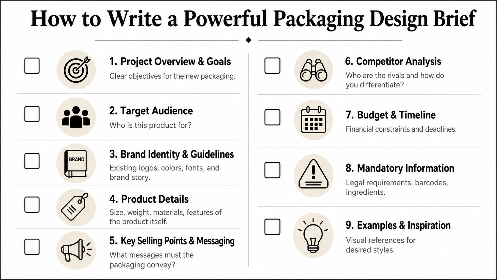
A strong brief saves time, cuts revision loops, and gives your designer something useful to solve. A weak brief produces vague work because the inputs were vague.
That doesn't mean your brief has to be long. It needs to be specific.
What your designer needs on day one
Start with the basics your business already knows but may not have written down clearly. What is the product. Who buys it. Where is it sold. Why would someone choose it instead of an alternative.
Then get practical. List the pack format if it's fixed. Add dimensions, fill weights, ingredients, barcode needs, warning statements, and anything the printer or fulfilment team has already flagged.
Include competitive context too. Not because your designer should copy the market, but because they need to know what visual habits customers already expect. If you're selling a plastic-free balm in a paper tube, for example, a product like this Beeswax lip balm stick is the sort of reference that helps clarify format expectations without dictating the final look.
If you need a cleaner framework before starting, this guide on how to write a design brief is a useful place to organise your thinking.
A simple brief checklist
Use this as your starting point:
- Product summary: What the product is, what it does, and what makes it worth buying.
- Target customer: Who's buying, gifting, comparing, or reordering it.
- Sales context: Retail shelf, online direct, marketplace, wholesale sample, subscription, or mixed channels.
- Brand personality: Calm, premium, playful, technical, natural, giftable, minimalist, bold.
- Mandatory content: Barcode, ingredients, usage instructions, legal copy, allergens, batch coding, contact details.
- Practical constraints: Existing bottle or carton size, printer limitations, deadlines, packing method, shipping issues.
- Budget range: Enough to guide decisions on format, finishes, and development depth.
- Examples you like and dislike: Useful references with a note on why they work or don't.
A good brief also states what success looks like. Maybe the goal is better shelf visibility. Maybe it's stronger gifting appeal. Maybe it's lower waste and easier recyclability. Maybe it's a pack that finally makes the product look as good as it is.
When that's clear, packaging design becomes much easier to judge. You're not choosing your favourite artwork. You're choosing the solution that best supports the business.
If you're ready to turn rough ideas into packaging that looks credible, prints properly, and supports the way your business is growing, DesignStack can help. The team works with UK businesses that need branding and graphic design that feel joined up, practical, and built for real-world use online and in print.
Leave a Reply