What Is Conversion Rate Optimization
Approximately 74% of online shopping baskets created in the UK during the last quarter of 2024 didn't become completed orders, and the mobile abandonment rate reached 76%, according to Leeds Beckett University's Retail Institute checkout research. That's the point at which conversion rate optimisation stops looking like a cosmetic design exercise and starts looking like a practical revenue-recovery discipline.
So, what is conversion rate optimization? It's the systematic improvement of a website or digital journey so that a greater proportion of relevant visitors complete a defined action, such as buying a product, submitting an enquiry, booking an appointment or signing up. The work isn't limited to changing a button colour. It covers the barriers that make people hesitate, abandon, misunderstand an offer or struggle to complete a task.
For a UK small business, those barriers often sit in plain sight: delivery costs revealed too late, a checkout that insists on account creation, a form that asks for unnecessary information, a page that loads poorly on mobile or controls that don't work with a keyboard. CRO gives you a structured way to find those problems, prioritise them and test whether a change improves business outcomes.
Table of Contents
- The True Cost of Friction in UK eCommerce
- Core Metrics and the Testing Process
- Performance and Accessibility as Conversion Levers
- High-Impact Tactics for Checkout and Forms
- Common Pitfalls That Waste Time and Budget
- A Local Scenario for Dorset Retailers
- When to Hire a CRO Agency and Next Steps
The True Cost of Friction in UK eCommerce
The UK basket-abandonment figures are uncomfortable because they reveal how much commercial intent businesses lose after doing the hard work of attracting visitors. A shopper may arrive through SEO, paid advertising, social media or a recommendation, find a product they want and still leave before payment. More traffic won't repair that leak if the final steps remain confusing or inconvenient.
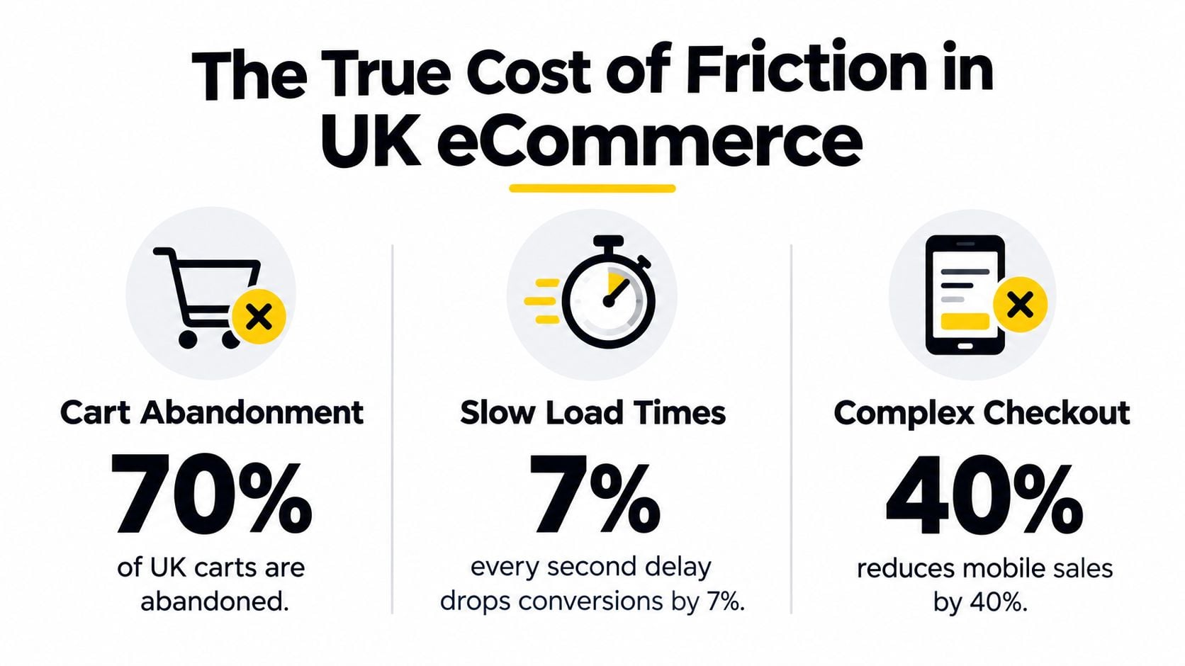
The Leeds Beckett research found that approximately 74% of UK online shopping baskets created in the last quarter of 2024 were abandoned, with abandonment rising to 76% on mobile compared with 67% on computers. Checkout recovery rates were below 5%, which means most businesses shouldn't assume that an abandoned basket will naturally return and convert later. Those figures make checkout analysis a sensible starting point for many online retailers.
CRO is more than a visual redesign
A new homepage can make a website feel more modern without making it easier to buy. If delivery information remains hidden, payment errors are hard to understand or the mobile layout forces users to pinch and zoom, the underlying conversion problem survives the redesign.
Practical CRO examines the full journey:
- Product discovery: Can visitors find the right category, product or service without unnecessary searching?
- Decision-making: Are price, availability, delivery, returns and trust information clear at the point of choice?
- Checkout completion: Can a customer enter details, choose payment and place an order without avoidable effort?
- Mobile usability: Do buttons, fields, menus and messages work comfortably on a smaller screen?
- Lead capture: Does an enquiry form request only information that the business really needs?
Practical rule: Treat every hesitation, error and unanswered question as a possible conversion issue, not as evidence that visitors lack commitment.
UK retail research also reports that online shopping represented 27% of UK retail sales and that smartphones were the primary shopping device, reinforcing why mobile CRO needs to cover the entire journey rather than just the homepage. A business that optimises only desktop screens is measuring the wrong experience for a substantial part of its audience.
The commercial logic is straightforward. Conversion rate is completed desired actions divided by relevant visitors or sessions, multiplied by 100. When traffic and average order value remain constant, even a modest percentage-point improvement can affect revenue materially. For a smaller retailer with limited acquisition funds, improving the experience for people already arriving may be more sustainable than continually paying for additional reach.
Core Metrics and the Testing Process
CRO becomes useful when it replaces opinions with a repeatable measurement process. Before changing copy, layout or checkout fields, define the action that matters and record how users currently move towards it.
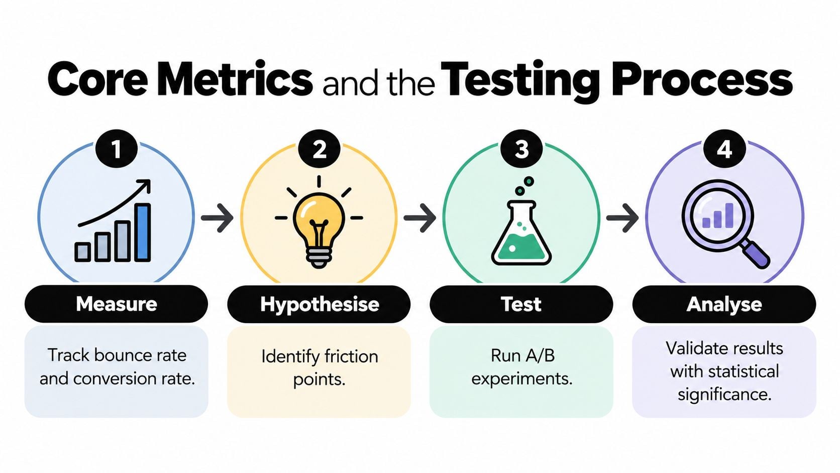
The basic calculation is:
Conversion rate = completed desired actions ÷ relevant visitors or sessions × 100
The denominator matters. A product purchase should be measured against an appropriate visitor or session group, while a service enquiry may need to be assessed against visitors to relevant service pages. Mixing every website visit with every possible action can produce a percentage that looks precise but tells you little.
Build a usable baseline
Start by tracking the events that describe the journey, not just the final result. For eCommerce, that could include product views, add-to-basket actions, checkout starts, payment errors and purchases. For professional services, useful events may include service-page visits, form starts, form completions, telephone clicks and booked consultations.
Segment the results by:
- Device: Mobile and desktop users can encounter entirely different obstacles.
- Traffic source: Search visitors may behave differently from paid or referral visitors.
- User type: New and returning visitors often have different levels of trust and familiarity.
- Page type: Product, pricing, landing and contact pages create different conversion contexts.
An analytics review should be paired with qualitative evidence, such as session recordings, form reports, customer feedback and support queries. DesignStack's analytics guidance is useful context for businesses setting up a clearer view of visitor behaviour and conversion paths.
Turn observations into hypotheses
A hypothesis should connect a specific problem with a proposed change and an expected behavioural outcome. For example: “Because mobile users see delivery charges only at the final step, showing the available delivery options on the product page will reduce checkout exits.” That's more valuable than “make checkout better” because it tells you what to change and what evidence would support the idea.
Baymard reports a global average cart-abandonment rate of about 70.19% and found that 65% of benchmarked US and EU sites had mediocre-or-worse checkout usability, while only 2% were rated good. Its usability testing identified an average potential conversion improvement of approximately 35% for a large eCommerce site through checkout-flow improvements alone. These findings don't guarantee a comparable result for a Dorset retailer, but they support prioritising checkout investigation over random visual tweaks. See Baymard's checkout usability research for the underlying evidence.
A proper A/B test exposes different versions to comparable audiences and measures a predefined primary outcome. A before-and-after comparison can still help a low-traffic business, but it needs careful interpretation because seasonality, campaign changes, device mix and demand can alter results. A change that increases completed orders while also increasing refunds, support contacts or poor-quality leads may not be a genuine improvement.
For businesses working on lead generation, the same principle applies to a gym lead generation system. Track qualified enquiries and booked conversations, not just form submissions or clicks. The winning version is the one that improves the commercial outcome, not the one that produces the most flattering dashboard.
Performance and Accessibility as Conversion Levers
A visitor can't convert through an interface they can't comfortably use. That sounds obvious, yet CRO discussions often jump straight to persuasion, urgency and button placement while ignoring speed, interaction and access.
A UK retail study found that 92% of 230 retailers missed a three-second page-load benchmark, while product pages averaged 5.20 seconds, with slower response times associated with lower conversion, fewer pages viewed and reduced customer satisfaction. The evidence is summarised in this UK retail performance discussion. The practical lesson isn't that every site needs to chase an arbitrary score. It's that real-user performance deserves a place in the conversion funnel.
Fix the wait before polishing the message
For an SME website, performance work should focus on what users experience:
- Server response: Review hosting and backend delays that hold up the first meaningful content.
- Responsive images: Compress and size images appropriately for the device displaying them.
- Third-party scripts: Remove or defer tools that add weight without supporting a measured business goal.
- Layout stability: Prevent content from shifting while a visitor tries to tap a button or complete a field.
- Primary action visibility: Render the product, enquiry or booking action early enough that users can identify the next step.
Measure real-user performance by device and geography, then compare it with conversion events. Page-speed scores are diagnostic signals, not the final business metric. A faster page that produces more accidental clicks or poorer leads hasn't necessarily improved the experience.
Accessibility expands the usable audience
Accessibility belongs in CRO because it affects whether people can understand, move through and complete the main task. Semantic labels, keyboard-operable controls, visible focus states, sufficient colour contrast, captions, readable content and useful validation all reduce uncertainty. They also help users who aren't disabled, particularly on mobile or when they're distracted, tired or working in poor conditions.
The available accessibility evidence reports detectable WCAG failures on 96.3% of home pages in 2023, while a separate analysis of more than 63,000 websites reported that 88% weren't fully compliant with current accessibility standards. UK-focused reporting estimates that roughly one in four UK adults, about 16.1 million people, has a disability, and cites research that 71% of disabled users leave websites they find difficult to use. These figures are presented in the accessibility evidence compiled by STP Trans.
That doesn't mean every accessibility change automatically increases revenue. It means barriers can prevent otherwise interested people from completing a task. Start with the primary journey, test it with disabled users where possible and measure task completion, errors and abandonment by journey rather than relying on a compliance statement alone. DesignStack's accessibility guidance provides a practical starting point for reviewing common interface barriers.
High-Impact Tactics for Checkout and Forms
The most effective CRO tactics remove uncertainty at the moment a customer needs confidence. Artificial urgency can produce a click, but clear information helps a suitable customer complete the transaction without regret.
A 2024 survey of 2,000 UK households found that 27% of abandoned carts were triggered by dissatisfaction with delivery-option choice, while 51% of consumers considered delivery choice more important than delivery cost. The findings are reported by Leeds Beckett University's Retail Institute. Delivery isn't a fulfilment detail to hide until the final screen. It's part of the buying decision.
| Tactic | Friction solved | Expected impact |
|---|---|---|
| Show delivery costs and timeframes early | Removes surprise at checkout | More informed progression towards payment |
| Offer guest checkout | Avoids forced account creation | Fewer unnecessary barriers for first-time buyers |
| Reduce form fields | Lowers effort and cognitive load | More completed checkouts and enquiries |
| Explain returns clearly | Addresses perceived purchase risk | Greater confidence at the decision point |
| Improve payment-error messages | Helps users recover from failed attempts | Fewer abandoned sessions after an error |
| Add genuine payment reassurance | Answers security concerns | Stronger trust without unsupported promises |
Make forms proportionate to the decision
A local service business doesn't need to interrogate a visitor before starting a conversation. Ask for the information required to respond, explain why any sensitive detail is needed and make errors visible beside the relevant field. If qualification matters, consider a staged process rather than presenting every question at once.
For eCommerce, test guest checkout against account creation, but also consider what the business needs after purchase. An account can support repeat ordering, yet forcing registration before a first order adds work at a moment when trust is still developing. Make account creation an optional benefit, not a toll gate.
Trust signals should answer real questions. Place accepted payment methods, delivery coverage, returns conditions and contact details near the action they support. A focused review of logos and credit cards can help ensure payment marks are clear and not treated as decorative clutter.
Social proof works best when it's relevant to the decision, not when a page is filled with generic badges. Businesses developing a social audience can also explore practical guidance on turning followers into paying customers, while keeping the CRO measurement focused on qualified purchases or enquiries rather than follower counts.
Common Pitfalls That Waste Time and Budget
CRO fails when teams test what looks interesting instead of investigating what prevents completion. A button colour may be easy to change, but ease of implementation isn't evidence of commercial value.
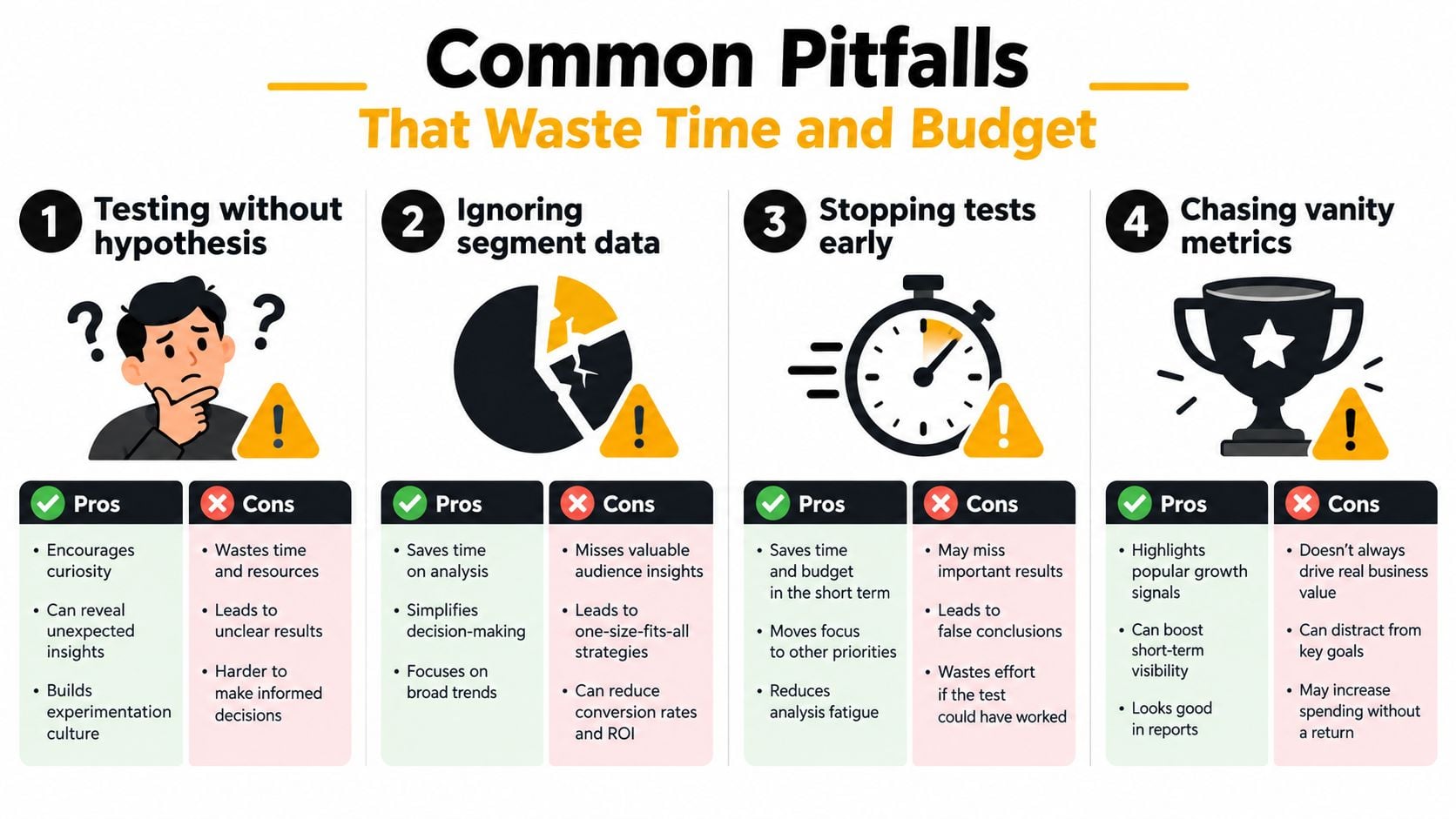
Four habits that undermine the work
- Testing without a hypothesis: A result may move without revealing why, leaving the team unable to make a sound follow-up decision.
- Ignoring segments: An overall result can conceal a serious mobile problem or a useful improvement for returning visitors.
- Stopping early: Early results can reflect normal variation rather than a dependable behavioural difference.
- Chasing vanity metrics: More clicks, longer sessions or deeper scrolling don't necessarily mean more sales, qualified leads or profitable customers.
Copying a competitor creates a similar problem. Their pricing, customer expectations, fulfilment model, brand familiarity and traffic sources may differ from yours. A layout that works for a national retailer may add confusion to a local business whose customers need delivery boundaries, collection details or a direct route to a human being.
Low-traffic sites also need realism. A small business may not generate enough comparable sessions to run endless formal A/B tests across tiny changes. In that situation, prioritise high-intent journeys, fix obvious usability barriers, use sequential testing carefully and combine quantitative evidence with user interviews and support feedback.
A clean-looking dashboard can't compensate for a poorly defined conversion or a test that never had enough evidence to answer its question.
Measure primary outcomes alongside guardrails. For a shop, that could mean completed orders, revenue per visitor, margin, refunds and support contacts. For a professional service firm, it may include qualified enquiries, booked calls and sales acceptance. DesignStack's guide to the hidden costs of cheap website design is relevant here because a low upfront build cost can leave businesses with limited measurement, brittle forms or technical issues that make later optimisation harder.
A Local Scenario for Dorset Retailers
Consider a representative Dorset retailer selling products through a WordPress eCommerce site. The owner believes sales are being held back by the homepage, so the first instinct is to commission a new visual design. A disciplined CRO review would resist that assumption until the data shows where users leave.

The audit starts with the mobile path from product view to purchase. Analytics shows that visitors add products to their baskets but a noticeable share exits after reaching the delivery stage. Session evidence suggests that the delivery wording is vague, the local coverage area isn't obvious and the returns information sits several clicks away.
Turn the problem into a testable change
The retailer forms a specific hypothesis: if the product and basket pages show delivery areas, expected timing, available options and returns information before payment, more suitable shoppers will continue to checkout. The proposed change also makes the primary action easier to identify on a mobile screen and gives customers a clear route to ask a question before committing.
The team instruments product view, add-to-basket, checkout start, delivery-option interaction, payment error and purchase events. It reviews results by mobile and desktop, new and returning visitors, and traffic source. This prevents a strong result from one audience being mistaken for a universal improvement.
A useful sprint might include:
- Observe: Review analytics, recordings, customer messages and checkout errors.
- Prioritise: Choose the point with the clearest commercial friction rather than redesigning every page.
- Change: Improve delivery clarity, returns visibility, form recovery and mobile hierarchy.
- Validate: Compare completed purchases and guardrail metrics through a controlled experiment where practical.
- Document: Record what changed, which audience was affected and what the result suggests for the next test.
The scenario illustrates a key distinction. The retailer isn't promised a particular uplift, because no responsible CRO practitioner can guarantee that without evidence from the business. The value comes from replacing a broad redesign with a focused investigation, a measurable hypothesis and a decision based on observed customer behaviour.
For a Dorset brand, local context can be commercially important. Delivery to nearby towns, collection arrangements, seasonal demand and access to a real support contact may matter more than a fashionable animation or a dramatic hero banner. CRO should make those practical advantages easier to understand at the point of decision.
When to Hire a CRO Agency and Next Steps
You can carry out a useful first review internally. Try the main journey on a current phone, use a private browsing window, add a product or submit an enquiry, check what information appears before payment and deliberately trigger a form error. Ask someone unfamiliar with the business to complete the same task without guidance.
Bring in specialist help when the problem spans analytics, technical performance, accessibility, UX and experimentation. An agency should be able to explain which events are tracked, how it will protect data quality, how it will separate evidence from opinion and which commercial metric defines success. Be cautious of a provider that promises a guaranteed conversion lift from a single landing-page tweak.
What a sound engagement should include
- Funnel diagnosis: A clear view of where visitors progress, hesitate and leave.
- Technical review: Performance, mobile behaviour, forms, checkout reliability and tracking quality.
- Accessibility checks: Keyboard use, labels, contrast, focus, error recovery and task completion.
- Prioritised recommendations: Changes ranked by likely impact, implementation effort and confidence.
- Testing plan: Hypotheses, audiences, primary outcomes and guardrail metrics.
- Learning record: A usable account of what was tested and what the result means next.
A partner should also understand the difference between selling online and generating demand for a local service. Businesses exploring ways to sell directly to local shoppers need to connect the website journey with practical local buying behaviour, rather than just add more promotional messages.
DesignStack is one option for businesses that need website, UX and measurement support together. Its work can include analytics and funnel audits, form and checkout reviews, mobile layout improvements, accessibility considerations and conversion-focused WordPress or eCommerce development. You can also compare the wider role of a UK marketing agency before deciding whether the immediate need is CRO, SEO, a rebuild or a combination.
Start today by recording your current conversion definitions, checking your mobile checkout, listing the questions customers ask before buying and identifying the first point where users abandon the journey. That evidence will give an internal team or agency a far more useful brief than “make the website convert better”.
DesignStack helps Dorset and UK businesses audit analytics, funnels, forms, product pages, checkout steps, mobile layouts and technical friction, then turn the findings into practical website improvements. Visit DesignStack to discuss a conversion-focused WordPress or eCommerce project built around measurable customer actions.