

Mega Menu Design: UX Best Practices for UK Sites
Your website often grows one page at a time. A new service gets added, a category expands, a blog archive starts to matter, and suddenly the main menu feels like a drawer stuffed with paper, nothing is easy to find, and every new item makes the rest harder to read. That's usually the moment a mega menu stops being a nice-to-have and becomes a practical navigation fix.
A mega menu is a large, two-dimensional dropdown panel that shows several paths at once. Nielsen Norman Group describes why this works well, it can present lower-level pages at a glance without forcing people through several nested dropdowns, and it fits complex site structures much better than a narrow list of links (Nielsen Norman Group on mega menus). For many UK SMBs using WordPress, that matters because the problem isn't style, it's making a growing site feel simple again.
The right navigation choice depends on the structure of the site, the size of the content inventory, and how much choice your visitors can realistically handle. This guide takes a practical view of mega menu design, with a strong focus on performance, accessibility, and the question many agencies dodge, when not to use one. If you're thinking in terms of site structure and user journeys, the basics of information architecture are the right place to start.
Table of Contents
- Introduction Is Your Website Navigation Working Hard Enough
- Mega Menu or Simple Dropdown Which Is Right for You
- Designing for People First UX and Accessibility Rules
- Layout Patterns and Visual Design That Guide Users
- Putting It All Together Real World Examples and Ideas
- WordPress Tips SEO and Performance Considerations
Introduction Is Your Website Navigation Working Hard Enough
A lot of small business sites reach a point where the menu no longer reflects the business. The company has more services, more product lines, more audience types, and more content than the header was ever built to hold. The result is familiar, people hesitate, hover twice, then give up and use search or leave.
That's why mega menu design exists. It's not a decorative dropdown, it's a way to turn a cramped top bar into a clear map of the site, with sections arranged so visitors can scan, compare, and choose quickly. In practical terms, it gives your menu a little of the structure of a landing page, without making users hunt for the next click.
Practical rule: if your main navigation has started to feel like a list of compromises, the site has probably outgrown a simple dropdown.
For UK businesses, especially those running on WordPress, this is a structural decision rather than a visual one. A menu should help first-time visitors understand the site and repeat visitors reach a destination fast. Nielsen Norman Group notes that mega menus work because they show many choices in a two-dimensional dropdown layout, which is exactly what a deep site needs when users want more than one path at a glance (Nielsen Norman Group on mega menus).
A well-built mega menu also has to respect the realities of a commercial website. It needs to support search, not compete with it. It needs to work on a phone. It needs to stay readable even when the business grows again next year. That's the difference between a menu that merely looks bigger and one that works harder.
Mega Menu or Simple Dropdown Which Is Right for You
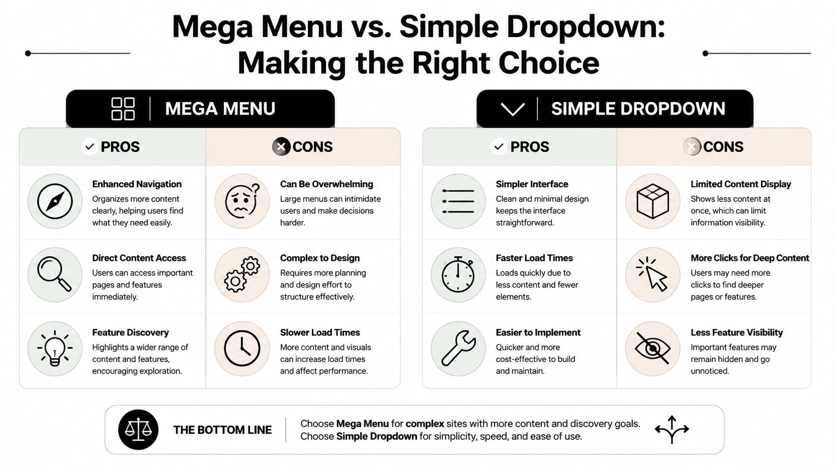
The easiest mistake is assuming a mega menu is always the better, more professional option. It isn't. For some sites, a simple dropdown with strong category pages is faster, clearer, and better for conversions, especially when the content inventory is shallow and the visitor doesn't need many branching choices.
For Dorset and UK SMEs, that distinction matters. Guidance aimed at usability and performance says the key question is often when not to use a mega menu, because too many links can create decision paralysis and cognitive load (Invoke Media on mega menu usability and performance). If the site only has a handful of top-level sections, forcing a large panel into the header can make the interface feel heavier, not more helpful.
Ask these questions before choosing
- Do we have enough distinct categories? If visitors are choosing between multiple product groups, service lines, or audience paths, a mega menu can help. If not, a standard dropdown usually stays cleaner.
- Can our visitors scan the options quickly? A menu full of similar labels creates friction. Clear category names and a small number of decisions are easier to process.
- Are we trying to expose a broad catalogue or just a few pages? Mega menus shine when the site has breadth. They're less useful when the site is still simple.
- Would stronger landing pages solve the same problem? Sometimes a better category page does more work than a bigger menu.
- Will the menu support the user journey, or just show everything? Showing everything is rarely the goal. Helping people move with confidence is.
Simple dropdowns still win when the site is focused. A local practice, a single-service business, or a small brochure site can often do more with concise top-level items and one click into a well-structured page. That approach keeps the header light and leaves the heavy lifting to the page content itself.
Mega menus are better when the site has real structural depth. That usually means eCommerce, multi-service firms, membership organisations, or content-heavy sites where users need to compare pathways quickly. In those cases, the menu is doing information architecture work, not just navigation work.
If the menu needs explaining, it's probably too complicated for the average visitor.
The safest decision is the one that matches the content, not the trend. If a mega menu helps people choose faster, use it. If it adds more choices than your visitors need, keep the nav simple and make the destination pages stronger.
Designing for People First UX and Accessibility Rules
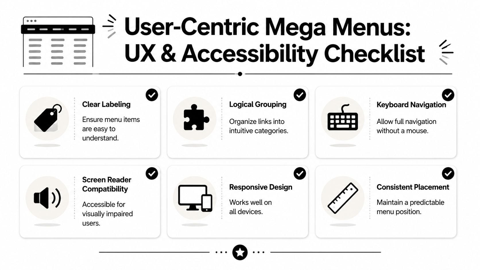
A mega menu only works when people can move through it without effort. The visual layout might look polished, but if the labels are vague or the interaction feels jumpy, the whole thing becomes a barrier. Accessibility and usability are not separate concerns here, they're part of the same job.
Effective mega menus can increase pages per session by 40–60% according to UK-facing UX guidance, and that lift depends on the menu being usable rather than flashy (Exmoor Web on mega menu interaction guidance). The same guidance recommends a 0.5-second hover delay to reduce accidental activation, and says top-level items should stay clickable links instead of acting only as triggers. That combination gives visitors control, which is the primary design goal.
Make the menu behave predictably
A good menu opens when people expect it to open and closes when they want it closed. Hover states should feel calm, not twitchy. On desktop, accidental activation is one of the fastest ways to make a menu feel broken, because users lose their place before they've even started reading.
Top-level navigation items should go somewhere useful. If a user clicks on “Services”, that link should lead to a real page, not just reveal a panel with no destination. That's a small choice with a big impact, because it gives both keyboard users and mouse users a clear path.
Write labels that help people think less
Clear labels reduce cognitive load. That means plain language, short phrases, and groups that reflect how customers think rather than how the company organises itself internally. A visitor scanning a menu should not have to decode jargon or guess which label hides the right page.
Practical rule: if two labels sound like they belong to the same bucket, the menu probably needs better grouping, not more items.
Keyboard navigation matters just as much as mouse interaction. Screen readers need predictable structure, and focus states need to be easy to follow. That's why mega menus should feel like part of the page architecture, not a separate interface bolted on top.
For WordPress sites, inclusive navigation principles should guide the build from the start, especially if the menu is serving a broad audience. A useful reference point is inclusive design principles, because the menu needs to support different abilities, devices, and browsing habits without falling apart for any of them.
Layout Patterns and Visual Design That Guide Users
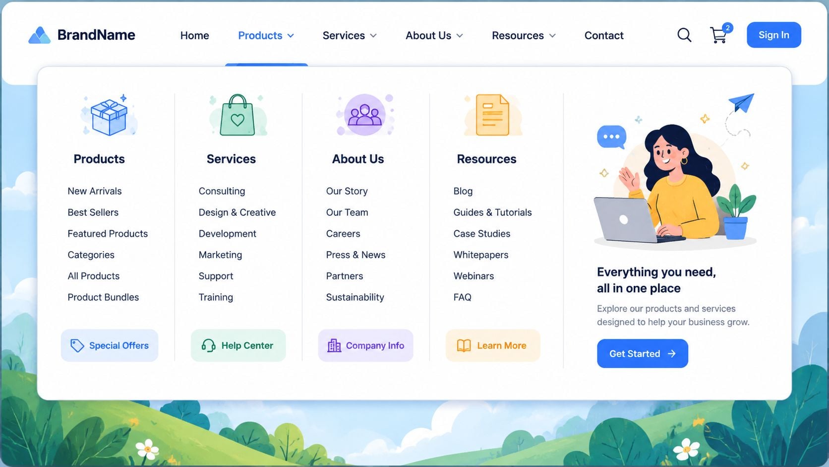
Good layout makes a large menu feel smaller. That sounds odd, but it's exactly what users need. When links are grouped cleanly and the eye can move in a simple pattern, the panel feels organised even if it contains a lot of content.
Nielsen Norman Group's guidance says to keep mega menus to about 3–4 columns and roughly 28–36 total links to avoid choice overload, while other UX guidance suggests panels with 4 to 6 columns and 5 to 8 links per column, and avoiding anything over 50 links in total (Nielsen Norman Group on mega menus). Those ranges matter because scanning time rises as the panel fills up, and the menu starts to feel like a spreadsheet instead of a helpful guide.
Use hierarchy to control scanning
Start with a clear top-level group, then build the panel around related sets. Think of the menu as a shelf system, not a bucket. Each cluster should answer a different visitor question, such as what you sell, who it's for, or what support content exists.
Short link labels help. The guidance recommends concise link text, roughly 2 to 4 words, because long labels slow scanning and make the columns harder to align visually (FatCow on mega menu design for large websites). That's especially useful for UK SMBs with WordPress sites, where the temptation is often to stuff in every page name instead of trimming the menu to the essentials.
Keep the panel visually calm
Typography does a lot of the work. Use weight, spacing, and size to separate section labels from links, and don't rely on colour alone to create hierarchy. Clear subheadings give the eye a stopping point, which helps the panel feel less dense.
Icons can help when they're used sparingly and consistently. They should clarify a group, not decorate every link. If the menu already feels crowded, more visual elements usually make it worse.
A mega menu should feel like a guided route, not a catalogue spread across the screen.
For WordPress sites with eCommerce sections or mixed content, a header pattern that balances clarity and scannability matters more than visual novelty. A useful reference for this kind of structure is eCommerce website header design, because the header often has to carry search, account access, and navigation without becoming cluttered.
Putting It All Together Real World Examples and Ideas
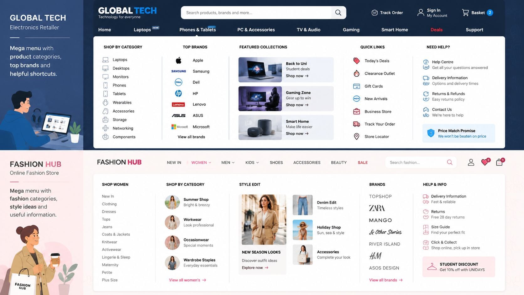
The strongest mega menus usually do one thing well, they organise complexity into sensible paths. That's why they're useful on different kinds of sites, from product-heavy retailers to service businesses with several audience groups. A good example doesn't just show links, it shows what the site believes matters most.
Retail sites often benefit from clear category grids because visitors arrive with broad intent, then narrow down as they browse. A menu that groups categories cleanly supports that behaviour far better than a skinny list of terms. For context on how WordPress sites can present this kind of structure in practice, WordPress eCommerce website examples are a useful starting point.
What strong examples tend to get right
Some menus lead with product families, then separate support and inspiration content into their own zones. That gives shoppers a fast route to the items they want while keeping content like guides or account pages visible but not dominant. The structure matters more than the styling.
Service businesses often need a different pattern. They benefit from grouping by need, such as “for homeowners”, “for businesses”, or “by service type”, because those labels match how people decide. The menu becomes a sorting tool, which helps visitors recognise themselves in the structure before they click.
Content-heavy brands can use mega menus to make editorial areas easier to enter. When categories, recent posts, and resource hubs are grouped cleanly, the navigation can support both exploration and direct access. That's useful for repeat visitors who already know where they want to go, and first-time visitors who need a broad overview.
A clean visual cue, such as a subtle heading style or a distinct call-out area, can also guide attention without making the panel noisy. The best examples avoid the temptation to overfill every column. They give each section room to breathe.
Good inspiration usually looks simple after the work is done. That simplicity is the result of editing, not the absence of structure.
If you're reviewing examples for your own site, focus on three questions. Can a visitor see the main groups instantly. Do the labels make sense without explanation. Does the menu help people move to the next sensible page without extra thinking. If the answer is yes, the design is probably doing its job.
WordPress Tips SEO and Performance Considerations
For WordPress sites, a mega menu has to be built with restraint. The most important rule is simple: every item should be part of the HTML structure where possible, so search engines can crawl the links and users can access them without fragile workarounds. If the menu is hidden inside heavy scripts or overly complex interactions, it can become slower and less reliable than the simple dropdown it replaced.
Many WordPress themes and plugins can create a mega menu without custom code, but the build still needs testing. The risk isn't the feature itself, it's the bloat that often comes with it. Large images, too many animations, and unnecessary JavaScript can slow the header down and make the whole site feel less responsive.
A practical way to keep things under control is to treat the menu like any other performance-sensitive component. Review how it loads, whether it adds extra assets to every page, and whether the design still performs well on mobile. If a menu feels heavy, it usually is.
SEO also depends on structure. Clear headings, sensible internal links, and crawlable destinations help the site's authority flow to the pages that matter most. A mega menu can support that well, but only if the links point to meaningful pages rather than thin placeholders.
For WordPress teams, the decision should be measured against the site's speed as well as its navigation value. A useful reference for the broader technical side is how to improve website loading speed, because navigation changes shouldn't undo the gains made elsewhere.
The best outcome is a menu that helps users and search engines at the same time. Keep it lean, keep it crawlable, and keep it aligned with the pages that earn business. If the menu is doing too much, simplify it. If it's not exposing enough of the site, expand it carefully.
If your WordPress site has grown into a maze, DesignStack can help you turn the header into a clearer, faster path for your customers. Get in touch with DesignStack for practical website support that puts navigation, SEO, and performance on the same page.


Leave a Reply