Professional Services Website Design: A UK SMB Guide 2026
You're probably in one of two positions right now. Your firm's website looks dated and you know it's holding you back, or you're planning your first serious rebuild and don't want to waste money on something that looks polished but doesn't win work.
That's a sensible concern. In professional services, a website isn't judged like an online brochure. It's judged like an early sales meeting. Clients use it to decide whether you feel credible, organised, and worth contacting.
Good professional services website design isn't about cramming in more pages, more text, or more moving parts. It's about making the right strategic decisions in the right order, so the final site supports trust, lead generation, and long-term growth.
Table of Contents
- Why Your Current Website Isnt Winning Clients
- Laying the Foundation with Strategy and Discovery
- Developing a Brand Story That Resonates
- Designing a User Experience for Trust and Conversions
- The Technical Build and Foundational SEO
- Budgeting Timelines and Ensuring Long-Term Success
Why Your Current Website Isnt Winning Clients
Many professional services firms have a website that technically works. It loads, it lists services, and it has a contact page. But it still doesn't bring in enough good enquiries.
The usual problem isn't a lack of effort. It's that the site was built as a brochure, not as a business tool. It tells visitors what the firm does, but it doesn't help them decide why they should trust the firm, what to do next, or whether the service is right for them.
That gap matters more now because competition is tighter. The UK Web Design Services industry includes 2,206 businesses in 2026 and industry revenue is projected to contract at a compound annual rate of 0.7% through 2026-27, according to IBISWorld's UK web design services industry data. More firms are competing for attention while many existing businesses are under pressure to protect revenue. In that environment, being online isn't enough. Your website has to perform.
What underperforming sites usually get wrong
A weak site often has the same symptoms:
- It leads with the firm, not the client. Visitors see history, credentials, and internal language before they see how you solve their problem.
- It buries next steps. People can't quickly work out whether to call, book, email, or read further.
- It looks cautious and generic. Stock imagery, bland copy, and crowded layouts make different firms feel interchangeable.
- It asks visitors to work too hard. They have to dig through pages to understand services, process, and fit.
Practical rule: If a potential client has to interpret your website, your website is already doing too little.
Professional services website design works best when it reflects how real buyers behave. Most aren't browsing casually. They're checking whether you seem competent, safe, and easy to deal with. They want clarity, not volume.
That's why the strongest websites don't start with colours or layouts. They start with strategy. Once that foundation is right, design decisions become much easier, and far more useful.
Laying the Foundation with Strategy and Discovery
The most expensive website mistake is starting with design mock-ups too early. A homepage can look polished and still fail because nobody agreed what the site was meant to do, who it was meant to attract, or how success would be judged.
For a UK professional services firm, a strategy-led website project typically takes 12 to 20 weeks, and that timescale matters because 75% of people judge a business's credibility based on its design, according to Flow Advisory's guide to web design for professional services in the UK. If credibility is one of the main outcomes, the planning stage can't be rushed.
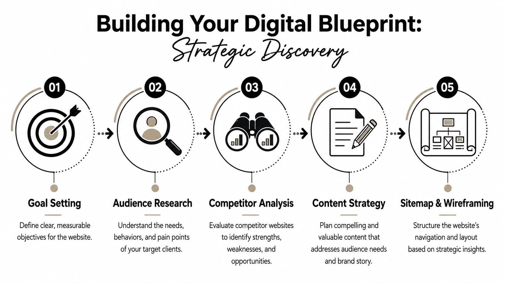
Start with business goals not page ideas
Clients often begin by saying they need a new homepage, better service pages, or a cleaner design. Those requests are understandable, but they sit too low down the decision chain.
Ask the harder questions first:
What should this website help the business achieve?
Lead generation is the obvious goal, but some firms also need the site to qualify prospects, support referrals, attract staff, or reduce time spent answering common questions.Which services matter most commercially?
Not every service needs equal prominence. A good site usually reflects where the firm wants to grow, not just everything it currently offers.What action counts as a conversion?
For one firm, that might be a consultation request. For another, it could be a document download, a phone call, or an enquiry from a specific sector.
Without those answers, design turns into opinion. With them, you can make decisions that have a clear purpose.
Build around the people who actually buy
Professional services firms often know their subject very well but describe it from the inside out. Website visitors don't think that way. They arrive with a concern, a time constraint, and a shortlist.
That changes what discovery needs to cover.
A useful planning session should identify:
- Buyer concerns. What makes someone hesitate before contacting your type of firm?
- Decision criteria. Are they comparing specialism, location, responsiveness, fee clarity, or sector experience?
- Common objections. Do they worry that your service is too complex, too expensive, or not suitable for a smaller business?
- Information needs. What must they understand before they feel comfortable making contact?
A website brief should explain buyer behaviour, not just page count and colour preferences.
Competitor review also matters here, but not for imitation. The point is to spot patterns. If every local accountant, consultant, solicitor, or surveyor says the same thing in the same way, your site needs a clearer point of difference. Sometimes that difference comes from tone. Sometimes it comes from a simpler process explanation. Sometimes it comes from being the only firm that speaks plainly.
Turn discovery into a practical brief
By the end of discovery, you should have a working document that gives the project direction. It doesn't need corporate language. It needs useful clarity.
A solid brief usually includes:
| Area | What to define |
|---|---|
| Business objective | What the site must help the firm achieve |
| Target audience | Who the main buyers are and what they care about |
| Priority services | Which offers deserve the strongest visibility |
| Brand position | How the firm should feel different from competitors |
| Content needs | What must be written, rewritten, or removed |
| Functional requirements | Forms, downloads, integrations, blog, team profiles |
| Success measures | What outcomes will show the project worked |
If you haven't written a proper one before, this guide to writing a design brief is a useful starting point.
Discovery doesn't slow a project down. It stops you paying for the wrong website.
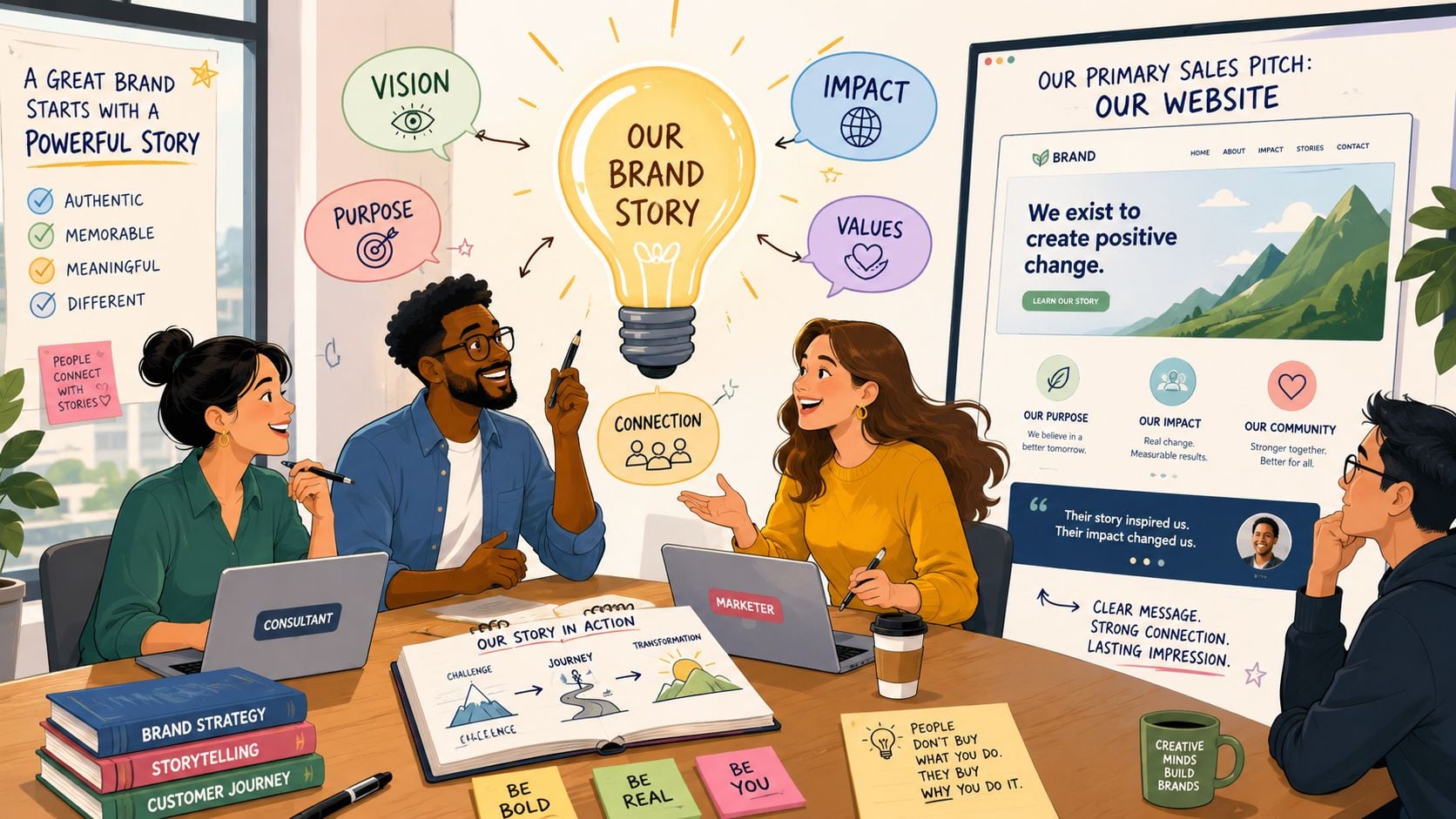
Developing a Brand Story That Resonates
A common mistake in professional services website design is assuming that more information creates more confidence. In practice, too much information often creates friction.
Visitors rarely arrive ready to study your whole firm. They want reassurance that you understand their problem, that you've helped similar people before, and that taking the next step will be straightforward.
Why information heavy websites lose people
Some firms respond to a redesign by trying to add everything. Every service detail, every compliance note, every industry phrase, every possible page. That approach feels safe internally because nobody wants to leave something out.
But visitors don't experience that as thoroughness. They experience it as effort.
A Dorset digital survey found that 62% of local professional service clients abandon websites after 8 seconds if the next step isn't immediately obvious, as cited in this discussion on conversion psychology in professional services web design. That's the clearest argument for prioritising conversion psychology over information density.
The right question is not “What else should we add?” It's “What does this visitor need right now to move forward?”
When the page tries to answer every question at once, it usually answers none of them well.
What strong website messaging looks like
A persuasive brand story doesn't mean writing slogans. It means shaping content so the firm feels credible, relevant, and human.
That usually comes from a few practical choices:
- Lead with the client problem. Your homepage and service pages should start with what the visitor is dealing with, not with your firm description.
- Explain outcomes in plain English. Buyers want to understand what changes after working with you.
- Show the people behind the service. Team pages matter because professional services are still person-to-person decisions.
- Make your process visible. People are far more likely to enquire when they know what happens next.
- Use proof carefully. Case studies, testimonials, memberships, and accreditations work best when they support a point already being made.
The tone matters too. Firms often fear sounding too simple, so they default to jargon. That usually weakens trust rather than strengthening it. Clear writing suggests confidence. Overwritten copy often suggests distance.
A useful content structure for most firms looks like this:
Problem
Name the challenge the client is facing.Approach
Explain how your firm deals with it.Evidence
Show why someone should believe you.Next step
Give one clear action.
If your brand feels too flat, your story may not be organised around the client journey. This explanation of brand storytelling is helpful when you're shaping messaging and tone.
A good website doesn't just say you're experienced. It makes that experience easy to understand.
Designing a User Experience for Trust and Conversions
Design quality carries unusual weight in professional services because the buyer often can't judge the service itself before making contact. They use signals instead. Layout, typography, imagery, spacing, and navigation all help them decide whether your firm feels reliable.
According to JE Consulting's article on quality website design for professional service firms, visitors form first impressions in 50 milliseconds, and 75% of consumers judge a company's credibility solely based on website design. That means trust starts before most of your copy has even been read.
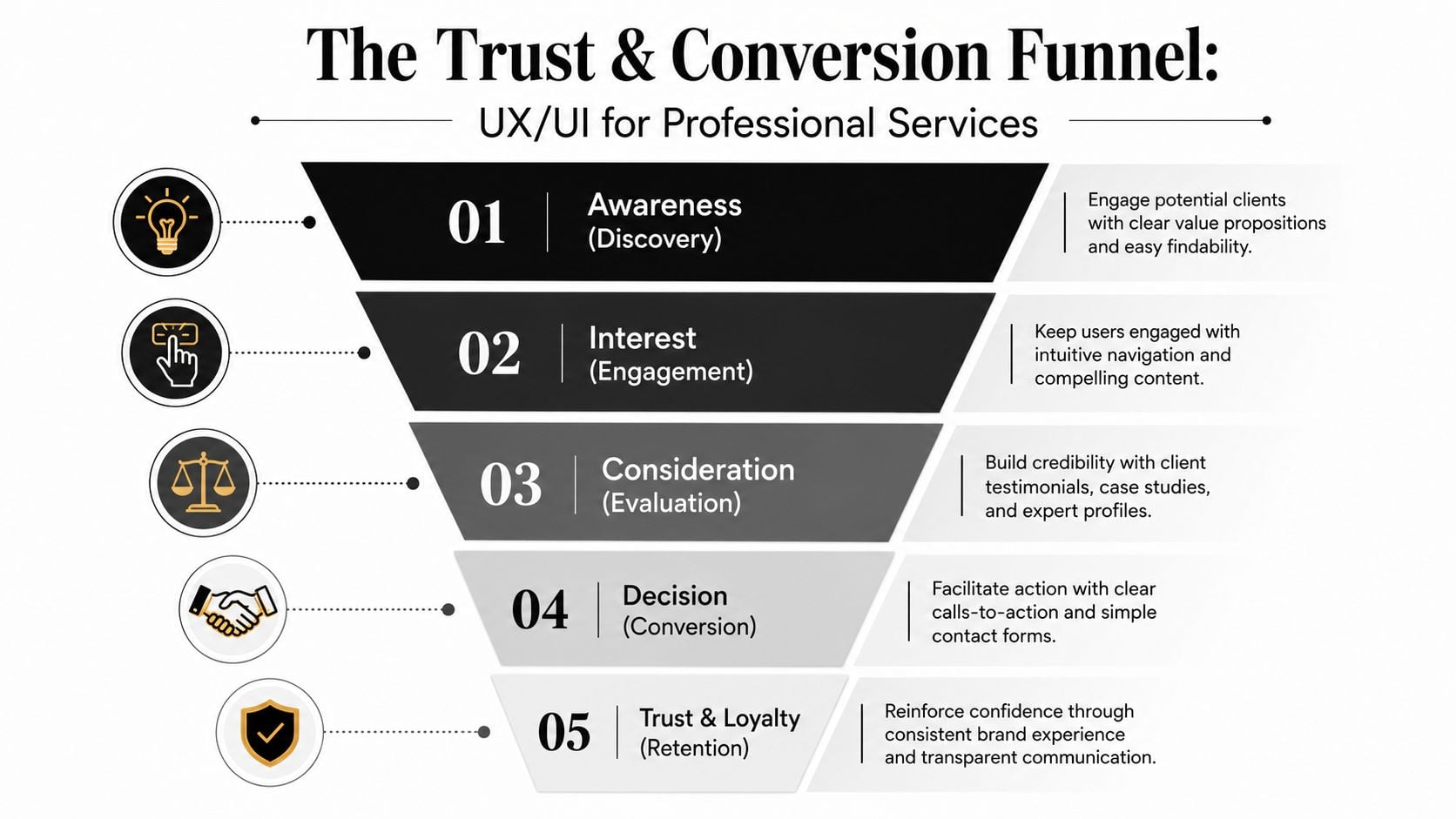
Trust starts before anyone reads a word
The strongest sites for accountants, consultants, solicitors, architects, and similar firms usually have a calm visual logic. They don't try to impress with clutter. They remove uncertainty.
That often means:
- Simple navigation. People should know where to click for services, sectors, team, insights, and contact.
- A clear opening statement. The first screen should explain what the firm does and who it helps.
- Professional photography. Real team images nearly always outperform generic stock visuals for trust.
- Consistent branding. Colour, typography, and spacing should feel intentional, not assembled.
- Focused calls to action. One page can support several actions, but one should clearly be primary.
A lot of firms weaken trust by mixing signals. The copy sounds premium, but the visual design feels dated. The homepage looks modern, but the service pages are cramped and text-heavy. The team page feels warm, but the enquiry process feels cold. Consistency matters.
Here's a short walkthrough that shows how design choices affect user confidence:
The pages and elements that move people forward
Once the visual trust barrier is cleared, UX has one main job. It should help visitors progress without hesitation.
A practical page structure often includes the following:
| Page or element | What it should do |
|---|---|
| Homepage | Clarify positioning and direct visitors to the right route |
| Service pages | Explain problems, approach, fit, and next steps |
| About or team page | Humanise the firm and build confidence in expertise |
| Case studies or proof pages | Support claims with real examples and context |
| Contact page | Remove friction and make enquiry easy |
Key judgement: If your contact journey feels harder than contacting a competitor, design is costing you leads.
The details matter. A short form usually beats a complicated one. A visible phone number can help buyers who want reassurance. Repeated calls to action work well when they appear naturally after useful content, not when they interrupt every paragraph.
Accessibility and readability also support trust. Strong contrast, legible type, logical heading structure, and generous spacing make the site feel more professional because they make it easier to use. That's not decoration. It's service.
If your current site feels busy, inconsistent, or unclear, reviewing core website user experience improvements is often where the biggest gains start.
The Technical Build and Foundational SEO
A website can have strong strategy, sharp writing, and good design, then still underperform because the build is weak. Slow pages, poor mobile behaviour, awkward editing tools, and broken search foundations all create drag.
For most UK SMBs, WordPress remains a practical choice for professional services website design because it gives you flexibility without locking everyday updates behind a developer. That matters after launch, when your team needs to edit service pages, publish insights, add team members, and keep content current.
Choose a build you can manage after launch
The technical setup should make life easier, not create dependency.
A sensible build usually includes:
- A flexible CMS. WordPress is widely used because it supports bespoke design without making content management painful.
- Clean page templates. Service pages, team pages, case studies, and articles should be easy to update consistently.
- Reliable plugin choices. Fewer, better tools are usually safer than a bloated stack.
- Basic governance. Decide who can edit what, how changes are approved, and how content gets reviewed.
Many cheaper projects often begin to demonstrate their limits. If the backend is confusing, the site gets neglected. If updates feel risky, content goes stale. A website that can't be maintained confidently won't stay effective for long.
Responsive design is not a nice to have
Mobile performance isn't a secondary consideration anymore. Buyers read emails on phones, open links between meetings, and compare providers on smaller screens before they ever reach a desktop.
According to Tenet's roundup of web design statistics, implementing a responsive, mobile-friendly design can boost conversion rates by 11% and increase user engagement by 20%. The same source says 62% of UK businesses report a direct increase in sales after making their site mobile-responsive.
That's why responsive design should affect decisions from the start:
- Navigation must collapse cleanly
- Buttons need clear tap targets
- Forms should feel easy on a phone
- Headings must stay readable on small screens
- Images should support the page, not slow it down
Mobile design isn't a smaller version of desktop design. It's a separate user test your site has to pass.
Foundational SEO should be built in from day one
Foundational SEO is less glamorous than branding, but it protects visibility. If search structure is ignored until after launch, you usually end up rewriting templates, page titles, and content hierarchy later.
The essentials are straightforward:
- Search-friendly URLs that describe the page clearly
- Proper heading structure so each page has a clear hierarchy
- Meta titles and descriptions that support search visibility
- Image alt text that improves context and accessibility
- Internal linking so related pages support each other
- Fast, stable templates that don't frustrate users or search engines
A useful non-technical introduction to technical SEO can help when you're reviewing proposals and asking agencies the right questions.
The technical build should support the strategy, not undermine it.
Budgeting Timelines and Ensuring Long-Term Success
Most clients eventually ask the same two questions. How much should this cost, and how long will it take?
Those are fair questions, but the better version is this: what level of investment gives the business a useful result rather than just a new set of pages?
Research focused on Southern England found that 48% of professional service firms underinvest in their websites by spending under £1,500, and those firms see 2.3x lower conversion rates than firms investing £3,500+ in optimized UX, according to Radical Web Design's article on web design for professional services. That doesn't mean every business needs a large budget. It does mean very low budgets often force compromises in strategy, UX, messaging, and technical quality.
What you are really paying for
Website cost usually reflects more than design time. It also reflects the thinking behind the design.
A cheaper project often strips out the parts that make a site effective:
- Little or no discovery
- Minimal copy guidance
- Template-led page structures
- Basic mobile treatment
- Weak conversion planning
- Limited testing and post-launch support
A more strategic build tends to include stronger planning, clearer content structure, bespoke page design, and better long-term usability. That's why timelines and budgets need to be judged against outcomes, not just deliverables.
A simple way to compare project options
Here is a practical comparison you can use when reviewing proposals.
| Feature | Basic Website (£1,500 – £3,000) | Strategic Website (£3,500 – £8,000+) |
|---|---|---|
| Discovery | Limited | In-depth business and audience discovery |
| Design approach | Template-led or lightly customised | Bespoke layouts shaped by strategy |
| Content support | Mostly client-supplied | Structured guidance and messaging input |
| UX focus | Basic page flow | Conversion-focused user journeys |
| Mobile design | Functional | Deliberately designed for mobile use |
| SEO setup | Essential basics only | Stronger page structure and on-page setup |
| Testing | Light | More thorough quality assurance |
| Post-launch readiness | Often minimal | Better handover, training, and support |
This isn't about prestige. It's about fit. A smaller brochure site may be enough for some firms. But if the site needs to generate leads, support growth, or compete in a crowded market, strategy usually pays for itself in clarity alone.
Launch is the start not the finish
A website isn't finished because it's live. It needs attention after launch if you want it to stay secure, current, and useful.
The basics are simple:
- Hosting must be reliable. If the site is slow or unstable, trust erodes quickly.
- Software needs updates. WordPress core, themes, and plugins all need routine maintenance.
- Content should evolve. Team changes, service shifts, and new insights all need reflecting.
- Performance should be reviewed. Analytics help you see which pages attract interest and where users drop off.
The best website projects plan for ownership after launch, not just applause on launch day.
If you need a clearer idea of what ongoing care involves, this overview of website support and maintenance is a useful reference.
A well-built website should keep improving after it goes live. That only happens when someone remains responsible for updates, measurement, and refinement.
If you're planning a new website and want a team that can handle strategy, branding, WordPress development, and ongoing support in one place, DesignStack is worth a look. They work with UK businesses that need more than a cosmetic redesign, with a practical approach focused on clarity, credibility, and results.


Leave a Reply