
What Is Information Architecture: A 2026 Guide
You might be in this position right now. Your website looks decent, the branding is fine, the pages exist, but people still ring the office to ask basic questions, struggle to find services, or drop off before making an enquiry.
That usually isn't a colour problem. It often isn't even a copy problem. It's a structure problem.
Most business owners have felt this from the customer side too. You land on a website, click one menu, then another, then another. The labels are vague. The search box returns rubbish. You know the information must be there, but the site makes you work for it. At that point, many visitors leave. If you're interested in the wider ingredients behind a strong site, this guide on what makes a good business website is a useful companion to the topic here.
That hidden structure has a name. It's information architecture, often shortened to IA. If you've been asking what is information architecture, the simplest answer is this: it's the way your website is organised so people can find what they need and do what they came to do.
Table of Contents
- The Invisible Blueprint Behind Every Great Website
- What Information Architecture Actually Is
- The Four Core Components of Good IA
- How Information Architecture Is Created
- The Measurable Business Benefits of Smart IA
- Real World Examples and Common Pitfalls
- Your Next Steps in Information Architecture
The Invisible Blueprint Behind Every Great Website
A good website feels easy in a way most people never notice. You arrive, scan, click, and get what you need. You don't stop to admire the menu structure or think about page hierarchy. You just move forward.
That's why information architecture is easy to ignore. When it works, it's almost invisible.
When it fails, the damage shows up everywhere. A service page sits under the wrong heading. An online shop hides important filters. A membership site uses internal team language that means nothing to new visitors. Customers can't tell where to start, so they hesitate.
Why this matters to a business owner
If a visitor can't find pricing, they may not enquire. If they can't compare products, they may not buy. If they can't locate delivery details, returns information, or opening hours, they may call your team instead.
Good information architecture acts like digital signposting. It reduces hesitation and helps people reach a decision faster.
This is why IA sits underneath so many business outcomes. It shapes how people browse, how they understand your offer, and whether they trust the site enough to keep going.
It's not just for giant websites
Some owners hear “information architecture” and assume it's only relevant to government portals, universities, or huge eCommerce shops. It isn't.
A five-page brochure site still needs clear structure. A local trade business still needs services grouped in a way that matches how customers think. A small retailer still needs categories, product labels, and search that make sense.
The size of the site changes the complexity. It doesn't remove the need for structure.
What Information Architecture Actually Is
Information architecture is the structural design of shared information environments. In practical website terms, it combines organisation, labeling, search, and navigation systems so users can find information and complete tasks efficiently, as explained in the RWS definition of information architecture.
The phrase can sound abstract, so it helps to think about a library.
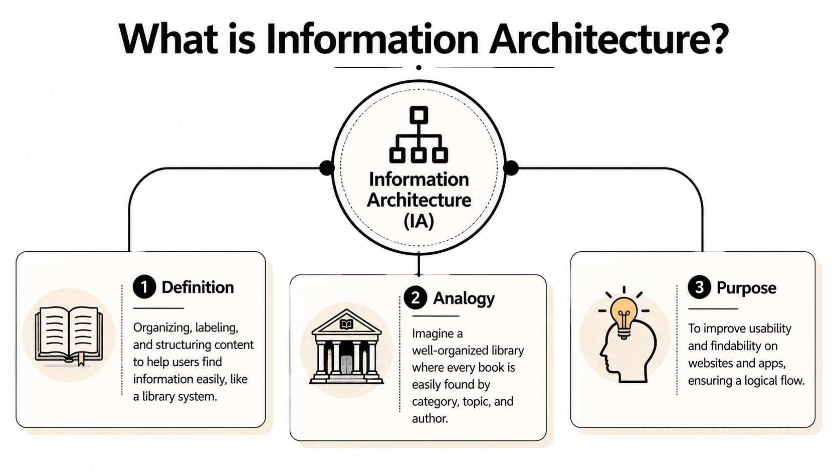
The library analogy
A well-run library doesn't throw every book into one room and hope for the best. It groups books into sections, gives shelves clear names, uses a catalogue, and makes it easy to move from one area to another.
A website works the same way.
- Organisation groups related content together.
- Labels tell people what those groups mean.
- Navigation helps them move around.
- Search gives them a shortcut when they know what they want.
If any one of those breaks, people get lost.
What IA is trying to achieve
The job of IA is simple. It helps people find, understand, and act.
That might mean helping a visitor:
- Book a service without clicking through irrelevant pages
- Find a product category without guessing what your labels mean
- Read key policies without digging through the footer
- Reach the right answer through search instead of ringing support
IA also affects how content is chunked for browsing. That matters because the way information is grouped changes whether someone reaches the right page quickly or gives up partway through the journey.
Practical rule: If a customer has to stop and decode your menu, your information architecture is doing extra work for them instead of removing work.
IA is not the same as visual design
Many readers find this confusing. A beautiful site can still have poor IA. Clean typography and polished layouts don't automatically create clarity.
IA sits closer to the skeleton than the skin. It's about structure first. That's one reason it overlaps with, but isn't identical to, UX. If you want to understand that relationship more clearly, this guide to what user experience design is helps separate the terms.
When people ask what is information architecture, they're often really asking, “Why does one site feel effortless and another feel messy?” The answer is usually in the structure.
The Four Core Components of Good IA
Most IA problems become easier to understand when you split them into four parts. If your website feels confusing, one or more of these parts is usually the reason.
Organisation
Organisation is how content gets grouped.
On a services website, that might mean placing related services under one clear parent section. On an eCommerce site, it means deciding whether shoppers browse by product type, use case, brand, or another pattern that matches how they think.
A poor organisation system often reflects the company's internal structure instead of the customer's mental model. For example, a visitor wants “boiler repair”, but the menu says “Domestic Heating Solutions Division”. That may be technically accurate inside the business, but it's weak IA.
Labelling
Labels are the words you put in menus, buttons, categories, and links.
This sounds small, but it has a huge effect. Labels tell users what to expect before they click. If the wording is vague, clever, or inconsistent, trust drops.
Consider the difference between these menu items:
- Clear labels like “Pricing”, “About”, “Case Studies”, “Returns”
- Unclear labels like “Solutions”, “Discover”, “Knowledge”, “Support Hub”
The second set might work in some contexts, but only if the audience instantly understands them. Many don't.
People rarely complain that labels are too plain. They complain when labels make them think.
Navigation
Navigation is how users move through the structure you've created.
That includes the main menu, footer links, breadcrumbs, internal links, related content, and calls to action that guide someone to the next logical step. Good navigation gives people a sense of orientation. They know where they are, where they can go, and how to go back.
Here are common navigation patterns businesses rely on:
- Top-level navigation for primary sections such as services, shop, about, and contact
- Local navigation inside a section, such as sub-services or support topics
- Footer navigation for secondary but important links like policies, FAQs, careers, and account access
- Breadcrumbs on larger sites where people need context inside a hierarchy
Navigation shouldn't force users into a maze. It should offer a clear path.
Search
Search matters more than many SMEs realise.
Some visitors don't want to browse. They want to type a term, skim results, and go straight to the answer. That's especially true on larger catalogues, help centres, member portals, and content-heavy websites.
A weak search experience usually has one or more of these problems:
- Poor indexing where relevant pages don't appear
- Weak labels that don't match the language visitors use
- No filtering on sites where filtering is needed
- Messy results that don't help users distinguish one page from another
For a deeper look at how content structure supports these systems, this article on what content strategy is connects IA with the broader planning work behind a site.
Why the four parts have to work together
A website can't rely on one strong component to rescue the others. Good search won't fix vague labels. Clear labels won't solve a broken hierarchy. Neat menus won't help if the content has been grouped in the wrong way.
That's why good IA feels joined-up. The categories make sense, the names make sense, the paths make sense, and the search behaves the way people expect.
How Information Architecture Is Created
Good IA rarely appears because someone guessed well. It usually comes from a process of research, sorting, testing, and simplifying.
It starts with users, not menus
Many business owners start with the menu because that's the visible part. Professionals usually start earlier.
They ask questions such as:
- What are visitors trying to do
- What content already exists
- Where are people getting stuck
- What words do customers use
- Which pages support business goals, and which create noise
That leads to a few common methods.
User research looks at what people need, what they expect, and how they talk about the subject. Even a small set of customer conversations can reveal major mismatches between business language and customer language.
Content audits list what's already on the site. This often shows duplication, outdated pages, thin content, and sections that no longer fit the business.
Card sorting is a practical exercise where people group topics into categories that make sense to them. It's a useful way to test whether your planned structure matches how users naturally think.
User flows trace the route someone takes to complete a task, such as booking, buying, donating, applying, or contacting you. That helps shape navigation around action rather than around department charts.
For businesses exploring expert website design for local businesses, it's worth noticing how often the strongest projects begin with this structural work rather than with colours and layouts.
The output is more than a sitemap
Once the research is done, the IA work turns into practical assets that a team can use. One of the most common is the wireframe. If that term feels fuzzy, this explanation of what a wireframe is in web design makes the relationship clearer.
Here are the deliverables you'll commonly see:
| Deliverable | What It Is | Main Purpose |
|---|---|---|
| Sitemap | A map of pages and their hierarchy | Shows the overall structure of the site |
| Wireframe | A basic page layout without visual styling | Tests layout, hierarchy, and content placement |
| Taxonomy | A classification system for content | Keeps categories, tags, and relationships consistent |
| User flow | A step-by-step path through a task | Helps remove friction from key journeys |
| Content audit | A record of existing content | Identifies gaps, duplication, and cleanup needs |
A business owner doesn't need to produce all of these personally. But it helps to know what they are, because they show where the thinking happens.
A sitemap tells you what exists. A user flow tells you how someone moves. A taxonomy tells you how content relates. Together, they turn guesswork into structure.
The end result isn't just a tidier menu. It's a clearer system for content, pages, tasks, and future growth.
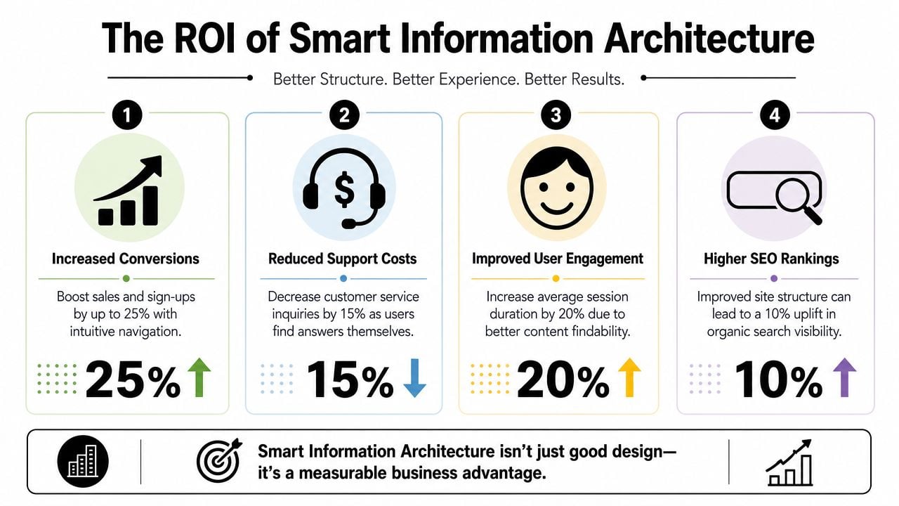
The Measurable Business Benefits of Smart IA
Information architecture can sound academic until you connect it to what a business cares about. Enquiries. Sales. Support load. Trust. Search visibility. Accessibility. Content maintenance.
That's where IA becomes much easier to value.
Better journeys usually mean better business outcomes
When a site is organised around user tasks, fewer people hit dead ends. They can compare services, understand what you offer, and reach conversion pages with less effort.
That affects several commercial areas at once:
- Conversions improve when users can find the right product, service, or contact route without confusion.
- SEO benefits when content is structured clearly and pages sit in a logical hierarchy that search engines can understand.
- Customer confidence grows when the site feels coherent and dependable.
- Support pressure falls when answers are easy to locate without a phone call or email.
A useful way to think about it is this. Every structural problem creates friction, and friction has a cost. Sometimes that cost is an abandoned basket. Sometimes it's a missed lead. Sometimes it's staff time spent answering questions the website should have answered.
Accessibility is part of business performance
IA also has a direct accessibility and compliance impact.
Poor information architecture increases cognitive load and makes keyboard navigation, heading structure, and link purpose harder to interpret, which harms task completion for users with disabilities. For UK organisations, that matters because the Public Sector Bodies (Websites and Mobile Applications) Accessibility Regulations 2018 cite WCAG 2.1 AA as the benchmark for digital accessibility, as outlined by the Interaction Design Foundation's overview of information architecture.
Even if your business isn't a public-sector body, the principle still matters. Clear hierarchies, meaningful headings, and understandable navigation make sites easier for everyone to use.
Accessibility isn't a layer you add at the end. Structure is one of the things that makes accessibility possible in the first place.
If you're reviewing structure, it also helps to map it properly first. This guide on how to create a website sitemap is a practical next read.
The bottom-line view
For SMEs, smart IA supports day-to-day performance in very practical ways:
- Your sales pages work harder because people can reach them more easily.
- Your content has a longer shelf life because it sits inside a structure that can grow.
- Your team wastes less time answering preventable questions.
- Your site becomes easier to manage because content relationships are clearer.
That's why IA shouldn't be treated as a design extra. It's part of how a website earns its keep.
Real World Examples and Common Pitfalls
The easiest way to understand IA is to compare it in action. One example shows what good structure can achieve. The other side shows why smaller websites still run into trouble.
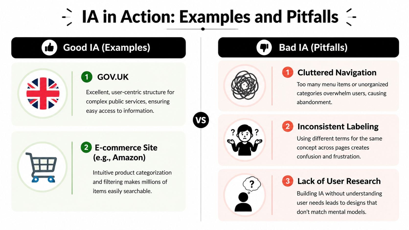
A UK example that changed the standard
A major UK milestone came with GOV.UK. The Government Digital Service launched in 2011, and when GOV.UK went live in October 2012 it replaced 820 separate departmental and agency websites, as documented in the Journal of Information Architecture analysis of GOV.UK.
That wasn't just a redesign. It was a structural change on a huge scale.
Instead of forcing people to understand government departments, the system focused on user needs. It used consistent labeling, clearer hierarchy, and a shared information model across a vast public-sector content estate. That's why it remains such an important IA example in the UK.
Most SMEs won't face that level of complexity, but the lesson is the same. People don't care how your organisation chart looks. They care about getting the answer, service, or action they need.
Mistakes that quietly damage performance
Poor IA usually doesn't arrive as one dramatic failure. It builds up through everyday decisions.
Common mistakes include:
- Internal jargon in menus that mirrors departments rather than customer tasks
- Inconsistent labels where one page says “Pricing” and another says “Packages” for the same idea
- Dead ends where users reach a page and don't know what to do next
- Overloaded navigation with too many top-level choices
- One-time planning where nobody revisits the structure after launch
One of the most overlooked parts of IA is revision after launch. Analytics, search logs, and content audits often show where people are getting lost or leaving. A structure that looked sensible on a whiteboard can prove weak once real users interact with it.
If users keep searching for something you already offer, your issue may not be content. It may be structure.
That matters even more now because people don't always enter through the homepage. They arrive through search, internal site search, shared links, and increasingly through AI-assisted discovery. A rigid, neglected structure becomes harder for people to use and harder for systems to interpret.
Your Next Steps in Information Architecture
If you've read this far, the main takeaway is simple. Information architecture is the foundation that helps your website make sense.
It isn't just a sitemap. It isn't just menu wording. It's the joined-up structure behind how people find information, complete tasks, and decide whether your business feels easy to deal with.
A quick health check for your site
Ask yourself these questions:
- Can a first-time visitor tell where to start
- Do menu labels use customer language rather than internal language
- Can someone reach key pages without hunting
- Does every important page offer a clear next step
- Is your search useful, if you have one
- Has the structure been reviewed since launch
If several of those answers are “not really”, your IA probably needs work.
When to get professional help
A simple brochure site with a handful of pages may be manageable in-house if you stay disciplined and keep the structure clear.
Professional support becomes far more valuable when you're dealing with things like:
- A large service catalogue
- An eCommerce shop with many categories
- A membership or resource-heavy site
- A merger of multiple websites
- A redesign where users already struggle to convert
- Content that needs to work across web, search, chatbot, and future channels
Modern IA also needs to support more than browsing. As the Optimal Workshop guide to information architecture notes, today's structure should support AI-assisted search and conversational interfaces through clean content models, explicit labels, and machine-readable relationships between pages.
That makes IA a long-term investment, not just a launch task.
If your website feels harder to use than it should, or you're planning a redesign and want the structure right before the visuals begin, DesignStack can help you turn a confusing site into one that's clear, scalable, and built around how real users find information.


Leave a Reply