
Restaurant Website Design: UK Guide for 2026
You've probably seen it happen outside your own restaurant. Someone stops on the pavement, pulls out their phone, checks your menu, scrolls for a few seconds, then either walks in or keeps moving. That decision often happens before they've smelled the food or seen the room.
That's why restaurant website design matters more than most owners realise. Your site isn't a side project for quiet afternoons. It's the digital front desk, the takeaway counter, the booking book, the menu folder, and the sign outside, all at once.
For UK restaurants, that shift has become hard to ignore. Customers expect to check opening hours, browse dishes, find directions, and book without friction. If your site feels slow, confusing, or out of date, people assume the experience inside may be the same. If it feels clear and easy, you've already lowered the barrier to choosing you.
A good restaurant website doesn't just look attractive. It helps people decide quickly. It answers practical questions. It reduces phone calls about basics. It nudges visitors towards a reservation, an order, or a walk-in visit. It should also reflect the story and atmosphere of the business, which is why brand clarity matters just as much as usability. If you're refining that side of your presentation, this guide to brand storytelling for businesses is a useful companion.
Table of Contents
- Your Digital Front Door
- Core Principles of Great Restaurant Website Design
- Must-Have Features That Turn Visitors Into Diners
- Choosing Your Tech Platform and Tools
- Getting Found by Hungry Local Customers
- Real-World Examples of Great UK Restaurant Websites
- Your Project Plan and Launch Checklist
Your Digital Front Door
A restaurant owner once described their website to me as “the thing people look at before they decide whether we're worth the trip.” That's exactly right. Your website isn't a brochure tucked away in a drawer. It sits out front all day, every day, greeting people who may already be close enough to visit.
For a restaurant, first impressions happen in seconds. A customer searches on their phone while leaving work. Another checks whether you've got vegan options before meeting friends. Someone else wants to know if they can book for six tonight. They're not looking for clever design tricks. They want quick answers and a reason to choose you.
Match the online experience to the real one
If your dining room feels warm, independent, and characterful, but your website feels generic and stale, there's a mismatch. If your venue is polished and premium, but the site looks cluttered and improvised, that creates doubt. Good restaurant website design closes that gap.
The visual language should feel familiar to anyone who walks through your door. That includes:
- Photography that sets expectations: Show the room, the dishes, and the atmosphere you provide.
- A recognisable tone of voice: Friendly neighbourhood bistro and formal tasting menu restaurant shouldn't sound the same.
- Clear priorities: If bookings drive your business, make booking obvious. If takeaway matters, treat it as a front-and-centre action.
A restaurant website works best when it behaves like a good front-of-house team member. Welcoming, organised, and quick with answers.
Design for movement, not for browsing
Many owners still review websites on a laptop in an office chair. Customers don't use them that way. They check them while walking, standing outside, sitting in a car, or comparing you with two nearby alternatives.
That changes how the site should work. Navigation needs to be short. Buttons need to be thumb-friendly. Contact details, map information, opening hours, and menus should be easy to reach without a hunt.
The strongest restaurant websites are built around decision points. Can I eat here? Can I afford it? Does it suit the group? Can I book now? Can I order now? Can I trust the information? If your site answers those cleanly, it starts doing commercial work rather than decorative work.
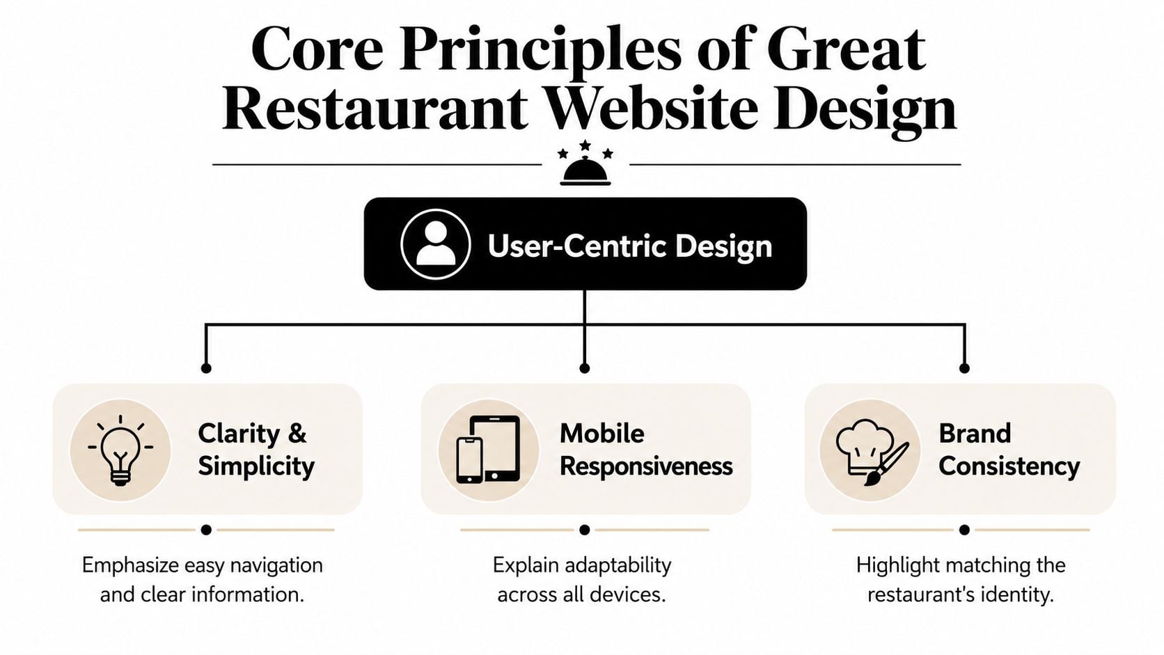
Core Principles of Great Restaurant Website Design
Before you choose a platform, add a booking tool, or think about SEO, get the fundamentals right. Restaurant website design succeeds when it follows the same rules as a well-planned dining space. People should know where to go, what matters most, and what action to take next.
In the UK, mobile use is central to that thinking. Ofcom reported that 69% of UK adults used a smartphone to go online in 2024, which is why restaurant sites now need mobile-first layouts and fast-loading pages rather than desktop-first brochure designs, as noted in this UK restaurant website trend overview.
Match the online experience to the real one
Think about your physical space. You choose lighting, finishes, furniture, music, and layout because they shape how guests feel. The same logic applies online. Logo, colour palette, typefaces, and photography should all support the type of restaurant you run.
A rustic pizza place can carry more warmth and informality. A cocktail-led venue may lean darker and more editorial. A family café usually needs openness and ease. None of those choices are about fashion alone. They help the right customer feel comfortable before they arrive.
Interior cues can inform digital direction too. If you're working through materials and visual mood, Original Mission Tile's design guide is a good example of how physical design decisions contribute to a coherent hospitality brand.
Design for movement, not for browsing
Good user experience is just clear service. Customers shouldn't have to think too hard. If they want the menu, they should see “Menu”. If they want to book, they should see “Book a Table”. If they want directions, the address and map should be where they expect.
That's the practical side of user interface design for business websites. Buttons, spacing, labels, and menus aren't decoration. They're the online version of signage, table layout, and staff guidance.
A simple rule helps here:
| Website element | Restaurant equivalent | What works |
|---|---|---|
| Navigation | Signage at the entrance | Short labels and predictable structure |
| Hero section | Window display | One clear message and one clear action |
| Menu page | Printed menu handed to guests | Easy scanning, clean categories, readable pricing |
| Booking button | Host stand | Visible and available from key pages |
Practical rule: If a first-time visitor can't find your menu, hours, or booking button quickly, the design is serving itself instead of the customer.
Fast loading matters for the same reason. Hungry people don't wait patiently while oversized images and fancy effects drag into place. Keep the site visually strong, but don't let motion, video, or huge files block basic actions.
Must-Have Features That Turn Visitors Into Diners
A lot of restaurant websites fail in a predictable way. They look polished on the homepage, then make the customer work too hard to do the thing that matters. The menu is hidden. Booking sends people off-site with no warning. Ordering is awkward. Dietary information is vague. That's where business gets lost.
The commercial test is simple. Can a visitor move from interest to action without friction?
Your menu is a sales tool
For most restaurants, the menu page is one of the most commercially important parts of the site. It shouldn't be treated like a file attachment.
For UK restaurants, HTML menus are preferable to PDFs because search engines can index the text, improving visibility. Guidance also stresses that menus should be mobile-friendly and easy to update, while PDFs create friction on phones and complicate maintenance, as explained in this restaurant menu design and conversion guide.
That has practical consequences:
- Use HTML, not PDF: HTML menus are easier to read on a phone and easier to maintain when dishes, prices, or availability change.
- Group items logically: Starters, mains, sides, desserts, drinks. Don't make customers decode a creative structure.
- Write dish descriptions for humans: Clear wording sells better than vague chef-speak.
- Keep prices easy to spot: Hidden or inconsistent pricing slows decisions.
If you need help shaping the words themselves, this guide on writing better website copy is useful, especially for menus, about pages, and landing pages.
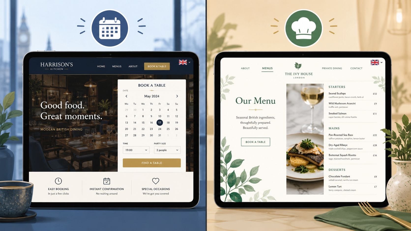
Bookings and orders need a short path
A restaurant website should reduce the number of steps between intention and action. If someone wants a table, let them start booking immediately. If they want takeaway, don't bury the order link in a submenu or footer.
The strongest setups usually include:
- A persistent booking button: Visible in the header on desktop and mobile.
- Click-to-call on mobile: Still useful for urgent or same-day queries.
- Clear location details: Address, map, and opening hours where people expect them.
- An ordering route that feels integrated: Native or well-connected systems feel smoother than abrupt handoffs.
The bigger point is commercial, not technical. In the UK, the case for restaurant websites is tied to the growth of online ordering and digital reservations. That shift means websites now work as conversion tools with menus, booking widgets, and location data acting as revenue infrastructure, as outlined in this restaurant web design trends summary.
If your website makes people call for information that should be obvious, the site is creating work instead of removing it.
Dietary trust has to be maintained, not assumed
Many restaurant sites become risky when they launch with a nice-looking menu page, but nobody thinks through how allergen and dietary information will stay accurate once the menu starts changing week to week.
You don't need to turn the site into a legal handbook. You do need a process. If you offer vegan, vegetarian, gluten-free, or other dietary indicators online, those labels have to be current. If specials change often, decide who updates them and how quickly.
A practical approach is:
- Keep menu content editable in one place: Avoid designs that require a developer for every small text change.
- Assign ownership: One staff member should be responsible for checking website accuracy.
- Review after every menu update: Not occasionally. Every time.
- Match website wording to in-house reality: Don't let old online descriptions drift away from what the kitchen is serving.
Trust is fragile here. A smart website doesn't just present information well. It supports an operational habit of keeping information right.
Choosing Your Tech Platform and Tools
Restaurant owners often ask which platform is “best”. That's usually the wrong question. The better one is: which setup will your team keep updated, without breaking the customer journey?
The right platform depends on your business model. A single-site independent restaurant with a stable menu needs something different from a multi-service venue juggling bookings, takeaway, events, and seasonal changes.
How the main options compare
Here's the practical view.
| Platform | Strengths | Trade-offs | Usually suits |
|---|---|---|---|
| WordPress | Flexible, scalable, strong content control, broad plugin ecosystem | Needs proper setup, hosting, maintenance, and someone who understands the build | Restaurants that want room to grow |
| Squarespace | Clean templates, simpler editing, all-in-one feel | Less flexible for more complex integrations or custom workflows | Smaller venues with straightforward needs |
| Wix | Easy to start, visual editor, accessible for DIY updates | Can become messy if built without structure | Owners who want hands-on control and simple features |
| Restaurant-specific platforms | Built around menus, ordering, and bookings | Can be more restrictive in branding and ownership | Takeaway-led or operationally focused venues |
WordPress often makes sense when the website needs to act as proper business infrastructure rather than a simple online leaflet. You can build menu systems, connect reservations, add location pages, improve local SEO, and keep control over the content structure. But flexibility comes with responsibility. Poor plugin choices or weak hosting can make a good idea feel clunky.
Squarespace and Wix are often fine if the brief is narrower. If the restaurant mainly needs a smart brochure site with a menu, booking link, and location details, an all-in-one builder may be enough. The danger is assuming “easy to start” means “easy to scale”.
What matters more than the platform name
The platform matters less than these questions:
- Can staff update menus without stress?
- Can you integrate bookings and ordering cleanly?
- Can the site grow if you add takeaway, events, or a second location?
- Can the pages be structured for search visibility?
- Can somebody support it when something breaks?
That's where a proper content management system explanation for business owners becomes useful. The CMS is the control room. If it's awkward, updates get delayed. If updates get delayed, menus, hours, and seasonal information go stale.
For UK restaurants, this platform choice sits inside a bigger business change. The website now needs to support online ordering and digital reservations as part of day-to-day revenue infrastructure, not just brand presentation. That's the practical shift highlighted in the earlier linked research.
One option in that space is DesignStack, which builds responsive WordPress websites and custom online systems. For a restaurant, that type of setup is usually most relevant when you want editable menus, SEO control, and integration flexibility rather than a locked template approach.
A good way to think about integrations is this: your website is the dining room, and tools like reservation widgets, payment links, and ordering systems are service stations connected to it. They should fit the room. They shouldn't feel like customers are being sent out the back door every time they try to do something useful.
Getting Found by Hungry Local Customers
A strong restaurant website still needs one more thing. People have to find it when they're ready to choose somewhere to eat.
Local SEO sounds more technical than it is. In practice, it's about making sure Google and your customers can match three things quickly: what you serve, where you are, and whether you're worth visiting.
Start with the roadmap below.
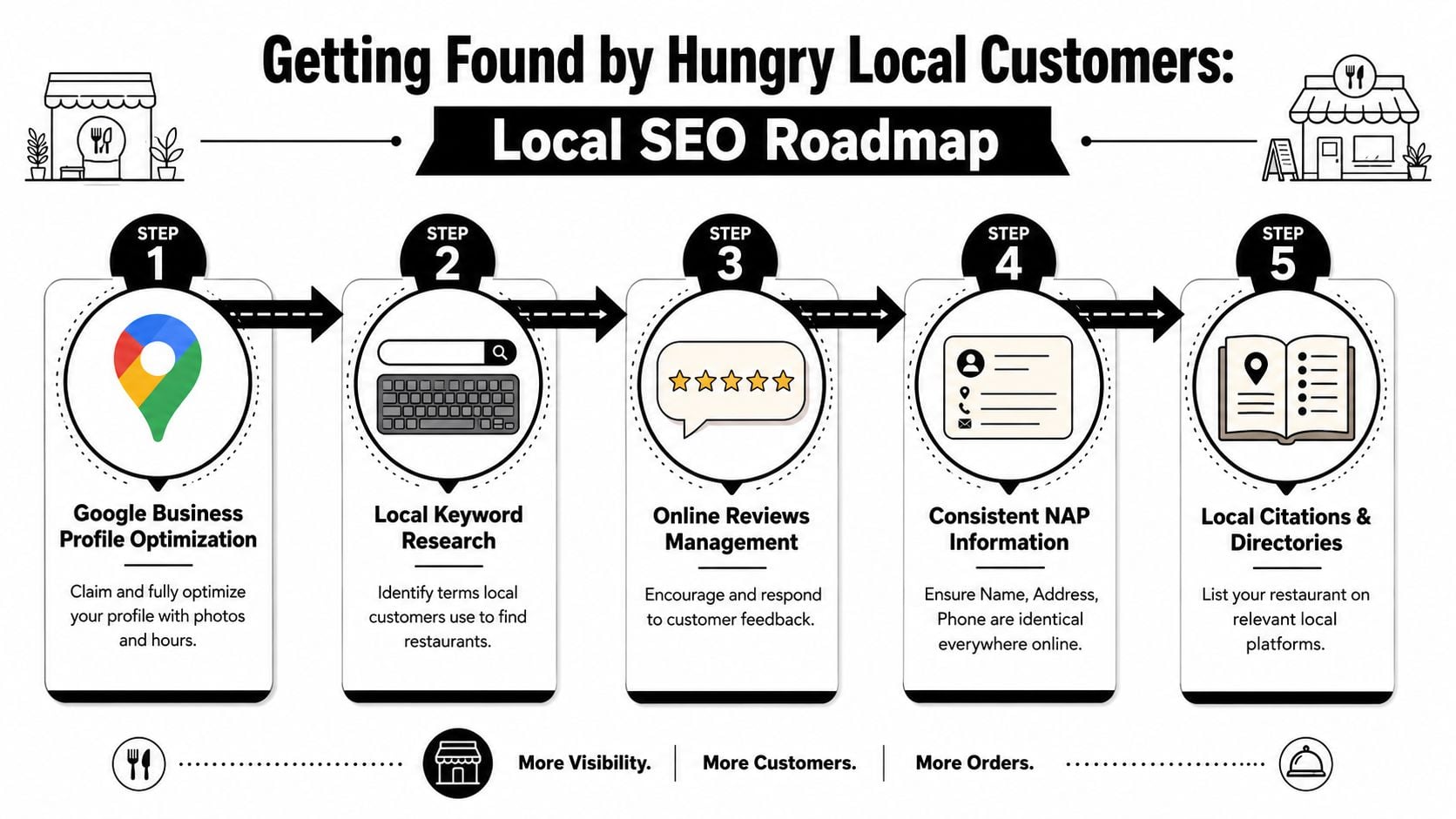
Start with local search basics
Your Google Business Profile does a lot of heavy lifting. If the opening hours are wrong, the category is vague, the photos are poor, or the reviews are ignored, your website has to work twice as hard.
The basics are not glamorous, but they matter:
- Keep your business details consistent: Your restaurant name, address, and phone number should appear the same way everywhere.
- Use real location language: Mention your town, area, or neighbourhood naturally in page titles and copy.
- Create useful core pages: Home, menu, bookings, contact, and about are usually enough to start.
- Show your hours clearly: Don't make people hunt for them.
If you want a fuller walkthrough, this guide to local SEO for businesses covers the wider principles in plain English.
The easiest analogy is shop signage. SEO isn't magic. It's the digital version of putting the right signs in the right windows so the right people know what's inside.
Here's a useful explainer before you tighten up your own setup:
Turn your website into a local relevance signal
Your site should reinforce what your Google listing suggests. If someone searches for “seafood restaurant Weymouth” or “Italian restaurant near the harbour”, the website needs signals that support that intent.
That usually means:
| Area | What to include | Why it helps |
|---|---|---|
| Page titles | Cuisine type plus town or area | Helps match search intent |
| Homepage copy | Clear summary of food, location, and booking option | Confirms relevance quickly |
| Contact page | Embedded map, address, phone, hours | Supports visits and trust |
| Menu content | Searchable dish names and categories | Expands ways people can discover you |
Good local SEO is less like advertising and more like accurate labelling. You're helping the right customer recognise you at the right moment.
Reviews also matter, not because they're a trick for rankings, but because they reduce uncertainty. Responding to them shows the business is active. Fresh photos help too. A restaurant website and a Google profile should support each other, not compete for attention.
Real-World Examples of Great UK Restaurant Websites
Examples matter because restaurant website design is easiest to judge when you trace the customer journey. You can usually tell within a minute whether a site was built around business goals or around surface-level style.
What a strong local restaurant site usually gets right
The best examples tend to share a pattern. They don't overload the homepage with every possible message. They establish atmosphere, then quickly guide the visitor to a menu, a booking action, or practical details.
A solid restaurant site usually does four things well:
- It sets the mood quickly: Good photography and restrained copy tell you what kind of place this is.
- It shortens the path to action: Menu and booking links are easy to spot.
- It answers practical questions without fuss: Hours, address, and contact details are close at hand.
- It feels maintained: Nothing undermines confidence faster than old menus, broken links, or outdated seasonal messaging.
The design choices are often quite simple. A clean hero image. A short value statement. A small set of strong calls to action. This works because restaurant customers are not looking for a long digital experience. They're trying to make a decision.
A useful Dorset example
One relevant local reference point is The Lobster Pot, a Dorset restaurant website project in the DesignStack portfolio. It's useful not because it chases novelty, but because it reflects a practical local brief: present the venue clearly, support search visibility, and make the customer journey straightforward.
That kind of site tends to work because it respects context. A restaurant by the coast should lean into location without letting the design become tourist-board fluff. The tone, imagery, and page structure should all support confidence. People want to know what sort of place it is, what they can eat, and how to get there.
The strongest restaurant websites don't try to impress every visitor. They make the right visitor feel they've found the right place.
That's the lens worth using when you review examples. Don't ask whether a site looks trendy. Ask whether it removes doubt, supports the brand, and makes the next step obvious.
Your Project Plan and Launch Checklist
A restaurant website project runs more smoothly when you treat it like an operational rollout, not a creative side quest. The restaurant already has moving parts: menu changes, supplier issues, staffing, bookings, events, and service. The site needs to fit that reality.
One of the most overlooked parts of restaurant website design is maintenance workflow. UK restaurants need a reliable process for keeping dietary and allergen information current, especially when menus change often. This point is stressed in this restaurant design article on workflow and trust. In practice, that means launch day is the start of a system, not the end of a project.
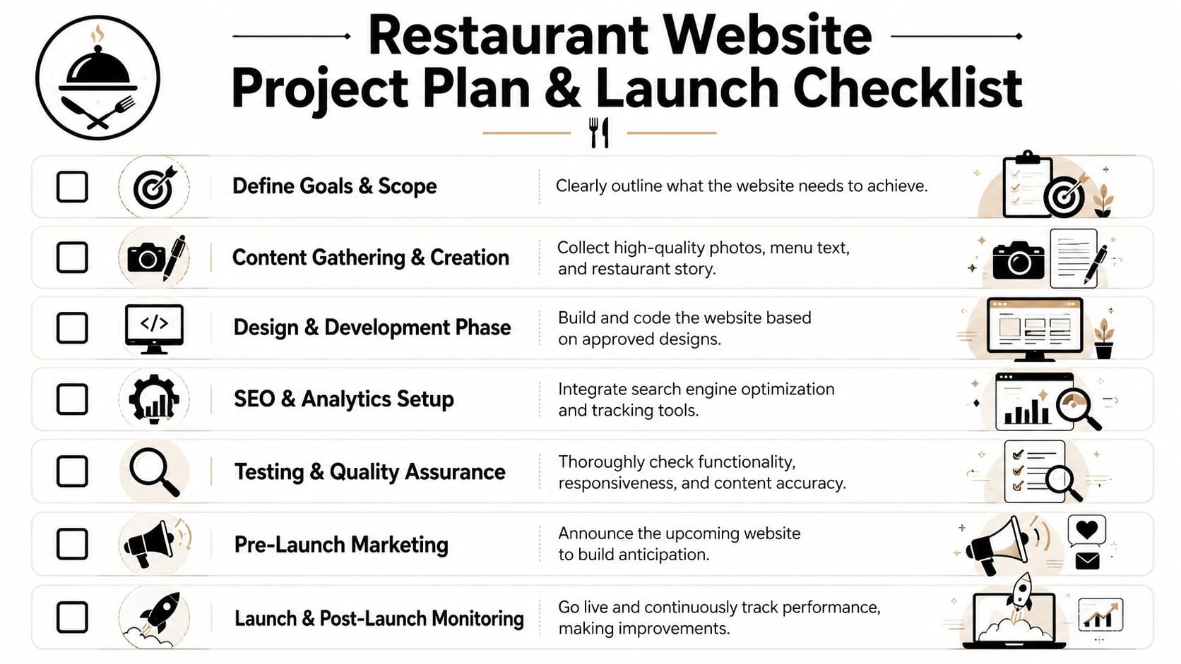
A sensible build sequence
Most successful projects follow a simple order.
Define the commercial goal
Decide what the site must do first. Book more tables, support takeaway, improve local visibility, reduce routine phone calls, or all of the above.Gather the right content
This includes menus, opening hours, photography, dietary notes, brand assets, and short business copy. Weak input produces a weak site.Choose the platform and integrations
Booking tools, ordering tools, contact forms, maps, and editable menu structures should be selected before design gets too far.Build around real user tasks
Menu, bookings, directions, and contact details should shape the page structure.
If you're still refining the business side of a food venue, this guidance for UK coffee shop owners is useful because it frames digital choices inside broader operational planning.
Pre-launch checks that prevent avoidable problems
Before the site goes live, run through a proper checklist.
- Check all core actions: Test forms, booking links, phone links, maps, and order routes on mobile and desktop.
- Review every menu detail: Prices, dish names, dietary labels, allergen notes, and availability cues need a final pass.
- Confirm opening hours everywhere: Website, Google Business Profile, footer, contact page, and booking tool should all match.
- Proofread for trust signals: Typos on a restaurant website can make basic details feel unreliable.
- Set up tracking: Make sure you can see enquiries, booking clicks, order clicks, and page behaviour after launch.
- Assign ownership after launch: Someone must be responsible for updates, especially menu changes and seasonal messaging.
The main mistake to avoid is treating launch as a finish line. Restaurant websites need ongoing care because the business itself keeps moving. Menus rotate. Bank holiday hours change. New reviews arrive. Delivery links change. Events get added. The website should keep up without becoming a burden.
If your restaurant website needs to do more than sit online and look presentable, DesignStack can help plan and build a site around bookings, orders, local visibility, and easy day-to-day updates.


Leave a Reply