How to Create a Style Guide: Boost Brand Consistency 2026
You can usually tell when a business needs a style guide before anyone says it out loud.
The Instagram post uses one shade of green. The website uses another. A freelancer has stretched the logo to make it “fit”. A new blog post sounds crisp and expert, then the next email sounds chatty and vague. None of these problems looks huge on its own. Together, they make the brand feel less settled than it really is.
That's where small businesses often get stuck. You know inconsistency is creeping in, but creating a style guide sounds like the kind of job that belongs to a big marketing team with a brand manager, a copy lead, and a design system in Figma. In reality, the best small-business style guides are much simpler than that. They're practical, compact, and built to stop repeat mistakes.
A useful guide isn't a glossy PDF you admire once and forget. It's a working document that helps your team, your freelancers, and your future self make the same decisions the same way. If you're working out creating effective brand guidelines, the important part isn't making the document look impressive. It's making it clear enough that people use it. That's the difference between a brand that feels joined up and one that keeps drifting. If you need a quick primer on the bigger picture, this overview of brand consistency is a useful companion.
Table of Contents
- Why Your Business Needs a Style Guide Right Now
- Laying the Foundation Before You Design
- Defining Your Core Visual Identity
- Finding and Documenting Your Brand Voice
- Creating Usable Templates and Layout Rules
- How to Launch and Maintain Your Style Guide
Why Your Business Needs a Style Guide Right Now
The problem starts quietly
Inconsistency in a business does not appear all at once. It creeps in through everyday jobs. A social post gets made from memory. Someone grabs an old logo from the wrong folder. A proposal is written in a tone that sounds nothing like the website.
Customers notice more than business owners expect. They may not say, "your brand feels inconsistent", but they do pick up on mixed signals. If your business looks careful in one place and makeshift in another, trust drops a little each time.
Small businesses feel this faster because work is spread across a few busy people. The owner writes LinkedIn posts. An admin updates a PDF. A freelancer designs an ad. A developer builds a landing page. If nobody has one clear reference, each person makes sensible decisions in isolation, and the brand starts to drift.
A style guide gives that work a shared standard.
A style guide works best as a single source of truth, not a brand mood board.
What a style guide actually does
A useful guide cuts out avoidable guesswork. It shows which logo file to use, how the brand should sound in a sales email, what heading styles look like, which colour values are approved, and what to avoid. That saves time, but the bigger gain is consistency. If you want a clearer view of why that matters day to day, this guide to brand consistency for growing businesses breaks it down well.
For small businesses, the value is operational. A style guide makes handovers easier, shortens briefing time, and reduces founder bottlenecks. New staff, contractors, and agency partners can produce work that feels on-brand without chasing constant approvals. That is the difference between a brand that depends on one person's memory and one that can be used properly by a team.
Good guidance also covers more than visuals. It should set rules for plain English, hierarchy, spacing, and presentation so your materials are easier to read and easier to use. That practical approach is a big part of creating effective brand guidelines, especially if your business produces content across web pages, proposals, decks, and social posts.
I see the same trade-off in small teams all the time. You can keep answering the same brand questions every week, or you can spend a bit of time documenting the decisions once. Without a guide, tiny inconsistencies multiply into slower reviews, muddled briefs, and last-minute fixes. With one, your brand becomes easier to repeat, easier to delegate, and much easier to keep steady as the business grows.
Laying the Foundation Before You Design
If you want to know how to create a style guide that people actually use, don't open Figma first. Start by figuring out what needs fixing.
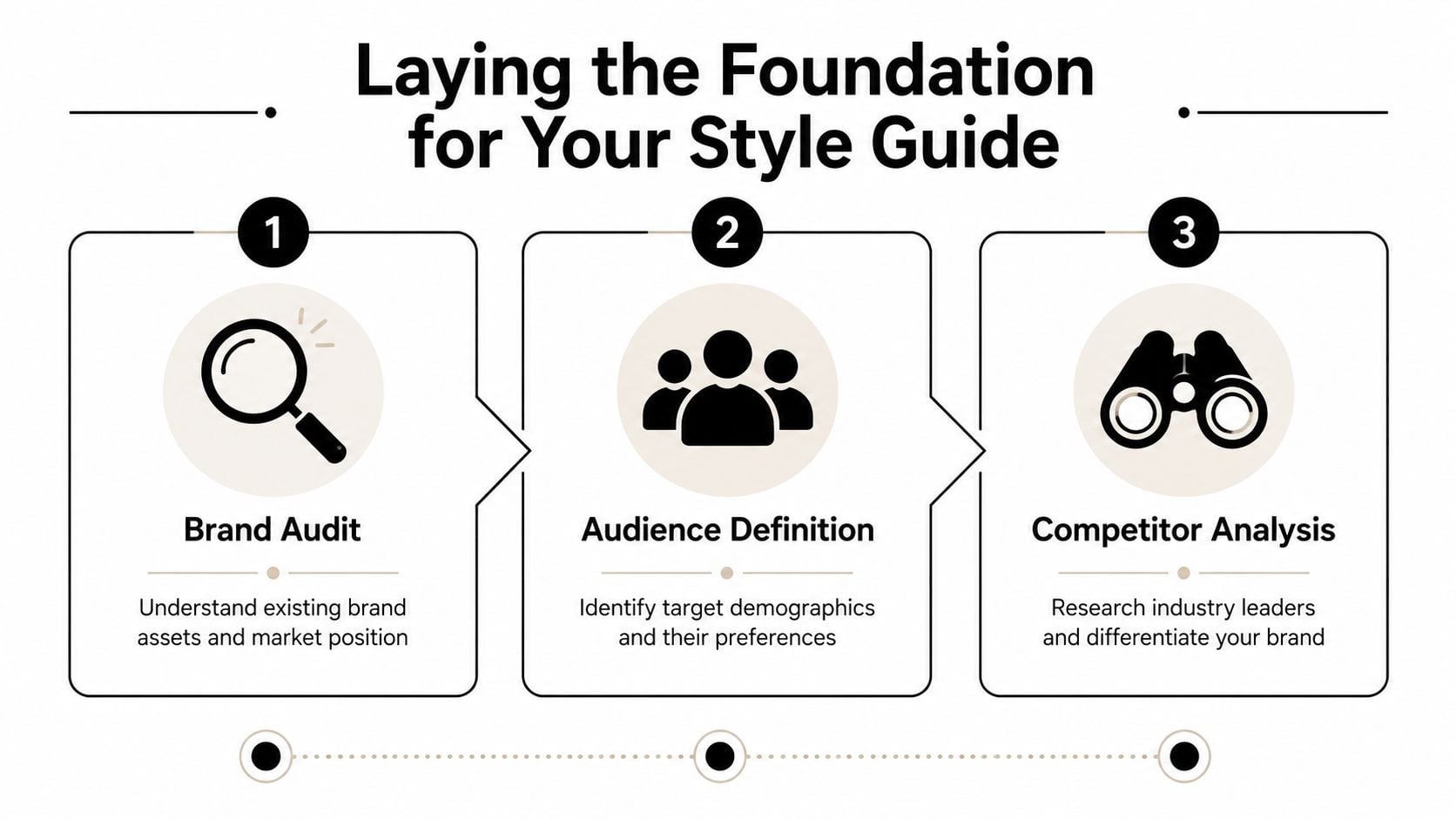
Start with a brand audit
Pull together everything your business already uses. Website pages, proposals, slide decks, social graphics, invoices, email signatures, packaging, signage, PDFs, even WhatsApp promos if that's part of your sales process. Put them in one place and review them side by side.
Look for patterns, not perfection.
- Logo drift: Are there multiple versions in circulation, with different spacing, colours, or proportions?
- Colour mismatch: Do printed materials, the website, and social posts all use the same palette?
- Typography creep: Have random fonts appeared because they were “close enough”?
- Tone inconsistency: Does the brand sound expert in one channel and awkwardly salesy in another?
This is also a good point to revisit your wider brand identity development process. If the business has changed direction, added services, or moved upmarket, the guide should reflect the current brand, not the one you launched with.
Decide who the guide is for
A style guide for one in-house designer looks different from one used by a founder, a VA, a freelance copywriter, and a print supplier. List the people who'll rely on it. Then list what each of them needs to do their job properly.
A freelance designer needs file formats, colour values, and logo rules. A copywriter needs voice guidance, punctuation choices, and approved terminology. A social media assistant needs templates, image dimensions, and caption examples. A printer needs clear artwork specs. If you skip this step, you end up with a document that's thorough in the wrong places and vague where people need help.
Practical rule: Build the guide for the people who use it most often, not for an imaginary future team.
Write the rules after the strategy
A practical method is to treat the guide like a controlled spec document. Define your brand identity and audience first, then lock down the rules. Design guidance reinforces that approach by recommending a clear table of contents, a compact structure, and review plus leadership sign-off before release (Figma's style guide resource).
That means answering a few plain questions before you start writing rules:
| Question | Why it matters |
|---|---|
| Who are we trying to reach? | It shapes the tone, visuals, and level of formality. |
| What do we want to be known for? | It helps separate core traits from personal preference. |
| Where is the brand used most often? | It tells you which applications need the clearest rules. |
| What keeps going wrong? | Those issues should become priority sections in the guide. |
Some small businesses try to document everything at once. That usually produces a bloated guide nobody opens. A better approach is to define the essentials first, then add detail only where confusion keeps appearing.
Defining Your Core Visual Identity
A style guide usually starts to pay for itself here. This is the section that stops a stretched logo appearing on a van, a washed-out colour showing up on leaflets, or three different heading styles creeping across your website because nobody knew which one was correct.
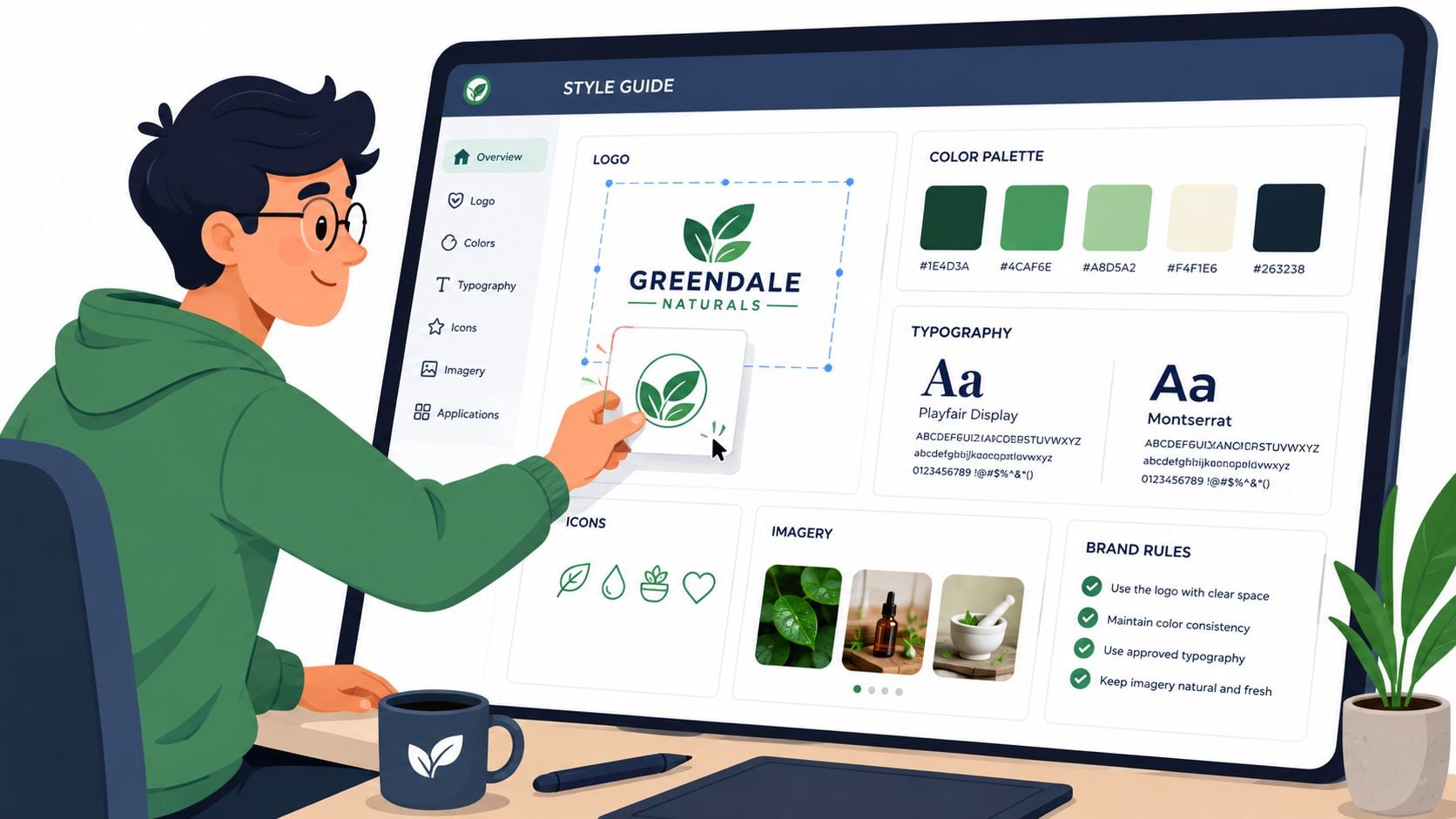
Small businesses often get stuck between two bad options. One is a loose PDF full of nice-looking examples and no usable rules. The other is a document so detailed that nobody outside the designer wants to open it. The better approach is to write the minimum set of visual rules that prevent expensive mistakes, then show those rules in context.
“Use the logo respectfully” leaves room for interpretation. A working guide gives exact instructions. Set the clear space. Set the minimum size. Show which version goes on a dark background, which one sits on photography, and which one should never be used online because it falls apart at small sizes.
Document logo rules people can follow
Logo guidance needs to answer the questions that come up during real jobs, not in a branding workshop. Include the full logo, any approved secondary versions, and a short note on where each version belongs. If the icon-only mark is only for social avatars or favicons, say that plainly.
Then document the rules that save time later:
- Minimum size: The smallest width or height that still reads clearly in print and on screen
- Clear space: The amount of breathing room required around the mark
- Background control: Approved versions for light, dark, busy, and photographic backgrounds
- File formats: Which files people should use for print, web, email signatures, and social posts
- Incorrect use: Examples of stretching, recolouring, outlining, rotating, shadow effects, or placing the logo inside shapes
Examples do a lot of the heavy lifting here. A one-page spread of approved use and common mistakes settles arguments faster than a paragraph of brand language. It also helps whoever owns the guide review work consistently, whether that is your designer, your marketing lead, or the founder.
Lock down colours and type properly
Colour choices need rules attached to them. A palette on its own does not tell anyone what to do.
Document your primary, secondary, and neutral colours with exact HEX, RGB, and CMYK values. Then add usage notes. For example, the darkest brand colour might be your default text colour, the bright accent might be reserved for buttons and calls to action, and a pale tint might only be used as a background wash. That level of clarity matters more than adding six extra shades nobody will remember.
Good colour decisions also need to survive real use. Check contrast before you sign anything off. A plain-language guide to WCAG color contrast guidelines is helpful when you're choosing text and background pairings for pages, buttons, and social graphics. If you want a wider view of how palettes affect perception, this guide to colour psychology in branding is worth a read, but theory should come after legibility and ease of use.
Typography needs the same level of discipline. Listing font names is not enough if nobody knows how to apply them.
| Element | What to define |
|---|---|
| Headings | Typeface, weight, case style, and spacing |
| Subheadings | Relationship to heading sizes and usage |
| Body copy | Typeface, size range, line height, and alignment |
| Captions or labels | Smaller text rules and where they appear |
| Fallback fonts | What to use if the main font isn't available |
I usually advise small businesses to keep this system tighter than they first expect. Two font families are often plenty. Sometimes one is enough. Every extra weight, style, or exception gives people another way to be inconsistent.
Show the brand in use
Rules become useful when people can see them applied. Add a handful of real examples based on the places your brand shows up most often. That might mean a homepage hero, a service page banner, an Instagram post, a proposal cover, signage, or packaging. Choose the formats your team produces in practice.
A quick visual walkthrough can help when you're assembling this section:
This is also where governance starts to matter. Someone needs to decide what counts as an approved example, who updates mockups when the website changes, and when exceptions are allowed. Without that ownership, even a well-written visual section dates quickly. With it, the guide stays practical, current, and much easier for a small team to follow.
Finding and Documenting Your Brand Voice
Visual consistency gets noticed quickly. Verbal inconsistency does quieter damage.
A business can look polished and still sound confused. One page says “trusted specialists”. Another says “we're a fun, quirky team”. A proposal sounds formal. An Instagram caption sounds like it belongs to another company entirely.
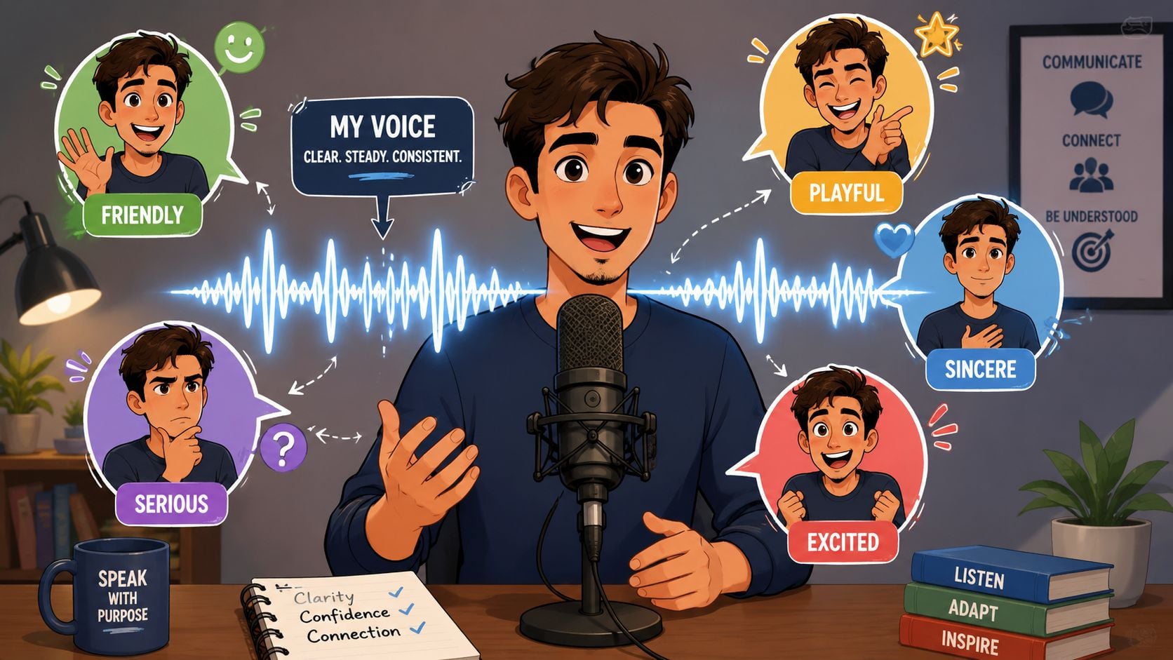
Voice stays steady and tone flexes
It helps to separate voice from tone.
Voice is the personality that stays recognisable across channels. Tone is how that personality adjusts to context. A law firm, a café, and a software company can all sound friendly, but friendly means different things in each case. The law firm may be calm and reassuring. The café may be warm and playful. The software company may be direct and helpful.
One simple exercise works well here. Ask, “If this brand were a person, how would it come across in a room?” Then plot your position between opposing traits.
| Pair | Your brand leans towards |
|---|---|
| Formal or casual | |
| Warm or authoritative | |
| Playful or serious | |
| Plainspoken or technical | |
| Energetic or calm |
You don't need to sit at an extreme on every line. Most good brands don't. What matters is choosing a position clearly enough that two different writers would make similar decisions.
This is where brand storytelling becomes useful. Not because every business needs a dramatic narrative, but because it forces you to clarify what role your brand plays in a customer's life and what language fits that role.
Turn personality into writing rules
Once you've chosen the personality, translate it into instructions. “Friendly but professional” is too loose on its own. Spell out what it means in practice.
For example:
- Friendly: Use contractions, write in plain English, prefer short sentences, and avoid corporate filler.
- Professional: Don't use slang, forced jokes, or exaggerated claims.
- Clear: Lead with the point. Keep service descriptions specific.
- Confident: State recommendations directly instead of hiding behind hesitant language.
If a writer has to ask what “on brand” means, the guide isn't finished yet.
A useful voice section often includes short rewrites. Show a sentence that sounds too stiff, then show the approved version. Show one that's too casual, then tighten it. Those examples teach faster than a page of adjectives.
Set editorial standards that remove doubt
Editorial rules matter because they save people from making the same tiny choices again and again. A practical starting point is to standardise naming and formatting. One research-based guide recommends snake case, keeping names under 32 characters for core variables, and formatting dates as YYYY-MM-DD to reduce ambiguity across datasets. The same logic applies neatly to editorial work where teams need consistent file naming, naming conventions, and publishing standards (practical style standard examples).
For a small business, that can translate into a simple list like this:
- Preferred terms: Choose one. “Clients” or “customers”. “Pricing” or “fees”. “Enquiry” or “contact”.
- Capitalisation: Decide how you write service names, product names, and job titles.
- Dates and file names: Use one format across documents, folders, and assets.
- Punctuation choices: Decide on serial commas, bullet style, and heading punctuation.
- Words to avoid: Ban phrases that sound generic, inflated, or unlike your brand.
The best voice guides don't try to sound literary. They sound usable.
Creating Usable Templates and Layout Rules
A style guide becomes valuable when it makes everyday work easier. If applying the brand feels slower than ignoring it, people will ignore it.
Make the correct version the easy version
This is why templates matter. A small business doesn't need an enterprise design system to get real value. It needs ready-made assets that remove friction. That can be a Google Docs proposal template, a Canva social post set, a PowerPoint deck, an email newsletter layout, or a Word letterhead.
The format doesn't need to be glamorous. It needs to be accessible. If your team already works in Google Workspace, put templates there. If social posts are made in Canva, build locked versions with the right colours, type, and logo placement. If sales decks live in PowerPoint, start there instead of forcing everyone into a new tool they won't maintain.
Working advice: Put the guide and the templates in the same place. If people have to hunt for assets, they'll use old files.
Define layout patterns for everyday use
Templates solve production. Layout rules solve consistency.
You don't need to map every possible design. Focus on the assets your business creates repeatedly. For most small firms, that means website pages, blog posts, lead magnets, emails, social graphics, and presentations. Define the recurring patterns that make those outputs feel related.
A simple layout section might include:
- Website headings: How H1, H2, intro text, buttons, and images should sit together.
- Blog formatting: Heading hierarchy, pull quotes, image treatment, spacing, and CTA placement.
- Email structure: Subject line style, intro length, button treatment, footer details, and sign-off.
- Social graphics: Logo position, text limits, safe margins, and image crop rules.
If your team produces social content regularly, it helps to keep current platform sizing requirements close at hand. A practical guide to essential social media image specs can sit alongside your own template library so staff don't create the right design in the wrong dimensions.
For websites, this intersects with structure as much as styling. If you're documenting recurring page sections, it helps to think in components rather than one-off mockups. This introduction to what a wireframe is in web design is useful if you're trying to define repeatable layouts before visual polish gets added.
The practical test is simple. Can a team member open the right template and produce something mostly correct without asking three follow-up questions? If not, keep refining until the answer is yes.
How to Launch and Maintain Your Style Guide
Monday morning, someone updates a sales deck, another person orders new signage, and your freelancer posts a social graphic using an old logo file. By Friday, the brand has drifted in three different directions, even though everyone thought they were following the same rules. That is the point where a style guide stops being a design document and starts becoming an operating document.
Small businesses feel this more sharply because there is rarely a full brand team watching every detail. The guide has to work across day-to-day jobs, handovers, suppliers, and rushed decisions. If nobody owns it, it slips out of date fast.
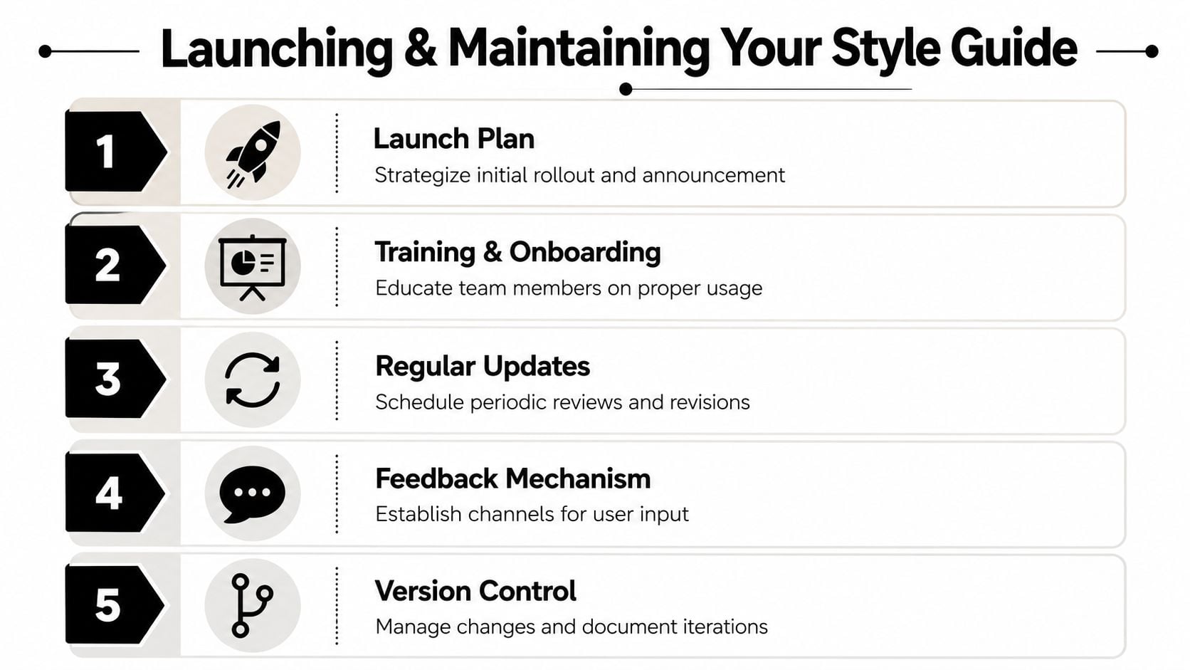
Appoint one owner
Give the guide a named owner.
That person does not need to approve every Instagram post or rewrite every brochure. They do need to be responsible for the document, the asset library, and the decisions that shape both. In a small company, that might be the founder, marketing lead, office manager, or retained designer. The job title matters less than clear responsibility.
Their role is to:
- Approve updates: Decide what becomes a rule and what stays a one-off exception.
- Control versions: Keep one current document and one current set of assets in circulation.
- Answer edge cases: Resolve the odd situations the guide does not cover yet.
- Protect clarity: Stop the guide filling up with personal preferences and contradictory notes.
Without that ownership, teams start making local fixes. Sales creates its own deck. A freelancer saves new logo files to a private folder. A printer uses artwork from last year. None of that feels dramatic in the moment, but it creates inconsistency that takes time and money to clean up later.
Build a lightweight review cycle
A style guide works best when it is short enough to use and structured enough to trust. Intelligent Editing, the makers of PerfectIt, advise keeping a style sheet concise and practical so people can apply it in real work, not just file it away for reference. Their guidance on maintaining a house style also supports reviewing and updating rules as language, teams, and materials change (PerfectIt style guide advice).
That approach suits small businesses. A 60-page brand manual may look impressive, but a four-page guide people can find, read, and apply will do more for consistency.
A simple review rhythm is enough:
| When | What to review |
|---|---|
| Monthly | Questions that came up, repeat mistakes, and missing examples |
| At brand changes | New services, revised messaging, updated offers, or refreshed visuals |
| Every scheduled review | Outdated rules, duplicated guidance, and anything people keep ignoring |
Keep the process light, but make it real. If your sales team keeps editing proposal wording, review the voice guidance. If your designer keeps fixing logo misuse from external suppliers, add a clearer example. The guide should respond to actual friction, not hypothetical edge cases.
Keep the guide alive in daily work
A launch email on its own is not enough. Show the guide to the people who will use it. Walk them through the parts that affect their job. Point them to the right templates and asset folders. Explain who can approve changes and where questions go.
The maintenance process should be easy to follow:
- Store one master version in a shared location everyone can access.
- Label versions clearly so old PDFs do not keep resurfacing.
- Set one feedback route such as shared comments, a dedicated email address, or a simple form.
- Record decisions so people understand why a rule changed.
- Refresh examples whenever the brand shifts in practice, not only when the wording changes.
This is the trade-off. The tighter the guide, the easier it is to maintain. The shorter the review cycle, the less likely it is to become irrelevant. But if you make updates too loosely, people lose confidence in what counts as current. Good governance sits in the middle. Stable enough to trust, flexible enough to stay useful.
That is what keeps a style guide alive. Not the PDF itself. The habits around it.
If your brand feels a bit scattered and you'd like expert help turning it into something clear, consistent, and easy to manage, DesignStack can help with branding, web design, and practical digital assets that small UK businesses can use day to day.


Leave a Reply