
Best Ecommerce Web Design Template for 2026
You're probably in one of two positions right now. Either you've outgrown a basic brochure website and need a proper online shop, or you're starting from scratch and trying to work out how to sell online without sinking months into a bespoke build.
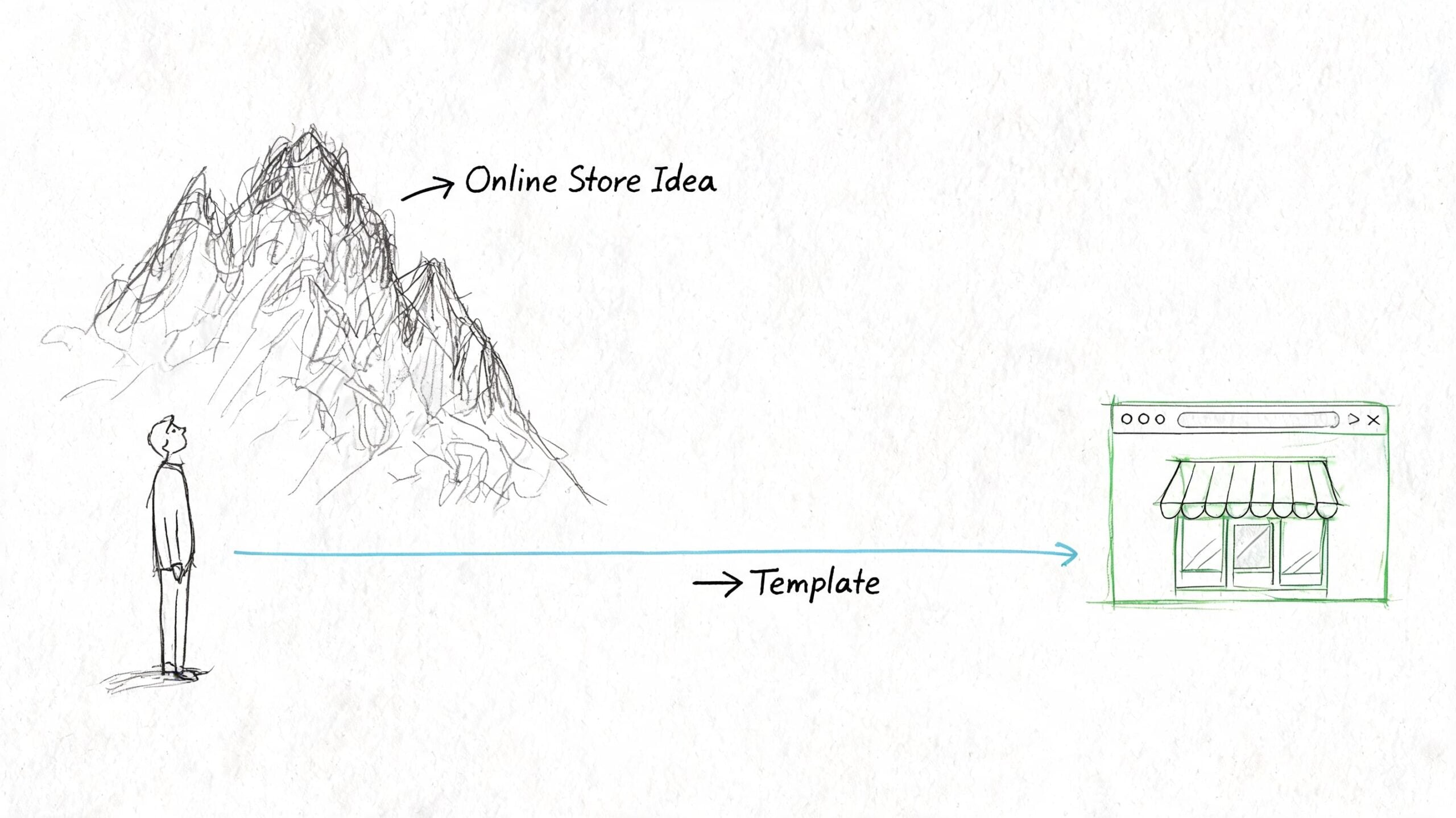
That's where an ecommerce web design template earns its keep. Used well, a template isn't a compromise. It's a structured starting point that gets the important parts right early: layout, mobile behaviour, product grids, basket flow, and content blocks that already reflect how people shop.
For UK small businesses, that matters more than many owners realise. You don't just need a site that looks tidy. You need one that handles VAT messaging clearly, supports trusted payment options, respects GDPR, and feels credible to local customers within seconds. A generic international design can look polished and still create friction in all the wrong places.
The strongest stores usually don't begin with unlimited freedom. They begin with sensible constraints, then layer in custom branding, better product presentation, sharper copy, and careful testing. That approach keeps budgets under control and makes launch far less painful.
Why a Template is Your Smartest First Move
If you run a shop, a service business, or a growing local brand, launching online can feel bigger than it should. You know you need a professional storefront, but every decision seems to come with extra cost, extra jargon, or extra delay.
A template cuts through that. It gives you a proven framework instead of a blank canvas. Navigation already exists. Product page structure already exists. Mobile layouts, account areas, checkout styling, and content sections are already in place. You're not paying someone to invent the wheel. You're paying to choose the right wheel, fit it properly, and make it look like your business.
That isn't just a convenience argument. In the UK, 52% of SMBs with online stores now use pre-built templates, up from 38% in 2020, and template-led builds have enabled a 28% average reduction in launch time. Template-based sites also contribute to 41% of UK online retail sales under £1M turnover according to UK ecommerce template adoption data.
Why this works in practice
Custom design has its place. If you need unusual subscription logic, complex trade pricing, or highly specialised integrations, a bespoke build may be justified. But for most small and medium businesses, the first challenge isn't uniqueness. It's getting online with a store that works reliably.
A good template helps because it already solves the basics:
- Layout logic: Customers know where to look for categories, filters, basket links, and product details.
- Speed to market: You can spend time on products, photography, shipping rules, and copy instead of rebuilding common ecommerce elements.
- Budget control: The build stays focused on practical customisation rather than design experimentation.
- Lower risk: You're choosing from patterns that have already been used, tested, and refined.
Practical rule: Start with a template when your business needs a dependable shop more than a completely novel interface.
What templates don't do for you
They don't fix weak product imagery. They don't write persuasive copy. They don't make unclear delivery terms disappear. And they don't automatically create trust.
That's why the right mindset is important. A template is your foundation, not your finished brand. When clients struggle with templates, it's rarely because templates are limited. It's because they treat the demo as the strategy.
Choose the framework well, then customise the parts that customers notice.
Choosing Your Foundation Platform and Template
Before you choose a design, choose the platform it lives on. For most UK businesses, that comes down to Shopify or WordPress with WooCommerce.
One is more packaged. The other is more flexible. Neither is automatically right. The better choice depends on how much control you want, how comfortable you are with ongoing management, and how far you expect the site to evolve.
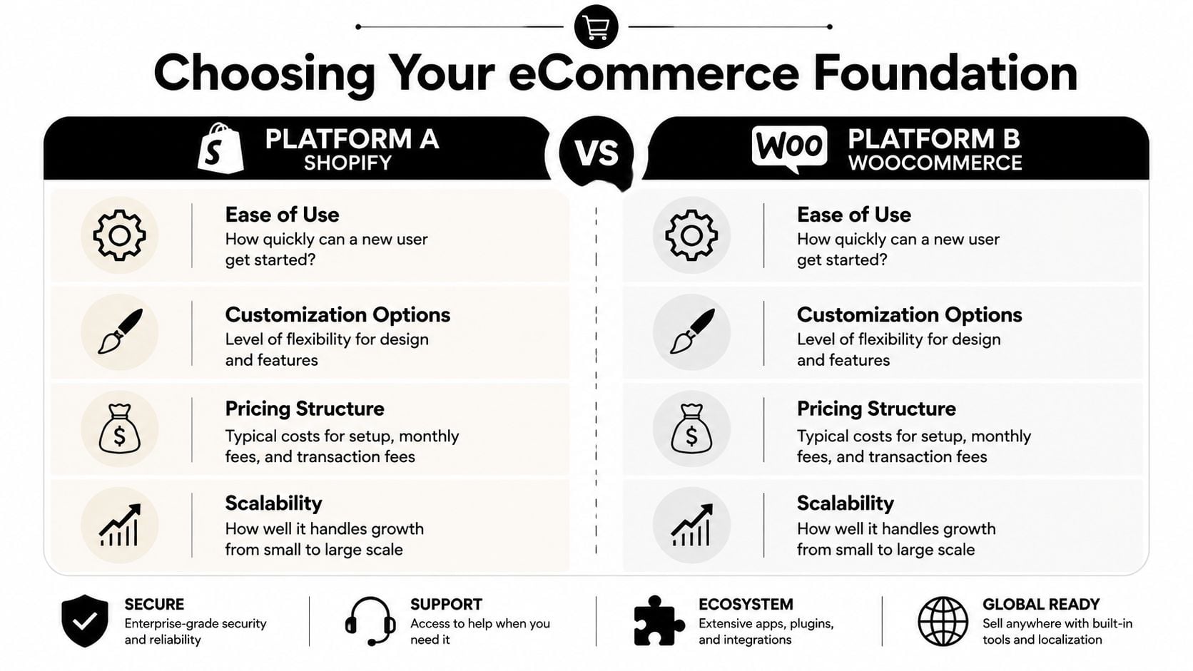
Shopify and WooCommerce side by side
| Platform | Strong fit for | Trade-offs |
|---|---|---|
| Shopify | Businesses that want a managed platform, faster setup, and less technical housekeeping | Less flexibility in some areas, ongoing platform constraints, and custom changes can become app-dependent |
| WooCommerce | Businesses that want deeper control over design, content, checkout behaviour, and wider WordPress flexibility | More setup decisions, more responsibility for maintenance, and stronger need for disciplined hosting and plugin choices |
If you want a broad platform overview before deciding, this guide to website content management systems is a useful starting point.
Mobile performance is non-negotiable
A template might look excellent on a desktop preview and still underperform where it matters most. In the UK, 62% of ecommerce traffic is mobile, and selecting a template for mobile optimisation can result in 40% higher conversion rates on smartphones. For stores under 500 orders per month, optimised UK templates on platforms like Shopify can yield 3.1% average conversions based on UK web design and mobile ecommerce benchmarks.
That means your template shortlist should be judged on a phone first, not last.
If the menu is clumsy, the filters are awkward, or the add-to-basket button sits too low on mobile, the template goes off the list.
A practical template vetting checklist
Don't choose a template because the demo looks stylish. Choose it because the structure is sound.
- Test the mobile menu properly: Open categories, filters, search, account, and basket on your phone. If any of those feel fiddly, customers will feel it too.
- Check product page flexibility: You need room for concise descriptions, longer detail sections, delivery information, returns guidance, reviews, and related products without clutter.
- Look at category pages, not just the homepage: That's where shoppers compare, filter, and decide. A good shop page matters more than a cinematic hero banner.
- Review support and update history: A template that isn't maintained will become a problem when platforms, plugins, or browsers change.
- Inspect the demo checkout journey: Even if checkout styling is partly platform-controlled, the route into checkout should feel direct and calm.
- Watch for feature bloat: Sliders, pop-ups, animation effects, countdowns, and aggressive sales widgets often make a demo feel busy rather than useful.
- Check page builder dependence: Some templates lock too much into one builder. That can make future edits harder than they need to be.
What usually works best
For catalogue-heavy shops, a cleaner template with strong filtering tends to outperform something visually noisy. For premium brands, careful spacing, restrained typography, and excellent imagery usually do more than decorative flourishes. For local retailers, simple collection pages and obvious trust signals often matter more than clever motion effects.
The smartest choice is usually the template that gives you the least to undo.
Customising for Conversions and Brand Identity
Once the platform and template are in place, the essential work begins. A store now stops looking like a demo and starts feeling like a business people can trust with their money.
Many owners begin by changing colours, uploading a logo, and picking a font. Those things matter, but they're not the main event. Customers make snap judgements based on whether the store feels coherent, reassuring, and easy to understand. Brand identity in ecommerce is as much about clarity as it is about style.
A useful reference point is studying high-converting Shopify landing pages, not to copy them blindly, but to notice the patterns they get right: clear hierarchy, focused messaging, visible calls to action, and trust built through structure rather than noise.
For a broader design perspective, this overview of crafting digital experiences helps frame why visual choices only work when they support usability.
Your brand trust checklist
The strongest ecommerce web design template is the one that disappears behind your brand. To get there, review these areas carefully.
- A logo that holds up at small sizes: Your mark needs to read well in the header, on mobile, and in the checkout summary. Thin details often vanish.
- Consistent type choices: Two typefaces are usually enough. One for headings, one for body text. More than that often starts to feel accidental.
- A colour system, not random colour use: Choose a primary brand colour, a supporting neutral palette, and a single accent for calls to action. Don't make every badge or button a new colour.
- Professional photography: If product images vary wildly in lighting, crop, or background, the whole store looks less trustworthy.
- Clear contact details: A real business address, email, and phone number help. So do delivery, returns, and privacy links that are easy to find.
- An About page with substance: People don't need your life story. They do want to know who runs the business, where you're based, and why the products are worth buying from you.
A brand feels credible when every part of the journey agrees with every other part. Tone, imagery, navigation, policies, and checkout should all feel like the same business.
Navigation needs restraint
Clients often try to solve clarity by adding more links. That usually backfires.
A tidy ecommerce navigation should help people answer a few practical questions fast: what do you sell, how is it organised, how do I search, what will delivery cost, and how do I contact you if something goes wrong? If the menu tries to tell your entire business story, it stops being useful.
Three navigation habits tend to work well:
- Put primary product categories first.
- Keep utility links obvious but secondary.
- Use labels customers already understand.
“Shop by collection” is clear. “Curated experiences” usually isn't.
Customise where buyers actually look
Not every part of a template deserves equal effort. Focus on the places that shape confidence.
Header and first screen
Your header sets the tone immediately. Keep the logo readable, the menu short, the search visible if you have multiple products, and the basket easy to spot. On mobile, the first screen should also make it obvious what you sell.
Collection pages
These pages deserve more thought than they usually get. Product cards need consistent image ratios, useful titles, straightforward pricing, and enough spacing to avoid visual noise. Filters should be relevant and not overwhelming.
Product pages
Brand voice matters here. Dry specifications rarely sell on their own. Customers want to know what the product is, why it's useful, how it fits into their life, and what to expect from purchase to delivery.
Footer and policy areas
The footer is one of the strongest trust zones on the site. Don't waste it. Include contact details, key links, returns, delivery, privacy, and payment information in plain language.
What not to overdo
The temptation with any ecommerce web design template is to prove you've customised it. That often creates the opposite effect.
Avoid loading the site with moving banners, excessive icon sets, novelty fonts, and promotional strips on every page. Those additions can make a business look less established, not more. A customer who wants to buy dog food, skincare, gifts, or specialist equipment doesn't need entertainment. They need confidence.
The best customisation is selective. It sharpens the journey instead of decorating every surface.
Optimising Product Pages and the Checkout Flow
Most ecommerce gains don't come from the homepage. They come from better product pages and fewer checkout hesitations.
When someone lands on a product page, they're trying to answer basic buying questions quickly. Is this the right item? Can I trust the business? What does it cost in full? How long will delivery take? What happens if I need to return it? A good template gives you the structure to answer those questions cleanly.
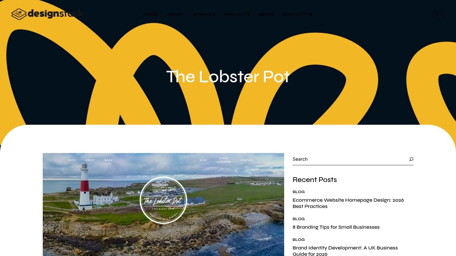
A live example helps show how visual clarity supports commercial goals.
Build product pages for decision-making
Strong product pages are part merchandising, part reassurance. The goal isn't to say everything. It's to remove doubt in the right order.
Start with the essentials above the fold
Customers should be able to see the product name, price, main image, key variant choices, and add-to-basket button without hunting. If the first screen is dominated by oversized imagery or decorative content, buyers have to work too hard.
Write descriptions that do two jobs
The first part should sell the product clearly. The second should handle practical detail. A simple rhythm works well:
- short summary of the benefit
- key features in scan-friendly form
- useful specifics such as sizing, ingredients, dimensions, or care
- delivery and returns information nearby
This structure keeps the page persuasive without becoming vague.
Use photography with intent
Show the product plainly first. Lifestyle imagery can support the sale, but it shouldn't replace clear product views. If relevant, include scale, texture, packaging, and close detail. Shoppers are trying to reduce uncertainty.
Store rule: Every product page should answer the question a careful customer would ask before buying from a business they've never used before.
Improve conversion with testing and markup
Once the page structure is solid, refine it through testing. A/B testing CTAs and product grids has led to a 22% uplift in add-to-cart rates for UK SMBs, and implementing schema.org markup can boost click-through rates by 30% on Google UK search results. Use those methods deliberately rather than changing design elements on instinct.
That might mean testing a simpler add-to-basket label, moving delivery messaging higher, changing product card density on collection pages, or improving how stock and variant choices display. For store owners wanting broader operational guidance, these tips for running a successful online store are worth reviewing alongside your design decisions.
Shape a checkout that feels local and reliable
Checkout is where many templates expose their weaknesses. The visual side may look polished, but friction creeps in through missing reassurance, unnecessary fields, and confusing totals.
For UK stores, a practical checkout should include:
- Clear pricing including VAT position: If VAT applies, present pricing in a way that doesn't create last-minute surprises.
- Trusted payment gateways: Stripe and PayPal are familiar to UK shoppers and straightforward to integrate on common ecommerce platforms.
- Guest checkout where possible: Don't force account creation if it isn't necessary.
- Visible delivery expectations: Shoppers want to know when items are likely to arrive before they commit.
- Returns information within reach: Not hidden in the footer and nowhere near the basket.
Later in the build, it helps to watch a walkthrough and compare your setup against a real journey.
Don't treat GDPR as a footer problem
Data protection is part of checkout design. If your forms collect more than they need, if your consent language is clumsy, or if cookie handling feels unclear, trust drops quickly.
For UK businesses, that means checking:
- what data each checkout field collects
- whether marketing opt-ins are separated from transactional necessity
- whether cookie consent is clear and not misleading
- whether privacy and returns policies are easy to access before purchase
This is one area where off-the-shelf templates often need careful adjustment. The template gives you the shell. Compliance and clarity still need proper setup.
Preparing for Launch SEO Performance and Testing
The week before launch often looks deceptively calm. Products are loaded, the template looks right, and the homepage feels finished. Then the final checks start and critical issues appear: duplicate title tags, oversized images, poor mobile spacing, missing redirects, category pages that are hard to crawl, and checkout emails that never arrive.
That is why this stage matters. A good ecommerce web design template gives you a head start, but it does not finish the technical work for you.
Your pre-launch checklist
A reliable launch usually comes down to three things: search visibility, page speed, and realistic testing.
Technical SEO basics
Templates often ship with passable defaults. Passable is not enough if you want a UK small business site to rank for the right local searches and avoid messy clean-up work later.
- Write page titles manually: Home, category, product, delivery, returns, and policy pages need specific titles, not recycled template text.
- Draft meta descriptions with intent: They help search listings read clearly and can improve click-through, especially for branded and local searches.
- Check heading structure: Use one clear H1 per page and keep subheadings in order.
- Generate and submit a sitemap: Search engines should be able to find your key pages without guesswork.
- Review URLs before launch: Short, readable URLs are easier to maintain than auto-generated slugs full of dates, IDs, or odd folder paths.
- Use schema where it fits: Product, organisation, and breadcrumb markup can improve how listings appear in search.
For small UK retailers, local relevance matters here too. Make sure contact details, delivery coverage, and location signals are consistent across the site. If you serve a specific region, say so plainly. Generic template copy rarely does this well.
If you want a simple companion tool while checking fundamentals, this SEO requirements validator for bootstrapped founders is useful for catching common omissions before launch.
Performance needs active work
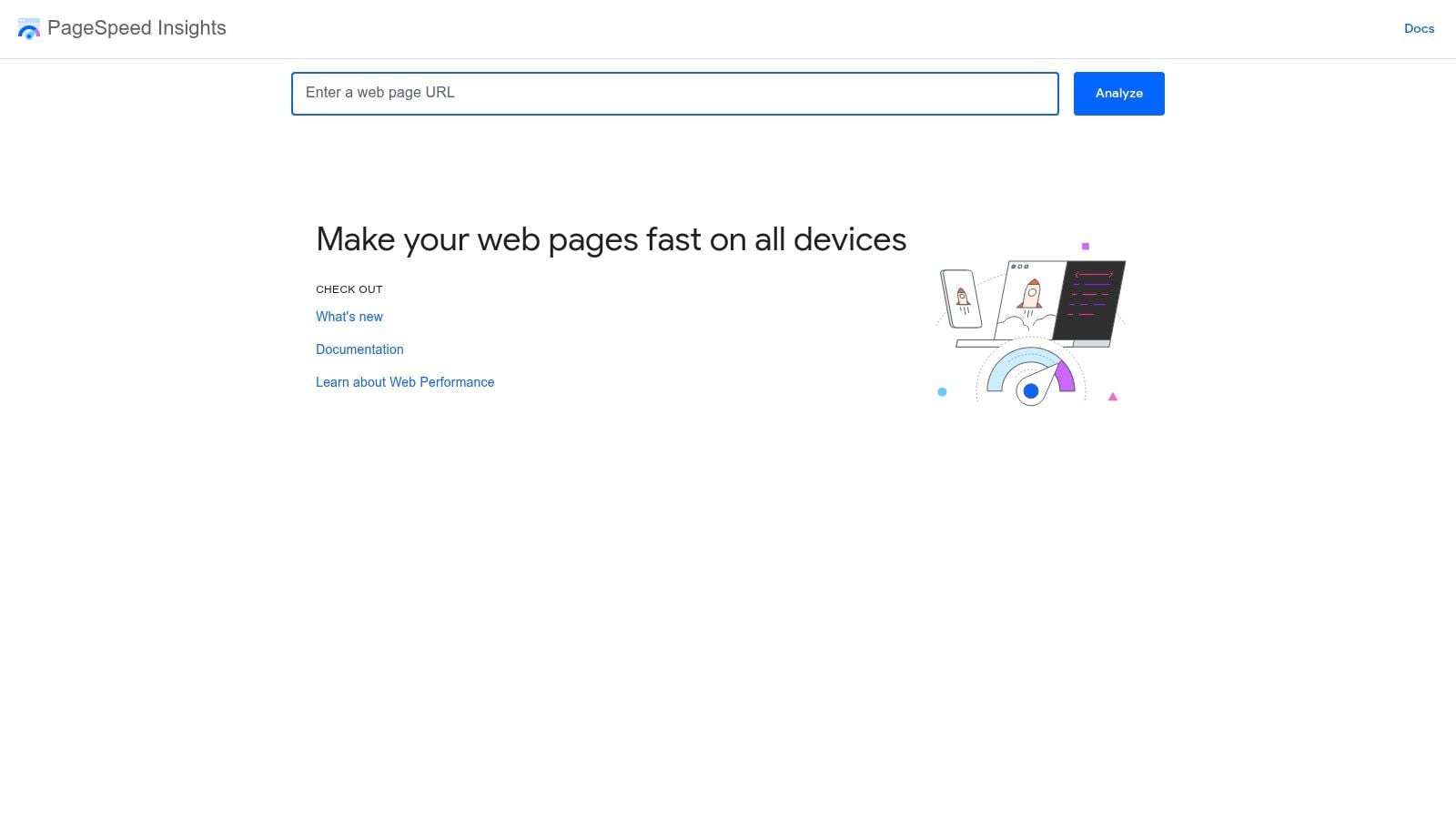
Speed problems usually come from choices made during setup, not from the platform alone. Heavy themes, oversized images, too many apps, poor font loading, and scripts added without review all add weight.
Slow stores lose sales. Shoppers leave sooner, pages feel less trustworthy, and paid traffic becomes more expensive because fewer visits turn into orders.
For UK businesses, I usually check performance from a UK connection and on a mid-range mobile device, not just a fast office broadband line. That gives a more honest picture of how the store feels to actual customers in Manchester, Bristol, Glasgow, or a village with patchier mobile coverage.
Focus on the practical fixes
- Use a lightweight theme: Start with a template that does not depend on five sliders, three pop-ups, and animation on every scroll.
- Compress and resize images properly: Product photos should be sharp, but they should not be uploaded at banner size if they display as thumbnails.
- Set up caching: This helps repeat visits and reduces unnecessary server work.
- Use a CDN that serves UK users well: Asset delivery should stay consistent during traffic spikes and sale periods.
- Audit third-party scripts: Reviews, chat, tracking, heatmaps, and promo tools often create the biggest slowdowns.
- Test cookie tools properly: Consent platforms can affect performance and user experience if they are badly configured.
Fast sites feel credible. Slow ones make shoppers hesitate before they have even decided whether they want the product.
Test like a customer, not a site owner
Site owners already know where everything is. First-time visitors do not. Proper testing means following the full journey with fresh eyes and checking the dull but costly details.
Run these checks on mobile, tablet, and desktop:
- Browse categories and use filters.
- Search with everyday product terms, not internal jargon.
- Add and remove items from basket.
- Change quantities, sizes, colours, and other variants.
- Complete checkout with realistic test data and different payment methods.
- Open delivery, returns, privacy, and contact pages.
- Check account emails, order confirmations, and thank-you pages.
- Test postcode rules, especially if shipping charges vary across the UK.
- Confirm cookie consent, analytics firing, and form handling behave as intended.
Then repeat the same journey in different browsers. Safari often exposes issues that Chrome hides. Mobile spacing problems also appear late if nobody has tested on real devices.
Templates reduce build time. They do not remove the need for careful launch checks.
Your Launch Day and Planning for Future Growth
Monday morning, the new shop is live, the first few orders arrive, and one small checkout mistake suddenly matters a lot. A postcode rule is wrong, a payment confirmation does not send, or the cookie banner blocks tracking you need for paid traffic. Launch day is less about celebration and more about controlled monitoring, especially for UK small businesses that need the basics right from the first order.
Keep the first day focused. Check that orders appear in the admin properly, payment statuses match what your gateway reports, stock reduces correctly, shipping rates work for the UK areas you serve, and customer emails land in inboxes rather than spam folders. If you offer Click & Collect, local delivery, or postcode-based exclusions, test those again with real scenarios before sending traffic in volume.
Then watch what happens over the next two to four weeks. That is when patterns appear.
What to stay on top of
- Security updates: Themes, plugins, apps, and payment integrations need routine updates.
- Backups: Recovery should be quick if an update, import, or app conflict causes problems.
- Analytics review: Check product views, search terms, basket exits, checkout drop-offs, and device behaviour.
- Content updates: Keep delivery information, returns wording, FAQs, seasonal promos, and stock messages current.
- Compliance checks: Review privacy notices, cookie consent, marketing opt-ins, and checkout data handling on a regular schedule.
Compliance deserves more attention than it usually gets. The UK government and the Information Commissioner's Office both make clear that customer data handling is an ongoing responsibility, not a launch task you tick off once. Review the ICO's guidance on security and personal data handling for businesses at ico.org.uk. If your template relies on several apps or plugins, check what customer data each one collects, where it stores that data, and whether your privacy and cookie notices still reflect reality.
Post-launch support is where many small retailers save or lose money. The design may be finished, but the work shifts to maintenance, reporting, and improvement. A Dorset-based agency such as DesignStack can help with responsive ecommerce builds, hosting, updates, and post-launch changes if you are running WordPress and want ongoing support without hiring in-house.
Good stores improve in small, regular steps. Fix the friction in checkout. Refine delivery messaging for UK customers. Review search terms, returns reasons, and abandoned baskets every month. Launch puts the shop in front of customers. Consistent maintenance keeps it trusted and profitable.


Leave a Reply