

Responsive WordPress Theme: What Makes One Actually Work
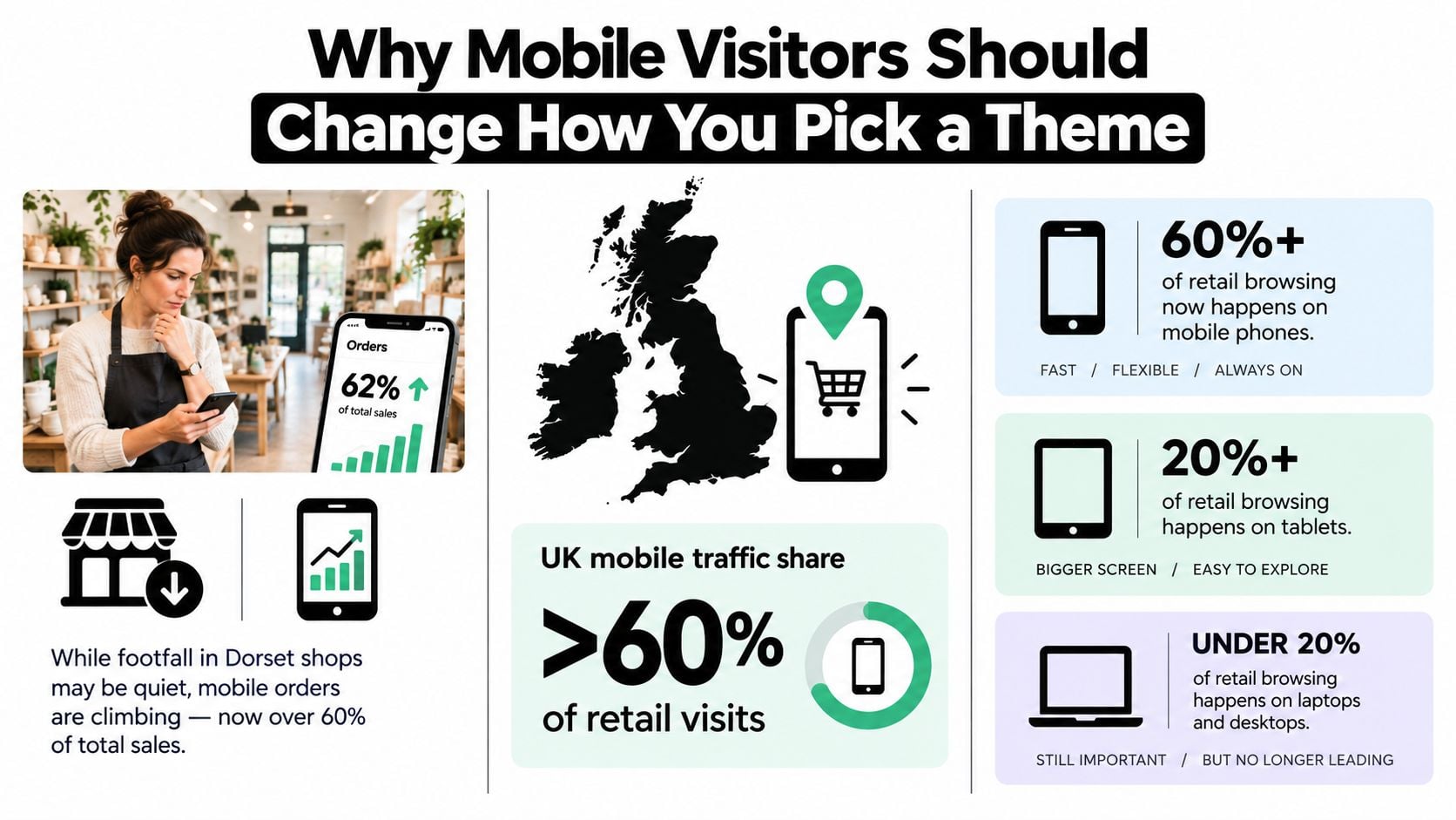
By December 2025, 61% of monthly visits to GOV.UK came from mobile devices, compared with 38% from desktop and 1% from tablet, according to UK mobile usage data. That isn't a minor design trend. It changes what a business website must do before a visitor can read, enquire, book, or buy.
A responsive WordPress theme is therefore more than a layout that shrinks neatly on a phone. The useful question is whether it stays usable, fast, accessible, and persuasive on every device your UK visitors use. A theme can look excellent in a desktop demo and still create cramped menus, slow pages, inaccessible forms, or awkward checkout journeys on mobile.
Table of Contents
- Why Mobile Visitors Should Change How You Pick a Theme
- What a Responsive WordPress Theme Actually Does
- The Five Qualities That Separate a Good Theme From a Great One
- Performance Is the Hidden Half of Responsive Design
- How to Evaluate a Theme Before You Commit
- Choosing Between a Premium Theme, a Builder, or a Custom Build
- Adapting a Theme for a Real Client Project
- What to Carry Forward Into Your Next Theme Decision
Why Mobile Visitors Should Change How You Pick a Theme
A Dorset shop owner might notice the change before opening any analytics report. In-store footfall feels quieter, yet orders arriving through a phone keep increasing. Customers are checking products while travelling, comparing prices from the sofa, and completing purchases between other tasks. If the website treats mobile as an afterthought, those customers don't always complain. They just leave.
UK browsing has been mixed rather than exclusively mobile-first. Statista's historical UK device-share data recorded mobile devices at 47.17% of web traffic in December 2023, while laptops and desktops represented a similar share and tablets remained under 5%, as reported in this UK mobile and desktop usage analysis. The commercial lesson is important. A site must work well on a phone without making the desktop experience feel like a stretched version of a mobile page.
A theme choice is a customer-retention decision
Responsive design means that the same content reshapes itself to suit the available screen. Navigation, columns, images, buttons, and forms adjust without forcing a visitor to pinch, zoom, or drag sideways. That technical behaviour affects practical decisions, such as whether a phone user can find the call button or whether a product image remains useful on a smaller display.
A theme should also preserve trust. Text that jumps as images load, buttons placed too close together, and menus that disappear behind unexplained icons make a business feel harder to deal with. A polished desktop preview can't reveal those problems by itself.
Practical rule: Don't ask only whether a theme resizes. Ask whether a visitor can complete the next important action without friction.
The rest of the decision should follow that question. Evaluate a responsive WordPress theme as part of your conversion system, not as a decorative skin. Its layout, code, accessibility settings, editing controls, and SEO structure all influence whether a visitor stays long enough to become a customer.
What a Responsive WordPress Theme Actually Does
A responsive WordPress theme keeps one set of content available across devices and changes its arrangement to suit the available space. Navigation, columns, images, buttons, and forms reflow at breakpoints, so visitors can read and act without pinching, zooming, or scrolling sideways. The goal is more than a smaller desktop page. The theme must keep the experience usable, fast, accessible, and capable of supporting conversions for the devices UK visitors use.

The browser applies CSS rules to make these adjustments. At sensible breakpoints, a multi-column services section can become a vertical stack. A full navigation bar can change into a menu button, while a wide call-to-action area can move below its supporting copy rather than compressing several elements into one narrow row.
The three parts work together
Breakpoints mark the points where the layout changes. They should respond to available space, rather than represent every phone model. A design should change when its content needs more room, whether that happens on a particular phone, tablet, or resized browser window.
Fluid grids let columns and spacing expand or contract instead of depending on rigid fixed widths. Percentage-based widths, flexible containers, and sensible maximum widths help content remain comfortable on a small laptop and a wide monitor.
Flexible media keeps images and video within their containers while preserving their proportions. WordPress can serve appropriately sized image variants through responsive image features, but the theme still needs to display those files correctly and prevent unexpected overflow.
An older adaptive design may provide several fixed layouts and switch between them. That arrangement can suit limited situations, yet gaps often appear between its preset widths. A genuinely responsive theme lets the design flow between widths, rather than behaving like a handful of separate desktop templates.
The guide to responsive web design explains the broader principle beyond WordPress. Responsiveness provides a dependable foundation, but it does not guarantee readable typography, clear content hierarchy, fast loading, accessible controls, or a persuasive customer journey. Those outcomes depend on deliberate theme evaluation and configuration.
The Five Qualities That Separate a Good Theme From a Great One
A theme can pass a basic mobile resize test and still be a poor choice for a working business website. Judge it against five connected qualities. Each one affects the visitor's ability to understand the offer and act on it.
Layout integrity
Check the header, navigation, content columns, buttons, forms, tables, and footer at different widths. Look for clipped text, horizontal scrolling, overlapping elements, and controls that become difficult to tap. A layout that preserves hierarchy on a tablet usually communicates more effectively than one that merely compresses every component.
Performance
A responsive theme still fails commercially if its scripts, fonts, sliders, and image treatments delay the first useful view. Google's accepted Core Web Vitals targets are LCP at or below 2.5 seconds, INP at or below 200 milliseconds, and CLS at or below 0.1, as summarised in GOV.UK mobile technology guidance. Treat those thresholds as practical checks rather than badges to pursue after launch.
Accessibility
A visitor should be able to move with a keyboard, see where focus sits, enlarge text, and use browser or device zoom without losing essential content. GOV.UK's accessibility strategy also recommends progressive enhancement, with core content available without CSS and the experience working without JavaScript. That approach reduces the number of ways a theme can fail.
Customisation
A small business needs to adjust typography, colours, spacing, templates, calls to action, and content blocks without rebuilding the whole site. Block patterns, the Site Editor, theme.json, and a restrained Customiser setup can provide useful control. More controls aren't automatically better, especially if each setting creates inconsistent pages.
SEO readiness
Clean heading structure, crawlable content, useful page titles, sensible internal links, and stable templates give search engines a clearer page to interpret. A theme doesn't create a complete SEO strategy, but bloated markup, duplicated headings, hidden content, or poor image handling can make that strategy harder to execute.
| Quality | What to check | Conversion impact when weak |
|---|---|---|
| Layout integrity | Reflow, spacing, menus, forms, and no horizontal scroll | Visitors struggle to understand or complete the next step |
| Performance | Lightweight assets, stable loading, and Core Web Vitals behaviour | People wait less patiently and abandon important pages |
| Accessibility | Keyboard access, visible focus, readable text, zoom, and form labels | Some visitors cannot use the site confidently or at all |
| Customisation | Block controls, reusable patterns, and maintainable settings | Staff publish inconsistent pages or depend on developers for every change |
| SEO readiness | Semantic headings, crawlable content, image support, and clean templates | Valuable pages become harder to discover and maintain |
The qualities interact. A visually refined theme with heavy animations can undermine performance. A very fast theme with weak contrast can exclude visitors. The right choice balances appearance, speed, access, and control instead of allowing one impressive feature to dominate the decision.
Performance Is the Hidden Half of Responsive Design
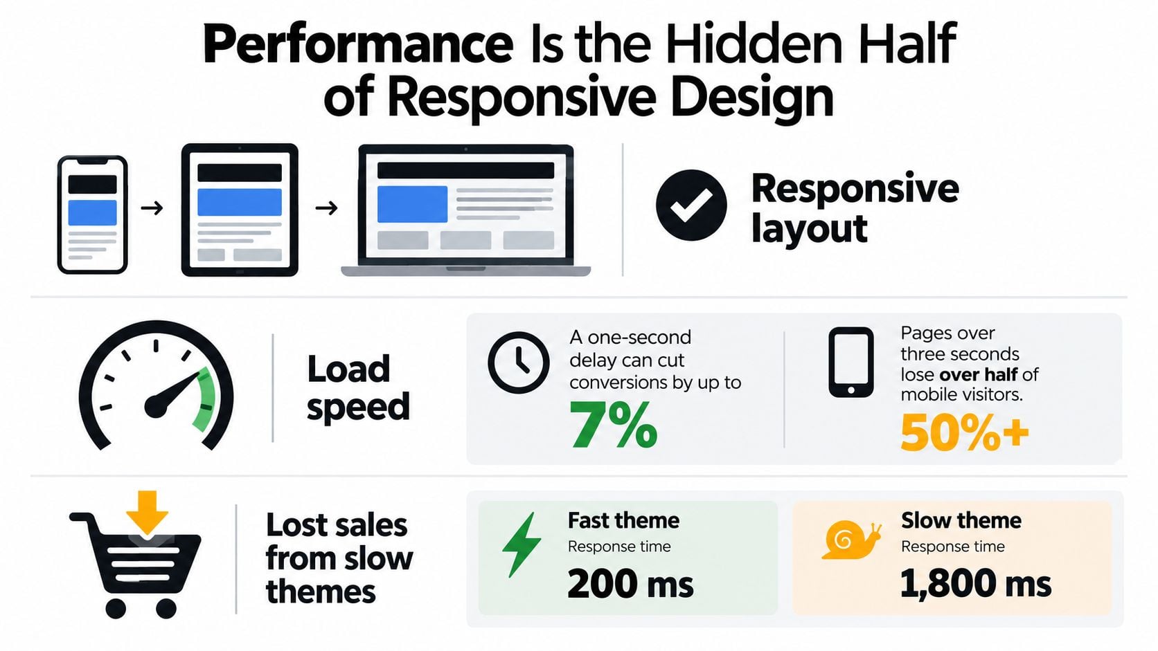
A page can reflow beautifully and still be functionally broken on mobile if it takes too long to become useful. Themes often carry more weight than owners realise, including page-builder assets, slider scripts, decorative icon sets, external fonts, and background effects. Every addition asks a visitor's device and connection to do more work.
UK audit evidence shows how demanding mobile performance can be. An independent review of 465 UK small-business homepages found that only 2.7% met both mobile lab thresholds, while the median mobile LCP was 7.22 seconds, according to this UK website performance audit. Those figures don't mean every slow page comes from its theme, but they do show why theme selection, image handling, scripts, and hosting deserve attention before launch.
What the theme should handle
A capable theme gives you a lean base, sensible CSS, stable dimensions for media, and scripts that don't load everywhere without purpose. WordPress's responsive image handling can help serve a suitable file, while lazy loading can postpone images that aren't immediately needed. Fonts should appear without blocking the first useful text, and non-critical JavaScript should wait until the page needs it.
Your team still controls much of the outcome. Large hero images, autoplay video, excessive font variants, third-party tracking, and unrestrained page-builder sections can overwhelm an otherwise clean theme. Caching and suitable hosting matter too.
A responsive layout is the suitcase. Performance is whether you can still lift it after packing every visual flourish inside.
Sticky headers, parallax effects, animated counters, and carousels may support a genuine communication need. They shouldn't become default decoration. Test them on a real phone or a throttled connection, not only on a fast office desktop.
For practical implementation ideas, use this guide to improve website loading speed. The useful aim isn't a perfect-looking report. It's a page that displays its main message promptly, stays visually stable, responds when tapped, and keeps the visitor moving towards an enquiry or purchase.
How to Evaluate a Theme Before You Commit
A theme demo is a sales presentation. Your job is to turn it into a practical test. You don't need to be a developer to identify obvious weaknesses before paying for a licence or recommending a theme to a client.
Start with the visitor's device
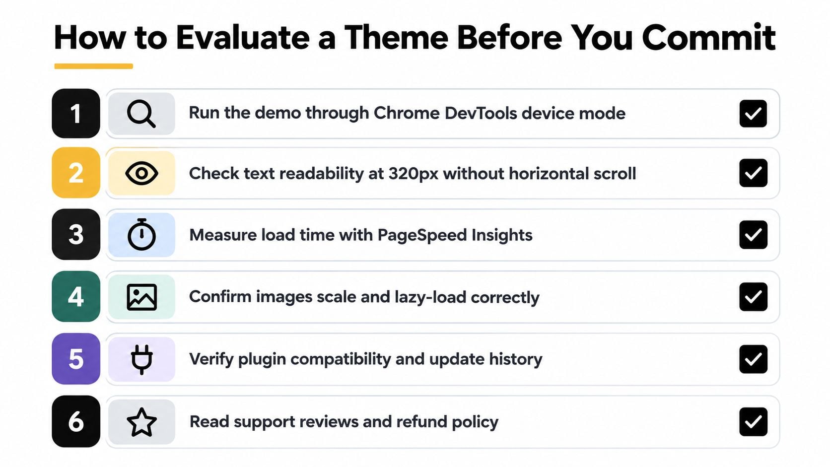
Open the demo in Chrome DevTools device mode and test a narrow phone viewport, a small laptop, and a wide desktop display. Read a full paragraph, open the menu, submit a test form, and inspect any product or service cards. Horizontal scrolling, clipped text, tiny controls, and disappearing content are immediate warning signs.
Use a throttled mobile connection rather than relying on your office broadband. Watch when the main heading, hero image, navigation, and primary action become usable. Then open Lighthouse or PageSpeed Insights and compare the theme's results across more than one representative page.
Test access and editing control
Tab through the interface. You should see a clear focus indicator, reach every interactive control in a sensible order, and understand links without relying on colour alone. An axe DevTools scan can identify issues worth investigating, although automated testing won't replace manual keyboard and zoom checks.
Inside WordPress, create a test page. Change a heading, adjust spacing, add an image, and build a call-to-action block. If a routine edit requires PHP or a collection of fragile shortcodes, the theme may become expensive to maintain.
Use this sequence before committing:
- Test the demo: Check the principal journey on a phone, tablet, laptop, and wide screen.
- Measure the page: Compare Lighthouse and PageSpeed Insights results, then inspect what causes delays.
- Check accessibility: Use the keyboard, browser zoom, text resizing, and an automated accessibility scan.
- Inspect the bundle: Look for sliders, page builders, icon packs, external fonts, and plugins loaded without need.
- Review maintenance: Confirm recent WordPress compatibility, update history, documentation, and support arrangements.
- Run an editing task: Build a representative page and see whether the controls preserve consistency.
A managed environment can make updates, backups, and performance work easier to organise. The managed WordPress hosting service explains the kind of support to examine, but hosting can't rescue a theme that ships unnecessary code. Test the theme and the hosting arrangement as parts of the same system.
Choosing Between a Premium Theme, a Builder, or a Custom Build
Most UK small businesses face three sensible routes. None is automatically correct. The right choice depends on how unusual the customer journey is, how much control the team needs, and whether the business can maintain a more complex system.
A premium theme suits a conventional service site, local shop, blog, or straightforward catalogue. It can provide a tested visual system and responsive templates without starting from a blank page. The trade-off is that you inherit decisions about structure and styling, and you may eventually spend more time overriding the theme than using it.
A page-builder theme offers more hands-on control. Tools such as GeneratePress with Elementor or Kadence with Breakdance can help a small team shape landing pages without writing code. They also make it easy to create too many templates, add overlapping design rules, and let performance drift as new campaigns accumulate.
A custom build earns its place when the content model, brand system, integrations, or conversion journey is genuinely unusual. It gives an agency room to remove unnecessary components and build around the business rather than forcing the business into a preset. The initial work is greater, and the client still needs a clear plan for future maintenance.
| Factor | Premium theme | Page-builder theme | Custom build |
|---|---|---|---|
| Best fit | Conventional websites with a clear standard structure | Teams needing visual control and frequent landing pages | Unusual journeys, integrations, or content models |
| Design control | Moderate, within the theme's system | High, with greater risk of inconsistency | Designed around the brief |
| Performance risk | Unused bundled features | Template and plugin sprawl | Depends on development quality and future additions |
| Maintenance | Updates may require care with overrides | More moving parts to keep compatible | Requires a documented development approach |
| Main trade-off | You accept inherited design decisions | Flexibility can become complexity | Higher planning and development commitment |
If you're comparing less conventional website tools or hosted alternatives, these Nicepage hosting insights provide useful questions about platform control, hosting, and long-term ownership. The same questions apply to WordPress: who controls the content, how portable is the site, and what happens when the original design system changes?
For shops and catalogues, the guide to the best WordPress themes for ecommerce can help narrow the field, but don't choose from screenshots alone. Test product filters, variations, basket controls, account areas, and checkout on a real phone. A theme that is attractive for a brochure site may be poorly suited to a purchase journey.
Adapting a Theme for a Real Client Project
A theme becomes useful when it serves a specific audience rather than an imagined average visitor. Start with discovery. Map the three most important journeys, such as finding a service, checking availability, and making contact, then walk through each one on a narrow phone viewport.
Suppose a local service business has a long hero statement, five service tabs, a rotating testimonial area, and a contact form with more fields than the team needs. The first adaptation isn't a new colour palette. It's deciding what the visitor must understand and do before scrolling.
Keep the system, reshape the journey
Retain the theme's reliable typography scale, colour contrast, heading hierarchy, and accessibility defaults wherever they work. Rebuild only the parts that prevent the visitor from moving forward. A five-tab product showcase might become a swipeable mobile carousel, provided the controls remain obvious and the content remains accessible. A decorative testimonial slider may work better as a static quote block near the first call to action.
A sticky phone button can be useful on narrow viewports for a service business that receives calls. It should appear only where it supports a real customer behaviour, not because every mobile site needs another floating element. Form fields should ask for information the team genuinely uses, with clear labels and error messages.
Use the Customiser, block editor, or a restrained builder for presentation changes. Put durable custom CSS in a child theme or a documented site-specific location, rather than editing the parent theme directly. That keeps future updates from erasing the work.
Client handover should record:
- Breakpoint behaviour: Note when navigation, columns, buttons, and sticky controls change.
- Font loading: Document the chosen fonts, formats, and fallback behaviour.
- Content limits: Explain suitable hero lengths, image proportions, and heading patterns.
- Custom code: Identify where CSS and template changes live and what survives an update.
- Testing routine: Record the devices, browsers, keyboard checks, and performance tests used before release.
A structured content migration service can also help when an existing site moves into a new theme. Migration isn't just copying text. It includes preserving headings, images, redirects, metadata, forms, and the content relationships that visitors and search engines already rely on.
What to Carry Forward Into Your Next Theme Decision
A useful theme decision can be reduced to four questions.
Does it stay fast on a real mobile connection? Test the main page, not just the demo homepage. Check whether the largest visible content appears promptly, whether the page moves while loading, and whether taps receive a quick response. A theme that looks responsive but makes visitors wait isn't doing the complete job.
Does it remain usable under accessibility constraints? Check keyboard focus, text resizing, zoom, contrast, labels, menus, and error states. GOV.UK's accessibility guidance treats these behaviours as part of the service experience, not optional extras. A theme should support the content without making visitors adapt themselves to the interface.
Can your team reshape important pages without touching code? Editing control matters when campaigns change, new services launch, or product information needs updating. Choose useful flexibility rather than an endless settings panel. Consistent blocks and documented patterns are often more valuable than unlimited visual effects.
Does it protect your SEO foundations across screen sizes? Confirm that headings, copy, links, images, structured content, and primary actions remain present and understandable when the layout changes. Responsive design shouldn't create a separate, weaker mobile version of the page.
Browser behaviour, assistive technology, WordPress releases, and search requirements continue to change, so a theme is a starting point rather than a finished answer. Plan for testing after major updates and after adding plugins, templates, tracking, or media.
The target isn't pixel-perfect sameness on every screen. It is consistent usability, speed, accessibility, and trust wherever a visitor arrives.
DesignStack can review an existing WordPress theme, adapt responsive layouts, or build a site around your actual customer journeys and content needs. If your current site looks fine on desktop but frustrates mobile visitors, visit DesignStack to discuss a practical review or responsive WordPress project.


Leave a Reply