

Responsive WordPress Web Design That Converts
If you're looking at your WordPress site on your laptop and thinking, “That looks fine,” you might be missing the problem. Your customers aren't judging it in a desktop preview. They're opening it on an iPhone outside your shop, on a Samsung in a van, or on patchy 4G between jobs. If the text is cramped, the menu is awkward, or the form takes too long to load, they leave.
That's why responsive WordPress web design needs a stricter standard than “it shrinks to fit”. I'd judge it on three things: whether mobile visitors can act quickly, whether the site passes Core Web Vitals on mobile, and whether every key page still works properly with accessibility baked in. Anything less is a brochure pretending to be a sales tool.
Table of Contents
- Why Your WordPress Site Must Work Beautifully on Mobile
- What Responsive WordPress Web Design Actually Means
- Choosing Between Themes, Builders, and Custom Builds
- Designing for Mobile Conversions, Not Just Mobile Screens
- Speed and Core Web Vitals for Responsive WordPress Sites
- Accessibility Standards Every Responsive Build Should Meet
- Timeline, Fixed-Cost Pricing, and a Pre-Launch Testing Checklist
- Your Next Step Toward a Site That Earns Its Keep
Why Your WordPress Site Must Work Beautifully on Mobile
In the UK, mobile use isn't a side case. It's the main case. GOV.UK recorded 1 billion visits and 2.3 billion page views in 2025, and by December 2025 61% of monthly visits came from mobile devices, compared with 38% from desktop and 1% from tablet, according to GOV.UK usage data. When GOV.UK launched in 2012, only 13% of visits were mobile, so the shift has been dramatic over time in the same source.
For a small business owner, that matters because your visitors behave the same way. They pick up a phone first. They want quick answers, clear buttons, readable text, and forms that don't fight them. If your site was built desktop-first a few years ago, there's a good chance it still “works” on mobile while making enquiries harder than they should be.
Three signs your site is failing on mobile
You don't need to guess. The usual warning signs are easy to spot:
- Poor behaviour on smaller screens: visitors on phones leave faster, view fewer pages, or stop before sending an enquiry.
- Search Console issues: Google flags mobile usability or indexing problems that often trace back to layout or performance choices.
- Weak real-user mobile performance: Core Web Vitals reports show that actual users are getting a slow or unstable experience.
Practical rule: If the homepage looks tidy on your monitor but your quote form is awkward on a phone, the design isn't responsive enough.
There are three decisions that matter. First, how the layout should technically adapt across real screen widths. Second, which WordPress build route suits your business and budget. Third, what responsive work should include before you pay for it.
What Responsive WordPress Web Design Actually Means
Responsive WordPress web design means the same website adjusts itself to the screen it's being viewed on. Not a separate mobile site. Not pinching and zooming. One codebase that changes layout, spacing, type, navigation, and images so the page stays usable.
Take a simple homepage example. You've got a hero section with a headline, short intro, call-to-action button, and an image. On a laptop, that might sit in two columns. On a phone, it should stack cleanly into one column, with the text first and the button easy to tap.
Start with a fluid grid
The layout should be built on a fluid grid. In practical terms, that means columns use percentages or flexible container rules rather than rigid pixel widths. A common starting point is a 12-column grid, because it gives enough control for service pages, testimonials, contact blocks, and footer layouts without getting messy.
If one section uses half the page for text and half for an image on desktop, those widths aren't fixed forever. They adapt.
Breakpoints tell the layout when to change
A responsive site then uses breakpoints to decide when the arrangement needs to shift. For WordPress builds aimed at UK audiences, practical testing guidance includes widths such as 360px, 768px, and 1440px, as noted in WordPress accessibility guidance for the UK.
That gives you three useful checkpoints:
- 360px: small phones
- 768px: portrait tablets
- 1440px: laptops and larger desktops
At those points, the build might stack columns, reduce oversized padding, resize headings, switch a horizontal menu to a toggle menu, or change button placement.
Media queries and responsive images do the heavy lifting
The actual mechanism is usually CSS media queries, often handled inside a child theme, block theme settings, or theme.json. Those rules tell the site what to do at different widths.
Images matter just as much. WordPress helps here by generating multiple image sizes from the Media Library, and modern builds use srcset and sizes so the browser can load an appropriately sized image instead of forcing a huge desktop image onto a mobile connection. If you want a clear plain-English primer first, this guide on what responsive web design is explains the core idea well.
If the viewport meta tag is missing or wrong, the rest of your responsive work can fall apart. The browser won't scale the page properly, and everything starts behaving as if it's wider than it really is.
That single tag is easy to overlook. It's also one of the fastest ways to break an otherwise decent build.
Choosing Between Themes, Builders, and Custom Builds
Most small businesses don't need a philosophical debate about WordPress. They need to know which route gives them a site that loads well, looks right on mobile, and doesn't become expensive to maintain. In practice, there are three sensible options.
Premium theme route
A lightweight premium theme such as GeneratePress or Kadence is usually the most sensible choice for a brochure site. You get a solid responsive foundation, sensible controls, and less front-end bloat than many visual builders.
This route suits businesses with a straightforward structure. Think home, about, services, testimonials, contact, maybe a blog. It's also the easiest path when you want the owner or office team to make small content edits without breaking the layout.
Page builder route
Elementor Pro and Divi can work well when your team wants drag-and-drop editing and quick campaign pages. The upside is flexibility without code. The downside is that many builder-led sites become heavy if no one keeps an eye on scripts, spacing, and reusable components.
Builders are fine when used with discipline. They're a problem when every page becomes a one-off experiment.
Custom build route
A bespoke WordPress build using something lightweight such as _s or Sage makes sense when design differences matter, or when the site has more complex functionality, integrations, or template logic. You get cleaner control over performance and ownership, but you'll spend more up front.
For some firms, that's justified. For many, it isn't.
WordPress Build Routes Compared for UK SMEs
| Build Route | Typical Speed | Flexibility | Indicative Cost | Best Fit |
|---|---|---|---|---|
| Premium theme | Usually good if configured properly | Good for standard content layouts | Lower | Brochure sites and service businesses |
| Page builder | Mixed. Depends heavily on discipline and plugin choices | High for marketing teams | Moderate | Teams that want drag-and-drop control |
| Custom build | Usually strongest when built properly | Highest | Higher | Distinct branding, custom features, complex templates |
Here's my blunt view for Dorset SMEs:
- Choose a premium theme if your site is under ten pages and your needs are ordinary.
- Choose a builder if your marketing team will use it and someone will manage performance.
- Choose custom only if brand, UX, or functionality gives a real business reason.
Hidden costs catch people out more than initial build price.
- Licence renewals: premium themes and builder add-ons often renew yearly.
- Migration pain: builder shortcodes or proprietary layouts can make future rebuilds awkward.
- Performance clean-up: a cheap build often becomes an expensive repair job later.
If you're still weighing platforms more broadly, this comparison of WordPress vs Squarespace vs Wix is worth reading before you commit. DesignStack also offers fixed-cost responsive WordPress builds as one option for businesses that want the WordPress route without piecing the whole stack together themselves.
Designing for Mobile Conversions, Not Just Mobile Screens
A site can be responsive and still underperform badly. That happens all the time. The layout fits the screen, but the visitor still struggles to act.
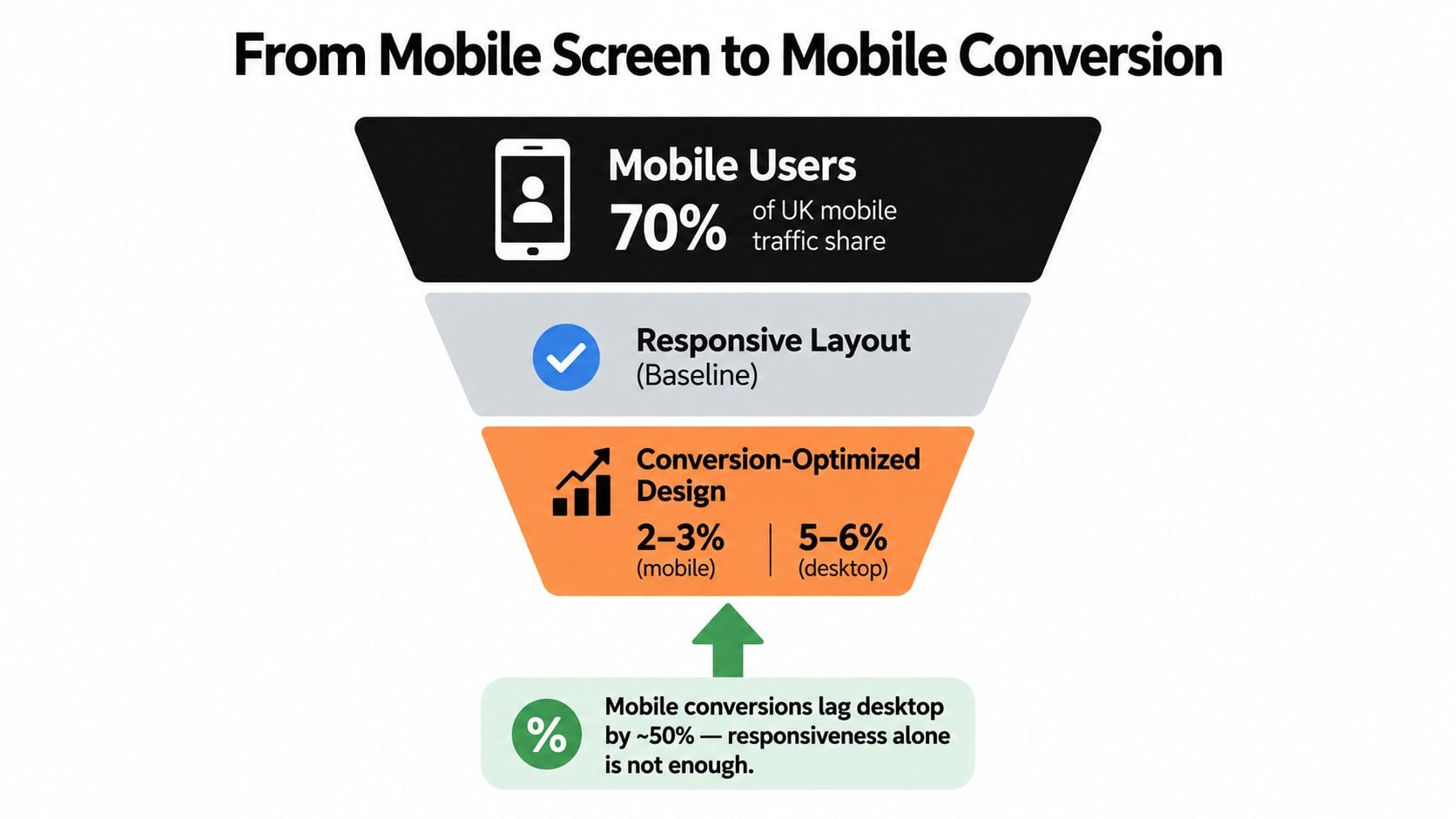
UK eCommerce traffic is estimated at roughly 72–79% mobile, while mobile conversion typically trails desktop by about 45–50%, according to UK eCommerce market data. That gap is the issue. Mobile traffic is dominant, but mobile journeys often ask people to do too much with too little room.
A responsive layout is baseline. A conversion-focused mobile layout puts the action where a thumb can reach it, removes friction, and makes the next step obvious.
What I'd change on a real SME site
For a trades business, dental clinic, accountant, or local retailer, I'd focus on these first:
- Primary action placement: put the main button high on the page and within easy thumb reach. Don't hide “Call now”, “Book a quote”, or “Get pricing” under oversized banners.
- Tap target size: buttons, menu items, accordions, and form controls should be comfortably tappable. Tiny links are still one of the quickest ways to kill mobile conversions.
- Form friction: cut fields hard. If the first enquiry step can be shorter, make it shorter.
- Checkout simplicity: if you run WooCommerce, keep mobile checkout linear and calm. No cluttered sidebars. No strange popups. No awkward coupon distractions before the customer's committed.
Responsive means the page adapts. Conversion-focused responsive design means the page helps the visitor finish the job.
This short video shows the difference between a site that merely fits on mobile and one that guides action properly.
Build for action, not just appearance
My default mobile rules are simple:
- Use one clear primary action per key section.
- Enable autofill wherever forms ask for common details.
- Keep navigation lean so users don't disappear into dead-end pages.
- Use mobile-friendly payment methods if you sell online.
- Test the full journey from landing page to enquiry or checkout on an actual phone.
If you want a practical next layer after responsiveness, this guide on how to improve website conversion rate is the right place to look.
Speed and Core Web Vitals for Responsive WordPress Sites
Performance is where most “responsive” sites get exposed. A page might technically adapt to a phone screen and still feel slow, jumpy, and frustrating. That's not good enough.
For mobile, Google's current Core Web Vitals thresholds are Largest Contentful Paint at 2.5 seconds or less, Interaction to Next Paint at 200 ms or less, and Cumulative Layout Shift at 0.1 or less, measured at the 75th percentile, as outlined in this mobile responsive web design and Core Web Vitals analysis. The same source notes that only 47% of websites pass all Core Web Vitals.
Core Web Vitals thresholds and WordPress levers that move them
| Metric | Good Threshold | WordPress Lever |
|---|---|---|
| LCP | ≤2.5 seconds | better hosting, edge caching, critical CSS, preloaded hero image, properly sized images, font loading strategy |
| INP | ≤200 ms | defer non-essential JavaScript, reduce builder overhead, trim third-party tags, break up heavy tasks |
| CLS | ≤0.1 | set width and height on images and embeds, reserve space for late content, stabilise font loading |
What actually improves each metric
LCP is usually hurt by slow hosting, oversized hero images, and render-blocking assets. I'd rather put money into decent managed hosting and edge caching than bolt five optimisation plugins onto weak foundations. Inline critical CSS, preload the hero image when it deserves priority, and serve modern image formats with width descriptors.
INP gets worse when a page-builder stack, chat widget, cookie tool, analytics tags, and animation library all compete on mobile. Defer what isn't essential. Remove what isn't earning its keep.
CLS is often the easiest to prevent and the most commonly ignored. Every image and embed needs dimensions. Menus shouldn't shove content down after load. Fonts should swap predictably instead of causing text jumps.
What to refuse
Don't accept a build that tries to solve theme bloat by stacking caching plugins on top of each other. That's not optimisation. That's covering one mistake with three more.
For practical site-speed work beyond the design layer, this guide on how to improve website loading speed is a useful companion.
Accessibility Standards Every Responsive Build Should Meet
A site can reflow neatly on mobile and still fail the people trying to use it. That's the quiet problem with many responsive WordPress builds. The layout stacks correctly, but the mobile menu traps keyboard focus, the text contrast is poor, or form errors only appear in colour.
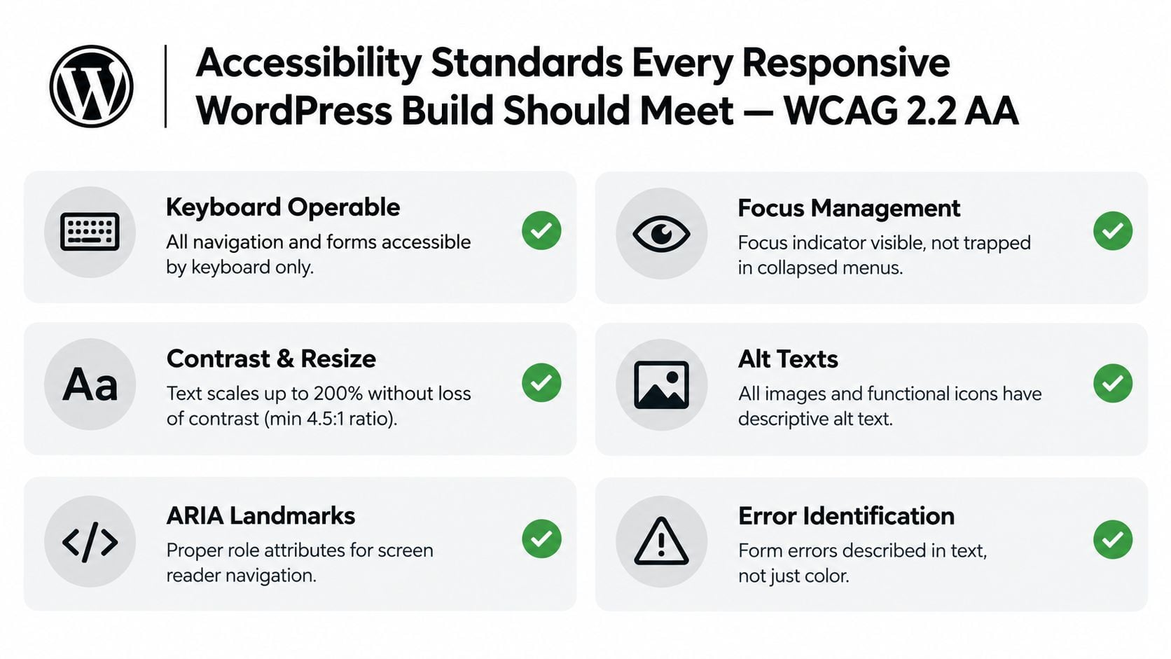
WordPress accessibility guidance for the UK states that the WordPress admin and bundled themes aim for WCAG 2.2 AA compliance where possible, and practical implementation guidance includes relative font units, visible keyboard focus, keyboard-reachable controls, labelled form fields, and testing at 360px, 768px, and 1440px in the same WordPress accessibility resource. That's the standard I'd want written into the project scope.
What should be included by default
A proper responsive build should include:
- Semantic structure: real
header,nav,main, andfooterlandmarks - Visible focus states: every button, link, form field, and menu control should show where keyboard focus is
- Accessible mobile navigation: menu toggles need clear states and proper focus management
- Form clarity: labels tied to inputs, plus error messages associated with the right fields
- Image handling: alt text on meaningful images and functional icons
- Text resilience: the site should still work when text is enlarged and the page is zoomed
The wider accessibility picture matters too. The 2025 Web Almanac reported the UK at 94% accessibility, up 2% from 2024, and found that interior pages create nearly all site issues because there are far more of them than homepages, according to the 2025 Web Almanac accessibility chapter. That matches what we see in practice. Homepages get attention. Service pages, product pages, and forms are where standards usually slip.
Ask to see keyboard-only testing on mobile menu, forms, and inner templates. If an agency only shows you the homepage, you haven't seen the risky part yet.
If you want a plain-English checklist before signing off a build, read this guide on how to make a website accessible.
Timeline, Fixed-Cost Pricing, and a Pre-Launch Testing Checklist
Small business owners usually get one of two bad pricing models. Either a vague low quote that expands later, or an open-ended hourly setup that makes every decision feel expensive. I prefer fixed-cost scopes tied to deliverables.
For a standard responsive WordPress marketing site, I'd usually break the work into four phases.
A realistic project timeline
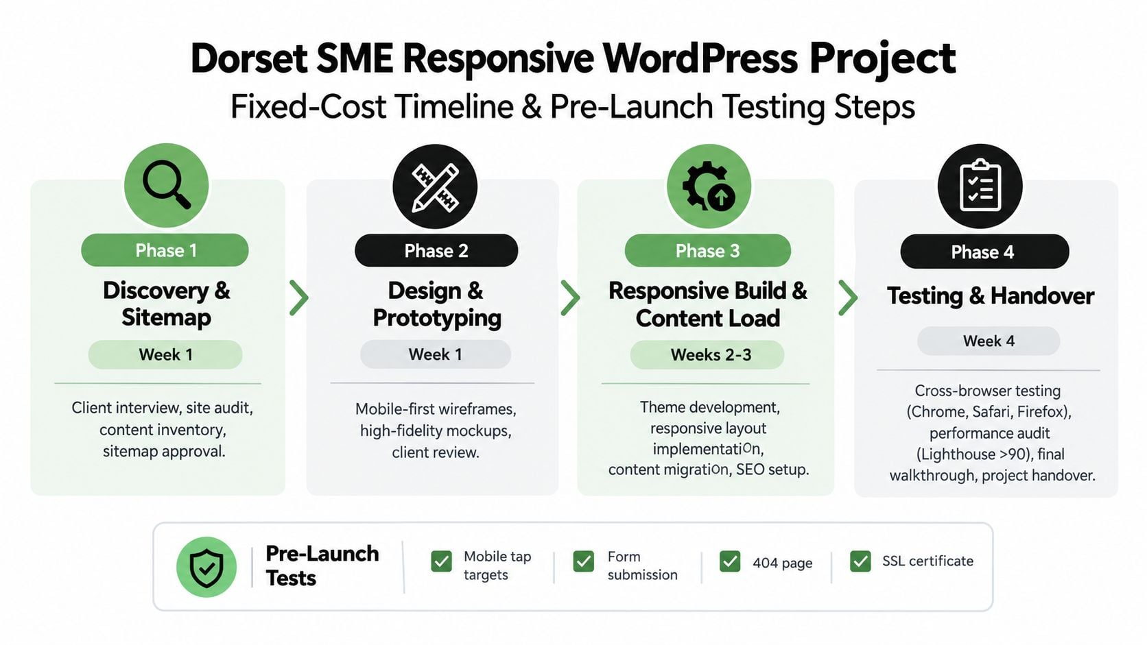
Discovery and sitemap
One week. Clarify goals, review the current site, map the page structure, and lock content priorities before design starts.Design and prototyping
One week. Mobile-first wireframes, visual direction, key templates, and revision rounds while the scope is still under control.Responsive build and content load
Two weeks. Theme setup or development, page templates, responsive rules, image prep, content population, forms, and basic SEO setup.QA and launch
Three to five days. Browser testing, device testing, redirects, forms, performance checks, final fixes, and handover.
For a straightforward five to seven page site, that usually lands in the region of four to five weeks if content and feedback arrive on time.
Fixed-cost ranges I'd expect
These are sensible ranges for the UK small business market, based on what the work includes:
| Project Type | Indicative Fixed Cost | What it should include |
|---|---|---|
| Starter brochure site | £1,800 to £2,800 | core pages, responsive setup, contact form, basic on-page SEO, launch support |
| Conversion-led SME site | £3,500 to £5,500 | stronger UX, template planning, performance work, clearer calls to action, content support |
| Custom WooCommerce build | £6,000 to £9,000 | bespoke templates, mobile-first product flows, checkout optimisation, deeper QA |
These prices only make sense when scope is defined. “Responsive website” on its own means nothing unless you know what's being delivered.
Pre-launch checklist you should insist on
Before launch, I'd want written sign-off against this list:
- Device widths: 360px, 768px, 1024px, and 1440px checked on key templates
- Browsers: Chrome, Safari, Firefox, and Samsung Internet tested
- Accessibility: keyboard navigation and WCAG 2.2 AA checks across core journeys
- Performance: Core Web Vitals and mobile testing under realistic throttled conditions
- Forms and checkout: end-to-end test submissions completed successfully
- Redirects and errors: 404 page, broken links, and redirect mapping verified
- Content details: headings, spacing, images, metadata, and legal pages reviewed
- Post-launch support: a defined short support window for fixes after launch
A fixed cost is only useful when the acceptance criteria are fixed too.
That's the point many quotes leave out.
Your Next Step Toward a Site That Earns Its Keep
The sentence you should be able to say after a redesign is simple. My WordPress site works on the devices my customers use, passes Core Web Vitals on mobile, and meets WCAG 2.2 AA principles well enough to support real users, not just a desktop preview.
That standard rules out a lot of average web design. It also makes buying easier, because you can judge proposals against something concrete. Does the agency talk about conversion paths on mobile? Do they define performance acceptance criteria? Do they test inner pages and forms, not just the homepage? If not, keep looking.
WordPress is still a major platform in the UK. Recent market data estimates it holds 45% of the UK CMS market in 2026, with about 4.5 million active WordPress websites in the country, according to UK WordPress market share statistics. That scale is exactly why responsive standards matter. Lots of businesses are on WordPress. Not enough of them are using it well.
If you're planning a rebuild, ask for a fixed-cost scope that includes these essentials:
- Conversion-led mobile layouts, not just resized desktop sections
- Core Web Vitals targets agreed before launch
- Accessibility checks across templates and forms
- Clear ownership over themes, licences, and content editing
- A testing list in writing, not vague promises
That approach saves money because it cuts rework. It also gives you a site that can support SEO, paid traffic, referrals, and repeat visitors without falling apart on smaller screens.
You don't need a flashy homepage. You need a responsive WordPress site that earns enquiries, loads properly on mobile, and stays manageable after handover.
If you want a straight answer on whether your current site is responsive enough, DesignStack can review the layout, mobile conversion path, and WordPress setup without dressing it up. We build fixed-cost responsive WordPress websites for Dorset and UK businesses, with performance, accessibility, and day-to-day usability treated as part of the job, not extras. Have a look at DesignStack and see whether the way we scope projects fits what you need.



Leave a Reply