

What Is a Responsive WordPress Theme and Why It Matters
UK adults spend roughly 3 hours 15 minutes each day on smartphones, so a responsive WordPress theme is a theme with one codebase that uses CSS breakpoints to adapt its layout, navigation and media to different screen sizes. It keeps the same website working across phones, tablets and desktops instead of sending mobile visitors to a separate, limited version.
That definition is simple, but the practical difference between a merely “mobile-friendly” site and a responsive one is substantial. A responsive theme must keep text readable, menus usable, forms accessible and pages efficient when someone is browsing on a small screen, zooming in, using a keyboard or switching between devices.
For a small business, that affects far more than appearance. It influences whether a customer can find your opening hours, complete an enquiry form, trust your brand and finish a purchase.
Table of Contents
- Why Responsive Design Is No Longer Optional
- How a Responsive WordPress Theme Actually Works
- The Business Benefits of Going Responsive
- How to Choose the Right Responsive Theme
- Testing Your Theme Across Devices and Breakpoints
- Common Responsive Theme Mistakes to Avoid
- Building a Responsive Foundation for Long-Term Growth
Why Responsive Design Is No Longer Optional
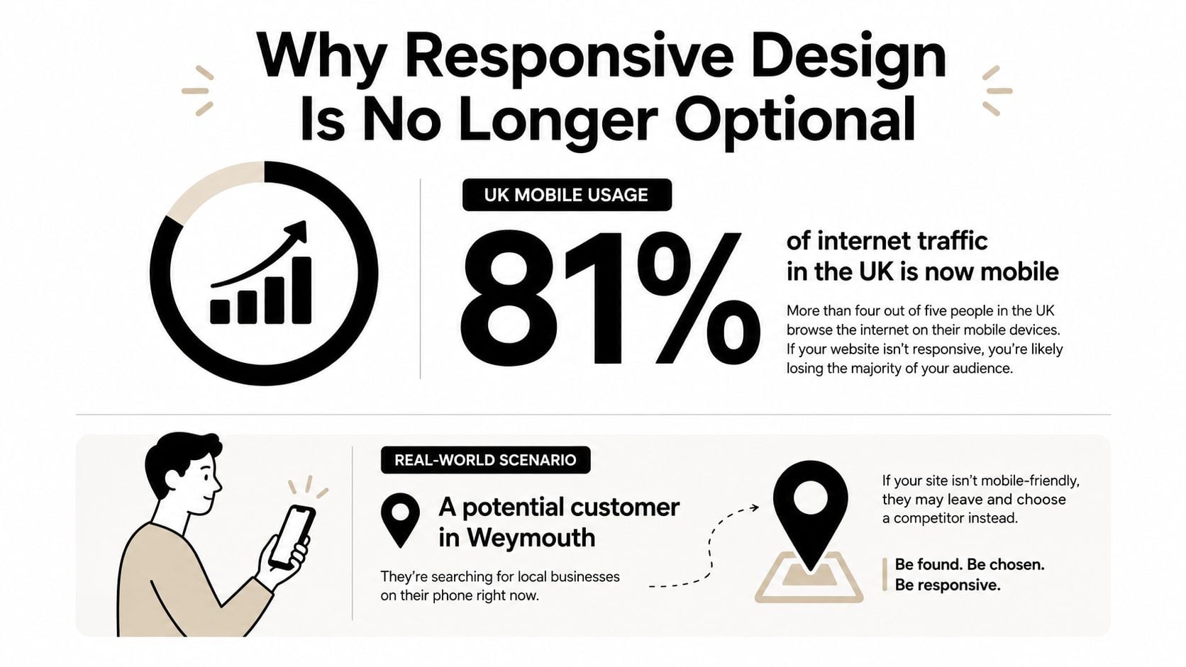
UK adults spent an average of 4 hours 20 minutes online each day in May 2024, with 75% of that time taking place on smartphones, according to Ofcom's UK mobile usage figures. That works out at about 3 hours 15 minutes per day on mobile devices alone.
Consider a potential customer in Weymouth searching for a local service during a lunch break. They tap a result, but the page opens with tiny text. The navigation menu is difficult to find, the phone number runs off the edge of the screen and the contact form asks them to pinch and zoom before they can type. They may still want the service, but the website has made continuing feel like work.
The issue affects different age groups in different ways. People aged 25 to 34 spend 83% of their online time on smartphones, while adults aged 65 and over spend 56% on smartphones, as the same Ofcom-based source records. A business site therefore needs to support both highly mobile-first visitors and customers who may move between a phone, tablet and computer.
The report also recorded 47.4 million UK adults accessing the internet across smartphones, tablets and computers in May 2024. Responsive design isn't a specialist enhancement for a narrow audience. It's the basic mechanism that allows one website to serve people using different devices.
Practical rule: If a customer needs to zoom, rotate their phone or hunt for a hidden menu to complete a simple task, the site isn't doing its job.
Responsive design also supports a more consistent brand experience. Your logo, colours, service information and calls to action should remain recognisable whether someone visits from a phone in Weymouth, a tablet at home or a desktop at work. You can learn more about the broader principles in this guide to responsive web design.
The important point is that “responsive” doesn't mean “make the desktop page smaller”. It means designing the page so its content can rearrange itself around the visitor's available space.
How a Responsive WordPress Theme Actually Works
A useful analogy is water poured into different containers. The water is the website content, while the containers are the visitor's screens. The content remains the same, but its shape and arrangement change to fit the available space.
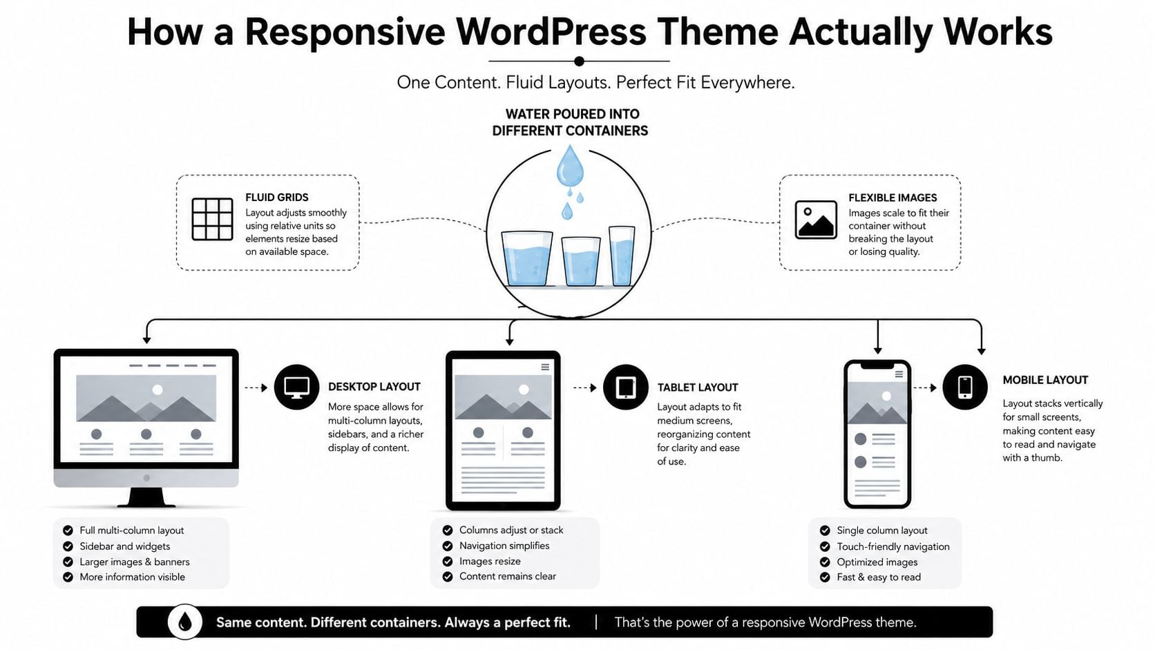
Three technical ingredients make that possible.
CSS breakpoints decide how the layout changes
A breakpoint is a rule that tells the theme to use a different arrangement when the screen reaches a certain width. On a desktop, a header might show a full navigation bar and a three-column layout. On a phone, those columns can stack vertically and the navigation can become a compact menu.
The theme isn't maintaining a second mobile website. It's applying different CSS instructions to the same underlying page. The UK Government Digital Service explanation of responsive design describes this as the same site responding to device size through additional CSS and some JavaScript, while keeping content and functionality consistent.
Flexible grids let content reflow
A fixed layout gives an element a rigid width. That can cause horizontal scrolling or clipped text when the screen is narrower than expected. A flexible grid uses relative sizing, spacing and columns that can shrink, expand or stack.
For a local restaurant, the desktop page might place its menu, booking panel and location details beside one another. On a phone, the same elements can appear in a logical vertical order, with the booking action placed where a visitor can reach it without searching.
Fluid images prevent visual breakage
Images need to scale within their containers. A fixed-size photograph can force a page wider than the screen, while an oversized image can make a mobile page feel slow and cumbersome. A responsive theme gives images room to shrink while preserving their proportions, and a well-built site serves appropriately sized media where possible.
This is why a responsive WordPress theme is more than a label in a theme marketplace. Check whether the demo changes its navigation, columns, images and interactive elements when you resize the browser. If only the text becomes smaller while the page still requires horizontal scrolling, it isn't responding properly.
The following video offers a visual introduction to the idea:
A strong implementation starts with a usable baseline and progressively enhances the experience for larger screens. That approach keeps core content and functions dependable even when JavaScript is unavailable or a device behaves differently from the designer's test setup.
The Business Benefits of Going Responsive
A responsive theme gives visitors a clearer route through your site. They can read the page without zooming, open the menu without tapping a tiny target and reach important information without fighting the layout. That improved experience supports trust, but it doesn't automatically guarantee strong results.
The UK figures reveal why. Mobile accounts for 54% of UK web traffic and 78% of retail site visits, yet mobile conversion rates remain roughly half those on desktop. The cited ecommerce ranges are 3.9% to 5.06% on desktop compared with 1.8% to 2.9% on mobile, as reported in this UK responsive web design and conversion analysis.
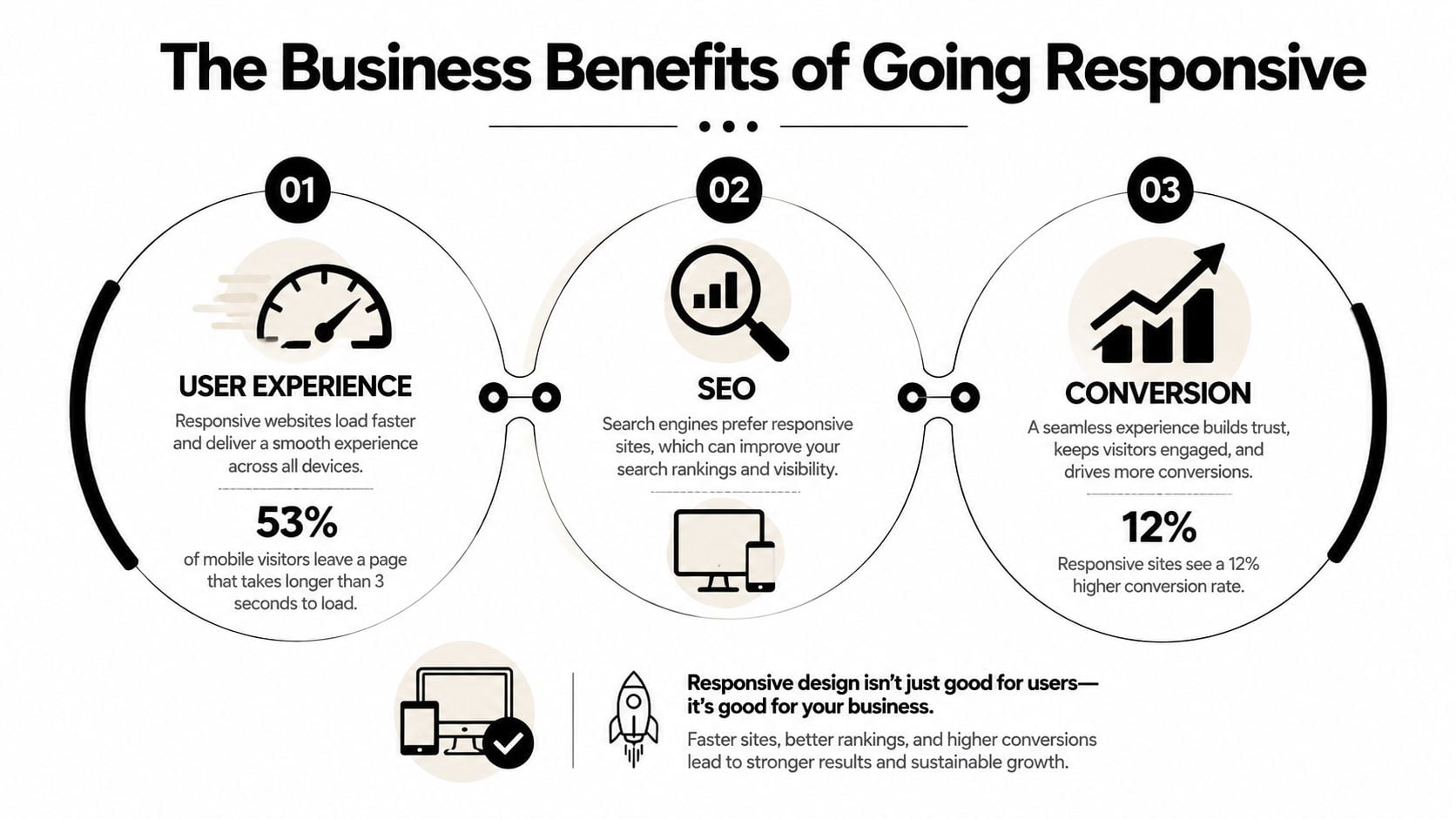
That gap tells you something important: responsive is necessary, but responsive alone isn't enough.
Usability removes avoidable friction
A mobile visitor may be ready to enquire or buy, yet abandon the task because an image pushes the page sideways, a form field is awkward to select or a pop-up covers the button they need. Responsive spacing, readable typography and a sensible content order reduce those unnecessary obstacles.
Forms deserve particular attention. Use clear labels, appropriate input types and a short path to completion. A postcode field, for example, should be easy to select and shouldn't become hidden beneath an oversized keyboard or floating banner.
Search visibility depends on the mobile experience
Search engines need to interpret the same content that visitors use. A single responsive site avoids the content and maintenance complications that can arise when a business operates separate desktop and mobile versions. It also gives your team one place to update service pages, metadata, navigation and structured content.
Responsive design doesn't replace good search engine optimisation. It provides a sound technical foundation for it. Clear headings, useful copy, accessible links and efficient pages still matter.
Conversions require deliberate mobile decisions
A shop selling products across Dorset might receive plenty of phone visits but lose orders at the basket or checkout stage. The theme may technically fit the screen, while the buying journey still contains too many fields, unclear delivery information or buttons that are difficult to tap.
Review each important action on a phone:
- Images: Use media that fits the layout and supports the decision without overwhelming the page.
- Touch spacing: Keep links, filters and buttons separated enough for accurate tapping.
- Checkout flow: Remove distractions and make each required step obvious.
- Performance: Reduce unnecessary scripts, effects and oversized assets so the page feels responsive as well as looking responsive.
For a wider practical framework, see this guide to improving website user experience. A responsive theme becomes a commercial asset when it helps visitors complete the task they arrived to do.
How to Choose the Right Responsive Theme
Don't choose a theme because its demo looks attractive on a large monitor. Open the demo on your own phone, try the menu, scroll through a long page and complete any available form. A theme that looks polished in a controlled screenshot may still be frustrating in everyday use.
Use this checklist before installing it:
| Evaluation criteria | What to look for | Why it matters |
|---|---|---|
| Mobile navigation | A clear menu, logical hierarchy and visible close controls | Visitors need to reach key pages without guesswork |
| Page speed | Sensible asset loading, restrained animation and efficient layouts | Heavy themes can make mobile browsing feel sluggish |
| WooCommerce compatibility | Product grids, filters, basket and checkout that adapt cleanly | Ecommerce relies on every stage working on a small screen |
| Accessibility | Keyboard focus, readable contrast, scalable text and usable controls | More people can access and operate the site |
| Customisation | Flexible colours, typography, templates and content sections | You can match the theme to your brand without unnecessary code |
| Developer support | Recent updates, clear documentation and responsive support channels | Ongoing maintenance matters after launch |
Free themes can be appropriate for a brochure site with straightforward content and modest customisation needs. A paid theme may make more sense when you need WooCommerce features, advanced templates, reliable support or a more controlled design system. Price isn't a substitute for quality, so inspect the actual implementation rather than assuming a premium label guarantees a good result.
Read the details behind the demo
Check the theme's changelog and documentation. Look for evidence that the developer maintains compatibility with current WordPress versions, fixes accessibility issues and explains how its responsive controls work. Be cautious with themes that bundle a large collection of features you won't use, because extra components can make future maintenance harder.
You can also compare a theme's behaviour against the requirements in this WordPress ecommerce themes guide. The right choice is the one that fits your content, customer journey, and maintenance capacity, not just the one with the most layouts.
Testing Your Theme Across Devices and Breakpoints
A theme isn't proven responsive because its preview resized neatly in the developer's browser. Test the pages your customers use, including the homepage, service pages, product pages, contact forms, menus and checkout.
Start with browser developer tools. In Chrome, Edge or Firefox, open the responsive device view and inspect the layout at 320px, 375px, 768px, 1024px and 1440px. These widths cover common small-phone, phone, tablet and desktop conditions used in UK-oriented testing guidance.
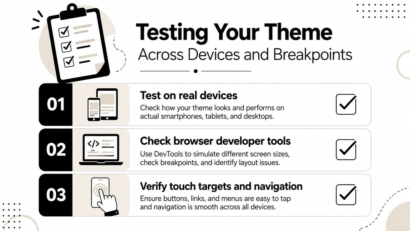
At each width, look for:
- Unexpected horizontal scrolling: Drag across every page. If the whole document moves sideways, identify the image, table, heading or embedded element causing it.
- Broken content order: Check whether headings, text, images and calls to action appear in a sensible reading sequence when columns stack.
- Unusable controls: Open menus, accordions, filters and forms. Confirm that buttons remain visible and easy to operate.
- Typography problems: Look for cramped lines, overlapping text and headings that become disproportionately large or small.
- Media faults: Check videos, maps, galleries and tables. Each should fit the available width without obscuring essential information.
Real-device testing catches problems that an emulator can miss. Try the site on the phones and tablets available to your team, then ask someone unfamiliar with the site to complete a task without guidance. If you want to record a visual walkthrough or capture issues for a developer, a tool such as ScreenSnap Pro screenshot app can help organise annotated evidence.
Accessibility needs its own test pass. For UK public-facing sites, responsiveness should be paired with WCAG 2.2 AA, keyboard operability and support for browser or device zoom up to 400%, as set out in UK digital accessibility guidance. Zoom the page and check that text, menus, forms and buttons remain usable rather than overlapping or disappearing.
Use the keyboard from the start of the page. Can you reach every link and control? Is the focus indicator visible? Does the focus order make sense? Test contrast, text resizing and form error messages as well. For further performance checks, use this resource on improving website loading speed.
Accessibility check: A page that looks perfect on a phone can still exclude someone who uses zoom, a keyboard or assistive technology.
Common Responsive Theme Mistakes to Avoid
Installing a responsive theme doesn't make every part of a WordPress website responsive. Content, plugins, custom code and page-builder settings can introduce problems long after the theme has been activated.
The most common mistake is testing only the homepage. A product page may contain a table that overflows, a booking form may use fields that are difficult to select and an old blog post may contain an image with a fixed width. Review templates and real content, not just the polished theme demo.
The layout can fit while the task still fails
A mobile menu that opens but covers the logo, a cookie banner that hides the checkout button and a pop-up that has no clear close control all create friction. So does a form that resets when a visitor makes a small mistake.
Hidden desktop elements can cause a second problem. Some builders hide a block visually on mobile but still load its images, styles or scripts. Visitors don't see the content, but their devices may still process unnecessary resources. Remove or simplify elements where possible rather than treating “hidden” as equivalent to “optimised”.
Images create similar trouble. A large hero photograph may scale down visually while remaining unnecessarily heavy to download. Choose appropriate dimensions, compress media and review whether every decorative image earns its place on a small screen.
Accessibility is part of responsiveness
A theme can appear clean and still fail keyboard users or people who need larger text. WordPress-oriented guidance recommends relative font units, 4.5:1 AA contrast for plain text, visible keyboard focus states and keyboard-reachable links and controls. The recommendations are covered in this WordPress theme customisation guidance.
Watch for these warning signs:
- Fixed text sizing: Text becomes uncomfortable or breaks when visitors increase its size.
- Missing focus indicators: Keyboard users can't tell which link or button is active.
- Low contrast: Grey text on a pale background becomes difficult to read.
- Unlabelled controls: Screen-reader users can't identify what a button or field does.
- Hover-only interactions: Important information appears only when someone points a mouse at it.
“Mobile-friendly” is not a complete quality assessment. It may describe a page that fits a narrow viewport, while genuine responsiveness also covers interaction, content order, accessibility and performance. Test the full customer journey, then fix the barriers you find.
Building a Responsive Foundation for Long-Term Growth
A responsive WordPress theme gives your business one adaptable foundation, but it needs thoughtful content, accessible components and ongoing checks. Choose a theme that fits your customer journey, test its templates at 320px, 375px, 768px, 1024px and 1440px, and review the site with a keyboard and increased zoom.
Treat the theme as part of your business infrastructure. It supports search visibility, product discovery, enquiries and brand confidence, but only when the pages remain easy to use. Your hosting choice matters too, so assess storage, support, security and the needs of your WordPress installation with this guide to choosing a web hosting provider.
Start with a short audit today. Visit your site on a phone, try one important task, record every point of friction and decide whether your current theme is helping customers or making them work too hard.
DesignStack can customise and build responsive WordPress websites, including ecommerce sites, with testing across common viewport sizes and support for ongoing updates. Visit DesignStack to discuss your current site, theme requirements and the practical changes that could make mobile browsing easier for your customers.

Leave a Reply